Summary
This tutorial shows how to create nice tables and charts for studying the association between a dichotomous and a metric variable. If statistical assumptions are met, these may be followed up by an independent samples t-test.
As an example, we'll investigate whether there's an association between income_2010 and gender in freelancers.sav: is the average income over 2010 equal for female and male respondents?
Quick Data Check
Before we do anything else with our two variables, let's first make sure they don't contain any unexpected values. We'll do so by running a histogram for our metric variables and a frequencies table for our dichotomous variable. The easy way to do so is by FREQUENCIES as shown in the syntax below.
We'll also run FORMATS for hiding the decimals of income_2010. This will suppress excessive decimal places in our output tables later on. Note that a simple tool for doing so is available from Set Decimals for Output Tables Tool.
SPSS Data Check Syntax
frequencies income_2010/format notable/histogram.
*2. Inspect frequencies for gender.
frequencies gender.
*3. Hide decimals in income_2010.
formats income_2010(dollar7).
Conclusion: nothing unusual is seen upon inspecting the results in the output viewer window. Note that neither variable has any missing values either. We may proceed our investigation confidently.
SPSS MEANS Table
We'd now like to take a look at the mean incomes for females and males separately. The way to go here is MEANS. We prettified the output table somewhat by using an SPSS table template (.stt file) that hides “Report” and shows the variable label as if it's a title.
means income_2010 by gender/cells count mean stddev.
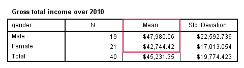
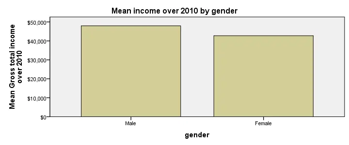
Conclusion: on average, male respondents made some $5,000 more than female respondents over 2010.
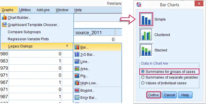
SPSS Bar Chart for Independent Means
We'll now visualize the mean incomes from our previous table. The way to go here is a bar chart for independent means. The screenshots below walk you through.
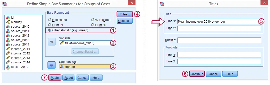
SPSS Bar Chart Independent Means Syntax
Completing the steps shown in the previous screenshots results in the syntax below. The result is shown in the next screenshot.
GRAPH
/BAR(SIMPLE)=MEAN(income_2010) BY gender
/title "Mean income over 2010 by gender".
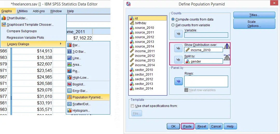
SPSS Bar Chart Styling
Although our chart is technically correct, it's ugly and not very outspoken. For one thing, we'll add the frequencies for gender to their value labels. We can have this modification reversed by preceding it with TEMPORARY as shown in the next syntax example, step 1.
Next, we'll style the chart by applying an SPSS chart template (.sgt file). In our case, we'll transpose it (“put it on its side”) and have the dollar axis run from $40,000 through $50,000. The final result (after minor additional tweaks) is shown in the following screenshot.
SPSS Bar Chart Independent Means Syntax
temporary.
*2. Add N's to value labels. "\n" breaks labels over two lines (N beneath gender in chart).
value labels gender 0 'Female\nN = 21' 1 'Male\nN = 19'.
*3. Rerun chart. Indicates end of temporary command and reverses previous value labels command.
GRAPH
/BAR(SIMPLE)=MEAN(income_2010) BY gender
/title "Mean income over 2010 by gender".

SPSS Population Pyramid
Another nice chart option for these data is a population pyramid. It visualizes the association between a metric and a categorical variable but it works best if the latter is dichotomous - exactly the case we've got here. The screenshot below walks you through.
SPSS Population Pyramid Syntax
XGRAPH CHART=[HISTOBAR] BY income_2010[s] BY gender[c]
/COORDINATE SPLIT=YES.
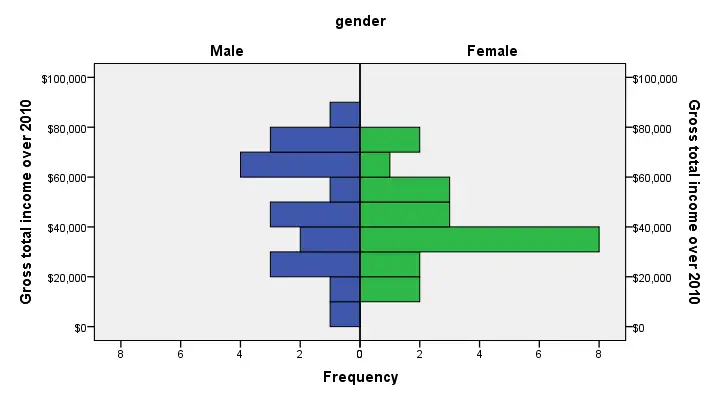
Conclusion: female respondents more often had incomes between $30,000 and $40,000 than males. Reversely, male respondents had incomes between $60,000 and $80,000 more often than female respondents. These are the most striking differences that account for the mean difference observed.
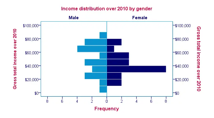
SPSS Population Pyramid Styling
Just as with our bar chart, we'll abuse the variable label of gender as a title and we'll again precede it with TEMPORARY. We'll add some more styling with an SPSS chart template.Styling our fake title and value labels (“Male” and “Female”) is notoriously hard as it can't be done with a chart template. If you don't want to do it manually, you'll need to dive into the chart's source code, possibly by using a Python script. The screenshot below shows our final result.
temporary.
*2. Temporarily set chart title as variable label.
variable labels gender 'Income distribution over 2010 by gender'.
*3. Run chart, then end temporary and reverse previous command.
XGRAPH CHART=[HISTOBAR] BY income_2010[s] BY gender[c]
/COORDINATE SPLIT=YES.
THIS TUTORIAL HAS 3 COMMENTS:
By mitiku bonsa debela on February 29th, 2016
it was good. but still some part not clear for me
By Natalie on June 8th, 2016
Hello,
What can [S] in SPSS Syntax mean? I just found it above.
Thank you!
By Ruben Geert van den Berg on June 8th, 2016
Hi Natalie, good question!
The [s] is very specific to the XGRAPH command in which you see it: [s] denotes scale variable (which indicates metric-variables) in SPSS. Reversely, [c] means categorical variables.
Hope that helps!
Ruben