Summary
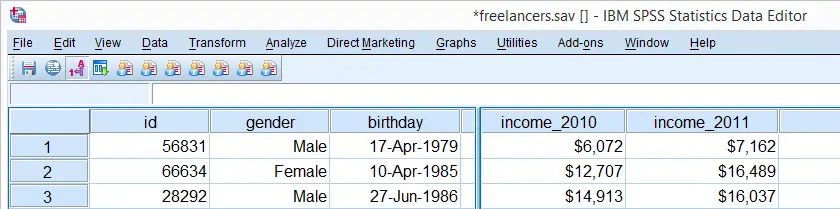
This tutorial shows how to create proper tables and means charts for multiple metric variables. If statistical assumptions are satisfied, these may be followed up by a repeated measures ANOVA. We'll use income 2010 through income_2014 from freelancers.sav throughout this tutorial.
SPSS FREQUENCIES for Inspecting Histograms
We'll first inspect the data in income_2010 through income_2014 by running basic histograms. This is done very easily with FREQUENCIES as shown in the syntax below.
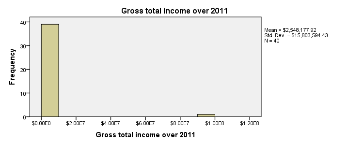
Note in the output viewer window that some of the histograms look very weird due to extreme values.
SPSS FREQUENCIES Syntax for Histograms
frequencies income_2010 to income_2014
/format notable
/histogram.
Specifying User Missing Values
Note that some extreme values occur in the data. These presumably don't reflect actual yearly incomes but rather codes to indicate missing values. We'll specify them as user missing values with the syntax below. Reinspecting the histograms shows that the remaining values show plausible distributions.
missing values income_2010 to income_2014 (99999997 thru hi).
*2. Rerun histograms. Results now look ok.
frequencies income_2010 to income_2014
/format notable
/histogram.
SPSS DESCRIPTIVES Table
The basic answer to our question regarding the comparison of mean incomes over years is answered by a basic DESCRIPTIVES table. Because it tends to have excessive decimal places, we'll suppress those by hiding the decimals or our values with FORMATS.
A nicer alternative here is a very simple tool, discussed in Set Decimals for Output Tables Tool. However, we'll stick with our quick and dirty solution for now.
SPSS DESCRIPTIVES Syntax
formats income_2010 to income_2014 (dollar8).
*2. Run descriptives table.
descriptives income_2010 to income_2014.
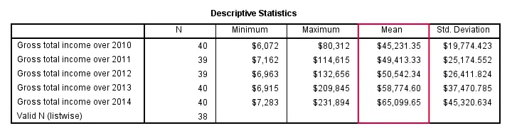
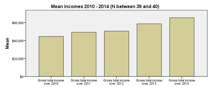
Conclusion: mean yearly incomes seem to gradually rise over the years. Starting from $45,000,- they increase with some $5,000,- per year on average.
SPSS Bar Chart for Multiple Variables
We'd now like to visualize these mean incomes with a chart. An appropriate choice here is a bar chart, as basic version of which is utterly easy to construct. The screenshots below walk you through.
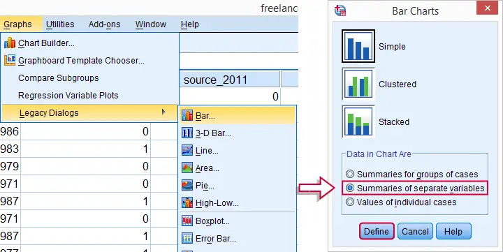
In the left window of the screenshot below, select income_2010 through income_2014 by using Shift. Move the variables to . By default, SPSS will presume you want to plot the means (rather than some other statistic) of selected variables so this section doesn't need further editing.
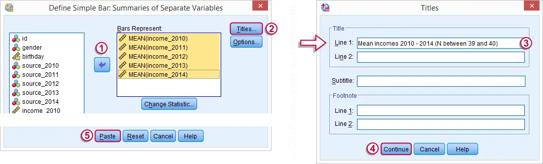
SPSS Bar Chart for Multiple Variables Syntax
Completing the steps shown in the previous screenshots results in the syntax below. Running it creates the desired bar chart.
GRAPH
/BAR(SIMPLE)=MEAN(income_2010) MEAN(income_2011) MEAN(income_2012) MEAN(income_2013) MEAN(income_2014)
/MISSING=LISTWISE
/TITLE='Mean incomes 2010 - 2014 (N between 39 and 40)'.
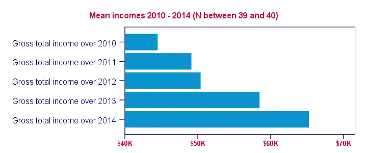
Styling the Bar Chart
The bar chart we've come up with so far provides insight into the mean incomes over 2010 through 2014. However, it could use some styling. The best way for doing so is building and applying an SPSS chart template (.sgt) file.
In order to create more space for the variable labels, our chart template transposes (“puts on its side”) the chart. Since this reverses the order of the variables in our chart, it's nice to circumvent this out by also reversing the variable order in the chart syntax as shown below.
Second, we'd like to display $40,000,- as $40 K. We can set “K” as a suffix for the x-axis with our chart template. DO REPEAT provides a fast way for dividing the data values of the income variables by 1000. We don't need to reverse this if we precede it with TEMPORARY.
Finally, we can highlight differences in mean income by having the x-axis run from 40 (now representing $40,000,-) through 70. We'll do so with our chart template as well. After adding minor additional tweaks, the screenshot below shows our final result.
SPSS Bar Chart Syntax Example
temporary.
*2. Divide income_2010 through income_2014 by 1000.
do repeat income = income_2010 to income_2014.
compute income = income / 1000.
end repeat.
*3. Reverse order of variables and rerun graph. This reverses previous data modification as well. Transpose chart with SPSS chart template.
GRAPH
/BAR(SIMPLE)=MEAN(income_2014) MEAN(income_2013) MEAN(income_2012) MEAN(income_2011) MEAN(income_2010)
/MISSING=LISTWISE
/TITLE='Mean incomes 2010 - 2014 (N between 39 and 40)'.
SPSS Bar Chart - Final Result
THIS TUTORIAL HAS 1 COMMENT:
By adam magombe on November 1st, 2019
wish to learn about various data packages