SPSS OMS (short for Output Management System) can convert your output to SPSS datasets. As we'll demonstrate in a minute, this can save you huge amounts of time, effort and frustration.
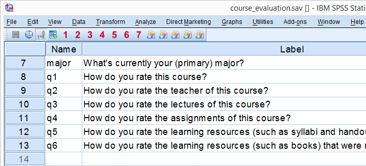
We recommend you follow along by downloading and opening course_evaluation.sav, part of which is shown below.
Today’s Challenge
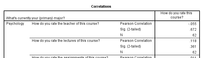
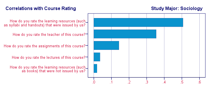
Some client wants to see charts holding correlations of q2 through q6 with q1 for each study major (psychology, anthropology) separately as shown here. This request -not unusual in market research- typically makes novice SPSS users
- panic,
- run the correlations in SPSS,
- copy/paste everything into Excel sheets and
- generate the charts one by one.
Unknown to many SPSS users, there's a much -much- faster way for getting this job done. It's called OMS.
Step 1: Split File
We'd normally always start with a routine data inspection but that's been done for you in this case. Now, a fast way for just running the desired correlations is by using SPLIT FILE. The syntax below shows how to do so.
sort cases by major.
split file by major.
*2. Show only variable labels in output table.
set tvars labels.
*3. Create correlation table.
correlations q2 to q6 with q1.
Result
Step 2: OMS Control Panel
Right, we created our correlations but they're in our output viewer window. We can't create charts from tables in our output window so we need this correlation table in data view instead.
We'll do just that by navigating to ![]() which is shown below.
which is shown below.
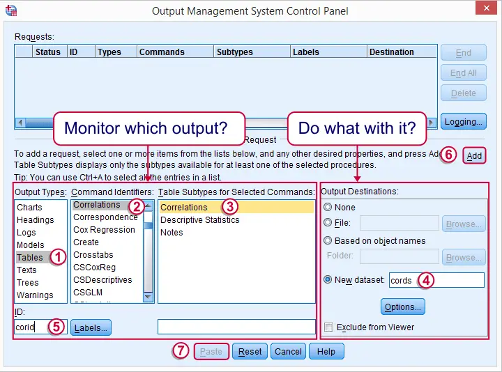
We'll follow the steps in the screenshot: we select our correlation table in the left half of the dialog.
 It's a best practice to always specify an here. In this case, “corid” is short for “correlation id”
 We then select in the right half of the dialog. “cords” is short for “correlation dataset”.
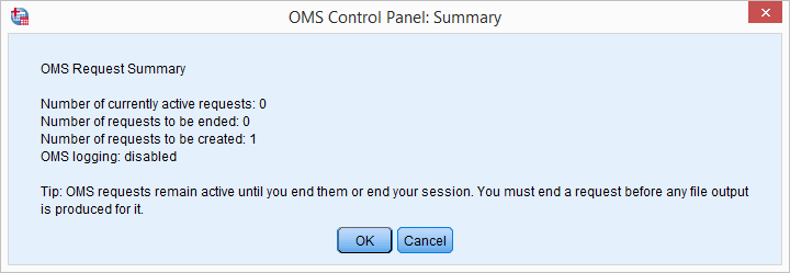
Clicking triggers a popup dialog confirming our OMS request. Just ignore it.
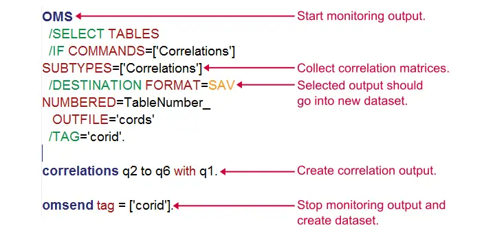
Clicking then generates the first block of the syntax below. We then (manually) added two lines to it.
SPSS OMS Syntax Example
DATASET DECLARE cords.
OMS
/SELECT TABLES
/IF COMMANDS=['Correlations']
SUBTYPES=['Correlations']
/DESTINATION FORMAT=SAV
NUMBERED=TableNumber_
OUTFILE='cords'
/TAG='corid'.
*2. (Manually added) correlations command.
correlations q2 to q6 with q1.
*3. (Manually added) omsend command.
omsend tag = ['corid'].
SPSS OMS Syntax - How Does It Work?
The next figure explains how our syntax basically works. In a nutshell,
- the OMS command has SPSS monitor selected output following it so
- our correlation table is captured by the OMS.
- OMSEND then stops SPSS from monitoring output and create our desired correlations dataset.
Result
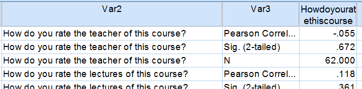
We now have our correlation matrix in an SPSS dataset, which allows us to run charts on it. We'll prepare these data a tiny bit before doing so with the syntax below.
dataset activate cords.
*2. Delete all rows that don't hold correlations.
select if char.index(var3,'Pearson') > 0.
execute.
*3. Split file by var1 (= study major).
sort cases by var1 howdoyouratethiscourse.
split file by var1.
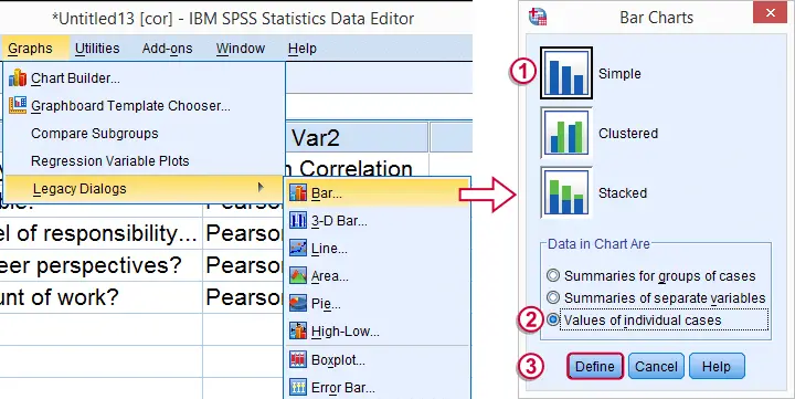
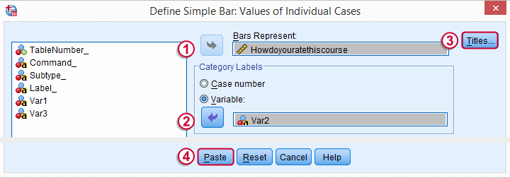
Step 3: Creating Our Charts
We'll now create our desired charts by following the figure below. Since we're using SPLIT FILE, we need only one single command for creating all charts at once.
 In the second dialog (below), choose a nice main title for your charts. We decided upon “Correlations with Course Rating”.
Following these steps results in the syntax below. Running it generates all desired charts.
SPSS Bar Chart Syntax Example
GRAPH /BAR(SIMPLE)=VALUE(Howdoyouratethiscourse) BY Var2/title 'Correlations with Course Rating'.
Step 4: Prettifying our Charts
We now have the charts we wanted. A nice trick to make them look great with little effort is creating a chart template for them.
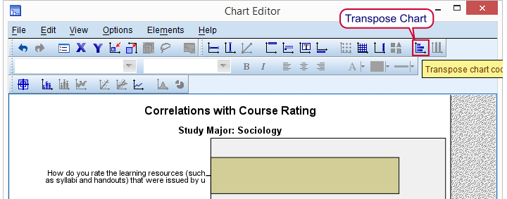
We double click just one of our charts and transpose it as shown below.
Next, we change the colors, fonts, layout, everything in our first chart until it looks nice. Then navigate to ![]() as explained in SPSS chart templates.
as explained in SPSS chart templates.
SPSS - Creating Pretty Charts
Finally, we activate the chart template we just created (step 3 below, first set path to .sgt file correctly). We then rerun the GRAPH command we pasted and ran previously and - there you go - five pretty charts in a split second.
If you ever get a similar request for different data, you can now rerun your syntax on it and you'll be done in seconds. As a bonus, you can probably (edit and) reuse your chart template other bar charts too.
Final Syntax Using Chart Template
variable labels var1 "Study Major".
*2. Suppress excessive decimal places.
formats howdoyouratethiscourse (f1).
*3. Activate newly created chart template (set path appropriately).
set ctemplate 'my-project-folder\my-template.sgt'.
*4. Rerun all graphs at once with chart template.
GRAPH /BAR(SIMPLE)=VALUE(Howdoyouratethiscourse) BY Var2/title 'Correlations with Course Rating'.
*5. Switch off chart template for any future graphs.
set ctemplate none.
Final Result
Final Notes
SPSS OMS can be a tremendous time saver. Today's tutorial redirected a single correlation table to an SPSS dataset but you can very easily create a single dataset holding output from 1,000 or more output tables. In fact, we did just that in the simulation studies we presented when explaining the basic idea behind ANOVA, regression and the chi-square test. In these studies we basically
- used one OMS command for capturing all ANOVA tables,
- ran ANOVA on 1,000 random samples from a population data file,
- ran OMSEND for creating a dataset with 1,000 F-values and
- created a histogram for visualizing our sampling distribution.
As we see, SPSS OMS opens up a lot of possibilities. We hope it'll help you save time and effort as well!
THIS TUTORIAL HAS 10 COMMENTS:
By Nik on February 28th, 2019
Hi Ruben! I have to export to Excel an output of hundreds of tables. I'd like to exclude from the Excel file whole the syntaxis and export just the tables. Do you think it is possible? Thank you!
By Ruben Geert van den Berg on February 28th, 2019
Hi Nicola!
First try OUTPUT EXPORT for this.
Avoid printing the syntax to the output viewer by running SET PRINTBACK OFF. before running the tables.
If that's not an option, try to remove all undesired output with OUTPUT MODIFY and then go for OUTPUT EXPORT.
I think OMS is only good for this job if you want unformatted output (just the numbers) in a single sheet. Then send all tables to a new dataset, edit it and save it as .xlsx.
Hope that helps!
By german on August 14th, 2021
me gusta poder bajar la sintaxis para aprender y correrlo
By Ruben Geert van den Berg on August 15th, 2021
Hola German!
You can copy-paste all syntax from all our tutorials into a syntax window and run it.
Hope that helps!
SPSS tutorials
By Eric on February 12th, 2024
This is an excellent tutorial and help me immensely. I now don't have to perform this and other task manually.