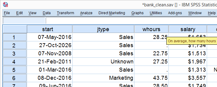
A large bank wants to gain insight into their employees’ job satisfaction. They carried out a survey, the results of which are in bank_clean.sav. The survey included the number of hours people work per week and their gross monthly salaries.
Research Question
It seems obvious that working hours are related to monthly salaries: employees who work more hours earn more money. But we'd like to know more about this relationship so our research question is how (strongly) is monthly salary related to working hours? Since we already inspected this data file (and set missing values) we can simply run correlations whours salary. and see that the correlation is 0.648, quite a strong linear relation. Some would leave it at. However, a scatterplot will show that there's way more to this relation.
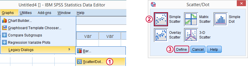
SPSS Scatterplot Creation
We'll first run our scatterplot the way most users find easiest: by following the screenshots below.
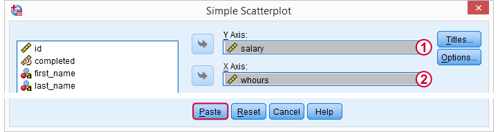
The aforementioned steps result in the syntax below. Running it creates our first basic scatterplot.
SPSS Scatterplot Syntax
GRAPH
/SCATTERPLOT(BIVAR)=whours WITH salary
/MISSING=LISTWISE.
Note: you'll get the exact same result by running graph/scatter whours with salary. You probably prefer this second version if you want to create multiple scatterplots by copy-paste-editing the syntax. If you want to create a huge number of scatterplots, see SPSS with Python - Looping over Scatterplots.
Result
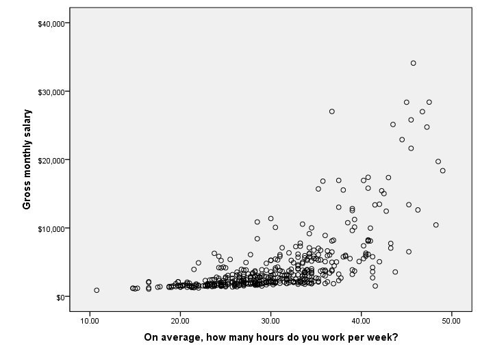
As we see, this is not a simple linear relation. First, we see that our dots become more dispersed as our respondents work more hours; the more hours people work, the greater the standard deviation of monthly salary. This is a textbook example of heteroscedasticity, the opposite of homoscedasticity, an important assumption for regression.
Second, the see the pattern of dots “bend upwards” towards the right side of our chart. This is a clear indication of nonlinearity, which also violates the regression assumptions.
So why do we see heteroscedasticity and nonlinearity in our scatterplot? Well, perhaps the higher hourly wages are only available for those in the more high level jobs which also require more hours per week. Interestingly, we have “job type” in our data, which comes somewhat close to job levels. Let's now add it to our scatterplot by following the screenshot below. Tip: use the dialog recall button ![]() for quick access to the scatter dialog.
for quick access to the scatter dialog.
SPSS Scatterplot with Legend
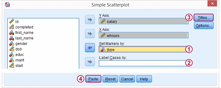
 uses a different colors for our dots, based on some variable. We'll enter jtype (job type).
 should label each dot with the value of a (unique identifier) variable but it doesn't work.You probably want to use this only for very small samples anyway. If you really need it: it does work in the chart builder but we'll skip it for now. We'll leave it empty.
 Optionally, let's add some nice title to our chart.
SPSS Scatterplot with Legend Syntax
GRAPH
/SCATTERPLOT(BIVAR)=whours WITH salary BY jtype
/MISSING=LISTWISE
/TITLE "Monthly Salary by Weekly Hours | n = 464".
Result
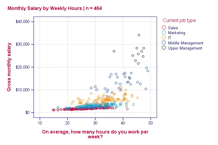
And there we have it. The cause for the heteroscedasticity and nonlinearity is that middle and upper managers have (very) high hourly wages and typically work more hours too than the other employees.
This plot also suggests that we should perhaps not lump together all job types: for sales employees (red dots), the relation between hours and salary looks very linear -presumably because their hourly wages are rather fixed. The precise opposite holds for upper management (black dots). We'll now confirm this by inspecting the correlation for each group separately.
Correlations for Job Types Separately
sort cases by jtype.
*Split file.
split file by jtype.
*Separate correlations for job types.
correlations salary with whours.
split file off.
Result
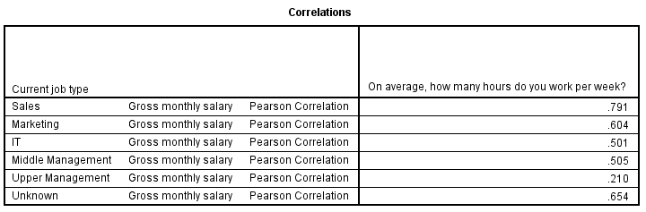
Indeed, the correlation between hours and salary is 0.79 for sales employees and 0.21 for upper management. We'll leave it as an exercise to the reader to create scatterplots for separate job type groups.
Final Notes
Our first finding on these data was simply a correlation of 0.65 between working hours and salary. However, a scatterplot suggested that it wasn't quite as simple as that. I hope we gave you an idea how to create scatterplots easily in SPSS and why they can be very useful indeed.
Thanks for reading!
THIS TUTORIAL HAS 4 COMMENTS:
By Jon Peck on March 9th, 2017
"Label cases by" does work, at least in recent versions, but the syntax has to include the BY clause.
GRAPH
/SCATTERPLOT(BIVAR)=whours WITH salary BY jtype BY id (NAME).
However, the id's really clutter this chart, so they are better omitted here.
The grouped scatter picture is fairly clear, although I have trouble distinguishing all the groups. Another chart that is helpful here is to panel by jtype, which gives a stack of scatters by jtype.
GRAPH
/SCATTERPLOT(BIVAR)=whours WITH salary
/PANEL ROWVAR=jtype ROWOP=CROSS.
You can see how the pattern varies by jtype very clearly. There is one obvious loafer - ID 282, in upper management. A boxplot of salary by jtype is also interesting here. The best plot type really depends on the story you want to tell.
By Ruben Geert van den Berg on March 10th, 2017
Hi Jon, thanks for your feedback!
I think I found the problem: the legacy dialog pastes (IDENTIFY) instead of (NAME). So the pasted syntax in SPSS Scatterplot Case Labels Not Working does not show case labels but the manually adjusted second version does.
The CSR only mentions these keywords under "XYZ" (3D scatterplot, which we're not dealing with here): "You can display the value label of an identification variable at the plotting position for each case by
adding BY var (NAME) or BY var (IDENTIFY) to the end of any valid scatterplot specification. When the
chart is created, NAME turns the labels on, while IDENTIFY turns the labels off."
I guess "value labels" should read "value labels or -if absent- values" here? If find the whole thing somewhat puzzling: if I don't want case labels, I'll just omit the BY clause altogether, right?
Well, it's still good to know that I don't need the chart builder syntax for having case labels.
Last, I think the higher salaries are not unreasonable for upper management of a bank. I wouldn't blindly go with 2 or 3 SD's above some mean but rather look up salaries of comparable banks. Sure we'd like to know if bonuses are included but this was meant as just a fun scatterplot exercise...
By Victor Ochoi on December 3rd, 2018
This is quite interesting...
By Penelope Pitts on August 30th, 2021
Thank you.