Summary
This tutorial shows how to create nice tables and charts for comparing multiple dichotomous or categorical variables. We recommend following along by downloading and opening freelancers.sav.
The question we'll answer is in which sectors our respondents have been working and to what extent this has been changing over the years 2010 through 2014. Variables sector_2010 through sector_2014 contain the necessary information.
SPSS Frequency Tables
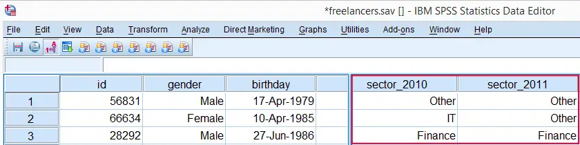
A simple and straightforward way for answering our question is running basic FREQUENCIES tables over the relevant variables. The syntax below shows how to do so. The next screenshot shows the first of the five tables created like so.
set tnumbers both.
*2. Inspect frequency tables.
frequencies sector_2010 to sector_2014.
SPSS FREQUENCIES Output
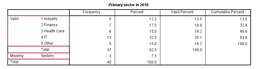
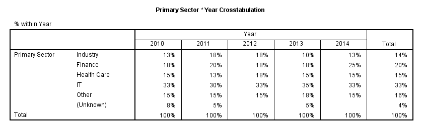
Right, with some effort we can see from these tables in which sectors our respondents have been working over the years. However, these separate tables don't provide for a nice overview. Therefore, we'll next create a single overview table for our five variables.
The table we'll create requires that all variables have identical value labels. Inspecting the five frequencies tables shows that all variables have values from 1 through 5 and these are identically labeled. A final preparation before creating our overview table is handling the system missing values that we see in some frequency tables.
Including System Missing Values
Since we're dealing with nominal variables, we may include system missing values as if they were valid. This keeps the N nice and consistent over analyses. Since the valid values run through 5, we'll RECODE them into 6.
recode sector_2010 to sector_2014 (sysmis = 6).
*2. Apply description to former system missing values.
add value labels sector_2010 to sector_2014 6 '(Unknown)'.
SPSS TABLES Command
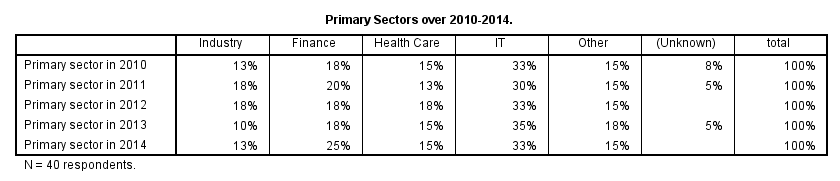
We'll now run a single table containing the percentages over categories for all 5 variables. One way to do so is by using TABLES as shown below. Using TABLES is rather challenging as it's not available from the menu and has been removed from the command syntax reference. We'll therefore propose an alternative way for creating this exact same table a bit later on.
set tnumbers labels.
*2. Frequency table for multiple variables.
tables
/ftotal = total
/table = sector_2010 + sector_2011 + sector_2012 + sector_2013 + sector_2014 by (labels) + total
/statistics = cpct((pct4)'')
/title = "Primary Sectors over 2010-2014."
/caption "N = 40 respondents.".
SPSS TABLES Output Table
SPSS VARSTOCASES Command
At this point, we'd like to visualize the previous table as a chart. A single graph containing separate bar charts for different years would be nice here. However, SPSS can't generate this graph given our current data structure.
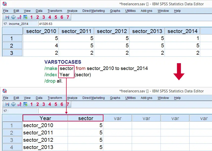
The solution is to restructure our data: we'll put our five variables (sectors for five years) on top of each other in a single variable. A second variable will indicate the year for each sector.
The syntax below shows how to do so with VARSTOCASES. Since we'll focus on sectors and years exclusively, we'll drop all other variables from the original data.
SPSS VARSTOCASES Syntax Example
VARSTOCASES
/make sector from sector_2010 to sector_2014
/index Year (sector)
/drop all.
Result
Additional Data Tweaks
Note that the variable label for sector is no longer correct after running VARSTOCASES; it's no longer limited to 2010. The first step in the syntax below will fixes this.
Also, note that year is a string variable representing years. We may chop off “sector_” from all values by using SUBSTR in order to clean it up a bit. This will make subsequent tables and charts look much nicer.
variable labels sector "Primary Sector".
*2. Chop off "sector_" from year.
compute year = char.substr(year,index(year,'_') + 1).
SPSS CROSSTABS Table
Since we restructured our data, the main question has now become whether there's an association between sector and year. Although year is metric, we'll treat both variables as categorical.
A contingency table generated with CROSSTABS now sheds some light onto this association. Note that the results are identical to the TABLES and FREQUENCIES results we ran previously.
crosstabs sector by year/cells column.
SPSS CROSSTABS Output
SPSS Split Bar Chart
Restructuring out data allows us to run a split bar chart; we'll make bar charts displaying frequencies for sector for our five years separately in a single chart. The screenshot below walks you through.
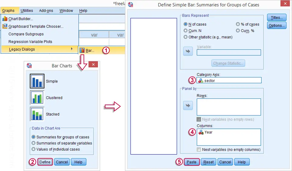
When running the syntax for this chart, the variable label of year will be shown above the chart. We don't want this but there's no easy way for circumventing it. The solution here is changing the variable label to a title for our chart and we do so by adding step 2 to our chart syntax below. Preceding it with TEMPORARY (step 1), circumvents the need to change back the variable label later on.
SPSS Split Bar Chart Syntax
temporary.
*2. Abuse variable label as title for chart.
variable labels Year "Primary Sectors by Year (N = 40)".
*3. Run chart and change back variable label.
GRAPH
/BAR(SIMPLE)=COUNT BY sector
/PANEL COLVAR=Year COLOP=CROSS.
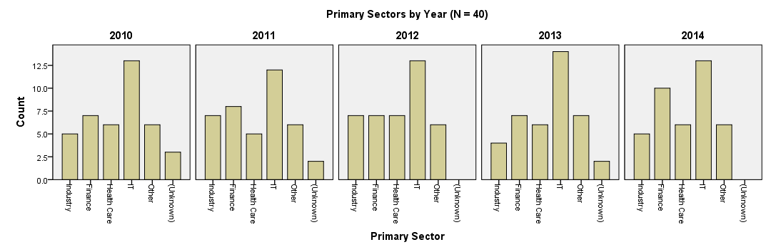
SPSS Split Bar Chart
Conclusion
Our chart visualizes the sectors our respondents have been working in over the years. However, the chart doesn't look very pretty and its layout is far from optimal. Creating an SPSS chart template for it can do some real magic here but this is beyond our scope now.
For rounding up with a bit of an anti climax, we don't observe any outspoken association between primary sector and year.
THIS TUTORIAL HAS 2 COMMENTS:
By Kate on August 25th, 2016
What if I need to change COUNT on X axis to cumulative % or % of cases? How do I write it in syntax then?
By Ruben Geert van den Berg on August 25th, 2016
Hi Kate! Great question. The answer is not so simple, though.
You can select "(cumulative) percent" in the legacy bar chart dialog and things'll run just fine but you'll get the wrong percentages. It's an interesting issue that really deserves a blog post but I'm currently too busy for writing it.
Option 1: use SPLIT FILE. Now you'll get the right (cumulative) percentages but you'll have separate charts for separate years.
Option 2: use the Chart Builder dialog. Now you can get the right percentages (but not cumulative) in a single chart.
I wrote some syntax for you at SPSS Cumulative Percentages in Bar Chart Issue.
Hope it helps!