This tutorial shows how to create nice tables and charts for comparing multiple dichotomous variables. If statistical assumptions are satisfied, these may be followed up by a McNemar test (2 variables) or a Cochran Q test (3+ variables). We'll use the freelancers.sav data throughout.

SPSS DESCRIPTIVES Table
The simplest way to compare multiple dichotomous variables is simply running DESCRIPTIVES: as long as 0 and 1 are the only valid values, means will correspond to proportions.If this doesn't hold, RECODE will usually be the easiest fix here.
The syntax below generates a basic descriptives table for source_2010 through source_2014. Note in the result (screenshot below) that the maximum and minimum values are indeed 0 and 1.
descriptives source_2010 to source_2014.

Conclusion: the lowest percentage of freelancers (43%) was observed in 2010, the highest percentages (50%) in 2012 and 2014.
SPSS TABLES Command
Although the previous table is technically correct, it doesn't quite get the message across because value labels are not shown. We may obtain a nicer table by using SPSS TABLES command.TABLES is the predecessor of CTABLES but doesn't require you purchase an extra license. It supposedly doesn't exist in SPSS anymore; it's absent from the menu as well as the command syntax reference. However, it works up to (at least) SPSS version 22. Using it is rather challenging since instructions are not easily obtained. The syntax below shows how to do so. Note that the percentages are (obviously) consistent with the proportions in the previous table.
tables
/format = zero
/ftotal = total
/table = source_2010 + source_2011 + source_2012 + source_2013 + source_2014 by (labels) + total
/statistics = cpct((pct4.1)'')
/title = 'Primary Sources of Income over 2010 - 2014.'.
 Output from SPSS TABLES Syntax
SPSS Bar Chart for Multiple Variables
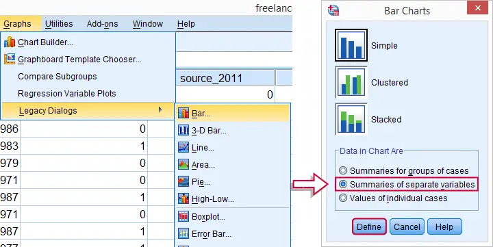
A nice way for visualizing the previous tables is a bar chart for multiple variables. The screenshots below walk you through.

(Note that for older SPSS versions, the graphs under are located directly under .)

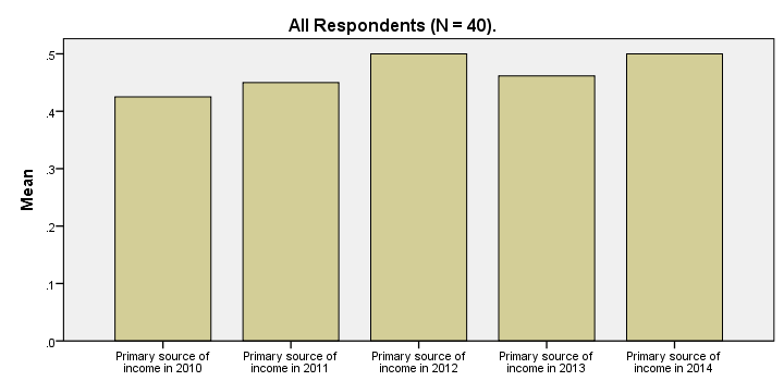
These steps generate the syntax below. The result is shown in the next screenshot.
SPSS Bar Chart for Multiple Variables Syntax
GRAPH
/BAR(SIMPLE)=MEAN(source_2010) MEAN(source_2011) MEAN(source_2012) MEAN(source_2013) MEAN(source_2014)
/MISSING=VARIABLEWISE
/title "All Respondents (N = 40).".

SPSS Bar Chart - Improvements
Our first bar chart -although technically correct- doesn't look nice at all. It doesn't quite convey its message either; all bars look roughly the same and the current variable labels are not very suitable for this chart.
Part of the problem can be solved by modifying our data: the result will be better with different variable labels and percentages instead of proportions. We could change things back after running the chart but a better option is simply closing and reopening the data without saving it. However, The most elegant solution is using TEMPORARY before modifying our data. The syntax below demonstrates how to do so.
temporary.
*2. Adapt variable labels.
variable labels source_2010 "Percentage freelancers 2010".
variable labels source_2011 "Percentage freelancers 2011".
variable labels source_2012 "Percentage freelancers 2012".
variable labels source_2013 "Percentage freelancers 2013".
variable labels source_2014 "Percentage freelancers 2014".
*3. Change 0 and 1 to 0% and 100% for percentages instead of proportions as means.
recode source_2010 to source_2014 (1 = 100).
formats source_2010 to source_2014 (pct4).
*4. Rerun exact same bar chart syntax as previously. This also reverses steps 2 and 3 and indicates end of temporary modifications.
GRAPH
/BAR(SIMPLE)=MEAN(source_2014) MEAN(source_2013) MEAN(source_2012) MEAN(source_2011) MEAN(source_2010)
/MISSING=VARIABLEWISE
/title "All Respondents (N = 40).".
SPSS Bar Chart - Styling
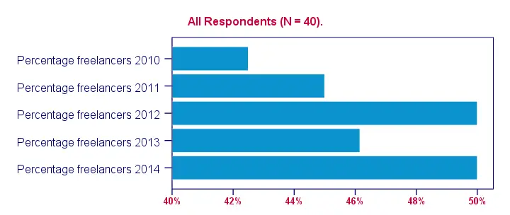
Last but not least, our chart will be much better if we build and apply an SPSS chart template (.sgt file). Like so, we'll transpose (“put on its side”) the chart because it creates space for our variable labels.
Also, we'll have the x-axis run from 40% through 50% in order to “magnify” the differences between years. The result after these (and additional) tweaks is shown in the final screenshot. Note that the didn't modify the syntax for the chart itself in any way.

 SPSS TUTORIALS
THIS TUTORIAL HAS 3 COMMENTS:
By Jackson Kadula on February 19th, 2016
how to use "missing" variable
By Ruben Geert van den Berg on February 20th, 2016
Hi Jackson! You probably mean missing values, right? Good question. You'll usually define them as missing values by running
MISSING VALUES ...in which case they'll be excluded from analysis altogether. Alternatively, you could RECODE them into valid values and apply a clear value label to them indicating they used to be missing. In this case, however, your variables will no longer be dichotomous and should be treated as (nominal) categorical variables.
By saifullah on January 21st, 2022
Information about spss