A frequency distribution is an overview of all distinct values in some variable and the number of times they occur.
That is, a frequency distribution tells how frequencies are distributed over values.
Frequency distributions are mostly used for summarizing categorical variables. That's because metric variables tend to have many distinct values. These result in huge tables and charts that don't give insight into your data. In this case, histograms are the way to go as they visualize frequencies for intervals of values rather than each distinct value.
Anyway. Let's look at some examples of frequency distributions.
Frequency Distribution - Example
We had 183 students fill out a questionnaire. One of the questions was which study major they're following. The screenshot below shows part of these data.
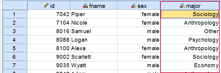
Frequency Distribution - Table
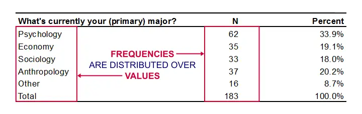
So what about these study majors? Just gazing at our 183 values isn't going to help us. A more viable approach is to simply tabulate each distinct study major in our data and its frequency -the number of times it occurs.
The resulting table (below) shows how frequencies are distributed over values -study majors in this example- and hence is a frequency distribution.
 Simple Frequency Distribution Table
The most popular study major is psychology (n = 62). “Other” is the least popular major (n = 16). The remaining majors are roughly equally popular (n between 33 and 37).
Note that the frequencies add up to our sample size of 183 students. This is always the case unless a variable contains missing values: respondents can sometimes skip a question or answer “no answer” or something similar.
Relative Frequencies
Optionally, a frequency distribution may contain relative frequencies: frequencies relative to (divided by) the total number of values. Relative frequencies are often shown as percentages or proportions.
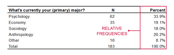
Relative frequencies provide easy insight into frequency distributions. Besides, they facilitate comparisons. For example, “67.5% of males and 63.2% of females graduated” is much easier to interpret than “79 out of 117 males and 120 out of 190 females graduated”. Right? Right.
Relative Frequencies and Probability
A special type of relative frequency is a probability.
A probability is a relative frequency over infinite trials.
So stating that “a coin flip has a 50% probability of landing heads up” technically means that if we'd flip the coin an infinite number of times, 50% -a relative frequency- of those flips will land heads up.
Now, we obviously can't flip a coin an infinite number of times so we can't prove this claim with certainty. However, if we flip our coin many (say 100) times, then the relative frequency of heads landing up should probably be close to 0.5 (or 50%).
A very different outcome may have a low probability value or p-value. We often state that an effect is statistically significant if p < 0.05. This simply means that our sample outcome -some percentage, correlation, mean difference or whatever- should occur in less than 5% of all samples if we could draw an infinite number of random samples. Such a relative frequency -or probability- being very low implies that our data are unlikely given some our null hypothesis -which is therefore rejected.
Ok. Nevermind. Let's move on with frequency distributions.
Frequency Distributions - Cumulative Frequencies
A cumulative frequency is the number of times that
a value and all values that precede it occur.
That is, the frequencies accumulate over values -hence “cumulative”. The same reasoning goes for cumulative relative frequencies as shown in the figure below.
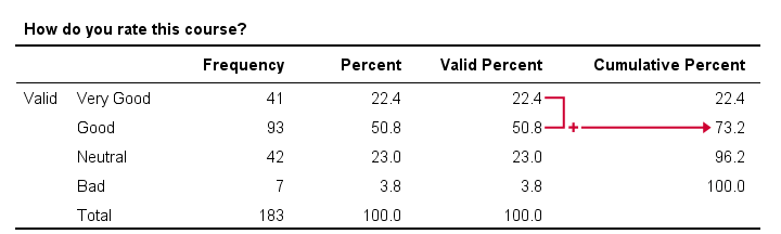
In this example, we immediately see that 73.2% of all respondents rate our course at least “Good”. It is the relative frequency for “Good” and all values that precede it -in this case only “Very Good”.
Regarding cumulative frequencies, don't overlook that
- cumulative frequencies depend on the order in which values are listed in a frequency table. If we'd reverse our table, the cumulative percentage for “Good” would be (3.8% + 23% + 50.8% =) 77.6%. This is the percentage for “Good” or a worse rating.
- cumulative frequencies are not useful for nominal variables. This is because their values don't have an inherent order. For example, it doesn't make sense to say that “25.3% of our respondents are at least French.”
Frequency Distributions - Bar Charts
One common visualization of a frequency distribution is a bar chart as shown below.
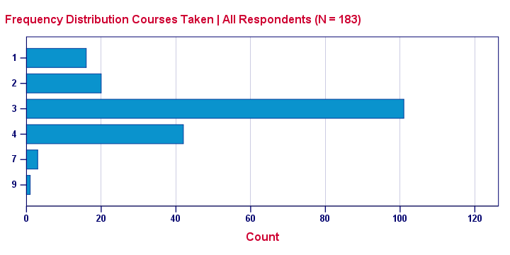
This is a simple chart but do note a couple of important points:
- Each distinct value is represented by a bar. So a variable with many distinct values (birthday or monthly income) will have a vast number of bars and is therefore not suitable for a bar chart. For such variables, a histogram is a better idea.
- The category axis is not linear: the distance (in centimeters) between 1 and 2 is the same as between 4 and 7. So we can't say that one centimeter represents a difference of 1 or 3 courses.
- Zero frequencies are omitted from the chart. For example, none of these students took 5 courses. This is why 5 does not occur at all on the category axis.
None of these features hold for a histogram, which may look similar to a bar chart but really isn't the same.
Frequency Distributions - Pie Charts
An alternative visualization for a frequency distribution is a pie chart as shown below.
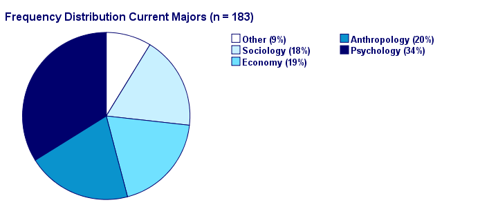
It could be argued that this pie chart is a better visualization than the aforementioned bar chart: our 5 percentages must add up to 100% and are thus not independent. The pie chart kinda visualizes this dependency: if one slice of the pie grows, at least one other must shrink. This doesn't hold for the bars in a bar chart -which wrongly suggests that the (relative) frequencies are independent.
Thanks for reading!
THIS TUTORIAL HAS 19 COMMENTS:
By Paul on February 9th, 2016
Nice
By Ruben Geert van den Berg on February 9th, 2016
Thanks! Please note that we very recently published an improved tutorial on histograms. Hope you like it!
By Phillip Goronga on August 20th, 2018
very good
By Jon Peck on August 20th, 2018
Most experts would say that the percentages are harder to read in a pie chart than a bar chart.
By Ruben Geert van den Berg on August 20th, 2018
Yeah, possibly. I actually think a chart with frequencies is better than percentages -you can calculate the latter from the former but not reversely. And the chart's proportions -the real visualization- are identical.
I considered adding a stacked bar chart as well. Perhaps that's the best of both worlds. Creating this chart for a single variable in SPSS requires crossing it with a to-be-created constant but it does show that the proportions are dependent.
It's a pity that creating charts with frequencies/percentages in them is so notoriously difficult in SPSS.