New Charts in SPSS 25: How Good Are They Really?
SPSS hasn't exactly been known for generating nice charts, although you really can do so by using your own chart templates. SPSS 25, however, allows you to “create great looking charts by default!”
This made me wonder: are the new charts really that great? The remainder of this article walks through the old and new looks for the big 5 charts in data analysis. All charts are based on bank_clean.sav and I'll include all syntax as well.
Overview “Big 5” Charts
| Chart | Purpose |
|---|---|
| Histogram | Summarize Single Metric Variable |
| Bar Chart Percentages | Summarize Single Categorical Variable |
| Scatterplot | Show Association Between 2 Metric Variables |
| Bar Chart Means by Category | Show Association Between Metric and Categorical Variable |
| Stacked Bar Chart Percentages | Show Association Between 2 Categorical Variables |
1. Histogram
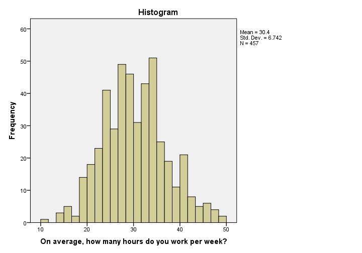 Histogram in SPSS 24
I'm not a big fan of the old histogram: the colors depress me and there is insufficient room between the title (“Histogram”) and the top of the figure.
The font sizes of the tick labels and statistics summary are too small. Unfortunately, you can't omit the statistics summary by syntax but you can style it or hide it altogether with a chart template.
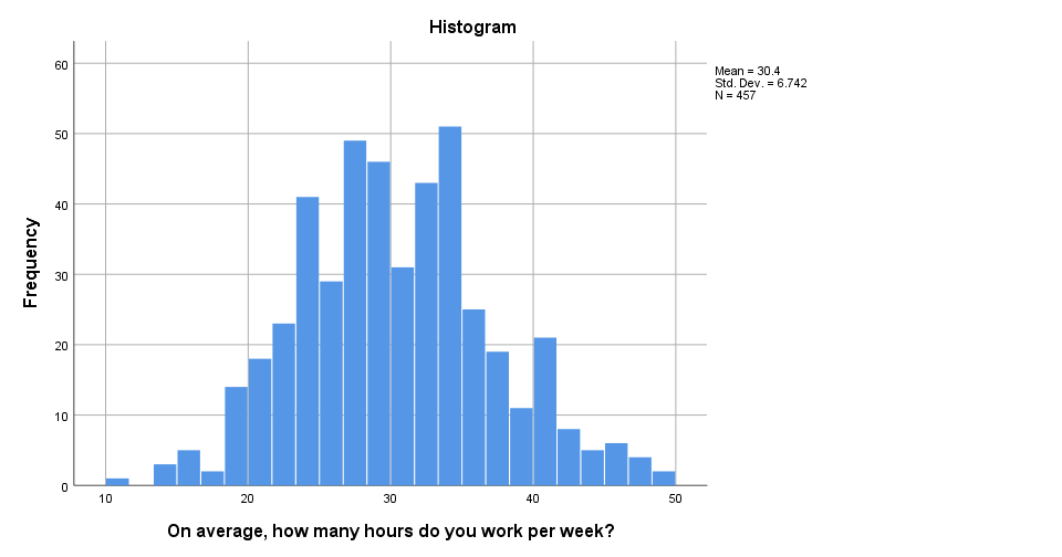 Histogram in SPSS 25
The new histogram has handy grid lines by default and much nicer colors. I still think some font sizes are too small but altogether, it's a huge step forward.
Histogram Syntax Example
frequencies whours
/format notable
/histogram.
2. Bar Chart Percentages
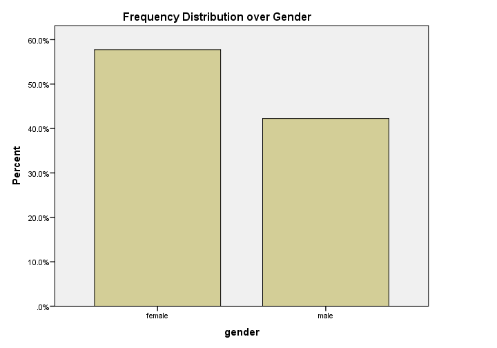 Bar Chart Percentages in SPSS 24
What really puzzles me with SPSS bar charts is that they are not transposed by default. With few categories, the bars become awkwardly wide. With many categories, there's insufficient room for the tick labels.
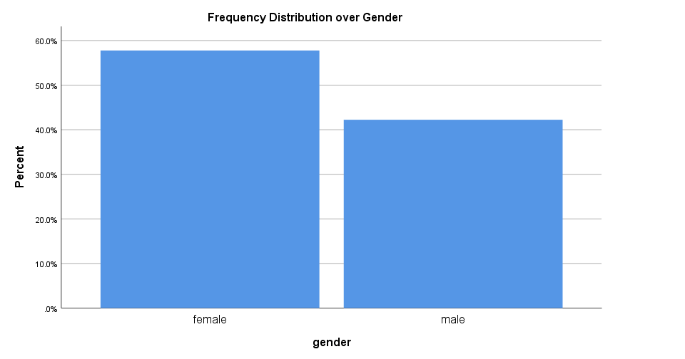 Bar Chart Percentages in SPSS 25
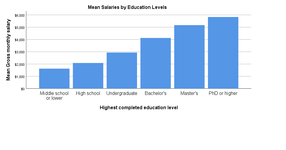
The new bar chart has much nicer styling. However, the bars are now even wider. I feel the transposed bar chart below works much better. Technically, it's the exact same chart as the previous examples, the only difference is that I applied a chart template. With this chart, I'll just increase or decrease its height, depending on the number of categories included.
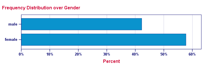 Transposed Bar Chart with Chart Template
Bar Chart Percentages Syntax Example
GRAPH
/BAR(SIMPLE)=PCT BY gender
/TITLE "Frequency Distribution over Gender".
3. Scatterplot
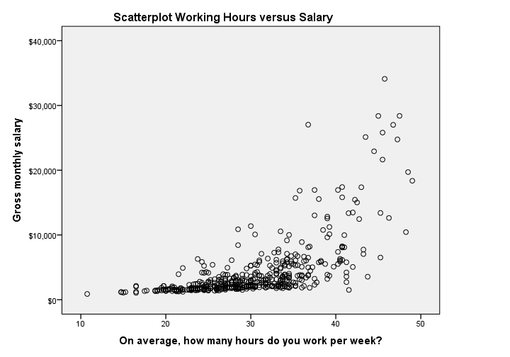 Scatterplot in SPSS 24
The old scatterplot has a rather depressing grey background and no gridlines. However, I do think circles tend to clutter less than dots and thus were a good choice.
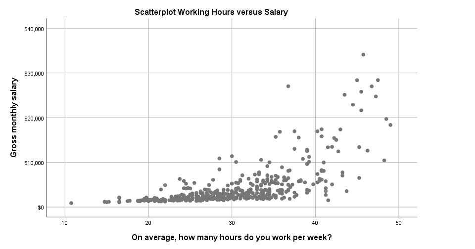 Scatterplot in SPSS 25
The new scatterplot has gridlines by default and a much nicer white background. However, I also feel the dots tend to clutter more than the old circles and it lacks color. If I need 50 shades of grey, I'll go and find myself a book shop.
Scatterplot Syntax Example
GRAPH
/SCATTERPLOT(BIVAR)=whours WITH salary
/MISSING=LISTWISE
/TITLE='Scatterplot Working Hours versus Salary'.
4. Bar Chart Means by Category
 Bar Chart Means by Category in SPSS 24
Apart from its dull styling: not transposing bar charts may leave little room for tick labels -in this case education levels. SPSS seems to “solve” the problem by using a very tiny font size that doesn't look nice and is hard to read.
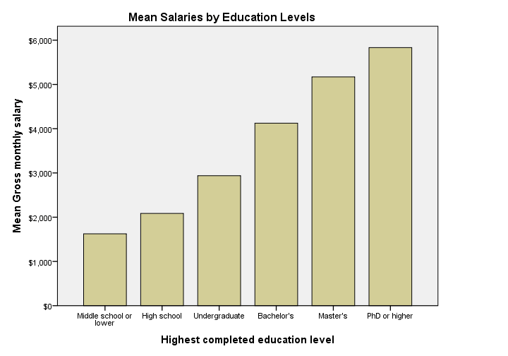
 Bar Chart Means by Category in SPSS 25
The new bar chart has a much nicer styling: it uses a reasonable font size for the x-axis categories. However, a much smaller font size is used for the y-axis. I think this looks rather awkward.
Perhaps even more awkward is the large white space beneath the chart. It doesn't attract a lot of attention in the output viewer window. However, after copy-pasting the chart into a report, it becomes clear that this can't be intentional -or at least I hope it isn't.
Bar Chart Means by Category Syntax Example
GRAPH
/BAR(SIMPLE)=MEAN(salary) BY educ
/TITLE='Mean Salaries by Education Levels'.
5. Stacked Bar Chart Percentages
 Stacked Bar Chart Percentages in SPSS 24
Regarding the old stacked bar chart, I can't help but wonder: You gotta be kidding me, right? Wrong. No kidding. This chart survived through SPSS 24. I'm not even going to discuss the looks. What I do want to point out, is that the y-axis label says “Count” instead of “Percent”. For adding injury to insult, the percent suffix is also missing from the tick labels.
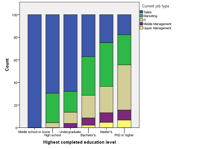
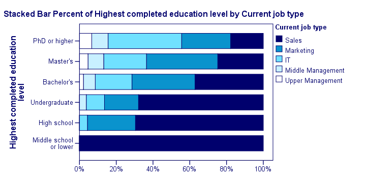
 Stacked Bar Chart Percentages in SPSS 25
The new version looks way better -especially the colors! A minor change to the chart builder dialog is that it adds a title by default to the syntax. Unfortunately, the title is wrong: the chart shows “job type by education”, not “education by job type”.
Note that the y-axis is appropriately labeled “Percent” in the new version but the percent suffix is still missing from the tick labels.
And once again, not transposing the chart leaves insufficient space for the tick labels which now had to be rotated and push down the x-axis label. Surely it's a matter of personal preference but I'd rather go for the layout shown below.
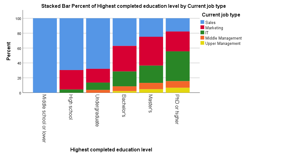
 Transposed Stacked Bar Chart Percentages with Chart Template
Stacked Bar Chart Percentages Syntax Example
GGRAPH
/GRAPHDATASET NAME="graphdataset" VARIABLES=educ COUNT()[name="COUNT"] jtype MISSING=LISTWISE
REPORTMISSING=NO
/GRAPHSPEC SOURCE=INLINE.
BEGIN GPL
SOURCE: s=userSource(id("graphdataset"))
DATA: educ=col(source(s), name("educ"), unit.category())
DATA: COUNT=col(source(s), name("COUNT"))
DATA: jtype=col(source(s), name("jtype"), unit.category())
GUIDE: axis(dim(1), label("Highest completed education level"))
GUIDE: axis(dim(2), label("Count"))
GUIDE: legend(aesthetic(aesthetic.color.interior), label("Current job type"))
SCALE: cat(dim(1), include("1", "2", "3", "4", "5", "6"))
SCALE: linear(dim(2), include(0))
SCALE: cat(aesthetic(aesthetic.color.interior), include("1", "2", "3", "4", "5"))
ELEMENT: interval.stack(position(summary.percent(educ*COUNT, base.coordinate(dim(1)))),
color.interior(jtype), shape.interior(shape.square))
END GPL.
*Stacked Bar Chart Percentages - Pasted from Chart Builder SPSS 25.
GGRAPH
/GRAPHDATASET NAME="graphdataset" VARIABLES=educ COUNT()[name="COUNT"] jtype MISSING=LISTWISE
REPORTMISSING=NO
/GRAPHSPEC SOURCE=INLINE.
BEGIN GPL
SOURCE: s=userSource(id("graphdataset"))
DATA: educ=col(source(s), name("educ"), unit.category())
DATA: COUNT=col(source(s), name("COUNT"))
DATA: jtype=col(source(s), name("jtype"), unit.category())
GUIDE: axis(dim(1), label("Highest completed education level"))
GUIDE: axis(dim(2), label("Percent"))
GUIDE: legend(aesthetic(aesthetic.color.interior), label("Current job type"))
GUIDE: text.title(label("Stacked Bar Percent of Highest completed education level by Current ",
"job type"))
SCALE: cat(dim(1), include("1", "2", "3", "4", "5", "6"))
SCALE: linear(dim(2), include(0))
SCALE: cat(aesthetic(aesthetic.color.interior), include("1", "2", "3", "4", "5"))
ELEMENT: interval.stack(position(summary.percent(educ*COUNT, base.coordinate(dim(1)))),
color.interior(jtype), shape.interior(shape.square))
END GPL.
Subtitles and SPLIT FILE
Creating charts with SPLIT FILE on adds a subtitle to them. Since titles are centered by default, the logical place for the subtitle is right below the main title as shown below (“gender: female”).
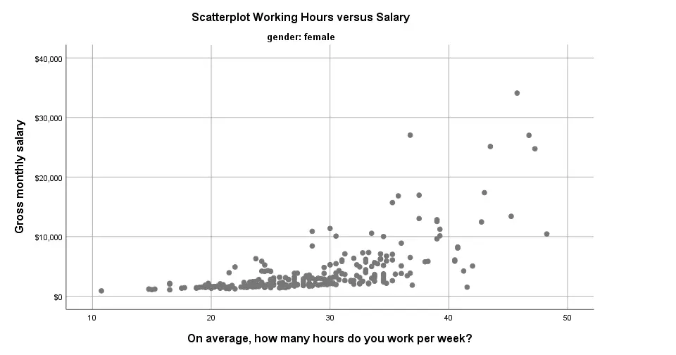 Scatterplot with Subtitle in SPSS 25
Alternatively, one could left align the main title and right align the subtitle as shown below. It looks nicer and makes better use of the available space.
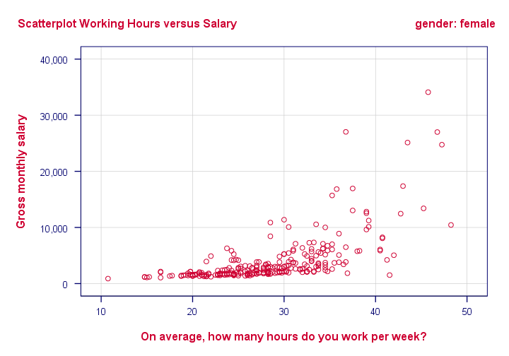 Scatterplot with Subtitle with Chart Template
Conclusion
Most charts have seriously improved in SPSS 25. I like the gridlines and the new color cycles -except for the new scatterplots which are entirely grey. Nevertheless, I can't help but feel it was a bit of a hasty job with sometimes insufficient eye for detail.
Next, there's the question: what if I liked the old looks better? Or what if my client does not want these changes? I had a quick look around but I couldn't find any way for returning to the old looks. If they're really really gone, then this violates SPSS’ backwards compatibility.
The same goes for the new charts being wider (854 by 504 pixels) than the old charts (629 by 504 pixels). I sure hope the larger width still fits into the layout of any reports that need to be delivered.
So what do you think about the old and new charts? Please let me know by dropping a comment below.
Thanks!
SPSS Chart Templates Tutorial
SPSS chart templates are tiny text files
that contain styling for charts.
- What are SPSS Chart Templates?
- Creating a Chart Template
- Applying Chart Templates
- Where do I Get Some Decent Chart Templates?
- Developing Your Own Chart Templates
Practice Data File
This tutorial walks you through creating and using chart templates. We'll use bank.sav -partly shown below- throughout. We encourage you to follow along with the examples.

What are SPSS Chart Templates?
In SPSS, chart templates are tiny XML files containing styling for charts. You can use chart templates for things like
- setting colors, fonts and borders for one or many charts;
- transposing one or many charts;
- hiding elements -titles or axis labels- from one or many charts;
- setting sizes for one or many charts.
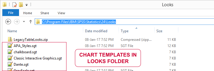
The file extension for chart templates is .sgt -short for SPSS graph template. You'll find some examples in the Looks folder as shown below.
However, these templates are pretty worthless. If you really want to benefit from chart templates, you'd better create your own. This is much easier than you might think. Let's go.
Creating a Chart Template
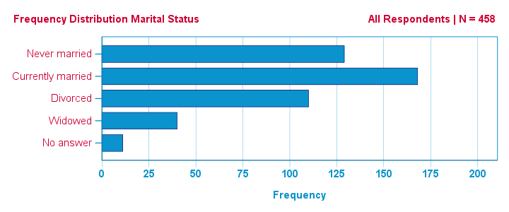
Right. So I'd like to visualize the frequency distribution for marital status. One option is creating a bar chart from
![]()
![]() as shown in our SPSS Bar Charts Tutorial.
as shown in our SPSS Bar Charts Tutorial.
Adding a title and a subtitle resulted in the syntax below.
GRAPH
/BAR(SIMPLE)=COUNT BY marit
/title 'Frequency Distribution Marital Status'
/subtitle 'All Respondents | N = 458'.
Result
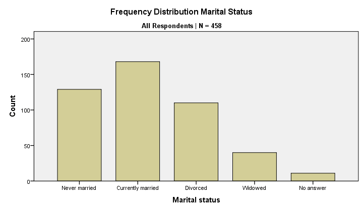
So there's my bar chart. And it looks terrible. Double clicking it, however, opens a Chart Editor window in which I'll style my chart. I'll transpose it as well.
After spending a couple of minutes on styling my chart, the best I could come up with is shown below. You'll probably come up with something better if you go through some trial and error.
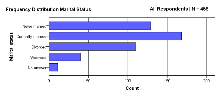
The chart looks much nicer because I changed its styling rules. Some of those rules are
- transpose the chart;
- use purple for the bars;
- use white as a background color;
- show the title left and the subtitle right at similar vertical positions.
The trick is that I can now
save all styling rules without saving the actual chart.
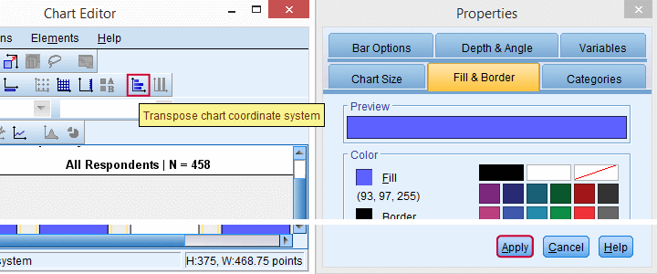
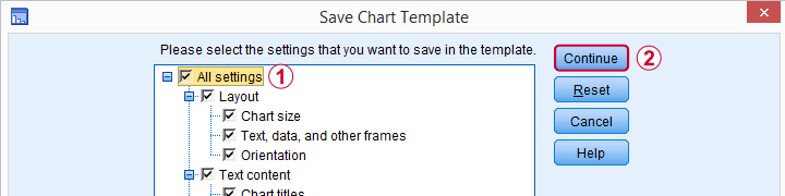
We'll start off by making sure we're in the Chart Editor window -which is not the same as the Output Viewer. Here we'll navigate to
![]() as shown below.
as shown below.
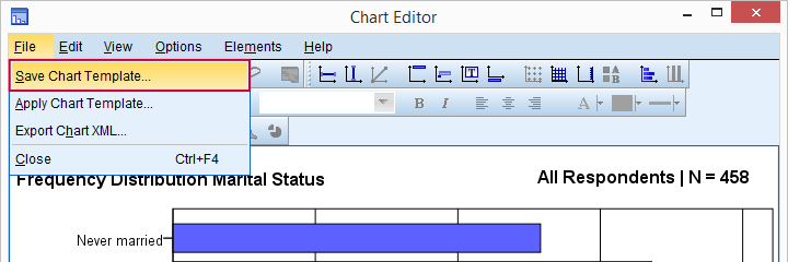
Next, we'll select .
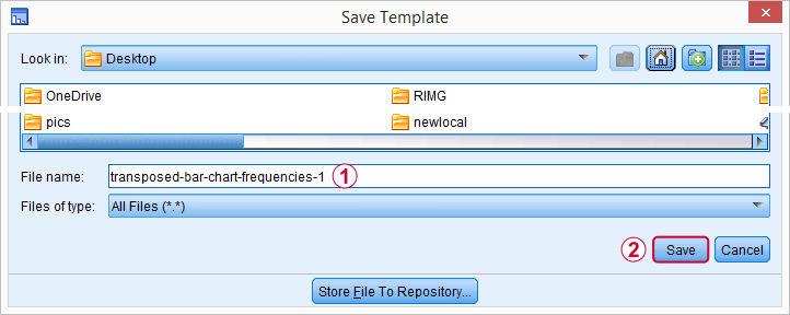
Finally, choose a folder and a file name. Clicking the button now creates transposed-bar-chart-frequencies-1.sgt. Feel free to download and try it.
Applying Chart Templates
We can now activate this chart template by running something like
set ctemplate
'transposed-bar-chart-frequencies-1.sgt'.
You may need to use a full path here if the template file is not in your default directory as set with CD. From now on, all charts we'll run will have the styling we created for our bar chart. If you don't want that anymore, you can deactivate this template by running
set ctemplate none.
From now on, all charts will have SPSS’ default styling again.
There's many other ways to apply chart templates to one or many charts.
- You can apply a chart template to an existing chart manually by using
 in the Chart Editor.
 - You can apply a chart template to a selection of existing charts with Python scripting.
- OUTPUT MODIFY can apply a chart template to a selection of existing charts. However, this doesn't work properly because it sets the wrong sizes.
- You can activate a template under
. We don't recommend this as it's basically just the wrong way to run SET CTEMPLATE as proposed previously.
- A surprising number of commands have a /TEMPLATE subcommand. This applies a template to only the charts created by this command. This doesn't work properly because the template doesn't completely overrule the previous template in some cases.
In short, we recommend you always use SET CTEMPLATE... for applying chart templates to future charts. This seems to be the only method that always works properly.
Where Do I Get Chart Templates?
There's several options for obtaining SPSS chart templates:
- Create and develop your own set of chart templates. Basic templates won't pose too much of a challenge. For really nice templates, though, you'll need to dive into the actual XML as we'll show in a minute.
- To some extent, you can extract a chart template from any existing chart in an SPSS output (.spv) file.
- Ask a specialist to develop some templates for you. We also offer this service but we do charge for it.
- Use the chart templates that are shipped with SPSS. You'll find them in the Looks folder but -honestly- you may find them pretty worthless.
Developing SPSS Chart Templates
In contrast to SPSS tablelooks, you'll probably want to develop a separate chart template for each type of chart you run. Thus far, we created a chart template from the Chart Editor menu. Although this is a good first step, this has its limitations. Those who'd like to develop much better templates should try and adjust their XML in a text editor such as Notepad++.
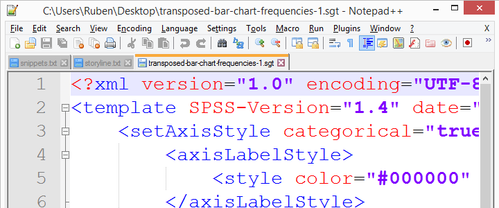 Chart template (.sgt) files contain XML which can you can edit.
Manually editing the XML is an optional extra step in developing chart templates. If you're not afraid of code, it'll help you develop much better templates than purely relying on the menu. You can also change some styles faster. For example, use the Ctrl + H shortkey to search and replace all font sizes or colors.
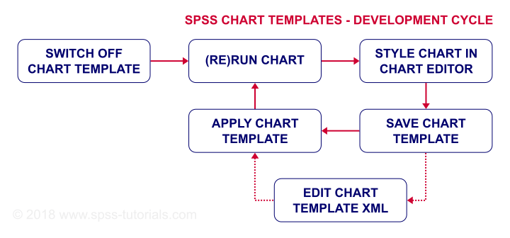
Summarizing some main points in this tutorial, the flowchart below proposes a development cycle for SPSS chart templates.
Final Notes
Developing chart templates may take some time and trial and error. However, if you create SPSS charts on a regular basis, it'll be well worth the effort. In any case, I hope this introduction will get you started.
Thanks for reading!