A histogram is a chart that shows frequencies for
intervals of values of a metric variable.
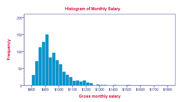
Such intervals as known as “bins” and they all have the same widths. The example above uses $25 as its bin width. So it shows how many people make between $800 and $825, $825 and $850 and so on.
Note that the mode of this frequency distribution is between $900 and $925, which occurs some 150 times.
Histogram - Example
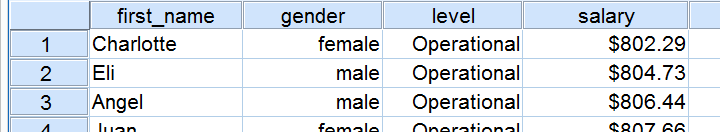
A company wants to know how monthly salaries are distributed over 1,110 employees having operational, middle or higher management level jobs. The screenshot below shows what their raw data look like.
Since these salaries are partly based on commissions, basically every employee has a slightly different salary. Now how can we gain some insight into the salary distribution?
Histogram Versus Bar Chart
We first try and run a bar chart of monthly salaries. The result is shown below.
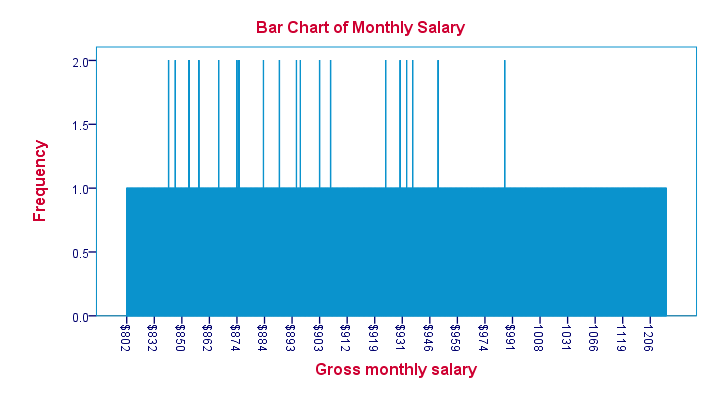
Our bar chart is pretty worthless. The only thing we learn from it is that most salaries occur just once and some twice. The main problem here is that a bar chart shows the frequency with which each distinct value occurs in the data.
Importantly, note that the first interval is ($832 - $802 =) $30 wide. The last interval represents ($1206 - $1119 =) $87. But both are equally wide in millimeters on your screen. This tells us that
the x-axis doesn't have a linear scale
which renders this chart unsuitable for a metric variable such as monthly salary.
Histogram - Basic Example
Since our bar chart wasn't any good, we now try and run a histogram on our data. The result is shown below.
This chart looks much more useful but how was it generated? Well, we assigned each employee’s salary to a $25 interval ($800 - $825, $825 - $850 and so on). Next, we looked up the number of employees that fall within each such interval. We visualize these frequencies by bars in a chart.
Importantly, the x-axis of our chart has a linear scale: each $25 interval corresponds to the same width in millimeters even if it contains zero employees. The chart we end up with is known as a histogram and -as we'll see in a minute- it's a very useful one.
Histogram - Bin Width
The bin width is the width of the intervals
whose frequencies we visualize in a histogram.
Our first example used a bin width of $25; the first bar represents the number of salaries between $800 and $825 and so on. This bin width of $25 is a rather arbitrary choice. The figure below shows histograms over the exact same data, using different bin widths.
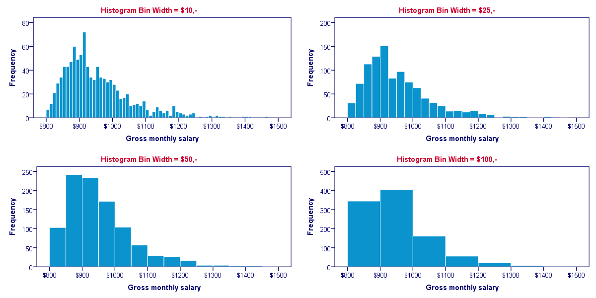
Although different bin widths seem reasonable, we feel $10 is rather narrow and $100 is rather wide for the data at hand. Either $25 or $50 seems more suitable.
Histograms - Why Are They So Useful?
Why are histograms so useful? Well, first of all, charts are much more visual than tables; after looking at a chart for 10 seconds, you can tell much more about your data than after inspecting the corresponding table for 10 seconds. Generally, charts convey information about our data faster than tables -albeit less accurately.
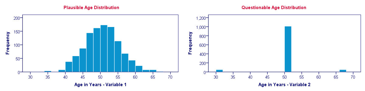
On top of that, histograms also give us a much more complete information about our data. Keep in mind that you can reasonably estimate a variable’s mean, standard deviation, skewness and kurtosis from a histogram. However, you can't estimate a variable’s histogram from the aforementioned statistics. We'll illustrate this with an example.
Histogram Versus Descriptive Statistics
Let's say we find two age variables in our data and we're not sure which one we should use. We compare some basic descriptive statistics for both variables and they look almost identical.
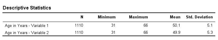
So can we conclude that both age variables have roughly similar distributions? If you think so, take a look at their histograms shown below.
Split Histogram - Frequencies
Each of the 1,110 employees in our data has a job level: operational, middle management or higher management. If we want to compare the salary distributions between these three groups, we may inspect a split histogram: we create a separate histogram for each job level and these three histograms have identical axes. The result is shown below.
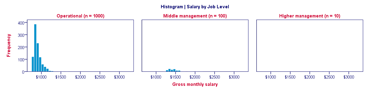
Our split histogram totally sucks. The problem is that the group sizes are very unequal and these relate linearly to the surface areas of our histograms. The result is that the surface area for higher management (n = 10) is only 1% of the surface area for “operational” (n = 1,000). The histogram for higher management is so small that it's no longer visible.
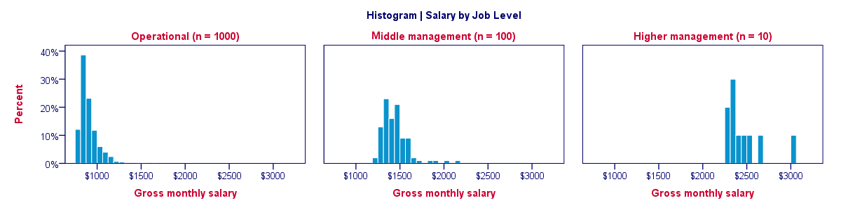
Split Histogram - Percentages
We just saw how a split histogram with frequencies is useless for the data at hand. Does this mean that we can't compare salary distributions over job levels? Nope. If we choose percentages within job level groups, then each histogram will have the same surface area of 100%. The result is shown below.
Histogram - Final Notes
This tutorial aimed at explaining what histograms are and how they differ from bar charts. In our opinion, histograms are among the most useful charts for metric variables. With the right software (such as SPSS), you can create and inspect histograms very fast and doing so is an excellent way for getting to know your data.
THIS TUTORIAL HAS 20 COMMENTS:
By sadhana ghosh on August 29th, 2016
I know how to make bi with Excel and make the frequency distribution.
How to do this with SPSS.
It makes frequency for metric data with class width 1 only.
By Ruben Geert van den Berg on August 29th, 2016
Hi Sadhana! This tutorial just explains what a histogram is but a second one -how to run it in SPSS- is on my list.
The fastest way is with a FREQUENCIES command (don't bother about the menu, it'll take more effort than copy-pasting these lines below).
frequencies v1 v4 v6 to v10/format notable
/histogram.
Regarding the bin widths: double-click the actual histogram bar(s). A menu will pop up that allows you to set the bin width, affecting the number of bars that'll be used. If this is a regular procedure for you, you can save the SPSS chart template. By reapplying it to other histograms, you can run a million of them with the bin widths set as desired.
Hope that helps!
By Diarmuid Hayes on February 19th, 2017
Hi Ruben,
Regarding the bin widths and chart templates - I applied a template to a newly generated histogram, and now I appear to be unable to change the bin widths.
I change the figure from 20 to 10, click apply and a pop-up appears saying that I cannot leave a text box empty - it then directs me down to a z-axis option, 'Custom value for anchor'. It is a paneled graph but I had never changed any z-axis default values (that I know of).
I have a feelings it is a problem with whatever template I applied. However I tried changing it to several other custom templates and the problem persists. I generally choose to tick all the boxes when saving a new template - what could I have done here that has caused this issue so I can avoid it in future? And is there any way around it for now, apart from recreating the chart?
By Ruben Geert van den Berg on February 20th, 2017
Hi Diarmuid!
I couldn't replicate your problem -I can set the bin widths fine and they're saved with my chart templates. That being said, there's some chart styles that don't get saved even when you tick "all settings". One example are subtitles for paneled charts. They seem completely unaffected by -even manually written- chart templates and that's a real problem.
Anyway, try opening your .sgt file in Notepad++ -it has a special option under Plugins => XML tools that makes the XML more readable. Then try and add a line such as
<setHistogramBinning binWidth="5000"/>
right within the <template> container to your template for forcing a set bin width.
Hope that helps!
By Brenda on December 15th, 2018
Was very helpful as I'm taking a biostats class from GCU.