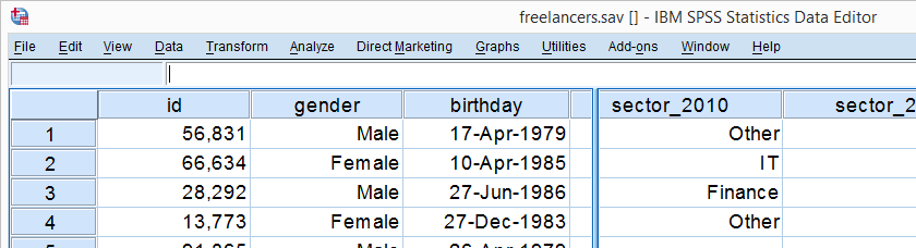
One of the best known charts is a simple bar chart containing frequencies or percentages. The easiest way to run it in SPSS is the FREQUENCIES command. This tutorial walks you through some options. We'll use freelancers.sav throughout, part of which is shown below.
Option 1: FREQUENCIES
In most cases, a simple FREQUENCIES command is our best option because it takes multiple variables in one go. Its syntax -shown below- is so simple that just typing it is probably faster than messing around with the menu.
frequencies sector_2010 to sector_2014
/format notable
/barchart.
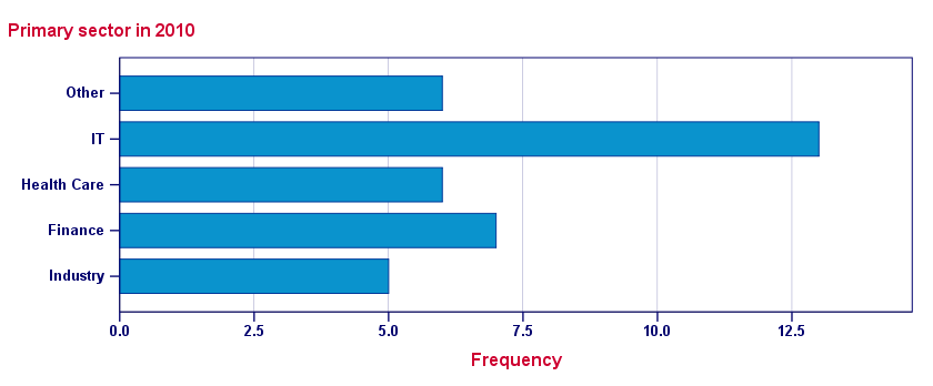
Result - Basic
Unsurprisingly, we created the desired bar charts but -like most SPSS charts- they look awful. A great way to fix that is using an SPSS chart template. Just one template is sufficient for having pretty bar charts for once and for all.
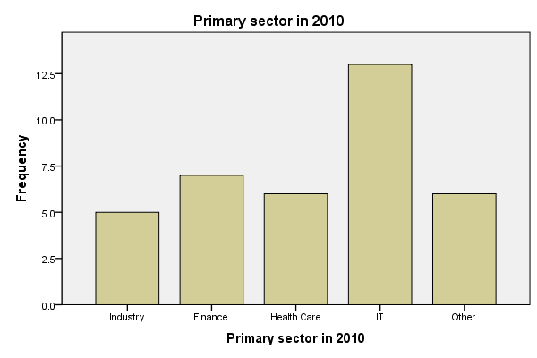
A chart template can also transpose (“put on its side”) our chart, which works much better for bar charts than SPSS’ default orientation. One of the charts that resulted from the template we built is shown below.
Result - Chart Template
Sorting Categories and Percentages
A nice -albeit little known- option is sorting the categories. If we transpose our chart, we can sort our bars by descending frequency by specifying /FORMAT NOTABLE AFREQ (use DFREQ for untransposed charts).
Second, we can have percentages instead of frequencies by using /BARCHART PERCENT as shown in the syntax below.
Sorted Bar Charts with Percentages Syntax
frequencies sector_2010
/format notable afreq
/barchart percent.
Result
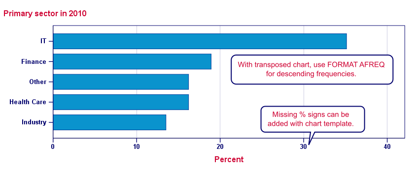
Note: the %-sign is missing from our chart but we can fix this by modifying our chart template.
Option 2: GRAPH
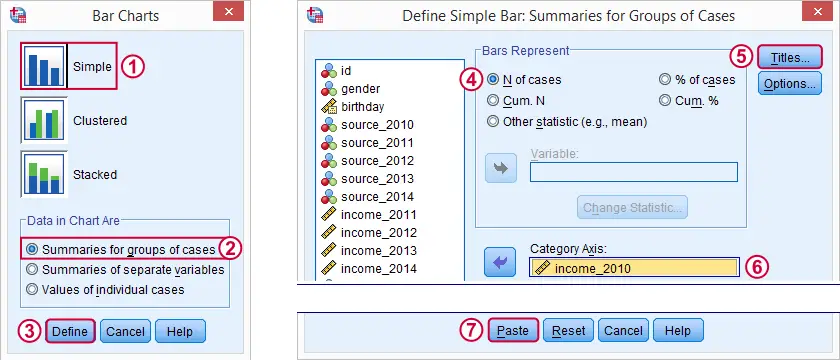
When we run bar charts with FREQUENCIES, the variable labels of the variables involved are used as chart titles. If we want custom titles instead, we're perhaps better off by using GRAPH.Alternatively, set the desired chart titles as new variable labels. Preceding this with TEMPORARY restores the old labels. Since its syntax is a bit more difficult, we'll generate it from the menu as shown below.
Resulting Syntax
GRAPH
/BAR(SIMPLE)=PCT BY sector_2010
/TITLE='All Respondents | n = 40'.
Note: unfortunately, GRAPH takes only one variable at the time. However, we can remove the line breaks from the syntax and copy-paste-edit it a couple of times for a handful of variables. For running charts or tables over many variables, see SPSS with Python - Looping over Scatterplots.
Second, GRAPH does not allow us to sort our categories but a chart template can fix that.
SPSS Bar Charts - Chart Sizes
One issue with all SPSS charts is that their sizes are fixed in pixels. However, a bar chart for many categories needs more space than a chart for few categories. In fact, categories may disappear altogether if they don't fit into the chart anymore. SPSS does not offer a solution for this other than “stretching” each chart manually in the output viewer. For a better solution, see SPSS - Set Chart Sizes Tool.
With respect to the layout of reports, we prefer having the heights (rather than the widths) of our charts depend on the amount of content they contain. This is yet another good reason for always transposing our bar charts.
Conclusion
In most cases, typing a simple FREQUENCIES command is by far the best option for creating bar charts. GRAPH as pasted from ![]() is a reasonable option too.
is a reasonable option too.
As with most charts, ![]() is better avoided since it's way more complicated and results in the exact same chart as the aforementioned options.
is better avoided since it's way more complicated and results in the exact same chart as the aforementioned options.
Bar Charts - FREQUENCIES Versus GRAPH
The table below quickly summarizes the differences between the two options we discussed in this tutorial.
| Feature | FREQUENCIES | GRAPH |
|---|---|---|
| Multiple variables | Yes | No |
| Category sorting | Yes | Only with chart template |
| Percent sign | Only with chart template | Yes |
| Custom title | No | Yes |
THIS TUTORIAL HAS 13 COMMENTS:
By Ruben Geert van den Berg on July 17th, 2017
Hi Ines, thanks for the compliment!
I worked at TNS NIPO for several years where the workload basically forced me to find better and faster ways to get things done. So I joined a couple of SPSS communities and started experimenting with things.
I traced a couple of bugs in SPSS too (very recently: SPSS ALTER TYPE Reporting Wrong Values?). But unfortunately, no invitation from IBM thus far...
I'm not on Twitter at all but you can follow SPSS tutorials on our facebook page or join the SPSS users group on LinkedIn.
By Ines Kondor on July 17th, 2017
Hi Ruben - thanks a lot for your fast reply and very helpful links and hints :-)
By Ali on April 29th, 2018
I have a quick problem that needs solving. I'm unsure as to why the spss bar chart via the chart builder keeps appearing with lines running through the bars. I am unaware if this is causing a change in the results of the chart but i need to find a way to create the car without any lines cutting through them! Is there anyway you can help solve this?
By Ruben Geert van den Berg on April 29th, 2018
Hi Ali!
First of, why are you using the chart builder? In the vast majority of cases, the legacy dialogs are to be prefered.
I'm not sure what you mean by "lines running through bars". Did you mean gridlines? Are you on SPSS version 25? If so, try running
set ctemplate "C:\Program Files\IBM\SPSS\Statistics\25\Looks\LegacyDefault.sgt".but make sure the path is correct.
Otherwise, try
set ctemplate none.This should result in a chart without gridlines for SPSS version 24 and below.
Also see SPSS chart templates.
Let me know if that helps!
By Kurt Birchler on April 11th, 2021
Hi Ruben, finally I find some good explanations on creating graphs working with Syntax. I have a question:
I have three different variables, that contain the same answers (all as strings, from a picklist). I need to sum the count of all three variables for the individual answers and would like to show a barchart for the summed answers. How can this be done in a bar chart? Because at the moment, when I use barchart, then it will show me three individual barcharts for each variable. Thank you in advance for your reply.