One of the most common research questions is do different groups have different mean scores on some variable? This question is best answered in 3 steps:
- create a table showing mean scores per group -you'll probably want to include the frequencies and standard deviations as well;
- create a chart showing mean scores per group;
- run some statistical test -ANOVA in this case. However, this is only meaningful if your data are (roughly) a simple random sample from your target population.
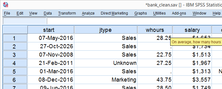
We'll show the first 2 steps using an employee survey whose data are in bank-clean.sav. The screenshot below shows what these data basically look like.
Creating a Means Table
For creating a table showing means per category, we could mess around with
![]()
![]() but its not worth the effort as the syntax is as simple as it gets. So let's just run it and inspect the result.
but its not worth the effort as the syntax is as simple as it gets. So let's just run it and inspect the result.
means q1 by jtype
/cells count mean stddev.
Note that you could easily add more statistics to the CELLS subcommand such as
Result
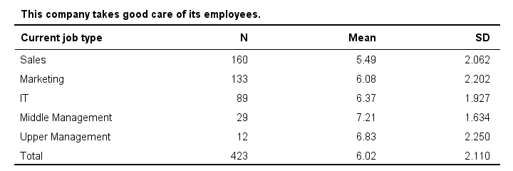
Basically, our table tells us that the mean employee care ratings increase with higher job levels except for “upper management”. A proper descriptives table -always recommended- gives nicely detailed information. However, it's not very visual. So let's now run our chart.
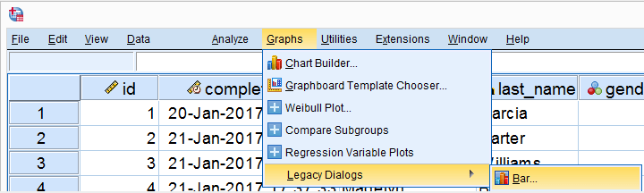
SPSS Bar Chart Menu & Dialogs
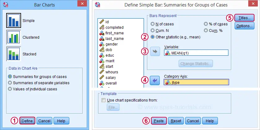
As a rule of thumb, I create all charts from
![]() and avoid the Chart Builder whenever I can -which is pretty much always unless I need a stacked bar chart with percentages.
and avoid the Chart Builder whenever I can -which is pretty much always unless I need a stacked bar chart with percentages.
 In the dialog shown below, selecting enables you to
  enter a dependent variable;
Basic Bar Chart Means by Category Syntax
GRAPH
/BAR(SIMPLE)=MEAN(q1) BY jtype
/TITLE='Mean Employee Care Rating by Job Type'
/SUBTITLE='N = 423'.
Result
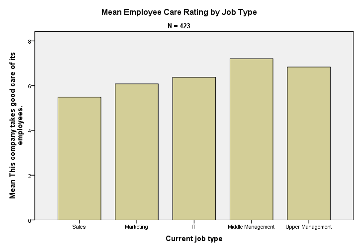
We now have our basic chart but it doesn't look too good.From SPSS version 25 onwards, it will look somewhat better. However, see New Charts in SPSS 25 - How Good Are They Really? Yet. We'll fix this by setting a chart template: bar-chart-means-trans-720-1.sgt.
Note that a chart template can also sort this bar chart -for instance by descending means- but we'll skip that for now.
Bar Chart Means by Category Syntax II
set ctemplate "bar-chart-means-trans-720-1.sgt".
*Rerun chart with template set.
GRAPH
/BAR(SIMPLE)=MEAN(q1) BY jtype
/TITLE='Mean Employee Care Rating by Job Type'
/SUBTITLE='N = 423'.
Result
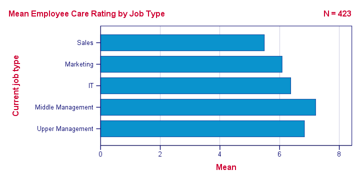
Right, so that's about it. If you need a couple of similar charts, you could copy-paste-edit the last GRAPH command (no need to repeat the other commands). If you need many similar charts, you could loop over the GRAPH command with Python for SPSS.
If you're going to run other types of charts, don't forget to set a different chart template. Or switch if off altogether by running set ctemplate none.
Thanks for reading!
THIS TUTORIAL HAS 12 COMMENTS:
By Ruben Geert van den Berg on April 13th, 2022
There's one thing I thought of when creating Python-based extension commands:
-adding the .sgt contents as a huge string in the .py file and
-have Python write it as a new file into the LOOKS subfolder with the os module
-adding TEMPORARY / SET CTEMPLATE ... to the Python generated SPSS syntax that's eventually run
but I think file permissions may preclude the second step here. It's pretty tedious too...
Something like SET CTEMPLATE 'https://www.spss-tutorials.com/downloads/mytemplate.sgt'. shouldn't be too hard to implement. Or should it?
By Jon Peck on April 13th, 2022
The way to handle url's for templates would be to use a bit of Python code via the urllib standard library module to write to a local file. Then get the current CTEMPLATE setting via the GetPreference api; set the CTEMPLATE to that downloaded file, which does not have to be in the Looks directory. Charts would then automatically use it. The previous setting could be restored via SetPreference api if desired if that setting is saved somewhere.