SPSS FREQUENCIES command can be used for much more than frequency tables: it's also the easiest way to obtain basic charts such as histograms and bar charts. On top of that, it provides us with percentiles and some other statistics. Plenty of reasons for taking a closer look at this ubiquitous SPSS command. We'll use employees.sav throughout this tutorial.
SPSS FREQUENCIES - Basic Table
The most basic way to use FREQUENCIES is simply generating a frequency table. For example, the frequency table for job_type is obtained by running the following line of SPSS syntax: frequencies job_type.
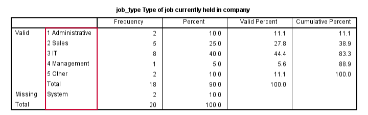
By default, the rows of this table are sorted ascendingly by value. Note that this may not be obvious when only value labels are displayed. We'll next take a look at different options for sorting the table rows.
SPSS FREQUENCIES - Sort Order
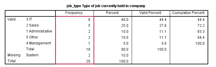
SPSS default sort order of ascendingly be value can be changed by adding a FORMAT subcommand. Possible values are AVALUE and DVALUE (ascending and descending values) or AFREQ and DFREQ (ascending and descending frequencies). For example, the syntax below sorts the rows from the value with highest frequency (yes, that's the mode) through the value with the lowest frequency.
frequencies job_type
/format dfreq.
SPSS FREQUENCIES - Bar Chart
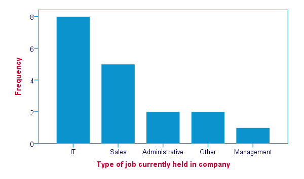
SPSS FREQUENCIES command is the easiest way to create one or more bar charts for categorical variables. Just add the BARCHART subcommand. Note that you can combine it with a sort order, resulting in the barchart bars being ordered from highest through lowest frequency as shown below.
frequencies job_type
/format dfreq
/barchart.
SPSS FREQUENCIES - Pie Chart
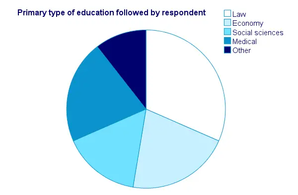
An alternative visualization for categorical variables is a pie chart. In order to generate it, simply add a PIECHART subcommand to FREQUENCIES. The syntax below creates a pie chart for education_type.
frequencies education_type
/piechart.
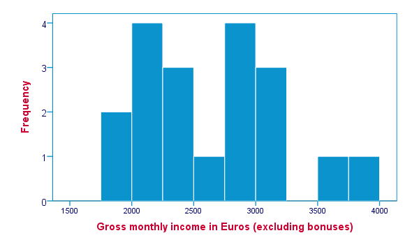
SPSS FREQUENCIES - Histogram
Frequency tables, bar charts and pie charts can all be used for both metric as well as categorical variables, including string variables. However, they are not useful for metric variables with many distinct values; in this case, tables get too many rows and graphs too many elements.
The ideal way to visualize such variables is a histogram, obtained by the HISTOGRAM subcommand. Apart from that, we can suppress frequency tables by specifying NOTABLE on the FORMAT subcommand. Like so, the syntax below generates a histogram for monthly_income.
frequencies monthly_income
/format notable
/histogram.
SPSS FREQUENCIES - Percentiles
SPSS FREQUENCIES provides a nice way to obtain percentiles: just add a PERCENTILES subcommand followed by the desired percentiles in parentheses. The syntax below gives an example. Keep in mind that percentiles are not meaningful for nominal variables.
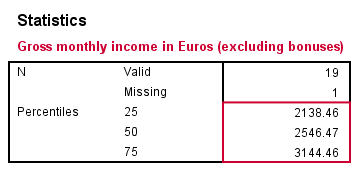
frequencies monthly_income
/format notable
/percentiles (25 50,75).
SPSS FREQUENCIES - Ntiles
Ntiles are easily obtained with SPSS FREQUENCIES: simply add the NTILES subcommand with the number of ntiles behind it in parentheses. If you want to assign cases to ntile groups, use RANK; it creates a new variable holding the ntile for each case on a given variable. Both options are shown in the syntax below.
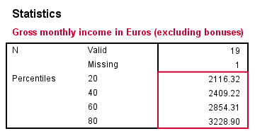
frequencies monthly_income
/format notable
/ntiles (5).
*2. Create monthly_income ntile group variable in data.
rank monthly_income/ntiles(5).
SPSS FREQUENCIES - Statistics
SPSS FREQUENCIES can compute all statistics obtained from DESCRIPTIVES plus the median and mode. Note that the statistics table from FREQUENCIES has a different layout with variables in columns and statistics in rows. For obtaining them, add a STATISTICS subcommand. Just as with DESCRIPTIVES, specifying the ALL keyword returns all available statistics.
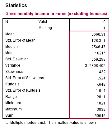
frequencies monthly_income
/format notable
/statistics all.
SPSS FREQUENCIES - Multiple Variables
Obviously, FREQUENCIES can be run for multiple variables, possibly using TO or ALL. If multiple types of output (frequency table, chart and so on) are generated, you can have them sorted by variable or output type by specifying VARIABLE or ANALYSIS on an ORDER subcommand.
frequencies education_type to job_type
/format dfreq
/barchart
/order variable.
*2. Sort output by output type (first tables for all variables, then charts for all variables).
frequencies education_type to job_type
/format dfreq
/barchart
/order analysis.
THIS TUTORIAL HAS 15 COMMENTS:
By Yunusa Uba Muhammd on March 13th, 2016
how do I enter data for frequency counts by using SPSS statistics.
By Ruben Geert van den Berg on March 14th, 2016
Hi Yunusa! Read up on WEIGHT, that should do the trick for you.
By Yotam Dalal on March 25th, 2016
Lets say that I have a frequency table that i want to insert to SPSS. I know that there are 4 cities, lets say
New York
Washington
Boston
Seattle
and I have a very high frequency count for every
city. If I would like to insert the data without entering
values for each one of the frequencies, Is there
a short way to do it in SPSS?
By Ruben Geert van den Berg on March 25th, 2016
Hi Yotam!
Yes, there is: enter cities and frequencies and then WEIGHT the cases by their frequencies. Quick example:
data list free/city (a20) ofreq.begin data
'Seattle' 1000
'Boston' 1500
'New York' 3000
'Washington' 5000
end data.
weight by ofreq.
frequencies city.You could even recreate the original data from these frequencies as explained in SPSS Disaggregate Data.
By Josh on August 15th, 2016
Is it possible to order the rows in a Multiple Response Crosstab in descending order of the variables values (exactly like the formatting of a normal crosstab). Copying that syntax did not work for me and I would like to flip the order of my MR CT without recoding values. Thanks in advance.