Creating Boxplots in SPSS – Quick Guide
Introduction & Practice Data File
There's 3 ways to create boxplots in SPSS:
The first approach is the simplest but it also has fewer options than the others. This tutorial walks you through all 3 approaches while creating different types of boxplots.
- Boxplot for 1 Variable - 1 Group of Cases
- Boxplot for Multiple Variables - 1 Group of Cases
- Boxplot for 1 Variable - Multiple Groups of Cases
- Tip 1 - Remove Outliers for Single Group
- Tip 2 - Show Outlier Values in Boxplot
- Tip 3 - Adding Titles to Boxplots
Example Data
All examples in this tutorial use driving-test.sav, partly shown below.
Our data file contains a sample of N = 238 people who were examined in a driving simulator. Participants were presented with 5 dangerous situations to which they had to respond as fast as possible. The data hold their reaction times and some other variables.
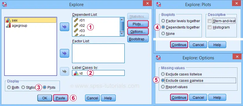
Boxplot for 1 Variable - 1 Group of Cases
We'll first run a boxplot for the reaction times on trial 1 for all cases. One option is
![]()
![]() which opens the dialogs shown below.
which opens the dialogs shown below.
Completing these steps results in the syntax below.
EXAMINE VARIABLES=r01
/COMPARE VARIABLE
/PLOT=BOXPLOT
/STATISTICS=NONE
/NOTOTAL
/ID=id
/MISSING=LISTWISE.
Result
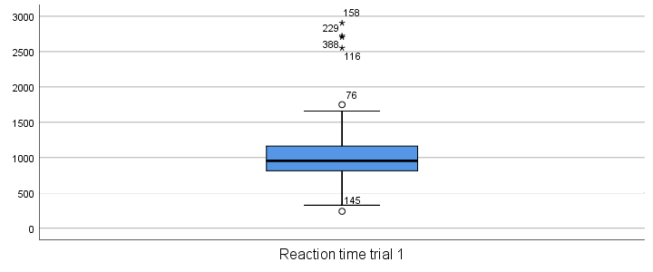
Our boxplot shows some potential outliers as well as extreme values. Interpreting these -and all other boxplot elements- is discussed in Boxplots - Beginners Tutorial. Also note that our boxplot doesn't have a title yet. Options for adding it are discussed in Tip 3 - Adding Titles to Boxplots.
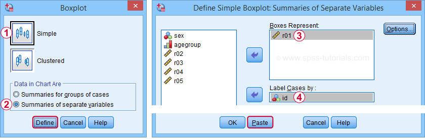
Boxplot for Multiple Variables - 1 Group of Cases
We'll now create a single boxplot for our 5 reaction time variables for all participants. We navigate to
![]()
![]() and fill out the dialogs as shown below.
and fill out the dialogs as shown below.
 “Dependents together” means that all dependent variables are shown together in each boxplot. If you enter a factor -say, sex- you'll get a separate boxplot for each factor level -female and male respondents. “Factor levels together” creates a separate boxplot for each dependent variable, showing all factor levels together in each boxplot.
 “Exclude cases pairwise” means that the results for each variable are based on all cases that don't have a missing value for that variable. “Exclude cases listwise” uses only cases without any missing values on all variables.
A minor note here is that many SPSS users select “Normality plots and tests” in this dialog for running a
Anyway. Completing these steps results in the syntax below. Let's run it.
EXAMINE VARIABLES=r01 r02 r03 r04 r05
/COMPARE VARIABLE
/PLOT=BOXPLOT
/STATISTICS=NONE
/NOTOTAL
/ID=id
/MISSING=PAIRWISE /* IMPORTANT! */.
Result
Now, before inspecting our boxplot, take a close look at the Case Processing Summary table first.
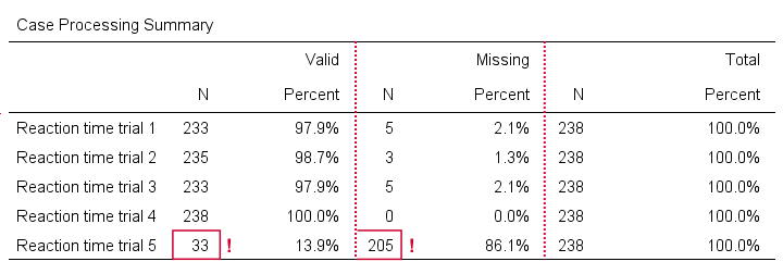
The first columns tells how many cases were used for each variable. Note that trial 5 has N = 205 or 86.1% missing values. Remember that “Exclude cases listwise” was the default in the Explore dialog. If we hadn't changed that, then none of our variables would have used more than N = 33 cases. The actual boxplot, however, wouldn't show anything wrong. This really is a major pitfall. Please avoid it.
Anyway, the figure below shows our actual boxplot.
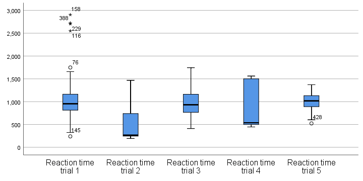
Note that we already saw the first boxplot bar in our previous example. Second, trials 2 and 4 seem strongly positively skewed. Both variables look odd. We'd better inspect their histograms to see what's really going on.
Boxplot for 1 Variable - Multiple Groups of Cases
We'll now run a boxplot for trial 3 for age groups separately. We first navigate to
![]() and fill out the dialogs as shown below.
and fill out the dialogs as shown below.
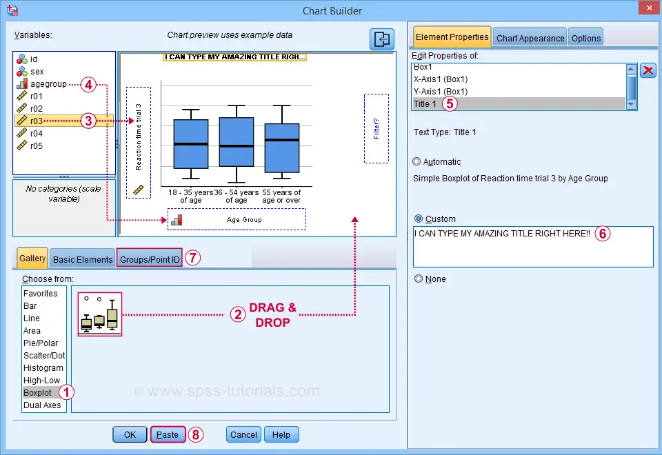
 Select “Point ID Label” in this tab and then drag & drop r03 into the ID box on the canvas. Doing so will show actual outlier values in the final boxplot.
Completing these steps results in the syntax below.
GGRAPH
/GRAPHDATASET NAME="graphdataset" VARIABLES=agegroup r03 MISSING=LISTWISE REPORTMISSING=NO
/GRAPHSPEC SOURCE=INLINE.
BEGIN GPL
SOURCE: s=userSource(id("graphdataset"))
DATA: agegroup=col(source(s), name("agegroup"), unit.category())
DATA: r03=col(source(s), name("r03"))
GUIDE: axis(dim(1), label("Age Group"))
GUIDE: axis(dim(2), label("Reaction time trial 3"))
GUIDE: text.title(label("I CAN TYPE MY AMAZING TITLE RIGHT HERE!"))
SCALE: cat(dim(1), include("1", "2", "3"))
SCALE: linear(dim(2), include(0))
ELEMENT: schema(position(bin.quantile.letter(agegroup*r03)), label(r03))
END GPL.
Result
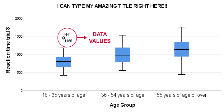
This boxplot shows increasing medians and standard deviations with increasing ages. Note that our boxplot also shows outlier values. In this example, these are reaction times of 1,441 and 1,455 milliseconds but for the youngest age group only.
Tip 1 - Remove Outliers for Single Group
If you'd like to remove outliers based on boxplot results, you'd normally set them as user missing values. For example, MISSING VALUES r03 (1441 THRU HI). sets values of 1441 and higher as missing for r03. In our example, however, this won't work: the aforementioned values are potential outliers only for the youngest age group. For the other age groups, they're within a normal range.
A solution is converting these values into different values for the youngest age group only. One option is combining DO IF with RECODE. The syntax below, however, shows a shorter option based on IF.
means r03 by agegroup
/cells count min max mean stddev.
*Recode potential outliers into 999999998 but only for agegroup 1.
if(agegroup = 1 and r03 >= 1441) r03 = 999999998.
*Set recoded outliers as user missing values.
missing values r03 (999999998).
*Apply value label to recoded outliers.
add value labels r03 999999998 'Value removed because outlier'.
*Rerun checktable.
means r03 by agegroup
/cells count min max mean stddev.
Tip 2 - Show Outlier Values in Boxplot
You can show data values for potential outliers and extreme values in boxplots. This only works if each boxplot involves a single dependent variable. Simply use this dependent variable as the ID variable too.
The only dialog that supports this is the Chart Builder. If you prefer the other dialogs, modifying the /ID subcommand in the syntax also does the trick.
EXAMINE VARIABLES=r03 BY agegroup
/PLOT=BOXPLOT
/STATISTICS=NONE
/NOTOTAL
/ID=r03. /*Label outliers with actual data values.
Tip 3 - Adding Titles to Boxplots
There's 3 options for showing titles in SPSS boxplots:
- create your boxplot via the Chart Builder as in example 3;
- use a chart template that has a fixed title and/or subtitle;
- add a title manually after creating your boxplot.
For this last option, open a Chart Editor window by double-clicking your chart. You can now add a title from the menu.
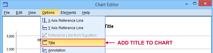
Note that you can adjust your title after adding it.
Final Notes
There's many more variations on boxplots, especially clustered boxplots. However, I think you'll get them done fairly easily after studying this tutorial.
If you've any questions or remarks, please throw me a comment below.
Thanks for reading!
Boxplots – Beginners Tutorial
A boxplot is a chart showing quartiles, outliers and
the minimum and maximum scores for 1+ variables.
Example
A sample of N = 233 people completed a speed task. The chart below shows a boxplot of their reaction times.
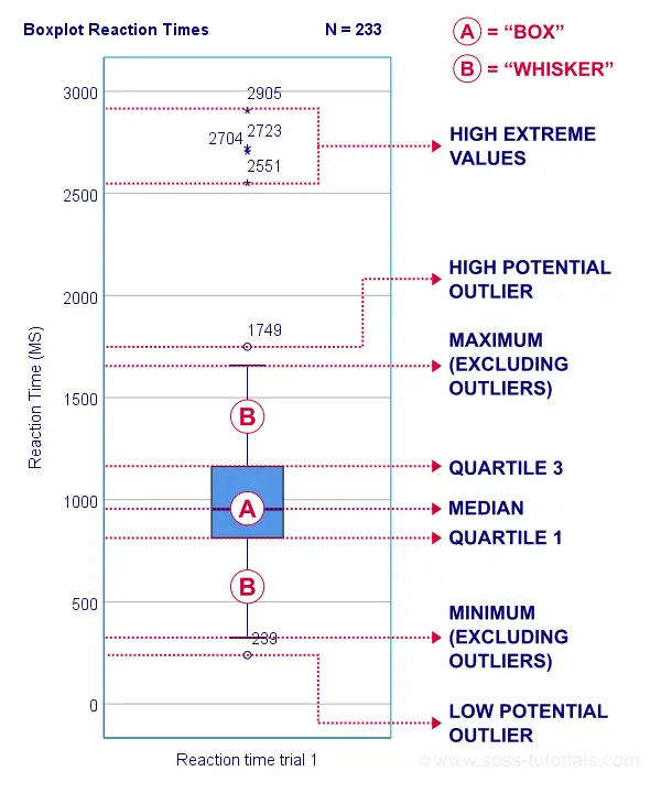
Some rough conclusions from this chart are that
- all 233 reaction times lie between 0 and 3,000 milliseconds;
- 4 scores are high extreme values. These are reaction times between 2,551 and 2,905 milliseconds;
- there's 1 high potential outlier of 1,749 milliseconds;
- the maximum reaction time (excluding potential outliers and extreme values) is around 1,650 milliseconds;
- 75% of all respondents score lower than some 1,150 milliseconds. This is the 75th percentile or quartile 3;
- 50% of all respondents score lower than some 975 milliseconds. This is the 50th percentile (the median) or quartile 2;
- 25% of all respondents score lower than some 800 milliseconds. This is the 25th percentile or quartile 1;
- the minimum reaction time (excluding potential outliers and extreme values) is around 350 milliseconds;
- there's 1 low potential outlier of 239 milliseconds;
- there aren't any low extreme values.
So what are quartiles? And how to obtain them? And how are potential outliers and extreme values defined?
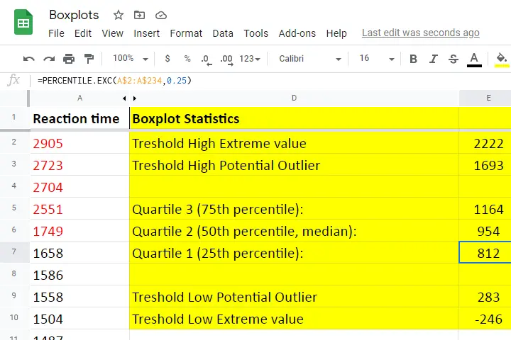
We'll show you all you need to know in this Googlesheet, part of which is shown below.
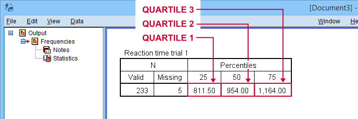
Quartile 1
Quartile 1 is the 25th percentile: it is the score that separates the lowest 25% from the highest 75% of scores. In Googlesheets and Excel, =PERCENTILE.EXC(A2:A234,0.25) returns quartile 1 for the scores in cells A2 through A234 (our 233 reaction times). The result is 811.5. This means that 25% of our scores are lower than 811.5 milliseconds. Or -reversely- 75% are higher.
A minor complication here is that 25% of N = 233 scores results in 58.25 scores. As there's no such thing as “0.25 scores”, we can't precisely separate the lowest 25% from the highest 75%.
There's no real solution to this problem but a technique known as linear interpolation probably comes closest. This is how Excel, Googlesheets and SPSS all come up with 811.5 as quartile 1 for our 233 scores.
Quartile 2
Quartile 2 -also known as the median- is the 50th percentile: the score that separates the lowest 50% from the highest 50% of scores. In Googlesheets, =PERCENTILE.EXC(A2:A234,0.50) returns quartile 2 for the scores in cells A2 through A234. For these data, that'll be 954 milliseconds.
This median is a measure of central tendency: it tells us that people typically had a reaction time of 954 milliseconds. Common measures of central tendency are
- the mean;
- the median;
- the mode.
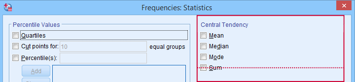 Percentiles, quartiles and measures of central tendency can be obtained from SPSS’ Frequencies dialog.
Quartile 3
Quartile 3 is the 75th percentile: the score that separates the lowest 75% from the highest 25% of scores. In Googlesheets, =PERCENTILE.EXC(A2:A234,0.75) returns quartile 3 for the scores in cells A2 through A234. For our 233 reaction times, that'll be 1,164 milliseconds.
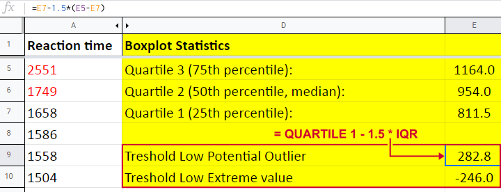
The screenshot below shows that SPSS comes up with the exact same quartiles as Excel and Googlesheets. We'll now use quartiles 1 and 3 (811.5 and 1,164 milliseconds) for computing the interquartile range or IQR.
 SPSS comes up with identical quartiles for our N = 233 reaction times
Interquartile Range - IQR
The interquartile range or IQR is computed as
$$IQR = quartile\;3 - quartile\;1$$
so for our data, that'll be
$$IQR = 1,164 - 811.5 = 352.5$$
The IQR is a measure of dispersion: it tells how far data points typically lie apart. Common measures of dispersion are
- the standard deviation
- the variance;
- the IQR;
- the range.
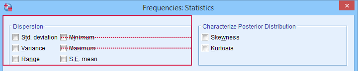 Measures of dispersion in SPSS’ Frequencies dialog.
Potential Outliers
In boxplots, potential outliers are defined as follows:
- low potential outlier: score is more than 1.5 IQR but at most 3 IQR below quartile 1;
- high potential outlier: score is more than 1.5 IQR but at most 3 IQR above quartile 3.
For our data at hand, quartile 1 = 811.5 and the IQR = 352.5. Therefore, the thresholds for low potential outliers are
- upper bound: 811.5 - 1.5 * 352.5 = 282.8;
- lower bound: 811.5 - 3 * 352.5 = -246.0.
Scores that are smaller than this lower bound are considered low extreme values: these are scores even more than 3 IQR below quartile 1.
Thresholds for high potential outliers are computed in a similar fashion, using quartile 3 and the IQR. To sum things up: for our data at hand, thresholds for potential outliers are
- low potential outlier: -246 ≤ reaction time < 282.8 (milliseconds);
- high potential outlier: 1,692.8 < reaction time ≤ 2,221.5 (milliseconds).
As shown in our boxplot example, potential outliers are typically shown as circles. These either lie below the minimum or above the maximum (both excluding outliers).
A final note here is that these definitions apply only to boxplots. In other contexts, z-scores are often used to define outliers.
Extreme Values
For boxplots, extreme values are defined as follows:
- low extreme value: score is more than 3 IQR below quartile 1;
- high extreme value: score is more than 3 IQR above quartile 3.
For our 233 reaction times, this implies
- low extreme value: reaction time < -246 (milliseconds);
- high extreme value: reaction time > 2,221.5 (milliseconds).
In boxplots, extreme values are usually indicated by asterisks (*). Note that our example boxplot shows 4 high extreme values but no low extreme values.
Boxplots - Purposes
Basic purposes of boxplots are
- quick and simple data screening, especially for outliers and extreme values;
- comparing 2+ variables for 1 sample (within-subjects test);
- comparing 2+ samples on 1 variable (between-subjects test).
The figure below shows a quick boxplot comparison among 3 samples (age groups) on 1 variable (reaction time trial 3).
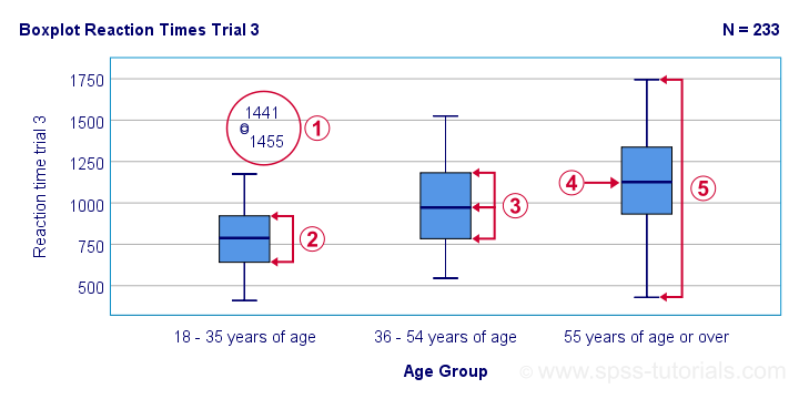
 The youngest age group has 2 potential outliers. However, they don't look too bad as they'd fall in the normal range for the other age groups.
 The young age group has the lowest “box”. This indicates that these respondents have the smallest IQR. Since the IQR ignores the bottom and top 25% of scores, this group does not necessarily have the smallest standard deviation too.
 The median lies roughly midway between quartiles 1 and 3. This suggests a roughly symmetrical frequency distribution.
The oldest age group has the highest median reaction time and reversely. Respondents thus seem to get slower with increasing age.
Reaction time for the oldest respondents have the largest range: the scores seem to lie further apart insofar as respondents are older.
Boxplots or Histograms?
Histograms.
The figure below illustrates why I always prefer histograms over boxplots. It's based on the exact same data as our last boxplot example.
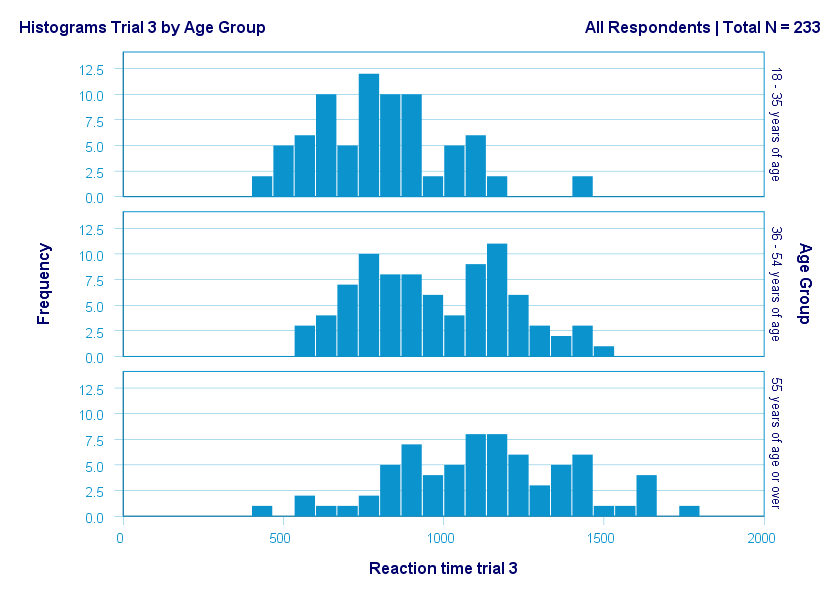
So what did the boxplot tell us that this histogram doesn't? Well, nothing really. Does it? Reversely, however, the histogram tells us that
- reaction times seem to follow a bimodal distribution for the intermediate age group;
- this distribution is therefore flattened (platykurtic) relative to a normal distribution. To some extent, this also holds for the other 2 age groups;
- means as well as standard deviations seem to increase with increasing age.
Our histograms make these points much clearer than our boxplot: in boxplots, we can't see how scores are distributed within the “box” or between the “whiskers”.
A histogram, however, allows us to roughly reconstruct our original data values. A chart simply doesn't get any more informative than that.
Agree? Disagree? Throw me a comment below and let me know what you think.
Thanks for reading!