How to Draw Regression Lines in SPSS?
- Method A - Legacy Dialogs
- Method B - Chart Builder
- Method C - CURVEFIT
- Method D - Regression Variable Plots
- Method E - All Scatterplots Tool
Summary & Example Data
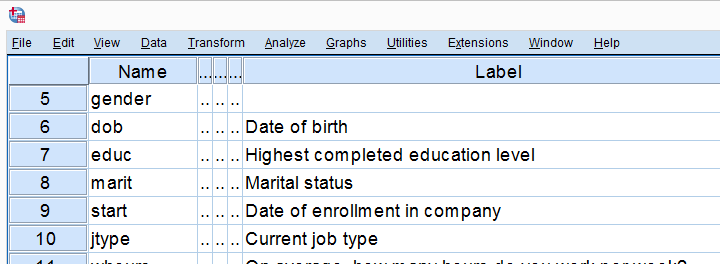
This tutorial walks you through different options for drawing (non)linear regression lines for either all cases or subgroups. All examples use bank-clean.sav, partly shown below.
Method A - Legacy Dialogs
A simple option for drawing linear regression lines is found under
![]()
![]() as illustrated by the screenshots below.
as illustrated by the screenshots below.
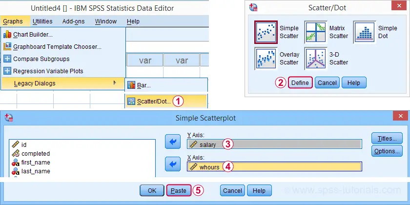
Completing these steps results in the SPSS syntax below. Running it creates a scatterplot to which we can easily add our regression line in the next step.
GRAPH
/SCATTERPLOT(BIVAR)=whours WITH salary
/MISSING=LISTWISE.
For adding a regression line, first double click the chart to open it in a Chart Editor window. Next, click the “Add Fit Line at Total” icon as shown below.
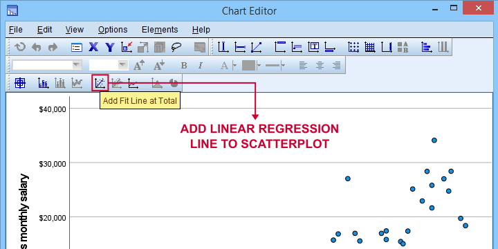
You can now simply close the fit line dialog and Chart Editor.
Result
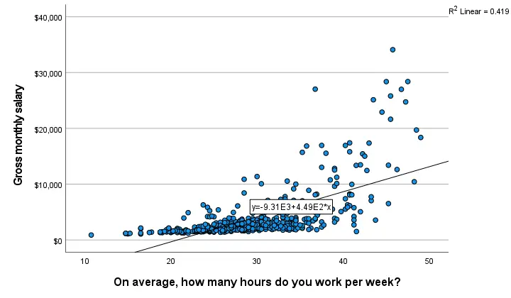
The linear regression equation is shown in the label on our line: y = 9.31E3 + 4.49E2*x which means that
$$Salary' = 9,310 + 449 \cdot Hours$$
Note that 9.31E3 is scientific notation for 9.31 · 103 = 9,310 (with some rounding).
You can verify this result and obtain more detailed output by running a simple linear regression from the syntax below.
regression
/dependent salary
/method enter whours.
When doing so, you'll also have significance levels and/or confidence intervals. Finally, note that a linear relation seems a very poor fit for these variables. So let's explore some more interesting options.
Method B - Chart Builder
For SPSS versions 25 and higher, you can obtain scatterplots with fit lines from the chart builder. Let's do so for job type groups separately: simply navigate to
![]() and fill out the dialogs as shown below.
and fill out the dialogs as shown below.
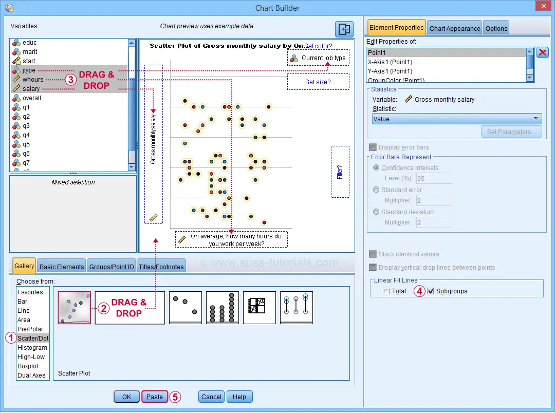
This results in the syntax below. Let's run it.
GGRAPH
/GRAPHDATASET NAME="graphdataset" VARIABLES=whours salary jtype MISSING=LISTWISE REPORTMISSING=NO
/GRAPHSPEC SOURCE=INLINE
/FITLINE TOTAL=NO SUBGROUP=YES.
BEGIN GPL
SOURCE: s=userSource(id("graphdataset"))
DATA: whours=col(source(s), name("whours"))
DATA: salary=col(source(s), name("salary"))
DATA: jtype=col(source(s), name("jtype"), unit.category())
GUIDE: axis(dim(1), label("On average, how many hours do you work per week?"))
GUIDE: axis(dim(2), label("Gross monthly salary"))
GUIDE: legend(aesthetic(aesthetic.color.interior), label("Current job type"))
GUIDE: text.title(label("Scatter Plot of Gross monthly salary by On average, how many hours do ",
"you work per week? by Current job type"))
SCALE: cat(aesthetic(aesthetic.color.interior), include(
"1", "2", "3", "4", "5"))
ELEMENT: point(position(whours*salary), color.interior(jtype))
END GPL.
Result
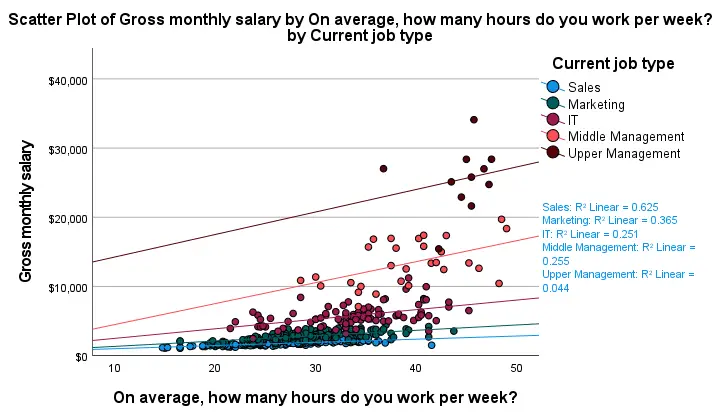
First off, this chart is mostly used for
- inspecting homogeneity of regression slopes in ANCOVA and
- simple slopes analysis in moderation regression.
Sadly, the styling for this chart is awful but we could have fixed this with a chart template if we hadn't been so damn lazy.
Anyway, note that R-square -a common effect size measure for regression- is between good and excellent for all groups except upper management. This handful of cases may be the main reason for the curvilinearity we see if we ignore the existence of subgroups.
Running the syntax below verifies the results shown in this plot and results in more detailed output.
sort cases by jtype.
split file layered by jtype.
*SIMPLE LINEAR REGRESSION.
regression
/dependent salary
/method enter whours.
*END SPLIT FILE.
split file off.
Method C - CURVEFIT
Scatterplots with (non)linear fit lines and basic regression tables are very easily obtained from CURVEFIT. Jus navigate to
![]()
![]() and fill out the dialog as shown below.
and fill out the dialog as shown below.
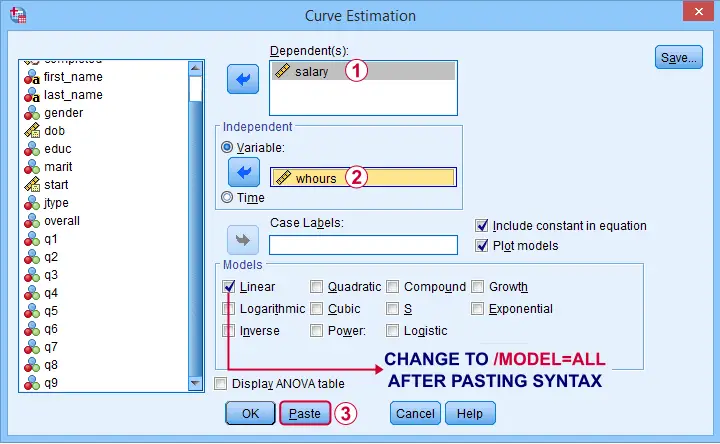
If you'd like to see all models, change /MODEL=LINEAR to /MODEL=ALL after pasting the syntax.
TSET NEWVAR=NONE.
CURVEFIT
/VARIABLES=salary WITH whours
/CONSTANT
/MODEL=ALL /* CHANGE THIS LINE MANUALLY */
/PLOT FIT.
Result
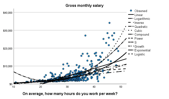
Despite the poor styling of this chart, most curves seem to fit these data better than a linear relation. This can somewhat be verified from the basic regression table shown below.
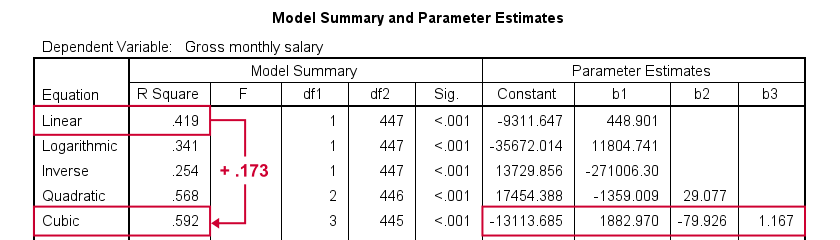
Especially the cubic model seems to fit nicely. Its equation is
$$Salary' = -13114 + 1883 \cdot hours - 80 \cdot hours^2 + 1.17 \cdot hours^3$$
Sadly, this output is rather limited: do all predictors in the cubic model seriously contribute to r-squared? The syntax below results in more detailed output and verifies our initial results.
compute whours2 = whours**2.
compute whours3 = whours**3.
regression
/dependent salary
/method forward whours whours2 whours3.
Method D - Regression Variable Plots
Regression Variable Plots is an SPSS extension that's mostly useful for
- creating several scatterplots and/or fit lines in one go;
- plotting nonlinear fit lines for separate groups;
- adding elements to and customizing these charts.
I believe this extension is preinstalled with SPSS version 26 onwards. If not, it's supposedly available from STATS_REGRESS_PLOT but I used to have some trouble installing it on older SPSS versions.
Anyway: if installed, navigating to
![]() should open the dialog shown below.
should open the dialog shown below.
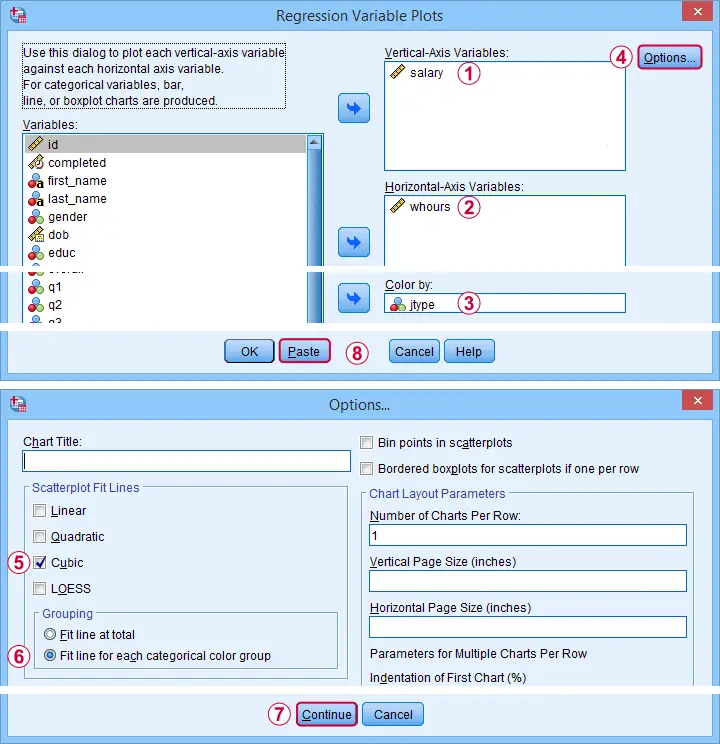
Completing these steps results in the syntax below. Let's run it.
STATS REGRESS PLOT YVARS=salary XVARS=whours COLOR=jtype
/OPTIONS CATEGORICAL=BARS GROUP=1 INDENT=15 YSCALE=75
/FITLINES CUBIC APPLYTO=GROUP.
Result
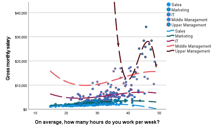
Most groups don't show strong deviations from linearity. The main exception is upper management which shows a rather bizarre curve.
However, keep in mind that these are only a handful of observations; the curve is the result of overfitting. It (probably) won't replicate in other samples and can't be taken seriously.
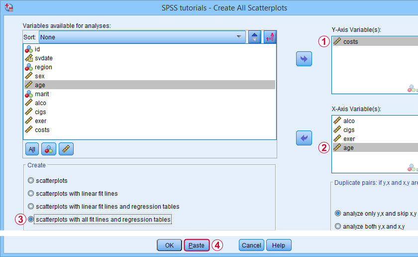
Method E - All Scatterplots Tool
Most methods we discussed so far are pretty good for creating a single scatterplot with a fit line. However, we often want to check several such plots for things like outliers, homoscedasticity and linearity. This is especially relevant for
A very simple tool for precisely these purposes is downloadable from and discussed in SPSS - Create All Scatterplots Tool.
Final Notes
Right, so those are the main options for obtaining scatterplots with fit lines in SPSS. I hope you enjoyed this quick tutorial as much as I have.
If you've any remarks, please throw me a comment below. And last but not least:
thanks for reading!
Multiple Linear Regression – What and Why?
Multiple regression is a statistical technique that aims to predict a variable of interest from several other variables. The variable that's predicted is known as the criterion. The variables that predict the criterion are known as predictors. Regression requires metric variables but special techniques are available for using categorical variables as well.
Multiple Regression - Example
I run a company and I want to know how my employees’ job performance relates to their IQ, their motivation and the amount of social support they receive. Intuitively, I assume that higher IQ, motivation and social support are associated with better job performance. The figure below visualizes this model.
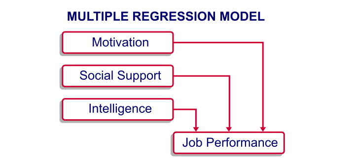
At this point, my model doesn't really get me anywhere; although the model makes intuitive sense, we don't know if it corresponds to reality. Besides, the model suggests that my predictors (IQ, motivation and social support) relate to job performance but it says nothing about how strong these presumed relations are. In essence, regression analysis provides numeric estimates of the strengths of such relations.
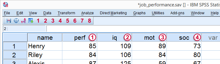
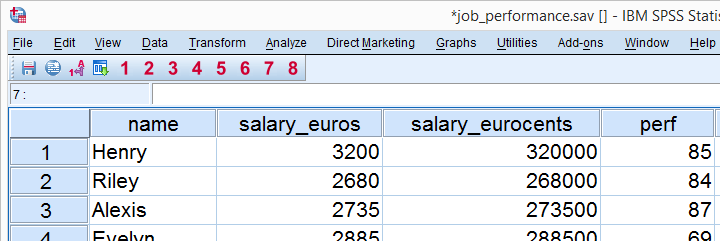
In order to use regression analysis, we need data on the four variables (1 criterion and 3 predictors) in our model. We therefore have our employees take some tests that measure these. Part of the raw data we collect are shown below.
Multiple Regression - Raw Data
Multiple Regression - Meaning Data
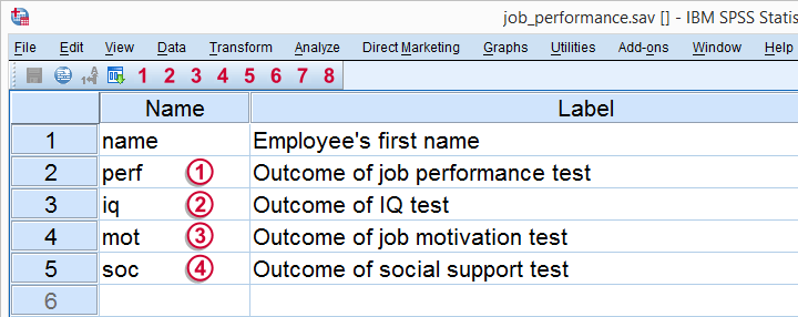
The meaning of each variable in our data is illustrated by the figure below.
Regarding the scores on these tests, tests  ,
,  and
and  have scores ranging from 0 (as low as possible) through 100 (as high as possible).
 IQ has an average of 100 points with a standard deviation of 15 points in an average population; roughly, we describe a score of 70 as very low, 100 as normal and 130 as very high.
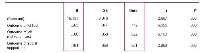
Multiple Regression - B Coefficients
Now that we collected the necessary data, we have our software (SPSS or some other package) run a multiple regression analysis on them. The main result is shown below.
In order to make things a bit more visual, we added the b coefficients to our model overview, which is illustrated below. (We'll get to the beta coefficients later.)
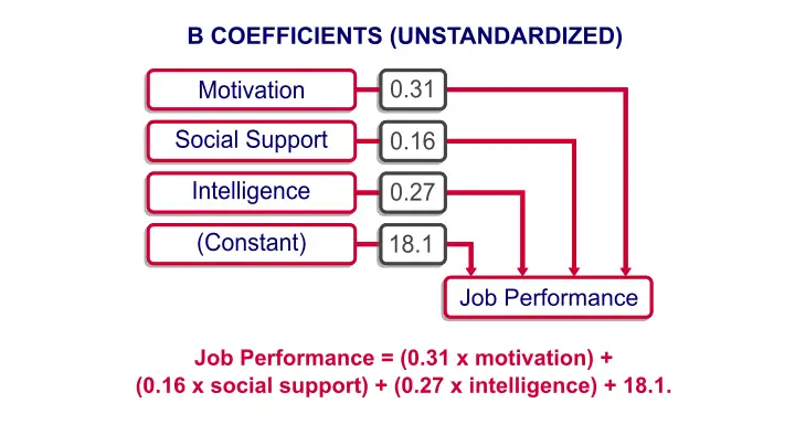
Note that the model now quantifies the strengths of the relations we presume. Precisely, the model says that
Job performance = (0.31 x motivation) +
(0.16 x social support) + (0.27 x intelligence) + 18.1.
In our model, 18.1 is a baseline score that's unrelated to any other variables. It's a constant over respondents, which means that it's the same 18.1 points for each respondent.
The formula shows how job performance is estimated: we add up each of the predictor scores after multiplying them with some number. These numbers are known as the b coefficients or unstandardized regression coefficients:
a B coefficient indicates how many units the criterion changes for a one unit increase on a predictor, everything else equal.
In this case, “units” may be taken very literally as the units of measurement of the variables involved. These can be meters, dollars, hours or -in our case- points scored on various tests.
For example, a 1 point increase on our motivation test is associated with a 0.31 points increase on our job performance test. This means that -on average- respondents who score 1 point higher on motivation score 0.31 points higher on job performance. We'll get back to the b coefficients in a minute.
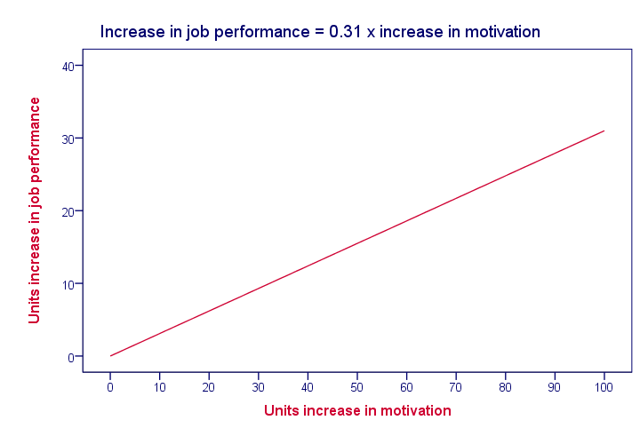
Multiple Regression - Linearity
Unless otherwise specified, “multiple regression” normally refers to univariate linear multiple regression analysis. “Univariate” means that we're predicting exactly one variable of interest. “Linear” means that the relation between each predictor and the criterion is linear in our model. For instance, the figure below visualizes the assumed relation between motivation and job performance.
Keep in mind that linearity is an assumption that may or may not hold. For instance, the actual relation between motivation and job performance may just as well be non linear as shown below.
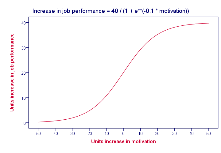
In practice, we often assume linearity at first and then inspect some scatter plots for signs of any non linear relations.
Multiple Regression - Beta Coefficients
The b coefficients are useful for estimating job performance, given the scores on our predictors. However, we can't always use them for comparing the relative strengths of our predictors because they depend on the scales of our predictors.
That is, if we'd use salary in Euros as a predictor, then replacing it by salary in Euro cents would decrease the B coefficient by a factor 100; if a 1 Euro increase in salary corresponds to a 2.3 points increase in job performance, then a one Euro cent increase corresponds to a (2.3 / 100 =) 0.023 points increase. However, you probably sense that changing Euros to Euro cents doesn't make salary a “stronger” predictor.
The solution to this problem is to standardize the criterion and all predictors; we transform them to z-scores. This gives all variables the same scale: the number of standard deviations below or above the variable’ s mean.
If we rerun our regression analysis using these z-scores, we get b coefficients that allow us to compare the relative strengths of the predictors. These standardized regression coefficients are known as the beta coefficients.
Beta coefficients are b coefficients obtained by running regression on standardized variables.
The next figure shows the beta coefficients obtained from our multiple regression analysis.
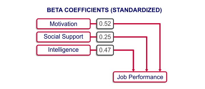
A minor note here is that the aforementioned constant has been left out of the figure. After standardizing all variables, it's always zero because z scores always have a mean of zero by definition.
Multiple Regression - Predicted Values
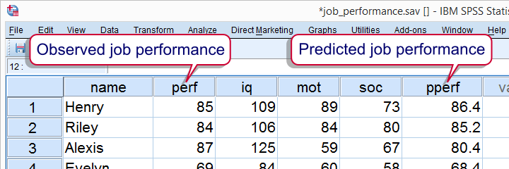
Right, now back to the b coefficients: note that we can use the b coefficients to predict job performance for each respondent. For instance, let's consider the scores of our first respondent, Henry, which are shown below.

For Henry, our regression model states that job performance = (109 x 0.27) + (89 x 0.31) + (73 x 0.16) + 18.1 = 86.8. That is, Henry has a predicted value for job performance of 86.8. This is the job performance score that Henry should have according to our model. However, since our model is just an attempt to approximate reality, the predicted values usually differ somewhat from the actual values in our data. We'll now explore this issue a bit further.
Multiple Regression - R Square
Instead of manually calculating model predicted values for job performance, we can have our software do it for us. After doing so, each respondent will have two job performance scores: the actual score as measured by our test and the value our model comes up with. Part of the result is shown below.
Now, if our model performs well, these two scores should be pretty similar for each respondent. We'll inspect to which extent this is the case by creating a scatterplot as shown below.
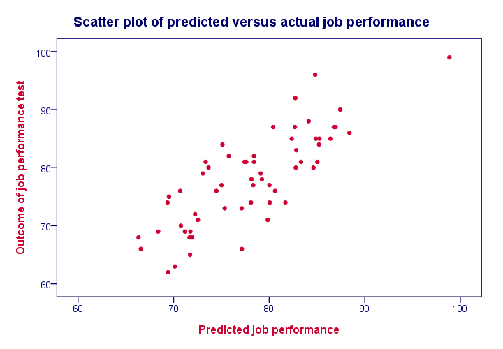
We see a strong linear relation between the actual and predicted values. The strength of such a relation is normally expressed as a correlation. For these data, there is a correlation of 0.81 between the actual and predicted job performance scores. However, we often report the square of this correlation, known as R square, which is 0.65.
R square is the squared (Pearson) correlation between
predicted and actual values.
We're interested in R square because it indicates how well our model is able to predict a variable of interest. An R square value of 0.65 like we found is generally considered very high; our model does a great job indeed!
Multiple Regression - Adjusted R Square
Remember that the b coefficients allow us to predict job performance, given the scores on our predictors. So how does our software come up the b coefficients we reported? Why did it choose 0.31 for motivation instead of, say, 0.21 or 0.41? The basic answer is that it calculates the b coefficients that lead to predicted values that are as close to the actual values as possible. This means that the software calculates the b coefficients that maximize R square for our data.
Now, assuming that our data are a simple random sample from our target population, they'll differ somewhat from the population data due to sampling error. Therefore, optimal b coefficients for our sample are not optimal for our population. This means that we'd also find a somewhat lower R square value if we'd use our regression model on our population.
Adjusted R square is an estimate for the population R square if we'd use our sample regression model on our population.
Adjusted R square gives a more realistic indication of the predictive power of our model whereas R square is overoptimistic. This decrease in R square is known as shrinkage and becomes worse with smaller samples and a larger number of predictors.
Multiple Regression - Final Notes
This tutorial aims to give a quick explanation of multiple regression basics. In practice, however, more issues are involved such as homoscedasticity and multicollinearity. These are beyond the scope of this tutorial but will be given separate tutorials in the near future.