SPSS Mean Centering and Interaction Tool
Also see SPSS Moderation Regression Tutorial.
- Regression with Moderation Effect
- Downloading and Installing the Mean Centering Tool
- Using the Mean Centering Tool
- Mean Centering Tool - Results
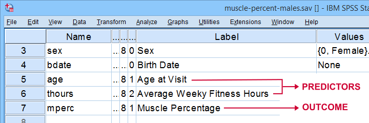
A sports doctor wants to know if and how training and age relate to body muscle percentage. His data on 243 male patients are in muscle-percent-males.sav, part of which is shown below.
Regression with Moderation Effect
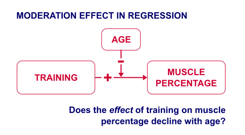
The basic way to go with these data is to run multiple regression with age and training hours as predictors. However, our doctor expects a moderation interaction effect between age and training. Precisely, he believes that the effect of training on muscle percentage diminishes with age. The diagram below illustrates the basic idea.
The moderation effect can be tested by creating a new variable that represents this interaction effect. We'll do just that in 3 steps:
- mean center both predictors: subtract the variable means from all individual scores. This results in centered predictors having zero means.
- compute the interaction predictor as the product of the mean centered predictors;
- run a multiple regression analysis with 3 predictors: the mean centered predictors and the interaction predictor.
Steps 1 and 2 can be done with basic syntax as covered in How to Mean Center Predictors in SPSS? However, we'll present a simple tool below that does these steps for you.
Downloading and Installing the Mean Centering Tool
First off, you need SPSS with the SPSS-Python-Essentials for installing this tool. The tool is downloadable from SPSS_TUTORIALS_MEAN_CENTER.spe.
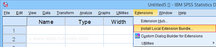
After downloading it, open SPSS and navigate to
![]() as shown below.
as shown below.
For older SPSS versions, try
![]() You may need to run SPSS as an administrator (by right-clicking its desktop shortcut) in order to install any tools.
You may need to run SPSS as an administrator (by right-clicking its desktop shortcut) in order to install any tools.
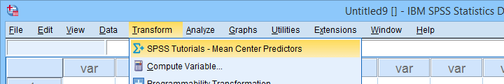
Using the Mean Centering Tool
First open some data such as muscle-percent-males.sav. After installing the mean centering tool, you'll find it in the menu.
This opens a dialog as shown below. Note that string variables don't show up here: these need to be converted to numeric variable before they can be mean centered.
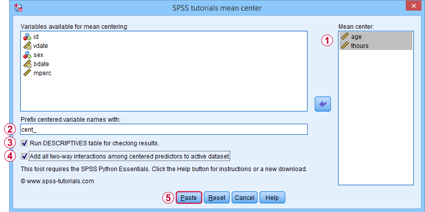
 Variable names for the centered predictors consist of a prefix + the original variable names. In this example, mean centered age and thours will be named cent_age and cent_thours.
 Optionally, create new variables holding all 2-way interaction effects among the centered predictors. For 2 predictors, this results in only 1 interaction predictor.
 Clicking results in the syntax below. Let's run it.
SPSS_TUTORIALS_MEAN_CENTER VARIABLES = "age thours"
/OPTIONS PREFIX = cent_ CHECKTABLE INTERACTIONS.
Mean Centering Tool - Results
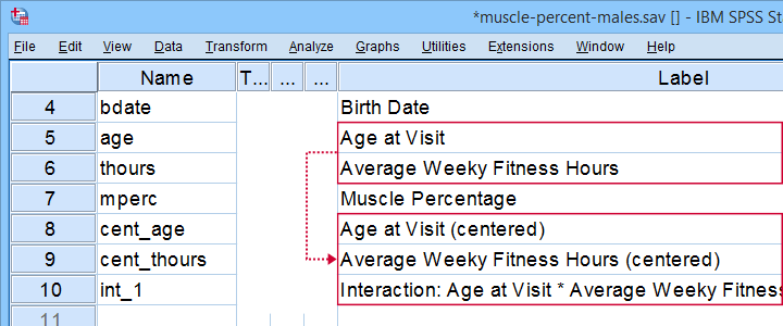
In variable view, note that 3 new variables have been created (and labeled). Precisely these 3 variables should be entered as predictors into our regression model.
If a checktable was requested, you'll find a basic Descriptive Statistics table in the output window.
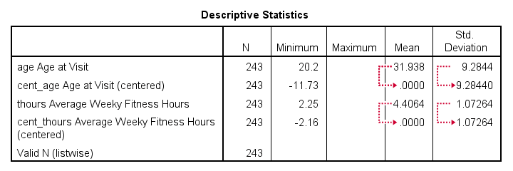
Note that the mean centered predictors have exactly zero means. Their standard deviations, however, are left unaltered by the mean centering -which is precisely how this procedure differs from computing z-scores.
Right, so that'll do for our mean centering tool. We'll cover a regression analysis with a moderation interaction effect in 1 or 2 weeks or so.
Thanks for reading!
SPSS – Create Dummy Variables Tool
Categorical variables can't readily be used as predictors in multiple regression analysis. They must be split up into dichotomous variables known as “dummy variables”. This tutorial offers a simple tool for creating them.
- Example Data File
- Prerequisites and Installation
- Example I - Numeric Categorical Variable
- Example II - Categorical String Variable
Example Data File
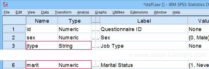
We'll demonstrate our tool on 2 examples: a numeric and a string variable. Both variables are in staff.sav, partly shown below.
We encourage you to download and open this data file in SPSS and replicate the examples we'll present.
Prerequisites and Installation
Our tool requires SPSS version 24 or higher. Also, the SPSS Python 3 essentials must be installed (usually the case with recent SPSS versions).
Next, click SPSS_TUTORIALS_DUMMIFY.spe in order to download our tool. For installing it, navigate to
![]() as shown below.
as shown below.
In the dialog that opens, navigate to the downloaded .spe file and install it. SPSS will then confirm that the extension was successfully installed under
![]()
Example I - Numeric Categorical Variable
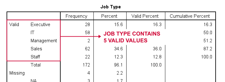
Let's now dummify Marital Status. Before doing so, we recommend you first inspect its basic frequency distribution as shown below.
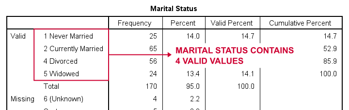
Importantly, note that Marital Status contains 4 valid (non missing) values. As we'll explain later on, we always need to exclude one category, known as the reference category. We'll therefore create 3 dummy variables to represent our 4 categories.
We'll do so by navigating to
![]() as shown below.
as shown below.
Let's now fill out the dialog that pops up.
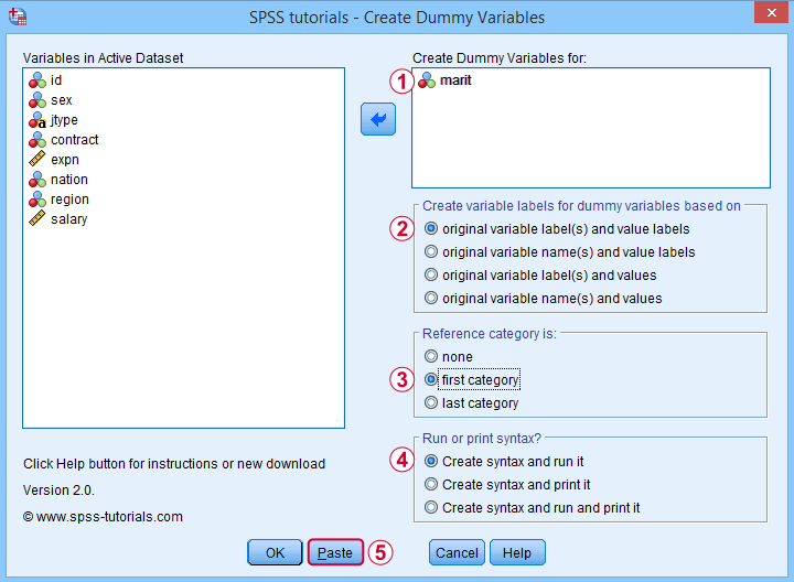
 We choose the first category (“Never Married”) as our reference category. Completing these results in the syntax below. Let's run it.
SPSS TUTORIALS DUMMIFY VARIABLES=marit
/OPTIONS NEWLABELS=LABLAB REFCAT=FIRST ACTION=RUN.
Result
Our tool has now created 3 dummy variables in the active dataset. Let's compare them to the value labels of our original variable, Marital Status.
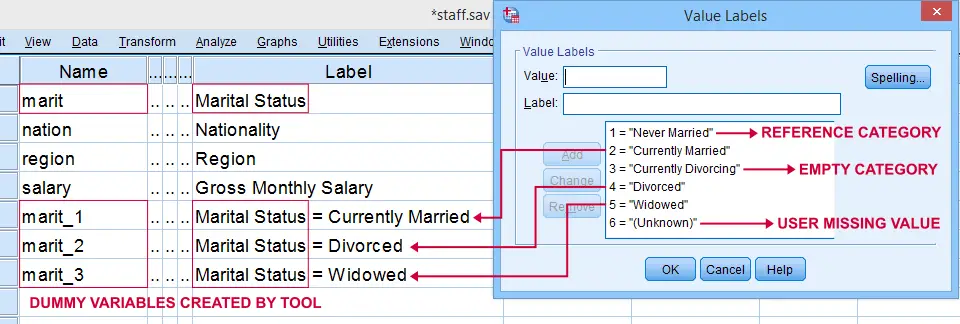
First note that the variable names for our dummy variables are the original variable name plus an integer suffix. These suffixes don't usually correspond to the categories they represent.
Instead, these categories are found in the variable labels for our dummy variables. In this example, they are based on the variable and value labels in Marital Status.
Next, note that some categories were skipped for the following reasons:
- no dummy variable was created for “Never Married” because we chose it as our reference category;
- no dummy variable was created for “Currently Divorcing” because it doesn't actually occur in our dataset;
- no dummy variable was created for “(Unknown)” because it is a user missing value.
Now the big question is:
are these results correct?
An easy way to confirm that they are indeed correct is actually running a dummy variable regression. We'll then run the exact same analysis with a basic ANOVA.
For example, let's try and predict Salary from Marital Status via both methods by running the syntax below.
regression
/dependent salary
/method enter marit_1 to marit_3.
*Compare mean salaries by marital status via ANOVA.
means salary by marit
/statistics anova.
First note that the regression r-square of 0.089 is identical to the eta squared of 0.089 in our ANOVA results. This makes sense because they both indicate the proportion of variance in Salary accounted for by Marital Status.
Also, our ANOVA comes up with a significance level of p = 0.002 just as our regression analysis does. We could even replicate the regression B-coefficients and their confidence intervals via ANOVA (we'll do so in a later tutorial). But for now, let's just conclude that the results are correct.
Example II - Categorical String Variable
Let's now dummify Job Type, a string variable. Again, we'll start off by inspecting its frequencies and we'll probably want to specify some missing values. As discussed in SPSS - Missing Values for String Variables, doing so is cumbersome but the syntax below does the job.
frequencies jtype.
*Change '(Unknown)' into 'NA'.
recode jtype ( '(Unknown)' = 'NA').
*Set empty string value and 'NA' as user missing values.
missing values jtype ('','NA').
*Reinspect basic frequency table.
frequencies jtype.
Result
Again, we'll first navigate to
![]() and we'll fill in the dialog as shown below.
and we'll fill in the dialog as shown below.
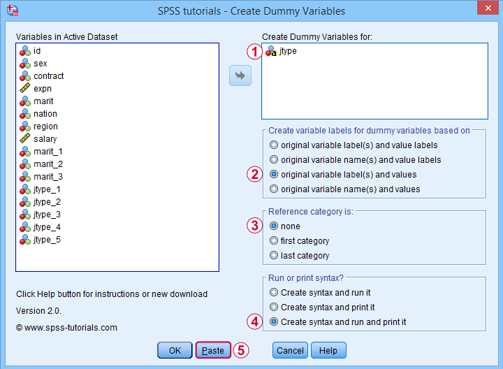
 For string variables, the values themselves usually describe their categories. We therefore throw values (instead of value labels) into the variable labels for our dummy variables.
If we neither want the first nor the last category as reference, we'll select “none”. In this case, we must manually exclude one of these dummy variables from the regression analysis that follows.
 Besides creating dummy variables, we may also want to inspect the syntax that's created and run by the tool. We may also copy, paste, edit and run it from a syntax window instead of having our tool do that for us.
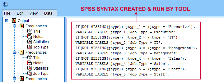
Completing these steps result in the syntax below.
SPSS TUTORIALS DUMMIFY VARIABLES=jtype
/OPTIONS NEWLABELS=LABVAL REFCAT=NONE ACTION=BOTH.
Result
Besides creating 5 dummy variables, our tool also prints the syntax that was used in the output window as shown below.
Finally, if you didn't choose any reference category, you must exclude one of the dummy variables from your regression analysis. The syntax below shows what happens if you don't.
regression
/dependent salary
/method enter jtype_1 jtype_2 jtype_3 jtype_4 jtype_5.
*Compare salaries by Job Type right way: reference category = 4 (sales).
regression
/dependent salary
/method enter jtype_1 jtype_2 jtype_3 jtype_5.
The first example is a textbook illustration of perfect multicollinearity: the score on some predictor can be perfectly predicted from some other predictor(s). This makes sense: a respondent scoring 0 on the first 4 dummies must score 1 on the last (and reversely).
In this situation, B-coefficients can't be estimated. Therefore, SPSS excludes a predictor from the analysis as shown below.
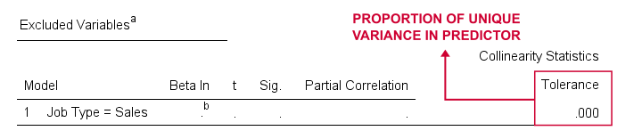
Note that tolerance is the proportion of variance in a predictor that can not be accounted for by other predictors in the model. A tolerance of 0.000 thus means that some predictor can be 100% -or perfectly- predicted from the other predictors.
Thanks for reading!
SPSS Scatterplots & Fit Lines Tool
Contents
- Example Data File
- Prerequisites and Installation
- Example I - Create All Unique Scatterplots
- Example II - Linearity Checks for Predictors
Visualizing your data is the single best thing you can do with it. Doing so may take little effort: a single line FREQUENCIES command in SPSS can create many histograms or bar charts in one go.
Sadly, the situation for scatterplots is different: each of them requires a separate command. We therefore built a tool for creating one, many or all scatterplots among a set of variables, optionally with (non)linear fit lines and regression tables.
Example Data File
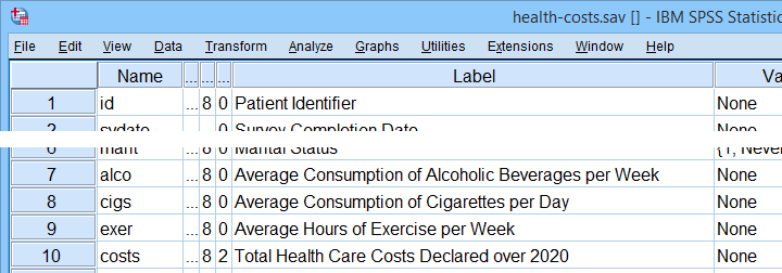
We'll use health-costs.sav (partly shown below) throughout this tutorial.
We encourage you to download and open this file and replicate the examples we'll present in a minute.
Prerequisites and Installation
Our tool requires SPSS version 24 or higher. Also, the SPSS Python 3 essentials must be installed (usually the case with recent SPSS versions).
Clicking SPSS_TUTORIALS_SCATTERS.spe downloads our scatterplots tool. You can install it through
![]() as shown below.
as shown below.
In the dialog that opens, navigate to the downloaded .spe file and install it. SPSS will then confirm that the extension was successfully installed under
![]()
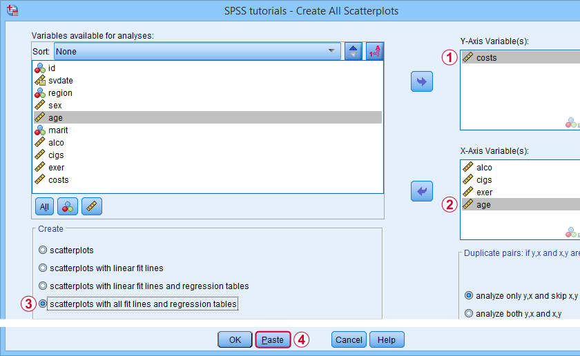
Example I - Create All Unique Scatterplots
Let's now inspect all unique scatterplots among health costs, alcohol and cigarette consumption and exercise. We'll navigate to
![]() and fill out the dialog as shown below.
and fill out the dialog as shown below.
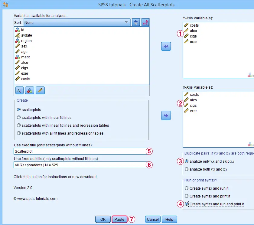
 We enter all relevant variables as y-axis variables. We recommend you always first enter the dependent variable (if any).
We enter these same variables as x-axis variables.
This combination of y-axis and x-axis variables results in duplicate chart. For instance, costs by alco is similar alco by costs transposed. Such duplicates are skipped if “analyze only y,x and skip x,y” is selected.
Besides creating scatterplots, we'll also take a quick look at the SPSS syntax that's generated.
 If no title is entered, our tool applies automatic titles. For this example, the automatic titles were rather lengthy. We therefore override them with a fixed title (“Scatterplot”) for all charts. The only way to have no titles at all is suppressing them with a chart template.
 Clicking results in the syntax below. Let's run it.
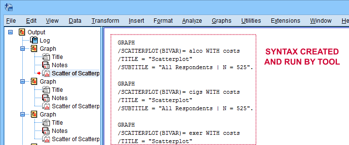
SPSS Scatterplots Tool - Syntax I
SPSS TUTORIALS SCATTERS YVARS=costs alco cigs exer XVARS=costs alco cigs exer
/OPTIONS ANALYSIS=SCATTERS ACTION=BOTH TITLE="Scatterplot" SUBTITLE="All Respondents | N = 525".
Results
First off, note that the GRAPH commands that were run by our tool have also been printed in the output window (shown below). You could copy, paste, edit and run these on any SPSS installation, even if it doesn't have our tool installed.
Beneath this syntax, we find all 6 unique scatterplots. Most of them show substantive correlations and all of them look plausible. However, do note that some plots -especially the first one- hint at some curvilinearity. We'll thoroughly investigate this in our second example.
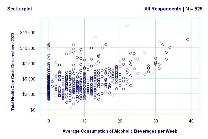
In any case, we feel that a quick look at such scatterplots should always precede an SPSS correlation analysis.
Example II - Linearity Checks for Predictors
I'd now like to run a multiple regression analysis for predicting health costs from several predictors. But before doing so,
let's see if each predictor relates linearly
to our dependent variable. Again, we navigate to
![]() and fill out the dialog as shown below.
and fill out the dialog as shown below.
Our dependent variable is our y-axis variable.
All independent variables are x-axis variables.
We'll create scatterplots with all fit lines and regression tables.
We'll run the syntax below after clicking the button.
SPSS Scatterplots Tool - Syntax II
SPSS TUTORIALS SCATTERS YVARS=costs XVARS=alco cigs exer age
/OPTIONS ANALYSIS=FITALLTABLES ACTION=RUN.
Note that running this syntax triggers some warnings about zero values in some variables. These can safely be ignored for these examples.
Results
In our first scatterplot with regression lines, some curves deviate substantially from linearity as shown below.
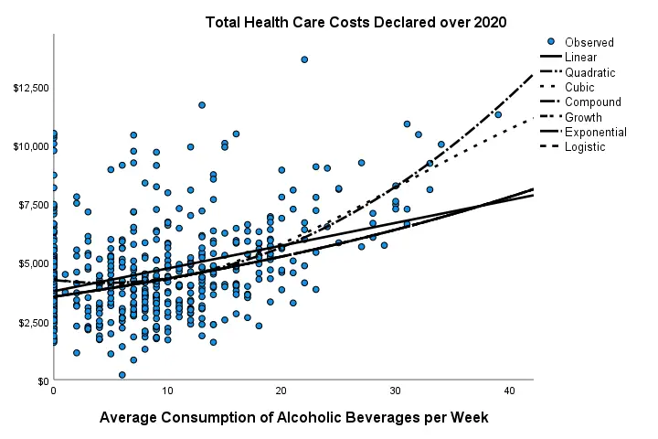
Sadly, this chart's legend doesn't quite help to identify which curve visualizes which transformation function. So let's look at the regression table shown below.
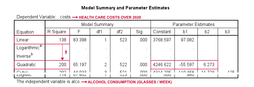
Very interestingly, r-square skyrockets from 0.138 to 0.200 when we add the squared predictor to our model. The b-coefficients tell us that the regression equation for this model is Costs’ = 4,246.22 - 55.597 * alco + 6.273 * alco2 Unfortunately, this table doesn't include significance levels or confidence intervals for these b-coefficients. However, these are easily obtained from a regression analysis after adding the squared predictor to our data. The syntax below does just that.
compute alco2 = alco**2.
*Multiple regression for costs on squared and non squared alcohol consumption.
regression
/statistics r coeff ci(95)
/dependent costs
/method enter alco alco2.
Result
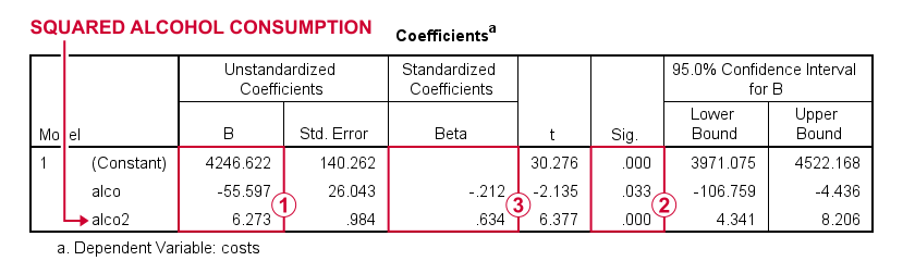
First note that we replicated the exact b-coefficients we saw earlier.
Surprisingly, our squared predictor is more statistically significant than its original, non squared counterpart.
The beta coefficients suggest that the relative strength of the squared predictor is roughly 3 times that of the original predictor.
In short, these results suggest substantial non linearity for at least one predictor. Interestingly, this is not detected by using the standard linearity check: inspecting a scatterplot of standardized residuals versus predicted values after running multiple regression.
But anyway, I just wanted to share the tool I built for these analyses and illustrate it with some typical examples. Hope you found it helpful!
If you've any feedback, we always appreciate if you throw us a comment below.
Thanks for reading!