SPSS OUTPUT MODIFY – Tutorial & Examples
- Boldface Absolute Correlations > 0.5
- Set Decimal Places for Output Tables
- Transpose One or Many Output Tables
- Delete Selection of Output Items
- Set Font Sizes and Styling for Output Tables
- Set Exact Sizes for Charts
All examples require SPSS version 22 or higher. We'll use bank_clean.sav (screenshot below) throughout this entire tutorial.
OUTPUT MODIFY - What and Why?
OUTPUT MODIFY is an SPSS command that edits one or many SPSS output items -mostly tables and charts- by syntax.
OUTPUT MODIFY was introduced in SPSS version 22 and -together with Python- is among the most important time savers in SPSS.
OUTPUT MODIFY is available from the menu -we'll get to that in a minute- but we recommend copy-paste-editing or just typing the syntax.
Alternatives for OUTPUT MODIFY
Prior to OUTPUT MODIFY there were 3 options for editing output items after creating them:
- manually: most properties of output items can be edited after double-clicking them.For some adjustments, this is still the only reasonable way to go. This is better avoided since it is very time consuming and not replicable.
- SPSS scripting: unknown to many users, SPSS includes a scripting language known as SaxBasic which is related to VBA. SPSS scripting has been deprecated in favor of Python introduced in SPSS version 14.
- Python scripting: the most powerful option to edit basically anything in the output viewer may require a steep learning curve. If OUTPUT MODIFY doesn't get it done, Python-scripting probably will.
Instead of using OUTPUT MODIFY, you may also edit output items before creating them:
- Variable formats -set with FORMATS or ALTER TYPE- mostly dictate how statistics show up in output tables.
- You can apply styling to charts by setting a chart template before creating them. Applying chart templates after creating charts -manually, with Python scripting or with OUTPUT MODIFY- is usually less convenient.
- For creating prettier tables, set a tablelook before creating your tables. Again, you can apply table templates after creating tables but that's often less handy.
- OMS can prevent the creation of output items altogether. An example is the often undesired “Case processing summary” table that comes with CROSSTABS.
OUTPUT MODIFY from SPSS’ Menu
Let's first run a quick correlation matrix from the syntax below. Again, we'll use bank_clean.sav throughout this entire tutorial.
factor
/variables q1 to q9
/print correlation.
Let's now try and boldface all absolute correlations > 0.50 by running OUTPUT MODIFY from the menu. Our first option is navigating to
![]() but this is only present when you're in the output viewer window.
but this is only present when you're in the output viewer window.
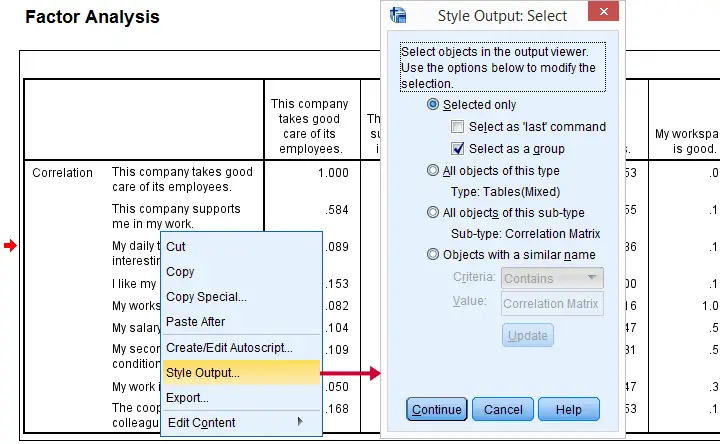
Our second option is to select after right-clicking an output item. In either case, we'll first get the output selection dialog shown below.
You can now make a selection of output items you'd like to modify. Personally, I think there's too many options here and it's unclear to me what they mean. I find it much easier to make my selection in the syntax. Clicking opens the main dialog.
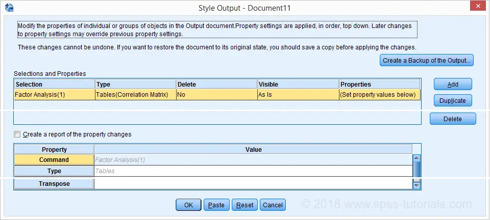
The main OUTPUT MODIFY dialog allows you to specify modifications for elements of your output items. I'll skip the details because -again- I find this easier to do this from syntax. In any case, the best syntax I could paste from the menu is shown below.
OUTPUT MODIFY Example - Pasted from Menu
OUTPUT MODIFY NAME=Document7
/REPORT PRINTREPORT=NO
/SELECT TABLES
/IF COMMANDS=["Factor Analysis(1)"] LABELS=[EXACT("Correlation Matrix")] INSTANCES=[1]
/DELETEOBJECT DELETE=NO
/OBJECTPROPERTIES VISIBLE=ASIS
/TABLECELLS SELECT=[CORRELATION] SELECTDIMENSION=COLUMNS SELECTCONDITION="Abs(x)>=0.5"
STYLE=REGULAR BOLD APPLYTO=CELL.
OUTPUT MODIFY - Syntax Problems
The syntax we just pasted is utter stupidity because it won't work in most situations; NAME=Document7 restricts the command to an output window named “Document7”. That's where my table resides now but probably not tomorrow when I continue working on my project. Let alone when a colleague or client tries to replicate my work. This defeats the whole point of working from syntax in the first place.
Furthermore, the syntax is way too long and complex to write manually but most of it does absolutely nothing. Now, most things in SPSS -including OUTPUT MODIFY- are best done by writing simple, clean syntax. Sadly, this pasted syntax is a very poor example for doing so. This goes for many other commands as well.
Last, "Abs(x) ≥ 0.5" includes the diagonal elements because abs(1.000) > 0.5. What I need is something like "Abs(x) ≥ 0.5 & Abs(x) < 1". I tried to accomplish this from the menu. I failed.
In short, I think
the pasted syntax sucks like hell
and I don't like the OUTPUT MODIFY dialogs either. So let's now study some examples that get things done the right way.
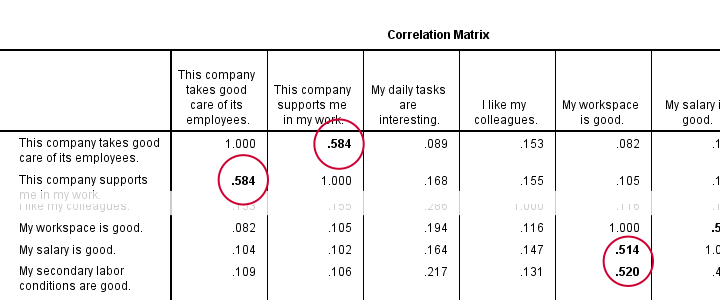
1. Boldface Correlations > 0.5
factor
/variables q1 to q9
/print correlation.
*Boldface absolute correlations > 0.5.
output modify
/select tables
/if commands = ['factor analysis'] subtypes = ['Correlation Matrix']
/tablecells select = [body] selectcondition = ["0.5 < abs(x) < 1"] style = bold.
Result
Notes
For processing all tables in the active output window, just use
OUTPUT MODIFY
/SELECT TABLES...
Optionally, specify some conditions by adding an /IF subcommand as in
OUTPUT MODIFY
/SELECT TABLES
/IF COMMANDS = ['FACTOR ANALYSIS']
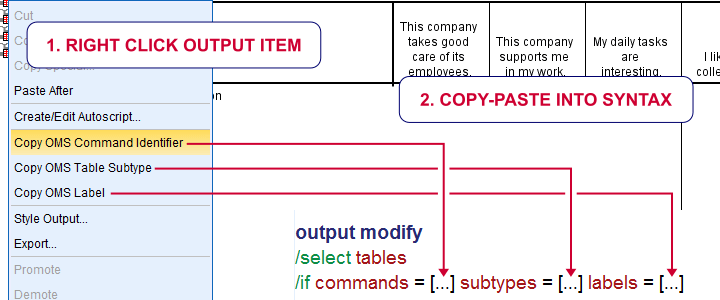
Only tables that satisfy all conditions are processed. Confusingly, COMMANDS does not refer to the commands that created the output -FACTOR in this example.
Instead, COMMANDS refers to the OMS command identifiers which you can copy-paste from the output outline. The same goes for SUBTYPES and LABELS as shown below.
Now, the BODY of our table contains just correlations. If we set some condition, we refer to those as x as in
x > 0.5
So how to style absolute correlations between 0.50 and 1 (exclusive)? The obvious way seems
abs(x) > 0.5 & abs(x) < 1
but it somehow does not work. Instead,
0.5 < abs(x) < 1
does the job. However, it's a rather unusual way to formulate such a condition in SPSS.
Last but not least, OUTPUT MODIFY seems unable to undo the boldfacing exercise. Insofar as I understood, the syntax below should work but it doesn't.
output modify
/select tables
/if commands = ['factor analysis'] subtypes = ['Correlation Matrix']
/tablecells select = [body] selectcondition = ["0.5 < abs(x) < 1"] style = regular.
2. Set Decimal Places Output Tables - Example I
descriptives salary.
*Set format for all cells in last table -whatever that was- to dollar1 (zero decimal places).
output modify
/select tables
/if instances = [last] /*SELECT LAST PIVOT TABLE IN OUTPUT*/
/tablecells select = [body] format = 'dollar1'.
Result

Set Decimal Places Output Tables - Example II
descriptives q1 to q4.
descriptives q5 to q9.
*Set 2 decimal places for columns 4 and 5 for all descriptives tables in output.
output modify
/select tables
/if commands = ['descriptives'] /*SELECT ALL TABLES IN OUTPUT CREATED BY DESCRIPTIVES COMMAND*/
/tablecells select = [position(4) position(5)] selectdimension = columns format = 'f3.2'.
*Note: "[position(4) position(5)] selectdimension = columns" selects columns 4 and 5.
3. Transpose One or Many Output Tables
*Run 2 basic means tables.
means q1 to q4.
means q5 to q9.
*Transpose only last means table but not case processing summary.
output modify
/select tables
/if commands = ['means(last)'] subtypes = ['report'] /* SELECT ONLY "REPORT" (DESCRIPTIVES) TABLE CREATED BY LAST MEANS COMMAND */
/table transpose = yes.
Result
Notes
This example shows how to create much nicer descriptive statistics tables than using DESCRIPTIVES. Using MEANS instead results in a better table format and allows reporting the median as well as skewness and kurtosis without their standard errors. For more on this, see SPSS DESCRIPTIVES - Problems and Fixes.
4. Delete Selection of Output Items
frequencies gender.
descriptives salary.
crosstabs educ by marit.
means salary by gender.
correlations salary with whours.
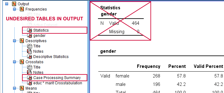
*Delete all unwanted tables: "statistics" for frequencies and "case processing summary" for means and descriptives.
output modify
/select tables
/if subtypes = ['case processing summary','statistics']
/deleteobject delete = yes.
Result
Notes
This example comes in very handy if you need to do some “quick and dirty” reporting to a client who doesn't have SPSS installed. In this case, delete all undesired output and convert the entire output document to PDF. You can do so by creating an OUTPUT EXPORT command from
![]() (only available in the output window).
(only available in the output window).
Alternatively, clean up your output window and convert everything in one go to an .rtf (rich text format, “WORD”) file. Since this'll include all tables and charts, you can use this as a great starting point for your final report.
5. Set Font Size for Output Tables
Note: this works properly for FREQUENCIES, DESCRIPTIVES and CORRELATIONS and only partly for MEANS and CROSSTABS.
frequencies gender.
descriptives salary.
crosstabs educ by marit.
means salary by gender.
correlations salary with whours.
*Set font sizes to 25 points.
output modify
/select tables
/tablecells select = [body,headers,title] fontsize = 25.
Result
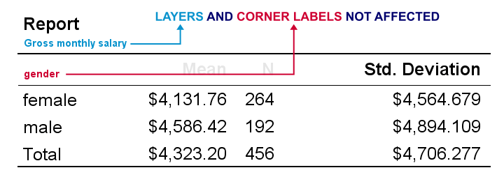
As we see, OUTPUT MODIFY seems unable to modify corner labels and layer dimensions. A workaround is creating a tablelook that sets a font size for all table elements. Next, OUTPUT MODIFY can apply this template to one, many or all output tables as shown below.
output modify
/select tables
/table tlook = "C:\Program Files\IBM\SPSS\Statistics\25\Looks\Original-15pt.stt".
*Shorthand if table template resides in default "Looks" folder (such as "C:\Program Files\IBM\SPSS\Statistics\25\Looks\").
output modify
/select tables
/table tlook = "Original-15pt".
*Don't use table template for any tables in output window.
output modify
/select tables
/table tlook = none.
Keep in mind that CD ignores the TLOOK setting, which is very annoying if your clients must replicate things on their own computers. You'll need to use absolute paths here and adjust those each time you move your project folder.
Alternatively, you can use a shorthand if you put your table templates in the default looks folder (such as C:\Program Files\IBM\SPSS\Statistics\24\Looks). However, that's typically where you don't want to develop, store and backup any project files.
6. Set Exact Size for Charts
frequencies dob
/format notable
/histogram.
*Set chart size to 720 by 300 points (resulted in 964 by 404 points).
output modify
/select charts
/objectproperties size=points(720,300).
Result
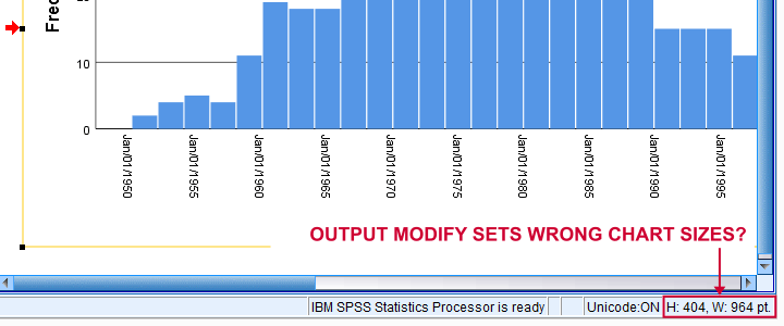
Apparently, OUTPUT MODIFY sets a different chart size than specified. For setting the correct chart sizes, try our SPSS - Set Chart Sizes Tool.
Final Notes
In this tutorial, I tried to cover the most important OUTPUT MODIFY tricks. But I still wonder:
“did I miss anything?”
If you -the reader- have any additional example(s) I should add to this tutorial, please drop me a comment below. Last but not least:
thanks for reading!
SPSS OMS (Output Management System) – Quick Tutorial
SPSS OMS (short for Output Management System) can convert your output to SPSS datasets. As we'll demonstrate in a minute, this can save you huge amounts of time, effort and frustration.
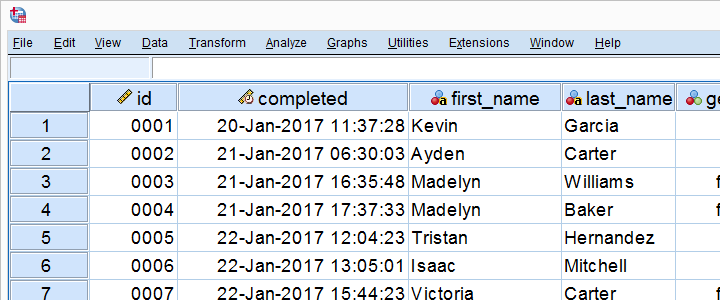
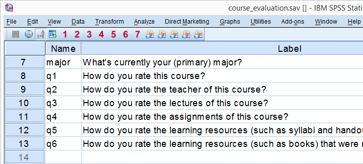
We recommend you follow along by downloading and opening course_evaluation.sav, part of which is shown below.
Today’s Challenge
Some client wants to see charts holding correlations of q2 through q6 with q1 for each study major (psychology, anthropology) separately as shown here. This request -not unusual in market research- typically makes novice SPSS users
- panic,
- run the correlations in SPSS,
- copy/paste everything into Excel sheets and
- generate the charts one by one.
Unknown to many SPSS users, there's a much -much- faster way for getting this job done. It's called OMS.
Step 1: Split File
We'd normally always start with a routine data inspection but that's been done for you in this case. Now, a fast way for just running the desired correlations is by using SPLIT FILE. The syntax below shows how to do so.
sort cases by major.
split file by major.
*2. Show only variable labels in output table.
set tvars labels.
*3. Create correlation table.
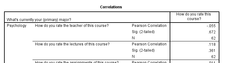
correlations q2 to q6 with q1.
Result
Step 2: OMS Control Panel
Right, we created our correlations but they're in our output viewer window. We can't create charts from tables in our output window so we need this correlation table in data view instead.
We'll do just that by navigating to ![]() which is shown below.
which is shown below.
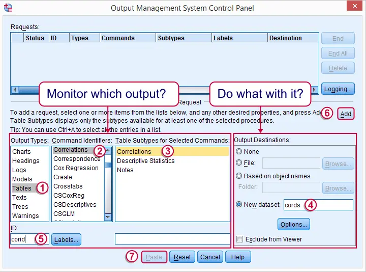
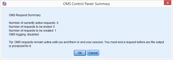
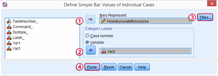
We'll follow the steps in the screenshot: we select our correlation table in the left half of the dialog.
 It's a best practice to always specify an here. In this case, “corid” is short for “correlation id”
 We then select in the right half of the dialog. “cords” is short for “correlation dataset”.
Clicking triggers a popup dialog confirming our OMS request. Just ignore it.
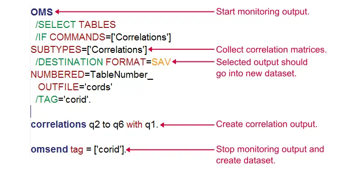
Clicking then generates the first block of the syntax below. We then (manually) added two lines to it.
SPSS OMS Syntax Example
DATASET DECLARE cords.
OMS
/SELECT TABLES
/IF COMMANDS=['Correlations']
SUBTYPES=['Correlations']
/DESTINATION FORMAT=SAV
NUMBERED=TableNumber_
OUTFILE='cords'
/TAG='corid'.
*2. (Manually added) correlations command.
correlations q2 to q6 with q1.
*3. (Manually added) omsend command.
omsend tag = ['corid'].
SPSS OMS Syntax - How Does It Work?
The next figure explains how our syntax basically works. In a nutshell,
- the OMS command has SPSS monitor selected output following it so
- our correlation table is captured by the OMS.
- OMSEND then stops SPSS from monitoring output and create our desired correlations dataset.
Result
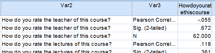
We now have our correlation matrix in an SPSS dataset, which allows us to run charts on it. We'll prepare these data a tiny bit before doing so with the syntax below.
dataset activate cords.
*2. Delete all rows that don't hold correlations.
select if char.index(var3,'Pearson') > 0.
execute.
*3. Split file by var1 (= study major).
sort cases by var1 howdoyouratethiscourse.
split file by var1.
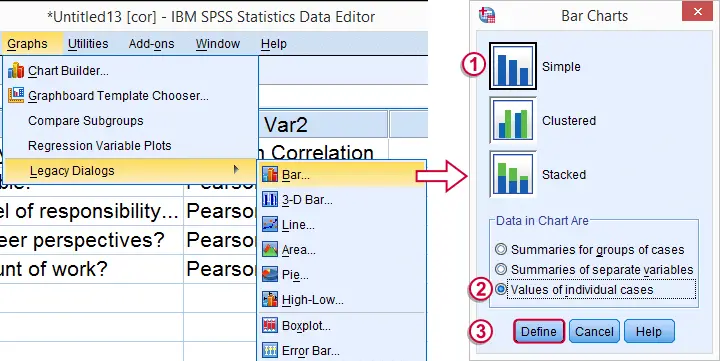
Step 3: Creating Our Charts
We'll now create our desired charts by following the figure below. Since we're using SPLIT FILE, we need only one single command for creating all charts at once.
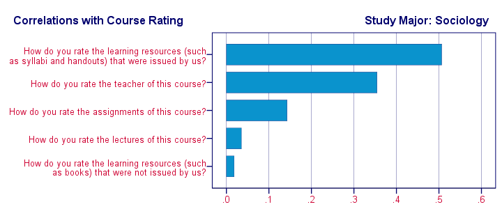
 In the second dialog (below), choose a nice main title for your charts. We decided upon “Correlations with Course Rating”.
Following these steps results in the syntax below. Running it generates all desired charts.
SPSS Bar Chart Syntax Example
GRAPH /BAR(SIMPLE)=VALUE(Howdoyouratethiscourse) BY Var2/title 'Correlations with Course Rating'.
Step 4: Prettifying our Charts
We now have the charts we wanted. A nice trick to make them look great with little effort is creating a chart template for them.
We double click just one of our charts and transpose it as shown below.
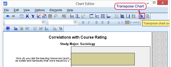
Next, we change the colors, fonts, layout, everything in our first chart until it looks nice. Then navigate to ![]() as explained in SPSS chart templates.
as explained in SPSS chart templates.
SPSS - Creating Pretty Charts
Finally, we activate the chart template we just created (step 3 below, first set path to .sgt file correctly). We then rerun the GRAPH command we pasted and ran previously and - there you go - five pretty charts in a split second.
If you ever get a similar request for different data, you can now rerun your syntax on it and you'll be done in seconds. As a bonus, you can probably (edit and) reuse your chart template other bar charts too.
Final Syntax Using Chart Template
variable labels var1 "Study Major".
*2. Suppress excessive decimal places.
formats howdoyouratethiscourse (f1).
*3. Activate newly created chart template (set path appropriately).
set ctemplate 'my-project-folder\my-template.sgt'.
*4. Rerun all graphs at once with chart template.
GRAPH /BAR(SIMPLE)=VALUE(Howdoyouratethiscourse) BY Var2/title 'Correlations with Course Rating'.
*5. Switch off chart template for any future graphs.
set ctemplate none.
Final Result
Final Notes
SPSS OMS can be a tremendous time saver. Today's tutorial redirected a single correlation table to an SPSS dataset but you can very easily create a single dataset holding output from 1,000 or more output tables. In fact, we did just that in the simulation studies we presented when explaining the basic idea behind ANOVA, regression and the chi-square test. In these studies we basically
- used one OMS command for capturing all ANOVA tables,
- ran ANOVA on 1,000 random samples from a population data file,
- ran OMSEND for creating a dataset with 1,000 F-values and
- created a histogram for visualizing our sampling distribution.
As we see, SPSS OMS opens up a lot of possibilities. We hope it'll help you save time and effort as well!