SPSS – Kendall’s Concordance Coefficient W
Kendall’s Concordance Coefficient W is a number between 0 and 1
that indicates interrater agreement.
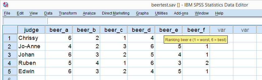
So let's say we had 5 people rank 6 different beers as shown below. We obviously want to know which beer is best, right? But could we also quantify how much these raters agree with each other? Kendall’s W does just that.
Kendall’s W - Example
So let's take a really good look at our beer test results. The data -shown above- are in beertest.sav. For answering which beer was rated best, a Friedman test would be appropriate because our rankings are ordinal variables. A second question, however, is to what extent do all 5 judges agree on their beer rankings? If our judges don't agree at all which beers were best, then we can't possibly take their conclusions very seriously. Now, we could say that “our judges agreed to a large extent” but we'd like to be more precise and express the level of agreement in a single number. This number is known as Kendall’s Coefficient of Concordance W.2,3
Kendall’s W - Basic Idea
Let's consider the 2 hypothetical situations depicted below: perfect agreement and perfect disagreement among our raters. I invite you to stare at it and think for a minute.
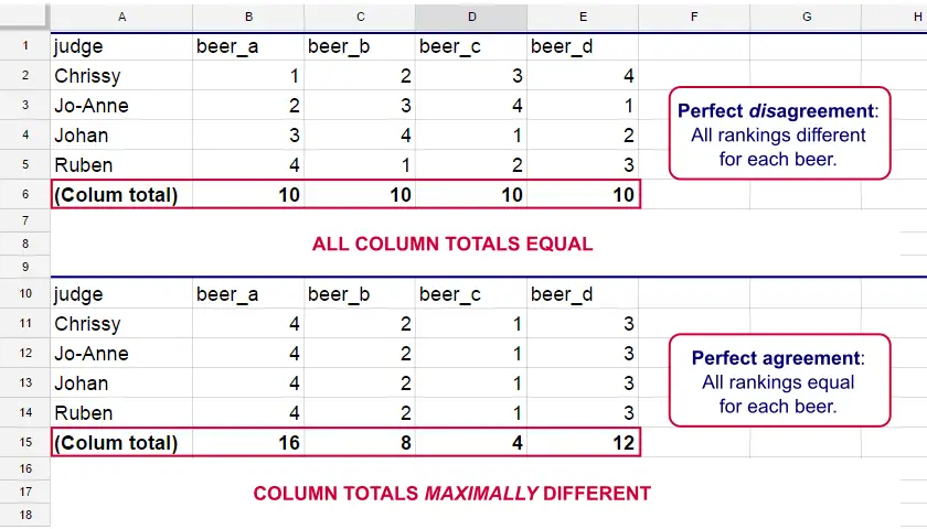
As we see, the extent to which raters agree is indicated by the extent to which the column totals differ. We can express the extent to which numbers differ as a number: the variance or standard deviation.
Kendall’s W is defined as
$$W = \frac{Variance\,over\,column\,totals}{Maximum\,possible\,variance\,over\,column\,totals}$$
As a result, Kendall’s W is always between 0 and 1. For instance, our perfect disagreement example has W = 0; because all column totals are equal, their variance is zero.
Our perfect agreement example has W = 1 because the variance among column totals is equal to the maximal possible variance. No matter how you rearrange the rankings, you can't possibly increase this variance any further. Don't believe me? Give it a go then.
So what about our actual beer data? We'll quickly find out with SPSS.
Kendall’s W in SPSS
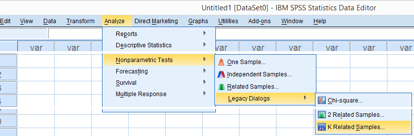
We'll get Kendall’s W from SPSS’ menu. The screenshots below walk you through.
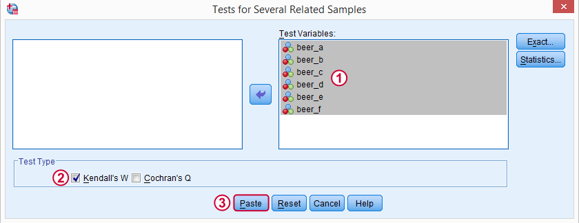
Note: SPSS thinks our rankings are nominal variables. This is because they contain few distinct values. Fortunately, this won't interfere with the current analysis. Completing these steps results in the syntax below.
Kendall’s W - Basic Syntax
NPAR TESTS
/KENDALL=beer_a beer_b beer_c beer_d beer_e beer_f
/MISSING LISTWISE.
Kendall’s W - Output
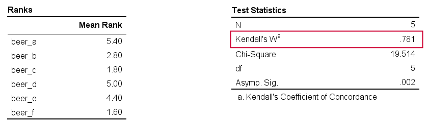
And there we have it: Kendall’s W = 0.78. Our beer judges agree with each other to a reasonable but not super high extent. Note that we also get a table with the (column) mean ranks that tells us which beer was rated most favorably.
Average Spearman Correlation over Judges
Another measure of concordance is the average over all possible Spearman correlations among all judges.1 It can be calculated from Kendall’s W with the following formula
$$\overline{R}_s = {kW - 1 \over k - 1}$$
where \(\overline{R}_s\) denotes the average Spearman correlation and \(k\) the number of judges.
For our example, this comes down to
$$\overline{R}_s = {5(0.781) - 1 \over 5 - 1} = 0.726$$
We'll verify this by running and averaging all possible Spearman correlations in SPSS. We'll leave that for a next tutorial, however, as doing so properly requires some highly unusual -but interesting- syntax.
Thank you for reading!
References
- Howell, D.C. (2002). Statistical Methods for Psychology (5th ed.). Pacific Grove CA: Duxbury.
- Slotboom, A. (1987). Statistiek in woorden [Statistics in words]. Groningen: Wolters-Noordhoff.
- Van den Brink, W.P. & Koele, P. (2002). Statistiek, deel 3 [Statistics, part 3]. Amsterdam: Boom.
Kendall’s Tau in SPSS – 2 Easy Options
- Example Data File
- Kendall’s Tau-B from Correlations Menu
- Kendall’s Tau-B & Tau-C from Crosstabs
- Wrong Significance Levels for Small Samples
Example Data File
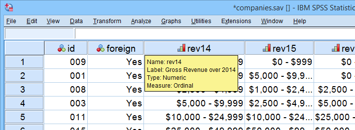
A survey among company owners included the question “what was your yearly revenue?” for several years. The data -partly shown below- are in companies.sav.
Our main research question for today is
to what extent are yearly revenues interrelated?
Are the best performing companies in 2014 the same as in 2015 and other years? Or do we have entirely different “winners” from year to year?
If we had the exact yearly revenues, we could have gone for Pearson correlation among years and perhaps proceed with some regression analyses.
However, our data contain only revenue categories and these are ordinal variables. This leaves us with 2 options: we can inspect either
Although both statistics are appropriate, we'll go for Kendall’s tau: its standard error and sampling distribution are better known and the latter converges to a normal distribution faster.
Filtering Out Domestic Companies.
We'll restrict our analyses to foreign companies by using a FILTER. Since this variable only contains 1 (foreign) and 0 (domestic), a single line of syntax is all we need.
filter by foreign.
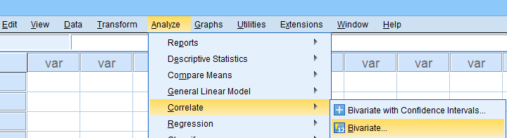
Kendall’s Tau-B from Correlations Menu
The easiest option for Kendalls tau-b is the correlations menu as shown below.
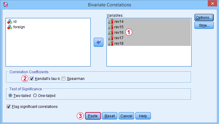
 Move all relevant variables into the variables box,
 select Kendall’s tau-b and
 clicking results in the syntax below. Let's run it.
NONPAR CORR
/VARIABLES=rev14 rev15 rev16 rev17 rev18
/PRINT=KENDALL TWOTAIL NOSIG
/MISSING=PAIRWISE.
*Short syntax, identical results.
nonpar corr rev14 to rev18
/print kendall nosig.
Result
SPSS creates a full correlation matrix, part of which is shown below.
Note that most Kendall correlations are (very) high. This means that
companies that perform well in one year
typically perform well in other years too.
Despite our minimal sample size, many Kendall correlations are statistically significant. The p-values are identical to those obtained from rerunning the analysis in JASP.
Kendall’s Tau-B and Tau-C from Crosstabs
An alternative method for obtaining Kendalls tau from SPSS is from CROSSTABS. We only recommend this if
- you're going to run CROSSTABS anyway -probably for obtaining chi-square tests;
- you need Kendall’s tau-c instead of tau-b;
In such cases, you could access the Crosstabs dialog as shown below.
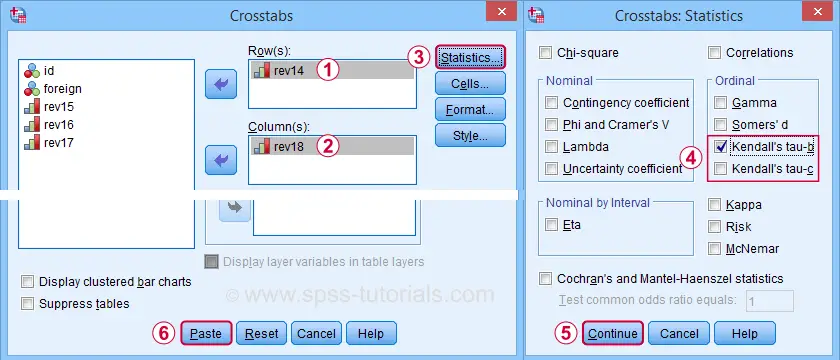
A lot of useful association measures -including Cramér’s V and eta squared- are found under Statistics.
 Select either Kendall’s tau-b and/or tau-c -although the latter is rarely reported.
 Clicking results in the syntax below.
CROSSTABS
/TABLES=rev14 BY rev18
/FORMAT=AVALUE TABLES
/STATISTICS=BTAU
/CELLS=COUNT
/COUNT ROUND CELL.
*Short syntax, identical results.
crosstabs rev14 by rev18
/statistics btau.
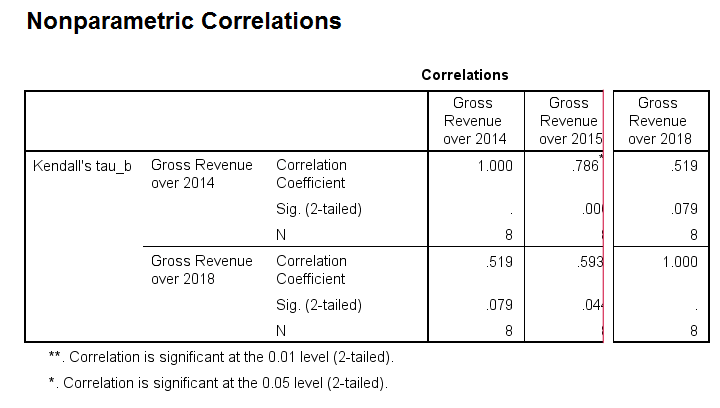
Wrong Significance Levels for Small Samples
Although Kendall’s tau obtained from CROSSTABS is correct, some of the other results are awkward at best.
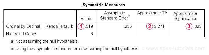
Kendall’s tau-b is identical to that obtained from the correlations dialog;
The Approximate T is a z-value rather than a t-value: it's approximately normally distributed but only for reasonable sample sizes. It cannot be used for the small sample size used in this example.
As a result, the Approximate Significance is wildly off:
SPSS comes up with p = 0.079 for the exact same data
when using the correlations dialog. This is the exact p-value that should be used for small sample sizes.
“Officially”, the approximate significance may be used for N > 10 but perhaps it's better avoided if N < 20 or so. In such cases, it may be wiser to run Kendall’s tau from the Correlations dialog than from Crosstabs.
Thanks for reading.
Kendall’s Tau – Simple Introduction
Kendall’s Tau is a number between -1 and +1
that indicates to what extent 2 variables are monotonously related.
- Kendall’s Tau - Formulas
- Kendall’s Tau - Exact Significance
- Kendall’s Tau - Confidence Intervals
- Kendall’s Tau versus Spearman Correlation
- Kendall’s Tau - Interpretation
Kendall’s Tau - What is It?
Kendall’s Tau is a correlation suitable for quantitative and ordinal variables. It indicates how strongly 2 variables are monotonously related:
to which extent are high values on variable x are associated with
either high or low values on variable y?
Like so, Kendall’s Tau serves the exact same purpose as the Spearman rank correlation. The reasoning behind the 2 measures, however, is different. Let's take a look at the example data shown below.
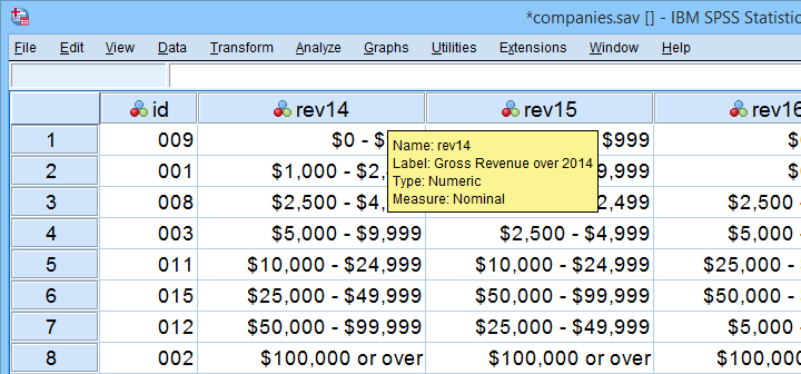
These data show yearly revenues over the years 2014 through 2018 for several companies. We'd like to know to what extent companies that did well in 2014 also did well in 2015. Note that we only have revenue categories and these are ordinal variables: we can rank them but we can't compute means, standard deviations or correlations over them.
Kendall’s Tau - Intersections Method
If we rank both years, we can inspect to what extent these ranks are different. A first step is to connect the 2014 and the 2015 ranks with lines as shown below.
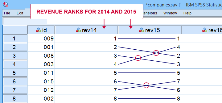
Our connection lines show 3 intersections. These are caused by the 2014 and 2015 rankings being slightly different. Note that the more the ranks differ, the more intersections we see:
- if 2 rankings are identical, we have zero intersections and
- if 2 rankings are exactly opposite, the number of intersections is
$$0.5\cdot n(n - 1)$$
This is the maximum number of intersections for \(n\) observations. Dividing the actual number of intersections by the maximum number of intersections is the basis for Kendall’s tau, denoted by \(\tau\) below.
$$\tau = 1 - \frac{2\cdot I}{0.5\cdot n(n - 1)}$$
where \(I\) is the number of intersections. For our example data with 3 intersections and 8 observations, this results in
$$\tau = 1 - \frac{2\cdot 3}{0.5\cdot 8(8 - 1)} =$$
$$\tau = 1 - \frac{6}{28} \approx 0.786$$
Since \(\tau\) runs from -1 to +1, \(\tau\) = 0.786 indicates a strong positive relation: higher revenue ranks in 2014 are associated with higher ranks in 2015.
Kendall’s Tau - Concordance Method
A second method to find Kendall’s Tau is to inspect all unique pairs of observations. We did so in this Googlesheet shown below.
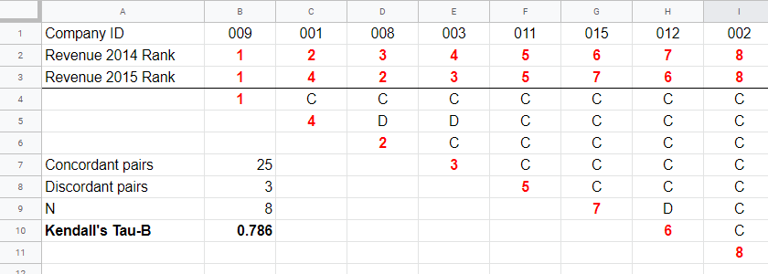
Starting at row 4, each 2015 rank is compared to all 2014 ranks to its right. If these are higher, we have concordant pairs of observations denoted by C. These indicate a positive relation.
However, 2015 ranks having larger 2014 ranks to their right indicate discordant pairs denoted by D. For instance, cell D5 is discordant because the 2014 rank (3) is smaller than the 2015 rank of 4. Discordant pairs indicate a negative relation.
Finally, Kendall’s Tau can be computed from the numbers of concordant and discordant pairs with
$$\tau = \frac{n_c - n_d}{0.5\cdot n(n - 1)}$$
for our example with 3 discordant and 25 concordant pairs in 8 observations, this results in
$$\tau = \frac{25 - 3}{0.5\cdot 8(8 - 1)} = $$
$$\tau = \frac{22}{28} \approx 0.786.$$
Note that C and D add up to the number of unique pairs of observations, \(0.5\cdot n(n - 1)\) which results 28 in our example. Keeping this in mind, you may see that
- \(\tau\) = -1 if all pairs are discordant;
- \(\tau\) = 0 if the numbers of concordant and discordant pairs are equal and
- \(\tau\) = 1 if all pairs are concordant.
Kendall’s Tau-B & Tau-C
Our first method for computing Kendall’s Tau only works if each company falls into a different revenue category. This holds for the 2014 and 2015 data. For 2017 and 2018, however, some companies fall into the same revenue categories. These variables are said to contain ties. Two modified formulas are used for this scenario:
- Kendall’s tau-b corrects for ties and
- Kendall’s tau-c ignores ties.
Simply “Kendall’s Tau” usually refers Kendall’s Tau-b. We won't discuss Kendall’s Tau-c as it's not often used anymore. In the absence of ties, both formulas yield identical results.
Kendall’s Tau - Formulas
So how could we deal with ties? First off, mean ranks are assigned to tied observations as in this Googlesheet shown below: companies 009 and 001 share the two lowest 2016 ranks so they are both ranked the mean of ranks 1 and 2, resulting in 1.5.
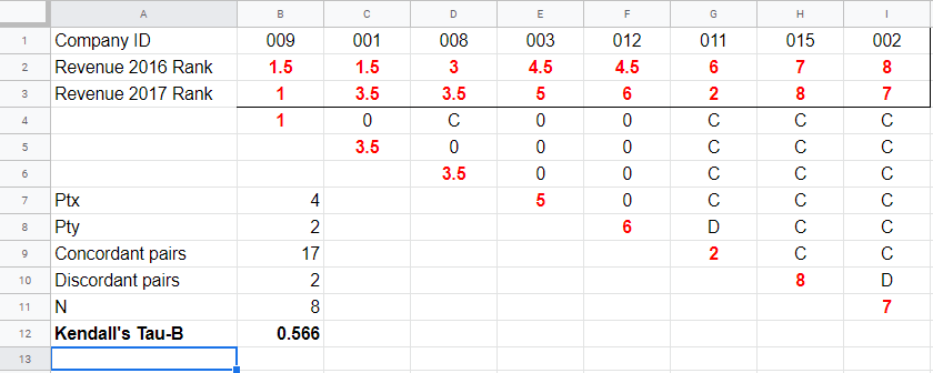
Second, pairs associated with tied 2016 observations are neither concordant nor discordant. Such pairs (columns B,C and E,F) receive a 0 rather than a C or a D. Third, 2017 ranks that have a 2017 tie to their right are also assigned 0. Like so, the 28 pairs in the example above result in
- 17 concordant pairs (C),
- 2 discordant pairs (D) and
- 9 inconclusive pairs (0).
For computing \(\tau_b\), ties on either variable result in a penalty computed as
$$Pt = \Sigma{(t_i^2 - t_i)}$$
where \(t_i\) denotes the length of the \(i\)th tie for either variable. The 2016 ranks have 2 ties -both of length 2- resulting in
$$Pt_{2016} = (2^2 - 2) + (2^2 - 2) = 4$$
Similarly,
$$Pt_{2017} = (2^2 - 2) = 2$$
Finally, \(\tau_b\) is computed with
$$\tau_b = \frac{2\cdot (C - D)}{\sqrt{n(n - 1) - Pt_x}\sqrt{n(n - 1) - Pt_y}}$$
For our example, this results in
$$\tau_b = \frac{2\cdot (17 - 2)}{\sqrt{8(8 - 1) - 4}\sqrt{8(8 - 1) - 2}} =$$
$$\tau_b = \frac{30}{\sqrt{52}\sqrt{54}} \approx 0.566$$
Kendall’s Tau - Exact Significance
For small sample sizes of N ≤ 10, the exact significance level for \(\tau_b\) can be computed with a permutation test. The table below gives critical values for α = 0.05 and α = 0.01.
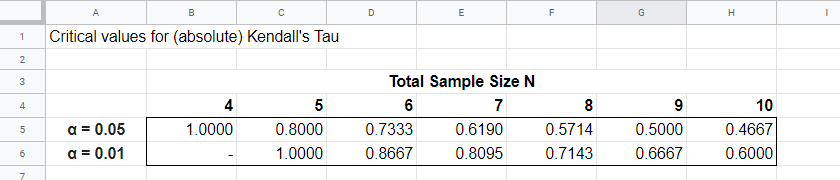
Our example calculation without ties resulted in \(\tau_b\) = 0.786 for 8 observations. Since \(|\tau_b|\) > 0.7143, p < 0.01: we reject the null hypothesis that \(\tau_b\) = 0 in the entire population. Basic conclusion: revenues over 2014 and 2015 are likely to have a positive monotonous relation in the entire population of companies.
The second example (with ties) resulted in \(\tau_b\) = 0.566 for 8 observations. Since \(|\tau_b|\) < 0.5714, p > 0.05. We retain the null hypothesis: our sample outcome is not unlikely if revenues over 2016 and 2017 are not monotonously related in the entire population.
Kendall’s Tau-B - Asymptotic Significance
For sample sizes of N > 10,
$$z = \frac{3\tau_b\sqrt{n(n - 1)}}{\sqrt{2(2n + 5)}}$$
roughly follows a standard normal distribution. For example, if \(\tau_b\) = 0.500 based on N = 12 observations,
$$z = \frac{3\cdot 0.500 \sqrt{12(11)}}{\sqrt{2(24 + 5)}} \approx 2.263$$
We can easily look up that \(p(|z| \gt 2.263) \approx 0.024\): we reject the null hypothesis that \(\tau_b\) = 0 in the population at α = 0.05 but not at α = 0.01.
Kendall’s Tau - Confidence Intervals
Confidence intervals for \(\tau_b\) are easily obtained from JASP. The screenshot below shows an output example.
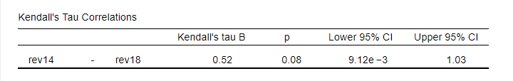
We presume that these confidence intervals require sample sizes of N > 10 but we couldn't find any reference on this.
Kendall’s Tau versus Spearman Correlation
Kendall’s Tau serves the exact same purpose as the Spearman rank correlation: both indicate to which extent 2 ordinal or quantitative variables are monotonously related. So which is better? Some general guidelines are that
- the statistical properties -sampling distribution and standard error- are better known for Kendall’s Tau than for Spearman-correlations. Kendall’s Tau also converges to a normal distribution faster (that is, for smaller sample sizes). The consequence is that significance levels and confidence intervals for Kendall’s Tau tend to be more reliable than for Spearman correlations.
- absolute values for Kendall’s Tau tend to be smaller than for Spearman correlations: when both are calculated on the same data, we typically see something like \(|\tau_b| \approx 0.7\cdot |R_s|\).
- Kendall’s Tau typically has smaller standard errors than Spearman correlations. Combined with the previous point, the significance levels for Kendall’s Tau tend to be roughly equal to those for Spearman correlations.
In order to illustrate point 2, we computed Kendall’s Tau and Spearman correlations on 8 simulated variables, v1 through v8. The colors shown below are linearly related to the absolute values.
For basically all cells, the second line (Spearman correlation) is darker, indicating a larger absolute value. Also, \(|\tau_b| \approx 0.7\cdot |R_s|\) seems a rough but reasonable rule of thumb for most cells.
The significance levels for the same variables are shown below.
These colors show no clear pattern: sometimes Kendall’s Tau is “more significant” than Spearman’s rho and sometimes the reverse is true. Also note that the significance levels tend to be more similar than the actual correlations. Sadly, the positive skewness of these p-values results in limited dispersion among the colors.
Kendall’s Tau - Interpretation
- \(\tau_b\) = -1 indicates a perfect negative monotonous relation among 2 variables: a lower score on variable A is always associated with a higher score on variable B;
- \(\tau_b\) = 0 indicates no monotonous relation at all;
- \(\tau_b\) = 1 indicates a perfect positive monotonous relation: a lower score on variable A is always associated with a lower score on variable B.
The values of -1 and +1 can only be attained if both variables have equal numbers of distinct ranks, resulting in a square contingency table.
Furthermore, if 2 variables are independent, \(\tau_b\) = 0 but the reverse does not always hold: a curvilinear or other non monotonous relation may still exist.
We didn't find any rules of thumb for interpreting \(\tau_b\) as an effect size so we'll propose some:
- \(|\tau_b|\) = 0.07 indicates a weak association;
- \(|\tau_b|\) = 0.21 indicates a medium association;
- \(|\tau_b|\) = 0.35 indicates a strong association.
Kendall’s Tau-B in SPSS
The simplest option for obtaining Kendall’s Tau from SPSS is from the correlations dialog as shown below.
Alternatively (and faster), use simplified syntax such as
nonpar corr rev14 to rev18
/print kendall nosig.
Thanks for reading!
Creating APA Style Correlation Tables in SPSS
Introduction & Practice Data File
When running correlations in SPSS, we get the p-values as well. In some cases, we don't want that: if our data hold an entire population, such p-values are actually nonsensical. For some stupid reason, we can't get correlations without significance levels from the correlations dialog. However, this tutorial shows 2 ways for getting them anyway. We'll use adolescents-clean.sav throughout.
 Correlation Table as Recommended by the APA
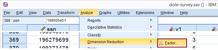
Option 1: FACTOR
A reasonable option is navigating to
![]()
![]() as shown below.
as shown below.
Next, we'll move iq through wellb into the variables box and follow the steps outlines in the next screenshot.
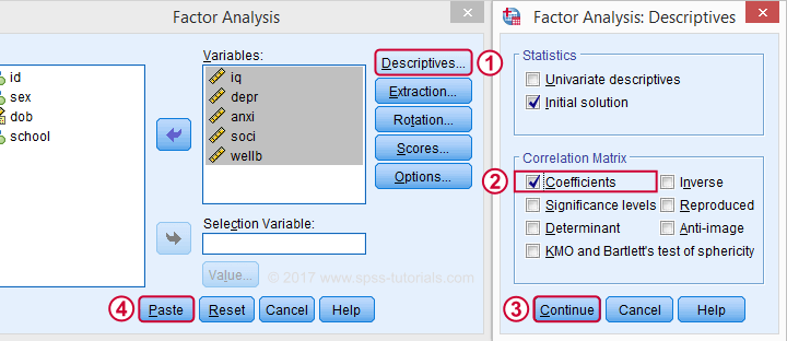
Clicking results in the syntax below. It'll create a correlation matrix without significance levels or sample sizes. Note that FACTOR uses listwise deletion of missing values by default but we can easily change this to pairwise deletion. Also, we can shorten the syntax quite a bit in case we need more than one correlation matrix.
Correlation Matrix from FACTOR Syntax
FACTOR
/VARIABLES iq depr anxi soci wellb
/MISSING pairwise /* WATCH OUT HERE: DEFAULT IS LISTWISE! */
/ANALYSIS iq depr anxi soci wellb
/PRINT CORRELATION EXTRACTION
/CRITERIA MINEIGEN(1) ITERATE(25)
/EXTRACTION PC
/ROTATION NOROTATE
/METHOD=CORRELATION.
*Can be shortened to...
factor
/variables iq to wellb
/missing pairwise
/print correlation.
*...or even...
factor
/variables iq to wellb
/print correlation.
*but this last version uses listwise deletion of missing values.
Result
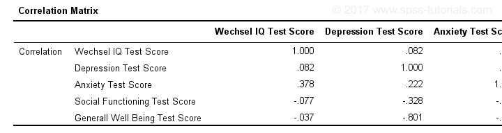
When using pairwise deletion, we no longer see the sample sizes used for each correlation. We may not want those in our table but perhaps we'd like to say something about them in our table title.
More importantly, we've no idea which correlations are statistically significant and which aren't. Our second approach deals nicely with both issues.
Option 2: Adjust Default Correlation Table
The fastest way to create correlations is simply running correlations iq to wellb. However, we sometimes want to have statistically significant correlations flagged. We'll do so by adding just one line.
correlations iq to wellb
/print nosig.
This results in a standard correlation matrix with all sample sizes and p-values. However, we'll now make everything except the actual correlations invisible.
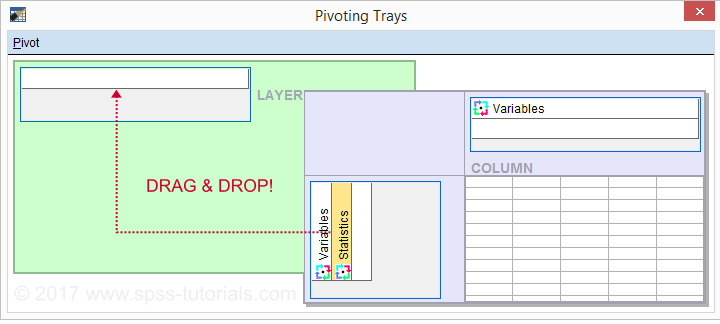
Adjusting Our Pivot Table Structure
We first right-click our correlation table and navigate to
![]() as shown below.
as shown below.
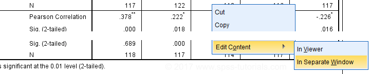
Select from the menu.
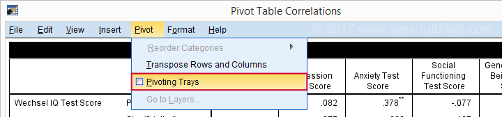
Drag and drop the Statistics (row) dimension into the LAYER area and close the pivot editor.
Result
Same Results Faster?
If you like the final result, you may wonder if there's a faster way to accomplish it. Well, there is: the Python syntax below makes the adjustment on all pivot tables in your output. So make sure there's only correlation tables in your output before running it. It may crash otherwise.
begin program.
import SpssClient
SpssClient.StartClient()
oDoc = SpssClient.GetDesignatedOutputDoc()
oItems = oDoc.GetOutputItems()
for index in range(oItems.Size()):
oItem = oItems.GetItemAt(oItems.Size() - index - 1)
if oItem.GetType() == SpssClient.OutputItemType.PIVOT:
pTable = oItem.GetSpecificType()
pManager = pTable.PivotManager()
nRows = pManager.GetNumRowDimensions()
rDim = pManager.GetRowDimension(0)
rDim.MoveToLayer(0)
SpssClient.StopClient()
end program.
Well, that's it. Hope you liked this tutorial and my script -I actually run it from my toolbar pretty often.
Thanks for reading!
Spearman Rank Correlations – Simple Tutorial
A Spearman rank correlation is a number between -1 and +1 that indicates to what extent 2 variables are monotonously related.
- Spearman Correlation - Example
- Spearman Rank Correlation - Basic Properties
- Spearman Rank Correlation - Assumptions
- Spearman Correlation - Formulas and Calculation
- Spearman Rank Correlation - Software
Spearman Correlation - Example
A sample of 1,000 companies were asked about their number of employees and their revenue over 2018. For making these questions easier, they were offered answer categories. After completing the data collection, the contingency table below shows the results.
The question we'd like to answer is is company size related to revenue? A good look at our contingency table shows the obvious: companies having more employees typically make more revenue. But note that this relation is not perfect: there's 60 companies with 1 employee making $50,000 - $99,999 while there's 89 companies with 2-5 employees making $0 - $49,999. This relation becomes clear if we visualize our results in the chart below.
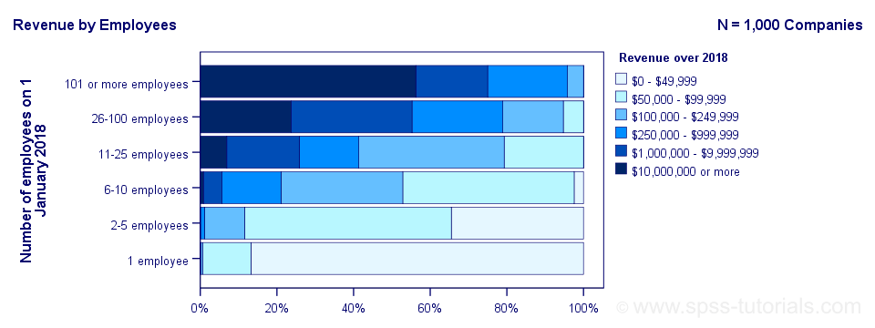
The chart shows an undisputable positive monotonous relation between size and revenue: larger companies tend to make more revenue than smaller companies. Next question.
How strong is the relation?
The first option that comes to mind is computing the Pearson correlation between company size and revenue. However, that's not going to work because we don't have company size or revenue in our data. We only have size and revenue categories. Company size and revenue are ordinal variables in our data: we know that 2-5 employees is larger than 1 employee but we don't know how much larger.
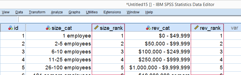
So which numbers can we use to calculate how strongly ordinal variables are related? Well, we can assign ranks to our categories as shown below.
As a last step, we simply compute the Pearson correlation between the size and revenue ranks. This results in a Spearman rank correlation (Rs) = 0.81. This tells us that our variables are strongly monotonously related. But in contrast to a normal Pearson correlation, we do not know if the relation is linear to any extent.
Spearman Rank Correlation - Basic Properties
Like we just saw, a Spearman correlation is simply a Pearson correlation computed on ranks instead of data values or categories. This results in the following basic properties:
- Spearman correlations are always between -1 and +1;
- Spearman correlations are suitable for all but nominal variables. However, when both variables are either metric or dichotomous, Pearson correlations are usually the better choice;
- Spearman correlations indicate monotonous -rather than linear- relations;
- Spearman correlations are hardly affected by outliers. However, outliers should be excluded from analyses instead of determine whether Spearman or Pearson correlations are preferable;
- Spearman correlations serve the exact same purposes as Kendall’s tau.
Spearman Rank Correlation - Assumptions
- The Spearman correlation itself only assumes that both variables are at least ordinal variables. This excludes all but nominal variables.
- The statistical significance test for a Spearman correlation assumes independent observations or -precisely- independent and identically distributed variables.
Spearman Correlation - Example II
A company needs to determine the expiration date for milk. They therefore take a tiny drop each hour and analyze the number of bacteria it contains. The results are shown below.
For bacteria versus time,
- the Pearson correlation is 0.58 but
- the Spearman correlation is 1.00.
There is a perfect monotonous relation between time and bacteria: with each hour passed, the number of bacteria grows. However, the relation is very non linear as shown by the Pearson correlation.
This example nicely illustrates the difference between these correlations. However, I'd argue against reporting a Spearman correlation here. Instead, model this curvilinear relation with a (probably exponential) function. This'll probably predict the number of bacteria with pinpoint precision.
Spearman Correlation - Formulas and Calculation
First off, an example calculation, exact significance levels and critical values are given in this Googlesheet (shown below).
Right. Now, computing Spearman’s rank correlation always starts off with replacing scores by their ranks (use mean ranks for ties). Spearman’s correlation is now computed as the Pearson correlation over the (mean) ranks.
Alternatively, compute Spearman correlations with
$$R_s = 1 - \frac{6\cdot \Sigma \;D^2}{n^3 - n}$$
where \(D\) denotes the difference between the 2 ranks for each observation.
For reasonable sample sizes of N ≥ 30, the (approximate) statistical significance uses the t distribution. In this case, the test statistic
$$T = \frac{R_s \cdot \sqrt{N - 2}}{\sqrt{1 - R^2_s}}$$
follows a t-distribution with
$$Df = N - 2$$
degrees of freedom.
This approximation is inaccurate for smaller sample sizes of N < 30. In this case, look up the (exact) significance level from the table given in this Googlesheet. These exact p-values are based on a permutation test that we may discuss some other time. Or not.
Spearman Rank Correlation - Software
Spearman correlations can be computed in Googlesheets or Excel but statistical software is a much easier option. JASP -which is freely downloadable- comes up with the correct Spearman correlation and its significance level as shown below.
SPSS also comes up with the correct correlation. However, its significance level is based on the t-distribution:
$$t = \frac{0.77\cdot\sqrt{4}}{\sqrt{(1 - 0.77^2)}} = 2.42$$
and
$$t(4) = 2.42,\;p = 0.072 $$
Again, this approximation is only accurate for larger sample sizes of N ≥ 30. For N = 6, it is wildly off as shown below.
Thanks for reading.
SPSS Correlation Analysis Tutorial
Contents
Correlation Test - What Is It?
A (Pearson) correlation is a number between -1 and +1 that indicates to what extent 2 quantitative variables are linearly related. It's best understood by looking at some scatterplots.
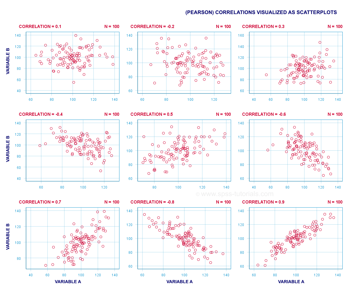
In short,
- a correlation of -1 indicates a perfect linear descending relation: higher scores on one variable imply lower scores on the other variable.
- a correlation of 0 means there's no linear relation between 2 variables whatsoever. However, there may be a (strong) non-linear relation nevertheless.
- a correlation of 1 indicates a perfect ascending linear relation: higher scores on one variable are associated with higher scores on the other variable.
Null Hypothesis
A correlation test (usually) tests the null hypothesis that the population correlation is zero. Data often contain just a sample from a (much) larger population: I surveyed 100 customers (sample) but I'm really interested in all my 100,000 customers (population). Sample outcomes typically differ somewhat from population outcomes. So finding a non zero correlation in my sample does not prove that 2 variables are correlated in my entire population; if the population correlation is really zero, I may easily find a small correlation in my sample. However, finding a strong correlation in this case is very unlikely and suggests that my population correlation wasn't zero after all.
Correlation Test - Assumptions
Computing and interpreting correlation coefficients themselves does not require any assumptions. However, the statistical significance-test for correlations assumes
- independent observations;
- normality: our 2 variables must follow a bivariate normal distribution in our population. This assumption is not needed for sample sizes of N = 25 or more.For reasonable sample sizes, the central limit theorem ensures that the sampling distribution will be normal.
SPSS - Quick Data Check
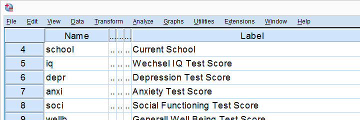
Let's run some correlation tests in SPSS now. We'll use adolescents.sav, a data file which holds psychological test data on 128 children between 12 and 14 years old. Part of its variable view is shown below.
Now, before running any correlations, let's first make sure our data are plausible in the first place. Since all 5 variables are metric, we'll quickly inspect their histograms by running the syntax below.
frequencies iq to wellb
/format notable
/histogram.
Histogram Output
Our histograms tell us a lot: our variables have between 5 and 10 missing values. Their means are close to 100 with standard deviations around 15 -which is good because that's how these tests have been calibrated. One thing bothers me, though, and it's shown below.
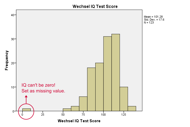
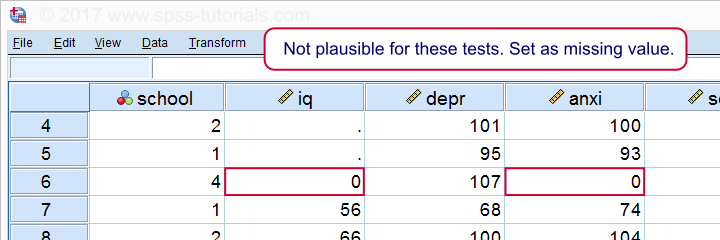
It seems like somebody scored zero on some tests -which is not plausible at all. If we ignore this, our correlations will be severely biased. Let's sort our cases, see what's going on and set some missing values before proceeding.
sort cases by iq.
*One case has zero on both tests. Set as missing value before proceeding.
missing values iq anxi (0).
If we now rerun our histograms, we'll see that all distributions look plausible. Only now should we proceed to running the actual correlations.
Running a Correlation Test in SPSS
Let's first navigate to
![]()
![]() as shown below.
as shown below.
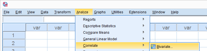
Move all relevant variables into the variables box. You probably don't want to change anything else here.
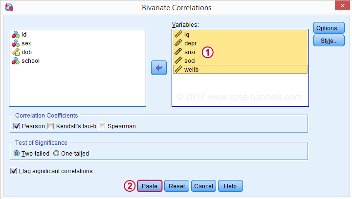
Clicking results in the syntax below. Let's run it.
SPSS CORRELATIONS Syntax
CORRELATIONS
/VARIABLES=iq depr anxi soci wellb
/PRINT=TWOTAIL NOSIG
/MISSING=PAIRWISE.
*Shorter version, creates exact same output.
correlations iq to wellb
/print nosig.
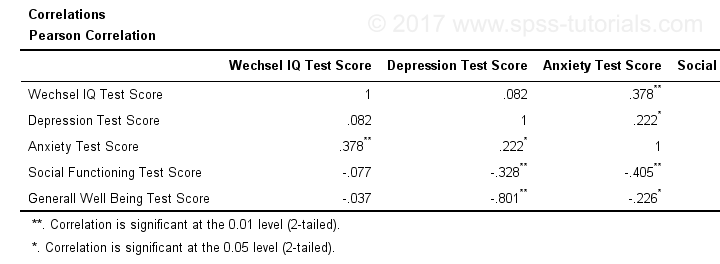
Correlation Output
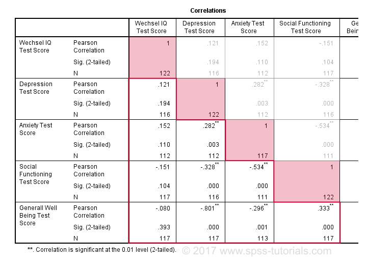
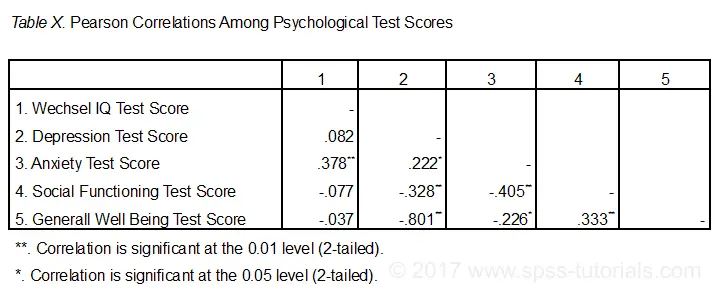
By default, SPSS always creates a full correlation matrix. Each correlation appears twice: above and below the main diagonal. The correlations on the main diagonal are the correlations between each variable and itself -which is why they are all 1 and not interesting at all. The 10 correlations below the diagonal are what we need. As a rule of thumb,
a correlation is statistically significant if its “Sig. (2-tailed)” < 0.05.
Now let's take a close look at our results: the strongest correlation is between depression and overall well-being : r = -0.801. It's based on N = 117 children and its 2-tailed significance, p = 0.000. This means there's a 0.000 probability of finding this sample correlation -or a larger one- if the actual population correlation is zero.
Note that IQ does not correlate with anything. Its strongest correlation is 0.152 with anxiety but p = 0.11 so it's not statistically significantly different from zero. That is, there's an 0.11 chance of finding it if the population correlation is zero. This correlation is too small to reject the null hypothesis.
Like so, our 10 correlations indicate to which extent each pair of variables are linearly related. Finally, note that each correlation is computed on a slightly different N -ranging from 111 to 117. This is because SPSS uses pairwise deletion of missing values by default for correlations.
Scatterplots
Strictly, we should inspect all scatterplots among our variables as well. After all, variables that don't correlate could still be related in some non-linear fashion. But for more than 5 or 6 variables, the number of possible scatterplots explodes so we often skip inspecting them. However, see SPSS - Create All Scatterplots Tool.
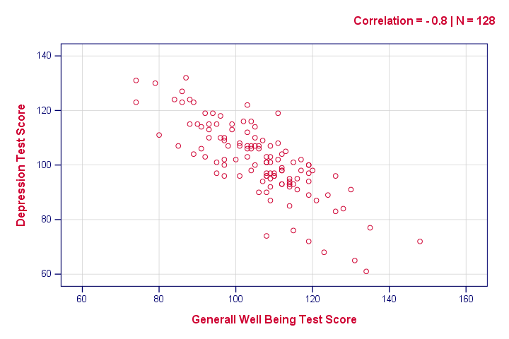
The syntax below creates just one scatterplot, just to get an idea of what our relation looks like. The result doesn't show anything unexpected, though.
graph
/scatter wellb with depr
/subtitle "Correlation = - 0.8 | N = 128".
Reporting a Correlation Test
The figure below shows the most basic format recommended by the APA for reporting correlations. Importantly, make sure the table indicates which correlations are statistically significant at p < 0.05 and perhaps p < 0.01. Also see SPSS Correlations in APA Format.
If possible, report the confidence intervals for your correlations as well. Oddly, SPSS doesn't include those. However, see SPSS Confidence Intervals for Correlations Tool.
Thanks for reading!
Cramér’s V – What and Why?
Cramér’s V is a number between 0 and 1 that indicates how strongly two categorical variables are associated. If we'd like to know if 2 categorical variables are associated, our first option is the chi-square independence test. A p-value close to zero means that our variables are very unlikely to be completely unassociated in some population. However, this does not mean the variables are strongly associated; a weak association in a large sample size may also result in p = 0.000.
Cramér’s V - Formula
A measure that does indicate the strength of the association is Cramér’s V, defined as
$$\phi_c = \sqrt{\frac{\chi^2}{N(k - 1)}}$$
where
- \(\phi_c\) denotes Cramér’s V;\(\phi\) is the Greek letter “phi” and refers to the “phi coefficient”, a special case of Cramér’s V which we'll discuss later.
- \(\chi^2\) is the Pearson chi-square statistic from the aforementioned test;
- \(N\) is the sample size involved in the test and
- \(k\) is the lesser number of categories of either variable.
Cramér’s V - Examples
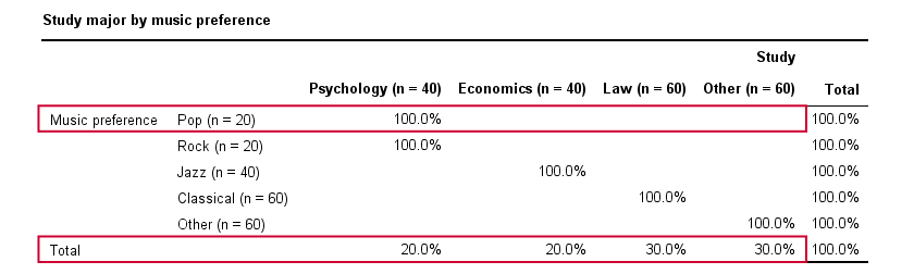
A scientist wants to know if music preference is related to study major. He asks 200 students, resulting in the contingency table shown below.
These raw frequencies are just what we need for all sort of computations but they don't show much of a pattern. The association -if any- between the variables is easier to see if we inspect row percentages instead of raw frequencies. Things become even clearer if we visualize our percentages in stacked bar charts.
Cramér’s V - Independence
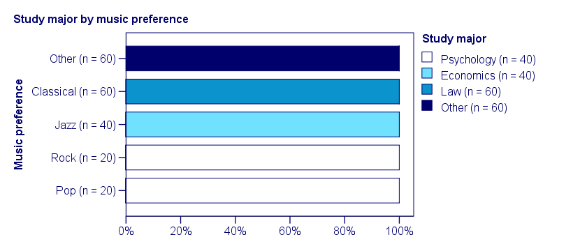
In our first example, the variables are perfectly independent: \(\chi^2\) = 0. According to our formula, chi-square = 0 implies that Cramér’s V = 0. This means that music preference “does not say anything” about study major. The associated table and chart make this clear.
Note that the frequency distribution of study major is identical in each music preference group. If we'd like to predict somebody’s study major, knowing his music preference does not help us the least little bit. Our best guess is always law or “other”.
Cramér’s V - Moderate Association
A second sample of 200 students show a different pattern. The row percentages are shown below.
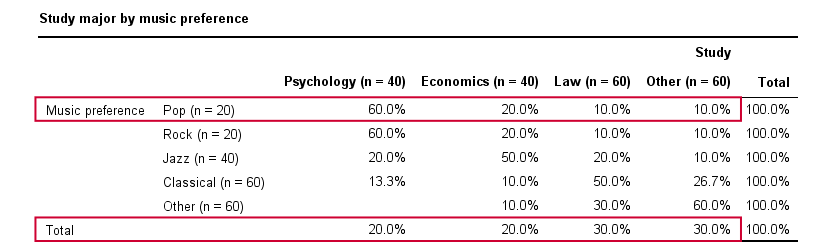
This table shows quite some association between music preference and study major: the frequency distributions of studies are different for music preference groups. For instance, 60% of all students who prefer pop music study psychology. Those who prefer classical music mostly study law. The chart below visualizes our table.
Note that music preference says quite a bit about study major: knowing the former helps a lot in predicting the latter. For these data
- \(\chi^2 \approx\) 113;For calculating this chi-square value, see either Chi-Square Independence Test - Quick Introduction or SPSS Chi-Square Independence Test.
- our sample size N = 200 and
- we've variables with 4 and 5 categories so k = (4 -1) = 3.
It follows that
$$\phi_c = \sqrt{\frac{113}{200(3)}} = 0.43.$$
which is substantial but not super high since Cramér’s V has a maximum value of 1.
Cramér’s V - Perfect Association
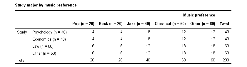
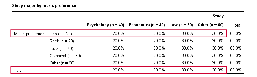
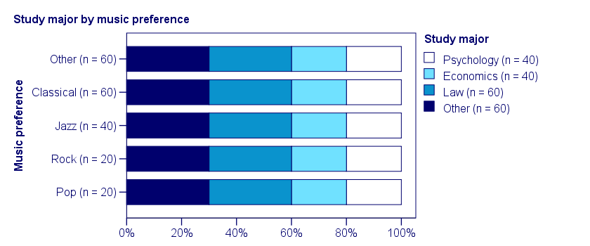
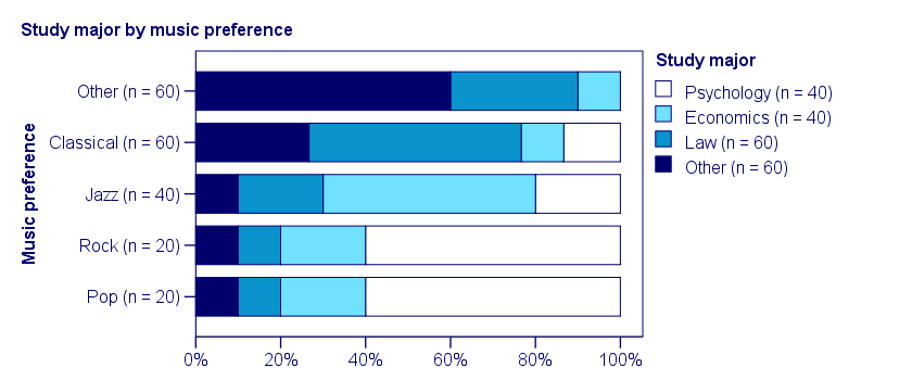
In a third -and last- sample of students, music preference and study major are perfectly associated. The table and chart below show the row percentages.
If we know a student’s music preference, we know his study major with certainty. This implies that our variables are perfectly associated. Do notice, however, that it doesn't work the other way around: we can't tell with certainty someone’s music preference from his study major but this is not necessary for perfect association: \(\chi^2\) = 600 so
$$\phi_c = \sqrt{\frac{600}{200(3)}} = 1,$$
which is the very highest possible value for Cramér’s V.
Alternative Measures
- An alternative association measure for two nominal variables is the contingency coefficient. However, it's better avoided since its maximum value depends on the dimensions of the contingency table involved.3,4
- For two ordinal variables, a Spearman correlation or Kendall’s tau are preferable over Cramér’s V.
- For two metric variables, a Pearson correlation is the preferred measure.
- If both variables are dichotomous (resulting in a 2 by 2 table) use a phi coefficient, which is simply a Pearson correlation computed on dichotomous variables.
Cramér’s V - SPSS
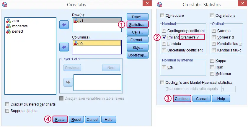
In SPSS, Cramér’s V is available from
![]()
![]() . Next, fill out the dialog as shown below.
. Next, fill out the dialog as shown below.
Warning: for tables larger than 2 by 2, SPSS returns nonsensical values for phi without throwing any warning or error. These are often > 1, which isn't even possible for Pearson correlations. Oddly, you can't request Cramér’s V without getting these crazy phi values.
Final Notes
Cramér’s V is also known as Cramér’s phi (coefficient)5. It is an extension of the aforementioned phi coefficient for tables larger than 2 by 2, hence its notation as \(\phi_c\). It's been suggested that its been replaced by “V” because old computers couldn't print the letter \(\phi\).3
Thank you for reading.
References
- Van den Brink, W.P. & Koele, P. (2002). Statistiek, deel 3 [Statistics, part 3]. Amsterdam: Boom.
- Field, A. (2013). Discovering Statistics with IBM SPSS Newbury Park, CA: Sage.
- Howell, D.C. (2002). Statistical Methods for Psychology (5th ed.). Pacific Grove CA: Duxbury.
- Slotboom, A. (1987). Statistiek in woorden [Statistics in words]. Groningen: Wolters-Noordhoff.
- Sheskin, D. (2011). Handbook of Parametric and Nonparametric Statistical Procedures. Boca Raton, FL: Chapman & Hall/CRC.
Pearson Correlations – Quick Introduction
A Pearson correlation is a number between -1 and +1 that indicates
to which extent 2 variables are linearly related.
The Pearson correlation is also known as the “product moment correlation coefficient” (PMCC) or simply “correlation”.
Pearson correlations are only suitable for quantitative variables (including dichotomous variables).
- For ordinal variables, use the Spearman correlation or Kendall’s tau and
- for nominal variables, use Cramér’s V.
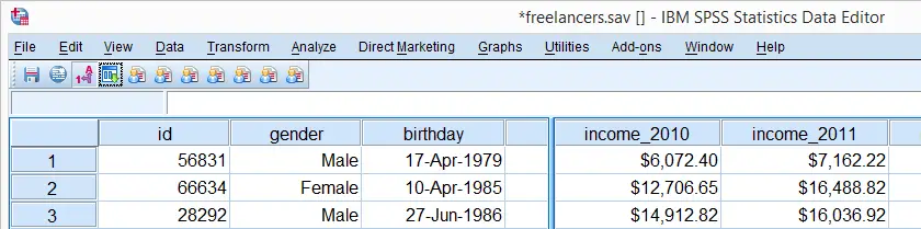
Correlation Coefficient - Example
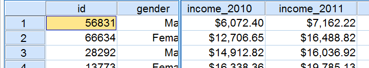
We asked 40 freelancers for their yearly incomes over 2010 through 2014. Part of the raw data are shown below.
Today’s question is:
is there any relation between income over 2010
and income over 2011?
Well, a splendid way for finding out is inspecting a scatterplot for these two variables: we'll represent each freelancer by a dot. The horizontal and vertical positions of each dot indicate a freelancer’s income over 2010 and 2011. The result is shown below.
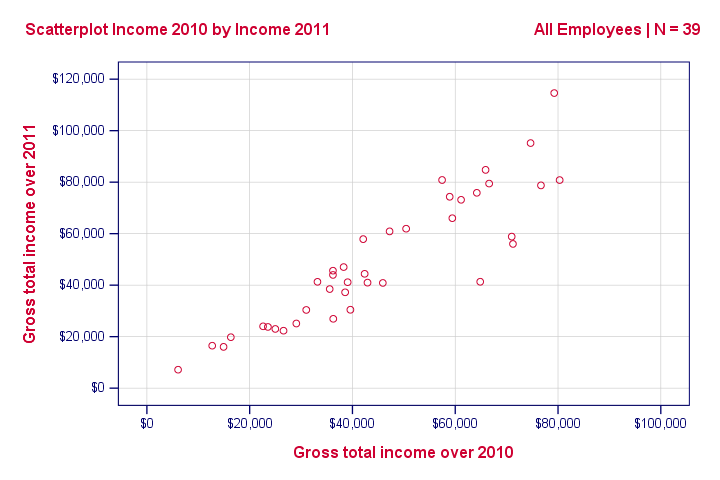
Our scatterplot shows a strong relation between income over 2010 and 2011: freelancers who had a low income over 2010 (leftmost dots) typically had a low income over 2011 as well (lower dots) and vice versa. Furthermore, this relation is roughly linear; the main pattern in the dots is a straight line.
The extent to which our dots lie on a straight line indicates the strength of the relation. The Pearson correlation is a number that indicates the exact strength of this relation.
Correlation Coefficients and Scatterplots
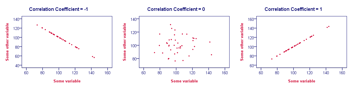
A correlation coefficient indicates the extent to which dots in a scatterplot lie on a straight line. This implies that we can usually estimate correlations pretty accurately from nothing more than scatterplots. The figure below nicely illustrates this point.
Correlation Coefficient - Basics
Some basic points regarding correlation coefficients are nicely illustrated by the previous figure. The least you should know is that
- Correlations are never lower than -1. A correlation of -1 indicates that the data points in a scatter plot lie exactly on a straight descending line; the two variables are perfectly negatively linearly related.
- A correlation of 0 means that two variables don't have any linear relation whatsoever. However, some non linear relation may exist between the two variables.
- Correlation coefficients are never higher than 1. A correlation coefficient of 1 means that two variables are perfectly positively linearly related; the dots in a scatter plot lie exactly on a straight ascending line.
Correlation Coefficient - Interpretation Caveats
When interpreting correlations, you should keep some things in mind. An elaborate discussion deserves a separate tutorial but we'll briefly mention two main points.
- Correlations may or may not indicate causal relations. Reversely, causal relations from some variable to another variable may or may not result in a correlation between the two variables.
- Correlations are very sensitive to outliers; a single unusual observation may have a huge impact on a correlation. Such outliers are easily detected by a quick inspection a scatterplot.
Correlation Coefficient - Software
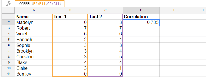
Most spreadsheet editors such as Excel, Google sheets and OpenOffice can compute correlations for you. The illustration below shows an example in Googlesheets.
Correlation Coefficient - Correlation Matrix
Keep in mind that correlations apply to pairs of variables. If you're interested in more than 2 variables, you'll probably want to take a look at the correlations between all different variable pairs. These correlations are usually shown in a square table known as a correlation matrix. Statistical software packages such as SPSS create correlations matrices before you can blink your eyes. An example is shown below.
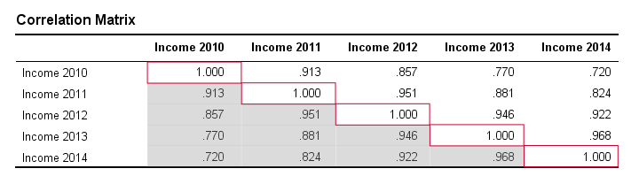
Note that the diagonal elements (in red) are the correlations between each variable and itself. This is why they are always 1.
Also note that the correlations beneath the diagonal (in grey) are redundant because they're identical to the correlations above the diagonal. Technically, we say that this is a symmetrical matrix.
Finally, note that the pattern of correlations makes perfect sense: correlations between yearly incomes become lower insofar as these years lie further apart.
Pearson Correlation - Formula
If we want to inspect correlations, we'll have a computer calculate them for us. You'll rarely (probably never) need the actual formula. However, for the sake of completeness, a Pearson correlation between variables X and Y is calculated by
$$r_{XY} = \frac{\sum_{i=1}^n(X_i - \overline{X})(Y_i - \overline{Y})}{\sqrt{\sum_{i=1}^n(X_i - \overline{X})^2}\sqrt{\sum_{i=1}^n(Y_i - \overline{Y})^2}}$$
The formula basically comes down to dividing the covariance by the product of the standard deviations. Since a coefficient is a number divided by some other number our formula shows why we speak of a correlation coefficient.
Correlation - Statistical Significance
The data we've available are often -but not always- a small sample from a much larger population. If so,
we may find a non zero correlation in our sample
even if it's zero in the population. The figure below illustrates how this could happen.
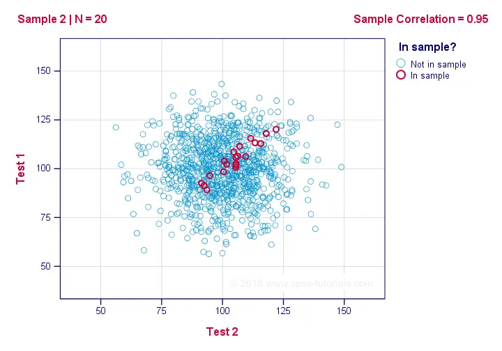
If we ignore the colors for a second, all 1,000 dots in this scatterplot visualize some population. The population correlation -denoted by ρ- is zero between test 1 and test 2.
Now, we could draw a sample of N = 20 from this population for which the correlation r = 0.95.
Reversely, this means that a sample correlation of 0.95 doesn't prove with certainty that there's a non zero correlation in the entire population. However, finding r = 0.95 with N = 20 is extremely unlikely if ρ = 0. But precisely how unlikely? And how do we know?
Correlation - Test Statistic
If ρ -a population correlation- is zero, then the probability for a given sample correlation -its statistical significance- depends on the sample size. We therefore combine the sample size and r into a single number, our test statistic t:
$$T = R\sqrt{\frac{(n - 2)}{(1 - R^2)}}$$
Now, T itself is not interesting. However, we need it for finding the significance level for some correlation. T follows a t distribution with ν = n - 2 degrees of freedom but only if some assumptions are met.
Correlation Test - Assumptions
The statistical significance test for a Pearson correlation requires 3 assumptions:
- independent observations;
- the population correlation, ρ = 0;
- normality: the 2 variables involved are bivariately normally distributed in the population. However, this is not needed for a reasonable sample size -say, N ≥ 20 or so.The reason for this lies in the central limit theorem.
Pearson Correlation - Sampling Distribution
In our example, the sample size N was 20. So if we meet our assumptions, T follows a t-distribution with df = 18 as shown below.
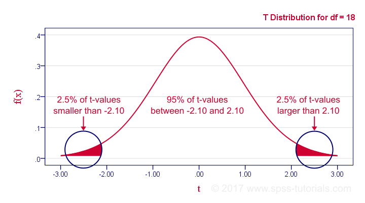
This distribution tells us that there's a 95% probability that -2.1 < t < 2.1, corresponding to -0.44 < r < 0.44. Conclusion:
if N = 20, there's a 95% probability of finding -0.44 < r < 0.44.
There's only a 5% probability of finding a correlation outside this range. That is, such correlations are statistically significant at α = 0.05 or lower: they are (highly) unlikely and thus refute the null hypothesis of a zero population correlation.
Last, our sample correlation of 0.95 has a p-value of 1.55e-10 -one to 6,467,334,654. We can safely conclude there's a non zero correlation in our entire population.
Thanks for reading!
SPSS CORRELATIONS – Beginners Tutorial
Also see Pearson Correlations - Quick Introduction.
SPSS CORRELATIONS creates tables with Pearson correlations and their underlying N’s and p-values. For Spearman rank correlations and Kendall’s tau, use NONPAR-CORR. Both commands can be pasted from
![]()
![]() .
.
This tutorial quickly walks through the main options. We'll use freelancers.sav throughout and we encourage you to download it and follow along with the examples.
User Missing Values
Before running any correlations, we'll first specify all values of one million dollars or more as user missing values for income_2010 through income_2014.Inspecting their histograms (also see FREQUENCIES) shows that this is necessary indeed; some extreme values are present in these variables and failing to detect them will have a huge impact on our correlations. We'll do so by running the following line of syntax: missing values income_2010 to income_2014 (1e6 thru hi). Note that “1e6” is a shorthand for a 1 with 6 zeroes, hence one million.
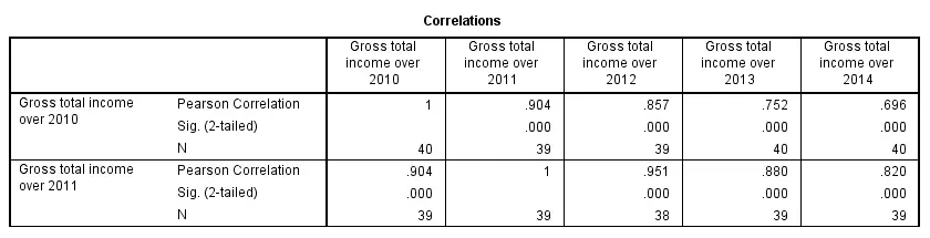
SPSS CORRELATIONS - Basic Use
The syntax below shows the simplest way to run a standard correlation matrix. Note that due to the table structure, all correlations between different variables are shown twice.
By default, SPSS uses pairwise deletion of missing values here; each correlation (between two variables) uses all cases having valid values these two variables. This is why N varies from 38 through 40 in the screenshot below.
correlations income_2010 to income_2014.
Keep in mind here that p-values are always shown, regardless of whether their underlying statistical assumptions are met or not. Oddly, SPSS CORRELATIONS doesn't offer any way to suppress them. However, SPSS Correlations in APA Format offers a super easy tool for doing so anyway.
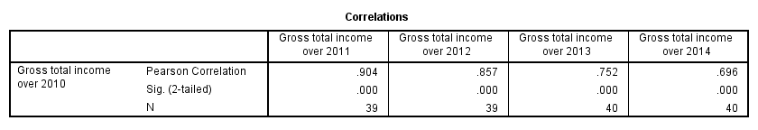
SPSS CORRELATIONS - WITH Keyword
By default, SPSS CORRELATIONS produces full correlation matrices. A little known trick to avoid this is using a WITH clause as demonstrated below. The resulting table is shown in the following screenshot.
correlations income_2010 with income_2011 to income_2014.
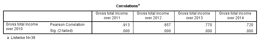
SPSS CORRELATIONS - MISSING Subcommand
Instead of the aforementioned pairwise deletion of missing values, listwise deletion is accomplished by specifying it in a MISSING subcommand.An alternative here is identifying cases with missing values by using NMISS. Next, use FILTER to exclude them from the analysis. Listwise deletion doesn't actually delete anything but excludes from analysis all cases having one or more missing values on any of the variables involved.
Keep in mind that listwise deletion may seriously reduce your sample size if many variables and missing values are involved. Note in the next screenshot that the table structure is slightly altered when listwise deletion is used.
correlations income_2010 to income_2014
/missing listwise.
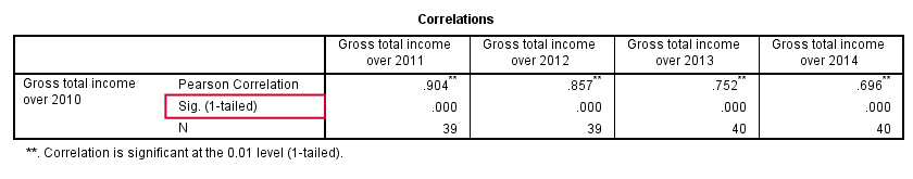
SPSS CORRELATIONS - PRINT Subcommand
By default, SPSS CORRELATIONS shows two-sided p-values. Although frowned upon by many statisticians, one-sided p-values are obtained by specifying ONETAIL on a PRINT subcommand as shown below.
Statistically significant correlations are flagged by specifying NOSIG (no, not SIG) on a PRINT subcommand.
correlations income_2010 with income_2011 to income_2014
/print nosig onetail.
SPSS CORRELATIONS - Notes
More options for SPSS CORRELATIONS are described in the command syntax reference. This tutorial deliberately skipped some of them such as inclusion of user missing values and capturing correlation matrices with the MATRIX subcommand. We did so due to doubts regarding their usefulness.
Thanks for reading!