SPSS Multiple Linear Regression Example
- Multiple Regression - Example
- Data Checks and Descriptive Statistics
- SPSS Regression Dialogs
- SPSS Multiple Regression Output
- Multiple Regression Assumptions
- APA Reporting Multiple Regression
Multiple Regression - Example
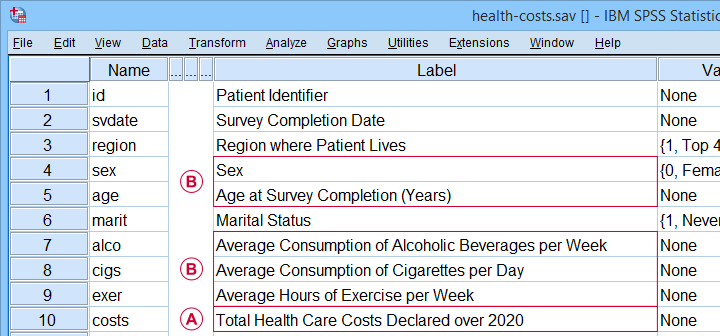
A scientist wants to know if and how health care costs can be predicted from several patient characteristics. All data are in health-costs.sav as shown below.
 The dependent variable is health care costs (in US dollars) declared over 2020 or “costs” for short.
 The independent variables are sex, age, drinking, smoking and exercise.
Our scientist thinks that each independent variable has a linear relation with health care costs. He therefore decides to fit a multiple linear regression model. The final model will predict costs from all independent variables simultaneously.
Data Checks and Descriptive Statistics
Before running multiple regression, first make sure that
- the dependent variable is quantitative;
- each independent variable is quantitative or dichotomous;
- you have sufficient sample size.
A visual inspection of our data shows that requirements 1 and 2 are met: sex is a dichotomous variable and all other relevant variables are quantitative. Regarding sample size, a general rule of thumb is that you want to
use at least 15 independent observations
for each independent variable
you'll include. In our example, we'll use 5 independent variables so we need a sample size of at least N = (5 · 15 =) 75 cases. Our data contain 525 cases so this seems fine.
 Note that we've N = 525 independent observations in our example data.
Keep in mind, however, that we may not be able to use all N = 525 cases if there's any missing values in our variables.
Let's now proceed with some quick data checks. I strongly encourage you to at least
- run basic histograms over all variables. Check if their frequency distributions look plausible. Are there any outliers? Should you specify any missing values?
- inspect a scatterplot for each independent variable (x-axis) versus the dependent variable (y-axis).A handy tool for doing just that is downloadable from SPSS - Create All Scatterplots Tool. Do you see any curvilinear relations or anything unusual?
- run descriptive statistics over all variables. Inspect if any variables have any missing values and -if so- how many.
- inspect the Pearson correlations among all variables. Absolute correlations exceeding 0.8 or so may later cause complications (known as multicollinearity) for the actual regression analysis.
The APA recommends you combine and report these last two tables as shown below.
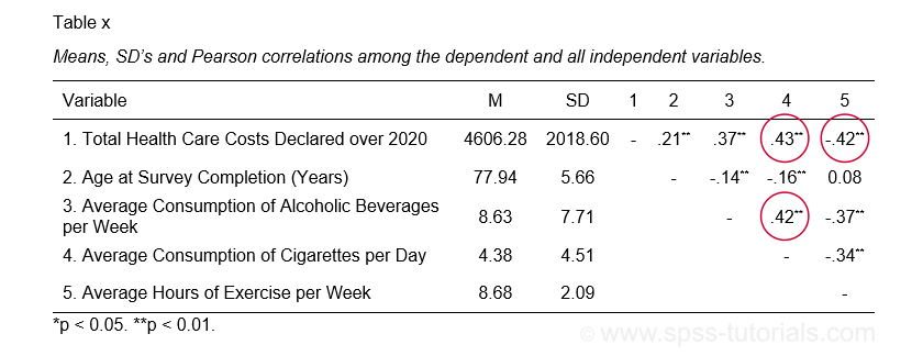 APA recommended table for reporting correlations and descriptive statistics
 as part of multiple regression results
These data checks show that our example data look perfectly fine: all charts are plausible, there's no missing values and none of the correlations exceed 0.43. Let's now proceed with the actual regression analysis.
SPSS Regression Dialogs
We'll first navigate to
![]()
![]() as shown below.
as shown below.
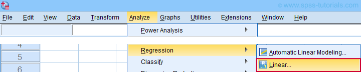
Next, we fill out the main dialog and subdialogs as shown below.
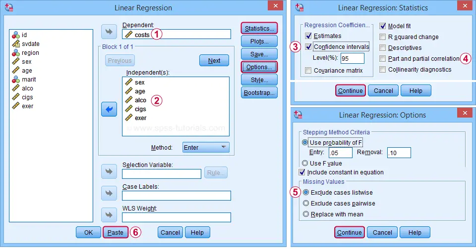
 We'll select 95% confidence intervals for our b-coefficients.
 Some analysts report squared semipartial (or “part”) correlations as effect size measures for individual predictors. But for now, let's skip them.
 By selecting “Exclude cases listwise”, our regression analysis uses only cases without any missing values on any of our regression variables. That's fine for our example data but this may be a bad idea for other data files.
 Clicking results in the syntax below. Let's run it.
SPSS Multiple Regression Syntax I
REGRESSION
/MISSING LISTWISE
/STATISTICS COEFF OUTS CI(95) R ANOVA
/CRITERIA=PIN(.05) POUT(.10)
/NOORIGIN
/DEPENDENT costs
/METHOD=ENTER sex age alco cigs exer.
SPSS Multiple Regression Output
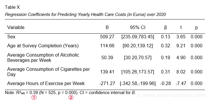
The first table we inspect is the Coefficients table shown below.
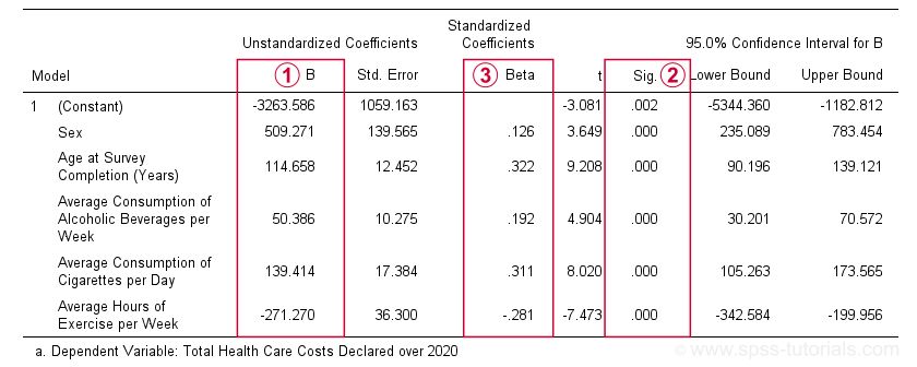
 The b-coefficients dictate our regression model:
$$Costs' = -3263.6 + 509.3 \cdot Sex + 114.7 \cdot Age + 50.4 \cdot Alcohol\\ + 139.4 \cdot Cigarettes - 271.3 \cdot Exericse$$
where \(Costs'\) denotes predicted yearly health care costs in dollars.
Each b-coefficient indicates the average increase in costs associated with a 1-unit increase in a predictor. For example, a 1-year increase in age results in an average $114.7 increase in costs. Or a 1 hour increase in exercise per week is associated with a -$271.3 increase (that is, a $271.3 decrease) in yearly health costs.
Now, let's talk about sex: a 1-unit increase in sex results in an average $509.3 increase in costs. For understanding what this means, please note that sex is coded 0 (female) and 1 (male) in our example data. So for this variable, the only possible 1-unit increase is from female (0) to male (1). Therefore, B = $509.3 simply means that
the average yearly costs for males
are $509.3 higher than for females
(everything else equal, that is). This hopefully clarifies how dichotomous variables can be used in multiple regression. We'll expand on this idea when we'll cover dummy variables in a later tutorial.
 The “Sig.” column in our coefficients table contains the (2-tailed) p-value for each b-coefficient. As a general guideline,
a b-coefficient is statistically significant if its “Sig.” or p < 0.05.
Therefore, all b-coefficients in our table are highly statistically significant. Precisely, a p-value of 0.000 means that if some b-coefficient is zero in the population (the null hypothesis), then there's a 0.000 probability of finding the observed sample b-coefficient or a more extreme one. We then conclude that the population b-coefficient probably wasn't zero after all.
The “Sig.” column in our coefficients table contains the (2-tailed) p-value for each b-coefficient. As a general guideline,
a b-coefficient is statistically significant if its “Sig.” or p < 0.05.
Therefore, all b-coefficients in our table are highly statistically significant. Precisely, a p-value of 0.000 means that if some b-coefficient is zero in the population (the null hypothesis), then there's a 0.000 probability of finding the observed sample b-coefficient or a more extreme one. We then conclude that the population b-coefficient probably wasn't zero after all.
Now, our b-coefficients don't tell us the relative strengths of our predictors. This is because these have different scales: is a cigarette per day more or less than an alcoholic beverage per week? One way to deal with this, is to compare the standardized regression coefficients or beta coefficients, often denoted as β (the Greek letter “beta”).In statistics, β also refers to the probability of committing a type II error in hypothesis testing. This is why (1 - β) denotes power but that's a completely different topic than regression coefficients.
Beta coefficients (standardized regression coefficients) are useful for comparing the relative strengths of our predictors. Like so, the 3 strongest predictors in our coefficients table are:
- age (β = 0.322);
- cigarette consumption (β = 0.311);
- exercise (β = -0.281).
Beta coefficients are obtained by standardizing all regression variables into z-scores before computing b-coefficients. Standardizing variables applies a similar standard (or scale) to them: the resulting z-scores always have mean of 0 and a standard deviation of 1.
This holds regardless whether they're computed over years, cigarettes or alcoholic beverages. So that's why b-coefficients computed over standardized variables -beta coefficients- are comparable within and between regression models.
Right, so our b-coefficients make up our multiple regression model. This tells us how to predict yearly health care costs. What we don't know, however, is precisely how well does our model predict these costs? We'll find the answer in the model summary table discussed below.
SPSS Regression Output II - Model Summary & ANOVA
The figure below shows  the model summary and
  the ANOVA tables in the regression output.
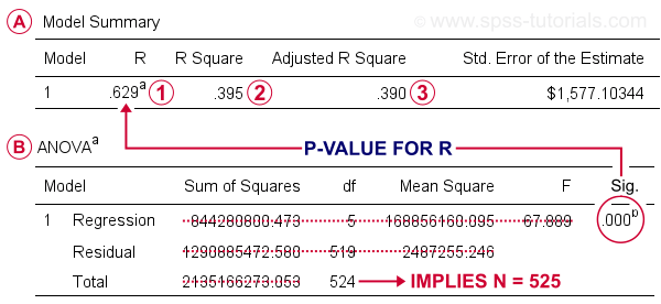
R denotes the multiple correlation coefficient. This is simply the Pearson correlation between the actual scores and those predicted by our regression model.
R-square or R2 is simply the squared multiple correlation. It is also the proportion of variance in the dependent variable accounted for by the entire regression model.
R-square computed on sample data tends to overestimate R-square for the entire population. We therefore prefer to report adjusted R-square or R2adj, which is an unbiased estimator for the population R-square. For our example, R2adj = 0.390. By most standards, this is considered very high.
Sadly, SPSS doesn't include a confidence interval for R2adj. However, the p-value found in the ANOVA table applies to R and R-square (the rest of this table is pretty useless). It evaluates the null hypothesis that our entire regression model has a population R of zero. Since p < 0.05, we reject this null hypothesis for our example data.
It seems we're done for this analysis but we skipped an important step: checking the multiple regression assumptions.
Multiple Regression Assumptions
Our data checks started off with some basic requirements. However, the “official” multiple linear regression assumptions are
- independent observations;
- normality: the regression residuals must be normally distributed in the populationStrictly, we should distinguish between residuals (sample) and errors (population). For now, however, let's not overcomplicate things.;
- homoscedasticity: the population variance of the residuals should not fluctuate in any systematic way;
- linearity: each predictor must have a linear relation with the dependent variable.
We'll check if our example analysis meets these assumptions by doing 3 things:
- A visual inspection of our data shows that each of our N = 525 observations applies to a different person. Furthermore, these people did not interact in any way that should influence their survey answers. In this case, we usually consider them independent observations.
- We'll create and inspect a histogram of our regression residuals to see if they are approximately normally distributed.
- We'll create and inspect a scatterplot of residuals (y-axis) versus predicted values (x-axis). This scatterplot may detect violations of both homoscedasticity and linearity.
The easy way to obtain these 2 regression plots, is selecting them in the dialogs (shown below) and rerunning the regression analysis.
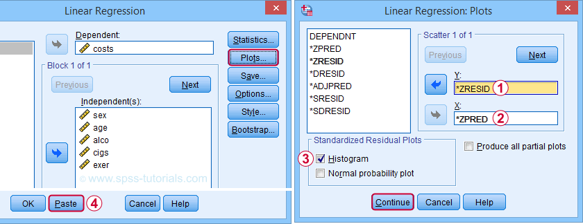
Clicking results in the syntax below. We'll run it and inspect the residual plots shown below.
SPSS Multiple Regression Syntax II
REGRESSION
/MISSING LISTWISE
/STATISTICS COEFF OUTS CI(95) R ANOVA
/CRITERIA=PIN(.05) POUT(.10)
/NOORIGIN
/DEPENDENT costs
/METHOD=ENTER sex age alco cigs exer
/SCATTERPLOT=(*ZRESID ,*ZPRED)
/RESIDUALS HISTOGRAM(ZRESID).
Residual Plots I - Histogram
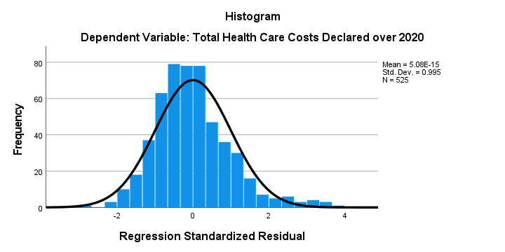
The histogram over our standardized residuals shows
- a tiny bit of positive skewness; the right tail of the distribution is stretched out a bit.
- a tiny bit of positive kurtosis; our distribution is more peaked (or “leptokurtic”) than the normal curve. This is because the bars in the middle are too high and pierce through the normal curve.
In short, we do see some deviations from normality but they're tiny. Most analysts would conclude that the residuals are roughly normally distributed. If you're not convinced, you could add the residuals as a new variable to the data via the SPSS regression dialogs. Next, you could run a Shapiro-Wilk test or a Kolmogorov-Smirnov test on them. However, we don't generally recommend these tests.
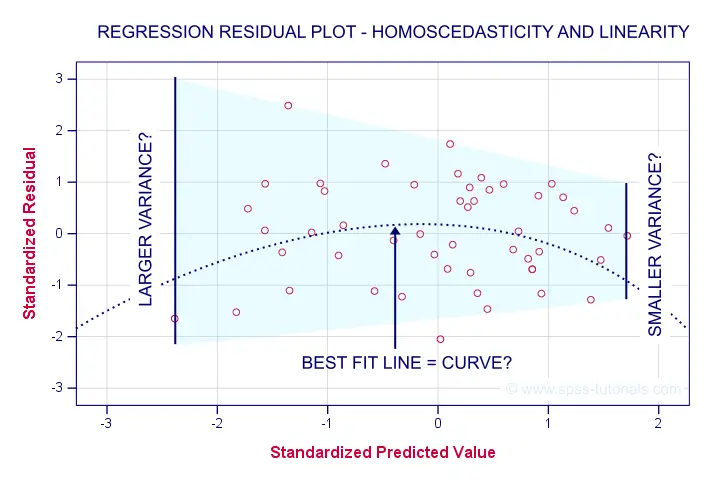
Residual Plots II - Scatterplot
The residual scatterplot shown below is often used for checking a) the homoscedasticity and b) the linearity assumptions. If both assumptions hold, this scatterplot shouldn't show any systematic pattern whatsoever. That seems to be the case here.
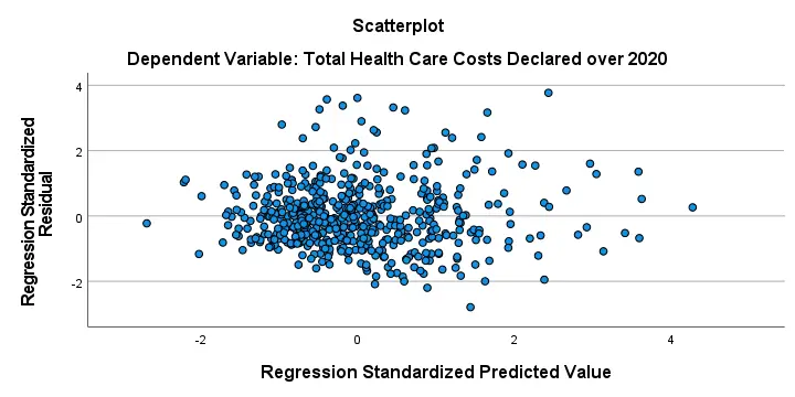
Homoscedasticity implies that the variance of the residuals should be constant. This variance can be estimated from how far the dots in our scatterplot lie apart vertically. Therefore, the height of our scatterplot should neither increase nor decrease as we move from left to right. We don't see any such pattern.
A common check for the linearity assumption is inspecting if the dots in this scatterplot show any kind of curve. That's not the case here so linearity also seems to hold here.On a personal note, however, I find this a very weak approach. An unusual (but much stronger) approach is to fit a variety of non linear regression models for each predictor separately.
Doing so requires very little effort and often reveils non linearity. This can then be added to some linear model in order to improve its predictive accuracy.
Sadly, this “low hanging fruit” is routinely overlooked because analysts usually limit themselves to the poor scatterplot approach that we just discussed.
APA Reporting Multiple Regression
The APA reporting guidelines propose the table shown below for reporting a standard multiple regression analysis.
I think it's utter stupidity that the APA table doesn't include the constant for our regression model. I recommend you add it anyway. Furthermore, note that
R-square adjusted is found in the model summary table and
its p-value is the only number you need from the ANOVA table
in the SPSS output. Last, the APA also recommends reporting a combined descriptive statistics and correlations table like we saw here.
Thanks for reading!
SPSS Hierarchical Regression Tutorial
Hierarchical regression comes down to comparing different regression models. Each model adds 1(+) predictors to the previous model, resulting in a “hierarchy” of models. This analysis is easy in SPSS but we should pay attention to some regression assumptions:
- linearity: each predictor has a linear relation with our outcome variable;
- normality: the prediction errors are normally distributed in the population;
- homoscedasticity: the variance of the errors is constant in the population.
Also, let's ensure our data make sense in the first place and choose which predictors we'll include in our model. The roadmap below summarizes these steps.
SPSS Hierarchical Regression Roadmap
| Step | Why? | Action? | |
|---|---|---|---|
| 1 | Inspect histograms | See if distributions make sense. | Set missing values. Exclude variables. |
| 2 | Inspect descriptives | See if any variables have low N. Inspect listwise valid N. | Exclude variables with low N. |
| 3 | Inspect scatterplots | See if relations are linear. Look for influential cases. | Exclude cases if needed. Transform predictors if needed. |
| 4 | Inspect correlation matrix | See if Pearson correlations make sense. | Inspect variables with unusual correlations. |
| 5 | Regression I: model selection | See which model is good. | Exclude variables from model. |
| 6 | Regression II: residuals | Inspect residual plots. | Transform variables if needed. |
Case Study - Employee Satisfaction
A company held an employee satisfaction survey which included overall employee satisfaction. Employees also rated some main job quality aspects, resulting in work.sav.
The main question we'd like to answer is which quality aspects predict job satisfaction? Let's follow our roadmap and find out.
Inspect All Histograms
Let's first see if our data make any sense in the first place. We'll do so by running histograms over all predictors and the dependent variable. The easiest way for doing so is running the syntax below. For more detailed instructions, see Creating Histograms in SPSS.
frequencies overall to tasks
/format notable
/histogram.
Result
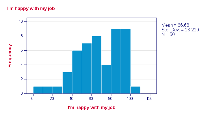
Just a quick look at our 6 histograms tells us that
- none of these variables contain any system missing values;
- none of our variables contain any clear outliers: there's no need to set any user missing values;
- all frequency distributions look plausible.
If histograms do show unlikely values, it's essential to set those as user missing values before proceeding with your analyses.
Inspect Descriptives Table
If variables contain missing values, a simple descriptives table is a fast way to inspect the extent of missingness. We'll run it from a single line of syntax .
descriptives overall to tasks.
Result
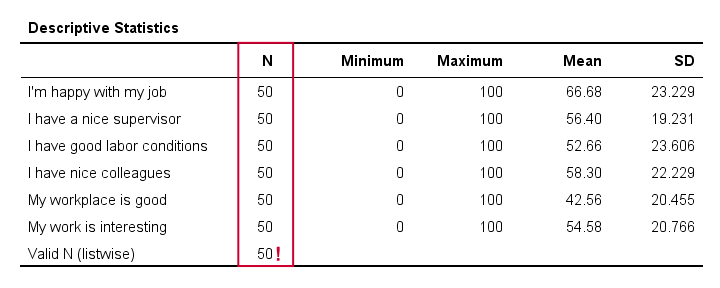
The descriptives table tells us if any variables have many missing values. If so, you may want to exclude such variables from analysis.
Valid N (listwise) is the number of cases without missing values on any variables in this table. SPSS regression (as well as factor analysis) uses only such complete cases unless you select pairwise deletion of missing values as we'll see in a minute.
Inspect Scatterplots
Do our predictors have (roughly) linear relations with the outcome variable? Most textbooks suggest inspecting residual plots: scatterplots of the predicted values (x-axis) with the residuals (y-axis) are supposed to detect non linearity.
However, I think residual plots are useless for inspecting linearity. The reason is that predicted values are (weighted) combinations of predictors. So what if just one predictor has a curvilinear relation with the outcome variable? This curvilinearity will be diluted by combining predictors into one variable -the predicted values.
It makes much more sense to inspect linearity for each predictor separately. A minimal way to do so is running scatterplots for each predictor (x-axis) with the outcome variable (y-axis).
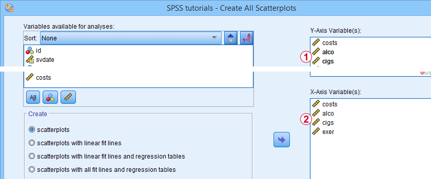
A simple way to create these scatterplots is to just one command from the menu as shown in SPSS Scatterplot Tutorial. Next, remove the line breaks and copy-paste-edit it as needed.
GRAPH /SCATTERPLOT(BIVAR)= supervisor WITH overall /MISSING=LISTWISE.
GRAPH /SCATTERPLOT(BIVAR)= conditions WITH overall /MISSING=LISTWISE.
GRAPH /SCATTERPLOT(BIVAR)= colleagues WITH overall /MISSING=LISTWISE.
GRAPH /SCATTERPLOT(BIVAR)= workplace WITH overall /MISSING=LISTWISE.
GRAPH /SCATTERPLOT(BIVAR)= tasks WITH overall /MISSING=LISTWISE.
Result
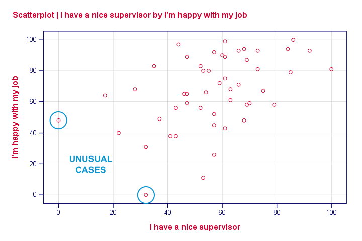
None of our scatterplots show clear curvilinearity. However, we do see some unusual cases that don't quite fit the overall pattern of dots. We'll flag and inspect these cases with the syntax below.
compute flag1 = (overall > 40 and supervisor < 10).
*Move unusual case(s) to top of file for visual inspection.
sort cases by flag1(d).
Result
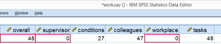
Our first case looks odd indeed: supervisor and workplace are 0 -couldn't be worse- but overall job rating is quite good. We should perhaps exclude such cases from further analyses with FILTER but we'll just ignore them for now.
Regarding linearity, our scatterplots provide a minimal check. A much better approach is inspecting linear and nonlinear fit lines as discussed in How to Draw a Regression Line in SPSS?
An excellent tool for doing this super fast and easy is downloadable from SPSS - Create All Scatterplots Tool.
Inspect Correlation Matrix
We'll now see if the (Pearson) correlations among all variables make sense. For the data at hand, I'd expect only positive correlations between, say, 0.3 and 0.7 or so. For more details, read up on SPSS Correlation Analysis.
correlations overall to tasks
/print nosig
/missing pairwise.
Result
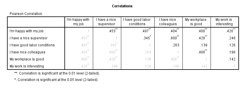
The pattern of correlations looks perfectly plausible. Creating a nice and clean correlation matrix like this is covered in SPSS Correlations in APA Format.
Regression I - Model Selection
The next question we'd like to answer is:
which predictors contribute substantially
to predicting job satisfaction?
Our correlations show that all predictors correlate statistically significantly with the outcome variable. However, there's also substantial correlations among the predictors themselves. That is, they overlap.
Some variance in job satisfaction accounted by a predictor may also be accounted for by some other predictor. If so, this other predictor may not contribute uniquely to our prediction.
There's different approaches towards finding the right selection of predictors. One of those is adding all predictors one-by-one to the regression equation. Since we've 5 predictors, this will result in 5 models. So let's navigate to
![]()
![]() and fill out the dialog as shown below.
and fill out the dialog as shown below.
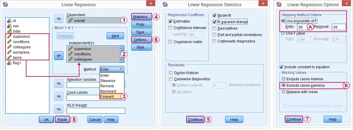
 The method we chose means that SPSS will add all predictors (one at the time) whose p-valuesPrecisely, this is the p-value for the null hypothesis that the population b-coefficient is zero for this predictor. are less than some chosen constant, usually 0.05.
 Choosing 0.98 -or even higher- usually results in all predictors being added to the regression equation.
 By default, SPSS uses only cases without missing values on the predictors and the outcome variable (“listwise exclusion”). If missing values are scattered over variables, this may result in little data actually being used for the analysis. For cases with missing values, pairwise exclusion tries to use all non missing values for the analysis.Pairwise deletion is not uncontroversial and may occasionally result in computational problems.
Syntax Regression I - Model Selection
REGRESSION
/MISSING PAIRWISE /*... because LISTWISE uses only complete cases...*/
/STATISTICS COEFF OUTS R ANOVA CHANGE
/CRITERIA=PIN(.98) POUT(.99)
/NOORIGIN
/DEPENDENT overall
/METHOD=FORWARD supervisor conditions colleagues workplace tasks.
Results Regression I - Model Summary
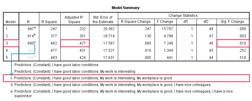
SPSS fitted 5 regression models by adding one predictor at the time. The model summary table shows some statistics for each model. The adjusted r-square column shows that it increases from 0.351 to 0.427 by adding a third predictor.
However, r-square adjusted hardly increases any further by adding a fourth predictor and it even decreases when we enter a fifth predictor. There's no point in including more than 3 predictors in or model. The “Sig. F Change” column confirms this: the increase in r-square from adding a third predictor is statistically significant, F(1,46) = 7.25, p = 0.010. Adding a fourth predictor does not significantly improve r-square any further. In short: this table suggests we should choose model 3.
Results Regression I - B Coefficients
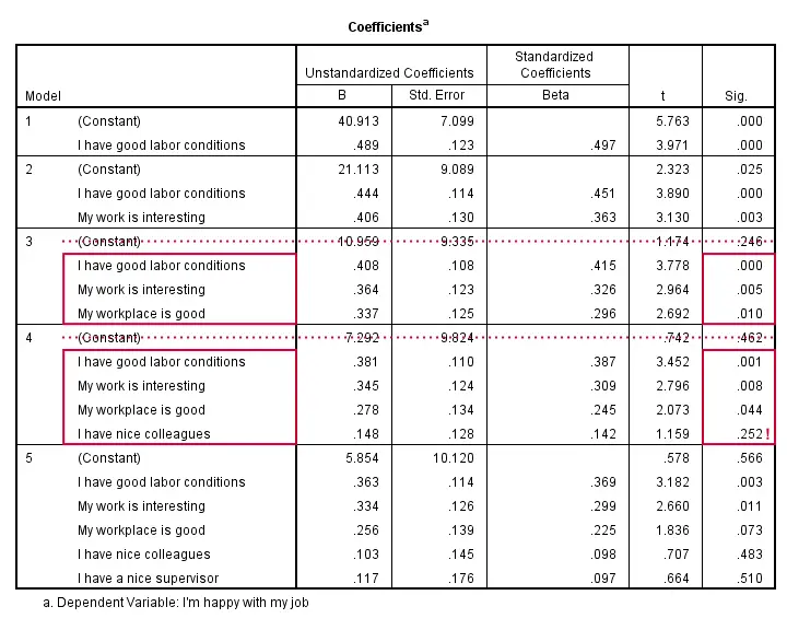
The coefficients table shows that all b-coefficients for model 3 are statistically significant. For a fourth predictor, p = 0.252. Its b-coefficient of 0.148 is not statistically significant. That is, it may well be zero in our population. Realistically, we can't take b = 0.148 seriously. We should not use it for predicting job satisfaction. It's not unlikely to deteriorate -rather than improve- predictive accuracy except for this tiny sample of N = 50.
Note that all b-coefficients shrink as we add more predictors. If we include 5 predictors (model 5), only 2 are statistically significant. The b-coefficients become unreliable if we estimate too many of them.
A rule of thumb is that we need 15 observations for each predictor. With N = 50, we should not include more than 3 predictors and the coefficients table shows exactly that. Conclusion? We settle for model 3 which says that
Satisfaction’ = 10.96 + 0.41 * conditions
+ 0.36 * interesting + 0.34 * workplace.
Now, before we report this model, we should take a close look if our regression assumptions are met. We usually do so by inspecting regression residual plots.
Regression II - Residual Plots
Let's reopen our regression dialog. An easy way is to use the dialog recall ![]() tool on our toolbar. Since model 3 excludes supervisor and colleagues, we'll remove them from the model as shown below.
tool on our toolbar. Since model 3 excludes supervisor and colleagues, we'll remove them from the model as shown below.
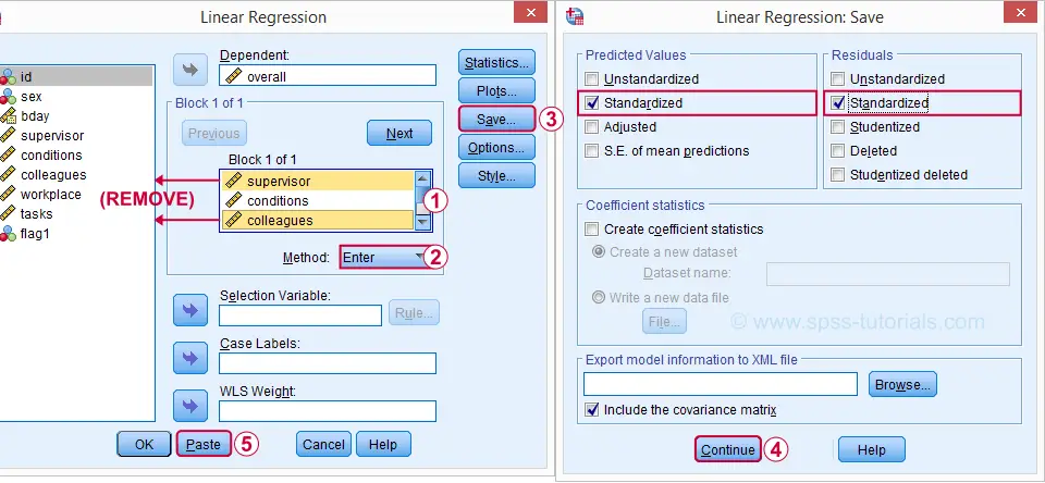
Now, the regression dialogs can create some residual plots but I rather do this myself. This is fairly easy if we save the predicted values and residuals as new variables in our data.
Syntax Regression II - Residual Plots
REGRESSION
/MISSING PAIRWISE
/STATISTICS COEFF OUTS CI(95) R ANOVA CHANGE /*CI(95) = 95% confidence intervals for B coefficients.*
/CRITERIA=PIN(.98) POUT(.99)
/NOORIGIN
/DEPENDENT overall
/METHOD=ENTER conditions workplace tasks /*Only 3 predictors now.*
/SAVE ZPRED ZRESID.
Results Regression II - Normality Assumption
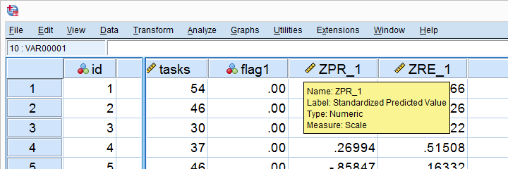
First note that SPSS added two new variables to our data: ZPR_1 holds z-scores for our predicted values. ZRE_1 are standardized residuals.
Let's first see if the residuals are normally distributed. We'll do so with a quick histogram.
frequencies zre_1
/format notable
/histogram normal.
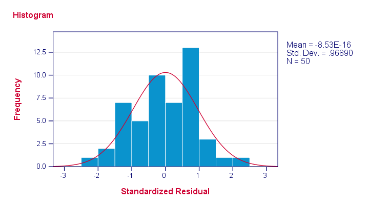
Note that our residuals are roughly normally distributed.
Results Regression II - Linearity and Homoscedasticity
Let's now see to what extent homoscedasticity holds. We'll create a scatterplot for our predicted values (x-axis) with residuals (y-axis).
GRAPH
/SCATTERPLOT(BIVAR)= zpr_1 WITH zre_1
/title "Scatterplot for evaluating homoscedasticity and linearity".
Result
First off, our dots seem to be less dispersed vertically as we move from left to right. That is: the residual variance seems to decrease with higher predicted values. This pattern is known as heteroscedasticity and suggests a (slight) violation of the homoscedasticity assumption.
Second, our dots seem to follow a somewhat curved -rather than straight or linear- pattern. It may be wise to try and fit some curvilinear models to these data but let's leave that for another day.
Right, that should do for now. Some guidelines on APA reporting multiple regression results are discussed in Linear Regression in SPSS - A Simple Example.
Thanks for reading!