Power (Statistics) – The Ultimate Beginners Guide
In statistics, power is the probability of rejecting
a false null hypothesis.
- Power Calculation Example
- Power & Alpha Level
- Power & Effect Size
- Power & Sample Size
- 3 Main Reasons for Power Calculations
- Software for Power Calculations - G*Power
Power - Minimal Example
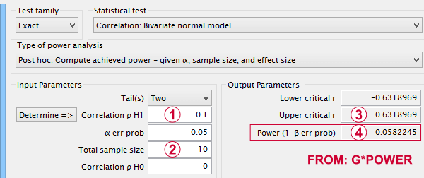
- In some country, IQ and salary have a population correlation ρ = .10.
- A scientist examines a sample of N = 10 people and finds a sample correlation r = .15.
- He tests the (false) null hypothesis H0 that ρ = 0. The significance level for this test, p = .68.
- Since p > .05, his chosen alpha level, he does not reject his (false) null hypothesis that ρ = 0.
Now, given a sample size of N = 10 and a population correlation ρ = 0.10, what's the probability of correctly rejecting the null hypothesis? This probability is known as power and denoted as (1 - β) in statistics. For the aforementioned example, (1 - β) is only .058 (roughly 6%) as shown below.
 If a population correlation ρ = .10 and
 we sample N = 10 respondents, then
 we need to find an absolute sample correlation of | r | > .63 for rejecting H0 at α = .05.
 The probability of finding this is only .058.
So even though H0 is false, we're unlikely to actually reject it. Not rejecting a false H0 is known as a committing a type II error.
Type I and Type II Errors
Any null hypothesis may be true or false and we may or may not reject it. This results in the 4 scenarios outlined below.
| Reality: H0 is true | Reality: H0 is false | |
|---|---|---|
| Decision: reject H0 | Type I error Probability = α | Correct decision Probability = (1 - β) = power |
| Decision: retain H0 | Correct decision Probability = (1 - α) | Type II error Probability = β |
As you probably guess, we usually want the power for our tests to be as high as possible. But before taking a look at factors affecting power, let's first try and understand how a power calculation actually works.
Power Calculation Example
A pharmaceutical company wants to demonstrate that their medicine against high blood pressure actually works. They expect the following:
- the average blood pressure in some untreated population is 160 mmHg;
- they expect their medicine to lower this to roughly 154 mmHg;
- the standard deviation should be around 8 mmHg (both populations);
- they plan to use an independent samples t-test at α = 0.05 with N = 20 for either subsample.
Given these considerations, what's the power for this study? Or -alternatively- what's the probability of rejecting H0 that the mean blood pressure is equal between treated and untreated populations?
Obviously, nobody knows the outcomes for this study until it's finished. However, we do know the most likely outcomes: they're our population estimates. So let's for a moment pretend that we'll find exactly these and enter them into a t-test calculator.
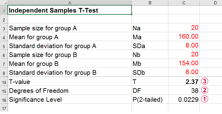 Compute t-test for expected sample sizes, means and SD's in Excel
We expect p = 0.023 so we expect to reject H0.
This is based on a t-distribution with df = 38 degrees of freedom (total sample size N = 40 - 2).
We expect to find t = 2.37 if the population mean difference is 6 mmHg (160 - 154).
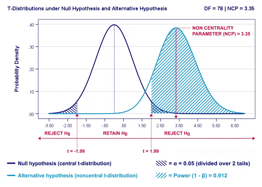
Now, this expected (or average) t = 2.37 under the alternative hypothesis Ha is known as a noncentrality parameter or NCP. The NCP tells us how t is distributed under some exact alternative hypothesis and thus allows us to estimate the power for some test. The figure below illustrates how this works.
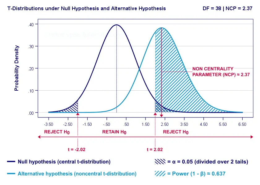
- First off, our H0 is tested using a central t-distribution with df = 38;
- If we test at α = 0.05 (2-tailed), we'll reject H0 if t < -2.02 (left critical value) or if t > 2.02 (right critical value);
- If our alternative hypothesis HA is exactly true, t follows a noncentral t-distribution with df = 38 and NCP = 2.37;
- Under this noncentral t-distribution, the probability of finding t > 2.02 ≈ 0.637. So this is roughly the probability of rejecting H0 -or the power (1 - β)- for our first scenario.
A minor note here is that we'd also reject H0 if t < -2.02 but this probability is almost zero for our first scenario. The exact calculation can be replicated from the SPSS syntax below.
data list free/alpha ncp.
begin data
0.05 2.37
end data.
*Compute left (lct) and right (rct) critical t-values and power.
compute lct = idf.t(0.5 * alpha,38).
compute rct = idf.t(1 - (0.5 * alpha),38).
compute lprob = ncdf.t(lct,38,ncp).
compute rprob = 1 - ncdf.t(rct,38,ncp).
compute power = lprob + rprob.
execute.
*Show 3 decimal places for all values.
formats all (f8.3).
Power and Effect Size
Like we just saw, estimating power requires specifying
- an exact null hypothesis and
- an exact alternative hypothesis.
In the previous example, our scientists had an exact alternative hypothesis because they had very specific ideas regarding population means and standard deviations. In most applied studies, however, we're pretty clueless about such population parameters. This raises the question how do we get an exact alternative hypothesis?
For most tests, the alternative hypothesis can be specified as an effect size measure: a single number combining several means, variances and/or frequencies. Like so, we proceed from requiring a bunch of unknown parameters to a single unknown parameter.
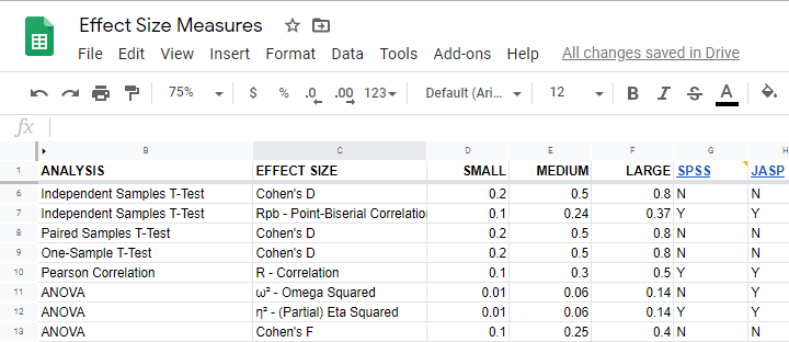
What's even better: widely agreed upon rules of thumb are available for effect size measures. An overview is presented in this Googlesheet, partly shown below.
In applied studies, we often use G*Power for estimating power. The screenshot below replicates our power calculation example for the blood pressure medicine study.
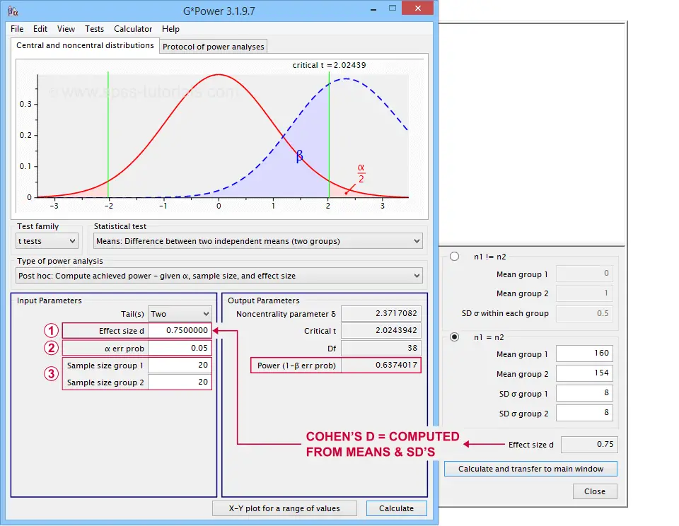 G*Power computes both effect size and power from two means and SD's
Note that estimating power in G*Power only requires
a single estimated effect size measure. Optionally, G*Power computes it for you, given your sample means and SD's.
the alpha level -often 0.05- used for testing the null hypothesis &
one or more sample sizes
Let's now take a look at how these 3 factors relate to power.
Factors Affecting Power
The figure below gives a quick overview how 3 factors relate to power.
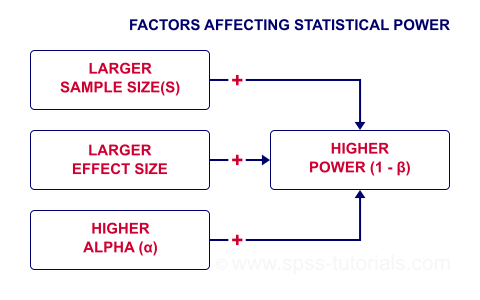
Let's now take a closer look at each of them.
Power & Alpha Level
Everything else equal, increasing alpha increases power. For our example calculation, power increases from 0.637 to 0.753 if we test at α = 0.10 instead of 0.05.
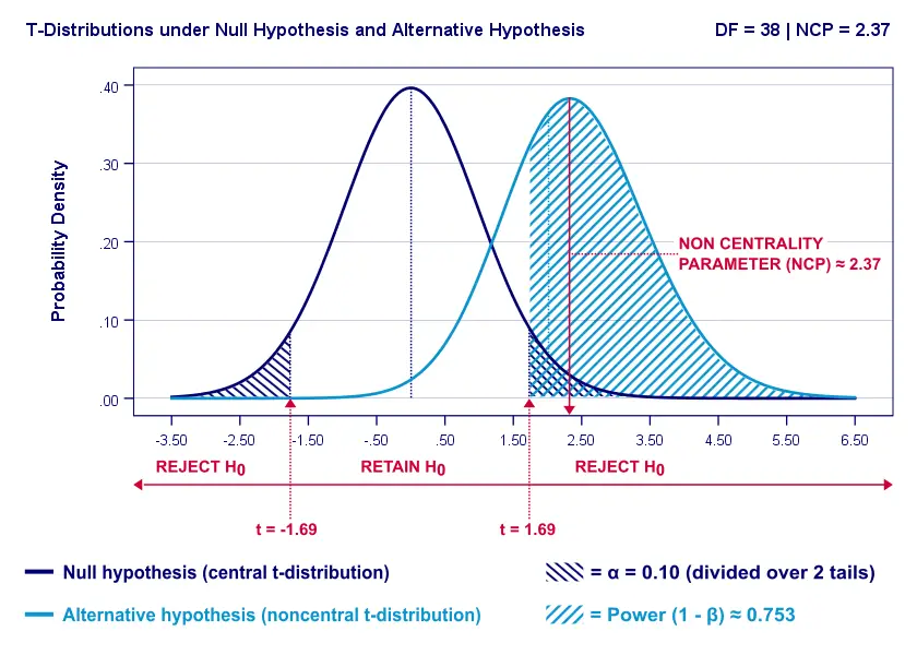
A higher alpha level results in smaller (absolute) critical values: we already reject H0 if t > 1.69 instead of t > 2.02. So the light blue area, indicating (1 - β), increases. We basically require a smaller deviation from H0 for statistical significance.
However, increasing alpha comes at a cost: it increases the probability of committing a type I error (rejecting H0 when it's actually true). Therefore, testing at α > 0.05 is generally frowned upon. In short, increasing alpha basically just decreases one problem by increasing another one.
Power & Effect Size
Everything else equal, a larger effect size results in higher power. For our example, power increases from 0.637 to 0.869 if we believe that Cohen’s D = 1.0 rather than 0.8.
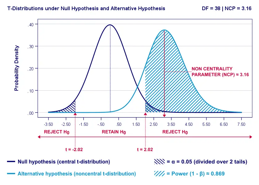
A larger effect size results in a larger noncentrality parameter (NCP). Therefore, the distributions under H0 and HA lie further apart. This increases the light blue area, indicating the power for this test.
Keep in mind, though, that we can estimate but not choose some population effect size. If we overestimate this effect size, we'll overestimate the power for our test accordingly. Therefore, we can't usually increase power by increasing an effect size.
An arguable exception is increasing an effect size by modifying a research design or analysis. For example, (partial) eta squared for a treatment effect in ANOVA may increase by adding a covariate to the analysis.
Power & Sample Size
Everything else equal, larger sample size(s) result in higher power. For our example, increasing the total sample size from N = 40 to N = 80 increases power from 0.637 to 0.912.
The increase in power stems from our distributions lying further apart. This reflects an increased noncentrality parameter (NCP). But why does the NCP increase with larger sample sizes?
Well, recall that for a t-distribution, the NCP is the expected t-value under HA. Now, t is computed as
$$t = \frac{\overline{X_1} - \overline{X_2}}{SE}$$
where \(SE\) denotes the standard error of the mean difference. In turn, \(SE\) is computed as
$$SE = Sw\sqrt{\frac{1}{n_1} + \frac{1}{n_2}}$$
where \(S_w\) denotes the estimated population SD of the outcome variable. This formula shows that as sample sizes increase, \(SE\) decreases and therefore t (and hence the NCP) increases.
On top of this, degrees of freedom increase (from df = 38 to df = 78 for our example). This results in slightly smaller (absolute) critical t-values but this effect is very modest.
In short, increasing sample size(s) is a sound way to increase the power for some test.
Power & Research Design
Apart from sample size, effect size & α, research design may also affect power. Although there's no exact formulas, some general guidelines are that
- everything else equal, within-subjects designs tend to have more power than between-subjects designs;
- for ANCOVA, including one or two covariates tends to increase power for demonstrating a treatment effect;
- for multiple regression, power for each separate predictor tends to decrease as more predictors are added to the model;
3 Main Reasons for Power Calculations
Power calculations in applied research serve 3 main purposes:
- compute the required sample size prior to data collection. This involves estimating an effect size and choosing α (usually 0.05) and the desired power (1 - B), often 0.80;
- estimate power before collecting data for some planned analyses. This requires specifying the intended sample size, choosing an α and estimating which effect sizes are expected. If the estimated power is low, the planned study may be cancelled or proceed with a larger sample size;
- estimate power after data have been collected and analyzed. This calculation is based on the actual sample size, α used for testing and observed effect size.
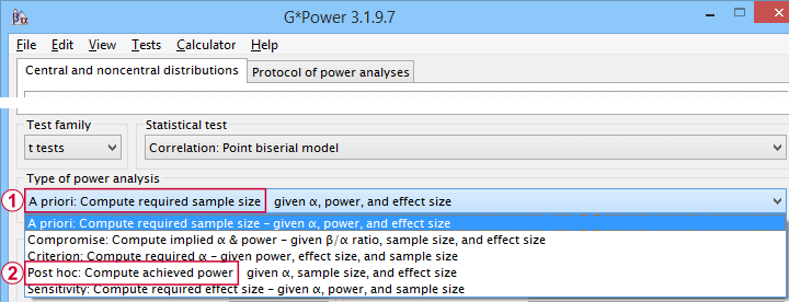 Different types of power analysis are made simple by G*Power
Software for Power Calculations - G*Power
G*Power is freely downloadable software for running the aforementioned and many other power calculations. Among its features are
- computing effect sizes from descriptive statistics (mostly sample means and standard deviations);
- computing power, required sample sizes, required effect sizes and more;
- creating plots that visualize how power, effect size and sample size relate for many different statistical procedures. The figure below shows an example for multiple linear regression.
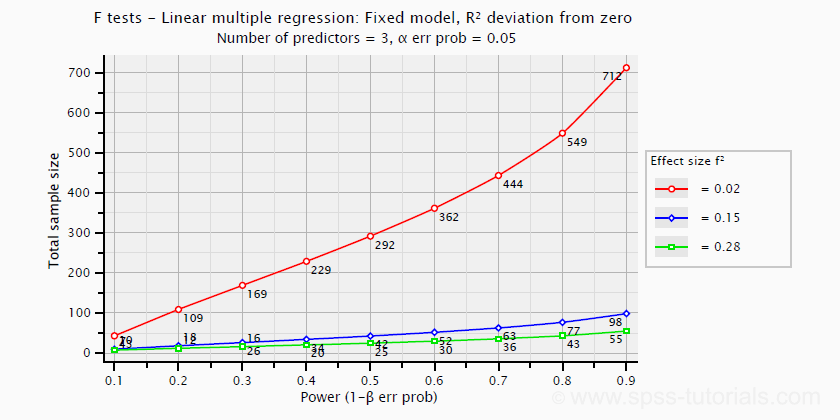 Required sample sizes for multiple linear regression, given desired power,
chosen α and 3 estimated effect sizes
Altogether, we think G*Power is amazing software and we highly recommend using it. The only disadvantage we can think of is that it requires rather unusual effect size measures. Some examples are
- Cohen’s f for ANOVA and
- Cohen’s W for a chi-square test.
This is awkward because the APA and (perhaps therefore) most journal articles typically recommend reporting
- (partial) eta-squared for ANOVA and
- the contingency coefficient or (better) Cramér’s V for a chi-square test.
These are also the measures we typically obtain from statistical packages such as SPSS or JASP. Fortunately, G*Power converts some measures and/or computes them from descriptive statistics like we saw in this screenshot.
Software for Power Calculations - SPSS
In SPSS, observed power can be obtained from the GLM, UNIANOVA and (deprecated) MANOVA procedures. Keep in mind that GLM - short for General Linear Model- is very general indeed: it can be used for a wide variety of analyses including
- (multiple) linear regression;
- t-tests;
- ANCOVA (analysis of covariance);
- repeated measures ANOVA.
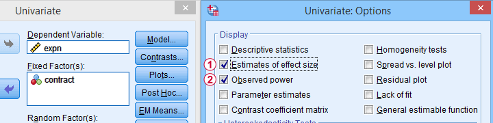 Select Observed power from Analyze - General Linear Model -
Univariate - Options
Other power calculations (required sample sizes or estimating power prior to data collection) were added to SPSS version 27, released in 2020.
 Power Analysis as found in SPSS version 27 onwards
In my opinion, SPSS power analysis is a pathetic attempt to compete with G*Power. If you don't believe me, just try running a couple of power analyses in both programs simultaneously. If you do believe me, ignore SPSS power analysis and just go for G*Power.
Thanks for reading.
Probability Density Functions – Simple Tutorial
A probability density function is a function from which
probabilities for ranges of outcomes can be obtained.
- Probability Density Functions - Basic Rules
- Cumulative Probability Density Functions
- Inverse Cumulative Probability Density Functions
- Differences Probability Density and Probability Distributions
- Probability Density Functions in Applied Statistics
Example
The birth weights of mice follow a normal distribution, which is a probability density function. The population mean μ = 1 gram and the standard deviation σ = 0.25 grams.
What's the probability that a newly born mouse
has a birth weight between 1.0 and 1.2 grams?
The figure below shows how to obtain an approximate answer, using only the probability density curve we just described.
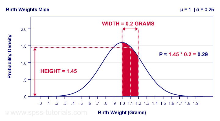
The probability is the surface area under the curve between 1.0 and 1.2 grams. It has a width of 0.2 grams and its average height -the probability density for this weight interval- is roughly 1.45. Therefore, the probability that a newborn mouse weighs between 1.0 and 1.2 grams is 1.45 · 0.2 = 0.29 -some 29%.
So What is Probability Density?
Probability density is probability per measurement unit.
Our probability density of 1.45 means that the probability is 1.45 per gram -the measurement unit- over the interval between 1.0 and 1.2 grams. In contrast to probability, probability density can exceed 1 but only over an interval smaller than 1 measurement unit.
Compare this to population density: a population density of 100 inhabitants per square kilometer for some village doesn't imply that it has 100 inhabitants. If this village has a surface area of only 0.5 square kilometers, then it has (100 · 0.5 =) 50 inhabitants.
The screenshot below shows how to get a probability density from Excel or Google sheets.

Simply typing =NORM.DIST(1.1,1,0.25,FALSE) into some cell returns the probability density at x = 1.1, which is 1.473. The last argument, cumulative, refers to the cumulative density function which we'll discuss in a minute.
Anyway. In applied statistics, we're usually after probabilities instead of probability densities. So
what good is a curve showing probability densities?
Well, just like a histogram, it shows which ranges of values occur how often. Like so, it predicts what a histogram will look like if we actually draw a (reasonably large) sample.
The figure below illustrates just this: it shows a histogram for a sample of 10,000 mice with the assumed normal curve (in red) superimposed on it.
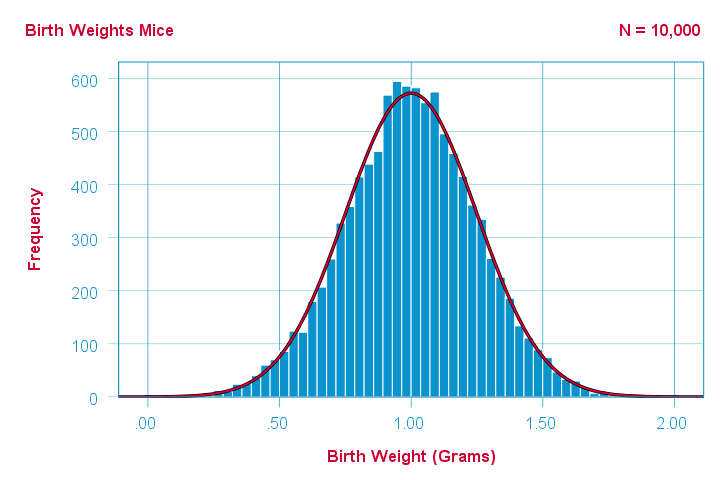 The normal curve (in red) predicts the shape of this histogram fairly precisely.
This curve -just a simple function- gives us a ton of information about our variable such as its
Probability Density Functions - Basic Rules
The mathematical definition of a probability density function is any function
- whose surface area is 1 and
- which doesn't return values < 0.
Furthermore,
- probability density functions only apply to continuous variables and
- the probability for any single outcome is defined as zero. Only ranges of outcomes have non zero probabilities.
So how do we usually obtain such probabilities in applied research? The easy way is using a cumulative probability density function.
Cumulative Probability Density Functions
A cumulative probability density function returns the probability
that an outcome is smaller than some value x.
Such a probability -denoted as \(P(X \lt x)\)- is known as a cumulative probability.
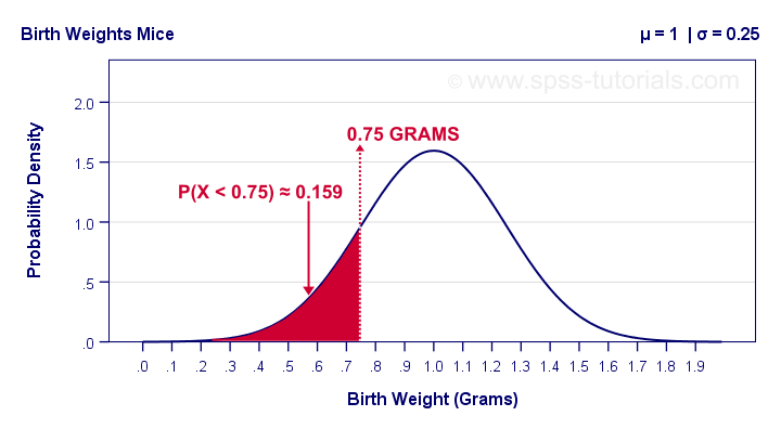
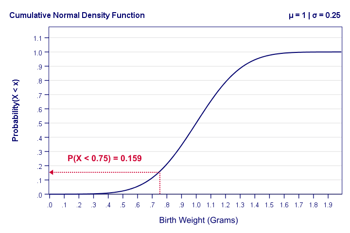
Example: the birth weights of mice are normally distributed with μ = 1 and σ = 0.25 grams. What's the probability that a random mouse is born with a weight less than 0.75 grams?
The figure below shows that this probability corresponds to the surface area left of 0.75 grams, which is 0.159 or 15.9%.
So how did we find this exact surface area? Well, the surface area left of any value can be computed with an integral:
$$F_{cpd}(x) = \int_{-\infty}^x F_{pd}(x)dx = P(X \lt x)$$
where
- \(F_{cpd}(x)\) denotes the cumulative probability density function;
- \(F_{pd}(x)\) denotes a probability density function and
- \(P(X \lt x)\) is the probability that an outcome \(X \lt x\).
The figure below shows what a cumulative normal density function looks like.
Note that we can readily look up probabilities from this curve. However, we can't easily estimate this variable's mean, standard deviation or skewness from this curve. The main exception to this is its median of 1.0 grams.
Last but not least, the screenshot below shows how to obtain cumulative probabilities in Excel or Google Sheets.
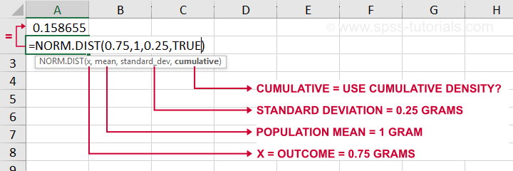
If a variable is normally distributed with μ = 1 and σ = 0.25, then typing =NORM.DIST(0.75,1,0.25,TRUE) into some cell returns the probability that X < 0.75, which is 0.159.
Inverse Cumulative Probability Density Functions
An inverse cumulative probability density function returns
the value x for a given cumulative probability.
Example: the birth weights of mice are normally distributed with μ = 1 and σ = 0.25 grams. Which birth weight separates the 10% lowest from the 90% highest birth weights? The figure below shows how to find this value in Excel: a birth weight less than 0.680 grams has a 0.1 or 10% probability of occurring.
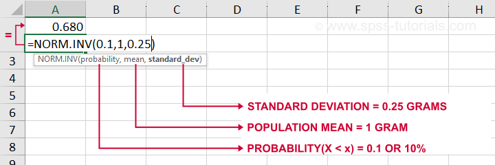
Looking up this value from the inverse cumulative density in Excel is done by typing =NORM.INV(0.1,1,0.25) which returns a value (birth weight in this example) of 0.680.
Differences Probability Density and Probability Distributions
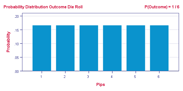
Probability density functions are often misreferred to as “probability-distributions”. This is confusing because they really are 2 different things:
- probability density functions apply to continuous variables whereas probability distributions apply to discrete variables;
- probability density functions return probability densities whereas probability distribution functions return probabilities;
- by definition, separate outcomes have zero probabilities for probability density functions. For probability distributions, separate outcomes may have non zero probabilities.
A text book illustration of a true probability distribution is shown below: the outcome of a roll with a balanced die.
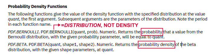
Sadly, the SPSS manual abbreviates both density and distribution functions to “PDF” as shown below. Also note that the Bernoulli distribution -a probability distribution- is wrongfully listed under probability density functions.
Interestingly, cumulative probability density functions are comparable to cumulative probability functions. Both return cumulative probabilities: the probability that some outcome is equal to or smaller than some value x denoted as \(P(X \le x)\).
Probability Density Functions in Applied Statistics
The big 4 probability density functions in applied statistics are
- the normal distribution (normality assumption and z-tests);
- the t-distribution (t-tests and regression coefficients);
- the χ2-distribution (chi-square test and loglinear analysis);
- the F-distribution (ANOVA, Levene's test).
These functions are used in different forms that serve different purposes:
1. Cumulative probability density functions return probabilities for ranges of outcomes. Two such types of probabilities are
- statistical significance and
- (1 - β) or power.
2. Inverse cumulative probability density functions return ranges of outcomes for (chosen) probabilities. Like so, they're used for constructing confidence intervals: ranges of values that enclose some parameter with a given likelihood, often 95%. Example: “the 95% confidence interval for the mean monthly salary runs from $2,300 through $2,450”.
3. Probability density functions are sometimes used to inspect statistical assumptions. Like so, the normality assumption can be evaluated by superimposing a normal curve over a histogram of observed values like we saw here. Alternatives for testing for normality are
- the Shapiro-Wilk test and
- the Kolmogorov-Smirnov test.
Right. I guess that's basically it regarding probability density functions. Let us know if you found this tutorial helpful by throwing a comment below.
Thanks for reading!
Percentiles – Quick Introduction & Examples
The nth percentile is the value that separates
the lowest n% of values from the other values.
Example: the 10th percentile for body weight is 60 kilos. This means that 10% of all people weigh less than 60 kilos and 90% of people weigh more.
- Percentiles - Simple Example
- Percentiles - Interpolation Formula
- PERCENTILE.EXC or PERCENTILE.INC?
- Percentiles in SPSS
- Quartiles, Median & Boxplots
Percentiles - Simple Example
Some fishermen catch and measure 100 trouts. The data thus obtained are in this Googlesheet, partly shown below.
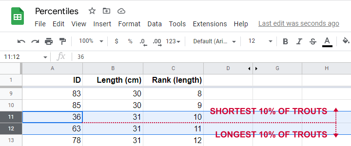
So what's the 10th percentile for the length of these trouts? For our 100 observations, this is super easy. We simply
- sort our lengths ascendingly;
- rank our lengths while ignoring ties (values that occur more than once);
- find the length between observations 10 (10% of 100 observations) and 11 (the next observation).
As shown in the screenshot above, observations 10 and 11 both have a length of 31 centimeters. This is the 10th percentile for length as either Excel or SPSS will readily confirm.
Sadly, things are rarely that simple with real life data. For example, how to find the 15th percentile from N = 141 observations?
In this case, we'd better use one or two simple formulas. We'll demonstrate them in order to find the 15th percentile for length.
Percentiles - Rank Formula
Percentile \(pct\) is the value that has \(Rank_{pct}\) defined as
$$Rank_{pct} = \frac{pct}{100} \cdot (N + 1)$$
where
- \(Rank_{pct}\) denotes the rank for some percentile \(pct\) and;
- \(N\) denotes the sample size or population size.
So the 15th percentile for 100 observations is the observation with rank
$$Rank_{15} = \frac{15}{100} \cdot (100 + 1) = 15.15$$
Sadly, there is no observation with rank 15.15. So we look at the nearest ranks, 15 and 16 in our Googlesheet.
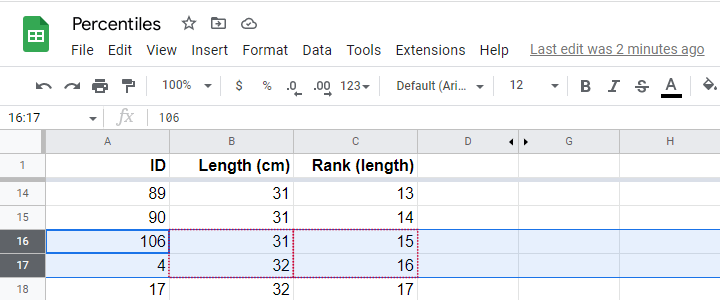
Note that
- observation 15 has a length of 31 centimeters and
- observation 16 has a length of 32 centimeters.
If both values would have been equal -as between ranks 10 and 11, both 31 centimeters- we would have reported this value. However, the 15th percentile is some value between 31 centimeters (rank 15) and 32 centimeters (rank 16).
If may be tempting to simply report the average, 31.5 centimeters. However, 15.15 is closer to rank 15 than rank 16. This is usually taken into account by linear interpolation.
Percentiles - Interpolation Formula
For non integer ranks, exact percentiles are usually computed with
$$Pct = X_{tr} + (X_{tr + 1} - X_{tr}) \cdot ({r - tr})$$
where
- \(Pct\) denotes the desired percentile;
- \(r\) denotes the decimal rank for the desired percentile;
- \(tr\) denotes the truncated rank for the desired percentile;
- \(X_{tr}\) denotes the score for the truncated rank;
- \(X_{tr + 1}\) denotes the score for the truncated rank + 1.
For our example, this results in
$$Pct = 31 + (32 - 31) \cdot ({15.15 - 15}) = 31.15$$
Our Googlesheet shows how to implement this formula and its outcome.
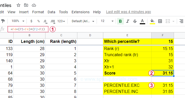
Note that we replicated this outcome with the built-in function for percentiles, which is
=PERCENTILE.EXC(B2:B101,0.15)
in Googlesheets as well as Excel. As we'll see in a minute, SPSS yields the same outcome.
PERCENTILE.EXC or PERCENTILE.INC?
You may have noticed that Excel and Googlesheets contain 2 different percentile formulas:
- PERCENTILE.EXC excludes percentiles 0 and 100. That is, these are undefined.
- PERCENTILE.INC defines percentile 0 as the minimum and percentile 100 as the maximum.
So which one is best?
My personal opinion is that PERCENTILE.EXC makes more sense given our definition:
the nth percentile is the value that separates
the lowest n% of values from the other values.
This implies that the zeroeth percentile would be the value that separates the lowest 0% (?!?!) of all values from the others.
This -and therefore PERCENTILE.INC- doesn't make a lot of sense to me. But if you disagree, I'll be happy to hear from you.
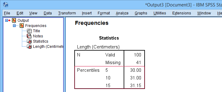
Percentiles in SPSS
SPSS users may first download and open trout.sav. Now, the simplest way to find percentiles is from
![]()
![]() and fill out the dialogs as shown below.
and fill out the dialogs as shown below.
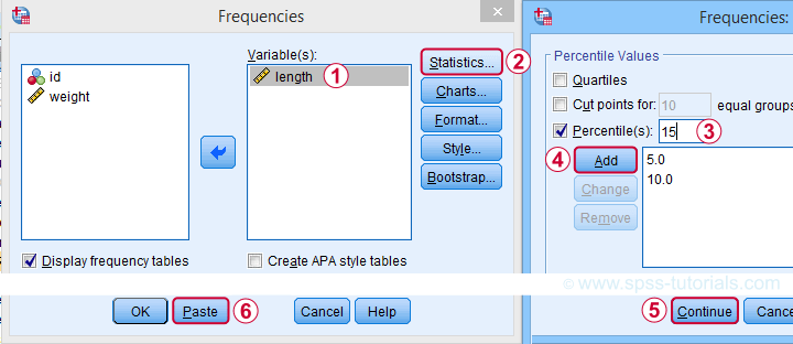
A much faster option is to use SPSS syntax like the one shown below.
frequencies length
/percentiles 5 10 15.
Completing these steps confirms once more 31.15 centimeters as the 15th percentile for the lengths of our trouts.
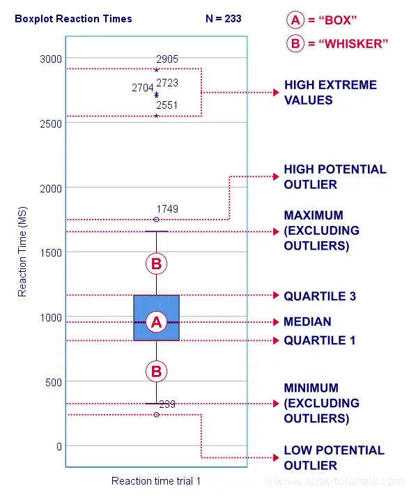
Quartiles, Median & Boxplots
The percentiles that are most often reported are
- the 25th percentile, also known as quartile 1;
- the 50th percentile, also known as quartile 2 or the median;
- the 75th percentile, also known as quartile 3.
These percentiles are often reported in boxplots such as the one shown below.
Percentiles - Conceptual Issues
Last but not least, I'd like to point out 2 conceptual issues with percentiles that are mentioned by few text books.
First off, in case of ties, percentiles may not exactly separate the lowest n% of observations from the others. Regarding our first example,
- 9.0% of trouts have a length smaller than 31 centimeters;
- 6.0% of trouts have a length equal to 31 centimeters;
- 85.0% of trouts have a length greater than 31 centimeters.
Note that there is no single value here that exactly separates the lowest 10% from all other observations.
The second conceptual issue is the opposite: in some cases, an infinite number of values exactly separate the lowest n% of values. This holds for our second example, which came up with a rank of 15.15.
Remember that ranks 15 and 16 corresponded to 31 and 32 centimeters. Our interpolation formula came up with 15.15 centimeters but
- 31.0000001 centimeters also exactly separates the lowest 15%,
- 31.0000002 centimeters also exactly separates the lowest 15%,
- and so on...
Fortunately, these conceptual issues rarely plague real-world data analysis.
Right, so that'll do. If you've any questions or remarks, please throw me a comment below. Other than that,
Thanks for reading!
Pearson Correlations – Quick Introduction
A Pearson correlation is a number between -1 and +1 that indicates
to which extent 2 variables are linearly related.
The Pearson correlation is also known as the “product moment correlation coefficient” (PMCC) or simply “correlation”.
Pearson correlations are only suitable for quantitative variables (including dichotomous variables).
- For ordinal variables, use the Spearman correlation or Kendall’s tau and
- for nominal variables, use Cramér’s V.
Correlation Coefficient - Example
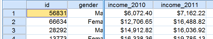
We asked 40 freelancers for their yearly incomes over 2010 through 2014. Part of the raw data are shown below.
Today’s question is:
is there any relation between income over 2010
and income over 2011?
Well, a splendid way for finding out is inspecting a scatterplot for these two variables: we'll represent each freelancer by a dot. The horizontal and vertical positions of each dot indicate a freelancer’s income over 2010 and 2011. The result is shown below.
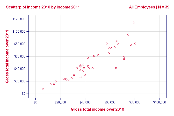
Our scatterplot shows a strong relation between income over 2010 and 2011: freelancers who had a low income over 2010 (leftmost dots) typically had a low income over 2011 as well (lower dots) and vice versa. Furthermore, this relation is roughly linear; the main pattern in the dots is a straight line.
The extent to which our dots lie on a straight line indicates the strength of the relation. The Pearson correlation is a number that indicates the exact strength of this relation.
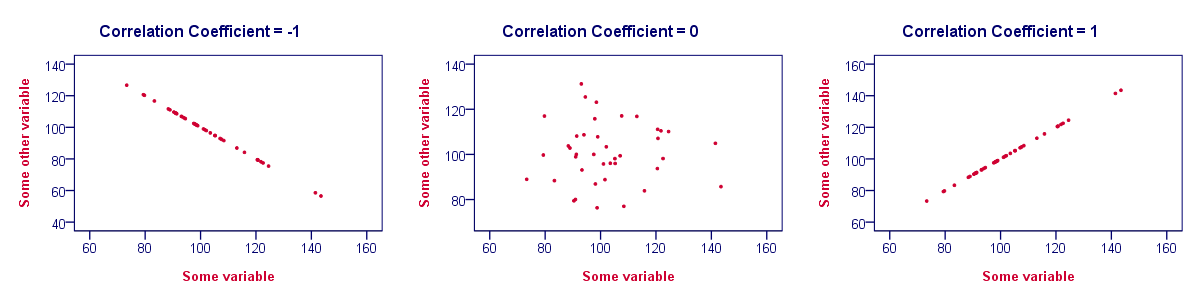
Correlation Coefficients and Scatterplots
A correlation coefficient indicates the extent to which dots in a scatterplot lie on a straight line. This implies that we can usually estimate correlations pretty accurately from nothing more than scatterplots. The figure below nicely illustrates this point.
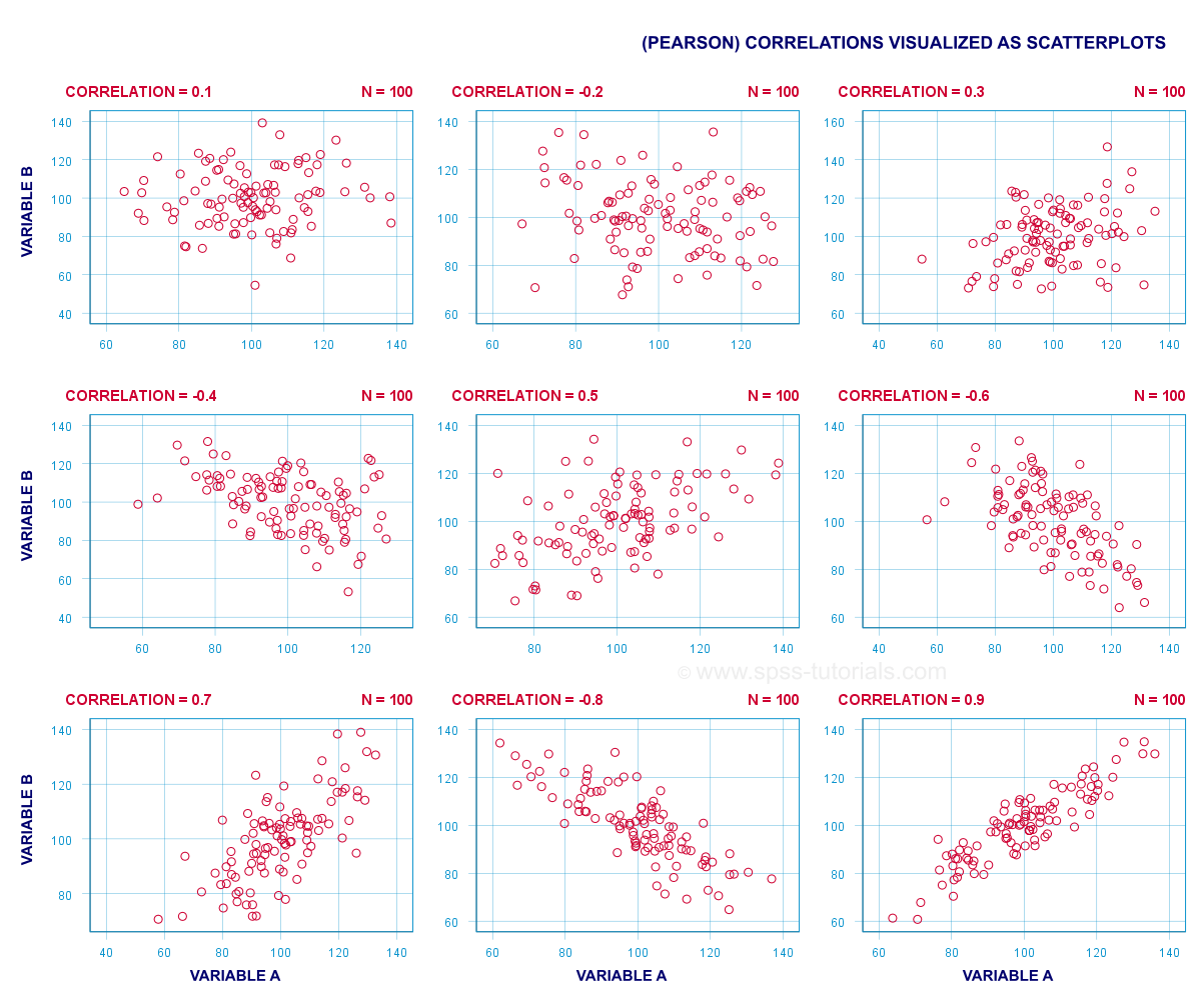
Correlation Coefficient - Basics
Some basic points regarding correlation coefficients are nicely illustrated by the previous figure. The least you should know is that
- Correlations are never lower than -1. A correlation of -1 indicates that the data points in a scatter plot lie exactly on a straight descending line; the two variables are perfectly negatively linearly related.
- A correlation of 0 means that two variables don't have any linear relation whatsoever. However, some non linear relation may exist between the two variables.
- Correlation coefficients are never higher than 1. A correlation coefficient of 1 means that two variables are perfectly positively linearly related; the dots in a scatter plot lie exactly on a straight ascending line.
Correlation Coefficient - Interpretation Caveats
When interpreting correlations, you should keep some things in mind. An elaborate discussion deserves a separate tutorial but we'll briefly mention two main points.
- Correlations may or may not indicate causal relations. Reversely, causal relations from some variable to another variable may or may not result in a correlation between the two variables.
- Correlations are very sensitive to outliers; a single unusual observation may have a huge impact on a correlation. Such outliers are easily detected by a quick inspection a scatterplot.
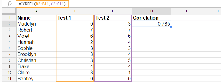
Correlation Coefficient - Software
Most spreadsheet editors such as Excel, Google sheets and OpenOffice can compute correlations for you. The illustration below shows an example in Googlesheets.
Correlation Coefficient - Correlation Matrix
Keep in mind that correlations apply to pairs of variables. If you're interested in more than 2 variables, you'll probably want to take a look at the correlations between all different variable pairs. These correlations are usually shown in a square table known as a correlation matrix. Statistical software packages such as SPSS create correlations matrices before you can blink your eyes. An example is shown below.
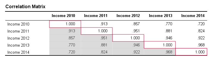
Note that the diagonal elements (in red) are the correlations between each variable and itself. This is why they are always 1.
Also note that the correlations beneath the diagonal (in grey) are redundant because they're identical to the correlations above the diagonal. Technically, we say that this is a symmetrical matrix.
Finally, note that the pattern of correlations makes perfect sense: correlations between yearly incomes become lower insofar as these years lie further apart.
Pearson Correlation - Formula
If we want to inspect correlations, we'll have a computer calculate them for us. You'll rarely (probably never) need the actual formula. However, for the sake of completeness, a Pearson correlation between variables X and Y is calculated by
$$r_{XY} = \frac{\sum_{i=1}^n(X_i - \overline{X})(Y_i - \overline{Y})}{\sqrt{\sum_{i=1}^n(X_i - \overline{X})^2}\sqrt{\sum_{i=1}^n(Y_i - \overline{Y})^2}}$$
The formula basically comes down to dividing the covariance by the product of the standard deviations. Since a coefficient is a number divided by some other number our formula shows why we speak of a correlation coefficient.
Correlation - Statistical Significance
The data we've available are often -but not always- a small sample from a much larger population. If so,
we may find a non zero correlation in our sample
even if it's zero in the population. The figure below illustrates how this could happen.
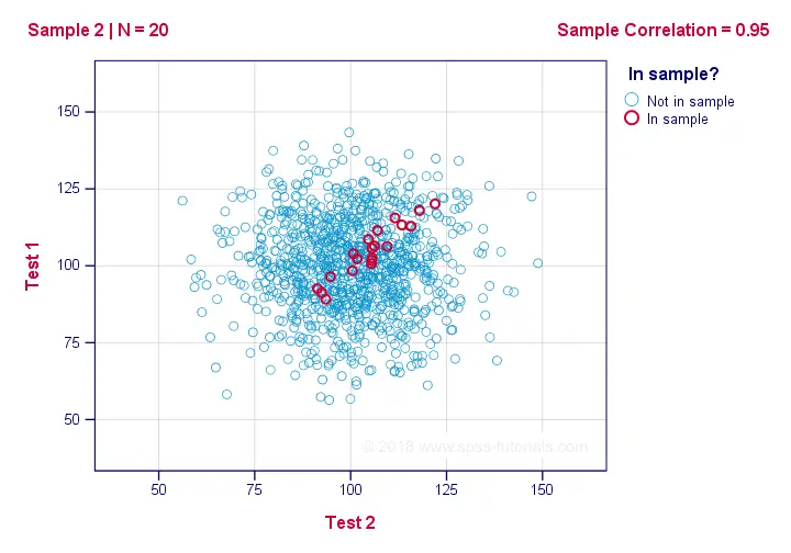
If we ignore the colors for a second, all 1,000 dots in this scatterplot visualize some population. The population correlation -denoted by ρ- is zero between test 1 and test 2.
Now, we could draw a sample of N = 20 from this population for which the correlation r = 0.95.
Reversely, this means that a sample correlation of 0.95 doesn't prove with certainty that there's a non zero correlation in the entire population. However, finding r = 0.95 with N = 20 is extremely unlikely if ρ = 0. But precisely how unlikely? And how do we know?
Correlation - Test Statistic
If ρ -a population correlation- is zero, then the probability for a given sample correlation -its statistical significance- depends on the sample size. We therefore combine the sample size and r into a single number, our test statistic t:
$$T = R\sqrt{\frac{(n - 2)}{(1 - R^2)}}$$
Now, T itself is not interesting. However, we need it for finding the significance level for some correlation. T follows a t distribution with ν = n - 2 degrees of freedom but only if some assumptions are met.
Correlation Test - Assumptions
The statistical significance test for a Pearson correlation requires 3 assumptions:
- independent observations;
- the population correlation, ρ = 0;
- normality: the 2 variables involved are bivariately normally distributed in the population. However, this is not needed for a reasonable sample size -say, N ≥ 20 or so.The reason for this lies in the central limit theorem.
Pearson Correlation - Sampling Distribution
In our example, the sample size N was 20. So if we meet our assumptions, T follows a t-distribution with df = 18 as shown below.
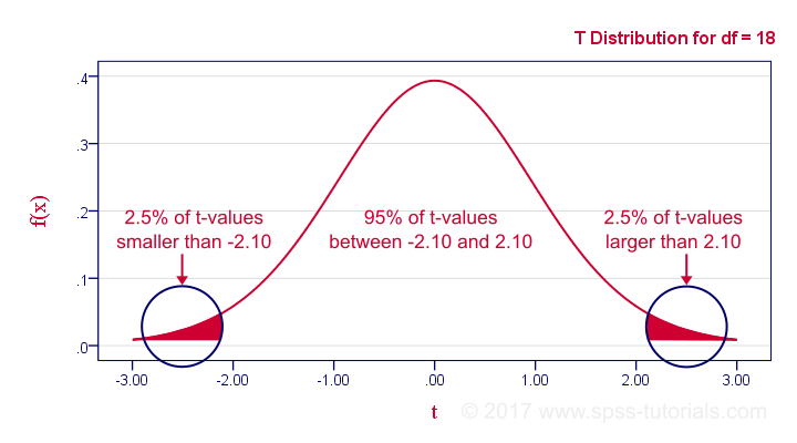
This distribution tells us that there's a 95% probability that -2.1 < t < 2.1, corresponding to -0.44 < r < 0.44. Conclusion:
if N = 20, there's a 95% probability of finding -0.44 < r < 0.44.
There's only a 5% probability of finding a correlation outside this range. That is, such correlations are statistically significant at α = 0.05 or lower: they are (highly) unlikely and thus refute the null hypothesis of a zero population correlation.
Last, our sample correlation of 0.95 has a p-value of 1.55e-10 -one to 6,467,334,654. We can safely conclude there's a non zero correlation in our entire population.
Thanks for reading!