SPSS Shapiro-Wilk Test – Quick Tutorial with Example
- Shapiro-Wilk Test - What is It?
- Shapiro-Wilk Test - Null Hypothesis
- Running the Shapiro-Wilk Test in SPSS
- Shapiro-Wilk Test - Interpretation
- Reporting a Shapiro-Wilk Test in APA style
Shapiro-Wilk Test - What is It?
The Shapiro-Wilk test examines if a variable
is normally distributed in some population.
Like so, the Shapiro-Wilk serves the exact same purpose as the Kolmogorov-Smirnov test. Some statisticians claim the latter is worse due to its lower statistical power. Others disagree.
As an example of a Shapiro-Wilk test, let's say a scientist claims that the reaction times of all people -a population- on some task are normally distributed. He draws a random sample of N = 233 people and measures their reaction times. A histogram of the results is shown below.
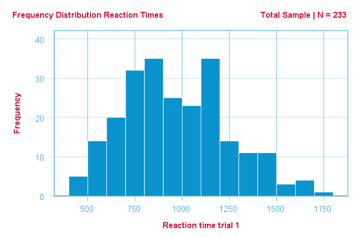
This frequency distribution seems somewhat bimodal. Other than that, it looks reasonably -but not exactly- normal. However, sample outcomes usually differ from their population counterparts. The big question is:
how likely is the observed distribution if the reaction times
are exactly normally distributed in the entire population?
The Shapiro-Wilk test answers precisely that.
How Does the Shapiro-Wilk Test Work?
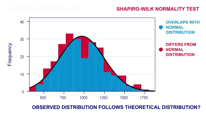
A technically correct explanation is given on this Wikipedia page. However, a simpler -but not technically correct- explanation is this: the Shapiro-Wilk test first quantifies the similarity between the observed and normal distributions as a single number: it superimposes a normal curve over the observed distribution as shown below. It then computes which percentage of our sample overlaps with it: a similarity percentage.
Finally, the Shapiro-Wilk test computes the probability of finding this observed -or a smaller- similarity percentage. It does so under the assumption that the population distribution is exactly normal: the null hypothesis.
Shapiro-Wilk Test - Null Hypothesis
The null hypothesis for the Shapiro-Wilk test is that a variable is normally distributed in some population.
A different way to say the same is that a variable’s values are a simple random sample from a normal distribution. As a rule of thumb, we
reject the null hypothesis if p < 0.05.
So in this case we conclude that our variable is not normally distributed.
Why? Well, p is basically the probability of finding our data if the null hypothesis is true. If this probability is (very) small -but we found our data anyway- then the null hypothesis was probably wrong.
Shapiro-Wilk Test - SPSS Example Data
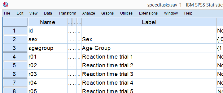
A sample of N = 236 people completed a number of speedtasks. Their reaction times are in speedtasks.sav, partly shown below. We'll only use the first five trials in variables r01 through r05.
I recommend you always thoroughly inspect all variables you'd like to analyze. Since our reaction times in milliseconds are quantitative variables, we'll run some quick histograms over them. I prefer doing so from the short syntax below. Easier -but slower- methods are covered in Creating Histograms in SPSS.
frequencies r01 to r05
/format notable
/histogram normal.
Results
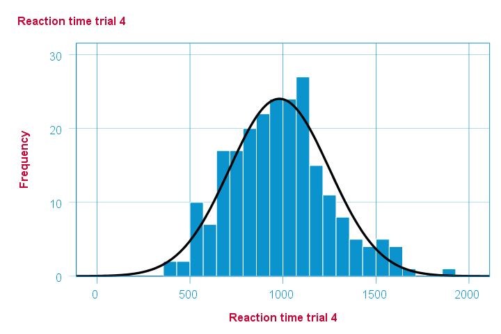
Note that some of the 5 histograms look messed up. Some data seem corrupted and had better not be seriously analyzed. An exception is trial 4 (shown below) which looks plausible -even reasonably normally distributed.
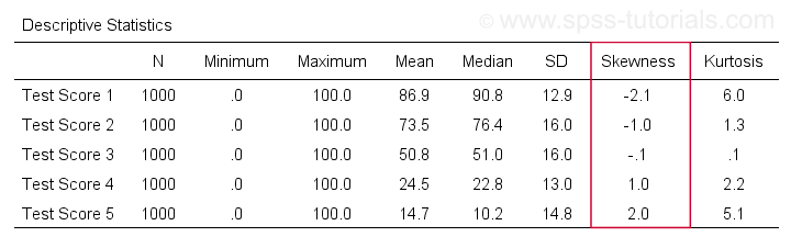
Descriptive Statistics - Skewness & Kurtosis
If you're reading this to complete some assignment, you're probably asked to report some descriptive statistics for some variables. These often include the median, standard deviation, skewness and kurtosis. Why? Well, for a normal distribution,
- skewness = 0: it's absolutely symmetrical and
- kurtosis = 0 too: it's neither peaked (“leptokurtic”) nor flattened (“platykurtic”).
So if we sample many values from such a distribution, the resulting variable should have both skewness and kurtosis close to zero. You can get such statistics from FREQUENCIES but I prefer using MEANS: it results in the best table format and its syntax is short and simple.
means r01 to r05
/cells count mean median stddev skew kurt.
*Optionally: transpose table (requires SPSS 22 or higher).
output modify
/select tables
/if instances = last /*process last table in output, whatever it is...
/table transpose = yes.
Results
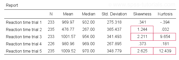
Trials 2, 3 and 5 all have a huge skewness and/or kurtosis. This suggests that they are not normally distributed in the entire population. Skewness and kurtosis are closer to zero for trials 1 and 4.
So now that we've a basic idea what our data look like, let's proceed with the actual test.
Running the Shapiro-Wilk Test in SPSS
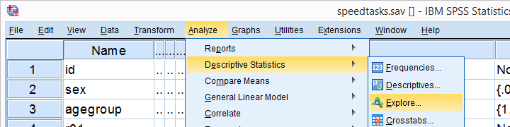
The screenshots below guide you through running a Shapiro-Wilk test correctly in SPSS. We'll add the resulting syntax as well.
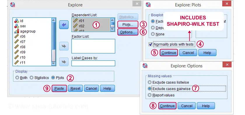
Following these screenshots results in the syntax below.
EXAMINE VARIABLES=r01 r02 r03 r04 r05
/PLOT BOXPLOT NPPLOT
/COMPARE GROUPS
/STATISTICS DESCRIPTIVES
/CINTERVAL 95
/MISSING PAIRWISE /*IMPORTANT!
/NOTOTAL.
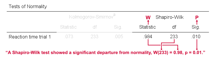
Running this syntax creates a bunch of output. However, the one table we're looking for -“Tests of Normality”- is shown below.
Shapiro-Wilk Test - Interpretation
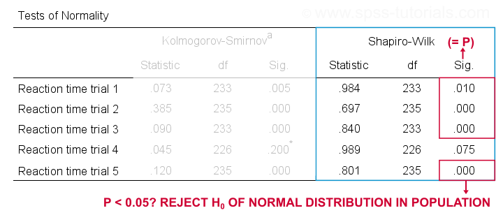
We reject the null hypotheses of normal population distributions
for trials 1, 2, 3 and 5 at α = 0.05.
“Sig.” or p is the probability of finding the observed -or a larger- deviation from normality in our sample if the distribution is exactly normal in our population. If trial 1 is normally distributed in the population, there's a mere 0.01 -or 1%- chance of finding these sample data. These values are unlikely to have been sampled from a normal distribution. So the population distribution probably wasn't normal after all.
We therefore reject this null hypothesis. Conclusion: trials 1, 2, 3 and 5 are probably not normally distributed in the population.
The only exception is trial 4: if this variable is normally distributed in the population, there's a 0.075 -or 7.5%- chance of finding the nonnormality observed in our data. That is, there's a reasonable chance that this nonnormality is solely due to sampling error. So
for trial 4, we retain the null hypothesis
of population normality because p > 0.05.
We can't tell for sure if the population distribution is normal. But given these data, we'll believe it. For now anyway.
Reporting a Shapiro-Wilk Test in APA style
For reporting a Shapiro-Wilk test in APA style, we include 3 numbers:
- the test statistic W -mislabeled “Statistic” in SPSS;
- its associated df -short for degrees of freedom and
- its significance level p -labeled “Sig.” in SPSS.
The screenshot shows how to put these numbers together for trial 1.
Limited Usefulness of Normality Tests
The Shapiro-Wilk and Kolmogorov-Smirnov test both examine if a variable is normally distributed in some population. But why even bother? Well, that's because many statistical tests -including ANOVA, t-tests and regression- require the normality assumption: variables must be normally distributed in the population. However,
the normality assumption is only needed for small sample sizes
of -say- N ≤ 20 or so. For larger sample sizes, the sampling distribution of the mean is always normal, regardless how values are distributed in the population. This phenomenon is known as the central limit theorem. And the consequence is that many test results are unaffected by even severe violations of normality.
So if sample sizes are reasonable, normality tests are often pointless. Sadly, few statistics instructors seem to be aware of this and still bother students with such tests. And that's why I wrote this tutorial anyway.
Hey! But what if sample sizes are small, say N < 20 or so? Well, in that case, many tests do require normally distributed variables. However, normality tests typically have low power in small sample sizes. As a consequence, even substantial deviations from normality may not be statistically significant. So when you really need normality, normality tests are unlikely to detect that it's actually violated. Which renders them pretty useless.
Thanks for reading.
Skewness – What & Why?
Skewness is a number that indicates to what extent
a variable is asymmetrically distributed.
- Positive (Right) Skewness Example
- Negative (Left) Skewness Example
- Population Skewness - Formula and Calculation
- Sample Skewness - Formula and Calculation
- Skewness in SPSS
- Skewness - Implications for Data Analysis
Positive (Right) Skewness Example
A scientist has 1,000 people complete some psychological tests. For test 5, the test scores have skewness = 2.0. A histogram of these scores is shown below.
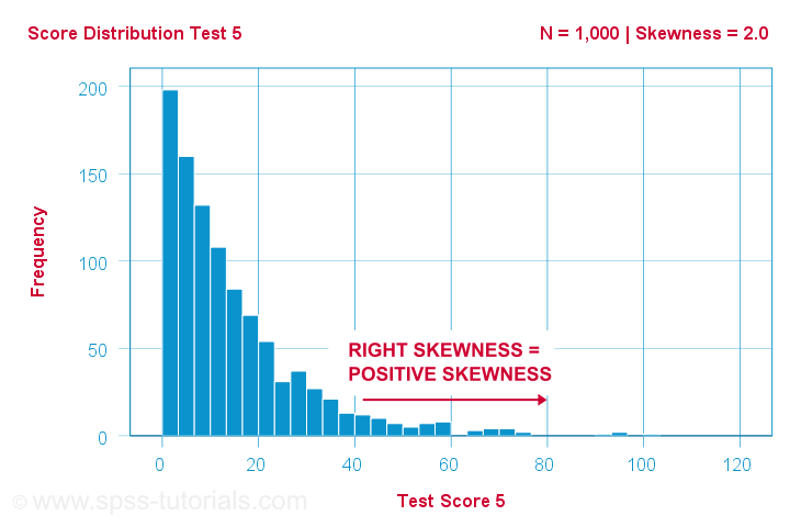
The histogram shows a very asymmetrical frequency distribution. Most people score 20 points or lower but the right tail stretches out to 90 or so. This distribution is right skewed.
If we move to the right along the x-axis, we go from 0 to 20 to 40 points and so on. So towards the right of the graph, the scores become more positive. Therefore,
right skewness is positive skewness
which means skewness > 0. This first example has skewness = 2.0 as indicated in the right top corner of the graph. The scores are strongly positively skewed.
Negative (Left) Skewness Example
Another variable -the scores on test 2- turn out to have skewness = -1.0. Their histogram is shown below.
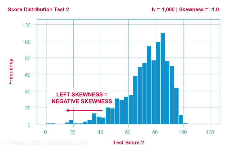
The bulk of scores are between 60 and 100 or so. However, the left tail is stretched out somewhat. So this distribution is left skewed.
Right: to the left, to the left. If we follow the x-axis to the left, we move towards more negative scores. This is why
left skewness is negative skewness.
And indeed, skewness = -1.0 for these scores. Their distribution is left skewed. However, it is less skewed -or more symmetrical- than our first example which had skewness = 2.0.
Symmetrical Distribution Implies Zero Skewness
Finally, symmetrical distributions have skewness = 0. The scores on test 3 -having skewness = 0.1- come close.
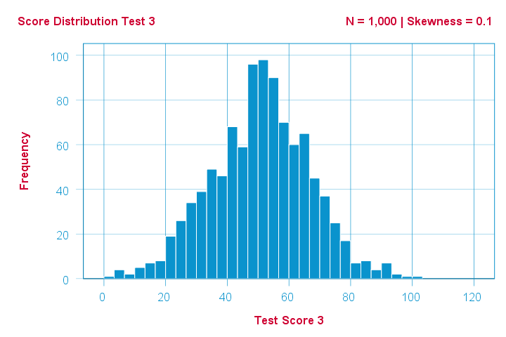
Now, observed distributions are rarely precisely symmetrical. This is mostly seen for some theoretical sampling distributions. Some examples are
- the (standard) normal distribution;
- the t distribution and
- the binomial distribution if p = 0.5.
These distributions are all exactly symmetrical and thus have skewness = 0.000...
Population Skewness - Formula and Calculation
If you'd like to compute skewnesses for one or more variables, just leave the calculations to some software. But -just for the sake of completeness- I'll list the formulas anyway.
If your data contain your entire population, compute the population skewness as:
$$Population\;skewness = \Sigma\biggl(\frac{X_i - \mu}{\sigma}\biggr)^3\cdot\frac{1}{N}$$
where
- \(X_i\) is each individual score;
- \(\mu\) is the population mean;
- \(\sigma\) is the population standard deviation and
- \(N\) is the population size.
For an example calculation using this formula, see this Googlesheet (shown below).
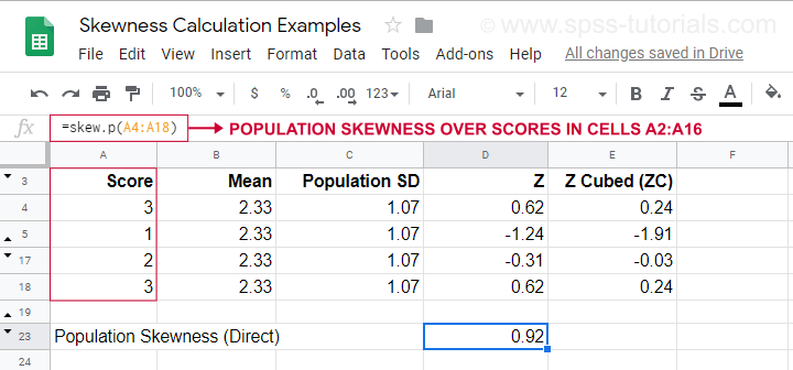
It also shows how to obtain population skewness directly by using =SKEW.P(...) where “.P” means “population”. This confirms the outcome of our manual calculation. Sadly, neither SPSS nor JASP compute population skewness: both are limited to sample skewness.
Sample Skewness - Formula and Calculation
If your data hold a simple random sample from some population, use
$$Sample\;skewness = \frac{N\cdot\Sigma(X_i - \overline{X})^3}{S^3(N - 1)(N - 2)}$$
where
- \(X_i\) is each individual score;
- \(\overline{X}\) is the sample mean;
- \(S\) is the sample-standard-deviation and
- \(N\) is the sample size.
An example calculation is shown in this Googlesheet (shown below).
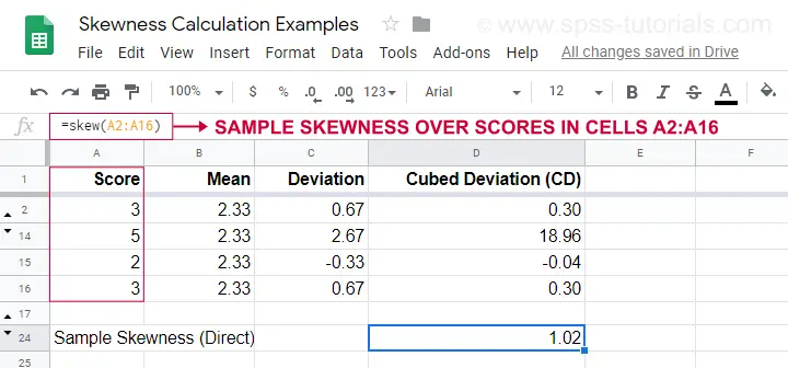
An easier option for obtaining sample skewness is using =SKEW(...). which confirms the outcome of our manual calculation.
Skewness in SPSS
First off, “skewness” in SPSS always refers to sample skewness: it quietly assumes that your data hold a sample rather than an entire population. There's plenty of options for obtaining it. My favorite is via MEANS because the syntax and output are clean and simple. The screenshots below guide you through.
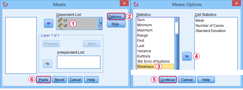
The syntax can be as simple as
means v1 to v5
/cells skew.
A very complete table -including means, standard deviations, medians and more- is run from
means v1 to v5
/cells count min max mean median stddev skew kurt.
The result is shown below.
Skewness - Implications for Data Analysis
Many analyses -ANOVA, t-tests, regression and others- require the normality assumption: variables should be normally distributed in the population. The normal distribution has skewness = 0. So observing substantial skewness in some sample data suggests that the normality assumption is violated.
Such violations of normality are no problem for large sample sizes -say N > 20 or 25 or so. In this case, most tests are robust against such violations. This is due to the central limit theorem. In short,
for large sample sizes, skewness is
no real problem for statistical tests.
However, skewness is often associated with large standard deviations. These may result in large standard errors and low statistical power. Like so, substantial skewness may decrease the chance of rejecting some null hypothesis in order to demonstrate some effect. In this case, a nonparametric test may be a wiser choice as it may have more power.
Violations of normality do pose a real threat
for small sample sizes
of -say- N < 20 or so. With small sample sizes, many tests are not robust against a violation of the normality assumption. The solution -once again- is using a nonparametric test because these don't require normality.
Last but not least, there isn't any statistical test for examining if population skewness = 0. An indirect way for testing this is a normality test such as
However, when normality is really needed -with small sample sizes- such tests have low power: they may not reach statistical significance even when departures from normality are severe. Like so, they mainly provide you with a false sense of security.
And that's about it, I guess. If you've any remarks -either positive or negative- please throw in a comment below. We do love a bit of discussion.
Thanks for reading!
Spearman Rank Correlations – Simple Tutorial
A Spearman rank correlation is a number between -1 and +1 that indicates to what extent 2 variables are monotonously related.
- Spearman Correlation - Example
- Spearman Rank Correlation - Basic Properties
- Spearman Rank Correlation - Assumptions
- Spearman Correlation - Formulas and Calculation
- Spearman Rank Correlation - Software
Spearman Correlation - Example
A sample of 1,000 companies were asked about their number of employees and their revenue over 2018. For making these questions easier, they were offered answer categories. After completing the data collection, the contingency table below shows the results.
The question we'd like to answer is is company size related to revenue? A good look at our contingency table shows the obvious: companies having more employees typically make more revenue. But note that this relation is not perfect: there's 60 companies with 1 employee making $50,000 - $99,999 while there's 89 companies with 2-5 employees making $0 - $49,999. This relation becomes clear if we visualize our results in the chart below.
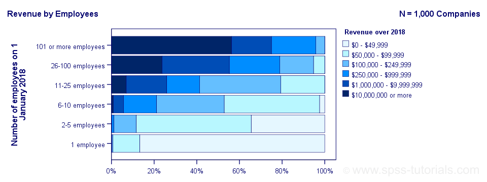
The chart shows an undisputable positive monotonous relation between size and revenue: larger companies tend to make more revenue than smaller companies. Next question.
How strong is the relation?
The first option that comes to mind is computing the Pearson correlation between company size and revenue. However, that's not going to work because we don't have company size or revenue in our data. We only have size and revenue categories. Company size and revenue are ordinal variables in our data: we know that 2-5 employees is larger than 1 employee but we don't know how much larger.
So which numbers can we use to calculate how strongly ordinal variables are related? Well, we can assign ranks to our categories as shown below.
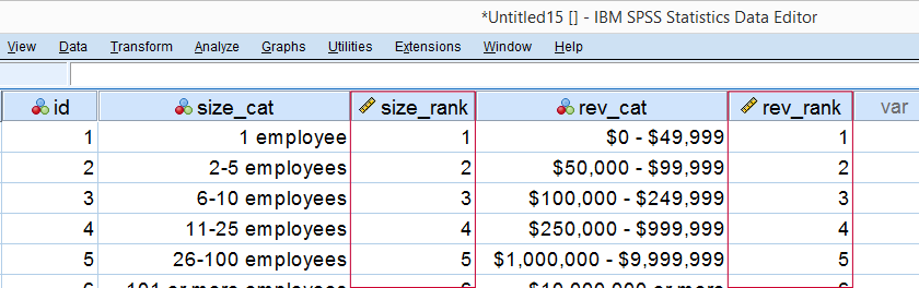
As a last step, we simply compute the Pearson correlation between the size and revenue ranks. This results in a Spearman rank correlation (Rs) = 0.81. This tells us that our variables are strongly monotonously related. But in contrast to a normal Pearson correlation, we do not know if the relation is linear to any extent.
Spearman Rank Correlation - Basic Properties
Like we just saw, a Spearman correlation is simply a Pearson correlation computed on ranks instead of data values or categories. This results in the following basic properties:
- Spearman correlations are always between -1 and +1;
- Spearman correlations are suitable for all but nominal variables. However, when both variables are either metric or dichotomous, Pearson correlations are usually the better choice;
- Spearman correlations indicate monotonous -rather than linear- relations;
- Spearman correlations are hardly affected by outliers. However, outliers should be excluded from analyses instead of determine whether Spearman or Pearson correlations are preferable;
- Spearman correlations serve the exact same purposes as Kendall’s tau.
Spearman Rank Correlation - Assumptions
- The Spearman correlation itself only assumes that both variables are at least ordinal variables. This excludes all but nominal variables.
- The statistical significance test for a Spearman correlation assumes independent observations or -precisely- independent and identically distributed variables.
Spearman Correlation - Example II
A company needs to determine the expiration date for milk. They therefore take a tiny drop each hour and analyze the number of bacteria it contains. The results are shown below.
For bacteria versus time,
- the Pearson correlation is 0.58 but
- the Spearman correlation is 1.00.
There is a perfect monotonous relation between time and bacteria: with each hour passed, the number of bacteria grows. However, the relation is very non linear as shown by the Pearson correlation.
This example nicely illustrates the difference between these correlations. However, I'd argue against reporting a Spearman correlation here. Instead, model this curvilinear relation with a (probably exponential) function. This'll probably predict the number of bacteria with pinpoint precision.
Spearman Correlation - Formulas and Calculation
First off, an example calculation, exact significance levels and critical values are given in this Googlesheet (shown below).
Right. Now, computing Spearman’s rank correlation always starts off with replacing scores by their ranks (use mean ranks for ties). Spearman’s correlation is now computed as the Pearson correlation over the (mean) ranks.
Alternatively, compute Spearman correlations with
$$R_s = 1 - \frac{6\cdot \Sigma \;D^2}{n^3 - n}$$
where \(D\) denotes the difference between the 2 ranks for each observation.
For reasonable sample sizes of N ≥ 30, the (approximate) statistical significance uses the t distribution. In this case, the test statistic
$$T = \frac{R_s \cdot \sqrt{N - 2}}{\sqrt{1 - R^2_s}}$$
follows a t-distribution with
$$Df = N - 2$$
degrees of freedom.
This approximation is inaccurate for smaller sample sizes of N < 30. In this case, look up the (exact) significance level from the table given in this Googlesheet. These exact p-values are based on a permutation test that we may discuss some other time. Or not.
Spearman Rank Correlation - Software
Spearman correlations can be computed in Googlesheets or Excel but statistical software is a much easier option. JASP -which is freely downloadable- comes up with the correct Spearman correlation and its significance level as shown below.
SPSS also comes up with the correct correlation. However, its significance level is based on the t-distribution:
$$t = \frac{0.77\cdot\sqrt{4}}{\sqrt{(1 - 0.77^2)}} = 2.42$$
and
$$t(4) = 2.42,\;p = 0.072 $$
Again, this approximation is only accurate for larger sample sizes of N ≥ 30. For N = 6, it is wildly off as shown below.
Thanks for reading.
SPSS Sign Test for One Median – Simple Example
A sign test for one median is often used instead of a one sample t-test when the latter’s assumptions aren't met by the data. The most common scenario is analyzing a variable which doesn't seem normally distributed with few (say n < 30) observations.
For larger sample sizes the central limit theorem ensures that the sampling distribution of the mean will be normally distributed regardless of how the data values themselves are distributed.
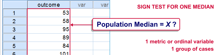
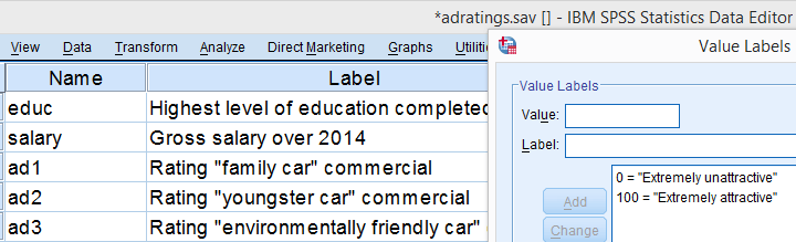
This tutorial shows how to run and interpret a sign test in SPSS. We'll use adratings.sav throughout, part of which is shown below.
SPSS Sign Test - Null Hypothesis
A car manufacturer had 3 commercials rated on attractiveness by 18 people. They used a percent scale running from 0 (extremely unattractive) through 100 (extremely attractive). A marketeer thinks a commercial is good if at least 50% of some target population rate it 80 or higher.
Now, the score that divides the 50% lowest from the 50% highest scores is known as the median. In other words, 50% of the population scoring 80 or higher is equivalent to our null hypothesis that
the population median is at least 79.5 for each commercial.
If this is true, then the medians in our sample will be somewhat different due to random sampling fluctuation. However, if we find very different medians in our sample, then our hypothesized 79.5 population median is not credible and we'll reject our null hypothesis.
Quick Data Check - Histograms
Let's first take a quick look at what our data look like in the first place. We'll do so by inspecting histograms over our outcome variables by running the syntax below.
frequencies ad1 to ad3/format notable/histogram.
Result
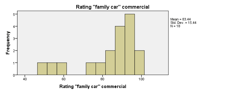
First, note that all distributions look plausible. Since n = 18 for each variable, we don't have any missing values. The distributions don't look much like normal distributions. Combined with our small sample sizes, this violates the normality assumption required by t-tests so we probably shouldn't run those.
Quick Data Check - Medians
Our histograms included mean scores for our 3 outcome variables but what about their medians? Very oddly, we can't compute medians -which are descriptive statistics- with DESCRIPTIVES. We could use FREQUENCIES but we prefer the table format we get from MEANS as shown below.
SPSS - Compute Medians Syntax
means ad1 to ad3/cells count mean median.
Result
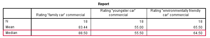
Only our first commercial (“family car”) has a median close to 79.5. The other 2 commercials have much lower median. But are they different enough for rejecting our null hypothesis? We'll find out in a minute.
SPSS Sign Test - Recoding Data Values
SPSS includes a sign test for two related medians but the sign test for one median is absent. But remember that our null hypothesis of a 79.5 population median is equivalent to 50% of the population scoring 80 or higher. And SPSS does include a test for a single proportion (a percentage divided by 100) known as the binomial test. We'll therefore just use binomial tests for evaluating if the proportion of respondents rating each commercial 80 or higher is equal to 0.50.
The easy way to go here is to RECODE our data values: values smaller than the hypothesized population median are recoded into a minus (-) sign. Values larger than this median get a plus (+) sign. It's these plus and minus signs that give the sign test its name. Values equal to the median are excluded from analysis so we'll specify them as missing values.
SPSS RECODE Syntax
recode ad1 to ad3 (79.5 = -9999)(lo thru 79.5 = 0)(79.5 thru hi = 1) into t1 to t3.
value labels t1 to t3 -9999 'Equal to median (exclude)' 0 '- (below median)' 1 '+ (above median)'.
missing values t1 to t3 (-9999).
*2. Quick check on results.
frequencies t1 to t3.
SPSS Binomial Test Menu
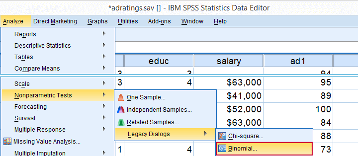
Minor note: the binomial test is a test for a single proportion, which is a population parameter. So it's clearly not a nonparametric test. Unfortunately, “nonparametric tests” often refers to both nonparametric and distribution free tests -even though these are completely different things.
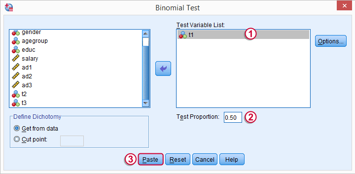
 t1 is one of our newly created variables. It merely indicates if ad1 was 80 or higher. Completing the steps results in the syntax below.
SPSS Binomial Test Syntax
NPAR TESTS
/BINOMIAL (0.50)=t1
/MISSING ANALYSIS.
Modifying Our Syntax
Oddly, SPSS’ binomial test results depend on the (arbitrary) order of cases: the test proportion applies to the first value encountered in the data. This is no major issue if -and only if- our test proportion is 0.50 but it still results in messy output. We'll avoid this by sorting our cases on each test variable before each test.
Modified Binomial Test Syntax
sort cases by t1.
NPAR TESTS
/BINOMIAL (0.50)=t1
/MISSING ANALYSIS.
sort cases by t2.
NPAR TESTS
/BINOMIAL (0.50)=t2
/MISSING ANALYSIS.
sort cases by t3.
NPAR TESTS
/BINOMIAL (0.50)=t3
/MISSING ANALYSIS.
Binomial Test Output
We'll first limit our focus to the first table of test results as shown below.
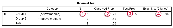
N: 5 out of 18 cases score higher than 79.5;
 the observed proportion is (5 / 18 =) 0.28 or 28%;
 the hypothesized test proportion is 0.50;
 p (denoted as “Exact Significance (2-tailed)”) = 0.096: the probability of finding our sample result is roughly 10% if the population proportion really is 50%. We generally reject our null hypothesis if p < 0.05 so
our binomial test does not refute the hypothesis that our population median is 79.5.
Before we move on, let's take a close look at what our 2-tailed p-value of 0.096 really means.
p (denoted as “Exact Significance (2-tailed)”) = 0.096: the probability of finding our sample result is roughly 10% if the population proportion really is 50%. We generally reject our null hypothesis if p < 0.05 so
our binomial test does not refute the hypothesis that our population median is 79.5.
Before we move on, let's take a close look at what our 2-tailed p-value of 0.096 really means.
The Binomial Distribution
Statistically, drawing 18 respondents from a population in which 50% scores 80 or higher is similar to flipping a balanced coin 18 times in a row: we could flip anything between 0 and 18 heads. If we repeat our 18 coin flips over and over again, the sampling distribution of the number of heads will closely resemble the binomial distribution shown below.
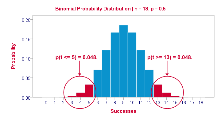
The most likely outcome is 9 heads with a probability around 0.19 or 19%. P = 0.048 for outcomes of 5 or fewer heads (red area). Now, reporting this 1-tailed p-value suggests that none of the other outcomes would refute the null hypothesis. This does not hold because 13 or more heads are also highly unlikely. So we should take into account our deviation of 4 heads from the expected 9 heads in both directions and add up their probabilities. This results in our 2-tailed p-value of 0.096.
Binomial Test - More Output
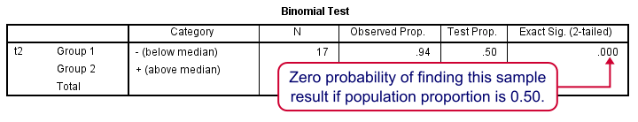
We saw previously that our second commercial (“youngster car”) has a sample median of 55.5. Our p-value of 0.000 means that we've a 0% probability of finding this sample median in a sample of n = 18 when the population median is 79.5. Since p < 0.05, we reject the null hypothesis: the population median is not 79.5 but -presumably- much lower. We'll leave it as an exercise to the reader to interpret the third and final test.
That's it for now. I hope this tutorial made clear how to run a sign test for one median in SPSS. Please let us know what you think in the comment section below. Thanks!
SPSS Sign Test for Two Medians – Simple Example
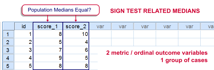
The sign test for two medians evaluates if 2 variables measured on 1 group of cases are likely to have equal population medians.There's also a sign test for comparing one median to a theoretical value. It's really very similar to the test we'll discuss here. Also see SPSS Sign Test for One Median - Simple Example . It can be used on either metric variables or ordinal variables. For comparing means rather than medians, the paired samples t-test and Wilcoxon signed-ranks test are better options.
Adratings Data
We'll use adratings.sav throughout this tutorial. It holds data on 18 respondents who rated 3 car commercials on attractiveness. Part of its dictionary is shown below.
Descriptive Statistics
Whenever you start working on data, always start with a quick data check and proceed only if your data look plausible. The adratings data look fine so we'll continue with some descriptive statistics. We'll use MEANS for inspecting the medians of our 3 rating variables by running the syntax below.DESCRIPTIVES may seem a more likely option here but -oddly- does not include medians - even though these are clearly “descriptive statistics”.
SPSS Syntax for Inspecting Medians
means ad1 to ad3
/cells count mean median.
SPSS Medians Output
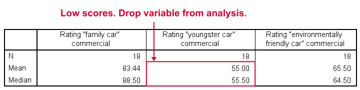
The mean and median ratings for the second commercial (“Youngster Car”) are very low. We'll therefore exclude this variable from further analysis and restrict our focus to the first and third commercials.
Sign Test - Null Hypothesis
For some reason, our marketing manager is only interested in comparing median ratings so our null hypothesis is that the two population medians are equal for our 2 rating variables. We'll examine this by creating a new variable holding signs:
- respondents who rated ad1 < ad3 receive a minus sign;
- respondents who rated ad1 > ad3 get a plus sign.
If our null hypothesis is true, then the plus and minus signs should be roughly distributed 50/50 in our sample. A very different distribution is unlikely under H0 and therefore argues that the population medians probably weren't equal after all.
Running the Sign Test in SPSS
The most straightforward way for running the sign test is outlined by the screenshots below.
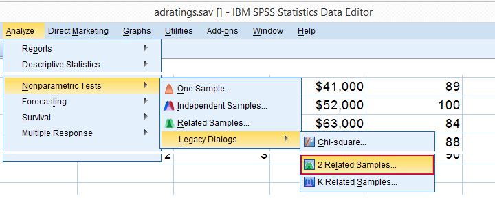
The samples refer to the two rating variables we're testing. They're related (rather than independent) because they've been measured on the same respondents.
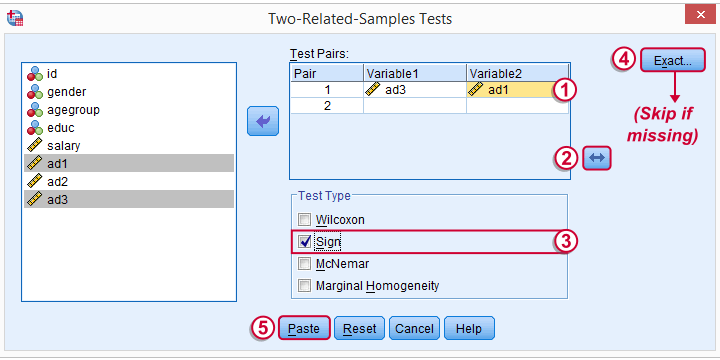
We prefer having the best rated variable in the second slot. We'll do so by reversing the variable order.
Whether your menu includes the button depends on your SPSS license. If it's absent, just skip the step shown below.
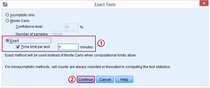
SPSS Sign Test Syntax
Completing these steps results in the syntax below (you'll have one extra line if you included the exact test). Let's run it.
NPAR TESTS
/SIGN=ad3 WITH ad1 (PAIRED)
/MISSING ANALYSIS.
Output - Signs Table
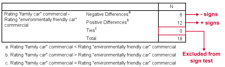
First off, ties (that is: respondents scoring equally on both variables) are excluded from this analysis altogether. This may be an issue with typical Likert scales. The percentage scales of our variables -fortunately- make this much less likely.
Since we've 18 respondents, our null hypothesis suggests that roughly 9 of them should rate ad1 higher than ad3. It turns out this holds for 12 instead of 9 cases. Can we reasonably expect this difference just by random sampling 18 cases from some large population?
Output - Test Statistics Table
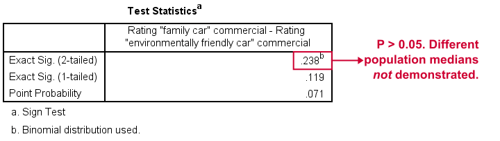
Exact Sig. (2-tailed) refers to our p-value of 0.24. This means there's a 24% chance of finding the observed difference if our null hypothesis is true. Our finding doesn't contradict our hypothesis is equal population medians.
In many cases the output will include “Asymp. Sig. (2-tailed)”, an approximate p-value based on the standard normal distribution.SPSS omits a continuity correction for calculating Z, which (slighly) biases p-values towards zero. It's not included now because our sample size n <= 25.
Reporting Our Sign Test Results
When reporting a sign test, include the entire table showing the signs and (possibly) ties. Although p-values can easily be calculated from it, we'll add something like “a sign test didn't show any difference between the two medians, exact binomial p (2-tailed) = 0.24.”
More on the P-Value
That's basically it. However, for those who are curious, we'll go into a little more detail now. First the p-value. Of our 18 cases, between 0 and 18 could have a plus (that is: rate ad1 higher than ad3). Our null hypothesis dictates that each case has a 0.5 probability of doing so, which is why the number of plusses follows the binomial sampling distribution shown below.
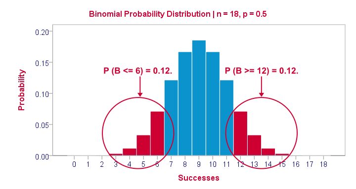
The most likely outcome is 9 plusses with a probability of roughly 0.175: if we'd draw 1,000 random samples instead of 1, we'd expect some 175 of those to result in 9 plusses. Roughly 12% of those samples should result in 6 or fewer plusses or 12 or more plusses. Reporting a 2-tailed p-value takes into account both tails (the areas in red) and thus results in p = 0.24 like we saw in the output.
SPSS Sign Test without a Sign Test
At this point you may see that the sign test is really equivalent to a binomial test on the variable holding our signs. This may come in handy if you want the exact p-value but only have the approximate p-value “Asymp. Sig. (2-tailed)” in your output. Our final syntax example shows how to get it done in 2 different ways.
Workaround for Exact P-Value
if(ad1 > ad3) sign = 1.
if(ad3 > ad1) sign = 0.
value labels sign 0 '- (minus)' 1 '+ (plus)'.
*Option 1: binomial test.
NPAR TESTS
/BINOMIAL (0.50)=sign
/MISSING ANALYSIS.
*Option 2: compute p manually.
frequencies sign.
*Compute p-value manually. It is twice the probability of flipping 6 or fewer heads when flipping a balanced coin 18 times.
compute pvalue = 2 * cdf.binom(6,18,0.5).
execute.
What Does “Statistical Significance” Mean?
Statistical significance is the probability of finding a given deviation from the null hypothesis -or a more extreme one- in a sample.
Statistical significance is often referred to as the p-value (short for “probability value”) or simply p in research papers.
A small p-value basically means that your data are unlikely under some null hypothesis. A somewhat arbitrary convention is to reject the null hypothesis if p < 0.05.
Example 1 - 10 Coin Flips
I've a coin and my null hypothesis is that it's balanced - which means it has a 0.5 chance of landing heads up. I flip my coin 10 times, which may result in 0 through 10 heads landing up. The probabilities for these outcomes -assuming my coin is really balanced- are shown below.Technically, this is a binomial distribution. The formula for computing these probabilities is based on mathematics and the (very general) assumption of independent and identically distributed variables
.
Keep in mind that probabilities are relative frequencies. So the 0.24 probability of finding 5 heads means that if I'd draw a 1,000 samples of 10 coin flips, some 24% of those samples should result in 5 heads up.
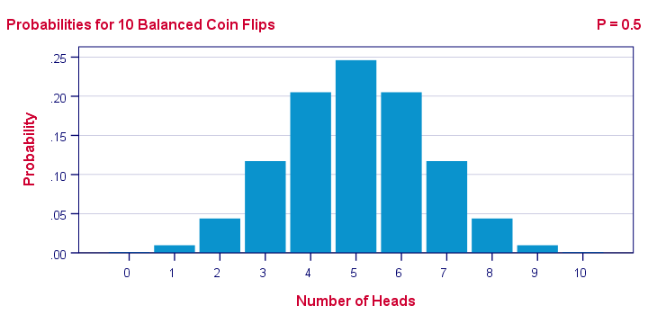
Now, 9 of my 10 coin flips actually land heads up. The previous figure says that the probability of finding 9 or more heads in a sample of 10 coin flips, p = 0.01. If my coin is really balanced, the probability is only 1 in 100 of finding what I just found.
So, based on my sample of N = 10 coin flips, I reject the null hypothesis: I no longer believe that my coin was balanced after all.
Example 2 - T-Test
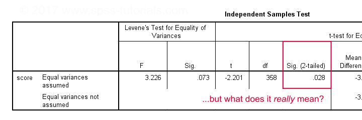
A sample of 360 people took a grammar test. We'd like to know if male respondents score differently than female respondents. Our null hypothesis is that on average, male respondents score the same number of points as female respondents. The table below summarizes the means and standard deviations for this sample.
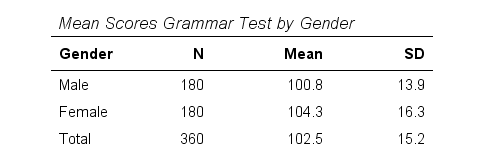
Note that females scored 3.5 points higher than males in this sample. However, samples typically differ somewhat from populations. The question is: if the mean scores for all males and all females are equal, then what's the probability of finding this mean difference or a more extreme one in a sample of N = 360? This question is answered by running an independent samples t-test.
Test Statistic - T
So what sample mean differences can we reasonably expect? Well, this depends on
- the standard deviations and
- the sample sizes we have.
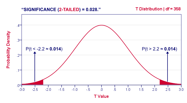
We therefore standardize our mean difference of 3.5 points, resulting in t = -2.2 So this t-value -our test statistic- is simply the sample mean difference corrected for sample sizes and standard deviations. Interestingly, we know the sampling distribution -and hence the probability- for t.
1-Tailed Statistical Significance
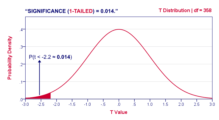
1-tailed statistical significance is the probability of finding a given deviation from the null hypothesis -or a larger one- in a sample.
In our example, p (1-tailed) ≈ 0.014. The probability of finding t ≤ -2.2 -corresponding to our mean difference of 3.5 points- is 1.4%. If the population means are really equal and we'd draw 1,000 samples, we'd expect only 14 samples to come up with a mean difference of 3.5 points or larger.
In short, this sample outcome is very unlikely if the population mean difference is zero. We therefore reject the null hypothesis. Conclusion: men and women probably don't score equally on our test.
Some scientists will report precisely these results. However, a flaw here is that our reasoning suggests that we'd retain our null hypothesis if t is large rather than small. A large t-value ends up in the right tail of our distribution. However, our p-value only takes into account the left tail in which our (small) t-value of -2.2 ended up. If we take into account both possibilities, we should report p = 0.028, the 2-tailed significance.
2-Tailed Statistical Significance
2-tailed statistical significance is the probability of finding a given absolute deviation from the null hypothesis -or a larger one- in a sample.
For a t test, very small as well as very large t-values are unlikely under H0. Therefore, we shouldn't ignore the right tail of the distribution like we do when reporting a 1-tailed p-value. It suggests that we wouldn't reject the null hypothesis if t had been 2.2 instead of -2.2. However, both t-values are equally unlikely under H0.
A convention is to compute p for t = -2.2 and the opposite effect: t = 2.2. Adding them results in our 2-tailed p-value: p (2-tailed) = 0.028 in our example. Because the distribution is symmetrical around 0, these 2 p-values are equal. So we may just as well double our 1-tailed p-value.
1-Tailed or 2-Tailed Significance?
So should you report the 1-tailed or 2-tailed significance? First off, many statistical tests -such as ANOVA and chi-square tests- only result in a 1-tailed p-value so that's what you'll report. However, the question does apply to t-tests, z-tests and some others.
There's no full consensus among data analysts which approach is better. I personally always report 2-tailed p-values whenever available. A major reason is that when some test only yields a 1-tailed p-value, this often includes effects in different directions.
“What on earth is he tryi...?” That needs some explanation, right?
T-Test or ANOVA?
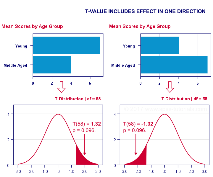
We compared young to middle aged people on a grammar test using a t-test. Let's say young people did better. This resulted in a 1-tailed significance of 0.096. This p-value does not include the opposite effect of the same magnitude: middle aged people doing better by the same number of points. The figure below illustrates these scenarios.
We then compared young, middle aged and old people using ANOVA. Young people performed best, old people performed worst and middle aged people are exactly in between. This resulted in a 1-tailed significance of 0.035. Now this p-value does include the opposite effect of the same magnitude.
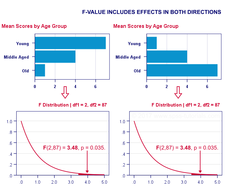
Now, if p for ANOVA always includes effects in different directions, then why would you not include these when reporting a t-test? In fact, the independent samples t-test is technically a special case of ANOVA: if you run ANOVA on 2 groups, the resulting p-value will be identical to the 2-tailed significance from a t-test on the same data. The same principle applies to the z-test versus the chi-square test.
The “Alternative Hypothesis”
Reporting 1-tailed significance is sometimes defended by claiming that the researcher is expecting an effect in a given direction. However,
I cannot verify that.
Perhaps such “alternative hypotheses” were only made up in order to render results more statistically significant.
Second, expectations don't rule out possibilities. If somebody is absolutely sure that some effect will have some direction, then why use a statistical test in the first place?
Statistical Versus Practical Significance
So what does “statistical significance” really tell us? Well, it basically says that some effect is very probably not zero in some population. So is that what we really want to know? That a mean difference, correlation or other effect is “not zero”?
No. Of course not.
We really want to know how large some mean difference, correlation or other effect is. However, that's not what statistical significance tells us.
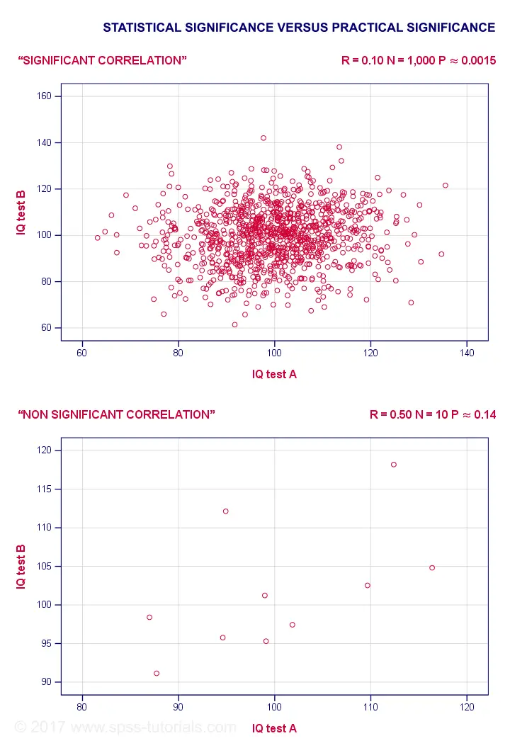
For example, a correlation of 0.1 in a sample of N = 1,000 has p ≈ 0.0015. This is highly statistically significant: the population correlation is very probably not 0.000... However, a 0.1 correlation is not distinguishable from 0 in a scatterplot. So it's probably not practically significant.
Reversely, a 0.5 correlation with N = 10 has p ≈ 0.14 and hence is not statistically significant. Nevertheless, a scatterplot shows a strong relation between our variables. However, since our sample size is very small, this strong relation may very well be limited to our small sample: it has a 14% chance of occurring if our population correlation is really zero.
The basic problem here is that
any effect is statistically significant if the
sample size is large enough.
And therefore, results must have both statistical and practical significance in order to carry any importance. Confidence intervals nicely combine these two pieces of information and can thus be argued to be more useful than just statistical significance.
Thanks for reading!
Simple Linear Regression – Quick Introduction
Simple linear regression is a technique that predicts a metric variable from a linear relation with another metric variable. Remember that “metric variables” refers to variables measured at interval or ratio level. The point here is that calculations -like addition and subtraction- are meaningful on metric variables (“salary” or “length”) but not on categorical variables (“nationality” or “color”).
Example: Predicting Job Performance from IQ
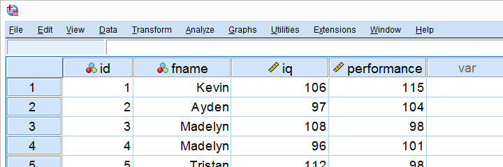
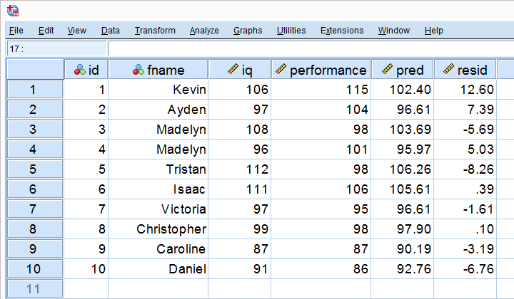
Some company wants to know can we predict job performance from IQ scores? The very first step they should take is to measure both (job) performance and IQ on as many employees as possible. They did so on 10 employees and the results are shown below.
Looking at these data, it seems that employees with higher IQ scores tend to have better job performance scores as well. However, this is difficult to see with even 10 cases -let alone more. The solution to this is creating a scatterplot as shown below.
Scatterplot Performance with IQ
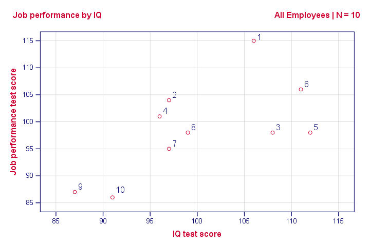
Note that the id values in our data show which dot represents which employee. For instance, the highest point (best performance) is 1 -Kevin, with a performance score of 115.
So anyway, if we move from left to right (lower to higher IQ), our dots tend to lie higher (better performance). That is, our scatterplot shows a positive (Pearson) correlation between IQ and performance.
Pearson Correlation Performance with IQ
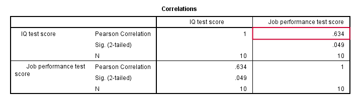
As shown in the previous figure, the correlation is 0.63. Despite our small sample size, it's even statistically significant because p < 0.05. There's a strong linear relation between IQ and performance. But what we haven't answered yet is: how can we predict performance from IQ? We'll do so by assuming that the relation between them is linear. Now the exact relation requires just 2 numbers -and intercept and slope- and regression will compute them for us.
Linear Relation - General Formula
Any linear relation can be defined as Y’ = A + B * X. Let's see what these numbers mean.
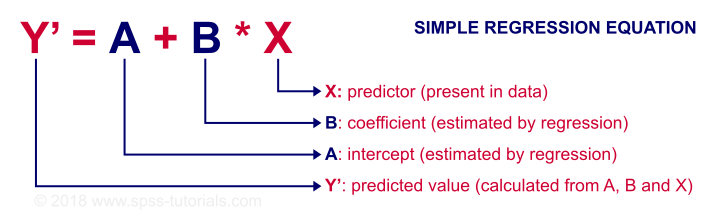
Since X is in our data -in this case, our IQ scores- we can predict performance if we know the intercept (or constant) and the B coefficient. Let's first have SPSS calculate these and then zoom in a bit more on what they mean.
Prediction Formula for Performance
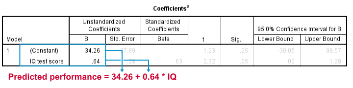
This output tells us that the best possible prediction for job performance given IQ is predicted performance = 34.26 + 0.64 * IQ. So if we get an applicant with an IQ score of 100, our best possible estimate for his performance is predicted performance = 34.26 + 0.64 * 100 = 98.26.
So the core output of our regression analysis are 2 numbers:
- An intercept (constant) of 34.26 and
- a b coefficient of 0.64.
So where did these numbers come from and what do they mean?
B Coefficient - Regression Slope
A b coefficient is number of units increase in Y associated with one unit increase in X. Our b coefficient of 0.64 means that one unit increase in IQ is associated with 0.64 units increase in performance. We visualized this by adding our regression line to our scatterplot as shown below.
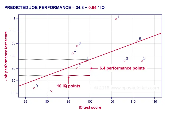
On average, employees with IQ = 100 score 6.4 performance points higher than employees with IQ = 90. The higher our b coefficient, the steeper our regression line. This is why b is sometimes called the regression slope.
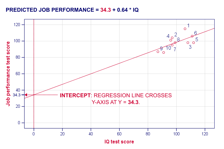
Regression Intercept (“Constant”)
The intercept is the predicted outcome for cases who score 0 on the predictor. If somebody would score IQ = 0, we'd predict a performance of (34.26 + 0.64 * 0 =) 34.26 for this person. Technically, the intercept is the y score where the regression line crosses (“intercepts”) the y-axis as shown below.
I hope this clarifies what the intercept and b coefficient really mean. But why does SPSS come up with a = 34.3 and b = 0.64 instead of some other numbers? One approach to the answer starts with the regression residuals.
Regression Residuals
A regression residual is the observed value - the predicted value on the outcome variable for some case. The figure below visualizes the regression residuals for our example.
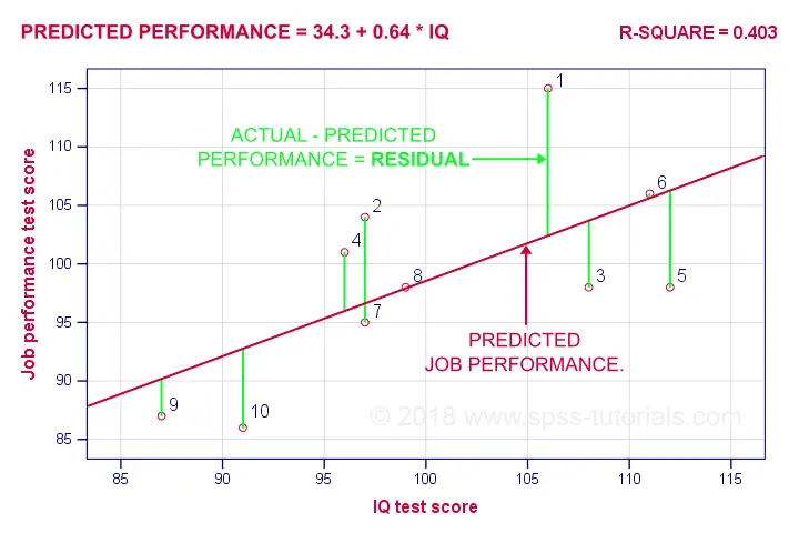
For most employees, their observed performance differs from what our regression analysis predicts. The larger this difference (residual), the worse our model predicts performance for this employee. So how well does our model predict performance for all cases?
Let's first compute the predicted values and residuals for our 10 cases. The screenshot below shows them as 2 new variables in our data. Note that performance = pred + resid.
Our residuals indicate how much our regression equation is off for each case. So how much is our regression equation off for all cases? The average residual seems to answer this question. However, it is always zero: positive and negative residuals simply add up to zero. So instead, we compute the mean squared residual which happens to be the variance of the residuals.
Error Variance
Error variance is the mean squared residual and indicates how badly our regression model predicts some outcome variable. That is, error variance is variance in the outcome variable that regression doesn't “explain”. So is error variance a useful measure? Almost. A problem is that the error variance is not a standardized measure: an outcome variable with a large variance will typically result in a large error variance as well. This problem is solved by dividing the error variance by the variance of the outcome variable. Subtracting this from 1 results in r-square.
R-Square - Predictive Accuracy
R-square is the proportion of variance in the outcome variable that's accounted for by regression. One way to calculate it is from the variance of the outcome variable and the error variance as shown below.
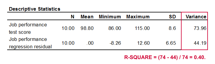
Performance has a variance of 73.96 and our error variance is only 44.19. This means that our regression equation accounts for some 40% of the variance in performance. This number is known as r-square. R-square thus indicates the accuracy of our regression model.
A second way to compute r-square is simply squaring the correlation between the predictor and the outcome variable. In our case, 0.6342 = 0.40. It's called r-square because “r” denotes a sample correlation in statistics.
So why did our regression come up with 34.26 and 0.64 instead of some other numbers? Well, that's because regression calculates the coefficients that maximize r-square. For our data, any other intercept or b coefficient will result in a lower r-square than the 0.40 that our analysis achieved.
Inferential Statistics
Thus far, our regression told us 2 important things:
- how to predict performance from IQ: the regression coefficients;
- how well IQ can predict performance: r-square.
Thus far, both outcomes only apply to our 10 employees. If that's all we're after, then we're done. However, we probably want to generalize our sample results to a (much) larger population. Doing so requires some inferential statistics, the first of which is r-square adjusted.
R-Square Adjusted
R-square adjusted is an unbiased estimator of r-square in the population. Regression computes coefficients that maximize r-square for our data. Applying these to other data -such as the entire population- probably results in a somewhat lower r-square: r-square adjusted. This phenomenon is known as shrinkage.
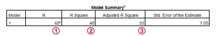
For our data, r-square adjusted is 0.33, which is much lower than our r-square of 0.40. That is, we've quite a lot of shrinkage. Generally,
- smaller sample sizes result in more shrinkage and
- including more predictors (in multiple regression) results in more shrinkage.
Standard Errors and Statistical Significance
Last, let's walk through the last bit of our output.
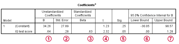
The intercept and b coefficient define the linear relation that best predicts the outcome variable from the predictor.
The standard errors are the standard deviations of our coefficients over (hypothetical) repeated samples. Smaller standard errors indicate more accurate estimates.
Beta coefficients are standardized b coefficients: b coefficients computed after standardizing all predictors and the outcome variable. They are mostly useful for comparing different predictors in multiple regression. In simple regression, beta = r, the sample correlation.
t is our test statistic -not interesting but necessary for computing statistical significance.
 “Sig.” denotes the 2-tailed significance for or b coefficient, given the null hypothesis that the population b coefficient is zero.
 The 95% confidence interval gives a likely range for the population b coefficient(s).
Thanks for reading!
Sampling Distribution – What is It?
A sampling distribution is the frequency distribution of a statistic over many random samples from a single population. Sampling distributions are at the very core of inferential statistics but poorly explained by most standard textbooks. The reasoning may take a minute to sink in but when it does, you'll truly understand common statistical procedures such as ANOVA or a chi-square test.
Sampling Distribution - Example
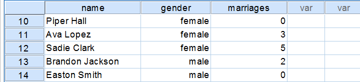
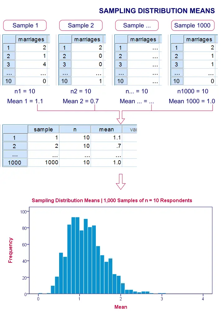
There's an island with 976 inhabitants. Its government has data on this entire population, including the number of times people marry. The screenshot below shows part of these data.
Population Distribution Marriages
Many inhabitants never married (yet), in which case marriages is zero. Other inhabitants married, divorced and remarried, sometimes multiple times. The histogram below shows the distribution of marriages over our 976 inhabitants.
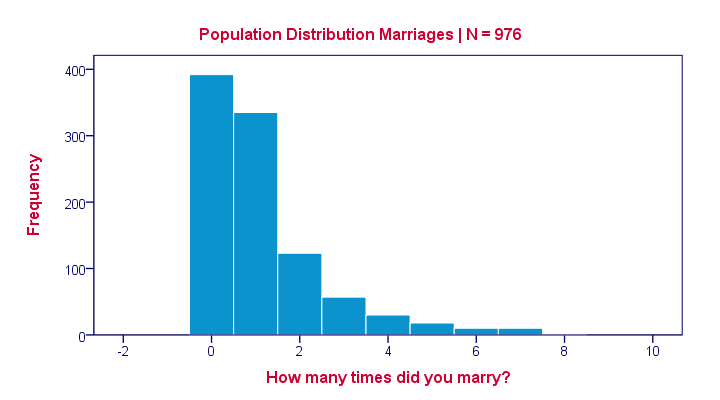
Note that the population distribution is strongly skewed (asymmetrical) which makes sense for these data. On average, people married some 1.1 times as shown by some descriptive statistics below.
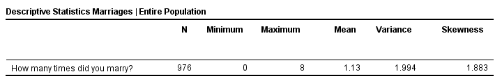
These descriptives reemphasize the high skewness of the population distribution; the skewness is around 1.8 whereas a symmetrical distribution has zero skewness.
Sampling Distribution - What and Why
The government has these exact population figures. However, a social scientist doesn't have access to these data. So although the government knows, our scientist is clueless how often the island inhabitants marry. In theory, he could ask all 976 people and thus find the exact population distribution of marriages. Since this is too time consuming, he decides to draw a simple random sample of n = 10 people.
On average, the 10 respondents married 1.1 times. So what does this say about the entire population of 976 people? We can't conclude that they marry 1.1 times on average because a second sample of n = 10 will probably come up with a (slightly) different mean number of marriages.
This is basically the fundamental problem in inferential statistics: sample statistics vary over (hypothetical) samples. The solution to the problem is to figure out how much they vary. Like so, we can at least estimate a likely range -known as a confidence interval- for a population parameter such as an average number of marriages.
Sampling Distribution - Simulation Study
If we draw repeated samples of 10 respondents from our island population, then how much will the average number of marriages vary over such samples? One approach here is a computer simulation (the one below was done with SPSS).
We actually drew 1,000 samples of n = 10 respondents from our population data of 976 inhabitants. We then computed the average number of marriages in each of these samples. A histogram of the outcomes visualizes the sampling distribution: the distribution of a sample statistic over many repeated samples.
Sampling Distribution - Central Limit Theorem
The outcome of our simulation shows a very interesting phenomenon: the sampling distribution of sample means is very different from the population distribution of marriages over 976 inhabitants: the sampling distribution is much less skewed (or more symmetrical) and smoother.
In fact, means and sums are always normally distributed (approximately) for reasonable sample sizes, say n > 30. This doesn't depend on whatever population distribution the data values may or may not follow.It does, however, require independent and identically distributed variables, which is a common assumption for most applied statistics. This phenomenon is known as the central limit theorem.
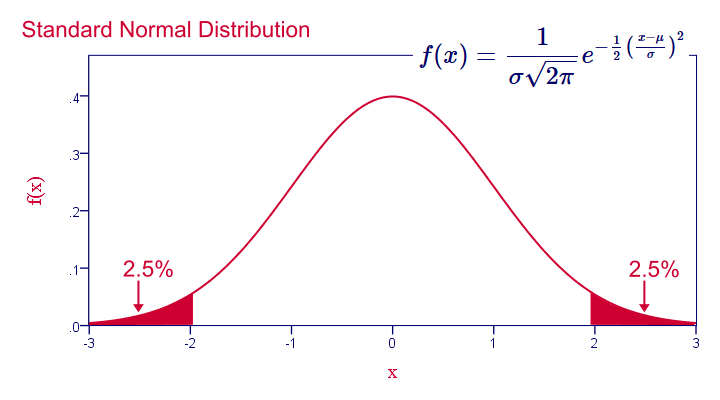
Note that even for 1,000 samples of n = 10, our sampling distribution of means is already looking somewhat similar to the normal distribution shown below.
Standard Normal Distribution
Common Sampling Distributions
The sampling distributions you'll encounter most in practice all derive from the normal distribution implied by the central limit theorem. This holds for
- the normal distribution for sample means, sums, percentages and proportions;
- the t distribution for sample means in a t-test and beta coefficients in regression analysis;
- the chi-square distribution for variances;
- the F-distribution for variance ratios in ANOVA.
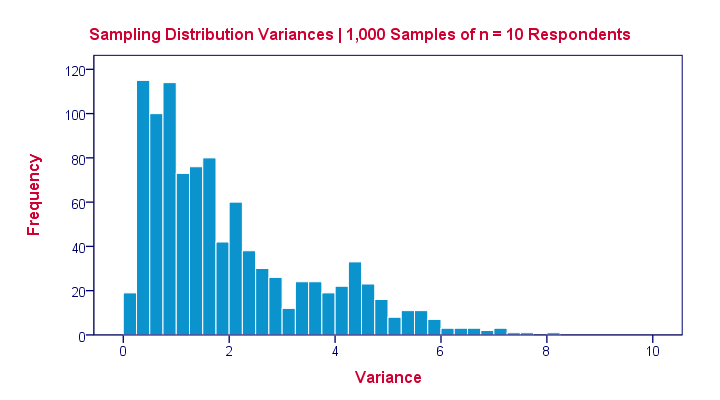 The sampling distribution for a variance approximates a chi-square distribution rather than a normal distribution.
Sampling Distribution - Importance
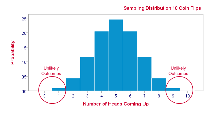
Sampling distributions tell us which outcomes are likely, given our research hypotheses. So perhaps our hypothesis is that a coin is balanced: both heads and tails have a 50% chance of landing up after a flip. This hypothesis implies the sampling distribution shown below for the number of heads resulting from 10 coin flips.
This tells us that from 1,000 such random samples of 10 coin flips, roughly 10 samples (1%) should result in 0 or 1 heads landing up. We therefore consider 0 or 1 heads an unlikely outcome. If such an outcome occurs anyway, then perhaps the coin wasn't balanced after all. We reject our hypothesis of equal chances for heads and tails and conclude that heads has a lower than 50% chance of landing up.
Standard Deviation – What Is It?
A standard deviation is a number that tells us
to what extent a set of numbers lie apart.
A standard deviation can range from 0 to infinity. A standard deviation of 0 means that a list of numbers are all equal -they don't lie apart to any extent at all.
Standard Deviation - Example
Five applicants took an IQ test as part of a job application. Their scores on three IQ components are shown below.
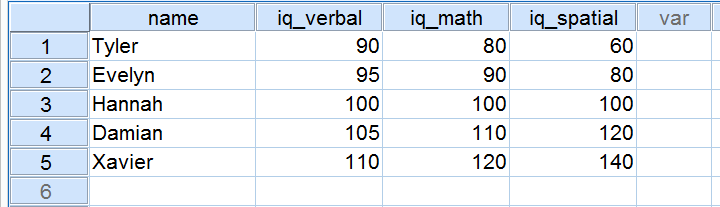
Now, let's take a close look at the scores on the 3 IQ components. Note that all three have a mean of 100 over our 5 applicants. However, the scores on iq_verbal lie closer together than the scores on iq_math. Furthermore, the scores on iq_spatial lie further apart than the scores on the first two components. The precise extent to which a number of scores lie apart can be expressed as a number. This number is known as the standard deviation.
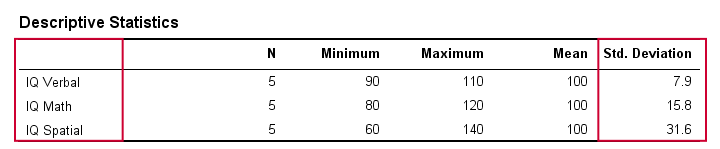
Standard Deviation - Results
In real life, we obviously don't visually inspect raw scores in order to see how far they lie apart. Instead, we'll simply have some software calculate them for us (more on that later). The table below shows the standard deviations and some other statistics for our IQ data. Note that the standard deviations confirm the pattern we saw in the raw data.
Standard Deviation and Histogram
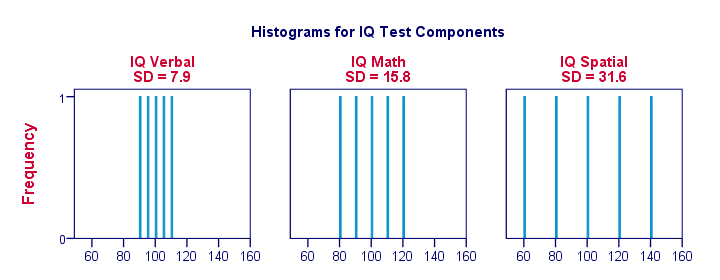
Right, let's make things a bit more visual. The figure below shows the standard deviations and the histograms for our IQ scores. Note that each bar represents the score of 1 applicant on 1 IQ component. Once again, we see that the standard deviations indicate the extent to which the scores lie apart.
Standard Deviation - More Histograms
When we visualize data on just a handful of observations as in the previous figure, we easily see a clear picture. For a more realistic example, we'll present histograms for 1,000 observations below. Importantly, these histograms have identical scales; for each histogram, one centimeter on the x-axis corresponds to some 40 ‘IQ component points’.
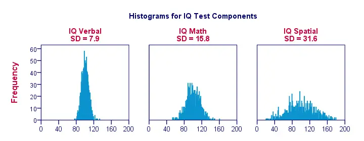
Note how the histograms allow for rough estimates of standard deviations. ‘Wider’ histograms indicate larger standard deviations; the scores (x-axis) lie further apart. Since all histograms have identical surface areas (corresponding to 1,000 observations), higher standard deviations are also associated with ‘lower’ histograms.
Standard Deviation - Population Formula
So how does your software calculate standard deviations? Well, the basic formula is
$$\sigma = \sqrt{\frac{\sum(X - \mu)^2}{N}}$$
where
- \(X\) denotes each separate number;
- \(\mu\) denotes the mean over all numbers and
- \(\sum\) denotes a sum.
In words, the standard deviation is the square root of the average squared difference between each individual number and the mean of these numbers.
Importantly, this formula assumes that your data contain the entire population of interest (hence “population formula”). If your data contain only a sample from your target population, see below.
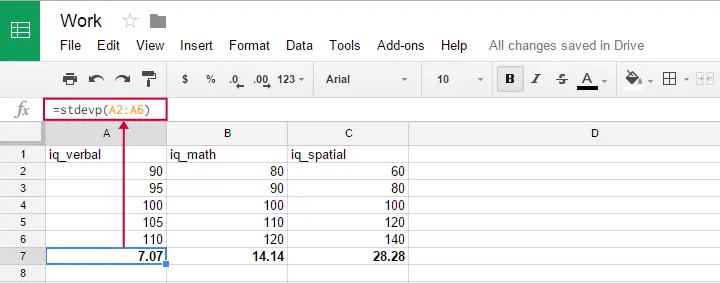
Population Formula - Software
You can use this formula in Google sheets, OpenOffice and Excel by typing =STDEVP(...) into a cell. Specify the numbers over which you want the standard deviation between the parentheses and press Enter. The figure below illustrates the idea.
Oddly, the population standard deviation formula does not seem to exist in SPSS.
Standard Deviation - Sample Formula
Now for something challenging: if your data are (approximately) a simple random sample from some (much) larger population, then the previous formula will systematically underestimate the standard deviation in this population. An unbiased estimator for the population standard deviation is obtained by using
$$S_x = \sqrt{\frac{\sum(X - \overline{X})^2}{N -1}}$$
Regarding calculations, the big difference with the first formula is that we divide by \(n -1\) instead of \(n\). Dividing by a smaller number results in a (slightly) larger outcome. This precisely compensates for the aforementioned underestimation. For large sample sizes, however, the two formulas have virtually identical outcomes.
In GoogleSheets, Open Office and MS Excel, the STDEV function uses this second formula. It is also the (only) standard deviation formula implemented in SPSS.
Standard Deviation and Variance
A second number that expresses how far a set of numbers lie apart is the variance. The variance is the squared standard deviation. This implies that, similarly to the standard deviation, the variance has a population as well as a sample formula.
In principle, it's awkward that two different statistics basically express the same property of a set of numbers. Why don't we just discard the variance in favor of the standard deviation (or reversely)? The basic answer is that the standard deviation has more desirable properties in some situations and the variance in others.
Simple Random Sampling – What Is It?
Popular statistical procedures such as ANOVA, a chi-square test or a t-test quietly rely on the assumption that your data are a simple random sample from your population. Violation of this assumption may result in biased or even nonsensical test results and few researchers seem to be aware of this.
Plenty of reasons for a brief discussion of simple random sampling: what exactly is it and why is it so important?
Simple Random Sampling - Definition
Simple random sampling is sampling where each time we sample a unit, the chance of being sampled is the same for each unit in a population. Note that this is a somewhat loose, non technical definition. We'll now use an example to make clear what exactly we mean by this definition.
Simple Random Sampling with Replacement - Example
A textbook example of simple random sampling is sampling a marble from a vase. We record one or more of its properties (perhaps its color, number or weight) and put it back into the vase. We repeat this procedure n times for drawing a sample of size n. The idea is illustrated by the figure below.
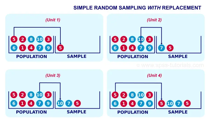
When sampling the first marble, each marble has the same chance of 0.1 of being sampled. When sampling the second marble, each marble still has a 0.1 chance of being sampled. This generalizes to all subsequent marbles being sampled. Each time we sample a unit, all units have similar chances of being sampled. This is precisely what we meant with our definition of simple random sampling.
Simple Random Sampling without Replacement
If you took a good look at the figure, it may surprise you that marble 5 occurs twice in our sample. This may happen because we need to replace each marble we sampled.
Not replacing the marbles we sampled results in simple random sampling without replacement, often abbreviated to SRSWOR. SRSWOR violates simple random sampling. Let's see how that works.
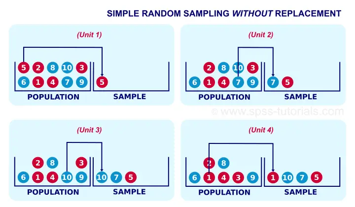
Right, for the first marble we sample, each marble has a 0.1 chance of being sampled. So far, so good. If we don't replace it before sampling a second unit, however, the first unit we sampled has a zero chance of being sampled. The other 9 units each have a chance of 1 in 9 = 0.11 of being sampled as the second unit. This is how SRSWOR violates our definition of simple random sampling. Note that this violation gets worse as we sample more units from a smaller population.
SRSWOR - How Bad Is It?
If you think about the example with the marbles, you'll probably see that it doesn't translate nicely to some real world situations. Most prominently, if we survey a population of people, SRS may result in persons receiving the same questionnaire multiple times. Since this is obviously a bad idea, SRSWOR is usually preferred over simple random sampling here.
SRSWOR is different from simple random sampling necessary for most standard statistical tests. So how serious is this problem? Well, this discussion really deserves a tutorial of its own. Very briefly, however, the problem gets less serious as we sample fewer units from a larger population; when sampling 4 marbles out of 1,000 (instead of 10) marbles, SRSWOR is almost identical to simple random sampling.
A very basic rule of thumb is that bias from using SRSWOR can be neglected when the sample size is less than 10% of the population size. If this doesn't hold, then a finity correction is in place.
Simple Random Sampling - IID Assumption
So far, we discussed what simple random sampling is. But why is it so important? The first reason is that simple random sampling satisfies the IID assumption: independent and identically distributed variables.We're currently working on a tutorial that thoroughly explains the meaning and the importance of this assumption. This assumption -really deserving a tutorial of its own- is the single most important assumption for common statistical procedures.
Simple Random Sampling - Representativity
The second reason why simple random sampling is highly desirable is that it tends to result in samples that are representative for the populations from which they were drawn on all imaginable variables. This very nice feature -driven by the law of large numbers- becomes more apparent with increasing sample sizes.
What if Simple Random Sampling Doesn't Hold?
Good question. Three common sampling procedures that violate simple random sampling are
sampling more than some 10% of a (finite) population;
stratified random sampling;
cluster sampling.
Using (a combination of) these sampling methods results in biased test results. Whether such bias is negligible can't be stated a priori. Formulas are available for correcting for it but actually using them may prove tedious. For SPSS users, these correction formulas have been implemented in SPSS Complex Samples, a somewhat costly add-on module.
Some sampling procedures are not well defined, most notably “convenience sampling”. The amount of bias resulting from such procedures will often remain unknown. This implies that generalizing such results to larger populations is speculative -at best.
Simple Random Sampling - Final Note
Purely statistically, simple random sampling is usually the ideal sampling procedure. Unfortunately, simple random sampling in the social sciences is rare. The reasons for this are discussed in Survey Sampling - How Does It Work?