Creating APA Style Correlation Tables in SPSS
Introduction & Practice Data File
When running correlations in SPSS, we get the p-values as well. In some cases, we don't want that: if our data hold an entire population, such p-values are actually nonsensical. For some stupid reason, we can't get correlations without significance levels from the correlations dialog. However, this tutorial shows 2 ways for getting them anyway. We'll use adolescents-clean.sav throughout.
 Correlation Table as Recommended by the APA
Option 1: FACTOR
A reasonable option is navigating to
![]()
![]() as shown below.
as shown below.
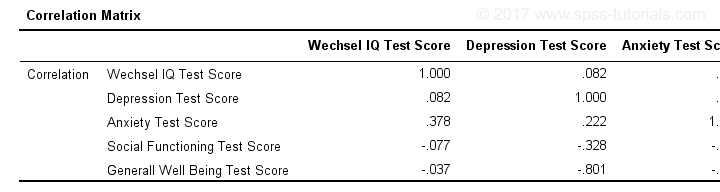
Next, we'll move iq through wellb into the variables box and follow the steps outlines in the next screenshot.
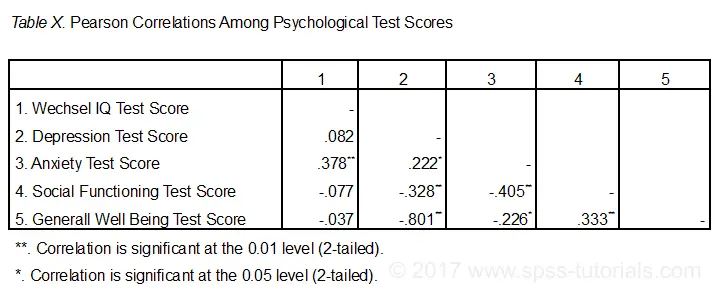
Clicking results in the syntax below. It'll create a correlation matrix without significance levels or sample sizes. Note that FACTOR uses listwise deletion of missing values by default but we can easily change this to pairwise deletion. Also, we can shorten the syntax quite a bit in case we need more than one correlation matrix.
Correlation Matrix from FACTOR Syntax
FACTOR
/VARIABLES iq depr anxi soci wellb
/MISSING pairwise /* WATCH OUT HERE: DEFAULT IS LISTWISE! */
/ANALYSIS iq depr anxi soci wellb
/PRINT CORRELATION EXTRACTION
/CRITERIA MINEIGEN(1) ITERATE(25)
/EXTRACTION PC
/ROTATION NOROTATE
/METHOD=CORRELATION.
*Can be shortened to...
factor
/variables iq to wellb
/missing pairwise
/print correlation.
*...or even...
factor
/variables iq to wellb
/print correlation.
*but this last version uses listwise deletion of missing values.
Result
When using pairwise deletion, we no longer see the sample sizes used for each correlation. We may not want those in our table but perhaps we'd like to say something about them in our table title.
More importantly, we've no idea which correlations are statistically significant and which aren't. Our second approach deals nicely with both issues.
Option 2: Adjust Default Correlation Table
The fastest way to create correlations is simply running correlations iq to wellb. However, we sometimes want to have statistically significant correlations flagged. We'll do so by adding just one line.
correlations iq to wellb
/print nosig.
This results in a standard correlation matrix with all sample sizes and p-values. However, we'll now make everything except the actual correlations invisible.
Adjusting Our Pivot Table Structure
We first right-click our correlation table and navigate to
![]() as shown below.
as shown below.
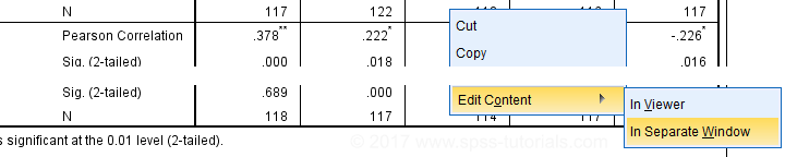
Select from the menu.
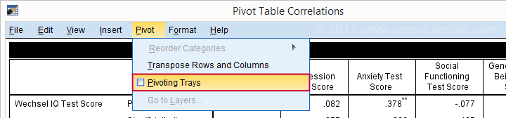
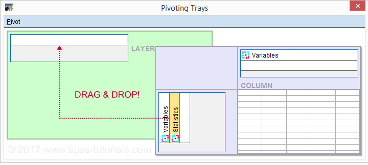
Drag and drop the Statistics (row) dimension into the LAYER area and close the pivot editor.
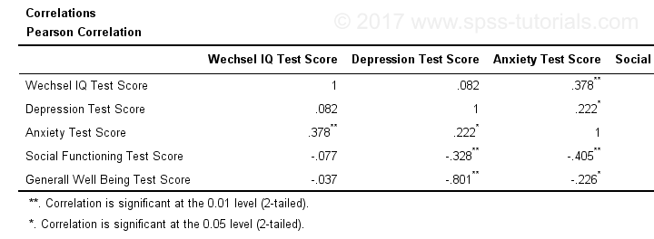
Result
Same Results Faster?
If you like the final result, you may wonder if there's a faster way to accomplish it. Well, there is: the Python syntax below makes the adjustment on all pivot tables in your output. So make sure there's only correlation tables in your output before running it. It may crash otherwise.
begin program.
import SpssClient
SpssClient.StartClient()
oDoc = SpssClient.GetDesignatedOutputDoc()
oItems = oDoc.GetOutputItems()
for index in range(oItems.Size()):
oItem = oItems.GetItemAt(oItems.Size() - index - 1)
if oItem.GetType() == SpssClient.OutputItemType.PIVOT:
pTable = oItem.GetSpecificType()
pManager = pTable.PivotManager()
nRows = pManager.GetNumRowDimensions()
rDim = pManager.GetRowDimension(0)
rDim.MoveToLayer(0)
SpssClient.StopClient()
end program.
Well, that's it. Hope you liked this tutorial and my script -I actually run it from my toolbar pretty often.
Thanks for reading!
APA Reporting SPSS Factor Analysis
- Introduction
- Creating APA Tables - the Easy Way
- Table I - Factor Loadings & Communalities
- Table II - Total Variance Explained
- Table III - Factor Correlations
Introduction
Creating APA style tables from SPSS factor analysis output can be cumbersome. This tutorial therefore points out some tips, tricks & pitfalls. We'll use the results of SPSS Factor Analysis - Intermediate Tutorial.
All analyses are based on 20-career-ambitions-pca.sav (partly shown below).
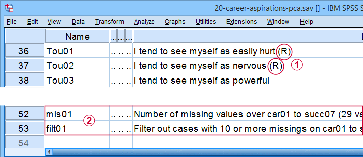
 Note that some items were reversed and therefore had “(R)” appended to their variable labels;
 We'll FILTER out cases with 10 or more missing values.
After opening these data, you can replicate the final analyses by running the SPSS syntax below.
filter by filt01.
*PCA VI - AS PREVIOUS BUT REMOVE TOU04.
FACTOR
/VARIABLES Car01 Car02 Car03 Car04 Car05 Car06 Car07 Car08 Conf01 Conf02 Conf03 Conf05 Conf06
Comp01 Comp02 Comp03 Tou01 Tou02 Tou05 Succ01 Succ02 Succ03 Succ04 Succ05 Succ06
Succ07
/MISSING PAIRWISE
/PRINT INITIAL EXTRACTION ROTATION
/FORMAT SORT BLANK(.3)
/CRITERIA FACTORS(5) ITERATE(25)
/EXTRACTION PC
/ROTATION PROMAX
/METHOD=CORRELATION.
Creating APA Tables - the Easy Way
For a wide variety of analyses, the easiest way to create APA style tables from SPSS output is usually to
- adjust your analyses in SPSS so the output is as close as possible to the desired end results. Changing table layouts (which variables/statistics go into which rows/columns?) is also best done here.
- copy-paste one or more tables into Excel or Googlesheets. This is the easiest way to set decimal places, fonts, alignment, borders and more;
- copy-paste your table(s) from Excel into WORD. Perhaps adjust the table widths with “autofit”, and you'll often have a perfect end result.
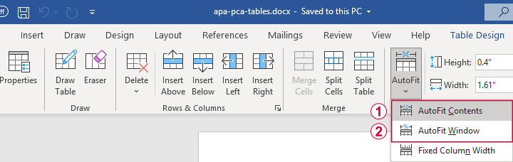 Autofit to Contents, then Window results in optimal column widths
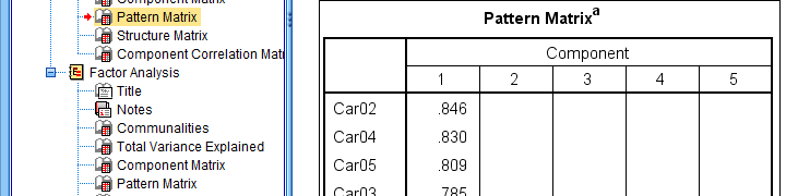
Table I - Factor Loadings & Communalities
The figure below shows an APA style table combining factor loadings and communalities for our example analysis.
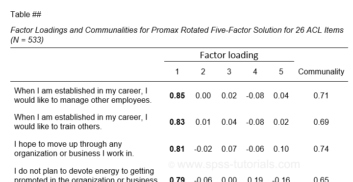 Example APA style factor loadings table
If you take a good look at the SPSS output, you'll see that you cannot simply copy-paste these tables for combining them in Excel. This is because the factor loadings (pattern matrix) table follows a different variable order than the communalities table. Since the latter follows the variable order as specified in your syntax, the easiest fix for this is to
- make sure that only variable names (not labels) are shown in the output;
- copy-paste the correctly sorted pattern matrix into Excel;
- copy-paste the variable names into the FACTOR syntax and rerun it.
Tip: try and replace the line breaks between variable names by spaces as shown below.
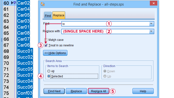 Replace line breaks by spaces in an SPSS syntax window
Also, you probably want to see only variable labels (not names) from now on. And -finally- we no longer want to hide any small absolute factor loadings shown below.
 This table is fine for an exploratory analysis but not for reporting
The syntax below does all that and thus creates output that is ideal for creating APA style tables.
set tvars labels.
*RERUN PREVIOUS ANALYSIS WITH VARIABLE ORDER AS IN PATTERN MATRIX TABLE.
FACTOR
/VARIABLES Car02 Car04 Car05 Car03 Car01 Car08 Car07 Car06 Succ01 Succ02 Succ03 Succ05 Succ07 Succ04 Succ06
Conf03 Conf01 Conf05 Conf02 Conf06 Tou02 Tou05 Tou01 Comp02 Comp03 Comp01
/MISSING PAIRWISE
/PRINT INITIAL EXTRACTION ROTATION
/FORMAT SORT
/CRITERIA FACTORS(5) ITERATE(25)
/EXTRACTION PC
/ROTATION PROMAX
/METHOD=CORRELATION.
You can now safely combine the communalities and pattern matrix tables and make some final adjustments. The end result is shown in this Googlesheet, partly shown below.
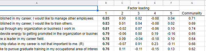 An APA table for WORD is best created in a Googlesheet or Excel
Since decimal places, fonts, alignment and borders have all been set, this table is now perfect for its final copy-paste into WORD.
Table II - Total Variance Explained
The screenshot below shows how to report the Eigenvalues table in APA style.
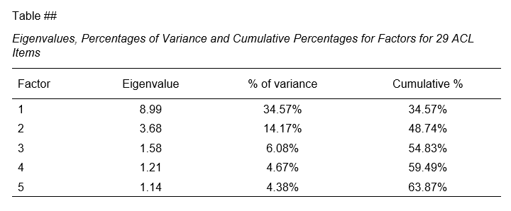 APA style Eigenvalues example table
The corresponding SPSS output table comes fairly close to this. However, an annoying problem are the missing percent signs.
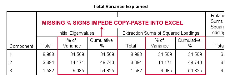
If we copy-paste into Excel and set a percentage format, 34.57 is converted into 3,457%. This is because Excel interprets these numbers as proportions rather than percentage points as SPSS does. The easiest fix is setting a percent format for these columns in SPSS before copy-pasting into Excel.
The OUTPUT MODIFY example below does just that for all Eigenvalues tables in the output window.
output modify
/select tables
/tablecells select = ["% of Variance"] format = 'pct6.2'
/tablecells select = ["Cumulative %"] format = 'pct6.2'.
After this tiny fix, you can copy-paste this table from SPSS into Excel. We can now easily make some final adjustments (including the removal of some rows and columns) and copy-paste this table into WORD.
Table III - Factor Correlations
If you used an oblique factor rotation, you'll probably want to report the correlations among your factors. The figure below shows an APA style factor correlations table.
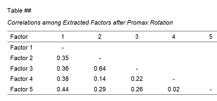
The corresponding SPSS output table (shown below) is pretty different from what we need.
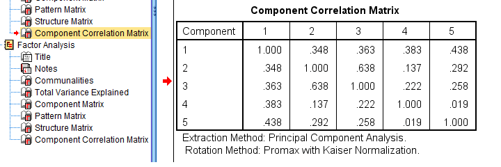 APA style factor correlation table
Adjusting this table manually is pretty doable. However, I personally prefer to use an SPSS Python script for doing so.
You can download my script from LAST-FACTOR-CORRELATION-TABLE-TO-APA.sps. This script is best run from an INSERT command as shown below.
insert file = 'D:\DOWNLOADS\LAST-FACTOR-CORRELATION-TABLE-TO-APA.sps'.
I highly recommend trying this script but it does make some assumptions:
- the above syntax assumes the script is located in D:\DOWNLOADS so you probably need to change that;
- the script assumes that you've the SPSS Python3.x essentials properly installed (usually the case for recent SPSS versions);
- the script assumes that no SPLIT FILE is in effect.
If you've any trouble or requests regarding my script, feel free to contact me and I'll see what I can do.
Final Notes
Right, so these are the basic routines I follow for creating APA style factor analysis tables. I hope you'll find them helpful.
If you've any feedback, please throw me a comment below.
Thanks for reading!
Creating APA Style Contingency Tables in SPSS
Running simple contingency tables in SPSS is easy enough. However, the default format is inconvenient and doesn't meet APA standards. This tutorial walks you through 3 options for creating the desired tables:
- CROSSTABS is easy but requires some (manual) editing.
- CTABLES is faster but a bit harder and requires a custom tables license.
- TABLES is fast but rather challenging.
We'll use bank_clean.sav -partly shown below- for all examples. You can try them yourself after downloading the data.

So What Are Contingency Tables Anyway?
Contingency tables show frequencies for all
combinations of values of 2(+) variables.
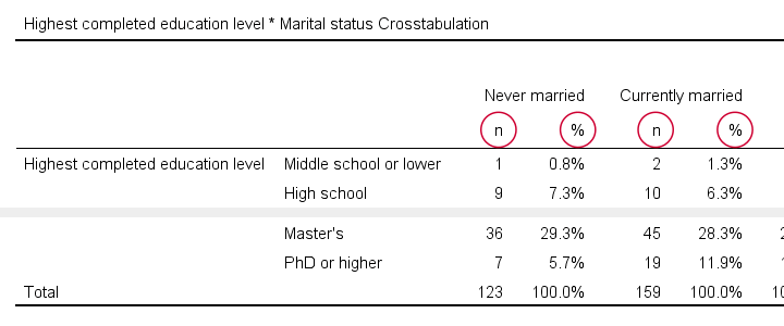
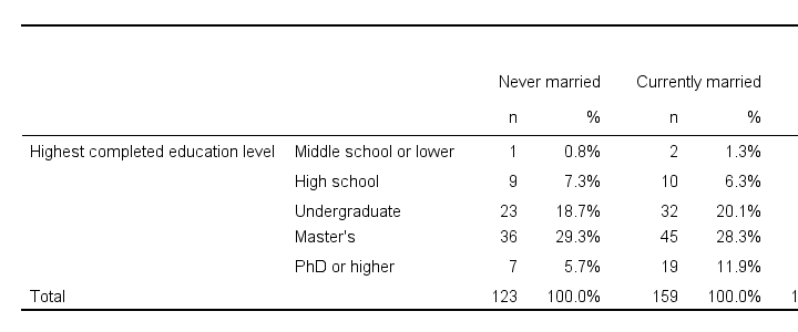
For example, the table below shows a contingency table -or “crosstab”- for 2 variables: marital status and education level.
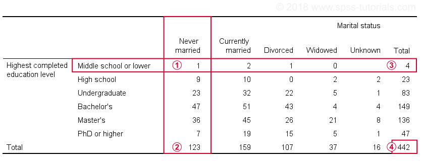
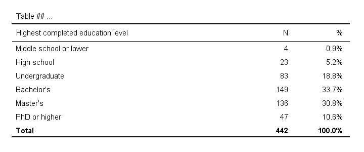
 Only 1 respondent had middle school and never married;
 A total of 123 respondents never married;
 Only 4 respondents have middle school or lower;
 The table shows all combinations of marital status and education for 442 respondents.
Hopefully, contingency tables give some insight into the association -if any- between these variables. So how does that work? For a very simple explanation, see
Running Simple Contingency Tables in SPSS
The fastest way to create the table we just saw is running one line of SPSS syntax:
crosstabs educ by marit.
The categories of the first variable -educ or education- become rows in the table. The values of the second variable -marit or marital status- become the columns. As a rule of thumb,
the columns hold the groups you want to compare
on whatever goes into the rows. In this case, we're comparing marital status groups on education level.
If we had wanted to do the reverse -compare education level groups on marital status- we'd swap the rows and columns and run
crosstabs marit by educ.
CROSSTABS with Column Percentages
Right. So how do our groups compare on education level? It's hard to see from our first table because each marital status group has a different n or sample size. We may see more of a pattern if we add column percentages. The syntax below does just that.
set
tvars labels
tnumbers labels.
*Create contingency table with frequencies and column percentages.
crosstabs educ by marit
/cells count column.
Result
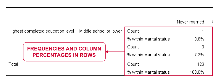
If we study the entire table, it seems that widowed respondents are somewhat higher educated than the others: no less than 56.8% hold a master's degree and another 13.5% even a PhD. The overall pattern is not very clear though and we'd perhaps better visualize it as a stacked bar chart.
In any case, the table format -percentages in rows- doesn't really help either and doesn't meet APA guidelines. So let's fix it.
Converting CROSSTABS to APA Tables
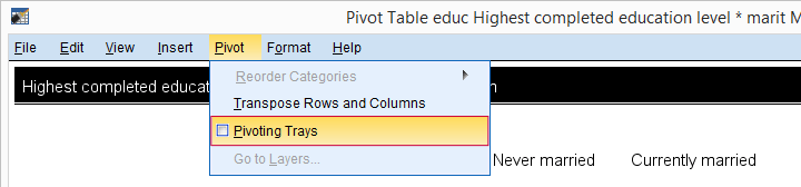
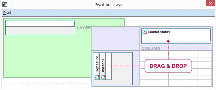
One solution is right-click our table and select
![]() In the pivot editor that opens, tick
as shown below.
In the pivot editor that opens, tick
as shown below.
Now drag and drop statistics right underneath Marital status and just close the window.
Let's now make 2 text replacements:
- use n instead of “Count”
- use % instead of “% within Marital status”
Using the Ctrl + H shortkey in the output viewer should work. Or -much nicer- use the OUTPUT MODIFY syntax below if you're on SPSS version 22 or higher.
output modify
/select tables
/tablecells select = ['% within Marital status'] replace = '%' applyto = columnheader
/tablecells select = ['Count'] replace = 'n' applyto = columnheader.
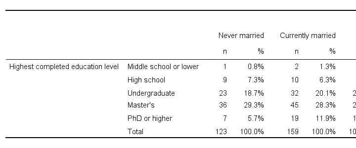
Result
 APA Contingency Table Created with CROSSTABS
So that's the easiest way to create an APA style contingency table in SPSS. But -personally- I find it too much work, especially for several tables. So let's consider 2 alternatives.
APA Contingency Tables from CTABLES
The table we just created can be run in one go with CTABLES. However, this only works if you've a license for the custom tables module. You can check this by running show license. If the resulting table includes “Custom Tables”, try the syntax below.
ctables
/table educ by marit [count 'n' colpct '%']
/categories variables = educ marit total = yes.
Result
 APA Contingency Table Created with CTABLES
CTABLES works great for this table but -unfortunately- you'll need a separate command for each table. The syntax is also somewhat challenging. I think you could paste it from
![]()
![]() but I somehow never get the results I want from the menu.
but I somehow never get the results I want from the menu.
A better way perhaps is to copy-paste-edit the syntax example for several tables. Or create and run the commands with Python for SPSS. This is faster but also harder. But if you like it fast and hard -I surely do- then go for it.
APA Contingency Tables from TABLES
So what if you don't have a license for CTABLES? Well, then there's TABLES. TABLES was replaced by CTABLES around 1990 and removed from all documentation. But -as very very few SPSS users know- TABLES still works in all recent SPSS versions.
Like so, the syntax below is an alternative for the CTABLES approach.
tables
/format zero
/ftotal = ftot 'Total'
/table educ + ftot by marit > (statistics) + ftot
/statistics count((f3) 'n') cpct((pct5.1) '%':marit).
Result
 APA Contingency Table Created with TABLES
This contingency table is almost identical to the CTABLES result. Unfortunately, the syntax is even harder and -worse- not documented. We might build a tool for creating the TABLES command from the menu but it won't come up any time soon.
Final Notes
We showed 3 ways for creating APA style contingency tables in SPSS:
- CROSSTABS is easiest. You can create several tables in one go but they require quite some (manual) editing.
- CTABLES runs the desired table straight away and could be run from the menu. However, it creates one table at the time and requires an additional license.
- TABLES also comes up with the right table straight away. However, the syntax is difficult and there's no menu.
Admittedly, none of these options is ideal. So we might build a tool some time that runs many tables in one go from the menu.
Thanks for reading!
Creating APA Style Frequency Tables in SPSS
The most basic table in statistics is probably a simple frequency distribution. Sadly, basic frequency tables from SPSS are monstrous. On top of that, they don't meet APA recommendations.
So how to create better frequency tables -preferably fast? This tutorial shows a cool trick for doing just that! We'll use bank_clean.sav throughout, part of which is shown below.
Why Basic SPSS Frequency Tables Suck
So let's take a close look at some basic frequency tables. We'll create some by running the syntax below.
set
tnumbers labels
tvars labels.
*Standard SPSS frequencies tables.
frequencies educ marit.
Result
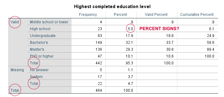
For just inspecting your data, this may do. However, these tables are not suitable for reporting:
- SPSS users surely know the difference between valid and missing values. However, clients who don't use SPSS often find this confusing.
- “Total” appears no less than 3 times in our tables.
- Percent signs are missing from percentages.
- We rarely need cumulative frequencies -which are really cumulative valid frequencies.
- The new styling for output tables -introduced in SPSS 23- looks disastrous.
Now, the styling is easily fixed with a tablelook. After applying it, our table looks much better as shown below.
Unfortunately, FREQUENCIES has no options for avoiding the other issues we just mentioned. So let's try something completely different.
Frequencies in MEANS Tables
Ok, this'll sound crazy but -really- do give it a go. First off, we'll create a new variable holding zeroes for all cases. Next, we'll run a minimal MEANS table for our constant by our target variables. Let's run the syntax below and see what happens.
compute constant = 0.
*Basic means tables constant over educ and marit.
means constant by educ marit.
Result
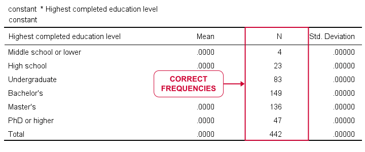
Our table looks stupid. Obviously, all means and standard deviations are 0.000. However, we do have clean and simple frequencies but we don't have the corresponding percentages. Yet.
MEANS without Means
Now the trick is that MEANS allows us to choose which columns we want in which order. Therefore, we can have MEANS without means or standard deviations but with frequencies and percentages. This results in nice and clean frequency tables in the APA recommended format.
variable labels constant 'Table ## ...'.
*Run means table but show only frequencies and percentages.
means constant by educ marit
/cells count npct.
*Optionally: prettify tables.
output modify
/select tables
/table tabletitle = ' '
/tablecells select = ['% of Total N'] applyto = columnheader replace = '%'
/tablecells select = ['Total'] applyto = row style = bold.
Result
First note that we set part of the desired table title as a variable label for our constant. If you don't want that, try and run
variable labels constant ' '.
After doing so, the title consists of a single space so there seems to be no title at all.
Also note that we prettified our tables with OUTPUT MODIFY which requires SPSS version 22 or higher. For keeping it simple, we processed all tables in the output window. If you don't want that, adding one or two lines to OUTPUT MODIFY restricts the modifications to a precise selection of tables.
If you're on SPSS 21 or lower, the Ctrl + H shortkey -either in the output window or after exporting to WORD- may help in removing or replacing text.
Including User Missing Values
By default, our approach includes only valid values. However, including user missing values is easily done by just adding a single line to the syntax.
means constant by educ marit
/cells count npct
/missing include.
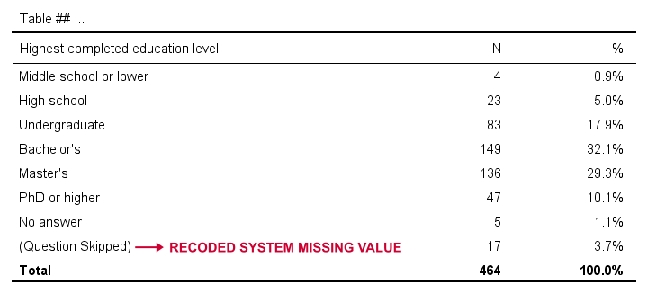
Including System Missing Values
Very few SPSS procedures can include system missing values. However, that's easily solved: we'll use a simple RECODE to change them to some huge number. We then give that a value label and set it as missing.
Quick tip: don't use very small numbers such as -9999 for this. Small numbers often end up as the first -rather than the last- rows in your tables.
recode educ marit (sysmis = 999999999).
*Add value label.
add value labels educ marit 999999999 '(Question Skipped)'.
*Set 999999999 as user missing.
missing values educ marit (999999999,7).
*Run APA frequencies with user and system missing values.
means constant by educ marit
/cells count npct
/missing include.
Result
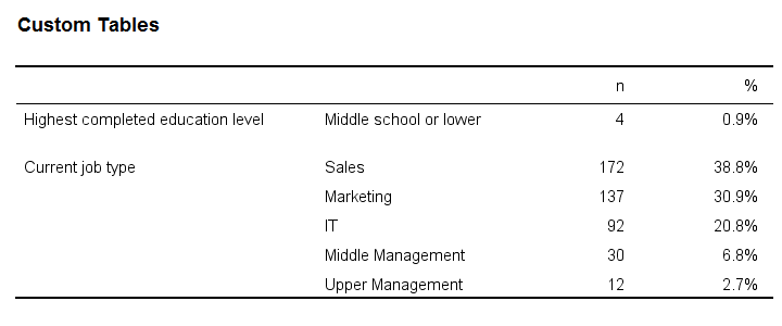
APA Frequency Tables from CTABLES
For me, creating frequency tables like we just discussed is the preferred option. It's fast and simple. However, an alternative is using CTABLES but this requires a license for the custom tables option.
CTABLES can create a single frequency table for multiple variables in one go. The syntax below presents a minimal example for doing so.
ctables
/table (educ + jtype) [count 'n' colpct.count '%'].
Result
So that'll do for our frequency tables. I hope you found this tutorial helpful! Let me know by throwing in a comment below.
Thanks for reading!
Creating APA Style Descriptives Tables in SPSS
Running some basic descriptive statistics in SPSS is super easy with the DESCRIPTIVES command. However, the resulting table doesn't even come close to the APA required format or what corporate clients often demand.
So what's the problem? Well, you'll quickly find out if you
try and create the table shown below.
 Nice and clean APA descriptives table.
SPSS DESCRIPTIVES Example
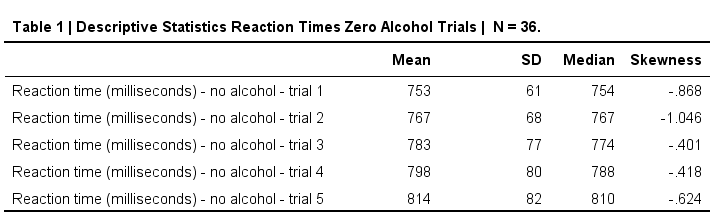
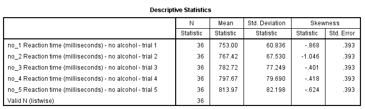
This table is based on no_1 to no_5 in alcotest.sav. When trying to create it with DESCRIPTIVES, the closest I got was the syntax below.
/statistics means stddev skewness.
Result
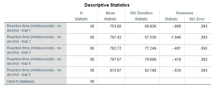
Although this table is very easy to create -and does a good job when exploring data- it's not quite what it should have been. So let's dive into some issues.
No Median in DESCRIPTIVES
For some weird reason, DESCRIPTIVES does not include the median. Seriously, I looked it up in the CSR and it's just not there.
Ok, then let's just skip the median for now and run into the second problem.
Undesired Inferential Statistics
For some statistics -including skewness and kurtosis- SPSS will automatically report their standard errors. But: if I want standard errors, I'll ask for them.
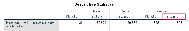
If I don't ask for them, then I probably don't want them. But I get them anyway. And I've several problems with that:
- The standard errors result in a complicated table format with merged cells. Removing or hiding these unwanted cells is complicated. At least, I haven't found a quick and easy way for doing so.
- Standard errors are not descriptive but -rather- inferential statistics. They are only correct if my data are a simple random sample from my population.
- If my data hold a substantive percentage of my population, these standard errors are biased (away from zero).In this case, I need to apply a so-called finity correction to the standard errors. The SPSS complex samples option (module) is needed to do so.
- If I sampled my entire population, the reported standard errors are nonsensical. In this case, there's no sampling error so the correct standard errors are all zero.
Undesired N Column
When I'm just exploring my data, I like to see the N per variable. It tells me how many missing values each variable has. But if I don't have any missings, I don't want this column. In this case, I rather report N in the title of my table. However, I can't omit N when using DESCRIPTIVES.
Can't Omit “Valid N (listwise)”
In a similar vein, DESCRIPTIVES always includes Valid N (listwise). This tells me how many cases have zero missing values on all variables included in my table. When preparing data -especially for a multivariate analysis- that's great. However,
“Valid N (listwise)” puzzles my non SPSS using clients
and they don't want to see it. Fortunately, an SPSS Python script does a fair job hiding it. Still, being able to choose whether to include it or not would be highly preferable over always including it and then having to hide it.
A similar point was made in SPSS Correlations in APA Format.
CELLS or STATISTICS?
- When running CROSSTABS, the CELLS subcommand specifies which cells my contingency table should hold.
Next, a test for statistical significance -usually a chi-square independence test- can be specified with STATISTICS.STATISTICS in CROSSTABS also creates several correlations such as Pearson correlations, Cramér’s V, Spearman rank correlations and many other statistics. - When running MEANS, the CELLS subcommand specifies which cells my means table should hold.
Next, a test for statistical significance -a one-way ANOVA- can be specified with STATISTICS. - When running DESCRIPTIVES, there's no CELLS subcommand.
STATISTICS specifies which cells my descriptives table should hold.
Table Styling
If you're on SPSS version 22 or earlier, your descriptives table probably looks like the one shown below. Not super pretty but clean and decent.
For some reason, SPSS 23 introduced new table styles with grey text on -again- grey backgrounds. I don't like the way they look on screen, let alone when printed out.
If you like the old styles more than the new ones, you can revert to them by setting Original.stt as your tablelook. On my system,
set tlook "C:\Program Files\IBM\SPSS\Statistics\24\Looks\Original.stt".
does the trick.
Nicer Descriptives with MEANS
So how to create this descriptives table in APA format? Well, it's utterly simple. Just run
means no_1 to no_5
/cells mean stddev median skew.
and transpose the resulting table. Which leaves us with one question: how to transpose a table in SPSS?
Transposing Pivot Tables in SPSS
In contrast to chart templates, table templates can't transpose output for you -which is unfortunate because it would save a lot of time. So there's 3 options:
- Manually: right-click the table, select
 and rearrange the pivoting trays. For an example, see SPSS Chi-Square Independence Test (scroll way down).
 - Python: an SPSS Python script can transpose one, many or all pivot tables in your output window for you. This requires you have the SPSS Python Essentials properly installed.
- Last but not least, if you're on SPSS 22 or higher, OUTPUT MODIFY does the trick fast with little syntax. I'll add an example below.
OUTPUT MODIFY
/SELECT TABLES
/IF commands = ["means"] subtypes =["report"]
/TABLE TRANSPOSE=YES.
Thanks for reading.
SPSS CROSSTABS – Simple Tutorial & Examples
SPSS CROSSTABS produces contingency tables: frequencies for one variable for each value of another variable separately. If assumptions are met, a chi-square test may follow to test whether an association between the variables is statistically significant. This tutorial, however, aims at quickly walking through the main options for CROSSTABS.
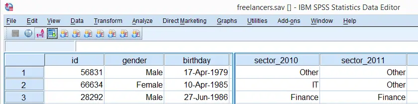
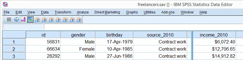
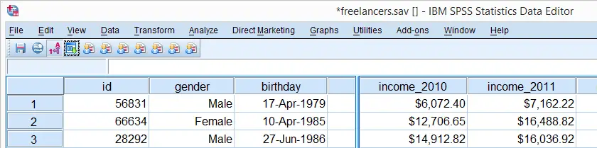
We'll use freelancers.sav throughout this tutorial as a test data file.
SPSS CROSSTABS - Minimal Specification
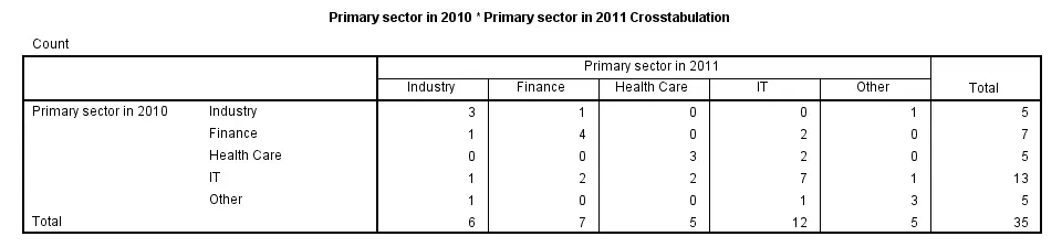
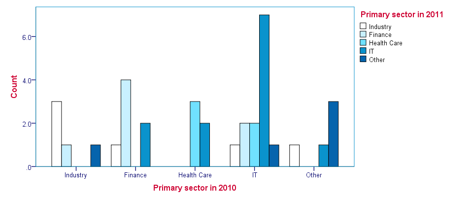
The syntax below demonstrates the simplest possible CROSSTABS command. It generates a table with the frequencies for sector_2010 for each value in sector_2011 separately. The screenshot below shows the result.
crosstabs sector_2010 by sector_2011.
SPSS CROSSTABS - CELLS Subcommand
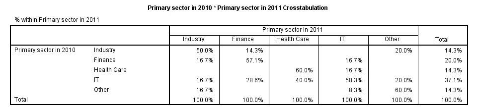
By default, CROSSTABS shows only frequencies (counts). However, the association between variables usually become more visible by displaying row or column percentages. They can be obtained by adding a CELLS subcommand.
Note that multiple cell contents may be chosen simultaneously; the second example below includes both column percentages and frequencies. Specifying ALL on the CELLS subcommand gives a complete overview of the options.
crosstabs sector_2010 by sector_2011/cells column.
*2. Crosstabs with both frequencies and column percentages in cells.
crosstabs sector_2010 by sector_2011/cells count column.
SPSS CROSSTABS - Multiway Tables
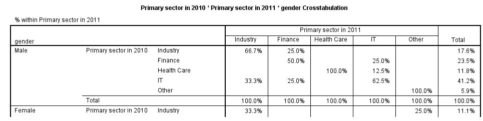
Multiway tables result from including more than one BY clause in CROSSTABS. Like so, the syntax below produces frequencies of sector_2011 for each combination of gender and sector_2010 separately. The following screenshot shows (part of) the result.
crosstabs sector_2010 by sector_2011 by gender
/cells column.
SPSS CROSSTABS - Multiple Tables, Similar Columns
Multiple tables with the same column variable but different row variables can be generated by a single CROSSTABS command; simply specify multiple variable names (possibly using TO) before the BY keyword. The syntax below gives an example.
crosstabs sector_2011 to sector_2014 by sector_2010.
SPSS CROSSTABS - Multiple Tables, Similar Rows
Multiple variables being specified after the BY keyword results in multiple tables with different column variables but the same row variable.
crosstabs sector_2010 by sector_2011 to sector_2014.
SPSS CROSSTABS - BARCHART Subcommand
Clustered barcharts can be obtained from CROSSTABS by simply adding a BARCHART subcommand as shown below. However, we prefer to generate such charts via GRAPH because it allows us to set appropriate titles for our charts.
Charts resulting from either option can be styled with an SPSS Chart Template (.sgt) file, which we used for the following screenshot.
crosstabs sector_2010 by sector_2011
/cells column
/barchart.
SPSS CROSSTABS - STATISTICS Subcommand
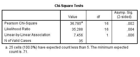
As mentioned in the introduction of this tutorial, CROSSTABS offers a chi-square test for evaluating the statistical significance of an association among the variables involved. It's obtained by specifying CHISQ on the STATISTICS subcommand.
Do keep in mind that SPSS happily produces test results even if their statistical assumptions don't hold, in which case such results may be wildly incorrect.
Besides the chi-square test statistic, many other statistics are available. For a full overview, specify ALL on the STATISTICS subcommand or consult the command syntax reference.
crosstabs sector_2010 by sector_2011
/cells column
/statistics chisq.
SPSS MEANS – Statistics by Category
SPSS MEANS produces tables containing means and/or other statistics for different groups of cases. These groups are defined by one or more categorical variables. If assumptions are met, MEANS can be followed up by an ANOVA.
This tutorial walks through its main options, pointing out some tips and tricks. You may follow along by downloading and opening freelancers.sav.
SPSS Quick Data Check
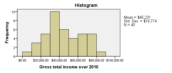
Since we'll run some tables on income_2010, we'll first take a quick look at its histogram by running FREQUENCIES. Note that the second line in the syntax below suppresses frequency tables. We also hide all decimals for income_2010 with FORMATS for suppressing excessive decimals in the output tables.
frequencies income_2010
/format notable
/histogram.
*2. Suppress excessive decimal places somewhat.
formats income_2010(dollar8).
SPSS MEANS - Minimal Use
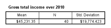
Since our histogram doesn't indicate anything unusual, we can now run MEANS. The most simple way to do so is running means income_2010.
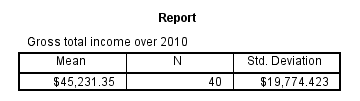
The result is basically the same as DESCRIPTIVES for a single variable but when multiple variables are specified, MEANS will use a different table structure which we'll see later on.
One thing we don't like here is the title (“Report”). However, by using an SPSS Table Template (.stt file), we can make it invisible and enlarge the variable label of the row variable (“Gross total ...”) so it will look like the title. We'll do so throughout the remainder of this tutorial.
SPSS MEANS - Typical Use
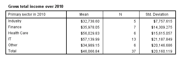
The first MEANS example produced mean incomes over all cases. However, we'll typically use MEANS for generating means for different groups of cases. Like so, the syntax below produces mean incomes for different sectors separately.
means income_2010 by sector_2010.
SPSS MEANS - CELLS Subcommand
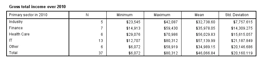
The syntax below has a second line containing a CELLS subcommand. It specifies which statistics (columns) are included in which order.
Note that MEANS has more options here than DESCRIPTIVES, all of which can be included by specifying ALL on the CELLS subcommand.
means income_2010 by sector_2010
/cells count min max mean stddev.
SPSS MEANS - Multiway Tables
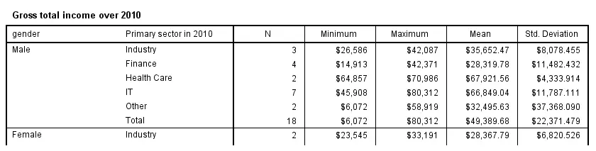
Multiway tables are generated by using more than one BY clause. For example, the syntax below produces mean incomes for each combination of gender and sector separately. You can use even more than two row variables but the resulting table will be rather messy in this case.
means income_2010 by gender by sector_2010
/cells count min max mean stddev.
SPSS MEANS - Multiple Metric Variables in One Table
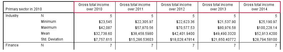
Multiple metric variables may be specified before the BY keyword (possibly using TO) as shown in the syntax below.If you reproduce this table, note that some of the results are wildly incorrect because we failed to specify user missing values for income_2012. This results in one MEANS table with the metric variables as columns.
Statistics and one or more row variables define rows in this case as shown in the following screenshot. If this structure is not to your liking, you may prefer using separate MEANS commands for separate tables instead.
means income_2010 to income_2014 by sector_2010
/cells count min max mean stddev.
SPSS MEANS - Multiple Tables
Specifying multiple variables after the BY keyword results in multiple tables with the same columns but different (categorical) row variables. The syntax below gives an example.
means income_2010 by sector_2010 to sector_2014
/cells count min max mean stddev.
SPSS MEANS - Final Note
Our discussion of MEANS is by no means exhaustive; you may consult the command syntax reference for more options. We deliberately skipped the STATISTICS subcommand because it doesn't provide any options for evaluating the essential assumptions that underlie statistical significance tests.
SPSS CORRELATIONS – Beginners Tutorial
Also see Pearson Correlations - Quick Introduction.
SPSS CORRELATIONS creates tables with Pearson correlations and their underlying N’s and p-values. For Spearman rank correlations and Kendall’s tau, use NONPAR-CORR. Both commands can be pasted from
![]()
![]() .
.
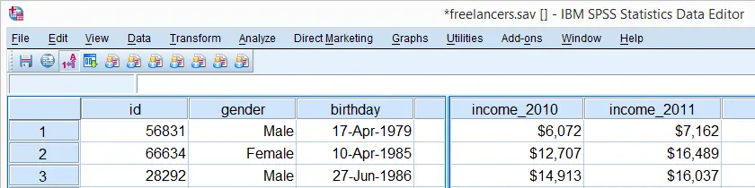
This tutorial quickly walks through the main options. We'll use freelancers.sav throughout and we encourage you to download it and follow along with the examples.
User Missing Values
Before running any correlations, we'll first specify all values of one million dollars or more as user missing values for income_2010 through income_2014.Inspecting their histograms (also see FREQUENCIES) shows that this is necessary indeed; some extreme values are present in these variables and failing to detect them will have a huge impact on our correlations. We'll do so by running the following line of syntax: missing values income_2010 to income_2014 (1e6 thru hi). Note that “1e6” is a shorthand for a 1 with 6 zeroes, hence one million.
SPSS CORRELATIONS - Basic Use
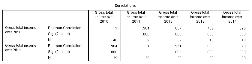
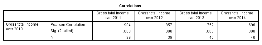
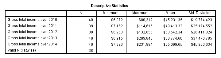
The syntax below shows the simplest way to run a standard correlation matrix. Note that due to the table structure, all correlations between different variables are shown twice.
By default, SPSS uses pairwise deletion of missing values here; each correlation (between two variables) uses all cases having valid values these two variables. This is why N varies from 38 through 40 in the screenshot below.
correlations income_2010 to income_2014.
Keep in mind here that p-values are always shown, regardless of whether their underlying statistical assumptions are met or not. Oddly, SPSS CORRELATIONS doesn't offer any way to suppress them. However, SPSS Correlations in APA Format offers a super easy tool for doing so anyway.
SPSS CORRELATIONS - WITH Keyword
By default, SPSS CORRELATIONS produces full correlation matrices. A little known trick to avoid this is using a WITH clause as demonstrated below. The resulting table is shown in the following screenshot.
correlations income_2010 with income_2011 to income_2014.
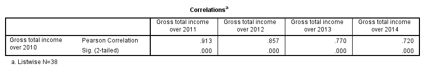
SPSS CORRELATIONS - MISSING Subcommand
Instead of the aforementioned pairwise deletion of missing values, listwise deletion is accomplished by specifying it in a MISSING subcommand.An alternative here is identifying cases with missing values by using NMISS. Next, use FILTER to exclude them from the analysis. Listwise deletion doesn't actually delete anything but excludes from analysis all cases having one or more missing values on any of the variables involved.
Keep in mind that listwise deletion may seriously reduce your sample size if many variables and missing values are involved. Note in the next screenshot that the table structure is slightly altered when listwise deletion is used.
correlations income_2010 to income_2014
/missing listwise.
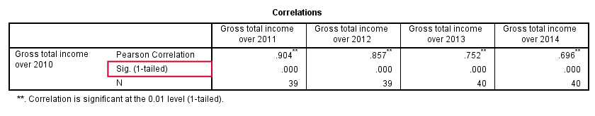
SPSS CORRELATIONS - PRINT Subcommand
By default, SPSS CORRELATIONS shows two-sided p-values. Although frowned upon by many statisticians, one-sided p-values are obtained by specifying ONETAIL on a PRINT subcommand as shown below.
Statistically significant correlations are flagged by specifying NOSIG (no, not SIG) on a PRINT subcommand.
correlations income_2010 with income_2011 to income_2014
/print nosig onetail.
SPSS CORRELATIONS - Notes
More options for SPSS CORRELATIONS are described in the command syntax reference. This tutorial deliberately skipped some of them such as inclusion of user missing values and capturing correlation matrices with the MATRIX subcommand. We did so due to doubts regarding their usefulness.
Thanks for reading!
SPSS DESCRIPTIVES – Quick Tutorial
SPSS DESCRIPTIVES generates a single table with descriptive statistics for one or more variables. It can also add z-scores to your data. We'll walk through its major options using freelancers.sav. The screenshot below shows part of its data view.
User Missing Values
Before running any descriptives, we first need to specify some user missing values for income_2010 through income_2014. We'll do so by running the syntax below. The FORMATS command suppresses excessive decimal places for output tables that we'll generate later on.
missing values income_2010 to income_2014 (1000000 thru hi).
*Hide decimal places for income_2010 through income_2014.
formats income_2010 to income_2014 (dollar8).
SPSS DESCRIPTIVES - Basic Use
The most basic way to run a descriptives table is simply “DESCRIPTIVES” followed by one ore more variable names (possibly using TO or ALL) and a period. The syntax below gives an example.
descriptives income_2010 to income_2014.
Note that “Valid N (listwise)” denotes the number of cases that don't have any missing values on any of the variables shown in the table.
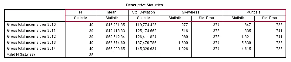
SPSS DESCRIPTIVES - STATISTICS Subcommand
Statistics and the order in which they'll appear in the table can be specified by adding a STATISTICS subcommand. However, the first column for descriptives is always N, even if not specified.
Note that some statistics (such as skewness and kurtosis) will always be followed by their standard error, which can't be specified separately.If this is not to your liking, try MEANS instead. Note that for MEANS, statistics are specified on a CELLS subcommand; STATISTICS refers to test statistics for significance tests here.
descriptives income_2010 to income_2014
/statistics mean stddev skewness kurtosis.
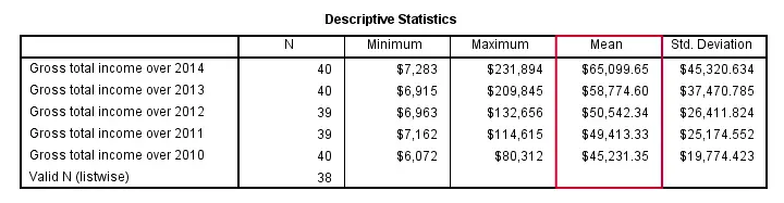
SPSS DESCRIPTIVES - SORT Subcommand
By default, table rows (representing variables) are sorted by the order in which these variables are specified in DESCRIPTIVES. This can be changed by specifying a statistic (or NAME for variable names) on a SORT subcommand. Add “(d)” for sorting descendingly.
descriptives income_2010 to income_2014
/sort mean(d).
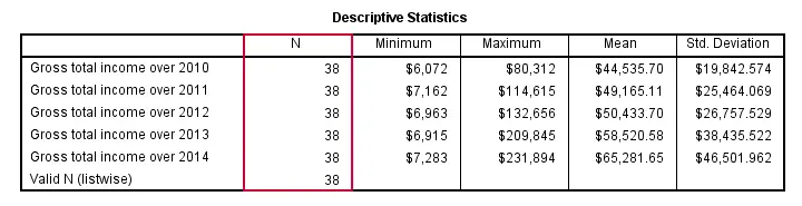
SPSS DESCRIPTIVES - MISSING Subcommand
By default, DESCRIPTIVES uses pairwise deletion of missing values: for each variable, all cases having a valid value on this variable are used.Since “deletion” doesn't actually delete anything, “exclusion” would be more appropriate here. This is why N may differ for different variables.
Specifying LISTWISE on a MISSING subcommand implies listwise deletion of missing values: for all variables, only cases are used that don't have any missing value on any of these variables.
descriptives income_2010 to income_2014
/missing listwise.
SPSS DESCRIPTIVES - Z-Scores
Standardizing variables mean rescaling them so that they have a mean of 0 and a standard deviation of 1. This is done by subtracting a variable's mean from each separate value and dividing the remainder by the variable's standard deviation. The resulting values are called z-scores.
DESCRIPTIVES offers two ways for adding z-scores to your data. First, adding a SAVE subcommand standardizes all variables on the DESCRIPTIVES command. The names for these new variables are the original variable names prefixed by “Z”. The screenshot below shows the result in data view.
descriptives income_2010 to income_2014
/save.
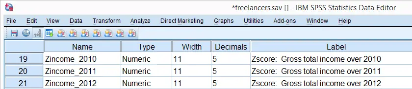
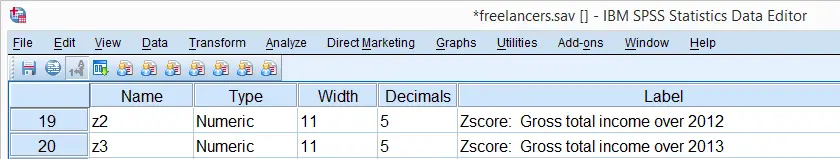
A second option here is adding variable names for the new (standardized) variables behind the original variable names, enclosed by parentheses.
descriptives income_2012 (z2) income_2013 (z3).
Note that either option for standardizing variables leaves the original variables intact. Second, DESCRIPTIVES automatically adds variable labels to the newly added standardized variables.
Z-Scores - Cautionary Note
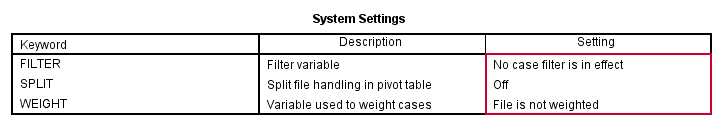
Whenever adding z-scores to your data with DESCRIPTIVES, keep in mind that the result may be affected by the missing subcommand. Also, FILTER, SPLIT FILE or WEIGHT being in effect may influence the calculation of z-scores. This may or may not be your intention.
Recent SPSS versions will show in the status bar whether these are in effect. However, if you want to be really sure, simply run
show filter split weight.
just before standardizing variables to stay on the safe side.
SPSS FREQUENCIES – Quick Tutorial
SPSS FREQUENCIES command can be used for much more than frequency tables: it's also the easiest way to obtain basic charts such as histograms and bar charts. On top of that, it provides us with percentiles and some other statistics. Plenty of reasons for taking a closer look at this ubiquitous SPSS command. We'll use employees.sav throughout this tutorial.
SPSS FREQUENCIES - Basic Table
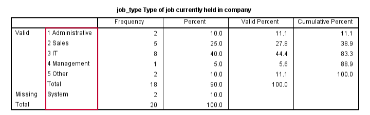
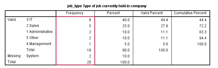
The most basic way to use FREQUENCIES is simply generating a frequency table. For example, the frequency table for job_type is obtained by running the following line of SPSS syntax: frequencies job_type.
By default, the rows of this table are sorted ascendingly by value. Note that this may not be obvious when only value labels are displayed. We'll next take a look at different options for sorting the table rows.
SPSS FREQUENCIES - Sort Order
SPSS default sort order of ascendingly be value can be changed by adding a FORMAT subcommand. Possible values are AVALUE and DVALUE (ascending and descending values) or AFREQ and DFREQ (ascending and descending frequencies). For example, the syntax below sorts the rows from the value with highest frequency (yes, that's the mode) through the value with the lowest frequency.
frequencies job_type
/format dfreq.
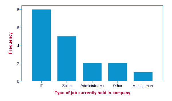
SPSS FREQUENCIES - Bar Chart
SPSS FREQUENCIES command is the easiest way to create one or more bar charts for categorical variables. Just add the BARCHART subcommand. Note that you can combine it with a sort order, resulting in the barchart bars being ordered from highest through lowest frequency as shown below.
frequencies job_type
/format dfreq
/barchart.
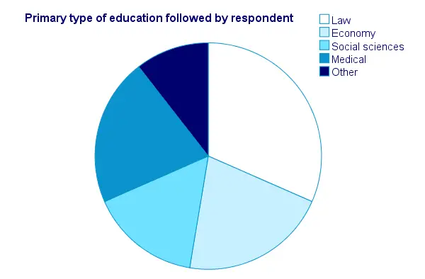
SPSS FREQUENCIES - Pie Chart
An alternative visualization for categorical variables is a pie chart. In order to generate it, simply add a PIECHART subcommand to FREQUENCIES. The syntax below creates a pie chart for education_type.
frequencies education_type
/piechart.
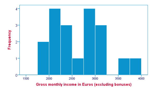
SPSS FREQUENCIES - Histogram
Frequency tables, bar charts and pie charts can all be used for both metric as well as categorical variables, including string variables. However, they are not useful for metric variables with many distinct values; in this case, tables get too many rows and graphs too many elements.
The ideal way to visualize such variables is a histogram, obtained by the HISTOGRAM subcommand. Apart from that, we can suppress frequency tables by specifying NOTABLE on the FORMAT subcommand. Like so, the syntax below generates a histogram for monthly_income.
frequencies monthly_income
/format notable
/histogram.
SPSS FREQUENCIES - Percentiles
SPSS FREQUENCIES provides a nice way to obtain percentiles: just add a PERCENTILES subcommand followed by the desired percentiles in parentheses. The syntax below gives an example. Keep in mind that percentiles are not meaningful for nominal variables.
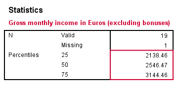
frequencies monthly_income
/format notable
/percentiles (25 50,75).
SPSS FREQUENCIES - Ntiles
Ntiles are easily obtained with SPSS FREQUENCIES: simply add the NTILES subcommand with the number of ntiles behind it in parentheses. If you want to assign cases to ntile groups, use RANK; it creates a new variable holding the ntile for each case on a given variable. Both options are shown in the syntax below.
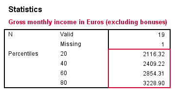
frequencies monthly_income
/format notable
/ntiles (5).
*2. Create monthly_income ntile group variable in data.
rank monthly_income/ntiles(5).
SPSS FREQUENCIES - Statistics
SPSS FREQUENCIES can compute all statistics obtained from DESCRIPTIVES plus the median and mode. Note that the statistics table from FREQUENCIES has a different layout with variables in columns and statistics in rows. For obtaining them, add a STATISTICS subcommand. Just as with DESCRIPTIVES, specifying the ALL keyword returns all available statistics.
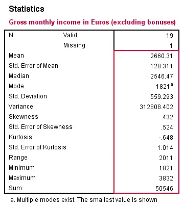
frequencies monthly_income
/format notable
/statistics all.
SPSS FREQUENCIES - Multiple Variables
Obviously, FREQUENCIES can be run for multiple variables, possibly using TO or ALL. If multiple types of output (frequency table, chart and so on) are generated, you can have them sorted by variable or output type by specifying VARIABLE or ANALYSIS on an ORDER subcommand.
frequencies education_type to job_type
/format dfreq
/barchart
/order variable.
*2. Sort output by output type (first tables for all variables, then charts for all variables).
frequencies education_type to job_type
/format dfreq
/barchart
/order analysis.