Cohen’s Kappa – What & Why?
Cohen’s kappa is a measure that indicates to what extent
2 ratings agree better than chance level.
- Cohen’s Kappa - Formulas
- Cohen’s Kappa - Interpretation
- Cohen’s Kappa in SPSS
- When (Not) to Use Cohen’s Kappa?
- Related Measures
Cohen’s Kappa - Quick Example
Two pediatricians observe N = 50 children. They independently diagnose each child. The data thus obtained are in this Googlesheet, partly shown below.
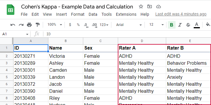
As we readily see, our raters agree on some children and disagree on others. So what we'd like to know is: to what extent do our raters agree on these diagnoses? An obvious approach is to compute the proportion of children on whom our raters agree. We can easily do so by creating a contingency table or “crosstab” for our raters as shown below.
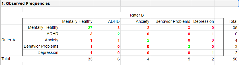
Note that the diagonal elements in green are the numbers of children on whom our raters agree. The observed agreement proportion \(P_a\) is easily calculated as
$$P_a = \frac{27 + 2 + 2 + 2 + 1}{50} = 0.68$$
This means that our raters diagnose 68% out of 50 children similarly. Now, this may seem pretty good but
what if our raters would diagnose children as (un)healthy
by simply flipping coins?
Such diagnoses would be pretty worthless, right? Nevertheless, we'd expect an agreement proportion of \(P_a\) = 0.50 in this case: our raters would agree on 50% of children just by chance.
A solution to this problem is to correct for such a chance-level agreement proportion. Cohen’s kappa does just that.
Cohen’s Kappa - Formulas
First off, how many children are diagnosed similarly? For this, we simply add up the diagonal elements (in green) in the table below.
This results in
$$\Sigma{o_{ij}} = 27 + 2 + 2 + 2 + 1 = 34$$
where \(o_{ij}\) denotes the observed frequencies on the diagonal.
Second, if our raters would not agree to any extent at all, how many similar diagnoses should we expect due to mere chance? Such expected frequencies are calculated as
$$e_{ij} = \frac{o_i\cdot o_j}{N}$$
where
- \(e_{ij}\) denotes an expected frequency;
- \(o_i\) is the corresponding marginal row frequency;
- \(o_j\) is the corresponding marginal column frequency;
- \(N\) is the total sample size.
Like so, the expected frequency for rater A = “mentally healthy” (n = 35) and rater B = “mentally healthy” (n = 33) is
$$e_{ij} = \frac{35\cdot 33}{50} = 23.1$$
The table below shows this and all other expected frequencies.
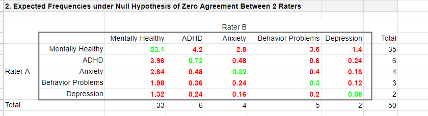
The diagonal elements in green show all expected frequencies for both raters giving similar diagnoses by mere chance. These add up to
$$\Sigma{e_{ij}} = 23.1 + 0.72 + 0.32 + 0.30 + 0.08 = 24.52$$
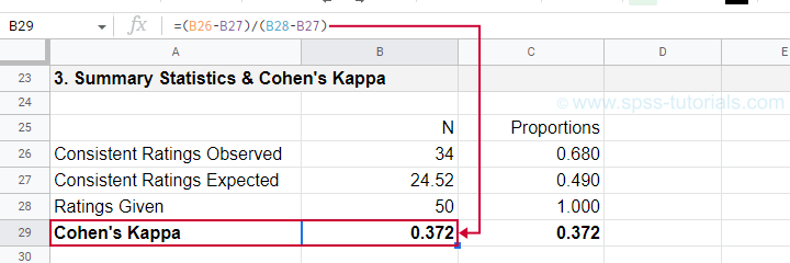
Finally, Cohen’s kappa (denoted as \(\boldsymbol \kappa\), the Greek letter kappa) is computed as3
$$\kappa = \frac{\Sigma{o_{ij}} - \Sigma{e_{ij}}}{N - \Sigma{e_{ij}}}$$
For our example, this results in
$$\kappa = \frac{34 - 24.52}{50 - 24.52} = 0.372$$
as confirmed by our Googlesheet shown below.
An alternative formula for Cohen’s kappa is
$$\kappa = \frac{P_a - P_c}{1 - P_c}$$
where
- \(P_a\) is the agreement proportion observed in our data and;
- \(P_c\) is the agreement proportion that may be expected by mere chance.
For our data, this results in
$$\kappa = \frac{0.68 - 0.49}{1 - 0.49} = 0.372$$
This formula also sheds some light on what Cohen’s kappa really means:
$$\kappa = \frac{\text{actual performance - chance performance}}{\text{perfect performance - chance performance}}$$
which comes down to
$$\kappa = \frac{\text{actual improvement over chance}}{\text{maximum possible improvement over chance}}$$
Cohen’s Kappa - Interpretation
Like we just saw, Cohen’s kappa basically indicates the extent to which observed agreement is better than chance agreement. Technically, agreement could be worse than chance too, resulting in Cohen’s kappa < 0. In short, Cohen’s kappa can run from -1.0 through 1.0 (both inclusive) where
- \(\kappa\) = -1.0 means that 2 raters perfectly disagree;
- \(\kappa\) = 0.0 means that 2 raters agree at chance level;
- \(\kappa\) = 1.0 means that 2 raters perfectly agree.
Another way to think of Cohen’s kappa is the proportion of disagreement reduction compared to chance. For our example, we expected N = 25.48 different diagnoses by chance. Since \(\kappa\) = .372, this is reduced to
$$25.48 - (25.48 \cdot 0.372) = 16$$
different (disagreeing) diagnoses by our raters.
With regard to effect size, there's no clear consensus on rules of thumb. However, Twisk (2016)4 more or less proposes that
- \(\kappa\) = 0.4 indicates a small effect;
- \(\kappa\) = 0.55 indicates a medium effect;
- \(\kappa\) = 0.7 indicates a large effect.
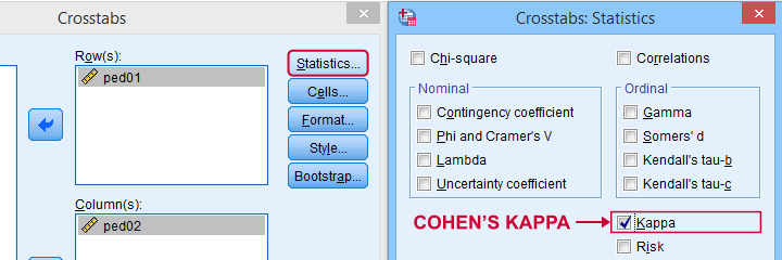
Cohen’s Kappa in SPSS
In SPSS, Cohen’s kappa is found under
![]()
![]() as shown below.
as shown below.
The output (below) confirms that  \(\kappa\) = .372 for our example.
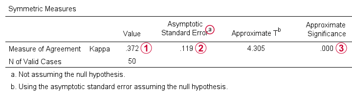
Keep in mind that the  significance level is based on the null hypothesis that \(\kappa\) = 0.0. However,
concluding that kappa is probably not zero is pretty useless
because zero doesn't come anywhere close to an acceptable value for kappa. A confidence interval would have been much more useful here but -sadly- SPSS doesn't include it.
significance level is based on the null hypothesis that \(\kappa\) = 0.0. However,
concluding that kappa is probably not zero is pretty useless
because zero doesn't come anywhere close to an acceptable value for kappa. A confidence interval would have been much more useful here but -sadly- SPSS doesn't include it.
When (Not) to Use Cohen’s Kappa?
Cohen’s kappa is mostly suitable for comparing 2 ratings if both ratings
- are nominal variables (unordered answer categories) and
- have identical answer categories.
For ordinal or quantitative variables, Cohen’s kappa is not your best option. This is because it only distinguishes between the ratings agreeing or disagreeing. So let's say we have answer categories such as
- very bad;
- somewhat bad;
- neutral;
- somewhat good;
- very good.
If 2 raters rate some item as “very bad” and “somewhat bad”, they slightly disagree. If they rate it as “very bad” and “very good”, they disagree much more strongly but Cohen’s kappa ignores this important difference: in both scenarios they simply “disagree”. A measure that does take into account how much raters disagree is weighted kappa. This is therefore a more suitable measure for ordinal variables.
Related Measures
Cohen’s kappa is an association measure for 2 nominal variables. For testing if this association is zero (both variables independent), we often use a chi-square independence test. Effect size measures for this test are
- the contingency coefficient;
- Cramér’s V;
- Cohen’s W.
These measures can basically be seen as correlations for nominal variables. So how do they differ from Cohen’s kappa? Well,
- Cohen’s kappa corrects for chance-level agreement and
- Cohen’s kappa requires both variables to have identical answer categories
whereas the other measures don't.
Second, if both ratings are ordinal, then weighted kappa is a more suitable measure than Cohen’s kappa.1 This measure takes into account (or “weights”) how much raters disagree. Weighted kappa was introduced in SPSS version 27 under
![]()
![]() as shown below.
as shown below.
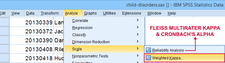
Lastly, if you have 3(+) raters instead of just two, use Fleiss-multirater-kappa. This measure is available in SPSS version 28(+) from
![]()
![]() Note that this is the same dialog as used for Cronbach’s alpha.
Note that this is the same dialog as used for Cronbach’s alpha.
References
- Van den Brink, W.P. & Koele, P. (2002). Statistiek, deel 3 [Statistics, part 3]. Amsterdam: Boom.
- Warner, R.M. (2013). Applied Statistics (2nd. Edition). Thousand Oaks, CA: SAGE.
- Howell, D.C. (2002). Statistical Methods for Psychology (5th ed.). Pacific Grove CA: Duxbury.
- Twisk, J.W.R. (2016). Inleiding in de Toegepaste Biostatistiek [Introduction to Applied Biostatistics]. Houten: Bohn Stafleu van Loghum.
- Van den Brink, W.P. & Mellenberg, G.J. (1998). Testleer en testconstructie [Test science and test construction]. Amsterdam: Boom.
- Fleiss, J.L., Levin, B. & Cho Paik, M. (2003). Statistical Methods for Rates and Proportions (3d. Edition). Hoboken, NJ: Wiley.
Cohen’s D – Effect Size for T-Test
Cohen’s D is the difference between 2 means
expressed in standard deviations.
- Cohen’s D - Formulas
- Cohen’s D and Power
- Cohen’s D & Point-Biserial Correlation
- Cohen’s D - Interpretation
- Cohen’s D for SPSS Users
Why Do We Need Cohen’s D?
Children from married and divorced parents completed some psychological tests: anxiety, depression and others. For comparing these 2 groups of children, their mean scores were compared using independent samples t-tests. The results are shown below.
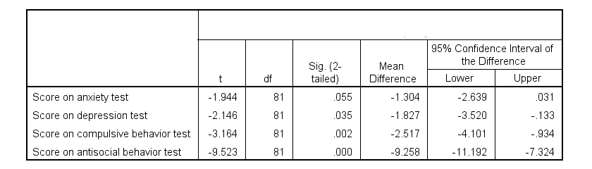
Some basic conclusions are that
- all mean differences are negative. So the second group -children from divorced parents- have higher means on all tests.
- Except for the anxiety test, all differences are statistically significant.
- The mean differences range from -1.3 points to -9.3 points.
However, what we really want to know is are these small, medium or large differences? This is hard to answer for 2 reasons:
- psychological test scores don't have any fixed unit of measurement such as meters, dollars or seconds.
- Statistical significance does not imply practical significance (or reversely). This is because p-values strongly depend on sample sizes.
A solution to both problems is using the standard deviation as a unit of measurement like we do when computing z-scores. And a mean difference expressed in standard deviations -Cohen’s D- is an interpretable effect size measure for t-tests.
Cohen’s D - Formulas
Cohen’s D is computed as
$$D = \frac{M_1 - M_2}{S_p}$$
where
- \(M_1\) and \(M_2\) denote the sample means for groups 1 and 2 and
- \(S_p\) denotes the pooled estimated population standard deviation.
But precisely what is the “pooled estimated population standard deviation”? Well, the independent-samples t-test assumes that the 2 groups we compare have the same population standard deviation. And we estimate it by “pooling” our 2 sample standard deviations with
$$S_p = \sqrt{\frac{(N_1 - 1) \cdot S_1^2 + (N_2 - 1) \cdot S_2^2}{N_1 + N_2 - 2}}$$
Fortunately, we rarely need this formula: SPSS, JASP and Excel readily compute a t-test with Cohen’s D for us.
Cohen’s D in JASP
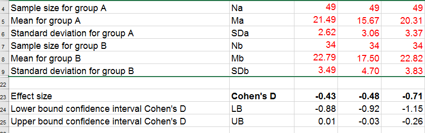
Running the exact same t-tests in JASP and requesting “effect size” with confidence intervals results in the output shown below.
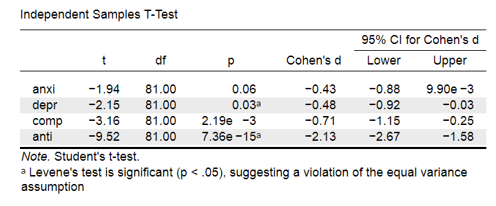
Note that Cohen’s D ranges from -0.43 through -2.13. Some minimal guidelines are that
- d = 0.20 indicates a small effect,
- d = 0.50 indicates a medium effect and
- d = 0.80 indicates a large effect.
And there we have it. Roughly speaking, the effects for
- the anxiety (d = -0.43) and depression tests (d = -0.48) are medium;
- the compulsive behavior test (d = -0.71) is fairly large;
- the antisocial behavior test (d = -2.13) is absolutely huge.
We'll go into the interpretation of Cohen’s D into much more detail later on. Let's first see how Cohen’s D relates to power and the point-biserial correlation, a different effect size measure for a t-test.
Cohen’s D and Power
Very interestingly, the power for a t-test can be computed directly from Cohen’s D. This requires specifying both sample sizes and α, usually 0.05. The illustration below -created with G*Power- shows how power increases with total sample size. It assumes that both samples are equally large.
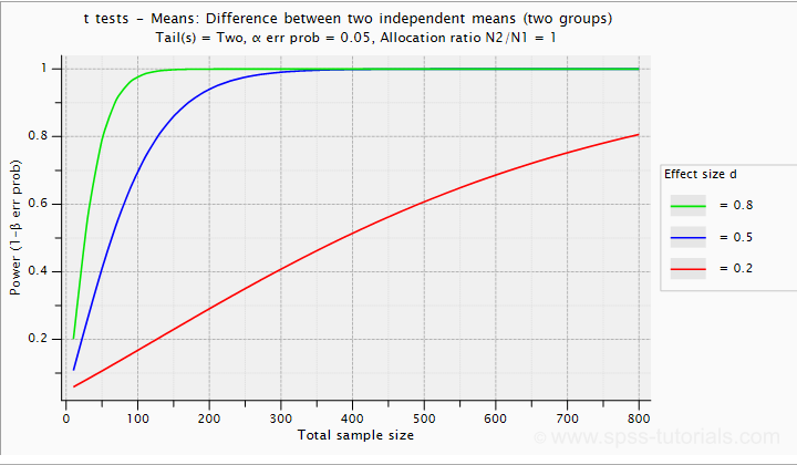
If we test at α = 0.05 and we want power (1 - β) = 0.8 then
- use 2 samples of n = 26 (total N = 52) if we expect d = 0.8 (large effect);
- use 2 samples of n = 64 (total N = 128) if we expect d = 0.5 (medium effect);
- use 2 samples of n = 394 (total N = 788) if we expect d = 0.2 (small effect);
Cohen’s D and Overlapping Distributions
The assumptions for an independent-samples t-test are
- independent observations;
- normality: the outcome variable must be normally distributed in each subpopulation;
- homogeneity: both subpopulations must have equal population standard deviations and -hence- variances.
If assumptions 2 and 3 are perfectly met, then Cohen’s D implies which percentage of the frequency distributions overlap. The example below shows how some male population overlaps with some 69% of some female population when Cohen’s D = 0.8, a large effect.
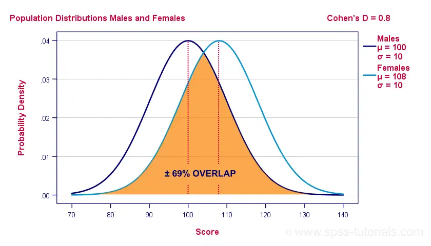
The percentage of overlap increases as Cohen’s D decreases. In this case, the distribution midpoints move towards each other. Some basic benchmarks are included in the interpretation table which we'll present in a minute.
Cohen’s D & Point-Biserial Correlation
An alternative effect size measure for the independent-samples t-test is \(R_{pb}\), the point-biserial correlation. This is simply a Pearson correlation between a quantitative and a dichotomous variable. It can be computed from Cohen’s D with
$$R_{pb} = \frac{D}{\sqrt{D^2 + 4}}$$
For our 3 benchmark values,
- Cohen’s d = 0.2 implies \(R_{pb}\) ± 0.100;
- Cohen’s d = 0.5 implies \(R_{pb}\) ± 0.243;
- Cohen’s d = 0.8 implies \(R_{pb}\) ± 0.371.
Alternatively, compute \(R_{pb}\) from the t-value and its degrees of freedom with
$$R_{pb} = \sqrt{\frac{t^2}{t^2 + df}}$$
Cohen’s D - Interpretation
The table below summarizes the rules of thumb regarding Cohen’s D that we discussed in the previous paragraphs.
| Cohen’s D | Interpretation | Rpb | % overlap | Recommended N |
|---|---|---|---|---|
| d = 0.2 | Small effect | ± 0.100 | ± 92% | 788 |
| d = 0.5 | Medium effect | ± 0.243 | ± 80% | 128 |
| d = 0.8 | Large effect | ± 0.371 | ± 69% | 52 |
Cohen’s D for SPSS Users
Cohen’s D is available in SPSS versions 27 and higher. It's obtained from
![]()
![]() as shown below.
as shown below.
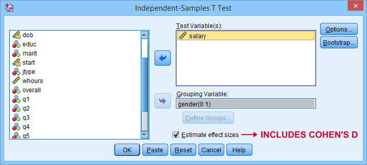
For more details on the output, please consult SPSS Independent Samples T-Test.
If you're using SPSS version 26 or lower, you can use Cohens-d.xlsx. This Excel sheet recomputes all output for one or many t-tests including Cohen’s D and its confidence interval from
- both sample sizes,
- both sample means and
- both sample standard deviations.
The input for our example data in divorced.sav and a tiny section of the resulting output is shown below.
Note that the Excel tool doesn't require the raw data: a handful of descriptive statistics -possibly from a printed article- is sufficient.
SPSS users can easily create the required input from a simple MEANS command if it includes at least 2 variables. An example is
means anxi to anti by divorced
/cells count mean stddev.
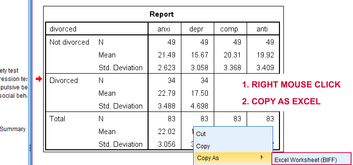
Copy-pasting the SPSS output table as Excel preserves the (hidden) decimals of the results. These can be made visible in Excel and reduce rounding inaccuracies.
Final Notes
I think Cohen’s D is useful but I still prefer R2, the squared (Pearson) correlation between the independent and dependent variable. Note that this is perfectly valid for dichotomous variables and also serves as the fundament for dummy variable regression.
The reason I prefer R2 is that it's in line with other effect size measures: the independent-samples t-test is a special case of ANOVA. And if we run a t-test as an ANOVA, η2 (eta squared) = R2 or the proportion of variance accounted for by the independent variable. This raises the question:
why should we use a different effect size measure
if we compare 2 instead of 3+ subpopulations?
I think we shouldn't.
This line of reasoning also argues against reporting 1-tailed significance for t-tests: if we run a t-test as an ANOVA, the p-value is always the 2-tailed significance for the corresponding t-test. So why should you report a different measure for comparing 2 instead of 3+ means?
But anyway, that'll do for today. If you've any feedback -positive or negative- please drop us a comment below. And last but not least:
thanks for reading!
Chi-Square Goodness-of-Fit Test – Simple Tutorial
A chi-square goodness-of-fit test examines if a categorical variable
has some hypothesized frequency distribution in some population.
The chi-square goodness-of-fit test is also known as
Example - Testing Car Advertisements
A car manufacturer wants to launch a campaign for a new car. They'll show advertisements -or “ads”- in 4 different sizes. For ad each size, they have 4 ads that try to convey some message such as “this car is environmentally friendly”. They then asked N = 80 people which ad they liked most. The data thus obtained are in this Googlesheet, partly shown below.
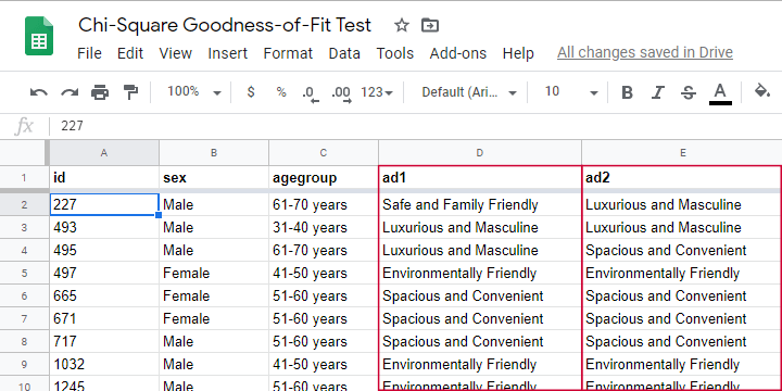
So which ads performed best in our sample? Well, we can simply look up which ad was preferred by most respondents: the ad having the highest frequency is the mode for each ad size.
So let's have a look at the frequency distribution for the first ad size -ad1- as visualized in the bar chart shown below.
Observed Frequencies and Bar Chart
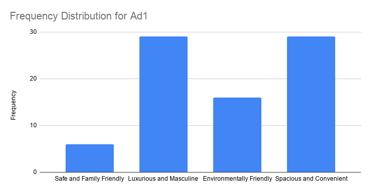
The observed frequencies shown in this chart are
- Safe and Family Friendly: 6
- Luxurious and Masculine: 29
- Environmentally Friendly: 16
- Spacious and Convenient: 29
Note that ad1 has a bimodal distribution: ads 2 and 4 are both winners with 29 votes. However, our data only hold a sample of N = 80. So
can we conclude that ads 2 and 4
also perform best in the entire population?
The chi-square goodness-of-fit answers just that. And for this example, it does so by trying to reject the null hypothesis that all ads perform equally well in the population.
Null Hypothesis
Generally, the null hypothesis for a chi-square goodness-of-fit test is simply
$$H_0: P_{01}, P_{02},...,P_{0m},\; \sum_{i=0}^m\biggl(P_{0i}\biggr) = 1$$
where \(P_{0i}\) denote population proportions for \(m\) categories in some categorical variable. You can choose any set of proportions as long as they add up to one. In many cases, all proportions being equal is the most likely null hypothesis.
For a dichotomous variable having only 2 categories, you're better off using
- a binomial test because it gives the exact instead of the approximate significance level or
- a z-test for 1 proportion because it gives a confidence interval for the population proportion.
Anyway, for our example, we'd like to show that some ads perform better than others. So we'll try to refute that our 4 population proportions are all equal and -hence- 0.25.
Expected Frequencies
Now, if the 4 population proportions really are 0.25 and we sample N = 80 respondents, then we expect each ad to be preferred by 0.25 · 80 = 20 respondents. That is, all 4 expected frequencies are 20. We need to know these expected frequencies for 2 reasons:
- computing our test statistic requires expected frequencies and
- the assumptions for the chi-square goodness-of-fit test involve expected frequencies as well.
Assumptions
The chi-square goodness-of-fit test requires 2 assumptions2,3:
- independent observations;
- for 2 categories, each expected frequency \(Ei\) must be at least 5.
For 3+ categories, each \(Ei\) must be at least 1 and no more than 20% of all \(Ei\) may be smaller than 5.
The observations in our data are independent because they are distinct persons who didn't interact while completing our survey. We also saw that all \(Ei\) are (0.25 · 80 =) 20 for our example. So this second assumption is met as well.
Formulas
We'll first compute the \(\chi^2\) test statistic as
$$\chi^2 = \sum\frac{(O_i - E_i)^2}{E_i}$$
where
- \(O_i\) denotes the observed frequencies and
- \(E_i\) denotes the expected frequencies -usually all equal.
For ad1, this results in
$$\chi^2 = \frac{(16 - 20)^2}{20} + \frac{(29 - 20)^2}{20} + \frac{(9 - 20)^2}{20} + \frac{(29 - 20)^2}{20} = 18.7 $$
If all assumptions have been met, \(\chi^2\) approximately follows a chi-square distribution with \(df\) degrees of freedom where
$$df = m - 1$$
for \(m\) frequencies. Since we have 4 frequencies for 4 different ads,
$$df = 4 - 1 = 3$$
for our example data. Finally, we can simply look up the significance level as
$$P(\chi^2(3) > 18.7) \approx 0.00032$$
We ran these calculations in this Googlesheet shown below.
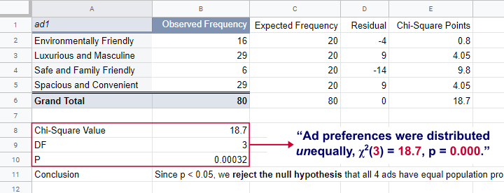
So what does this mean? Well, if all 4 ads are equally preferred in the population, there's a 0.00032 chance of finding our observed frequencies. Since p < 0.05, we reject the null hypothesis. Conclusion: some ads are preferred by more people than others in the entire population of readers.
Right, so it's safe to assume that the population proportions are not all equal. But precisely how different are they? We can express this in a single number: the effect size.
Effect Size - Cohen’s W
The effect size for a chi-square goodness-of-fit test -as well as the chi-square independence test- is Cohen’s W. Some rules of thumb1 are that
- Cohen’s W = 0.10 indicates a small effect size;
- Cohen’s W = 0.30 indicates a medium effect size;
- Cohen’s W = 0.50 indicates a large effect size.
Cohen’s W is computed as
$$W = \sqrt{\sum_{i = 1}^m\frac{(P_{oi} - P_{ei})^2}{P_{ei}}}$$
where
- \(P_{oi}\) denote observed proportions and
- \(P_{ei}\) denote expected proportions under the null hypothesis for
- \(m\) cells.
For ad1, the null hypothesis states that all expected proportions are 0.25. The observed proportions are computed from the observed frequencies (see screenshot below) and result in
$$W = \sqrt{\frac{(0.2 - 0.25)^2}{0.25} +\frac{(0.3625 - 0.25)^2}{0.25} +\frac{(0.075 - 0.25)^2}{0.25} +\frac{(0.3625 - 0.25)^2}{0.25} } = $$
$$W = \sqrt{0.234} = 0.483$$
We ran these computations in this Googlesheet shown below.
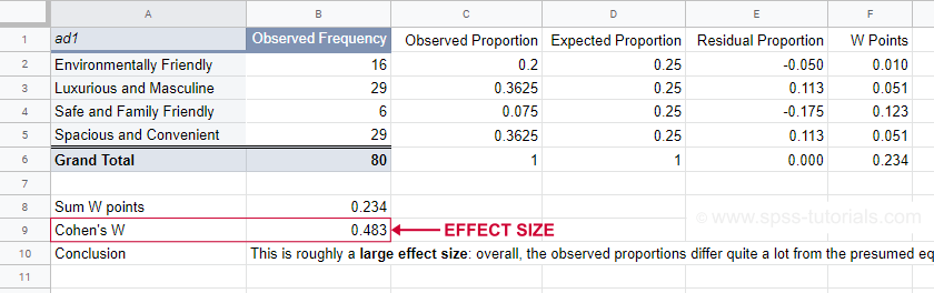
For ad1, the effect size \(W\) = 0.483. This indicates a large overall difference between the observed and expected frequencies.
Power and Sample Size Calculation
Now that we computed our effect size, we're ready for our last 2 steps. First off, what about power? What's the probability demonstrating an effect if
- we test at α = 0.05;
- we have a sample of N = 80;
- df = 3 (our outcome variable has 4 categories);
- we don't know the population effect size \(W\)?
The chart below -created in G*Power- answers just that.
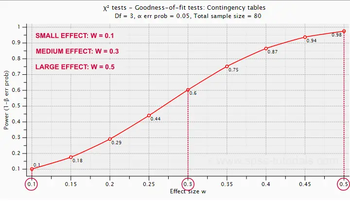
Some basic conclusions are that
- power = 0.98 for a large effect size;
- power = 0.60 for a medium effect size;
- power = 0.10 for a small effect size.
These outcomes are not too great: we only have a 0.60 probability of rejecting the null hypothesis if the population effect size is medium and N = 80. However, we can increase power by increasing the sample size. So which sample sizes do we need if
- we test at α = 0.05;
- we want to have power = 0.80;
- df = 3 (our outcome variable has 4 categories);
- we don't know the population effect size \(W\)?
The chart below shows how required sample sizes decrease with increasing effect sizes.
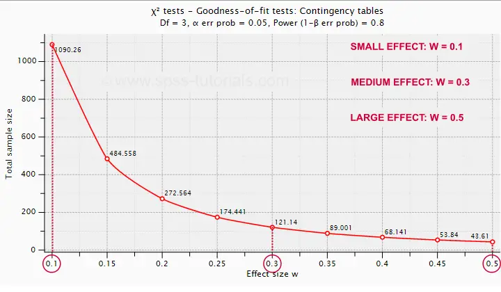
Under the aforementioned conditions, we have power ≥ 0.80
- for a large effect size if N = 44;
- for a medium effect size if N = 122;
- for a small effect size if N = 1091.
References
- Cohen, J (1988). Statistical Power Analysis for the Social Sciences (2nd. Edition). Hillsdale, New Jersey, Lawrence Erlbaum Associates.
- Siegel, S. & Castellan, N.J. (1989). Nonparametric Statistics for the Behavioral Sciences (2nd ed.). Singapore: McGraw-Hill.
- Warner, R.M. (2013). Applied Statistics (2nd. Edition). Thousand Oaks, CA: SAGE.
Simple Introduction to Confidence Intervals
- Confidence Intervals - Example
- Confidence Intervals - How Does it Work?
- Confidence Intervals - Illustration
- Confidence Intervals or Statistical Significance?
- Formulas and Example Calculations
A confidence interval is a range of values
that encloses a parameter with a given likelihood.
So let's say we've a sample of 200 people from a population of 100,000. Our sample data come up with a correlation of 0.41 and indicate that
the 95% confidence interval for this correlation
runs from 0.29 to 0.52.
This means that
- the range of values -0.29 through 0.52-
- has a 95% likelihood
- of enclosing the parameter -the correlation for the entire population- that we'd like to know.
So basically, a confidence interval tells us how much our sample correlation is likely to differ from the population correlation we're after.
Confidence Intervals - Example
El Hierro is the smallest Canary island and has 8,077 inhabitants of 18 years or over. A scientist wants to know their average yearly income. He asks a sample of N = 100. The table below presents his findings.
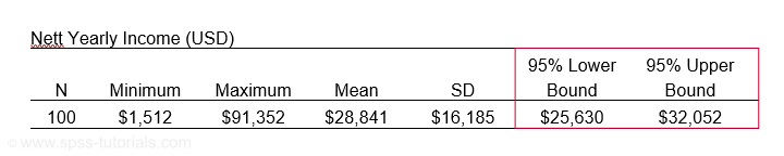
Based on these 100 people, he concludes that the average yearly income for all 8,077 inhabitants is probably between $25,630 and $32,052. So how does that work?
Confidence Intervals - How Does it Work?
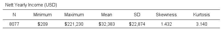
Let's say the tax authorities have access to the yearly incomes of all 8,077 inhabitants. The table below shows some descriptive statistics.
Now, a scientist who samples 100 of these people can compute a sample mean income. This sample mean probably differs somewhat from the $32,383 population mean. Another scientist could also sample 100 people and come up with another different mean. And so on: if we'd draw 100 different samples, we'd probably find 100 different means. In short,
sample means fluctuate over samples.
So how much do they fluctuate? This is expressed by the standard deviation of sample means over samples, known as the standard error -SE- of the mean. SE is calculated as
$$SE = \frac{\sigma}{\sqrt{N}}$$
so for our data that'll be
$$SE = \frac{$22,874}{\sqrt{100}} = $2,287.$$
Right. Now, statisticians also figured out the exact frequency distribution of sample means: the sampling distribution of the mean. For our data, it's shown below.
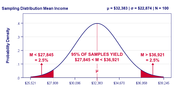
Our graph tells us that 95% of all samples will come up with a mean between roughly $27,808 and $36,958. This is basically the mean ± 2SE:
- the lower bound is roughly $32,383 - 2 · $2,287 = $27,808 and
- the upper bound is roughly $32,383 + 2 · $2,287 = $36,958.
In practice, however, we usually don't know the population mean. So we estimate it from sample data. But how much is a sample mean likely to differ from its population counterpart? Well, we just saw that a sample mean has a 95% probability of falling within ± 2SE of the population mean.
Now, we don't know SE because it depends on the (unknown) population standard deviation. However, we can estimate SE from the sample standard deviation. By doing so, most samples will come up with roughly the correct SE. As a result,
the 95% of samples whose means fall within ± 2SE
typically have confidence intervals enclosing the population mean
as illustrated below.
Confidence Intervals - Illustration
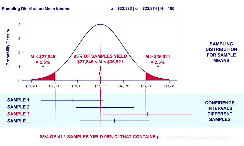 Sampling distribution and confidence intervals. Note that the interval for sample 3 does not contain the population mean μ. This holds for 5% of all CI’s.
Now, a sample having a mean within ±2SE may have a confidence interval not containing the population mean. This may happen if it underestimates the population standard deviation. The reverse may occur too.
However, the sample standard deviation is an unbiased estimator: on average it is exactly correct. So for all samples,
exactly 95% of all 95% confidence intervals
contain the parameter they estimate.
Just as promised.
Confidence Intervals - Basic Properties
Right, so a confidence interval is basically a likely range of values for a parameter such as a population correlation, mean or proportion. Therefore,
wider confidence intervals indicate less precise estimates
for such parameters.
Three factors determine the width of a confidence interval. Everything else equal,
- lower confidence levels result in smaller intervals: 90% CI's are smaller than 95% CI's and these are smaller than 99% CI's. The tradeoff here is that smaller intervals are less likely to contain the parameter we're after: 90% versus 95% or 99%. More precision, less confidence and reversely.
- larger sample sizes result in smaller CI's. However, the width of a CI is linearly related to the square root of the sample size. Therefore, very large samples are inefficient for obtaining precise estimates.
- smaller population SD's result in smaller CI's. However, these are beyond the control of the researcher.
Confidence Intervals or Statistical Significance?
If both are available, confidence intervals. Why? Well, confidence intervals give the same -and more- information than statistical significance. Some examples:
- A 90% confidence interval for the difference between independent means runs from -2.3 to 6.4. Since it contains zero, these means are not significantly different at α 0.90. There's no further need for an independent samples t-test on these data. We already know the outcome.
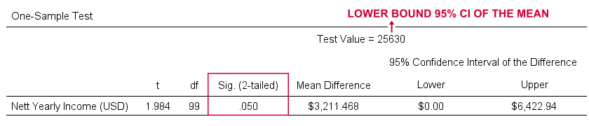
- For our example, the 95% confidence interval ran from $25,630 to $32,052. This renders a one sample t-test useless: we already know that test values in this range result in p > 0.05 and reversely. When testing for the lower or upper bound of the interval, p = 0.05 as SPSS quickly confirms.
So should we stop reporting statistical significance altogether in favor of confidence intervals? Probably not. Confidence intervals are not available for nonparametric tests such as ANOVA or the chi-square independence test. If we compare 2 means, a single confidence interval for the difference tells it all. But that's not going to work for comparing 3 or more means...
Formulas and Example Calculations
Statistical software such as SPSS, Stata or SAS computes confidence intervals for us so there's no need to bother about any formulas or calculations. Do you want to know anyway? Then let's go: we computed the confidence interval for our example in this Googlesheet (downloadable as Excel) as shown below.
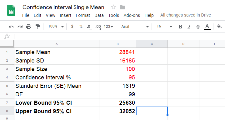
So how does it work? Well, first off, our sample data came up with the descriptive statistics shown below.
We estimate the standard error of the mean as
$$SE_{mean} = \frac{S}{\sqrt{N}}$$
so that'll be
$$SE_{mean} = \frac{$16,185}{\sqrt{100}} = $1,6185.$$
Next,
$$T = \frac{M - \mu}{SE_{mean}}$$
This formula tries to tell you that the difference between the sample mean \(M\) and the population mean \(\mu\) divided by \(SE_{mean}\) follows a t distribution. We're really just standardizing the mean difference here into a z-score (T).
Finally, we need the degrees of freedom given by
$$Df = N - 1$$
so that'll be
$$Df = 100 - 1 = 99.$$
So between which t-values do we find 95% of all (standardized) mean differences? We can look this up in Google sheets as shown below.
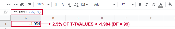
This tells us that a proportion of 0.025 (or 2.5%) of all t-values < -1.984. Because the t-distribution is symmetrical, a proportion of 0.975 of t-values > 1.984. These critical t-values are visualized below.
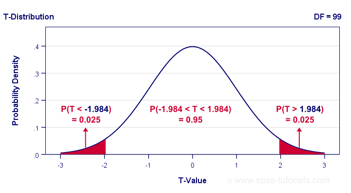
The illustration tells us that our previous rule of thumb of roughly ±2SE is ±1.984SE for this example: 95% of all standardized mean differences are between -1.984 and 1.984. Finally, the 95% confidence interval is
$$M - T_{0.975} \cdot SE_{mean} \lt \mu \lt M + T_{0.975} \cdot SE_{mean} $$
so that'll be
$$$28,841 - 1.984 \cdot $1,619 \lt \mu \lt $28,841 + 1.984 \cdot $1,619$$
which results in
$$$25,630 \lt \mu \lt $32,052.$$
Thanks for reading.
Covariance – Quick Introduction
- Covariance - What is It?
- Covariance or Correlation?
- Sample Covariance Formula
- Covariance Calculation Example
- Software for Computing Covariances
Covariance - What is It?
A covariance is basically an unstandardized correlation. That is: a covariance is a number that indicates to what extent 2 variables are linearly related. In contrast to a (Pearson) correlation, however, a covariance depends on the scales of both variables involved as expressed by their standard deviations.
The figure below visualizes some correlations and covariances as scatterplots.
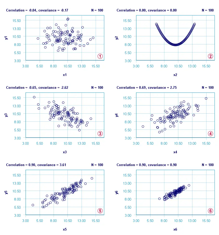
x1 and y1 are basically unrelated. The covariance and correlation are both close to zero;
 x2 and y2 are strongly related but not linearly at all. The covariance and correlation are zero.
x3 and y3 are negatively related. The covariance and correlation are both negative;
 x4 and y4 are positively related. The covariance and correlation are both positive;
 x5 and y5 are strongly positively related. Because they have the same standard deviations as x4 and y4, the correlation and covariance both increase;
 x6 and y6 are identical to x5 and y5 except that their standard deviations are 1.0 instead of 2.0. This shrinks the covariance with a factor 4.0 but does not affect the correlation.
Comparing plots and emphasizes that covariances are scale dependent whereas correlations aren't. This may make you wonder
why should I ever compute a covariance
instead of a correlation?
Covariance or Correlation?
First off, the precise relation between a covariance and correlation is given by
$$S_{xy} = r_{xy} \cdot s_x \cdot s_y$$
where
- \(S_{xy}\) denotes the (sample) covariance between variables \(X\) and \(Y\);
- \(r_{xy}\) denotes the (Pearson) correlation between \(X\) and \(Y\);
- \(s_x\) and \(s_y\) denote the (sample) standard deviations of \(X\) and \(Y\).
This formula shows that a covariance can be seen as a correlation that's “weighted” by the product of the standard deviations of the 2 variables involved: everything else equal, larger standard deviations result in larger covariances.
This feature may be desirable for comparing associations among variable pairs. This only makes sense if all variables are measured on identical scales such as dollars, seconds or kilos. Some analyses that require covariances are the following:
1. Cronbach’s alpha is usually computed on covariances instead of correlations. This is because scale scores are computed as sums or means over unstandardized variables. Therefore, variables with larger SD's have more impact on scale scores. This is why associations among such variables also have more weight in the computation of Cronbach's alpha.
2. In factor analysis, a covariance matrix is sometimes analyzed instead of a correlation matrix. If so, associations among variables have more impact on the factor solution insofar as these variables have larger SD's.
3. Some analyses need to meet the assumption of equal covariance matrices over subpopulations. An example is MANOVA, in which the Box test -basically a multivariate expansion of Levene's test- is often used for testing this assumption.
4. Somewhat surprisingly, ANCOVA -meaning analysis of covariance- does not involve computing covariances.
So those are some analyses that involve covariances. So how are these computed? Well, which formula to use depends on which type of data you're analyzing.
Sample Covariance Formula
If your data contain a sample from a much larger population (usually the case), the sample covariance is computed as
$$S_{xy} = \frac{\sum\limits_{i = 1}^N(X_i - \overline{X})(Y_i - \overline{Y})}{N - 1}$$
where
- \(S_{xy}\) denotes the (sample) covariance between variables \(X\) and \(Y\);
- \(\overline{X}\) and \(\overline{Y}\) denote the sample means for \(X\) and \(Y\);
- \(N\) denotes the total sample size.
Let's now get a grip on this formula by using it in a calculation example.
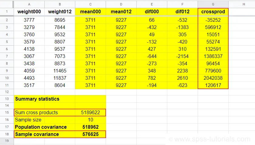
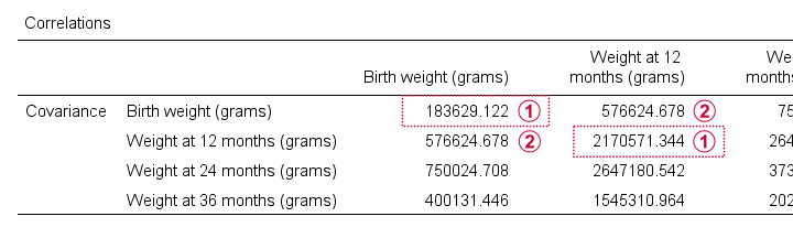
Covariance Calculation Example
The table below contains the weights in grams of 10 babies at birth (X) and at age 12 months (Y). What's the covariance between X and Y?
| ID | 1 | 2 | 3 | 4 | 5 | 6 | 7 | 8 | 9 | 10 |
|---|---|---|---|---|---|---|---|---|---|---|
| X | 3777 | 3279 | 3760 | 3579 | 4138 | 3067 | 3438 | 4059 | 4493 | 3517 |
| Y | 8695 | 7844 | 9532 | 8807 | 9537 | 7073 | 8873 | 11465 | 11837 | 8604 |
First off,
- the sample size is \(N\) = 10 and the means are
- \(\overline{X}\) = 3711 and
- \(\overline{Y}\) = 9227.
Therefore,
$$S_{xy} = \frac{(3777 - 3711)\cdot(8695 - 9227)\;+\;...\;+\;(3517 - 3711)\cdot(8604 - 9227)}{10 - 1}$$
$$S_{xy} = \frac{66 \cdot -532\;+\;...\;+\;-194 \cdot -623}{10 - 1}$$
$$S_{xy} = \frac{5189622}{10 - 1} = 576625$$
You can look up the entire calculation in this Googlesheet, partly shown below.
Population Covariance Formula
If your data hold the entire population you'd like to study, you can compute the covariance as
$$\sigma_{xy} = \frac{\sum\limits_{i = 1}^N(X_i - \mu_x)(Y_i - \mu_Y)}{N}$$
where
- \(\sigma_{xy}\) denotes the (population) covariance between variables \(X\) and \(Y\);
- \(\mu_x\) and \(\mu_y\) denote the population means for \(X\) and \(Y\);
- \(N\) denotes the population size.
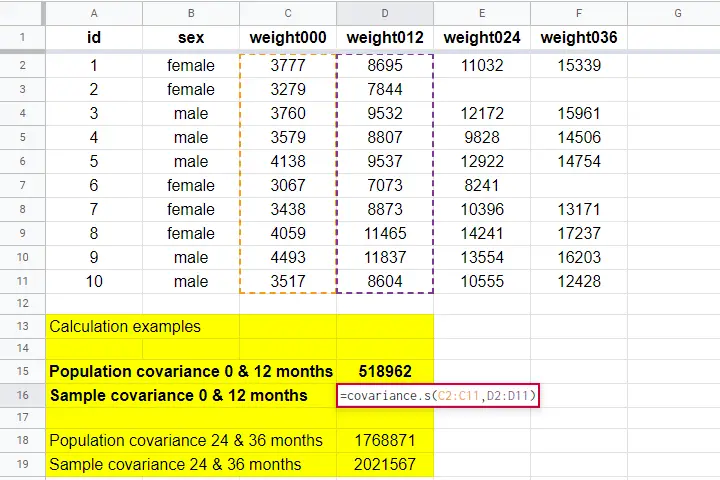
Software for Computing Covariances
Both sample and population covariances are easily computed in Googlesheets and Excel. This Googlesheet, partly shown below, contains a couple of examples.
A full covariance matrix for several variables is easily obtained from SPSS. However, “covariance” in SPSS always refers to the sample covariance because
the population covariance is completely absent from SPSS.
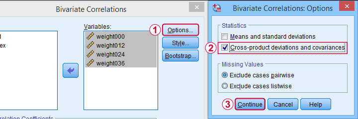
Pretty poor for a “statistical package”. But anyway: the only menu based option for this is
![]()
![]() as illustrated below.
as illustrated below.
A much better option, however, is using SPSS syntax like we did in Cronbach’s Alpha in SPSS. This is faster and results in a much nicer table layout as shown below.
Two quick notes are in place here:
Just like a correlation matrix, a covariance matrix is symmetrical: the covariance between X and Y is obviously equal to that between Y and X.
The main diagonal contains the covariances between each variable and itself. These are simply the variances (squared standard deviations) of our variables. This last point implies that
we can compute a correlation matrix from a covariance matrix
but not reversely.
For example, the correlation between our first 2 variables is
$$r_{xy} = \frac{576625}{\sqrt{183629} \cdot \sqrt{2170571}} = 0.913$$
Right. I guess that should do regarding covariances. If you've any feedback, please throw us a comment below. Other than that:
thanks for reading!
Chi-Square Independence Test – What and Why?
- Chi-Square Independence Test - What Is It?
- Null Hypothesis
- Assumptions
- Test Statistic
- Effect Size
- Reporting
Chi-Square Independence Test - What Is It?
The chi-square independence test evaluates if
two categorical variables are related in some population.
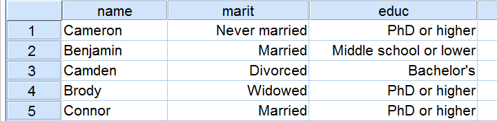
Example: a scientist wants to know if education level and marital status are related for all people in some country. He collects data on a simple random sample of n = 300 people, part of which are shown below.
Chi-Square Test - Observed Frequencies
A good first step for these data is inspecting the contingency table of marital status by education. Such a table -shown below- displays the frequency distribution of marital status for each education category separately. So let's take a look at it.
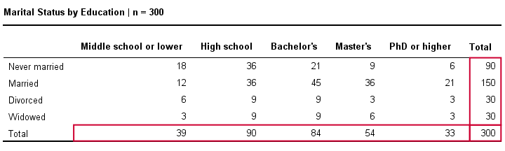
The numbers in this table are known as the observed frequencies. They tell us an awful lot about our data. For instance,
- there's 4 marital status categories and 5 education levels;
- we succeeded in collecting data on our entire sample of n = 300 respondents (bottom right cell);
- we've 84 respondents with a Bachelor’s degree (bottom row, middle);
- we've 30 divorced respondents (last column, middle);
- we've 9 divorced respondents with a Bachelor’s degree.
Chi-Square Test - Column Percentages
Although our contingency table is a great starting point, it doesn't really show us if education level and marital status are related. This question is answered more easily from a slightly different table as shown below.
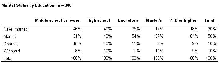
This table shows -for each education level separately- the percentages of respondents that fall into each marital status category. Before reading on, take a careful look at this table and tell me is marital status related to education level and -if so- how? If we inspect the first row, we see that 46% of respondents with middle school never married. If we move rightwards (towards higher education levels), we see this percentage decrease: only 18% of respondents with a PhD degree never married (top right cell).
Reversely, note that 64% of PhD respondents are married (second row). If we move towards the lower education levels (leftwards), we see this percentage decrease to 31% for respondents having just middle school. In short, more highly educated respondents marry more often than less educated respondents.
Chi-Square Test - Stacked Bar Chart
Our last table shows a relation between marital status and education. This becomes much clearer by visualizing this table as a stacked bar chart, shown below.
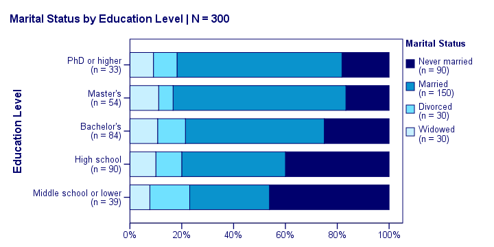
If we move from top to bottom (highest to lowest education) in this chart, we see the dark blue bar (never married) increase. Marital status is clearly associated with education level.The lower someone’s education, the smaller the chance he’s married. That is: education “says something” about marital status (and reversely) in our sample. So what about the population?
Chi-Square Test - Null Hypothesis
The null hypothesis for a chi-square independence test is that two categorical variables are independent in some population. Now, marital status and education are related -thus not independent- in our sample. However, we can't conclude that this holds for our entire population. The basic problem is that samples usually differ from populations.
If marital status and education are perfectly independent in our population, we may still see some relation in our sample by mere chance. However, a strong relation in a large sample is extremely unlikely and hence refutes our null hypothesis. In this case we'll conclude that the variables were not independent in our population after all.
So exactly how strong is this dependence -or association- in our sample? And what's the probability -or p-value- of finding it if the variables are (perfectly) independent in the entire population?
Chi-Square Test - Statistical Independence
Before we continue, let's first make sure we understand what “independence” really means in the first place. In short,
independence means that one variable doesn't
“say anything” about another variable.
A different way of saying the exact same thing is that
independence means that the relative frequencies of one variable
are identical over all levels of some other variable.
Uh... say again? Well, what if we had found the chart below?
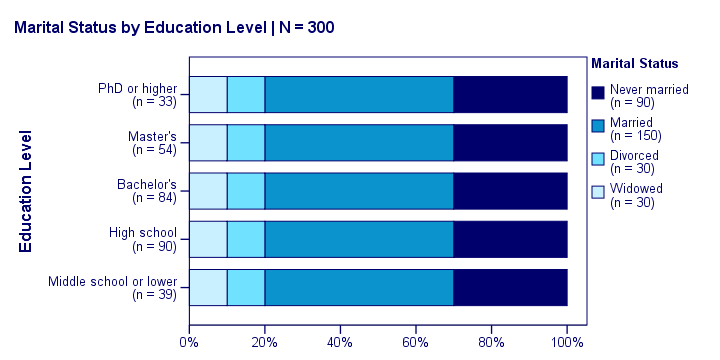
What does education “say about” marital status? Absolutely nothing! Why? Because the frequency distributions of marital status are identical over education levels: no matter the education level, the probability of being married is 50% and the probability of never being married is 30%.
In this chart, education and marital status are perfectly independent. The hypothesis of independence tells us which frequencies we should have found in our sample: the expected frequencies.
Expected Frequencies
Expected frequencies are the frequencies we expect in a sample
if the null hypothesis holds.
If education and marital status are independent in our population, then we expect this in our sample too. This implies the contingency table -holding expected frequencies- shown below.
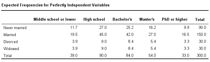
These expected frequencies are calculated as
$$eij = \frac{oi\cdot oj}{N}$$
where
- \(eij\) is an expected frequency;
- \(oi\) is a marginal column frequency;
- \(oj\) is a marginal row frequency;
- \(N\) is the total sample size.
So for our first cell, that'll be
$$eij = \frac{39 \cdot 90}{300} = 11.7$$
and so on. But let's not bother too much as our software will take care of all this.
Note that many expected frequencies are non integers. For instance, 11.7 respondents with middle school who never married. Although there's no such thing as “11.7 respondents” in the real world, such non integer frequencies are just fine mathematically. So at this point, we've 2 contingency tables:
- a contingency table with observed frequencies we found in our sample;
- a contingency table with expected frequencies we should have found in our sample if the variables are really independent.
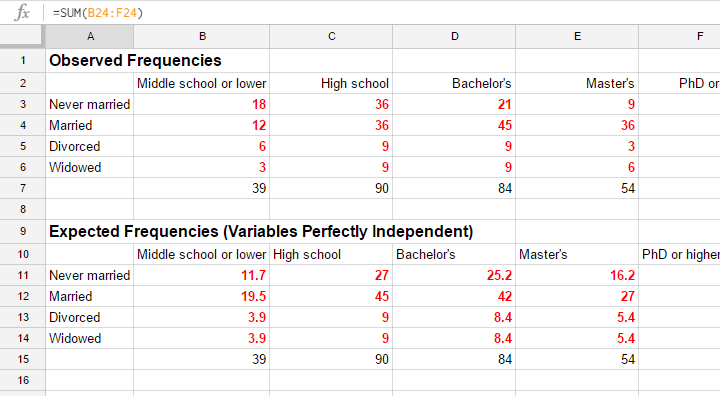
The screenshot below shows both tables in this GoogleSheet (read-only). This sheet demonstrates all formulas that are used for this test.
Residuals
Insofar as the observed and expected frequencies differ, our data deviate more from independence. So how much do they differ? First off, we subtract each expected frequency from each observed frequency, resulting in a residual. That is,
$$rij = oij - eij$$
For our example, this results in (5 * 4 =) 20 residuals. Larger (absolute) residuals indicate a larger difference between our data and the null hypothesis. We basically add up all residuals, resulting in a single number: the χ2 (pronounce “chi-square”) test statistic.
Test Statistic
The chi-square test statistic is calculated as
$$\chi^2 = \Sigma{\frac{(oij - eij)^2}{eij}}$$
so for our data
$$\chi^2 = \frac{(18 - 11.7)^2}{11.7} + \frac{(36 - 27)^2}{27} + ... + \frac{(6 - 5.4)^2}{5.4} = 23.57$$
Again, our software will take care of all this. But if you'd like to see the calculations, take a look at this GoogleSheet.
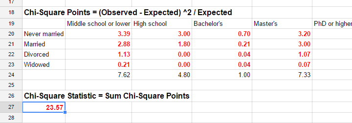
So χ2 = 23.57 in our sample. This number summarizes the difference between our data and our independence hypothesis. Is 23.57 a large value? What's the probability of finding this? Well, we can calculate it from its sampling distribution but this requires a couple of assumptions.
Chi-Square Test Assumptions
The assumptions for a chi-square independence test are
- independent observations. This usually -not always- holds if each case in SPSS holds a unique person or other statistical unit. Since this is the case for our data, we'll assume this has been met.
- For a 2 by 2 table, all expected frequencies > 5.However, for a 2 by 2 table, a z-test for 2 independent proportions is preferred over the chi-square test.
For a larger table, all expected frequencies > 1 and no more than 20% of all cells may have expected frequencies < 5.
If these assumptions hold, our χ2 test statistic follows a χ2 distribution. It's this distribution that tells us the probability of finding χ2 > 23.57.
Chi-Square Test - Degrees of Freedom
We'll get the p-value we're after from the chi-square distribution if we give it 2 numbers:
- the χ2 value (23.57) and
- the degrees of freedom (df).
The degrees of freedom is basically a number that determines the exact shape of our distribution. The figure below illustrates this point.
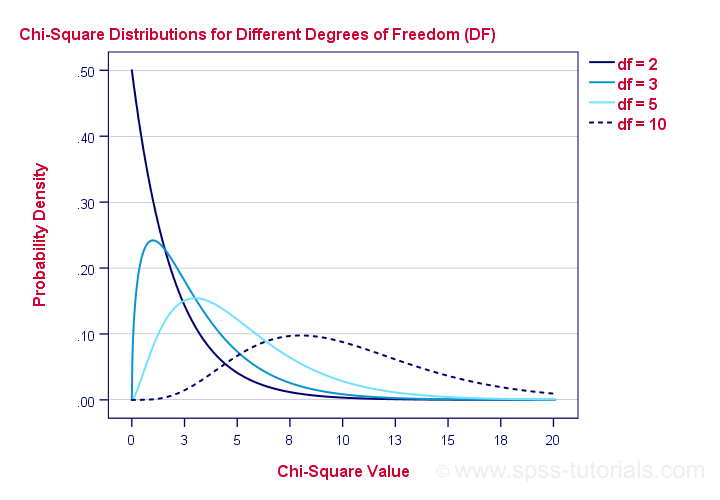
Right. Now, degrees of freedom -or df- are calculated as
$$df = (i - 1) \cdot (j - 1)$$
where
- \(i\) is the number of rows in our contingency table and
- \(j\) is the number of columns
so in our example
$$df = (5 - 1) \cdot (4 - 1) = 12.$$
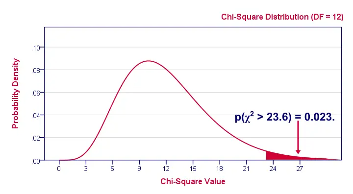
And with df = 12, the probability of finding χ2 ≥ 23.57 ≈ 0.023.We simply look this up in SPSS or other appropriate software. This is our 1-tailed significance. It basically means, there's a 0.023 (or 2.3%) chance of finding this association in our sample if it is zero in our population.
Since this is a small chance, we no longer believe our null hypothesis of our variables being independent in our population.
Conclusion: marital status and education are related
in our population.
Now, keep in mind that our p-value of 0.023 only tells us that the association between our variables is probably not zero. It doesn't say anything about the strength of this association: the effect size.
Effect Size
For the effect size of a chi-square independence test, consult the appropriate association measure. If at least one nominal variable is involved, that'll usually be Cramér’s V (a sort of Pearson correlation for categorical variables). In our example Cramér’s V = 0.162. Since Cramér’s V takes on values between 0 and 1, 0.162 indicates a very weak association. If both variables had been ordinal, Kendall’s tau or a Spearman correlation would have been suitable as well.
Reporting
For reporting our results in APA style, we may write something like “An association between education and marital status was observed, χ2(12) = 23.57, p = 0.023.”
Chi-Square Independence Test - Software
You can run a chi-square independence test in Excel or Google Sheets but you probably want to use a more user friendly package such as
The figure below shows the output for our example generated by SPSS.
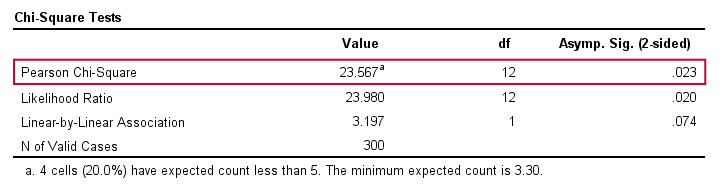
For a full tutorial (using a different example), see SPSS Chi-Square Independence Test.
Thanks for reading!
Cramér’s V – What and Why?
Cramér’s V is a number between 0 and 1 that indicates how strongly two categorical variables are associated. If we'd like to know if 2 categorical variables are associated, our first option is the chi-square independence test. A p-value close to zero means that our variables are very unlikely to be completely unassociated in some population. However, this does not mean the variables are strongly associated; a weak association in a large sample size may also result in p = 0.000.
Cramér’s V - Formula
A measure that does indicate the strength of the association is Cramér’s V, defined as
$$\phi_c = \sqrt{\frac{\chi^2}{N(k - 1)}}$$
where
- \(\phi_c\) denotes Cramér’s V;\(\phi\) is the Greek letter “phi” and refers to the “phi coefficient”, a special case of Cramér’s V which we'll discuss later.
- \(\chi^2\) is the Pearson chi-square statistic from the aforementioned test;
- \(N\) is the sample size involved in the test and
- \(k\) is the lesser number of categories of either variable.
Cramér’s V - Examples
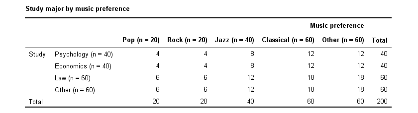
A scientist wants to know if music preference is related to study major. He asks 200 students, resulting in the contingency table shown below.
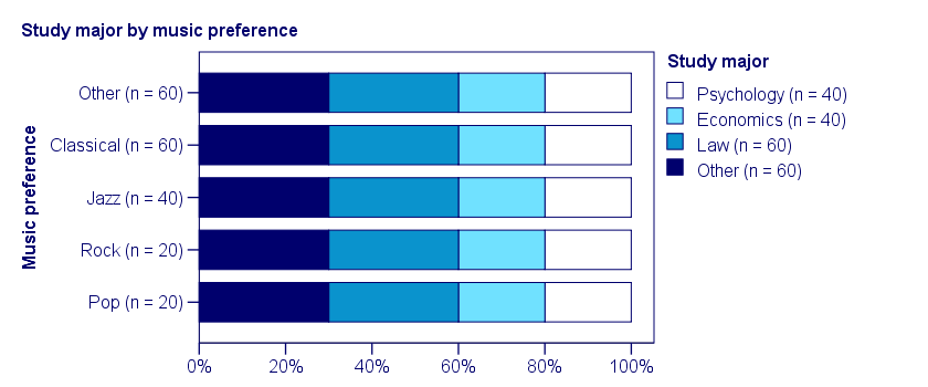
These raw frequencies are just what we need for all sort of computations but they don't show much of a pattern. The association -if any- between the variables is easier to see if we inspect row percentages instead of raw frequencies. Things become even clearer if we visualize our percentages in stacked bar charts.
Cramér’s V - Independence
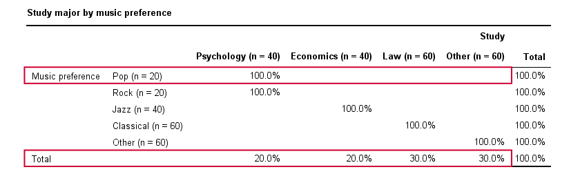
In our first example, the variables are perfectly independent: \(\chi^2\) = 0. According to our formula, chi-square = 0 implies that Cramér’s V = 0. This means that music preference “does not say anything” about study major. The associated table and chart make this clear.
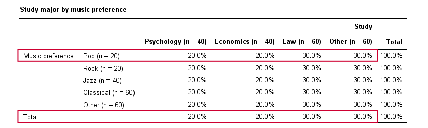
Note that the frequency distribution of study major is identical in each music preference group. If we'd like to predict somebody’s study major, knowing his music preference does not help us the least little bit. Our best guess is always law or “other”.
Cramér’s V - Moderate Association
A second sample of 200 students show a different pattern. The row percentages are shown below.
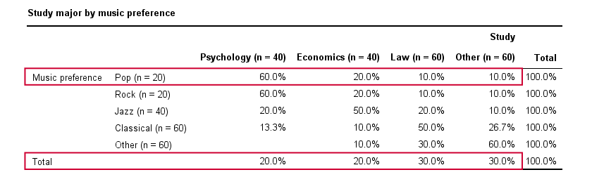
This table shows quite some association between music preference and study major: the frequency distributions of studies are different for music preference groups. For instance, 60% of all students who prefer pop music study psychology. Those who prefer classical music mostly study law. The chart below visualizes our table.
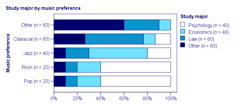
Note that music preference says quite a bit about study major: knowing the former helps a lot in predicting the latter. For these data
- \(\chi^2 \approx\) 113;For calculating this chi-square value, see either Chi-Square Independence Test - Quick Introduction or SPSS Chi-Square Independence Test.
- our sample size N = 200 and
- we've variables with 4 and 5 categories so k = (4 -1) = 3.
It follows that
$$\phi_c = \sqrt{\frac{113}{200(3)}} = 0.43.$$
which is substantial but not super high since Cramér’s V has a maximum value of 1.
Cramér’s V - Perfect Association
In a third -and last- sample of students, music preference and study major are perfectly associated. The table and chart below show the row percentages.
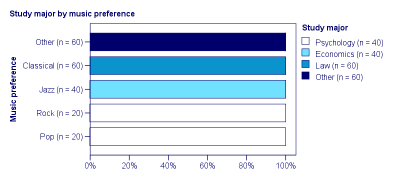
If we know a student’s music preference, we know his study major with certainty. This implies that our variables are perfectly associated. Do notice, however, that it doesn't work the other way around: we can't tell with certainty someone’s music preference from his study major but this is not necessary for perfect association: \(\chi^2\) = 600 so
$$\phi_c = \sqrt{\frac{600}{200(3)}} = 1,$$
which is the very highest possible value for Cramér’s V.
Alternative Measures
- An alternative association measure for two nominal variables is the contingency coefficient. However, it's better avoided since its maximum value depends on the dimensions of the contingency table involved.3,4
- For two ordinal variables, a Spearman correlation or Kendall’s tau are preferable over Cramér’s V.
- For two metric variables, a Pearson correlation is the preferred measure.
- If both variables are dichotomous (resulting in a 2 by 2 table) use a phi coefficient, which is simply a Pearson correlation computed on dichotomous variables.
Cramér’s V - SPSS
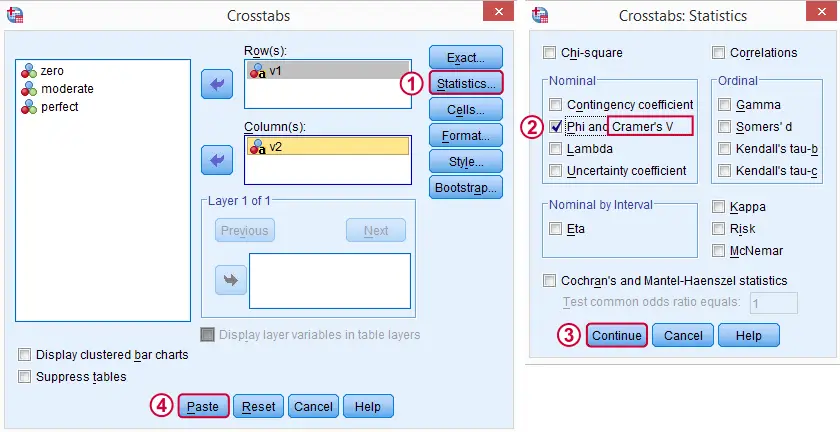
In SPSS, Cramér’s V is available from
![]()
![]() . Next, fill out the dialog as shown below.
. Next, fill out the dialog as shown below.
Warning: for tables larger than 2 by 2, SPSS returns nonsensical values for phi without throwing any warning or error. These are often > 1, which isn't even possible for Pearson correlations. Oddly, you can't request Cramér’s V without getting these crazy phi values.
Final Notes
Cramér’s V is also known as Cramér’s phi (coefficient)5. It is an extension of the aforementioned phi coefficient for tables larger than 2 by 2, hence its notation as \(\phi_c\). It's been suggested that its been replaced by “V” because old computers couldn't print the letter \(\phi\).3
Thank you for reading.
References
- Van den Brink, W.P. & Koele, P. (2002). Statistiek, deel 3 [Statistics, part 3]. Amsterdam: Boom.
- Field, A. (2013). Discovering Statistics with IBM SPSS Newbury Park, CA: Sage.
- Howell, D.C. (2002). Statistical Methods for Psychology (5th ed.). Pacific Grove CA: Duxbury.
- Slotboom, A. (1987). Statistiek in woorden [Statistics in words]. Groningen: Wolters-Noordhoff.
- Sheskin, D. (2011). Handbook of Parametric and Nonparametric Statistical Procedures. Boca Raton, FL: Chapman & Hall/CRC.
Cochran’s Q Test in SPSS – Quick Tutorial
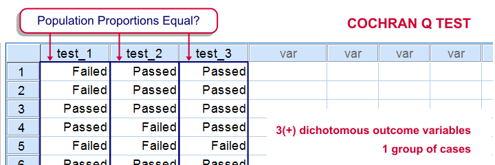
SPSS Cochran Q test is a procedure for testing if the proportions of 3 or more dichotomous variables are equal in some population. These outcome variables have been measured on the same people or other statistical units.
SPSS Cochran Q Test Example
The principal of some university wants to know whether three exams are equally difficult. Fifteen students took these exams and their results are in exam-results.sav.
1. Quick Data Check
It's always a good idea to take a quick look at what the data look like before proceeding to any statistical tests. We'll open the data and inspect some histograms by running FREQUENCIES with the syntax below. Note the TO keyword in step 3.
cd 'd:downloaded'. /*or wherever data file is located.
*2. Open data.
get file 'exam-results.sav'.
*3. Quick check.
frequencies test_1 to test_3
/format notable
/histogram.

The histograms indicate that the three variables are indeed dichotomous (there could have been some “Unknown” answer category but it doesn't occur). Since N = 15 for all variables, we conclude there's no missing values. Values 0 and 1 represent “Failed” and “Passed”.We suggest you RECODE your values if this is not the case. We therefore readily see that the proportions of students succeeding range from .53 to .87.
2. Assumptions Cochran Q Test
Cochran's Q test requires only one assumption:
- independent observations (or, more precisely, independent and identically distributed variables);
3. Running SPSS Cochran Q Test


We'll navigate to
![]()
![]()
![]()
 We move our test variables under ,
 select under ,
 select under and
 click
click
This results in the syntax below which we then run in order to obtain our results.
NPAR TESTS
/COCHRAN=test_1 test_2 test_3
/STATISTICS DESCRIPTIVES
/MISSING LISTWISE.
4. SPSS Cochran Q Test Output

The first table (Descriptive Statistics) presents the descriptives we'll report. Do not report the results from DESCRIPTIVES instead.The reason is that the significance test is (necessarily) based on cases without missing values on any of the test variables. The descriptives obtained from Cochran's test are therefore limited to such complete cases too.
Since N = 15, the descriptives once again confirm that there are no missing values and
the proportions range from .53 to .87.Again, proportions correspond to means if 0 and 1 are used as values.

The table Test Statistics presents the result of the significance test.
The p-value (“Asymp. Sig.”) is .093; if the three tests really are equally difficult in the population, there's still a 9.3% chance of finding the differences we observed in this sample. Since this chance is larger than 5%, we do not reject the null hypothesis that the tests are equally difficult.
5. Reporting Cochran's Q Test Results
When reporting the results from Cochran's Q test, we first present the aforementioned descriptive statistics. Cochran's Q statistic follows a chi-square distribution so we'll report something like “Cochran's Q test did not indicate any differences among the three proportions, χ2(2) = 4.75, p = .093”.