Z-Test and Confidence Interval Single Proportion
- Z-Test Assumptions
- Z-Test for Single Proportion - Formulas
- Continuity Correction for Z-Test
- Confidence Interval for Single Proportion
- Agresti-Coull Adjustment for CI
A z-test for a single proportion examines if a
population proportion is likely to be x.
Example: does a proportion of 0.60 (or 60%) of some population have antibodies against Covid-19?
If this is true, a sample proportion may differ somewhat from 0.60. However, a very different sample proportion suggests that our initial claim was wrong.
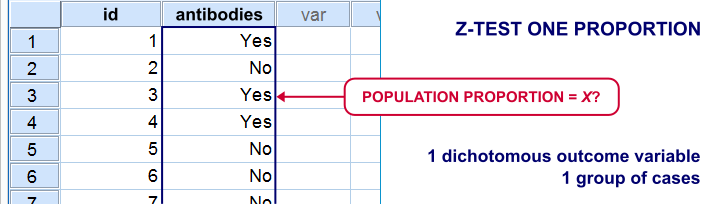
Note that this null hypothesis implies a dichotomous outcome variable: the only 2 possible outcomes are to carry or not to carry such antibodies.
Z-Test Single Proportion - Example
- An epidemiologist believes that 60% of all Dutch adults carry antibodies against Covid-19;
- she samples N = 112 people and administers PCR tests to them;
- 58 people (51.8%) out of 112 people test positive and thus carry antibodies.
Given this outcome, should she still believe that 60% of the entire population carry antibodies? A z-test answers just that but it does require some assumptions.
Z-Test Assumptions
A z-test for a single proportion requires two assumptions:
- independent observations;
- \(n_1 \ge 15\) and \(n_2 \ge 15\): our sample should contain at least some 15 observations for either possible outcome.
Standard textbooks3,5 often propose \(n_1 \ge 5\) and \(n_2 \ge 5\) but recent studies suggest that these sample sizes are insufficient for accurate test results.2
Z-Test for Single Proportion - Formulas
If sample sizes are sufficient, a sample proportion is approximately normally distributed with
$$\mu_0 = \pi_0$$ and
$$\sigma_0 = SE_0 = \sqrt{\frac{\pi_0(1 - \pi_0)}{N}}$$
where
- \(\pi_0\) denotes the population proportion under the null hypothesis;
- \(SE_0\) denotes the standard error under the null hypothesis;
- \(N\) denotes the total sample size.
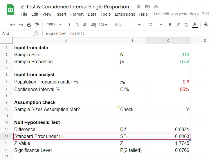
Our example examines if the population proportion \(\pi_0\) is 0.60 using a total sample size of \(N\) = 112 and therefore,
$$SE_0 = \sqrt{\frac{0.60(1 - 0.60)}{112}} = 0.046.$$
Using this outcome, we can standardize our sample proportion \(pi\) into a z-score using
$$Z = \frac{pi - \pi_0}{SE_0}$$
Our sample came up with a proportion \(pi\) of 0.52 because 58 out of 112 people carried Covid-19 antibodies. Therefore,
$$Z = \frac{0.52 - 0.60}{0.046} = -1.77$$
Finally,
$$p(2{\text -}tailed) = 2 \cdot p(z \lt -1.77) = 0.076.$$
This means that if the population proportion really is 0.60, there's a 0.076 (or 7.6%) probability of finding a sample proportion of 0.52 or a more extreme outcome in either direction. Conclusion: we do not reject the null hypothesis that \(\pi_0 = 0.60\) if we test at the usual \(\alpha\) = 0.05 level. All formulas are found in this Googlesheet (read-only), partly shown below.
Continuity Correction for Z-Test
The z-test we just discussed comes up with an approximate significance level. The accuracy of this result can be improved by a simple adjustment:
$$pi_{cc} = \begin{cases} \frac{N \cdot pi \;- \;0.5}{N} \;\;\text{ if } \;\;pi \gt \pi_0\\\\ \frac{N \cdot pi \;+ \;0.5}{N} \;\;\text{ if } \;\;pi \lt \pi_0 \end{cases}$$
This continuity correction simply adds or subtracts 0.5 from the number of successes before converting it into a sample proportion.
For our example, we thus test for
$$pi_{cc} = \frac{112 \cdot 0.52 + 0.5}{N} = 0.522$$
Now, we still compute \(SE_0\) based on \(pi\) but we compute \(Z\) as
$$Z_{cc} = \frac{pi_{cc} - \pi_0}{SE_0} \approx -1.68 $$
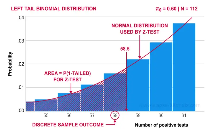
The reason for the continuity correction is that the number of successes strictly follows a binomial distribution. This discrete distribution gives the exact probability for each separate outcome.
When approximating these probabilities with a probability density function -such as the normal distribution- we need to include the entire outcome. This runs from (outcome - 0.5) to (outcome + 0.5) as illustrated below for our example.
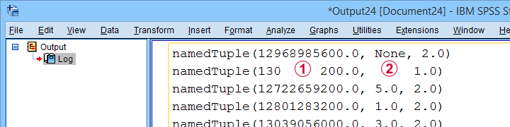
Finally, the screenshot below shows the SPSS output for the (un)corrected z-tests.
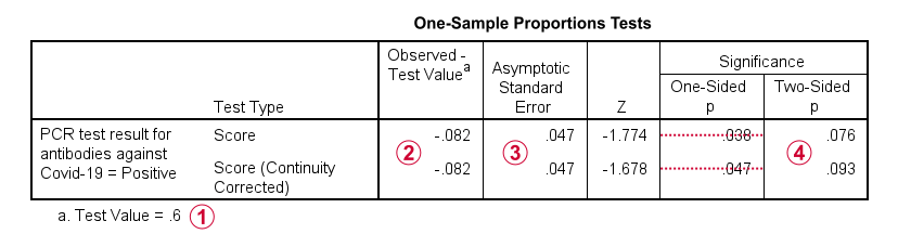
 “Test Value” refers to \(\pi_0\), the hypothesized population proportion;
 “Observed Test Value” refers to \(pi - \pi_0\);
 SPSS reports the wrong standard error for this test;
 the z-values and p-values confirm our calculations.
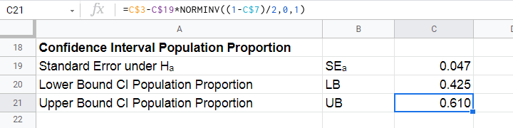
Confidence Interval for Single Proportion
Computing a confidence interval for a proportion uses a different standard error than the corresponding z-test:
$$SE_a = \sqrt{\frac{pi(1 - pi)}{N}}$$
Note that the standard error now uses our sample proportion \(pi\) instead of the hypothesized population proportion \(\pi_0\). Our sample of \(N\) = 112 came up with a proportion of 0.52 and therefore
$$SE_a = \sqrt{\frac{0.52(1 - 0.52)}{112}} = 0.047.$$
We can now construct a confidence interval for the population proportion \(\pi\) with
$$CI_{\pi} = pi - SE_a \cdot Z_{1-^{\alpha}_2} \lt \pi \lt pi + SE_a \cdot Z_{1-^{\alpha}_2}$$
For a 95% CI, \(\alpha\) = 0.05. Therefore,
$$Z_{1-^{\alpha}_2} = Z_{.975} \approx 1.96$$
and this results in
$$CI_{\pi} = 0.52 - 0.047 \cdot 1.96 \lt \pi \lt 0.52 + 0.047 \cdot 1.96 = $$
$$CI_{\pi} = 0.43 \lt \pi \lt 0.61$$
This means that the interval [0.43,0.61] has a 95% likelihood of enclosing the population proportion of people carrying antibodies against Covid-19.
The screenshot below shows how to compute this CI in this Googlesheet.
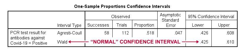
Agresti-Coull Adjustment for CI
We proposed earlier that the aforementioned confidence interval requires that \(n_1 \ge 15\) and \(n_2 \ge 15\). Agresti & Coull (1998)1 proposed a simple adjustment when this assumption is not met:
- \(n_{1ac} = n_1 + 2\) and
- \(n_{2ac} = n_2 + 2\).
That is, we simply add 2 observations to each group and then proceed as usual. The example presented by the authors involves a sample containing
- \(n_1\) = 0 respondents who own an iPod and
- \(n_2\) = 20 respondents who don't own an iPod.
After adding 2 observations to either group, we simply compute the confidence interval for
- \(n_1\) = 22 respondents don't own an iPod and
- \(n_2\) = 2 respondents do own an iPod.
This initially results in
$$CI_{\pi} = \frac{22}{24} - 0.056 \cdot 1.96 \lt \pi \lt \frac{22}{24} + 0.056 \cdot 1.96 = $$
$$CI_{\pi} = 0.807 \lt \pi \lt 1.027$$
However, since proportions can't be larger than 1, we'll censor this interval to [0.807,1.000].
The screenshot below shows the SPSS output for (un)adjusted confidence intervals for our Covid-19 example.
Relation to Other Tests
First off, the z-test for a single proportion without the continuity correction is equivalent to the chi-square goodness-of-fit test: these tests always yield identical p-values.
Second, the z-test for a single proportion with the continuity correction comes very close to the binomial test: for our Covid-19 example,
- p(2-tailed) = .093 for the continuity corrected z-test;
- 2 · p(1-tailed) = .095 for the binomial test.
Note that a binomial test yields an exact p-value for some sample proportion. However, some reasons for not using it are that
- it only yields 1-tailed p-values unless \(\pi\) = 0.50;
- it does not yield any confidence intervals;
- it is computationally intensive for larger sample sizes.
References
- Agresti, A. & Coull, B.A. (1998). Approximate Is Better than "Exact" for Interval Estimation of Binomial Proportions The American Statistician, 52(2), 119-126.
- Agresti, A. & Franklin, C. (2014). Statistics. The Art & Science of Learning from Data. Essex: Pearson Education Limited.
- Van den Brink, W.P. & Koele, P. (1998). Statistiek, deel 2 [Statistics, part 2]. Amsterdam: Boom.
- Van den Brink, W.P. & Koele, P. (2002). Statistiek, deel 3 [Statistics, part 3]. Amsterdam: Boom.
- Twisk, J.W.R. (2016). Inleiding in de Toegepaste Biostatistiek [Introduction to Applied Biostatistics]. Houten: Bohn Stafleu van Loghum.
Conditions and Loops in Python
- Python “for” Loop
- Python “while” Loop
- Python “if” Statement
- Python “if-else” Statement
- Python “if-elif-else” Statement
Common parts of any computer language are conditions, loops and functions. In Python, these have fairly similar structures as illustrated by the figure below.
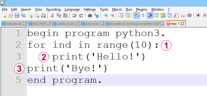
a function, loop or condition is terminated by a colon;
one or more indented lines indicate that they are subjected to the condition or loop or part of some function;
an outdented line indicates that some loop, condition or function has ended.
Loops, conditions and functions are often nested as indicated by their indentation levels. The syntax below shows a commented example.
begin program python3.
for ind in range(10): # start of loop
print('What I know about {},'.format(ind)) # subjected to loop
if(ind % 2 == 0): # start of condition
print('is that it\'s an even number.') # subjected to loop and condition
else: # end previous condition, start new condition
print('is that it\'s an odd number.') # subjected to loop and condition
print('That will do.') # end condition, end loop
end program.
Let's now take a closer look at how loops and conditions are structured in Python.
Python “for” Loop
In Python, we mostly use for loops in which we iterate over all elements of an iterable object. As it's perfectly straightforward, a single example may do.
begin program python3.
countries = ['Netherlands','Germany','France','Belgium','Slovakia','Bulgaria','Spain']
for country in countries:
print(country)
print("That's all.")
end program.
Note that the indentation indicates where the loop ends: “That's it.” is printed just once because it's not indented.
Python “while” Loop
A second type of Python loop is the “while” loop. It'll simply keep iterating as long as some condition is met. Make sure that at some point the condition won't be met anymore or Python will keep looping forever -or until you somehow disrupt it anyway, perhaps with Windows’ Task Manager.
We rarely use “while” loops in practice but I'll give an example below anyway: we'll randomly sample zeroes and ones while the number of ones in our sample is smaller than 10. If we endlessly repeat this experiment, the sample sizes will follow a negative binomial distribution.
begin program python3.
import random
sample = []
while sum(sample) < 10:
sample.append(random.randint(0,1))
print(sample)
end program.
*NOTE: SECOND/THIRD/... ATTEMPTS TYPICALLY RESULT IN SHORTER/LONGER LISTS.
Python “if” Statement
Conditional processing in Python is done with if statements and they work very similarly to for and while. Let's first run a simple example.
begin program python3.
countries = ['Netherlands','Germany','France','Belgium','Slovakia','Bulgaria','Spain']
for country in countries:
if 'm' in country:
print('%s contains the letter "m".'%country)
end program.
Python “if-else” Statement
Our previous example did something if some condition was met. If the condition wasn't met, nothing happened. Sometimes that's just what we need. In other cases, however, we may want something to happen if a condition is not met. We can do so by using else as shown below.
begin program python3.
countries = ['Netherlands','Poland','Germany','Portugal','France','Belgium','Slovakia','Bulgaria','Spain']
for country in countries:
if country.startswith("S"):
print('%s starts with an "S".'%country)
else:
print('%s doesn\'t start with an "S".'%country)
end program.
Python “if-elif-else” Statement
Our last example took care of two options: a condition is met or it is not met. We can add more options with elif, short for “else if”. This means that a condition is met and none of the previous conditions in our if structure has been met.
Like so, an if structure may contain (at the same indentation level):
- 1
ifclause: do something if some condition is met; - 0 or more
elifstatements: do something if some condition but none of the previous conditions is met; - 0 or 1
elsestatements: do something if none of the previous conditions is met.
Example
begin program python3.
countries = ['Netherlands','Poland','Germany','Portugal','France','Belgium','Slovakia','Bulgaria','Spain']
for country in countries:
if country.startswith("S"):
print('%s starts with an "S".'%country)
elif country.startswith("P"):
print('%s starts with a "P".'%country)
else:
print('%s doesn\'t start with a "P" or an "S".'%country)
end program.
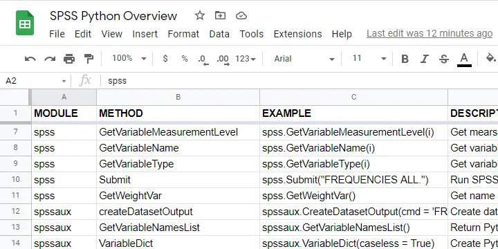
Quick Overview SPSS Python Modules
Basic Python can't do anything in SPSS. However, we can add extra functionality to it that makes things work. Such functionality resides in modules that we import. This basic idea is similar to installing apps on a smartphone.
Overview Main SPSS Python Modules
| Name | Meaning | Main Uses |
|---|---|---|
| spss | SPSS Functions | Have Python run the SPSS syntax it creates. Look up variable properties, variable count, case count, system settings and more. |
| spssaux | SPSS Auxiliary Functions | Get and set variable properties including value labels. Retrieve variable names by expanding SPSS TO and ALL keywords. |
| spssdata | SPSS Data Values | Look up all data values in one or many variables. Append new variables/cases to dataset. |
| os | Operating System | Look up contents of folders. Create, edit or delete files or folders. |
| SpssClient | SPSS Client | Access Output, Data Editor and Syntax windows. Batch modify SPSS Output tables or Charts. |
SPSS Python Modules - What & Why?
Python has a modular structure: there's the basic program with quite some functions built into it. And then there's a ton of modules, add-on files that extend Python's capabilities.
Like so, there's a couple of modules for having Python interact with SPSS. All modules discussed in this lesson are included in the SPSS Python Essentials so you don't need to download them.
For recent SPSS versions, they're found in a folder like C:\Program Files\IBM\SPSS Statistics\Python3\Lib\site-packages as shown below.
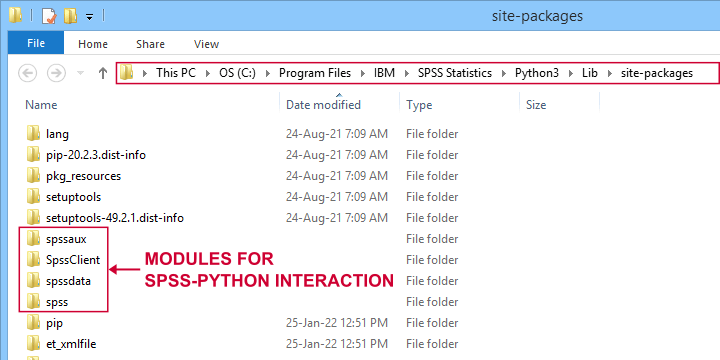
Note that the site-packages folder is also where you can create your own SPSS Python module(s) as we'll do in SPSS - Cloning Variables with Python.
The remainder of this tutorial walks you through the main SPSS Python modules and their functions. We also created a handy overview of these in this Googlesheet (read-only).
Python spss Module
We'll use the spss module mostly for looking up SPSS dictionary information and having Python run SPSS syntax. The SPSS module is extensively documented in the SPSS Python Reference Guide (download here).
| Module | Component | Example | Description |
|---|---|---|---|
| spss | GetSetting | spss.GetSetting('tnumbers') | Get system setting from SET command. Similar to spssaux.GetSHOW. |
| spss | GetSplitVariableNames | spss.GetSplitVariableNames() | Return Python list of split variable names. |
| spss | GetVariableCount | spss.GetVariableCount() | Get number of variables in active dataset. |
| spss | GetVariableFormat | spss.GetVariableFormat(0) | Get variable format (such as F4.2, A20, date11) by Python index. |
| spss | GetVariableLabel | spss.GetVariableLabel(0) | Get variable label by Python index. |
| spss | GetVariableMeasurementLevel | spss.GetVariableMeasurementLevel(0) | Get measurement level by Python index. |
| spss | GetVariableName | spss.GetVariableName(0) | Get variable name by Python index. |
| spss | GetVariableType | spss.GetVariableType(0) | Get variable type (string or numeric) by Python index. |
| spss | Submit | spss.Submit("FREQUENCIES ALL.") | Run SPSS syntax held in Python string. |
| spss | GetWeightVar | spss.GetWeightVar() | Get name of active WEIGHT variable -if any. |
Python spssaux Module
spssaux is short for SPSS auxiliary functions and has quite some overlap with the spss module. Two important things that we'll do with spssaux are
- expand the SPSS TO keyword for looking up a range of variable names. We'll do just that in Looping over SPSS Commands with Python.
- look up value labels as we'll do in SPSS - Change Value Labels with Python.
The table below lists these and some other main uses of spssaux.
| Module | Component | Example | Description |
|---|---|---|---|
| spssaux | createDatasetOutput | spssaux.CreateDatasetOutput(...) | Create dataset holding SPSS output, similarly to SPSS OMS. |
| spssaux | GetVariableNamesList | spssaux.GetVariableNamesList() | Return Python list of all variable names in active dataset. Of limited use because most variable properties are retrieved by index instead of name. |
| spssaux | VariableDict | spssaux.VariableDict(caseless = True) | Create Python dict containing all variable names and indices. Expands SPSS TO and ALL keywords and retrieves variable properties. |
| spssaux | GetSHOW | spssaux.GetSHOW('weight') | Retrieves system setting displayed by SHOW. Has some more options than spss.GetSetting. |
| spssaux | GetValueLabels | spssaux.GetValueLabels(0) | Returns Python dict object holding value labels by index. |
| spssaux | GetVariableValues | spssaux.GetVariableValues(6) | Returns Python list holding distinct data values by index. Does not work with SPLIT FILE on. |
Python spssdata Module
The spssdata module can look up data values in SPSS for one or several variables. We'll do so with spssdata.Spssdata as shown below (using bank.sav).
begin program python3.
import spssdata
with spssdata.Spssdata(['dob','educ','marit']) as allData:
for case in allData:
print(case)
end program.
Part of the resulting output is shown below.
By default, SPSS date variables are not converted to Python datetime objects. For more on this, see SPSS - Extract ISO Weeks from Date Variable.
Missing values in SPSS result in Python NoneType objects.
Python os Module
The Python os (short for operating system - probably MS Windows for most readers) module allows us to look up the contents of folders and move files to different folder and/or rename them. The table below lists some functions.
| Module | Component | Example | Description |
|---|---|---|---|
| os | listdir | os.listdir(r'd:\data') | Return Python list of all files and folders in some directory. |
| os | path.exists | os.path.exists(r'd:\data\myfile.sav') | Check if path exists. |
| os | path.join | os.path.join(dir,'myfile.sav') | Create path from components such as (sub)folders and file name. |
| os | remove | os.remove(r'd:\data\myfile.sav') | Delete file. |
| os | rename | os.rename(r'd:\temp',r'd:\tmp') | Change file/folder name or location. |
| os | walk | os.walk(r'd:\data') | Search folder and all subfolders. |
Note that we often use raw strings for escaping the backslashes found in Windows paths. We'll use os.listdir in some future tutorials.
Python SpssClient Module
The SpssClient module works quite differently than the other SPSS Python modules. We mostly use it for (batch) processing SPSS output items such as tables and charts.
Most of what we used to do with the SpssClient module has been added to OUTPUT MODIFY for recent SPSS versions. This works way easier, faster and more reliably.
On top of that, the SpssClient module is rather challenging. We therefore decided not to cover it any further during this course.
Thanks for reading!
Quick Overview Python Object Types
In our examples, you'll encounter terms such as a Python list or dict object. So which object types do we find in Python and what are their basic properties? The table below presents a quick overview.
Quick Overview Python Object Types
| Type | Meaning | Iterable? | Mutable? | Looks like | What is it? |
|---|---|---|---|---|---|
| str | String | Yes | No | apple | Sequence of 0 or more characters |
| list | List | Yes | Yes | [1,2,3] | Sequence of objects that are referenced by their positions |
| tuple | Python tuple | Yes | No | ('apple','banana') | Sequence of objects that are referenced by their positions |
| dict | Dictionary | Yes | Yes | {1:'apple',2:'banana'} | Unordered set of (unique) keys, each of which has some value |
| int | Integer number | No | No | 1 | Number that has no decimal places |
| float | Floating point number | No | No | 1.0 | Number that has decimal places |
| function | Python function | No | No | def myfunction(): | Named amount of code that takes zero or more arguments and executes something |
| module | Python module | No | No | (Text file with .py extension) | One or more Python files that define functions and/or other objects. |
| bool | Boolean | No | No | True / False | Object that can only indicate True or False |
| range | Python range | Yes | No | range(0, 10) | Sequence of integer numbers |
| NoneType | Empty object | No | No | None | Empty object without type |
What Does “Iterable” Mean in Python?
Python objects are iterable if you can loop over them. For instance, you can loop over (the characters contained in) a Python string object. However, you can't loop over a Python int object.
Whether you can (not) loop over an object only depends on the type of object, not its contents. Like so, you can loop over an empty list as shown below.
begin program python3.
myString = '13579'
for char in myString:
print(char)
end program.
*INT OBJECT IS NOT ITERABLE.
begin program python3.
myInt = 13579
for char in myInt:
print(char) # TypeError: 'int' object is not iterable
end program.
*PYTHON LIST IS ITERABLE, EVEN IF EMPTY.
begin program python3.
myList = []
for elem in myList:
print(elem)
end program.
What Does “Mutable” Mean in Python?
Python objects are mutable if their values can be changed. Confusingly, it seems you can change the value of, for instance, a string object. Doing so, however, simply creates an entirely new string object with the same name but a (possibly) different value than the original string object.
The examples below demonstrate this by inspecting the Python IDs before and after modifying some string object.
begin program python3.
myString = 'apple'
print(myString) # apple
print(id(myString)) # 51135968
myString += 's'
print(myString) # apples
print(id(myString)) # 51043720
end program.
*CHANGING ELEMENTS OF LIST OBJECT DOES NOT RESULT IN NEW LIST OBJECT.
begin program python3.
myList = ['apple','banana','cherry']
print(myList) # ['apple', 'banana', 'cherry']
print(id(myList)) # 45378824
myList.append('durian')
print(myList) # ['apple', 'banana', 'cherry', 'durian']
print(id(myList)) # 45378824
end program.
Python String Object
A Python string simply consists of 0 or (usually) more characters. For a detailed overview of Python string methods, read up on Overview Python String Methods. The syntax below demonstrates some minimal basics.
begin program python3.
myString = 'apple'
print(type(myString)) # <type 'str'>
print(myString) # apple
end program.
*RETRIEVE LAST ELEMENT (CHARACTER) FROM STRING.
begin program python3.
print(myString[-1]) # e
end program.
Why are Python string objects so important? Well, a main goal of using Python in SPSS is creating (large amounts of) SPSS syntax to accomplish several tasks. Such syntax is created as one or many Python string objects which are then passed on to be run in SPSS.
Python List Object
Python list objects consist of 0 or (usually) more elements separated by commas and enclosed by square brackets.
begin program python3.
myList = ['apple','banana','cherry']
print(type(myList)) # <class 'list'>
print(myList) # ['apple','banana','cherry']
end program.
*RETRIEVE ITEM FROM LIST BY INDEX.
begin program python3.
print(myList[0]) # apple
end program.
List objects are similar to tuples except that they are editable (“mutable”). As a consequence, many methods are available for lists. We may present a quick overview of those in a future tutorial.
Python Tuple Object
Python tuples consist of 0 or more elements enclosed by parentheses and separated by commas. The syntax below demonstrates a handful of basics.
begin program python3.
myTuple = ('apple','banana','cherry')
print(type(myTuple)) # <class 'tuple'>
print(myTuple) # ('apple','banana','cherry')
end program.
*EXTRACT LAST ELEMENT FROM TUPLE.
begin program python3.
print(myTuple[-1]) # cherry
end program.
Python tuples are similar to Python list objects, except that they are not editable (“immutable”). We usually just extract elements from them with square brackets.
Python Dictionary Object
A Python dict object consists of 0 or (usually) more key-value pairs. Value can only be retrieved from their keys, not from any indices as shown below.
Python dict keys (but not values) must be unique. Both keys and values are usually Python string or integer objects but they can technically be any type including
- lists;
- tuples;
- dictionaries;
- or any other Python object.
The syntax below demonstrates a handful of Python dict basics.
begin program python3.
myDict = {'a':'apple','b':'banana','c':'cherry'}
print(type(myDict)) # <class 'dict'>
print(myDict) # {'b': 'banana', 'a': 'apple', 'c': 'cherry'}
end program.
*RETRIEVE DICT VALUE FROM DICT KEY.
begin program python3.
print(myDict['a']) # apple
end program.
*NOTE: YOU CAN'T RETRIEVE DICT VALUE FROM INDEX.
begin program python3.
print(myDict[0]) # ... KeyError ...
end program.
*LOOP OVER DICT KEYS AND VALUES.
begin program python3.
for key,value in myDict.items():
print(key,value)
end program.
Python Integer Object
An “int” in Python indicates an integer number: a number without decimal places.
begin program python3.
myInt = 5
print(type(myInt)) # <class 'int'>
print(myInt) # 5
end program.
*NOTE THAT / OPERATOR INDICATES DIVISION FOR INT / FLOAT.
begin program python3.
print(myInt / 2)
end program.
Note that a number with decimal places is a float or a decimal in Python.
Python Float Object
Numbers with decimal places are floats or decimals in Python. The syntax below demonstrates a handful of basics.
begin program python3.
myFloat = 3.0
print(type(myFloat)) # <class 'float'>
print(myFloat) # 3.0
end program.
*FOR FLOAT, + OPERATOR INDICATES NUMERIC ADDITION.
begin program python3.
print(myFloat + 1) # 1.5
end program.
Floats in Python are single-precision floating point numbers. In contrast, all numbers in SPSS are double-precision floating-point numbers.
Python Functions
A function in Python consists of 1 or more lines of Python code. These typically accomplish a general task that is needed in several different situations. A minimal example is shown below.
begin program python3.
def myFunction(myName = 'Ruben'):
print('Hello! My name is {}'.format(myName))
end program.
*INSPECT FUNCTION.
begin program python3.
print(type(myFunction)) # <class 'function'>
print(myFunction) # <function myFunction at 0x00000000030A3978>
end program.
*RUN FUNCTION WITH(OUT) ARGUMENT.
begin program python3.
myFunction() # Hello! My name is Ruben
myFunction(myName = 'Chrissy') # Hello! My name is Chrissy
end program.
Note that this function takes at most 1 argument: myName. If no argument is passed, it defaults to “Ruben”.
In Python and other programming languages, functions are very useful to make code shorter and more manageable: we basically break up a large amount of code into tiny building blocks that we can adjust and correct separately of the others.
A lesson in which we'll define and use Python functions is SPSS - Cloning Variables with Python.
Python Modules
A Python module basically consists of one or more text files containing Python code with the .py extension.
begin program python3.
import os
print(type(os)) # <class 'module'>
print(os) # <module 'os' from 'C:\\Program Files\\IBM\\SPSS\\Statistics\\Python3\\lib\\os.py'>
end program.
Python modules typically define classes and functions that are related to specific tasks such as
- working with regular expressions (Python re module);
- interacting with Excel files (openpyxl module);
- creating, moving, copying or deleting files and/or folders (Python os module).
We'll create some very simple SPSS Python modules in SPSS - Cloning Variables with Python.
Python Boolean Object
Boolean objects are simply True or False. They're used to specify if you want some task to be performed or not. Also, conditions implicitly result in Booleans (True if they're met, False otherwise).
begin program python3.
myBoolean = True
print(type(myBoolean)) # <class 'bool'>
print(myBoolean) # True
end program.
*USE BOOLEAN IN IF STATEMENT.
begin program python3.
if myBoolean:
print('Yes!')
else:
print('No!')
end program.
*IMPLICIT BOOLEAN IN IF STATEMENT.
begin program python3.
if 'a' in 'banana':
print('Yes!')
else:
print('No!')
end program.
*USE BOOLEAN AS FUNCTION ARGUMENT.
begin program python3.
myList = [5,2,8,1,9]
print(sorted(myList,reverse = True)) # [9, 8, 5, 2, 1]
end program.
Python Range Object
A Python range object creates a series of consecutive integers when looped over. Note that range(10) results in 0 through 9. For 1 through 10, use range(1,11).
begin program python3.
myRange = range(10)
print(type(myRange)) #<class 'range'>
print(myRange) # range(0, 10)
end program.
*LOOP OVER NUMBERS 1 - 10.
begin program python3.
for myInt in range(1,11):
print(myInt)
end program.
Python NoneType Object
A NoneType object in Python indicates an empty object that has been declared but does not have any value (yet).
begin program python3.
myNone = None
print(type(myNone)) # <class 'NoneType'>
print(myNone) # None
end program.
When reading SPSS data values with the spssdata module, missing values usually result in NoneType objects in Python. Also, optional arguments sometimes have None as their default in Python functions.
Final Notes
So much for my basic overview of Python object types. Did I miss anything? Did you find it helpful? Help me out and let me know.
Thanks for reading!
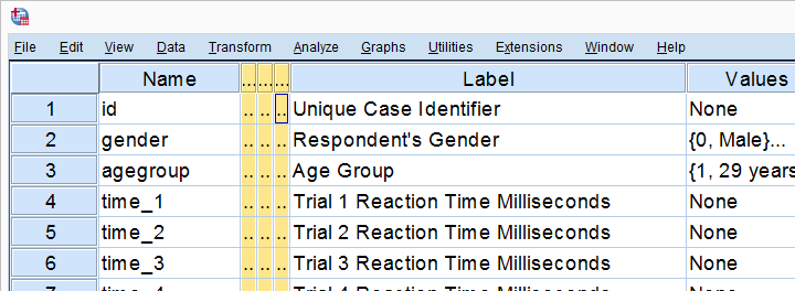
SPSS – How to Sort Variables Using Python?
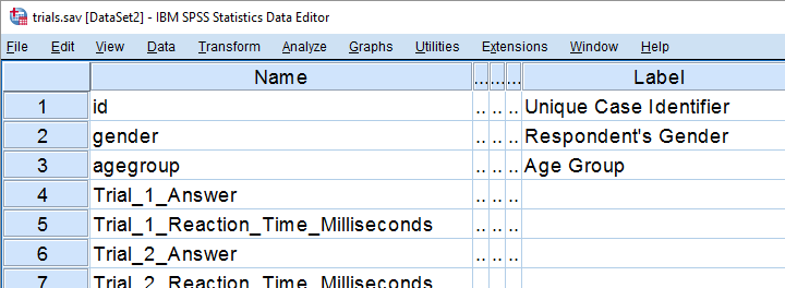
We held a reaction time experiment in which people had to resolve 20 puzzles as fast as possible. The 20 answers and reactions times are in an SPSS data file which we named trials.sav. Part of if is shown below.
In first instance, we'd just like to inspect the histograms of our reaction time variables. The easiest way is running FREQUENCIES as shown below but specifying the right variable names is cumbersome even for this very tiny data file.
frequencies Trial_1_Reaction_Time_Milliseconds Trial_2_Reaction_Time_Milliseconds Trial_3_Reaction_Time_Milliseconds /*and so on through 20.
/format notable
/histogram.
If our reaction times were adjacent, we could address the entire block with the TO keyword. We'll therefore reorder our variables with ADD FILES as shown in SPSS - Reorder Variables with Syntax. The easiest way to get the job done is ADD FILES FILE */KEEP id to agegroup [reaction time variables here] ALL. ALL refers to all variables in our data that we haven't specified yet -in this case all answer variables. This command still requires spelling out all reaction time variables unless we have Python do that for us. Let's first just look up all variable names and proceed from there.
1. Retrieve Variable Names by Index
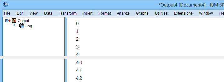
The spss module allows us to retrieve variable names by index. Now, we've 43 variables in our data but Python starts counting from 0. So our first and last variables should be indexed 0 and 42 by Python. Let's see if that's right by running the syntax below.
begin program python3.
import spss
print(spss.GetVariableName(0))
print(spss.GetVariableName(42))
end program.
2. Retrieve All Variable Indices
So if we can retrieve the first and last variable names by their Python indices -0 and 42- then we can retrieve all of them if we have all indices. A standard way for doing just that is using range.
Technically, range is an iterable object which means that we can loop over it. The syntax below shows how that works.
begin program python3.
for ind in range(10):
print(ind)
end program.
*Print all variable indices.
begin program python3.
import spss
for ind in range(spss.GetVariableCount()):
print(ind)
end program.
Result
3. Retrieve All Variable Names
We'll now run a very simple Python for loop over our variable indices. In each iteration, we'll retrieve one variable name, resulting in the names of all variables in our data. We'll filter out our target variables in the next step.
begin program python3.
import spss
for ind in range(spss.GetVariableCount()):
print(spss.GetVariableName(ind))
end program.
4. Filter Variable Names
Before we'll create and run the required syntax, we still need to filter out only those variables having “Time” in their variable names. We'll use a very simple Python if statement for doing so. The syntax below retrieves exactly our target variables.
begin program python3.
import spss
for ind in range(spss.GetVariableCount()):
varNam = spss.GetVariableName(ind)
if 'Time' in varNam:
print(varNam)
end program.
5. Create Python String Holding Target Variables
We'd like to create some SPSS syntax containing the variables we selected in the previous syntax. We'll first pass the names into a Python string we'll call timeVars. We first create it as an empty string and then concatenate each variable name and a space to it.
begin program python3.
import spss
timeVars = ''
for ind in range(spss.GetVariableCount()):
varNam = spss.GetVariableName(ind)
if 'Time' in varNam:
timeVars += varNam + ' '
print(timeVars)
end program.
Minor note: editing Python strings is considered bad practice because they're immutable. Our reason for doing so anyway is that it keeps things simple. It gets the job done just fine unless we're processing a truly massive amount of code -which we basically never do in SPSS.
6. Create Required SPSS Syntax
We're almost there. We'll now create our basic ADD FILES command as a Python string. In the syntax below, %s is a placeholder that we'll replace with our time variable names. For more details on this technique, please consult SPSS Python Text Replacement Tutorial.
begin program python3.
import spss
timeVars = ''
for ind in range(spss.GetVariableCount()):
varNam = spss.GetVariableName(ind)
if 'Time' in varNam:
timeVars += varNam + ' '
spssSyntax = "ADD FILES FILE */KEEP id to agegroup %s ALL."%timeVars
print(spssSyntax)
end program.
7. Create and Run Desired Syntax
Let's take a close look at the syntax we just created. Is it exactly what we need? Sure? Then we'll comment out the print command and run our syntax with spss.Submit instead.
begin program python3.
import spss
timeVars = ''
for ind in range(spss.GetVariableCount()):
varNam = spss.GetVariableName(ind)
if 'Time' in varNam:
timeVars += varNam + ' '
spssSyntax = "ADD FILES FILE */KEEP id to agegroup %s ALL."%timeVars
#print spssSyntax
spss.Submit(spssSyntax)
end program.
execute.
8. Run Histograms
Now that we nicely sorted our variables, running the desired histograms is easily done with the TO keyword as shown below.
frequencies Trial_1_Reaction_Time_Milliseconds to Trial_20_Reaction_Time_Milliseconds
/format notable
/histogram.
Although we got our first job done, we're rather dissatisfied with the crazy long variable names. In our humble opinion, variable names should be short and simple. More elaborate descriptions of what variables mean should go into their variable labels.
We're going to do just that in our next lesson.
Let's move on.
Python for SPSS – How to Use It?
- SPSS Python Essentials
- Run Python from SPSS Syntax Window
- Wrap Python Code into Functions
- Write Your Own Python Module
- Create an SPSS Extension
SPSS Python Essentials
First off, using Python in SPSS always requires that you have
- SPSS,
- Python and
- the SPSS-Python plugin files installed on your computer.
These components are collectively known as the SPSS Python essentials. For recent SPSS versions, the Python essentials are installed by default. One way to check this is navigating to
![]()
![]() in which you'll probably find some Python location(s) as shown below.
in which you'll probably find some Python location(s) as shown below.
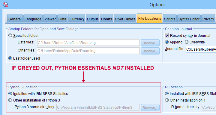
So what should you see here? Well,
- if you see an active Python 3 location here, you're good to go;
- if you only see an active Python 2 location, then you can only use Python 2, which is no longer supported. Your best option is to upgrade to SPSS version 24 or (preferably) higher;
- if all locations are greyed out (or even absent), you have SPSS without any Python essentials installed. In this case, you'll need to (re)install a recent SPSS version.
Run Python from SPSS Syntax Window
Right. So if you've SPSS with the Python essentials properly installed, what's next?
Well, the simplest way to go is to run Python from an SPSS syntax window. Enclose all lines of Python between BEGIN PROGRAM PYTHON3. and END PROGRAM. as shown below.
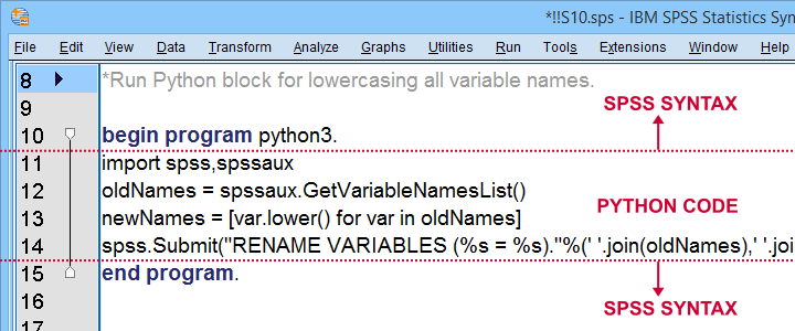
Try and copy-paste-run the entire syntax below. Note that this Python block simply lowercases all variable names, regardless what or how many they are.
data list free/V1 V2 v3 v4 EDUC gender SAlaRY.
begin data
end data.
*Run Python block for lowercasing all variable names.
begin program python3.
import spss,spssaux
oldNames = spssaux.GetVariableNamesList()
newNames = [var.lower() for var in oldNames]
spss.Submit("RENAME VARIABLES (%s = %s)."%(' '.join(oldNames),' '.join(newNames)))
end program.
Wrap Python Code into Functions
Right, so we just ran some Python from an SPSS syntax window. Now, this works fine but doing so has some drawbacks:
- our syntax becomes less readable and manageable if it contains long Python blocks;
- if we use some Python block in several SPSS syntax files and we'd like to correct it, we'll need to correct it in each syntax file;
- the SPSS syntax editor is a poor text editor.
A first step towards resolving these issues is to first wrap our Python code into a Python function.
data list free/V1 V2 v3 v4 EDUC gender SAlaRY.
begin data
end data.
*Define lowerCaseVars as Python function.
begin program python3.
def lowerCaseVars():
import spss,spssaux
oldNames = spssaux.GetVariableNamesList()
newNames = [var.lower() for var in oldNames]
spss.Submit("RENAME VARIABLES (%s = %s)."%(' '.join(oldNames),' '.join(newNames)))
end program.
*Run function.
begin program python3.
lowerCaseVars()
end program.
Note that we first define a Python function and then run it. Like so, you can develop a single SPSS syntax file containing several such functions.
Running this file just once (preferably with INSERT) defines all of your Python functions. You can now use these for all projects you'll work on during your SPSS session.
Write Your Own Python Module
We just defined and then ran a function. The next step is moving our function into a Python file: a plain text file with the .py extension that we'll place in C:\Program Files\IBM\SPSS Statistics\Python3\Lib\site-packages or wherever our site-packages folder is located.
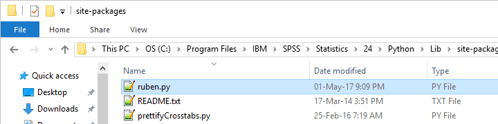
We can now edit this file with Notepad++, which is much nicer than SPSS’ syntax editor. Since a Python file contains only Python, we'll leave out BEGIN PROGRAM PYTHON3. and END PROGRAM.
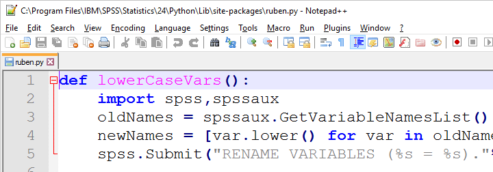
If we now import our module in SPSS, we can readily run any function it contains as shown below.
data list free/V1 v2 V3 V4 v5 V6.
begin data
end data.
*Import module and lowercase variable names.
begin program python3.
import ruben
ruben.lowerCaseVars()
end program.
Developing and using our own Python module has great advantages:
- each function is defined only once and it doesn't clutter up our syntax window;
- if we need to correct some function, we need to correct it only in one module that can be used by several SPSS syntax files;
- we can use functions within functions in our module. Doing so can make our code shorter and easier to manage.
A quick tip: if you're developing your module, reload it after each edit.
begin program python3.
import ruben,importlib # import ruben and importlib modules
importlib.reload(ruben) # use importlib to reload ruben module
ruben.lowerCaseVars() # run function from ruben module
end program.
Create an SPSS Extension
SPSS extensions are tools that can be developed by all SPSS users for a wide variety of tasks. For an outstanding collection of SPSS extensions, visit SPSS Tools - Overview.
Extensions are easy to install and can typically be run from SPSS menu dialogs as shown below.
So how does this work and what does it have to do with Python?
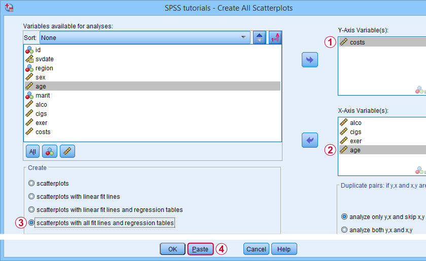
Well, most extensions define new SPSS syntax commands. These are not much different from built-in commands such as FREQUENCIES or DESCRIPTIVES. The syntax below shows an example from SPSS - Create All Scatterplots Tool.
SPSS TUTORIALS SCATTERS YVARS=costs XVARS=alco cigs exer age
/OPTIONS ANALYSIS=FITALLTABLES ACTION=RUN.
Now, running this SPSS syntax command basically passes its arguments -such as input/output variables, values or titles- on to an underlying Python function and runs it. This Python function, in turn, creates and runs SPSS syntax that gets the final job done.
Note that SPSS users don't see any Python when running this syntax -unless they can make the Python code crash. For actually seeing the Python code, you may unzip the SPSS extension (.spe) file and look for some Python (.py) file in the resulting folder.
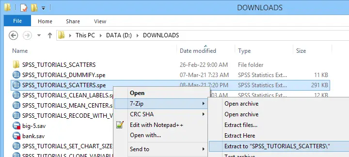 Unzipping an SPSS extension (.spe) file results in a folder in which you'll usually find a Python (.py) file
Some final notes on SPSS extensions is that developing them is seriously challenging and takes a lot of practice. However, well-written extensions can save you tons of time and effort over the years to come.
Thanks for reading!
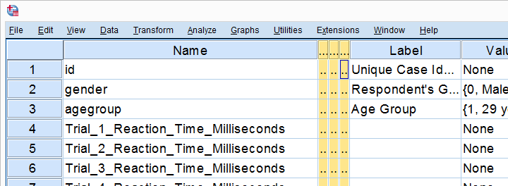
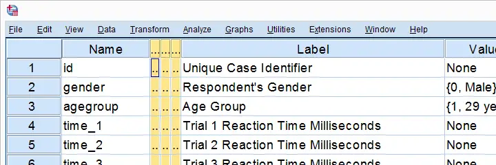
Set SPSS Variable Names as Labels with Python
Our previous lesson started out with a rather problematic data file. We reordered our variables with Python and saved our data as trials-ordered.sav, the starting point for this lesson. The screenshot below shows part of the data.
We find the long variable names problematic for two reasons: first, typing them into a syntax window is too much work and results in overly long, unmanageable syntax. More importantly, the underscores don't look nice in our output but variable names can't hold spaces instead.
We'll therefore set our variable names as variable labels and replace the underscores by spaces. Finally, we'll replace the long names by nice and short ones.
1. Retrieve All Variable Names from Data
Retrieving all variable names from our data is a standard technique that we cover in Sort Variables in SPSS with Python. We'll do it with the syntax below once again.
begin program python3.
import spss
for ind in range(spss.GetVariableCount()):
varNam = spss.GetVariableName(ind)
print(varNam)
end program.
2. Retrieve All Variable Labels from Data
Note that our first 3 variables already have a label. In order to ensure we don't overwrite them, we'll now inspect all variable labels as well, which is a simple function covered by the spss module.
begin program python3.
import spss
for ind in range(spss.GetVariableCount()):
varNam = spss.GetVariableName(ind)
varLab = spss.GetVariableLabel(ind)
print(varLab)
end program.
3. Create Variable Labels with Python
If some variable does not have a label yet, Python will return an empty string. We'll check if this holds with if not varLab:, which is True if the label is empty. For those variables, we'll create a variable label by replacing the underscores in their names by spaces. For now, we'll just print these labels.
begin program python3.
import spss
for ind in range(spss.GetVariableCount()):
varNam = spss.GetVariableName(ind)
varLab = spss.GetVariableLabel(ind)
if not varLab: # True if varLab is empty string (no VARIABLE LABEL set)
varLab = varNam.replace("_"," ")
print(varLab)
end program.
4. Create VARIABLE LABELS Commands
We'll now create and inspect VARIABLE LABELS commands with
"VARIABLE LABELS %s '%s'."%(varNam,varLab)
The first %s is replaced by the variable name, the second by its newly created label. This technique is explained in SPSS Python Text Replacement Tutorial.
begin program python3.
import spss
for ind in range(spss.GetVariableCount()):
varNam = spss.GetVariableName(ind)
varLab = spss.GetVariableLabel(ind)
if not varLab:
varLab = varNam.replace("_"," ")
print("VARIABLE LABELS %s '%s'."%(varNam,varLab))
end program.
Note: since we use single quotes around the variable label, there may be no single quotes within it. This is no issue here but if it is, escape each single quote within the label with 2 single quotes.
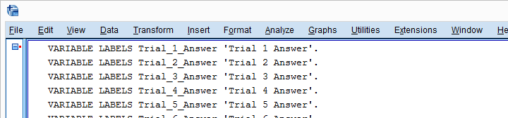
Result
5. Run VARIABLE LABELS Commands
Since our VARIABLE LABELS commands look fine, we'll now have Python run them in SPSS. We basically just replace print with spss.Submit and add some parentheses. This concludes the first part of our job.
begin program python3.
import spss
for ind in range(spss.GetVariableCount()):
varNam = spss.GetVariableName(ind)
varLab = spss.GetVariableLabel(ind)
if not varLab:
varLab = varNam.replace("_"," ")
spss.Submit("VARIABLE LABELS %s '%s'."%(varNam,varLab))
end program.
6. RENAME VARIABLES
At this point, at least our output will look good if we display only variable labels (not names) with SET TVARS LABELS. However, we still prefer nice and short variable names. If we use the TO keyword, a single line RENAME VARIABLES command does the trick for us.
rename variables(Trial_1_Reaction_Time_Milliseconds to Trial_20_Answer = time_1 to time_20 answer_1 to answer_20).
Final Result
As shown, our variable names are now nice and short and we've decent variable labels as well. This'll surely pay off when further editing or analyzing these data...
Thanks for reading!
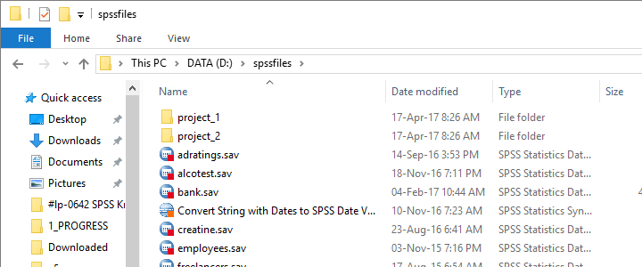
Process Multiple SPSS Data Files with Python
Running syntax over several SPSS data files in one go is fairly easy. If we use SPSS with Python we don't even have to type in the file names. The Python os (for operating system) module will do it for us.
Try it for yourself by downloading spssfiles.zip. Unzip these files into d:\spssfiles as shown below and you're good to go.
Find All Files and Folders in Root Directory
The syntax below creates a Python list of files and folders in rDir, our root directory. Prefixing it with an r as in r'D:\spssfiles' ensures that the backslash doesn't do anything weird.
begin program python3.
import os
rDir = r'D:\spssfiles'
print(os.listdir(rDir))
end program.
Result
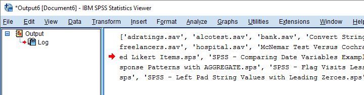
Filter Out All .Sav Files
As we see, os.listdir() creates a list of all files and folders in rDir but we only want SPSS data files. For filtering them out, we first create and empty list with savs = []. Next, we'll add each file to this list if it endswith(".sav").
begin program python3.
import os
rDir = r'D:\spssfiles'
savs = []
for fil in os.listdir(rDir):
if fil.endswith(".sav"):
savs.append(fil)
print(savs)
end program.
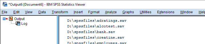
Using Full Paths for SPSS Files
For doing anything whatsoever with our data files, we probably want to open them. For doing so, SPSS needs to know in which folder they are located. We could simply set a default directory in SPSS with CD as in
CD "d:\spssfiles".
However, having Python create full paths to our files with os.path.join() is a more fool-proof approach for this.
begin program python3.
import os
rDir = r'D:\spssfiles'
savs = []
for fil in os.listdir(rDir):
if fil.endswith(".sav"):
savs.append(os.path.join(rDir,fil))
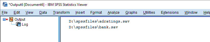
for sav in savs:
print(sav)
end program.
Result
Have SPSS Open Each Data File
Generally, we open a data file in SPSS with something like
GET FILE "d:\spssfiles\mydata.sav".
If we replace the file name with each of the paths in our Python list, we'll open each data file, one by one. We could then add some syntax we'd like to run on each file. Finally, we could save our edits with
SAVE OUTFILE "...".
and that'll batch process multiple files. In this example, however, we'll simply look up which variables each file contains with spssaux.GetVariableNamesList().
begin program python3.
import os,spss,spssaux
rDir = r'D:\spssfiles'
savs = []
for fil in os.listdir(rDir):
if fil.endswith(".sav"):
savs.append(os.path.join(rDir,fil))
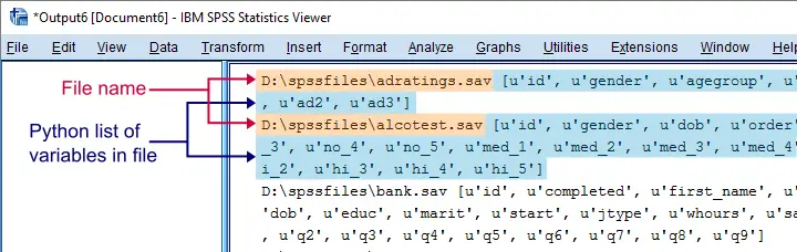
for sav in savs:
spss.Submit("GET FILE '%s'."%sav)
print(sav,spssaux.GetVariableNamesList())
end program.
Result
Inspect which Files Contain “Salary”
Now suppose we'd like to know which of our files contain some variable “salary”. We'll simply check if it's present in our variable names list and -if so- print back the name of the data file.
begin program python3.
import os,spss,spssaux
rDir = r'D:\spssfiles'
findVar = 'salary'
savs = []
for fil in os.listdir(rDir):
if fil.endswith(".sav"):
savs.append(os.path.join(rDir,fil))
for sav in savs:
spss.Submit("get file '%s'."%sav)
if findVar in spssaux.GetVariableNamesList():
print(sav)
end program.
Result
Circumvent Python’s Case Sensitivity
There's one more point I'd like to cover: since we search for “salary”, Python won't detect “Salary” or “SALARY” because it's fully case sensitive. I you don't like that, the simple solution is to convert all variable names for all files to lower()case.
A basic way to change all items in a Python list is
[i... for i in list]
where i... is a modified version of i, in our case i.lower(). This technique is known as a Python list comprehension and the syntax below uses it to lowercase all variable names (line 13).
begin program python3.
import os,spss,spssaux
rDir = r'D:\spssfiles'
findVar = 'salary'
savs = []
for fil in os.listdir(rDir):
if fil.endswith(".sav"):
savs.append(os.path.join(rDir,fil))
for sav in savs:
spss.Submit("get file '%s'."%sav)
if findVar.lower() in [varNam.lower() for varNam in spssaux.GetVariableNamesList()]:
print(sav)
end program.
Note: since I usually avoid all uppercasing in SPSS variable names, the result is identical to our case sensitive search.
Thanks for reading!
Looping over SPSS Commands with Python
A nasty limitation of SPSS is that some commands take only one variable. Now, DO REPEAT and LOOP allow us to loop over variables but they are limited to SPSS transformation commands.
Python, however, allows us to loop over any command. On top of that, we can use the TO keyword, thus circumventing the need to spell out all variable names.
This lesson -covering both techniques- is among the most important of this course. Let's dive in!
Population Pyramids
We previously cleaned up some reaction time data and this resulted in trials-renamed.sav, part of which is shown below.
We'd now like to visualize the performance of our female versus male participants. A great way for doing so is running population pyramids. They allow for a “quick and dirty” comparison of
- means,
- standard deviations,
- skewnesses,
- outliers
and so on between males and females. We'll first just create one by following the screenshots below.
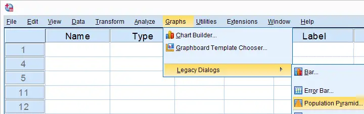
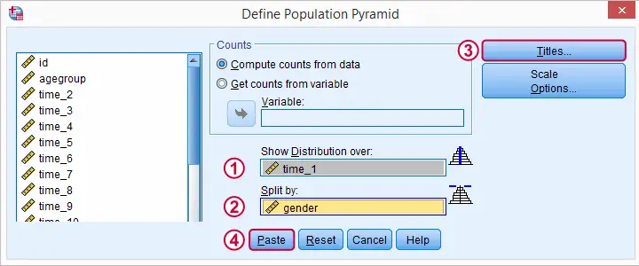
SPSS Population Pyramid Syntax
XGRAPH CHART=[HISTOBAR] BY time_1[s] BY gender[c]
/COORDINATE SPLIT=YES
/BIN START=AUTO SIZE=AUTO
/TITLES TITLE='Reaction Time by Gender'.
Apparently, we need 4 lines of syntax for one population pyramid and we'd like to have a quick peek at 20 of them.Admittedly, we could shorten the syntax somewhat but let's not waste time on it. So we need at least 80 lines of syntax. Right?
Expanding SPSS’ TO Keyword
Wrong. As in previous lessons, we'll have Python loop over this command and use a different variable name in each iteration. In this case, our reaction time variables have such simple names that we can generate all of them with a Python list comprehension like ["time_%s"%ind for ind in range(1,21)] But what about variable names that don't follow such a simple pattern? In SPSS, we'll usually specify a block of variables with the first and last variable names separated by SPSS’ TO keyword. Additional variables may be added, separated by spaces as in time_1 time_3 to time_6 time_8 time_12 Python can expand this SPSS variable specification into a Python list of variable names. This is among the most important SPSS Python techniques and it's demonstrated below.
begin program python3.
import spssaux
sDict = spssaux.VariableDict(caseless = True)
varList = sDict.expand("tiME_1 to time_20")
print(varList)
end program.
Note: since Python is case sensitive, we often need to use the correct casing for variable names and any other SPSS objects. For VariableDict(), however, adding caseless = True allows us to use any casing we like, which is usually all lowercase.
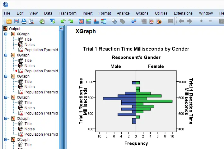
Running our Population Pyramids
We can now use a simple Python for loop for iterating over our XGRAPH commands. In each iteration, Python replaces %s with a variable name. This gets our job done.
begin program python3.
import spssaux,spss
sDict = spssaux.VariableDict(caseless = True)
varList = sDict.expand("time_1 to time_20")
for var in varList:
spss.Submit('''
XGRAPH CHART=[HISTOBAR] BY %s[s] BY gender[c]
/COORDINATE SPLIT=YES
/BIN START=AUTO SIZE=AUTO
/TITLES TITLE='Reaction Time by Gender'.
'''%var)
end program.
Result
Insert Variable Labels into Titles
We got our basic job done. However, we'll now insert our variable labels into our chart titles. Now,
spss.GetVariableLabel()
can retrieve variable labels by variable indices. For getting variable labels by variable names, however, the aforementioned VariableDict() object comes in handy (line 8, below).
In our final example, we have two text replacements in each XGRAPH command. When using multiple text replacements, using locals() is often a nice way to get things done.
begin program python3.
import spssaux,spss
sDict = spssaux.VariableDict(caseless = True)
varList = sDict.expand("time_1 to time_20")
for var in varList:
varLab = sDict[var].VariableLabel
spss.Submit('''
XGRAPH CHART=[HISTOBAR] BY %(var)s[s] BY gender[c]
/COORDINATE SPLIT=YES
/BIN START=AUTO SIZE=AUTO
/TITLES TITLE='%(varLab)s by Gender'.
'''%locals())
end program.
So I guess that'll do for this lesson. If you've any feedback, please let us know.
Hope you found it helpful!
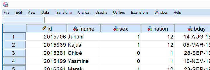
SPSS – Cloning Variables with Python
In this lesson, we'll develop our own SPSS Python module. As we're about to see, this is easier and more efficient than you might think. We'll use hotel-evaluation.sav, part of which is shown below.
Cloning Variables
Whenever using RECODE, I prefer recoding into the same variable. So how can I compare the new values with the old ones? Well, I'll first make a copy of some variable and then recode the original. A problem here is that the copy does not have any dictionary information.
We're going to solve that by cloning variables with all their dictionary properties. The final tool (available at SPSS Clone Variables Tool) is among my favorites. This lesson will deal with its syntax.
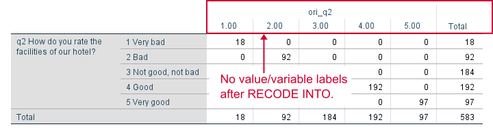
The RECODE Problem
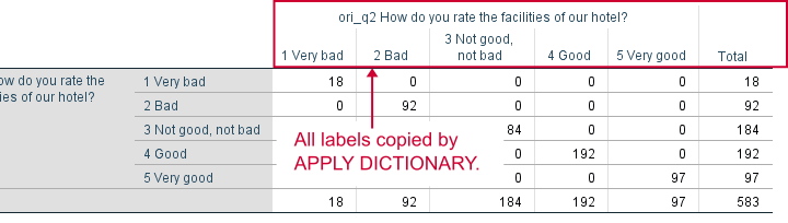
Let's first demonstrate the problem with q2. We'll make a copy with the syntax below and compare it to the original.
*Show variable names, values and labels in output.
set tnumbers both tvars both.
*Set 6 ("no answer") as user missing value.
missing values q2 (6).
*Copy q2 into ori_q2.
recode q2 (else = copy) into ori_q2.
*Inspect result.
crosstabs q2 by ori_q2.
Result
APPLY DICTIONARY
We could manually set all labels/missing values/format and so on for our new variable. However, an SPSS command that does everything in one go is APPLY DICTIONARY. We'll demonstrate it below and rerun our table.
apply dictionary from *
/source variables = q2
/target variables = ori_q2.
*Now we have a true clone as we can verify by running...
crosstabs q2 by ori_q2.
*Delete new variable for now, we need something better.
delete variables ori_q2.
Result
Create Clone Module
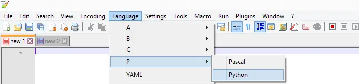
APPLY DICTIONARY as we used it here takes only one variable at a time. Therefore, cloning several variables is still cumbersome -at least, for now. We'll speed things up by creating a module in Notepad++. We'll first just open it and set its language to Python as shown below.
We now add the following code to our module in Notepad.
import spssaux
sDict = spssaux.VariableDict(caseless = True)
varList = sDict.expand(varSpec)
print(varList)
This defines a Python function which we call clone. It doesn't work yet but we're going to fix that step by step. For one thing, our function needs to know which variables to clone. We'll tell it by passing an argument that we call varSpec (short for “variable specification”).
Now which names should be used for our clones? A simple option is some prefix and the original variable name. We'll pass our prefix as a second argument to our function.
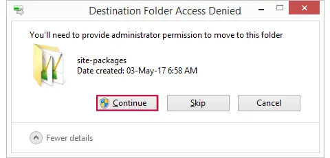
Move clone.py to Site-Packages Folder
Now we save this file as clone.py in some easy location (for me, that's Windows’ desktop) and then we'll move it into C:\Program Files\IBM\SPSS\Statistics\24\Python\Lib\site-packages or wherever the site-packages folder is located. We may get a Windows warning as shown below. Just click “Continue” here.
Import Module and Run Function
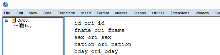
We now turn back to SPSS Syntax Editor. We'll import our module and run our function as shown below. Note that it specifies all variables with SPSS’ ALL keyword and it uses ori_ (short for “original”) as a prefix.
begin program python3.
import clone
clone.clone(varSpec = 'all',prefix = 'ori_')
end program.
Result
Create New Variable Names
We'll now reopen clone.py in Notepad++ and develop it step by step. After each step, we'll save it in Notepad++ and then import and run it in SPSS. Let's first create our new variable names by concatenating the prefix to the old names and print the result.
New Contents Clone.py (Notepad++)
import spssaux
sDict = spssaux.VariableDict(caseless = True)
varList = sDict.expand(varSpec)
for var in varList:
newVar = prefix + var # concatenation
print (var, newVar)
Because we already imported clone.py, Python will ignore any subsequent import requests. However, we do need to “reimport” our module because we made changes to it after our first import. We'll therefore reload it with the syntax below.
begin program python3.
import clone,importlib
importlib.reload(clone)
clone.clone(varSpec = 'all',prefix = 'ori_')
end program.
Result
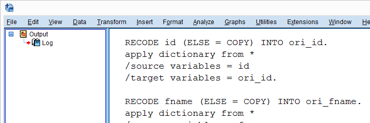
Add RECODE and APPLY DICTIONARY to Function
We'll now have our function create an empty Python string called spssSyntax. We'll concatenate our SPSS syntax to it while looping over our variables.
The syntax we'll add to it is basically just the RECODE and APPLY DICTIONARY commands that we used earlier. We'll replace all instances of the old variable name by %(var)s. %(newVar)s is our placeholder for our new variable name. This is explained in SPSS Python Text Replacement Tutorial.
New Contents Clone.py (Notepad++)
import spssaux
spssSyntax = '' # empty string for concatenating to
sDict = spssaux.VariableDict(caseless = True)
varList = sDict.expand(varSpec)
for var in varList:
newVar = prefix + var
# three quotes below because line breaks in string
spssSyntax += '''
RECODE %(var)s (ELSE = COPY) INTO %(newVar)s.
APPLY DICTIONARY FROM *
/SOURCE VARIABLES = %(var)s
/TARGET VARIABLES = %(newVar)s.
'''%locals()
print(spssSyntax)
Just as previously, we reload our module and run our function with the syntax below.
begin program python3.
import clone,importlib
importlib.reload(clone)
clone.clone(varSpec = 'all',prefix = 'ori_')
end program.
Result
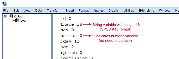
Check for String Variables
Our syntax looks great but there's one problem: our RECODE will crash on string variables. We first need to declare those with something like STRING ori_fname (A18). We can detect string variables and their lengths with sDict[var].VariableType This returns the string length for string variables and 0 for numeric variables. Let's try that.
New Contents Clone.py (Notepad++)
import spssaux
spssSyntax = ''
sDict = spssaux.VariableDict(caseless = True)
varList = sDict.expand(varSpec)
for var in varList:
newVar = prefix + var
varTyp = sDict[var].VariableType # 0 = numeric, > 0 = string length
print(var,varTyp)
spssSyntax += '''
RECODE %(var)s (ELSE = COPY) INTO %(newVar)s.
APPLY DICTIONARY FROM *
/SOURCE VARIABLES = %(var)s
/TARGET VARIABLES = %(newVar)s.
'''%locals()
print(spssSyntax)
(Reload and run in SPSS as previously.)
Result
Declare Strings Before RECODE
For each string variable we specified, we'll now add the appropriate STRING command to our syntax.
import spssaux
spssSyntax = ''
sDict = spssaux.VariableDict(caseless = True)
varList = sDict.expand(varSpec)
for var in varList:
newVar = prefix + var
varTyp = sDict[var].VariableType # 0 = numeric, > 0 = string length
if varTyp > 0: # need to declare new string variable in SPSS
spssSyntax += 'STRING %(newVar)s (A%(varTyp)s).'%locals()
spssSyntax += '''
RECODE %(var)s (ELSE = COPY) INTO %(newVar)s.
APPLY DICTIONARY FROM *
/SOURCE VARIABLES = %(var)s
/TARGET VARIABLES = %(newVar)s.
'''%locals()
print(spssSyntax)
Run All SPSS Syntax
At this point, we can use our clone function: we'll comment-out our print statement and replace it by spss.Submit for running our syntax. As we'll see, Python now creates perfect clones of all variables we specified.
import spssaux,spss # spss module needed for submitting syntax
spssSyntax = ''
sDict = spssaux.VariableDict(caseless = True)
varList = sDict.expand(varSpec)
for var in varList:
newVar = prefix + var
varTyp = sDict[var].VariableType
if varTyp > 0:
spssSyntax += 'STRING %(newVar)s (A%(varTyp)s).'%locals()
spssSyntax += '''
RECODE %(var)s (ELSE = COPY) INTO %(newVar)s.
APPLY DICTIONARY FROM *
/SOURCE VARIABLES = %(var)s
/TARGET VARIABLES = %(newVar)s.
'''%locals()
spssSyntax += "EXECUTE." # execute RECODE (transformation) commands
#print(spssSyntax) # comment out, uncomment if anything goes wrong
spss.Submit(spssSyntax) # have Python run spssSyntax
Final Notes
Our clone function works fine but there's still one more thing we could add: a check if the new variables don't exist yet. Since today's lesson may be somewhat challenging already, we'll leave this as an exercise to the reader.