Cohen’s D – Effect Size for T-Test
Cohen’s D is the difference between 2 means
expressed in standard deviations.
- Cohen’s D - Formulas
- Cohen’s D and Power
- Cohen’s D & Point-Biserial Correlation
- Cohen’s D - Interpretation
- Cohen’s D for SPSS Users
Why Do We Need Cohen’s D?
Children from married and divorced parents completed some psychological tests: anxiety, depression and others. For comparing these 2 groups of children, their mean scores were compared using independent samples t-tests. The results are shown below.
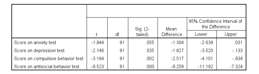
Some basic conclusions are that
- all mean differences are negative. So the second group -children from divorced parents- have higher means on all tests.
- Except for the anxiety test, all differences are statistically significant.
- The mean differences range from -1.3 points to -9.3 points.
However, what we really want to know is are these small, medium or large differences? This is hard to answer for 2 reasons:
- psychological test scores don't have any fixed unit of measurement such as meters, dollars or seconds.
- Statistical significance does not imply practical significance (or reversely). This is because p-values strongly depend on sample sizes.
A solution to both problems is using the standard deviation as a unit of measurement like we do when computing z-scores. And a mean difference expressed in standard deviations -Cohen’s D- is an interpretable effect size measure for t-tests.
Cohen’s D - Formulas
Cohen’s D is computed as
$$D = \frac{M_1 - M_2}{S_p}$$
where
- \(M_1\) and \(M_2\) denote the sample means for groups 1 and 2 and
- \(S_p\) denotes the pooled estimated population standard deviation.
But precisely what is the “pooled estimated population standard deviation”? Well, the independent-samples t-test assumes that the 2 groups we compare have the same population standard deviation. And we estimate it by “pooling” our 2 sample standard deviations with
$$S_p = \sqrt{\frac{(N_1 - 1) \cdot S_1^2 + (N_2 - 1) \cdot S_2^2}{N_1 + N_2 - 2}}$$
Fortunately, we rarely need this formula: SPSS, JASP and Excel readily compute a t-test with Cohen’s D for us.
Cohen’s D in JASP
Running the exact same t-tests in JASP and requesting “effect size” with confidence intervals results in the output shown below.
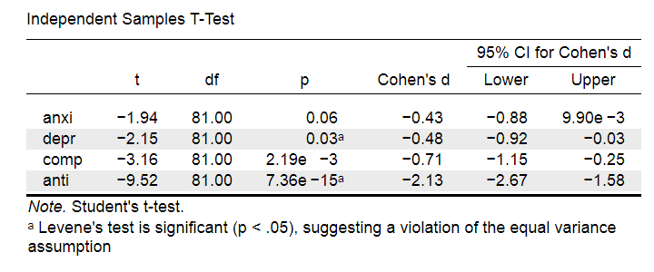
Note that Cohen’s D ranges from -0.43 through -2.13. Some minimal guidelines are that
- d = 0.20 indicates a small effect,
- d = 0.50 indicates a medium effect and
- d = 0.80 indicates a large effect.
And there we have it. Roughly speaking, the effects for
- the anxiety (d = -0.43) and depression tests (d = -0.48) are medium;
- the compulsive behavior test (d = -0.71) is fairly large;
- the antisocial behavior test (d = -2.13) is absolutely huge.
We'll go into the interpretation of Cohen’s D into much more detail later on. Let's first see how Cohen’s D relates to power and the point-biserial correlation, a different effect size measure for a t-test.
Cohen’s D and Power
Very interestingly, the power for a t-test can be computed directly from Cohen’s D. This requires specifying both sample sizes and α, usually 0.05. The illustration below -created with G*Power- shows how power increases with total sample size. It assumes that both samples are equally large.
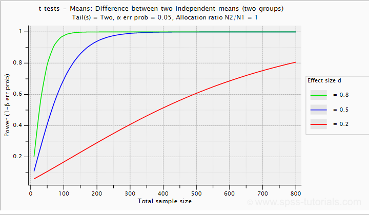
If we test at α = 0.05 and we want power (1 - β) = 0.8 then
- use 2 samples of n = 26 (total N = 52) if we expect d = 0.8 (large effect);
- use 2 samples of n = 64 (total N = 128) if we expect d = 0.5 (medium effect);
- use 2 samples of n = 394 (total N = 788) if we expect d = 0.2 (small effect);
Cohen’s D and Overlapping Distributions
The assumptions for an independent-samples t-test are
- independent observations;
- normality: the outcome variable must be normally distributed in each subpopulation;
- homogeneity: both subpopulations must have equal population standard deviations and -hence- variances.
If assumptions 2 and 3 are perfectly met, then Cohen’s D implies which percentage of the frequency distributions overlap. The example below shows how some male population overlaps with some 69% of some female population when Cohen’s D = 0.8, a large effect.
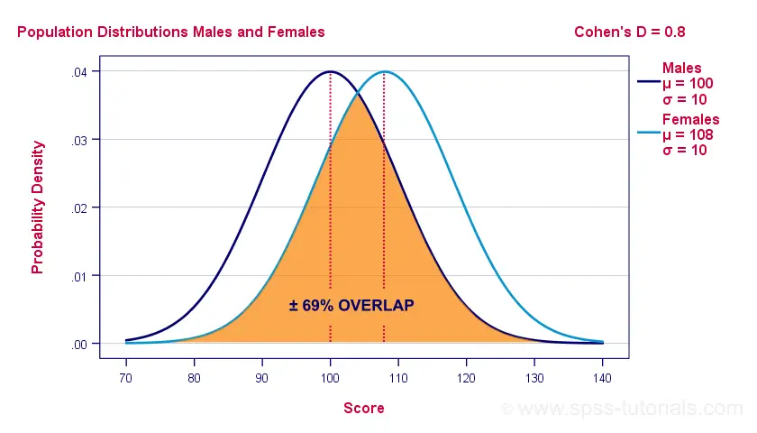
The percentage of overlap increases as Cohen’s D decreases. In this case, the distribution midpoints move towards each other. Some basic benchmarks are included in the interpretation table which we'll present in a minute.
Cohen’s D & Point-Biserial Correlation
An alternative effect size measure for the independent-samples t-test is \(R_{pb}\), the point-biserial correlation. This is simply a Pearson correlation between a quantitative and a dichotomous variable. It can be computed from Cohen’s D with
$$R_{pb} = \frac{D}{\sqrt{D^2 + 4}}$$
For our 3 benchmark values,
- Cohen’s d = 0.2 implies \(R_{pb}\) ± 0.100;
- Cohen’s d = 0.5 implies \(R_{pb}\) ± 0.243;
- Cohen’s d = 0.8 implies \(R_{pb}\) ± 0.371.
Alternatively, compute \(R_{pb}\) from the t-value and its degrees of freedom with
$$R_{pb} = \sqrt{\frac{t^2}{t^2 + df}}$$
Cohen’s D - Interpretation
The table below summarizes the rules of thumb regarding Cohen’s D that we discussed in the previous paragraphs.
| Cohen’s D | Interpretation | Rpb | % overlap | Recommended N |
|---|---|---|---|---|
| d = 0.2 | Small effect | ± 0.100 | ± 92% | 788 |
| d = 0.5 | Medium effect | ± 0.243 | ± 80% | 128 |
| d = 0.8 | Large effect | ± 0.371 | ± 69% | 52 |
Cohen’s D for SPSS Users
Cohen’s D is available in SPSS versions 27 and higher. It's obtained from
![]()
![]() as shown below.
as shown below.
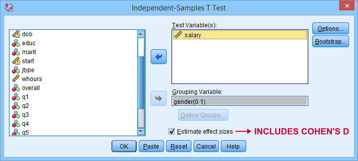
For more details on the output, please consult SPSS Independent Samples T-Test.
If you're using SPSS version 26 or lower, you can use Cohens-d.xlsx. This Excel sheet recomputes all output for one or many t-tests including Cohen’s D and its confidence interval from
- both sample sizes,
- both sample means and
- both sample standard deviations.
The input for our example data in divorced.sav and a tiny section of the resulting output is shown below.
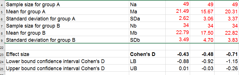
Note that the Excel tool doesn't require the raw data: a handful of descriptive statistics -possibly from a printed article- is sufficient.
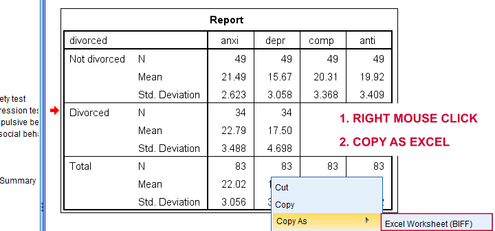
SPSS users can easily create the required input from a simple MEANS command if it includes at least 2 variables. An example is
means anxi to anti by divorced
/cells count mean stddev.
Copy-pasting the SPSS output table as Excel preserves the (hidden) decimals of the results. These can be made visible in Excel and reduce rounding inaccuracies.
Final Notes
I think Cohen’s D is useful but I still prefer R2, the squared (Pearson) correlation between the independent and dependent variable. Note that this is perfectly valid for dichotomous variables and also serves as the fundament for dummy variable regression.
The reason I prefer R2 is that it's in line with other effect size measures: the independent-samples t-test is a special case of ANOVA. And if we run a t-test as an ANOVA, η2 (eta squared) = R2 or the proportion of variance accounted for by the independent variable. This raises the question:
why should we use a different effect size measure
if we compare 2 instead of 3+ subpopulations?
I think we shouldn't.
This line of reasoning also argues against reporting 1-tailed significance for t-tests: if we run a t-test as an ANOVA, the p-value is always the 2-tailed significance for the corresponding t-test. So why should you report a different measure for comparing 2 instead of 3+ means?
But anyway, that'll do for today. If you've any feedback -positive or negative- please drop us a comment below. And last but not least:
thanks for reading!
SPSS Factor Analysis – Beginners Tutorial
- What is Factor Analysis?
- Quick Data Checks
- Running Factor Analysis in SPSS
- SPSS Factor Analysis Output
- Adding Factor Scores to Our Data
What is Factor Analysis?
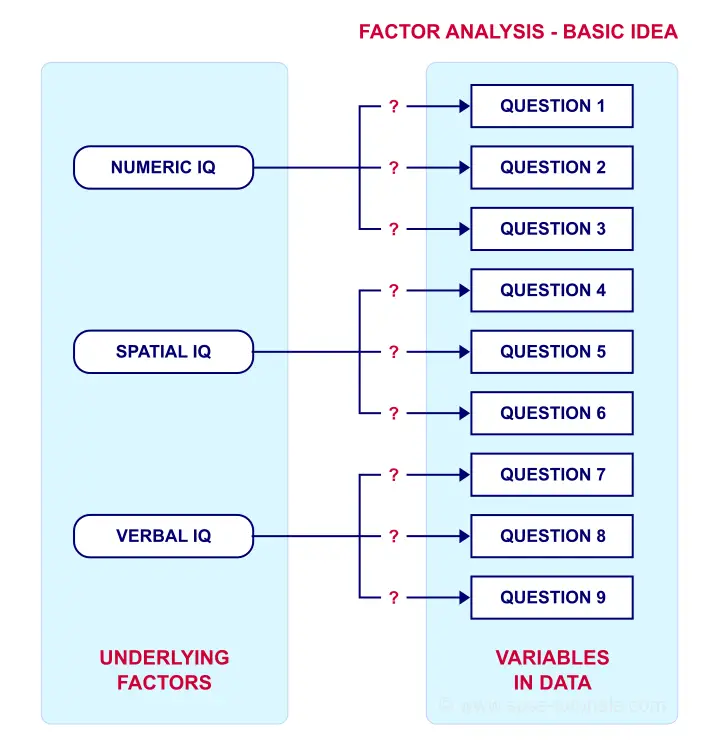
Factor analysis examines which underlying factors are measured
by a (large) number of observed variables.
Such “underlying factors” are often variables that are difficult to measure such as IQ, depression or extraversion. For measuring these, we often try to write multiple questions that -at least partially- reflect such factors. The basic idea is illustrated below.
Now, if questions 1, 2 and 3 all measure numeric IQ, then the Pearson correlations among these items should be substantial: respondents with high numeric IQ will typically score high on all 3 questions and reversely.
The same reasoning goes for questions 4, 5 and 6: if they really measure “the same thing” they'll probably correlate highly.
However, questions 1 and 4 -measuring possibly unrelated traits- will not necessarily correlate. So if my factor model is correct, I could expect the correlations to follow a pattern as shown below.
Confirmatory Factor Analysis
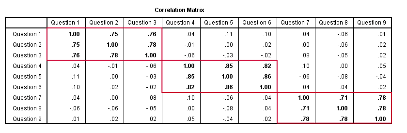
Right, so after measuring questions 1 through 9 on a simple random sample of respondents, I computed this correlation matrix. Now I could ask my software if these correlations are likely, given my theoretical factor model. In this case, I'm trying to confirm a model by fitting it to my data. This is known as “confirmatory factor analysis”.
SPSS does not include confirmatory factor analysis but those who are interested could take a look at AMOS.
Exploratory Factor Analysis
But what if I don't have a clue which -or even how many- factors are represented by my data? Well, in this case, I'll ask my software to suggest some model given my correlation matrix. That is, I'll explore the data (hence, “exploratory factor analysis”). The simplest possible explanation of how it works is that
the software tries to find groups of variables
that are highly intercorrelated.
Each such group probably represents an underlying common factor. There's different mathematical approaches to accomplishing this but the most common one is principal components analysis or PCA. We'll walk you through with an example.
Research Questions and Data
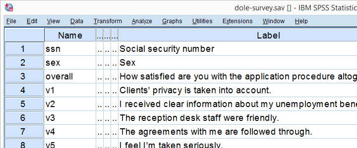
A survey was held among 388 applicants for unemployment benefits. The data thus collected are in dole-survey.sav, part of which is shown below.
The survey included 16 questions on client satisfaction. We think these measure a smaller number of underlying satisfaction factors but we've no clue about a model. So our research questions for this analysis are:
- how many factors are measured by our 16 questions?
- which questions measure similar factors?
- which satisfaction aspects are represented by which factors?
Quick Data Checks
Now let's first make sure we have an idea of what our data basically look like. We'll inspect the frequency distributions with corresponding bar charts for our 16 variables by running the syntax below.
set
tnumbers both /* show values and value labels in output tables */
tvars both /* show variable names but not labels in output tables */
ovars names. /* show variable names but not labels in output outline */
*Basic frequency tables with bar charts.
frequencies v1 to v20
/barchart.
Result
This very minimal data check gives us quite some important insights into our data:
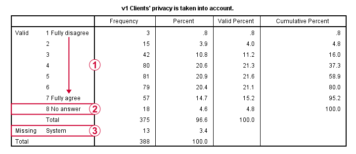
- All frequency distributions look plausible. We don't see anything weird in our data.
- All variables are
 positively coded: higher values always indicate more positive sentiments.
 - All variables have
 a value 8 (“No answer”) which we need to set as a user missing value.
 - All variables have some
 system missing values too but the extent of missingness isn't too bad.
A somewhat annoying flaw here is that we don't see variable names for our bar charts in the output outline.
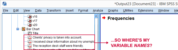
If we see something unusual in a chart, we don't easily see which variable to address. But in this example -fortunately- our charts all look fine.
So let's now set our missing values and run some quick descriptive statistics with the syntax below.
missing values v1 to v20 (8).
*Inspect valid N for each variable.
descriptives v1 to v20.
Result
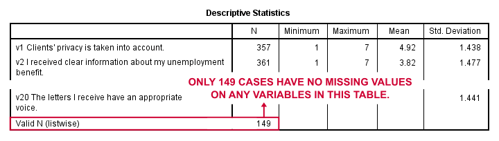
Note that none of our variables have many -more than some 10%- missing values. However, only 149 of our 388 respondents have zero missing values on the entire set of variables. This is very important to be aware of as we'll see in a minute.
Running Factor Analysis in SPSS
Let's now navigate to
![]()
![]() as shown below.
as shown below.
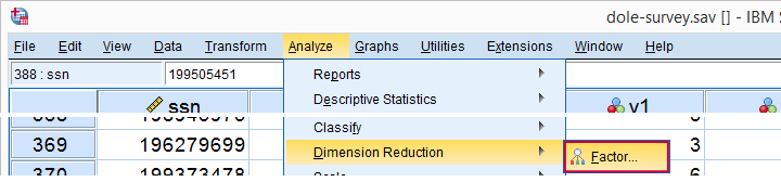
In the dialog that opens, we have a ton of options. For a “standard analysis”, we'll select the ones shown below. If you don't want to go through all dialogs, you can also replicate our analysis from the syntax below.
 Avoid “Exclude cases listwise” here as it'll only include our 149 “complete” respondents in our factor analysis. Clicking results in the syntax below.
SPSS Factor Analysis Syntax
set tvars both.
*Initial factor analysis as pasted from menu.
FACTOR
/VARIABLES v1 v2 v3 v4 v5 v6 v7 v8 v9 v11 v12 v13 v14 v16 v17 v20
/MISSING PAIRWISE /*IMPORTANT!*/
/PRINT INITIAL CORRELATION EXTRACTION ROTATION
/FORMAT SORT BLANK(.30)
/PLOT EIGEN
/CRITERIA MINEIGEN(1) ITERATE(25)
/EXTRACTION PC
/CRITERIA ITERATE(25)
/ROTATION VARIMAX
/METHOD=CORRELATION.
Factor Analysis Output I - Total Variance Explained
Right. Now, with 16 input variables, PCA initially extracts 16 factors (or “components”). Each component has a quality score called an Eigenvalue. Only components with high Eigenvalues are likely to represent real underlying factors.
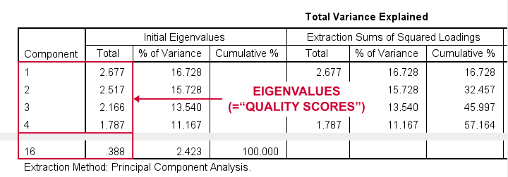
So what's a high Eigenvalue? A common rule of thumb is to select components whose Eigenvalues are at least 1. Applying this simple rule to the previous table answers our first research question: our 16 variables seem to measure 4 underlying factors.
This is because only our first 4 components have Eigenvalues of at least 1. The other components -having low quality scores- are not assumed to represent real traits underlying our 16 questions. Such components are considered “scree” as shown by the line chart below.
Factor Analysis Output II - Scree Plot
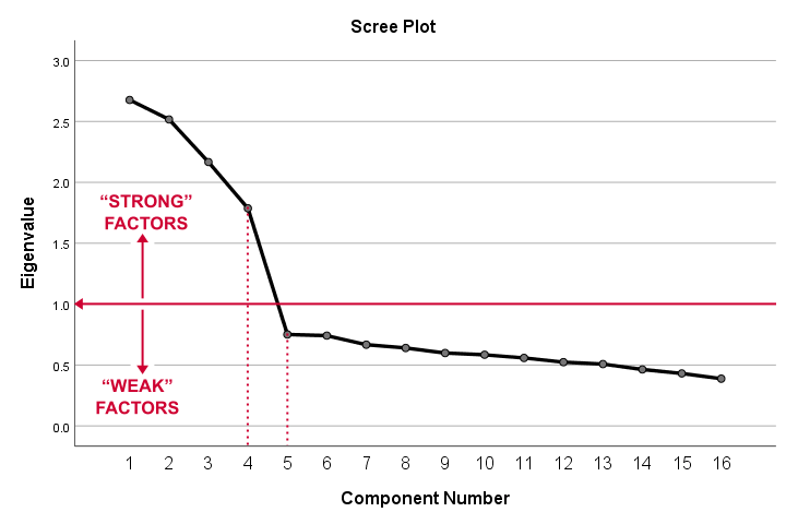
A scree plot visualizes the Eigenvalues (quality scores) we just saw. Again, we see that the first 4 components have Eigenvalues over 1. We consider these “strong factors”. After that -component 5 and onwards- the Eigenvalues drop off dramatically. The sharp drop between components 1-4 and components 5-16 strongly suggests that 4 factors underlie our questions.
Factor Analysis Output III - Communalities
So to what extent do our 4 underlying factors account for the variance of our 16 input variables? This is answered by the r square values which -for some really dumb reason- are called communalities in factor analysis.
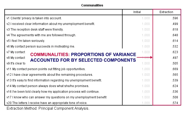
Right. So if we predict v1 from our 4 components by multiple regression, we'll find r square = 0.596 -which is v1’ s communality. Variables having low communalities -say lower than 0.40- don't contribute much to measuring the underlying factors.
You could consider removing such variables from the analysis. But keep in mind that doing so changes all results. So you'll need to rerun the entire analysis with one variable omitted. And then perhaps rerun it again with another variable left out.
If the scree plot justifies it, you could also consider selecting an additional component. But don't do this if it renders the (rotated) factor loading matrix less interpretable.
Factor Analysis Output IV - Component Matrix
Thus far, we concluded that our 16 variables probably measure 4 underlying factors. But which items measure which factors? The component matrix shows the Pearson correlations between the items and the components. For some dumb reason, these correlations are called factor loadings.
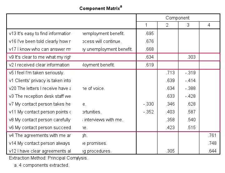
Ideally, we want each input variable to measure precisely one factor. Unfortunately, that's not the case here. For instance, v9 measures (correlates with) components 1 and 3. Worse even, v3 and v11 even measure components 1, 2 and 3 simultaneously. If a variable has more than 1 substantial factor loading, we call those cross loadings. And we don't like those. They complicate the interpretation of our factors.
The solution for this is rotation: we'll redistribute the factor loadings over the factors according to some mathematical rules that we'll leave to SPSS. This redefines what our factors represent. But that's ok. We hadn't looked into that yet anyway.
Now, there's different rotation methods but the most common one is the varimax rotation, short for “variable maximization. It tries to redistribute the factor loadings such that each variable measures precisely one factor -which is the ideal scenario for understanding our factors. And as we're about to see, our varimax rotation works perfectly for our data.
Factor Analysis Output V - Rotated Component Matrix
Our rotated component matrix (below) answers our second research question: “which variables measure which factors?”
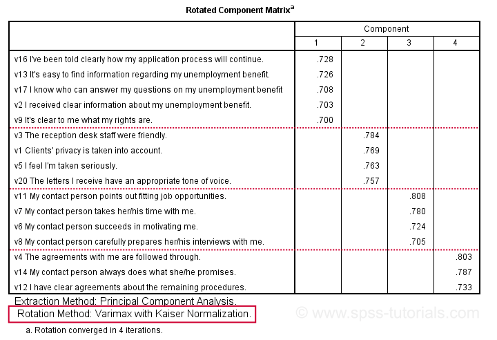
Our last research question is: “what do our factors represent?” Technically, a factor (or component) represents whatever its variables have in common. Our rotated component matrix (above) shows that our first component is measured by
- v17 - I know who can answer my questions on my unemployment benefit.
- v16 - I've been told clearly how my application process will continue.
- v13 - It's easy to find information regarding my unemployment benefit.
- v2 - I received clear information about my unemployment benefit.
- v9 - It's clear to me what my rights are.
Note that these variables all relate to the respondent receiving clear information. Therefore, we interpret component 1 as “clarity of information”. This is the underlying trait measured by v17, v16, v13, v2 and v9.
After interpreting all components in a similar fashion, we arrived at the following descriptions:
- Component 1 - “Clarity of information”
- Component 2 - “Decency and appropriateness”
- Component 3 - “Helpfulness contact person”
- Component 4 - “Reliability of agreements”
We'll set these as variable labels after actually adding the factor scores to our data.
Adding Factor Scores to Our Data
It's pretty common to add the actual factor scores to your data. They are often used as predictors in regression analysis or drivers in cluster analysis. SPSS FACTOR can add factor scores to your data but this is often a bad idea for 2 reasons:
- factor scores will only be added for cases without missing values on any of the input variables. We saw that this holds for only 149 of our 388 cases;
- factor scores are z-scores: their mean is 0 and their standard deviation is 1. This complicates their interpretation.
In many cases, a better idea is to compute factor scores as means over variables measuring similar factors. Such means tend to correlate almost perfectly with “real” factor scores but they don't suffer from the aforementioned problems. Note that you should only compute means over variables that have identical measurement scales.
It's also a good idea to inspect Cronbach’s alpha for each set of variables over which you'll compute a mean or a sum score. For our example, that would be 4 Cronbach's alphas for 4 factor scores but we'll skip that for now.
Computing and Labeling Factor Scores Syntax
compute fac_1 = mean(v16,v13,v17,v2,v9).
compute fac_2 = mean(v3,v1,v5,v20).
compute fac_3 = mean(v11,v7,v6,v8).
compute fac_4 = mean(v4,v14,v12).
*Label factors.
variable labels
fac_1 'Clarity of information'
fac_2 'Decency and appropriateness'
fac_3 'Helpfulness contact person'
fac_4 'Reliability of agreements'.
*Quick check.
descriptives fac_1 to fac_4.
Result
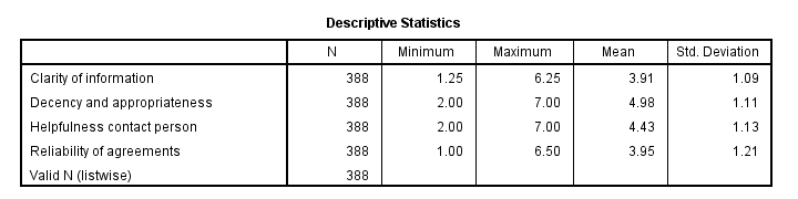
This descriptives table shows how we interpreted our factors. Because we computed them as means, they have the same 1 - 7 scales as our input variables. This allows us to conclude that
- “Decency and appropriateness” is rated best (roughly 5.0 out of 7 points) and
- “Clarity of information” is rated worst (roughly 3.9 out of 7 points).
Thanks for reading!
SPSS FILTER – Quick & Simple Tutorial
SPSS FILTER temporarily excludes a selection of cases
from all data analyses.
For excluding cases from data editing, use DO IF or IF instead.
Quick Overview Contents
- SPSS Filtering Basics
- Example 1 - Exclude Cases with Many Missing Values
- Example 2 - Filter on 2 Variables
- Example 3 - Filter without Filter Variable
- Tip - Commands with Built-In Filters
- Warning - Data Editing with Filter
SPSS FILTER - Example Data
I'll use bank_clean.sav -partly shown below- for all examples in this tutorial. This file contains the data from a small bank employee survey. Feel free to download these data and rerun the examples yourself.
SPSS Filtering Basics
Filtering in SPSS usually involves 4 steps:
- create a filter variable;
- activate the filter variable;
- run one or many analyses -such as correlations, ANOVA or a chi-square test- with the filter variable in effect;
- deactivate the filter variable.
In theory, any variable can be used as a filter variable. After activating it, cases with
- zeroes,
- user missing values or
- system missing values
on the filter variable are excluded from all analyses until you deactivate the filter. For the sake of clarity, I recommend you only use filter variables containing 0 or 1 for each case. Enough theory. Let's put things into practice.
Example 1 - Exclude Cases with Many Missing Values
At the end of our data, we find 9 rating scales: q1 to q9. Perhaps we'd like to run a factor analysis on them or use them as predictors in regression analysis. In any case, we may want to exclude cases having many missing values on these variables. We'll first just count them by running the syntax below.
compute mis_1 = nmiss(q1 to q9).
*Apply variable label.
variable labels mis_1 'Number of missings on q1 to q9'.
*Check frequencies.
frequencies mis_1.
Result
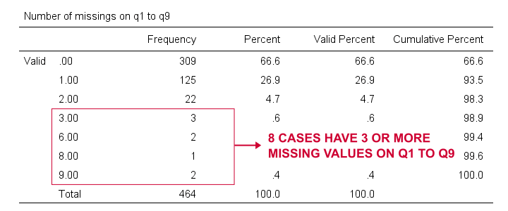
Based on this frequency distribution, we decided to exclude the 8 cases having 3 or more missing values on q1 to q9. We'll create our filter variable with a simple RECODE as shown below.
recode mis_1 (lo thru 2 = 1)(else = 0) into filt_1.
*Apply variable label.
variable labels filt_1 'Filter out cases with 3 or more missings on q1 to q9'.
*Activate filter variable.
filter by filt_1.
*Reinspect numbers of missings over q1 to q9.
frequencies mis_1.
Result
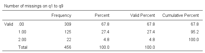
Note that SPSS now reports 456 instead of 464 cases. The 8 cases with 3 or more missing values are still in our data but they are excluded from all analyses. We can see why in data view as shown below.
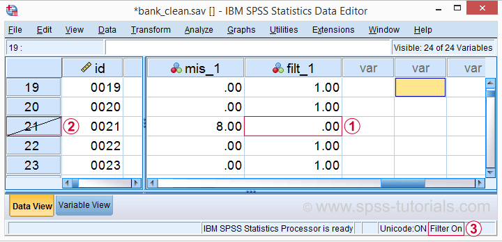
Case 21 has 8 missing values on q1 to q9 and we recoded this into zero on our filter variable.
The strikethrough its $casenum shows that case 21 is currently filtered out.
The status bar confirms that a filter variable is in effect.
Finally, let's deactivate our filter by simply running
FILTER OFF.
We'll leave our filter variable filt_1 in the data. It won't bother us in any way.
Example 2 - Filter on 2 Variables
For some other analysis, we'd like to use only female respondents working in sales or marketing. A good starting point is running a very simple contingency table as shown below.
set tnumbers both.
*Show frequencies for job type per gender.
crosstabs gender by jtype.
Result
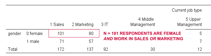
As our table shows, we've 181 female respondents working in either sales or marketing. We'll now create a new filter variable holding only zeroes. We'll then set it to 1 for our case selection with a simple IF command.
compute filt_2 = 0.
*Set filter to 1 for females in job types 1 and 2.
if(gender = 0 & jtype <= 2) filt_2 = 1.
*Apply variable label.
variable labels filt_2 'Filter in females working in sales and marketing'.
*Activate filter.
filter by filt_2.
*Confirm filter working properly.
crosstabs gender by jtype.
Rerunning our contingency table (not shown) confirms that SPSS now reports only 181 female cases working in marketing or sales. Also note that we now have 2 filter variables in our data and that's just fine but only 1 filter variable can be active at any time. Ok. Let's deactivate our new filter variable as well with FILTER OFF.
Example 3 - Filter without Filter Variable
Experienced SPSS users may know that
- TEMPORARY can “undo” some data editing that follow it and
- SELECT IF permanently deletes cases from your data.
By combining them you can circumvent the need for creating a filter variable but for 1 analysis at the time only. The example below shows just that: the first CROSSTABS is limited to a selection of cases but also rolls back our case deletion. The second CROSSTABS therefore includes all cases again.
temporary.
*Delete cases unless gender = 1 & jtype = 3.
select if (gender = 1 & jtype = 3).
*Crosstabs includes only males in IT and rolls back case selection.
crosstabs gender by jtype.
*Crosstabs includes all cases again.
crosstabs gender by jtype.
Tip - Commands with Built-In Filters
Something else you may want to know is that some commands have a built-in filter. These are
- REGRESSION,
- LOGISTIC REGRESSION,
- FACTOR and
- DISCRIMINANT.
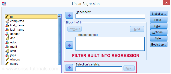
The dialog suggests you can filter cases -for this command only- based on just 1 variable. I suspect you can enter more complex conditions on the resulting /SELECT subcommand as well. I haven't tried it.
In any case, I think these built-in filters can be very handy and it kinda puzzles me they're only limited to the 4 aforementioned commands.
Warning - Data Editing with Filter
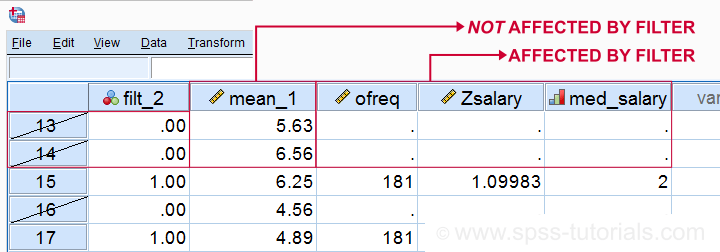
Most data editing in SPSS is unaffected by filtering. For example, computing means over variables -as shown below- affects all cases, regardless of whatever filter is active. We therefore need DO IF or IF to restrict this transformation to a selection of cases. However, an active filter does affect functions over cases. Some examples that we'll demonstrate below are
- adding a case count with AGGREGATE;
- computing z-scores for one or many variables;
- adding ranks, or percentiles with RANK.
SPSS Data Editing Affected by Filter Examples
filter by filt_2.
*Not affected by filter: add mean over q1 to q9 to data.
compute mean_1 = mean(q1 to q9).
execute.
*Affected by filter: add case count to data.
aggregate outfile * mode addvariables
/ofreq = n.
*Affected by filter: add z-scores salary to data..
descriptives salary
/save.
*Affected by filter: add median groups salary to data.
rank salary
/ntiles(2) into med_salary.
Result
Right. So that's pretty much all about filtering in SPSS. I hope you found this tutorial helpful and
Thanks for reading!
Effect Size – A Quick Guide
Effect size is an interpretable number that quantifies
the difference between data and some hypothesis.
Statistical significance is roughly the probability of finding your data if some hypothesis is true. If this probability is low, then this hypothesis probably wasn't true after all. This may be a nice first step, but what we really need to know is how much do the data differ from the hypothesis? An effect size measure summarizes the answer in a single, interpretable number. This is important because
- effect sizes allow us to compare effects -both within and across studies;
- we need an effect size measure to estimate (1 - β) or power. This is the probability of rejecting some null hypothesis given some alternative hypothesis;
- even before collecting any data, effect sizes tell us which sample sizes we need to obtain a given level of power -often 0.80.
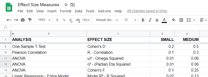
Overview Effect Size Measures
For an overview of effect size measures, please consult this Googlesheet shown below. This Googlesheet is read-only but can be downloaded and shared as Excel for sorting, filtering and editing.
Chi-Square Tests
Common effect size measures for chi-square tests are
- Cohen’s W (both chi-square tests);
- Cramér’s V (chi-square independence test) and
- the contingency coefficient (chi-square independence test) .
Chi-Square Tests - Cohen’s W
Cohen’s W is the effect size measure of choice for
Basic rules of thumb for Cohen’s W8 are
- small effect: w = 0.10;
- medium effect: w = 0.30;
- large effect: w = 0.50.
Cohen’s W is computed as
$$W = \sqrt{\sum_{i = 1}^m\frac{(P_{oi} - P_{ei})^2}{P_{ei}}}$$
where
- \(P_{oi}\) denotes observed proportions and
- \(P_{ei}\) denotes expected proportions under the null hypothesis for
- \(m\) cells.
For contingency tables, Cohen’s W can also be computed from the contingency coefficient \(C\) as
$$W = \sqrt{\frac{C^2}{1 - C^2}}$$
A third option for contingency tables is to compute Cohen’s W from Cramér’s V as
$$W = V \sqrt{d_{min} - 1}$$
where
- \(V\) denotes Cramér's V and
- \(d_{min}\) denotes the smallest table dimension -either the number of rows or columns.
Cohen’s W is not available from any statistical packages we know. For contingency tables, we recommend computing it from the aforementioned contingency coefficient.
For chi-square goodness-of-fit tests for frequency distributions your best option is probably to compute it manually in some spreadsheet editor. An example calculation is presented in this Googlesheet.
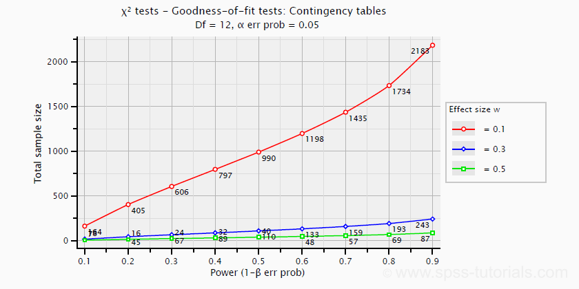
Power and required sample sizes for chi-square tests can't be directly computed from Cohen’s W: they depend on the df -short for degrees of freedom- for the test. The example chart below applies to a 5 · 4 table, hence df = (5 - 1) · (4 -1) = 12.
T-Tests
Common effect size measures for t-tests are
- Cohen’s D (all t-tests) and
- the point-biserial correlation (only independent samples t-test).
T-Tests - Cohen’s D
Cohen’s D is the effect size measure of choice for all 3 t-tests:
- the independent samples t-test,
- the paired samples t-test and
- the one sample t-test.
Basic rules of thumb are that8
- |d| = 0.20 indicates a small effect;
- |d| = 0.50 indicates a medium effect;
- |d| = 0.80 indicates a large effect.
For an independent-samples t-test, Cohen’s D is computed as
$$D = \frac{M_1 - M_2}{S_p}$$
where
- \(M_1\) and \(M_2\) denote the sample means for groups 1 and 2 and
- \(S_p\) denotes the pooled estimated population standard deviation.
A paired-samples t-test is technically a one-sample t-test on difference scores. For this test, Cohen’s D is computed as
$$D = \frac{M - \mu_0}{S}$$
where
- \(M\) denotes the sample mean,
- \(\mu_0\) denotes the hypothesized population mean (difference) and
- \(S\) denotes the estimated population standard deviation.
Cohen’s D is present in JASP as well as SPSS (version 27 onwards). For a thorough tutorial, please consult Cohen’s D - Effect Size for T-Tests.
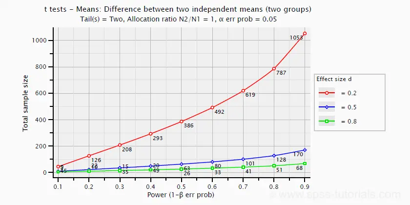
The chart below shows how power and required total sample size are related to Cohen’s D. It applies to an independent-samples t-test where both sample sizes are equal.
Pearson Correlations
For a Pearson correlation, the correlation itself (often denoted as r) is interpretable as an effect size measure. Basic rules of thumb are that8
- r = 0.10 indicates a small effect;
- r = 0.30 indicates a medium effect;
- r = 0.50 indicates a large effect.
Pearson correlations are available from all statistical packages and spreadsheet editors including Excel and Google sheets.
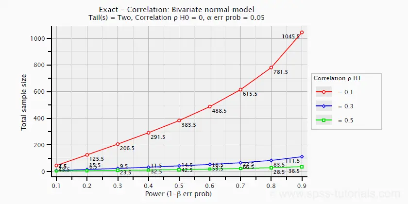
The chart below -created in G*Power- shows how required sample size and power are related to effect size.
ANOVA
Common effect size measures for ANOVA are
- \(\color{#0a93cd}{\eta^2}\) or (partial) eta squared;
- Cohen’s F;
- \(\color{#0a93cd}{\omega^2}\) or omega-squared.
ANOVA - (Partial) Eta Squared
Partial eta squared -denoted as η2- is the effect size of choice for
- ANOVA (between-subjects, one-way or factorial);
- repeated measures ANOVA (one-way or factorial);
- mixed ANOVA.
Basic rules of thumb are that
- η2 = 0.01 indicates a small effect;
- η2 = 0.06 indicates a medium effect;
- η2 = 0.14 indicates a large effect.
Partial eta squared is calculated as
$$\eta^2_p = \frac{SS_{effect}}{SS_{effect} + SS_{error}}$$
where
- \(\eta^2_p\) denotes partial eta-squared and
- \(SS\) denotes effect and error sums of squares.
This formula also applies to one-way ANOVA, in which case partial eta squared is equal to eta squared.
Partial eta squared is available in all statistical packages we know, including JASP and SPSS. For the latter, see How to Get (Partial) Eta Squared from SPSS?
ANOVA - Cohen’s F
Cohen’s f is an effect size measure for
- ANOVA (between-subjects, one-way or factorial);
- repeated measures ANOVA (one-way or factorial);
- mixed ANOVA.
Cohen’s f is computed as
$$f = \sqrt{\frac{\eta^2_p}{1 - \eta^2_p}}$$
where \(\eta^2_p\) denotes (partial) eta-squared.
Basic rules of thumb for Cohen’s f are that8
- f = 0.10 indicates a small effect;
- f = 0.25 indicates a medium effect;
- f = 0.40 indicates a large effect.
G*Power computes Cohen’s f from various other measures. We're not aware of any other software packages that compute Cohen’s f.
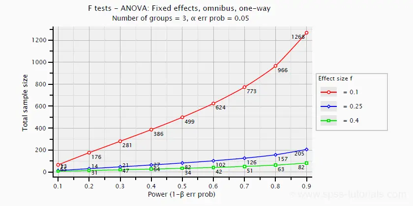
Power and required sample sizes for ANOVA can be computed from Cohen’s f and some other parameters. The example chart below shows how required sample size relates to power for small, medium and large effect sizes. It applies to a one-way ANOVA on 3 equally large groups.
ANOVA - Omega Squared
A less common but better alternative for (partial) eta-squared is \(\omega^2\) or Omega squared computed as
$$\omega^2 = \frac{SS_{effect} - df_{effect}\cdot MS_{error}}{SS_{total} + MS_{error}}$$
where
- \(SS\) denotes sums of squares;
- \(df\) denotes degrees of freedom;
- \(MS\) denotes mean squares.
Similarly to (partial) eta squared, \(\omega^2\) estimates which proportion of variance in the outcome variable is accounted for by an effect in the entire population. The latter, however, is a less biased estimator.1,2,6 Basic rules of thumb are5
- Small effect: ω2 = 0.01;
- Medium effect: ω2 = 0.06;
- Large effect: ω2 = 0.14.
\(\omega^2\) is available in SPSS version 27 onwards but only if you run your ANOVA from
![]()
![]() The other ANOVA options in SPSS (via General Linear Model or Means) do not yet include \(\omega^2\). However, it's also calculated pretty easily by copying a standard ANOVA table into Excel and entering the formula(s) manually.
The other ANOVA options in SPSS (via General Linear Model or Means) do not yet include \(\omega^2\). However, it's also calculated pretty easily by copying a standard ANOVA table into Excel and entering the formula(s) manually.
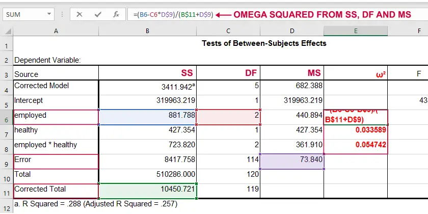 Note: you need “Corrected total” for computing omega-squared from SPSS output.
Linear Regression
Effect size measures for (simple and multiple) linear regression are
- \(\color{#0a93cd}{f^2}\) (entire model and individual predictor);
- \(R^2\) (entire model);
- \(r_{part}^2\) -squared semipartial (or “part”) correlation (individual predictor).
Linear Regression - F-Squared
The effect size measure of choice for (simple and multiple) linear regression is \(f^2\). Basic rules of thumb are that8
- \(f^2\) = 0.02 indicates a small effect;
- \(f^2\) = 0.15 indicates a medium effect;
- \(f^2\) = 0.35 indicates a large effect.
\(f^2\) is calculated as
$$f^2 = \frac{R_{inc}^2}{1 - R_{inc}^2}$$
where \(R_{inc}^2\) denotes the increase in r-square for a set of predictors over another set of predictors. Both an entire multiple regression model and an individual predictor are special cases of this general formula.
For an entire model, \(R_{inc}^2\) is the r-square increase for the predictors in the model over an empty set of predictors. Without any predictors, we estimate the grand mean of the dependent variable for each observation and we have \(R^2 = 0\). In this case, \(R_{inc}^2 = R^2_{model} - 0 = R^2_{model}\) -the “normal” r-square for a multiple regression model.
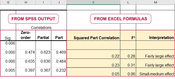
For an individual predictor, \(R_{inc}^2\) is the r-square increase resulting from adding this predictor to the other predictor(s) already in the model. It is equal to \(r^2_{part}\) -the squared semipartial (or “part”) correlation for some predictor. This makes it very easy to compute \(f^2\) for individual predictors in Excel as shown below.
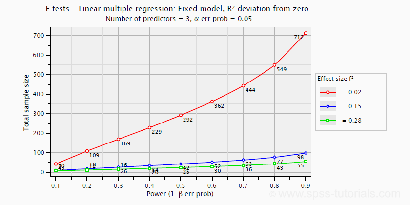
\(f^2\) is useful for computing the power and/or required sample size for a regression model or individual predictor. However, these also depend on the number of predictors involved. The figure below shows how required sample size depends on required power and estimated (population) effect size for a multiple regression model with 3 predictors.
Right, I think that should do for now. We deliberately limited this tutorial to the most important effect size measures in a (perhaps futile) attempt to not overwhelm our readers. If we missed something crucial, please throw us a comment below. Other than that,
thanks for reading!
References
- Van den Brink, W.P. & Koele, P. (2002). Statistiek, deel 3 [Statistics, part 3]. Amsterdam: Boom.
- Warner, R.M. (2013). Applied Statistics (2nd. Edition). Thousand Oaks, CA: SAGE.
- Agresti, A. & Franklin, C. (2014). Statistics. The Art & Science of Learning from Data. Essex: Pearson Education Limited.
- Hair, J.F., Black, W.C., Babin, B.J. et al (2006). Multivariate Data Analysis. New Jersey: Pearson Prentice Hall.
- Field, A. (2013). Discovering Statistics with IBM SPSS Statistics. Newbury Park, CA: Sage.
- Howell, D.C. (2002). Statistical Methods for Psychology (5th ed.). Pacific Grove CA: Duxbury.
- Siegel, S. & Castellan, N.J. (1989). Nonparametric Statistics for the Behavioral Sciences (2nd ed.). Singapore: McGraw-Hill.
- Cohen, J (1988). Statistical Power Analysis for the Social Sciences (2nd. Edition). Hillsdale, New Jersey, Lawrence Erlbaum Associates.
- Pituch, K.A. & Stevens, J.P. (2016). Applied Multivariate Statistics for the Social Sciences (6th. Edition). New York: Routledge.
SPSS Shapiro-Wilk Test – Quick Tutorial with Example
- Shapiro-Wilk Test - What is It?
- Shapiro-Wilk Test - Null Hypothesis
- Running the Shapiro-Wilk Test in SPSS
- Shapiro-Wilk Test - Interpretation
- Reporting a Shapiro-Wilk Test in APA style
Shapiro-Wilk Test - What is It?
The Shapiro-Wilk test examines if a variable
is normally distributed in some population.
Like so, the Shapiro-Wilk serves the exact same purpose as the Kolmogorov-Smirnov test. Some statisticians claim the latter is worse due to its lower statistical power. Others disagree.
As an example of a Shapiro-Wilk test, let's say a scientist claims that the reaction times of all people -a population- on some task are normally distributed. He draws a random sample of N = 233 people and measures their reaction times. A histogram of the results is shown below.
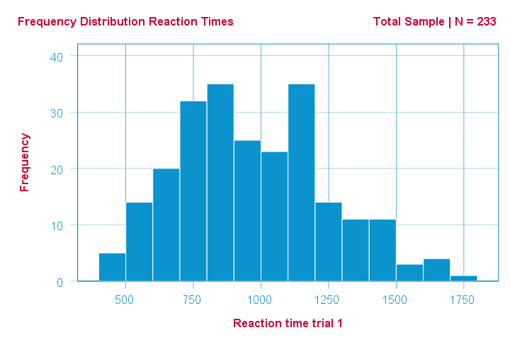
This frequency distribution seems somewhat bimodal. Other than that, it looks reasonably -but not exactly- normal. However, sample outcomes usually differ from their population counterparts. The big question is:
how likely is the observed distribution if the reaction times
are exactly normally distributed in the entire population?
The Shapiro-Wilk test answers precisely that.
How Does the Shapiro-Wilk Test Work?
A technically correct explanation is given on this Wikipedia page. However, a simpler -but not technically correct- explanation is this: the Shapiro-Wilk test first quantifies the similarity between the observed and normal distributions as a single number: it superimposes a normal curve over the observed distribution as shown below. It then computes which percentage of our sample overlaps with it: a similarity percentage.
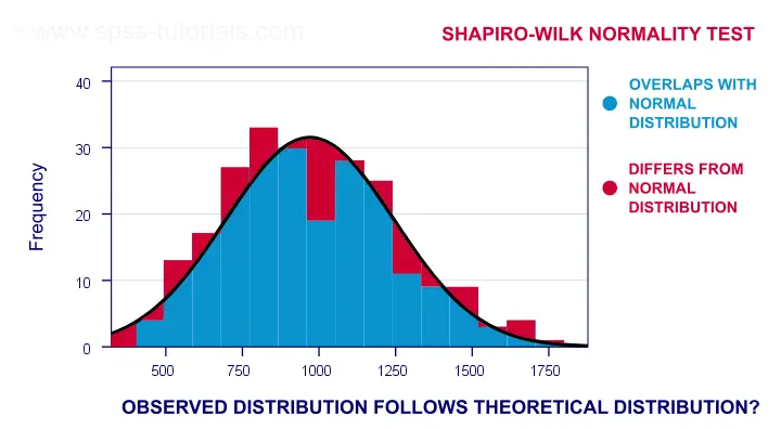
Finally, the Shapiro-Wilk test computes the probability of finding this observed -or a smaller- similarity percentage. It does so under the assumption that the population distribution is exactly normal: the null hypothesis.
Shapiro-Wilk Test - Null Hypothesis
The null hypothesis for the Shapiro-Wilk test is that a variable is normally distributed in some population.
A different way to say the same is that a variable’s values are a simple random sample from a normal distribution. As a rule of thumb, we
reject the null hypothesis if p < 0.05.
So in this case we conclude that our variable is not normally distributed.
Why? Well, p is basically the probability of finding our data if the null hypothesis is true. If this probability is (very) small -but we found our data anyway- then the null hypothesis was probably wrong.
Shapiro-Wilk Test - SPSS Example Data
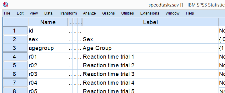
A sample of N = 236 people completed a number of speedtasks. Their reaction times are in speedtasks.sav, partly shown below. We'll only use the first five trials in variables r01 through r05.
I recommend you always thoroughly inspect all variables you'd like to analyze. Since our reaction times in milliseconds are quantitative variables, we'll run some quick histograms over them. I prefer doing so from the short syntax below. Easier -but slower- methods are covered in Creating Histograms in SPSS.
frequencies r01 to r05
/format notable
/histogram normal.
Results
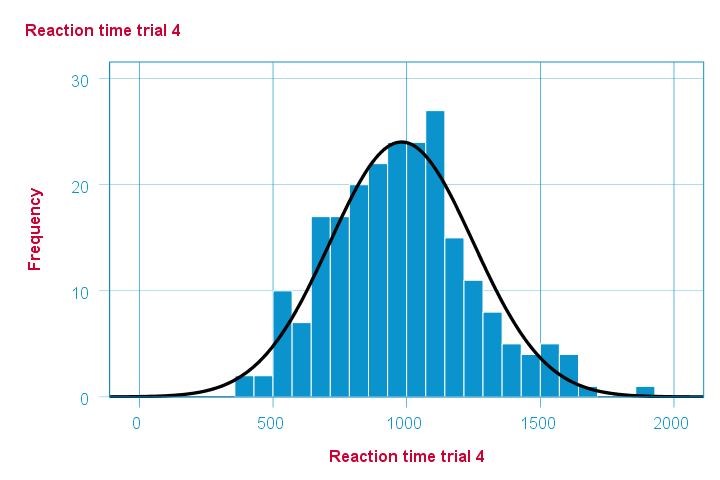
Note that some of the 5 histograms look messed up. Some data seem corrupted and had better not be seriously analyzed. An exception is trial 4 (shown below) which looks plausible -even reasonably normally distributed.
Descriptive Statistics - Skewness & Kurtosis
If you're reading this to complete some assignment, you're probably asked to report some descriptive statistics for some variables. These often include the median, standard deviation, skewness and kurtosis. Why? Well, for a normal distribution,
- skewness = 0: it's absolutely symmetrical and
- kurtosis = 0 too: it's neither peaked (“leptokurtic”) nor flattened (“platykurtic”).
So if we sample many values from such a distribution, the resulting variable should have both skewness and kurtosis close to zero. You can get such statistics from FREQUENCIES but I prefer using MEANS: it results in the best table format and its syntax is short and simple.
means r01 to r05
/cells count mean median stddev skew kurt.
*Optionally: transpose table (requires SPSS 22 or higher).
output modify
/select tables
/if instances = last /*process last table in output, whatever it is...
/table transpose = yes.
Results
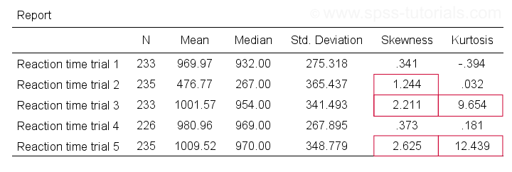
Trials 2, 3 and 5 all have a huge skewness and/or kurtosis. This suggests that they are not normally distributed in the entire population. Skewness and kurtosis are closer to zero for trials 1 and 4.
So now that we've a basic idea what our data look like, let's proceed with the actual test.
Running the Shapiro-Wilk Test in SPSS
The screenshots below guide you through running a Shapiro-Wilk test correctly in SPSS. We'll add the resulting syntax as well.
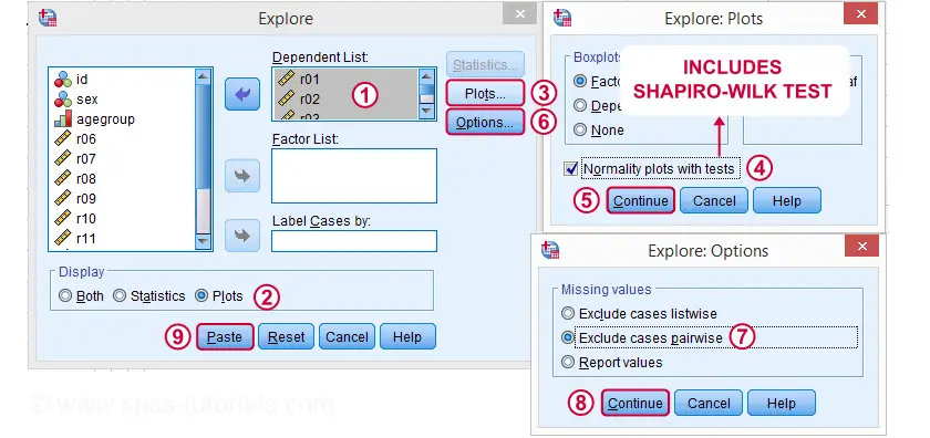
Following these screenshots results in the syntax below.
EXAMINE VARIABLES=r01 r02 r03 r04 r05
/PLOT BOXPLOT NPPLOT
/COMPARE GROUPS
/STATISTICS DESCRIPTIVES
/CINTERVAL 95
/MISSING PAIRWISE /*IMPORTANT!
/NOTOTAL.
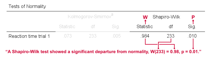
Running this syntax creates a bunch of output. However, the one table we're looking for -“Tests of Normality”- is shown below.
Shapiro-Wilk Test - Interpretation
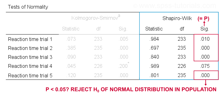
We reject the null hypotheses of normal population distributions
for trials 1, 2, 3 and 5 at α = 0.05.
“Sig.” or p is the probability of finding the observed -or a larger- deviation from normality in our sample if the distribution is exactly normal in our population. If trial 1 is normally distributed in the population, there's a mere 0.01 -or 1%- chance of finding these sample data. These values are unlikely to have been sampled from a normal distribution. So the population distribution probably wasn't normal after all.
We therefore reject this null hypothesis. Conclusion: trials 1, 2, 3 and 5 are probably not normally distributed in the population.
The only exception is trial 4: if this variable is normally distributed in the population, there's a 0.075 -or 7.5%- chance of finding the nonnormality observed in our data. That is, there's a reasonable chance that this nonnormality is solely due to sampling error. So
for trial 4, we retain the null hypothesis
of population normality because p > 0.05.
We can't tell for sure if the population distribution is normal. But given these data, we'll believe it. For now anyway.
Reporting a Shapiro-Wilk Test in APA style
For reporting a Shapiro-Wilk test in APA style, we include 3 numbers:
- the test statistic W -mislabeled “Statistic” in SPSS;
- its associated df -short for degrees of freedom and
- its significance level p -labeled “Sig.” in SPSS.
The screenshot shows how to put these numbers together for trial 1.
Limited Usefulness of Normality Tests
The Shapiro-Wilk and Kolmogorov-Smirnov test both examine if a variable is normally distributed in some population. But why even bother? Well, that's because many statistical tests -including ANOVA, t-tests and regression- require the normality assumption: variables must be normally distributed in the population. However,
the normality assumption is only needed for small sample sizes
of -say- N ≤ 20 or so. For larger sample sizes, the sampling distribution of the mean is always normal, regardless how values are distributed in the population. This phenomenon is known as the central limit theorem. And the consequence is that many test results are unaffected by even severe violations of normality.
So if sample sizes are reasonable, normality tests are often pointless. Sadly, few statistics instructors seem to be aware of this and still bother students with such tests. And that's why I wrote this tutorial anyway.
Hey! But what if sample sizes are small, say N < 20 or so? Well, in that case, many tests do require normally distributed variables. However, normality tests typically have low power in small sample sizes. As a consequence, even substantial deviations from normality may not be statistically significant. So when you really need normality, normality tests are unlikely to detect that it's actually violated. Which renders them pretty useless.
Thanks for reading.
How to Run Levene’s Test in SPSS?
Levene’s test examines if 2+ populations all have
equal variances on some variable.
Levene’s Test - What Is It?
If we want to compare 2(+) groups on a quantitative variable, we usually want to know if they have equal mean scores. For finding out if that's the case, we often use
- an independent samples t-test for comparing 2 groups or
- a one-way ANOVA for comparing 3+ groups.
Both tests require the homogeneity (of variances) assumption: the population variances of the dependent variable must be equal within all groups. However, you don't always need this assumption:
- you don't need to meet the homogeneity assumption if the groups you're comparing have roughly equal sample sizes;
- you do need this assumption if your groups have sharply different sample sizes.
Now, we usually don't know our population variances but we do know our sample variances. And if these don't differ too much, then the population variances being equal seems credible.
But how do we know if our sample variances differ “too much”? Well, Levene’s test tells us precisely that.
Null Hypothesis
The null hypothesis for Levene’s test is that the groups we're comparing all have equal population variances. If this is true, we'll probably find slightly different variances in samples from these populations. However, very different sample variances suggest that the population variances weren't equal after all. In this case we'll reject the null hypothesis of equal population variances.
Levene’s Test - Assumptions
Levene’s test basically requires two assumptions:
- independent observations and
- the test variable is quantitative -that is, not nominal or ordinal.
Levene’s Test - Example
A fitness company wants to know if 2 supplements for stimulating body fat loss actually work. They test 2 supplements (a cortisol blocker and a thyroid booster) on 20 people each. An additional 40 people receive a placebo.
All 80 participants have body fat measurements at the start of the experiment (week 11) and weeks 14, 17 and 20. This results in fatloss-unequal.sav, part of which is shown below.
One approach to these data is comparing body fat percentages over the 3 groups (placebo, thyroid, cortisol) for each week separately.Perhaps a better approach to these data is using a single mixed ANOVA. Weeks would be the within-subjects factor and supplement would be the between-subjects factor. For now, we'll leave it as an exercise to the reader to carry this out. This can be done with an ANOVA for each of the 4 body fat measurements. However, since we've unequal sample sizes, we first need to make sure that our supplement groups have equal variances.
Running Levene’s test in SPSS
Several SPSS commands contain an option for running Levene’s test. The easiest way to go -especially for multiple variables- is the One-Way ANOVA dialog.This dialog was greatly improved in SPSS version 27 and now includes measures of effect size such as (partial) eta squared. So let's navigate to
![]()
![]() and fill out the dialog that pops up.
and fill out the dialog that pops up.
As shown below,  the Homogeneity of variance test under Options refers to Levene’s test.
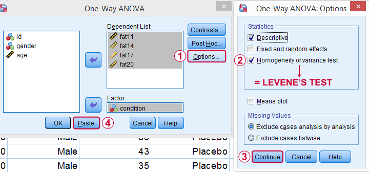
Clicking results in the syntax below. Let's run it.
SPSS Levene’s Test Syntax Example
ONEWAY fat11 fat14 fat17 fat20 BY condition
/STATISTICS DESCRIPTIVES HOMOGENEITY
/MISSING ANALYSIS.
Output for Levene’s test
On running our syntax, we get several tables. The second -shown below- is the Test of Homogeneity of Variances. This holds the results of Levene’s test.
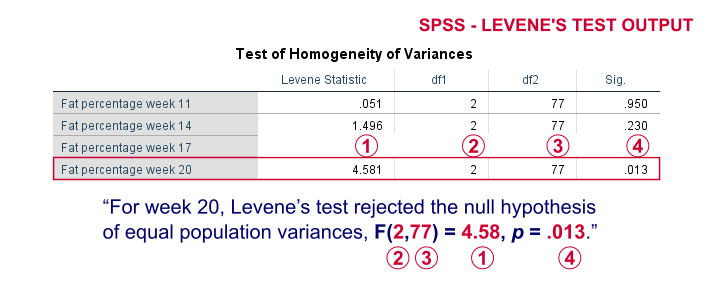
As a rule of thumb, we conclude that population variances are not equal if “Sig.” or p < 0.05. For the first 2 variables, p > 0.05: for fat percentage in weeks 11 and 14 we don't reject the null hypothesis of equal population variances.
For the last 2 variables, p < 0.05: for fat percentages in weeks 17 and 20, we reject the null hypothesis of equal population variances. So these 2 variables violate the homogeity of variance assumption needed for an ANOVA.
Descriptive Statistics Output
Remember that we don't need equal population variances if we have roughly equal sample sizes. A sound way for evaluating if this holds is inspecting the Descriptives table in our output.
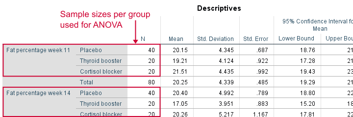
As we see, our ANOVA is based on sample sizes of 40, 20 and 20 for all 4 dependent variables. Because they're not (roughly) equal, we do need the homogeneity of variance assumption but it's not met by 2 variables.
In this case, we'll report alternative measures (Welch and Games-Howell) that don't require the homogeneity assumption. How to run and interpret these is covered in SPSS ANOVA - Levene’s Test “Significant”.
Reporting Levene’s test
Perhaps surprisingly, Levene’s test is technically an ANOVA as we'll explain here. We therefore report it like just a basic ANOVA too. So we'll write something like “Levene’s test showed that the variances for body fat percentage in week 20 were not equal, F(2,77) = 4.58, p = .013.”
Levene’s Test - How Does It Work?
Levene’s test works very simply: a larger variance means that -on average- the data values are “further away” from their mean. The figure below illustrates this: watch the histograms become “wider” as the variances increase.
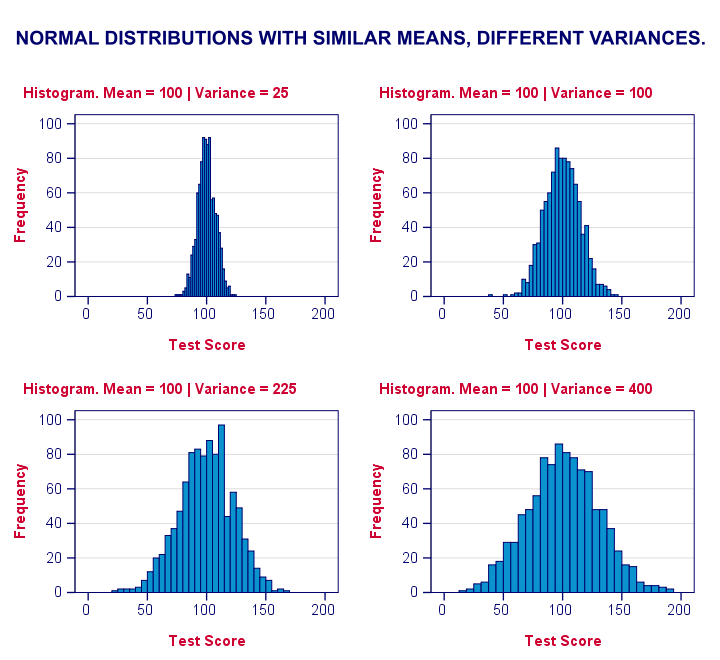
We therefore compute the absolute differences between all scores and their (group) means. The means of these absolute differences should be roughly equal over groups. So technically, Levene’s test is an ANOVA on the absolute difference scores. In other words: we run an ANOVA (on absolute differences) to find out if we can run an ANOVA (on our actual data).
If that confuses you, try running the syntax below. It does exactly what I just explained.
“Manual” Levene’s Test Syntax
aggregate outfile * mode addvariables
/break condition
/mfat20 = mean(fat20).
*Compute absolute differences between fat20 and group means.
compute adfat20 = abs(fat20 - mfat20).
*Run minimal ANOVA on absolute differences. F-test identical to previous Levene's test.
ONEWAY adfat20 BY condition.
Result
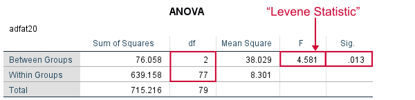
As we see, these ANOVA results are identical to Levene’s test in the previous output. I hope this clarifies why we report it as an ANOVA as well.
Thanks for reading!
SPSS SELECT IF – Tutorial & Examples
Quick Overview Contents
In SPSS, SELECT IF permanently removes
a selection of cases (rows) from your data.
- Example 1 - Selection for 1 Variable
- Example 2 - Selection for 2 Variables
- Example 3 - Selection for (Non) Missing Values
- Tip 1 - Inspect Selection Before Deletion
- Tip 2 - Use TEMPORARY
Summary
SELECT IF in SPSS basically means “delete all cases that don't satisfy one or more conditions”. Like so, select if(gender = 'female'). permanently deletes all cases whose gender is not female. Let's now walk through some real world examples using bank_clean.sav, partly shown below.
Example 1 - Selection for 1 Variable
Let's first delete all cases who don't have at least a Bachelor's degree. The syntax below:
- inspects the frequency distribution for education level;
- deletes unneeded cases;
- inspects the results.
set tnumbers both.
*Run minimal frequencies table.
frequencies educ.
*Select cases with a Bachelor's degree or higher. Delete all other cases.
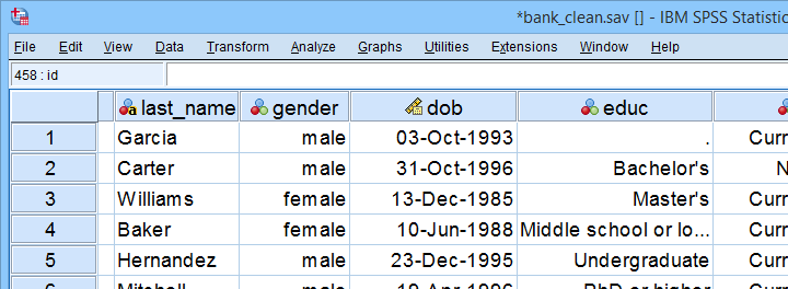
select if(educ >= 4).
*Reinspect frequencies.
frequencies educ.
Result
As we see, our data now only contain cases having a Bachelor's, Master's or PhD degree. Importantly, cases having
on education level have been removed from the data as well.
Example 2 - Selection for 2 Variables
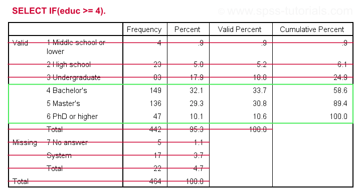
The syntax below selects cases based on gender and education level: we'll keep only female respondents having at least a Bachelor's degree in our data.
crosstabs educ by gender.
*Select females having a Bachelor's degree or higher.
select if(gender = 0 & educ >= 4).
*Reinspect contingency table.
crosstabs educ by gender.
Result
Example 3 - Selection for (Non) Missing Values
Selections based on (non) missing values are straightforward if you master SPSS Missing Values Functions. For example, the syntax below shows 2 options for deleting cases having fewer than 7 valid values on the last 10 variables (overall to q9).
select if(nvalid(overall to q9) >= 7)./*At least 7 valid values or at most 3 missings.
execute.
*Alternative way, exact same result.
select if(nmiss(overall to q9) < 4)./*Fewer than 4 missings or more than 6 valid values.
execute.
Tip 1 - Inspect Selection Before Deletion
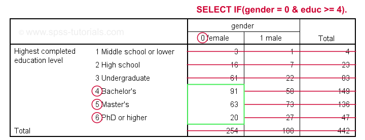
Before deleting cases, I sometimes want to have a quick look at them. A good way for doing so is creating a FILTER variable. The syntax below shows the right way for doing so.
compute filt_1 = 0.
*Set filter variable to 1 for cases we want to keep in data.
if(nvalid(overall to q9) >= 7) filt_1 = 1.
*Move unselected cases to bottom of dataset.
sort cases by filt_1 (d).
*Scroll to bottom of dataset now. Note that cases 459 - 464 will be deleted because they have 0 on filt_1.
*If selection as desired, delete other cases.
select if(filt_1).
execute.
Quick note: select if(filt_1). is a shorthand for select if(filt_1 <> 0). and deletes cases having either a zero or a missing value on filt_1.
Result
 Cases that will be deleted are at the bottom of our data. We also readily see we'll have 458 cases left after doing so.
Tip 2 - Use TEMPORARY
A final tip I want to mention is combining SELECT IF with TEMPORARY. By doing so, SELECT IF only applies to the first procedure that follows it. For a quick example, compare the results of the first and second FREQUENCIES commands below.
temporary.
*Select only female cases.
select if(gender = 0).
*Any procedure now uses only female cases. This also reverses case selection.
frequencies gender educ.
*Rerunning frequencies now uses all cases in data again.
frequencies gender educ.
Final Notes
First off, parentheses around conditions in syntax are not required. Therefore, select if(gender = 0). can also be written as select if gender = 0. I used to think that shorter syntax is always better but I changed my mind over the years. Readability and clear structure are important too. I therefore use (and recommend) parentheses around conditions. This also goes for IF and DO IF.
Right, I guess that should do. Did I miss anything? Please let me know by throwing a comment below.
Thanks for reading!
SPSS IF – A Quick Tutorial
In SPSS, IF computes a new or existing variable
for a selection of cases.
For analyzing a selection of cases, use FILTER or SELECT IF instead.
- Example 1 - Flag Cases Based on Date Function
- Example 2 - Replace Range of Values by Function
- Example 3 - Compute Variable Differently Based on Gender
- SPSS IF Versus DO IF
- SPSS IF Versus RECODE
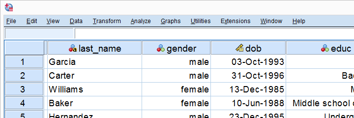
Data File Used for Examples
All examples use bank.sav, a short survey of bank employees. Part of the data are shown below. For getting the most out of this tutorial, we recommend you download the file and try the examples for yourself.
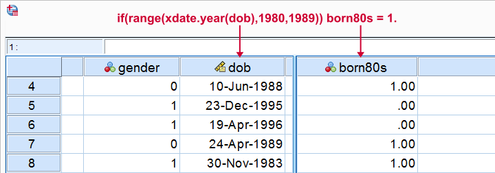
Example 1 - Flag Cases Based on Date Function
Let's flag all respondents born during the 80’s. The syntax below first computes our flag variable -born80s- as a column of zeroes. We then set it to one if the year -extracted from the date of birth- is in the RANGE 1980 through 1989.
compute born80s = 0.
*Set value to 1 if respondent born between 1980 and 1989.
if(range(xdate.year(dob),1980,1989)) born80s = 1.
execute.
*Optionally: add value labels.
add value labels born80s 0 'Not born during 80s' 1 'Born during 80s'.
Result
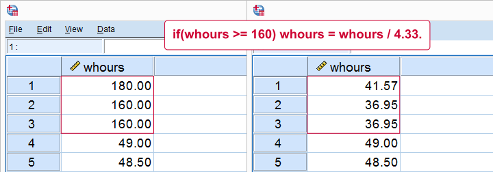
Example 2 - Replace Range of Values by Function
Next, if we'd run a histogram on weekly working hours -whours- we'd see values of 160 hours and over. However, weeks only hold (24 * 7 =) 168 hours. Even Kim Jong Un wouldn't claim he works 160 hours per week!
We assume these respondents filled out their monthly -rather than weekly- working hours. On average, months hold (52 / 12 =) 4.33 weeks. So we'll divide weekly hours by 4.33 but only for cases scoring 160 or over.
sort cases by whours (d).
*Divide 160 or more hours by 4.33 (average weeks per month).
if(whours >= 160) whours = whours / 4.33.
execute.
Result
Note
We could have done this correction with RECODE as well: RECODE whours (160 = 36.95)(180 = 41.57). Note, however, that RECODE becomes tedious insofar as we must correct more distinct values. It works reasonably for this variable but IF works great for all variables.
Example 3 - Compute Variable Differently Based on Gender
We'll now flag cases who work fulltime. However, “fulltime” means 40 hours for male employees and 36 hours for female employees. So we need to use different formulas based on gender. The IF command below does just that.
compute fulltime = 0.
*Set fulltime to 1 if whours >= 36 for females or whours >= 40 for males.
if(gender = 0 & whours >= 36) fulltime = 1.
if(gender = 1 & whours >= 40) fulltime = 1.
*Optionally, add value labels.
add value labels fulltime 0 'Not working fulltime' 1 'Working fulltime'.
*Quick check.
means whours by gender by fulltime
/cells min max mean stddev.
Result
Our syntax ends with a MEANS table showing minima, maxima, means and standard deviations per gender per group. This table -shown below- is a nice way to check the results.
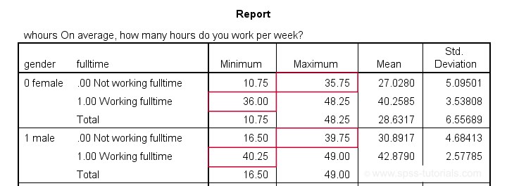
The maximum for females not working fulltime is below 36. The minimum for females working fulltime is 36. And so on.
SPSS IF Versus DO IF
Some SPSS users may be familiar with DO IF. The main differences between DO IF and IF are that
- IF is a single line command while DO IF requires at least 3 lines: DO IF, some transformation(s) and END IF.
- IF is a conditional COMPUTE command whereas DO IF can affect other transformations -such as RECODE or COUNT- as well.
- If cases meet more than 1 condition, the first condition prevails when using DO IF - ELSE IF. If you use multiple IF commands instead, the last condition met by each case takes effect. The syntax below sketches this idea.
DO IF - ELSE IF Versus Multiple IF Commands
do if(condition_1).
result_1.
else if(condition_2). /*excludes cases meeting condition_1.
result_2.
end if.
*IF: respondents meeting both conditions get result_2.
if(condition_1) result_1.
if(condition_2) result_2. /*includes cases meeting condition_1.
SPSS IF Versus RECODE
In many cases, RECODE is an easier alternative for IF. However, RECODE has more limitations too.
First off, RECODE only replaces (ranges of) constants -such as 0, 99 or system missing values- by other constants. So something like
recode overall (sysmis = q1).
is not possible -q1 is a variable, not a constant- but
if(sysmis(overall)) overall = q1.
works fine. You can't RECODE a function -mean, sum or whatever- into anything nor recode anything into a function. You'll need IF for doing so.
Second, RECODE can only set values based on a single variable. This is the reason why
you can't recode 2 variables into one
but you can use an IF condition involving multiple variables:
if(gender = 0 & whours >= 36) fulltime = 1.
is perfectly possible.
You can get around this limitation by combining RECODE with DO IF, however. Like so, our last example shows a different route to flag fulltime working males and females using different criteria.
Example 4 - Compute Variable Differently Based on Gender II
recode whours (40 thru hi = 1)(else = 0) into fulltime2.
*Apply different recode for female respondents.
do if(gender = 0).
recode whours (36 thru hi = 1)(else = 0) into fulltime2.
end if.
*Optionally, add value labels.
add value labels fulltime2 0 'Not working fulltime' 1 'Working fulltime'.
*Quick check.
means whours by gender by fulltime2
/cells min max mean stddev.
Final Notes
This tutorial presented a brief discussion of the IF command with a couple of examples. I hope you found them helpful. If I missed anything essential, please throw me a comment below.
Thanks for reading!
SPSS Missing Values Tutorial
Contents
- SPSS System Missing Values
- SPSS User Missing Values
- Setting User Missing Values
- Inspecting Missing Values per Variable
- SPSS Data Analysis with Missing Values
What are “Missing Values” in SPSS?
In SPSS, “missing values” may refer to 2 things:
- System missing values are values that are completely absent from the data. They are shown as periods in data view.
- User missing values are values that are invisible while analyzing or editing data. The SPSS user specifies which values -if any- must be excluded.
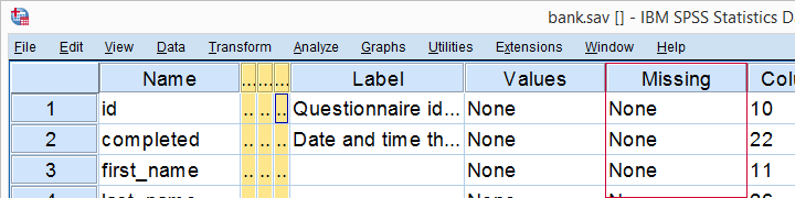
This tutorial walks you through both. We'll use bank.sav -partly shown below- throughout. You'll get the most out of this tutorial if you try the examples for yourself after downloading and opening this file.

SPSS System Missing Values
System missing values are values that are
completely absent from the data.
System missing values are shown as dots in data view as shown below.
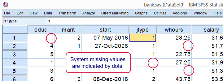
System missing values are only found in numeric variables. String variables don't have system missing values. Data may contain system missing values for several reasons:
- some respondents weren't asked some questions due to the questionnaire routing;
- a respondent skipped some questions;
- something went wrong while converting or editing the data;
- some values weren't recorded due to equipment failure.
In some cases system missing values make perfect sense. For example, say I ask
“do you own a car?”
and somebody answers “no”. Well, then my survey software should skip the next question:
“what color is your car?”
In the data, we'll probably see system missing values on color for everyone who does not own a car. These missing values make perfect sense.
In other cases, however, it may not be clear why there's system missings in your data. Something may or may not have gone wrong. Therefore, you should try to
find out why some values are system missing
especially if there's many of them.
So how to detect and handle missing values in your data? We'll get to that after taking a look at the second type of missing values.
SPSS User Missing Values
User missing values are values that are excluded
when analyzing or editing data.
“User” in user missing refers to the SPSS user. Hey, that's you! So it's you who may need to set some values as user missing. So which -if any- values must be excluded? Briefly,
- for categorical variables, answers such as “don't know” or “no answer” are typically excluded from analysis.
- For metric variables, unlikely values -a reaction time of 50ms or a monthly salary of € 9,999,999- are usually set as user missing.
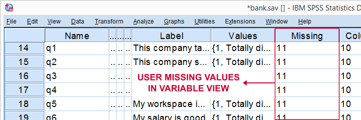
For bank.sav, no user missing values have been set yet, as can be seen in variable view.
Let's now see if any values should be set as user missing and how to do so.
User Missing Values for Categorical Variables
A quick way for inspecting categorical variables is running frequency distributions and corresponding bar charts. Make sure the output tables show both values and value labels. The easiest way for doing so is running the syntax below.
set tnumbers both.
*Basic frequency table for q1.
frequencies q1 to q9.
Result
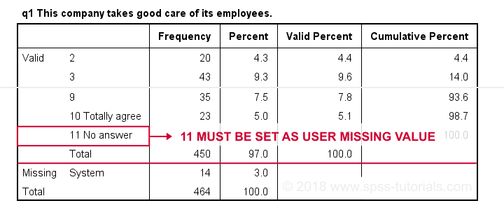
First note that q1 is an ordinal variable: higher values indicate higher levels of agreement. However, this does not go for 11: “No answer” does not indicate more agreement than 10 - “Totally agree”. Therefore, only values 1 through 10 make up an ordinal variable and 11 should be excluded.
The syntax below shows the right way to do so.
missing values q1 to q9 (11).
*Rerun frequencies table.
frequencies q1 to q9.
Result
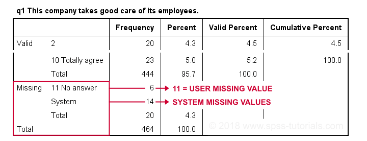
Note that 11 is shown among the missing values now. It occurs 6 times in q1 and there's also 14 system missing values. In variable view, we also see that 11 is set as a user missing value for q1 through q9.
User Missing values for Metric Variables
The right way to inspect metric variables is running histograms over them. The syntax below shows the easiest way to do so.
frequencies whours
/format notable
/histogram.
Result
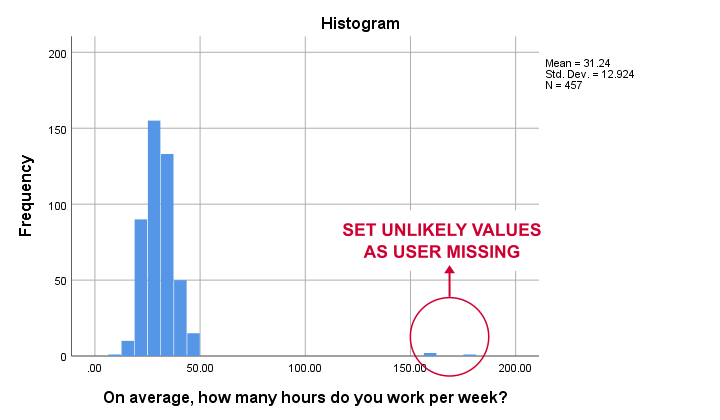
Some respondents report working over 150 hours per week. Perhaps these are their monthly -rather than weekly- hours. In any case, such values are not credible. We'll therefore set all values of 50 hours per week or more as user missing. After doing so, the distribution of the remaining values looks plausible.
missing values whours (50 thru hi).
*Rerun histogram.
frequencies whours
/format notable
/histogram.
Inspecting Missing Values per Variable
A super fast way to inspect (system and user) missing values per variable is running a basic DESCRIPTIVES table. Before doing so, make sure you don't have any WEIGHT or FILTER switched on. You can check this by running SHOW WEIGHT FILTER N. Also note that there's 464 cases in these data. So let's now inspect the descriptive statistics.
descriptives q1 to q9.
*Note: (464 - N) = number of missing values.
Result
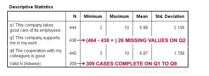
The N column shows the number of non missing values per variable. Since we've 464 cases in total, (464 - N) is the number of missing values per variable. If any variables have high percentages of missingness, you may want to exclude them from -especially- multivariate analyses.
Importantly, note that Valid N (listwise) = 309. These are the cases without any missing values on all variables in this table. Some procedures will use only those 309 cases -known as listwise exclusion of missing values in SPSS.
Conclusion: none of our variables -columns of cells in data view- have huge percentages of missingness. Let's now see if any cases -rows of cells in data view- have many missing values.
Inspecting Missing Values per Case
For inspecting if any cases have many missing values, we'll create a new variable. This variable holds the number of missing values over a set of variables that we'd like to analyze together. In the example below, that'll be q1 to q9.
We'll use a short and simple variable name: mis_1 is fine. Just make sure you add a description of what's in it -the number of missing...- as a variable label.
count mis_1 = q1 to q9 (missing).
*Set description of mis_1 as variable label.
variable labels mis_1 'Missing values over q1 to q9'.
*Inspect frequency distribution missing values.
frequencies mis_1.
Result
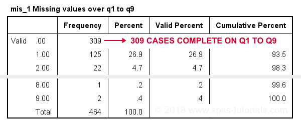
In this table, 0 means zero missing values over q1 to q9. This holds for 309 cases. This is the Valid N (listwise) we saw in the descriptives table earlier on.
Also note that 1 case has 8 missing values out of 9 variables. We may doubt if this respondent filled out the questionnaire seriously. Perhaps we'd better exclude it from the analyses over q1 to q9. The right way to do so is using a FILTER.
SPSS Data Analysis with Missing Values
So how does SPSS analyze data if they contain missing values? Well, in most situations,
SPSS runs each analysis on all cases it can use for it.
Right, now our data contain 464 cases. However, most analyses can't use all 464 because some may drop out due to missing values. Which cases drop out depends on which analysis we run on which variables.
Therefore, an important best practice is to
always inspect how many cases are actually used
for each analysis you run.
This is not always what you might expect. Let's first take a look at pairwise exclusion of missing values.
Pairwise Exclusion of Missing Values
Let's inspect all (Pearson) correlations among q1 to q9. The simplest way for doing so is just running correlations q1 to q9. If we do so, we get the table shown below.
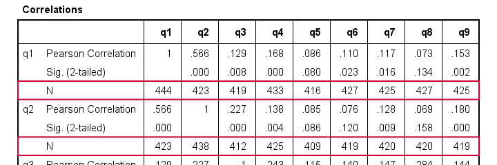
Note that each correlation is based on a different number of cases. Precisely, each correlation between a pair of variables uses all cases having valid values on these 2 variables. This is known as pairwise exclusion of missing values. Note that most correlations are based on some 410 up to 440 cases.
Listwise Exclusion of Missing Values
Let's now rerun the same correlations after adding a line to our minimal syntax:
correlations q1 to q9
/missing listwise.
After running it, we get a smaller correlation matrix as shown below. It no longer includes the number of cases per correlation.
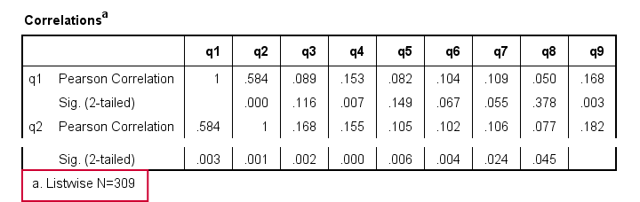
Each correlation is based on the same 309 cases, the listwise N. These are the cases without missing values on all variables in the table: q1 to q9. This is known as listwise exclusion of missing values.
Obviously, listwise exclusion often uses far fewer cases than pairwise exclusion. This is why we often recommend the latter: we want to use as many cases as possible. However, if many missing values are present, pairwise exclusion may cause computational issues. In any case, make sure you
know if your analysis uses
listwise or pairwise exclusion of missing values.
By default, regression and factor analysis use listwise exclusion and in most cases, that's not what you want.
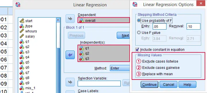
Exclude Missing Values Analysis by Analysis
Analyzing if 2 variables are associated is known as bivariate analysis. When doing so, SPSS can only use cases having valid values on both variables. Makes sense, right?
Now, if you run several bivariate analyses in one go, you can exclude cases analysis by analysis: each separate analysis uses all cases it can. Different analyses may use different subsets of cases.
If you don't want that, you can often choose listwise exclusion instead: each analysis uses only cases without missing values on all variables for all analyses. The figure below illustrates this for ANOVA.
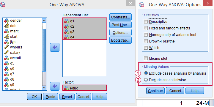
The test for q1 and educ uses all cases having valid values on q1 and educ, regardless of q2 to q4.
All tests use only cases without missing values on q1 to q4 and educ.
We usually want to use as many cases as possible for each analysis. So we prefer to exclude cases analysis by analysis. But whichever you choose, make sure you know how many cases are used for each analysis. So check your output carefully. The Kolmogorov-Smirnov test is especially tricky in this respect: by default, one option excludes cases analysis by analysis and the other uses listwise exclusion.
Editing Data with Missing Values
Editing data with missing values can be tricky. Different commands and functions act differently in this case. Even something as basic as computing means in SPSS can go very wrong if you're unaware of this.
The syntax below shows 3 ways we sometimes encounter. With missing values, however, 2 of those yield incorrect results.
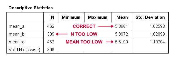
compute mean_a = mean(q1 to q9).
*Compute mean - wrong way 1.
compute mean_b = (q1 + q2 + q3 + q4 + q5 + q6 + q7 + q8 + q9) / 9.
*Compute mean - wrong way 2.
compute mean_c = sum(q1 to q9) / 9.
*Check results.
descriptives mean_a to mean_c.
Result
Final Notes
In real world data, missing values are common. They don't usually cause a lot of trouble when analyzing or editing data but in some cases they do. A little extra care often suffices if missingness is limited. Double check your results and know what you're doing.
Thanks for reading.
SPSS Output – Basics, Tips & Tricks
 Exporting SPSS output is usually easier and faster than copy-pasting
SPSS Output Introduction
In SPSS, we usually work from 3 windows. These are
- the data editor window
 ;
; - the syntax editor window
 ;
; - the output viewer window
 .
.
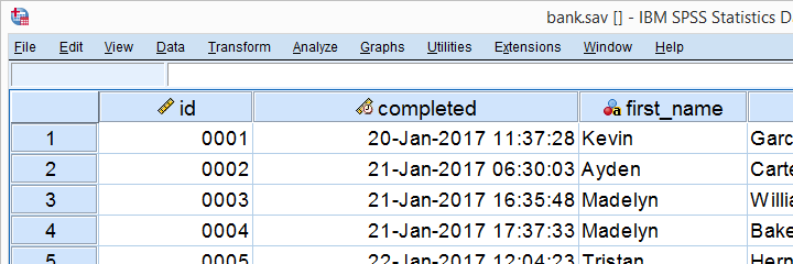
Our previous tutorials discussed the data editor and the syntax editor windows. So let's now take a look at the output viewer. We suggest you follow along by downloading and opening bank.sav, part of which is shown below.
SPSS Output - First Steps
Right. So with our data open, let's create some output by running the syntax below.
frequencies educ marit jtype
/barchart
/order variable.
Running this syntax opens an output viewer window as shown below.
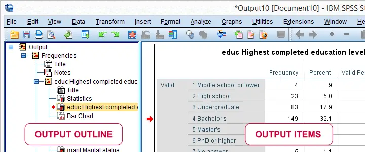
As illustrated, the SPSS output viewer window always has 2 main panes:
- the output outline is mostly used for navigating through your output items and
- the actual output items -mostly tables and charts- are often exported to WORD or Excel for reporting.
In the output outline, you can also delete output items -SPSS often produces way more output than you ask for. Use the ctrl key to select multiple items. A faster way for deleting a selection of output items is OUTPUT MODIFY.
You can also collapse and reorder output items in the outline but I don't find that too useful. So let's turn to the actual output items. The most important ones are tables and charts so we'll discuss those separately.
SPSS Output - Tables
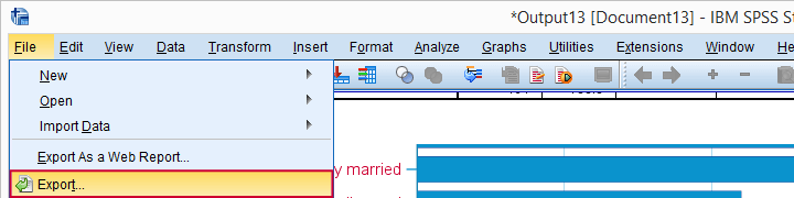
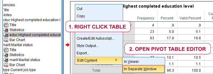
We'll usually want to make some adjustments to our output tables. One option for doing so is right-clicking the table and selecting
![]() as shown below.
as shown below.
The pivot table editor window (shown below) allows us to adjust basically anything about our table.
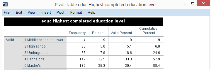
That being said, we recommend you only use the pivot table editor if everything else fails. One reason is that you can't replicate and rerun whatever you do in the pivot table editor. And more importantly, there are faster options with which you can adjust many tables in one go. So let's explore some of those.
Variable and Value Labels in Output Tables
When I'm inspecting my data, I want to see variable names and labels in my output. The same goes for values and value labels because I want to know how my variables have been coded.
However, I want to see only labels in the final tables that I'll report. One way for doing so is navigating to
![]() and selecting the tab.
and selecting the tab.
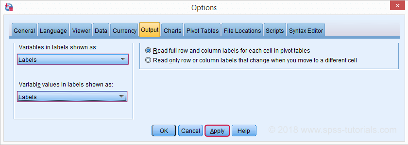
Oddly, the options dialog has no button. This is because it creates very messy syntax. A much better option for this than the crappy menu is just running the syntax below.
set
tnumbers labels
tvars labels.
- TVARS is short for ”table variables”. It sets how variables are shown in tables: names, labels or both;
- TNUMBERS is short for “table numbers”. It sets how values are shown in tables: values, labels or both.
Running this syntax is a much better option than using the aforementioned menu. After doing so, all output tables we'll run will show only variable and value labels.
SPSS Table Templates
Another thing I don't like about these tables is their styling: grey fonts with grey backgrounds. The best way to fix this is setting a tablelook before running any tables. Running set tlook 'C:\Program Files\IBM\SPSS\Statistics\24\Looks\Original.stt'. does the trick for me. On your computer, you may need a slightly different path. If I now rerun my frequency distributions, they'll look much nicer as shown below.
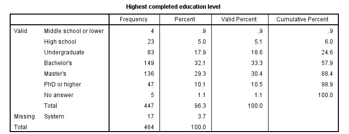
Right. So those are the main basics regarding output tables. Let's now turn to our charts.
SPSS Output - Charts
First off, you can adjust basically anything about charts in the chart editor window. You can open one by right clicking a chart as shown below.
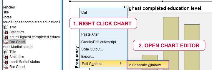
This opens a chart editor window as shown below.
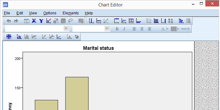
As a rule of thumb, only use the chart editor if everything else fails. There's better ways to adjust charts than using the chart editor window. So let's explore some of those.
SPSS Chart Templates
You can apply styling -colors, borders, sizes and so on- to charts by setting a chart template before running any charts. The proper way to do so is running something like SET CTEMPLATE 'C:\Program Files\IBM\SPSS\Statistics\24\Looks\sometemplate.sgt'. After doing so, all of our bar charts look as shown below. If you have some nice chart templates, it's a matter of seconds to have all of your charts look great.
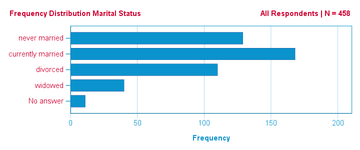
SPSS - All Output to WORD
A great way to convert SPSS output to WORD is exporting all contents of the output viewer in one go. You can do so by navigating to
![]() as shown below.
as shown below.
Selecting the options below results in a WORD document containing all tables and charts shown in your output viewer. This is the ideal starting point for writing your report.
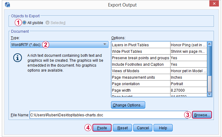
Since you can batch edit tables and charts in SPSS -but not in WORD- make sure your output is as good as it gets before converting it. A great way to adjust tables and delete unwanted output items is OUTPUT MODIFY.
Copy-Pasting SPSS Output Tables to WORD
If you need only a handful of output items in WORD, you can also just copy-paste them. The ctrl + c and ctrl + v shortkeys usually work fine for both tables and charts. If it fails, however, use copy special for tables as shown below.
The same goes for copy-pasting charts to WORD: first try ctrl + c. If that doesn't work, copy the chart as an image as shown below.
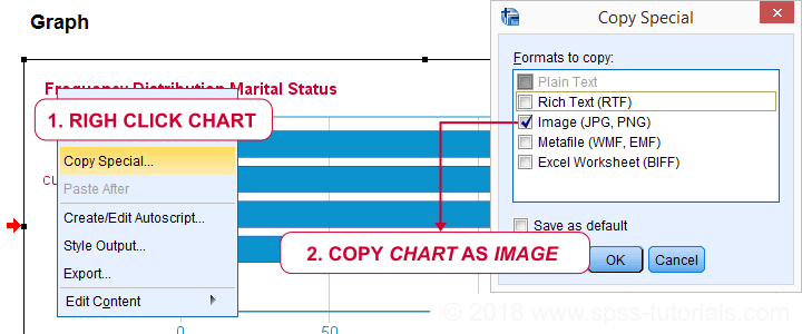
SPSS - All Output to Excel
You can convert all contents of your output window -including all tables and charts- in one go to a single Excel sheet. For doing so, navigate to
![]() and select the options shown below.
and select the options shown below.
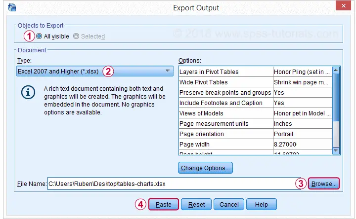
Copy-Pasting SPSS Output Tables to Excel
If you need just a couple of output tables in Excel, you can copy-paste them with the ctrl + c and ctrl + v shortkeys. If that fails, use copy special as Excel worksheet as shown below.
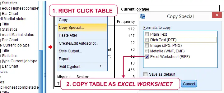
SPSS Output Tricks
SPSS users tend to waste a lot of time and effort on manually adjusting output items. The easiest way for doing so -like discussed- is using the pivot table editor and chart editor windows. We also suggested to use these only if everything else fails. So which are better -and especially faster- alternatives?
- Try to style tables with tablelooks. These can apply fonts, borders, colors, text-alignment and more to one or many tables. To some extent, table templates can also hide table elements such as titles and captions.
- For styling charts, use chart templates. These can also hide chart elements such as titles and labels.
- You can apply numeric formats -and hence set decimal places- to a selection of table columns, rows or cells with OUTPUT MODIFY. It can also apply conditional formatting -such as boldface or italicize- table cells or delete a selection of output items.
- You can convert one or many output tables to a single SPSS dataset by using the OMS. You can further process this dataset in SPSS and/or save it as Excel or some other format. OMS is easy to use from the menu. It can also suppress a selection of output items: warnings, case processing summaries and so on.
- You can edit almost anything for one or many output items with Python scripting. This is harder to use and works slower than OUTPUT MODIFY. However, it accomplishes much more. For an example, see SPSS Correlations in APA Format.
- Several table adjustments can be made from extensions that are built into recent SPSS versions with the SPSS Python Essentials installed. Most are based on Python scripting and are found under as shown below.
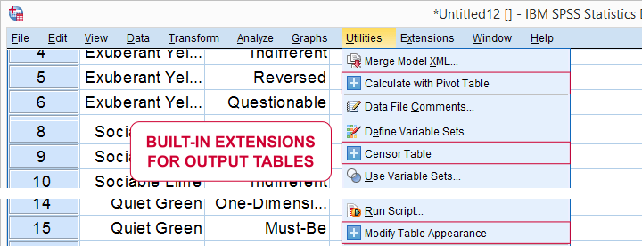
SPSS Output - Final Notes
Right, so that'll do for introducing SPSS output. I hope we clarified some basics. Some of the output tricks may be suitable only for experienced or even expert SPSS users. However, I thought you should at least be aware that they exist.
Thanks for reading!