Clustered Bar Chart over Multiple Variables
- Example Data
- VARSTOCASES without VARSTOCASES
- Restructuring the Data
- SPSS Chart Builder - Basic Steps
- Final Result
This tutorial shows how to create the clustered bar chart shown below in SPSS. As this requires restructuring our data, we'll first do so with a seriously cool trick.

Example Data
A sample of N = 259 respondents were asked “which means of transportation do you use on a regular basis?” Respondents could select one or more means of transportation for both work and leisure related travelling. The data thus obtained are in transportation.sav, partly shown below.
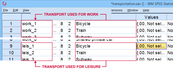
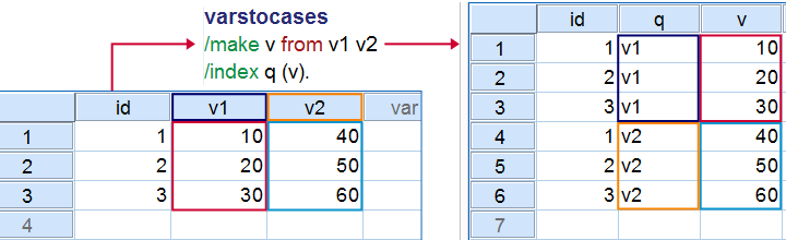
Note that our data consist of 2 sets (work and leisure) of 8 dichotomous variables (transportation options). For creating our chart, we need to stack these 2 sets vertically. The usual way to do so is with VARSTOCASES as illustrated below.
Now, we could use VARSTOCASES for our data but we find this rather tedious for 8 variables. We'll replace it with a trick that creates nicer results and requires less syntax too.
VARSTOCASES without VARSTOCASES
The screenshots below illustrate how to mimic VARSTOCASES without needing its syntax.
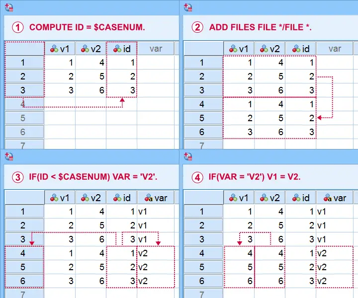
This method saves more effort insofar as you stack more variables: placing the IF command in step  in a DO REPEAT loop does the trick.
Restructuring the Data
Let's now run these steps on transportation.sav with the syntax below. If you're not sure about some command, you can inspect its result in data view if you run EXECUTE right after it.
descriptives all.
*Add id to dataset.
compute id = $casenum.
*Vertically stack dataset onto itself.
add files file */file *.
*Identify copied cases.
compute Purpose = ($casenum > id).
value labels Purpose 0 'Work' 1 'Leisure'.
*Shift values from leisure into work variables.
do repeat #target = work_1 to work_8 / #source = leis_1 to leis_8.
if(purpose) #target = #source.
end repeat.
*Create checktable 2.
means work_1 to work_8 by Purpose.
If everything went right, the 2 checktables will show the exact same information.
Final Data Adjustments
Our data now have the structure required for running our chart. However, a couple of adjustments are still desirable:
- since we want to see percentages instead of proportions, we'll RECODE our 0-1 variables into 0-100;
- next, FORMATS adds percent signs to the recoded values;
- the Chart Builder only computes means over quantitative variables. We'll therefore set all measurement levels to scale;
- we'll remove a couple of variables that have become redundant.
recode work_1 to work_8 (1 = 100).
*Set formats to percentages.
formats work_1 to work_8 (pct8).
*Set measurement levels (needed for SPSS chart builder & Custom Tables).
variable level work_1 to work_8 (scale).
*Remove (now) redundant variables.
add files file */drop leis_1 to id.
SPSS Chart Builder - Basic Steps
The screenshot below sketches some basic steps that'll result in our chart.
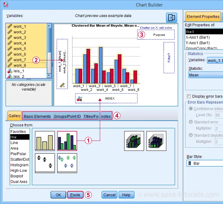
 drag and drop the clustered bar chart onto the canvas;
 select, drag and drop all outcome variables in one go into the y-axis box. Click “Ok” in the dialog that pops up;
 drag “Purpose” (leisure or work) into the Color box;
go through these tabs, select “Transpose” and choose some title and subtitle for the chart;
 clicking results in the syntax below.
GGRAPH
/GRAPHDATASET NAME="graphdataset" VARIABLES=MEAN(work_1) MEAN(work_2) MEAN(work_3) MEAN(work_4)
MEAN(work_5) MEAN(work_6) MEAN(work_7) MEAN(work_8) Purpose MISSING=LISTWISE REPORTMISSING=NO
TRANSFORM=VARSTOCASES(SUMMARY="#SUMMARY" INDEX="#INDEX")
/GRAPHSPEC SOURCE=INLINE.
BEGIN GPL
SOURCE: s=userSource(id("graphdataset"))
DATA: SUMMARY=col(source(s), name("#SUMMARY"))
DATA: INDEX=col(source(s), name("#INDEX"), unit.category())
DATA: Purpose=col(source(s), name("Purpose"), unit.category())
COORD: rect(dim(1,2), transpose(), cluster(3,0))
GUIDE: axis(dim(2), label("Mean"))
GUIDE: legend(aesthetic(aesthetic.color.interior), label("Purpose"))
GUIDE: text.title(label("Transportation Methods Used on Regular Basis"))
GUIDE: text.subsubtitle(label("All Respondents | N = 259"))
SCALE: cat(dim(3), reverse(), include("0", "1", "2", "3", "4", "5", "6", "7"))
SCALE: linear(dim(2), include(0))
SCALE: cat(aesthetic(aesthetic.color.interior), reverse(), include("0.00", "1.00"))
SCALE: cat(dim(1), include("0.00", "1.00"))
ELEMENT: interval(position(Purpose*SUMMARY*INDEX), color.interior(Purpose),
shape.interior(shape.square))
END GPL.
Initial Result
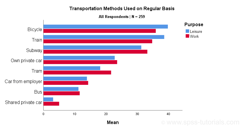
Whoomp! There it is. We created the chart we were looking for. Sadly, it doesn't look too great:
- despite setting all variable formats to PCT4 (percentages with zero decimal places), percent signs are missing from the x-axis;
- the x-axis is labeled “Mean” instead of “Percentage”;
- the chart doesn't show gridlines.
All such issues can be fixed in the Chart Editor which opens if we double-click our chart. A nicer option, though, is developing and applying a chart template. Our final result after doing so is shown below.
Final Result
Right. This tutorial has been pretty heavy on syntax but I hope you got the hang of it. Were you (not) able to recreate our chart? Do you have any other feedback? Please throw us a comment below.
Thanks for reading!
Creating Boxplots in SPSS – Quick Guide
Introduction & Practice Data File
There's 3 ways to create boxplots in SPSS:
The first approach is the simplest but it also has fewer options than the others. This tutorial walks you through all 3 approaches while creating different types of boxplots.
- Boxplot for 1 Variable - 1 Group of Cases
- Boxplot for Multiple Variables - 1 Group of Cases
- Boxplot for 1 Variable - Multiple Groups of Cases
- Tip 1 - Remove Outliers for Single Group
- Tip 2 - Show Outlier Values in Boxplot
- Tip 3 - Adding Titles to Boxplots
Example Data
All examples in this tutorial use driving-test.sav, partly shown below.
Our data file contains a sample of N = 238 people who were examined in a driving simulator. Participants were presented with 5 dangerous situations to which they had to respond as fast as possible. The data hold their reaction times and some other variables.
Boxplot for 1 Variable - 1 Group of Cases
We'll first run a boxplot for the reaction times on trial 1 for all cases. One option is
![]()
![]() which opens the dialogs shown below.
which opens the dialogs shown below.
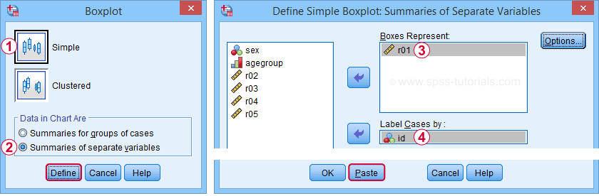
Completing these steps results in the syntax below.
EXAMINE VARIABLES=r01
/COMPARE VARIABLE
/PLOT=BOXPLOT
/STATISTICS=NONE
/NOTOTAL
/ID=id
/MISSING=LISTWISE.
Result
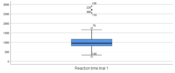
Our boxplot shows some potential outliers as well as extreme values. Interpreting these -and all other boxplot elements- is discussed in Boxplots - Beginners Tutorial. Also note that our boxplot doesn't have a title yet. Options for adding it are discussed in Tip 3 - Adding Titles to Boxplots.
Boxplot for Multiple Variables - 1 Group of Cases
We'll now create a single boxplot for our 5 reaction time variables for all participants. We navigate to
![]()
![]() and fill out the dialogs as shown below.
and fill out the dialogs as shown below.
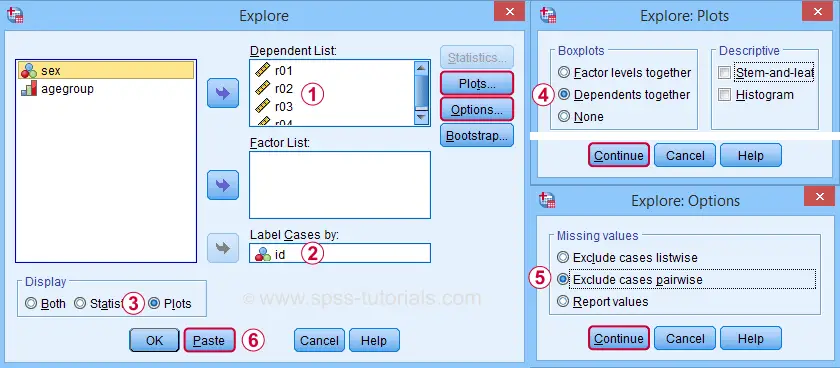
“Dependents together” means that all dependent variables are shown together in each boxplot. If you enter a factor -say, sex- you'll get a separate boxplot for each factor level -female and male respondents. “Factor levels together” creates a separate boxplot for each dependent variable, showing all factor levels together in each boxplot.
“Exclude cases pairwise” means that the results for each variable are based on all cases that don't have a missing value for that variable. “Exclude cases listwise” uses only cases without any missing values on all variables.
A minor note here is that many SPSS users select “Normality plots and tests” in this dialog for running a
Anyway. Completing these steps results in the syntax below. Let's run it.
EXAMINE VARIABLES=r01 r02 r03 r04 r05
/COMPARE VARIABLE
/PLOT=BOXPLOT
/STATISTICS=NONE
/NOTOTAL
/ID=id
/MISSING=PAIRWISE /* IMPORTANT! */.
Result
Now, before inspecting our boxplot, take a close look at the Case Processing Summary table first.
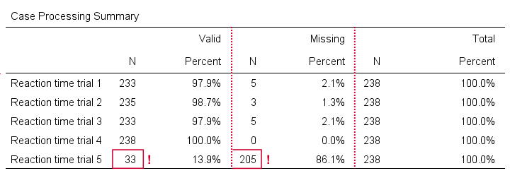
The first columns tells how many cases were used for each variable. Note that trial 5 has N = 205 or 86.1% missing values. Remember that “Exclude cases listwise” was the default in the Explore dialog. If we hadn't changed that, then none of our variables would have used more than N = 33 cases. The actual boxplot, however, wouldn't show anything wrong. This really is a major pitfall. Please avoid it.
Anyway, the figure below shows our actual boxplot.
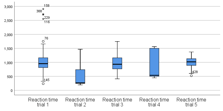
Note that we already saw the first boxplot bar in our previous example. Second, trials 2 and 4 seem strongly positively skewed. Both variables look odd. We'd better inspect their histograms to see what's really going on.
Boxplot for 1 Variable - Multiple Groups of Cases
We'll now run a boxplot for trial 3 for age groups separately. We first navigate to
![]() and fill out the dialogs as shown below.
and fill out the dialogs as shown below.
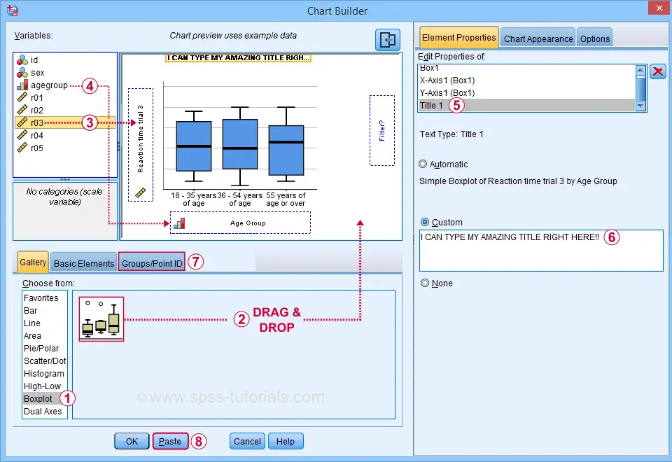
 Select “Point ID Label” in this tab and then drag & drop r03 into the ID box on the canvas. Doing so will show actual outlier values in the final boxplot.
Completing these steps results in the syntax below.
GGRAPH
/GRAPHDATASET NAME="graphdataset" VARIABLES=agegroup r03 MISSING=LISTWISE REPORTMISSING=NO
/GRAPHSPEC SOURCE=INLINE.
BEGIN GPL
SOURCE: s=userSource(id("graphdataset"))
DATA: agegroup=col(source(s), name("agegroup"), unit.category())
DATA: r03=col(source(s), name("r03"))
GUIDE: axis(dim(1), label("Age Group"))
GUIDE: axis(dim(2), label("Reaction time trial 3"))
GUIDE: text.title(label("I CAN TYPE MY AMAZING TITLE RIGHT HERE!"))
SCALE: cat(dim(1), include("1", "2", "3"))
SCALE: linear(dim(2), include(0))
ELEMENT: schema(position(bin.quantile.letter(agegroup*r03)), label(r03))
END GPL.
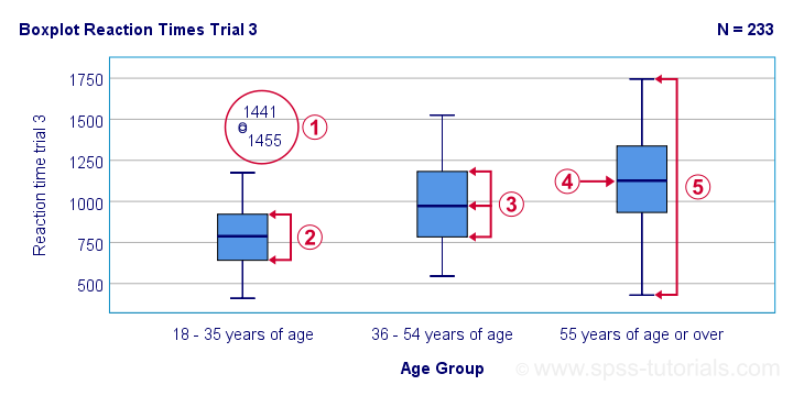
Result
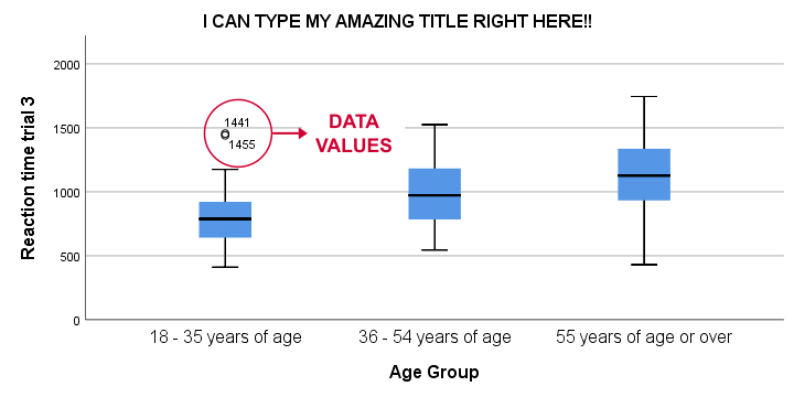
This boxplot shows increasing medians and standard deviations with increasing ages. Note that our boxplot also shows outlier values. In this example, these are reaction times of 1,441 and 1,455 milliseconds but for the youngest age group only.
Tip 1 - Remove Outliers for Single Group
If you'd like to remove outliers based on boxplot results, you'd normally set them as user missing values. For example, MISSING VALUES r03 (1441 THRU HI). sets values of 1441 and higher as missing for r03. In our example, however, this won't work: the aforementioned values are potential outliers only for the youngest age group. For the other age groups, they're within a normal range.
A solution is converting these values into different values for the youngest age group only. One option is combining DO IF with RECODE. The syntax below, however, shows a shorter option based on IF.
means r03 by agegroup
/cells count min max mean stddev.
*Recode potential outliers into 999999998 but only for agegroup 1.
if(agegroup = 1 and r03 >= 1441) r03 = 999999998.
*Set recoded outliers as user missing values.
missing values r03 (999999998).
*Apply value label to recoded outliers.
add value labels r03 999999998 'Value removed because outlier'.
*Rerun checktable.
means r03 by agegroup
/cells count min max mean stddev.
Tip 2 - Show Outlier Values in Boxplot
You can show data values for potential outliers and extreme values in boxplots. This only works if each boxplot involves a single dependent variable. Simply use this dependent variable as the ID variable too.
The only dialog that supports this is the Chart Builder. If you prefer the other dialogs, modifying the /ID subcommand in the syntax also does the trick.
EXAMINE VARIABLES=r03 BY agegroup
/PLOT=BOXPLOT
/STATISTICS=NONE
/NOTOTAL
/ID=r03. /*Label outliers with actual data values.
Tip 3 - Adding Titles to Boxplots
There's 3 options for showing titles in SPSS boxplots:
- create your boxplot via the Chart Builder as in example 3;
- use a chart template that has a fixed title and/or subtitle;
- add a title manually after creating your boxplot.
For this last option, open a Chart Editor window by double-clicking your chart. You can now add a title from the menu.
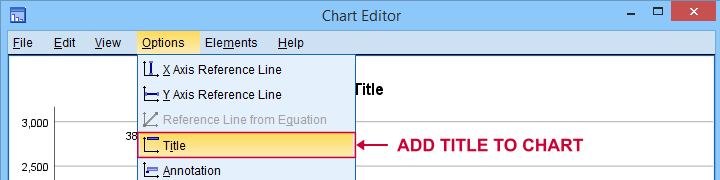
Note that you can adjust your title after adding it.
Final Notes
There's many more variations on boxplots, especially clustered boxplots. However, I think you'll get them done fairly easily after studying this tutorial.
If you've any questions or remarks, please throw me a comment below.
Thanks for reading!
Boxplots – Beginners Tutorial
A boxplot is a chart showing quartiles, outliers and
the minimum and maximum scores for 1+ variables.
Example
A sample of N = 233 people completed a speed task. The chart below shows a boxplot of their reaction times.
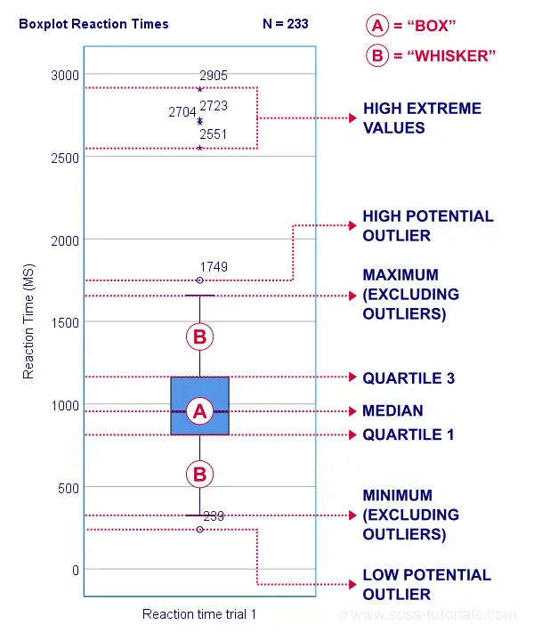
Some rough conclusions from this chart are that
- all 233 reaction times lie between 0 and 3,000 milliseconds;
- 4 scores are high extreme values. These are reaction times between 2,551 and 2,905 milliseconds;
- there's 1 high potential outlier of 1,749 milliseconds;
- the maximum reaction time (excluding potential outliers and extreme values) is around 1,650 milliseconds;
- 75% of all respondents score lower than some 1,150 milliseconds. This is the 75th percentile or quartile 3;
- 50% of all respondents score lower than some 975 milliseconds. This is the 50th percentile (the median) or quartile 2;
- 25% of all respondents score lower than some 800 milliseconds. This is the 25th percentile or quartile 1;
- the minimum reaction time (excluding potential outliers and extreme values) is around 350 milliseconds;
- there's 1 low potential outlier of 239 milliseconds;
- there aren't any low extreme values.
So what are quartiles? And how to obtain them? And how are potential outliers and extreme values defined?
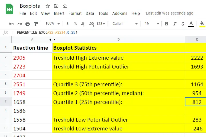
We'll show you all you need to know in this Googlesheet, part of which is shown below.
Quartile 1
Quartile 1 is the 25th percentile: it is the score that separates the lowest 25% from the highest 75% of scores. In Googlesheets and Excel, =PERCENTILE.EXC(A2:A234,0.25) returns quartile 1 for the scores in cells A2 through A234 (our 233 reaction times). The result is 811.5. This means that 25% of our scores are lower than 811.5 milliseconds. Or -reversely- 75% are higher.
A minor complication here is that 25% of N = 233 scores results in 58.25 scores. As there's no such thing as “0.25 scores”, we can't precisely separate the lowest 25% from the highest 75%.
There's no real solution to this problem but a technique known as linear interpolation probably comes closest. This is how Excel, Googlesheets and SPSS all come up with 811.5 as quartile 1 for our 233 scores.
Quartile 2
Quartile 2 -also known as the median- is the 50th percentile: the score that separates the lowest 50% from the highest 50% of scores. In Googlesheets, =PERCENTILE.EXC(A2:A234,0.50) returns quartile 2 for the scores in cells A2 through A234. For these data, that'll be 954 milliseconds.
This median is a measure of central tendency: it tells us that people typically had a reaction time of 954 milliseconds. Common measures of central tendency are
- the mean;
- the median;
- the mode.
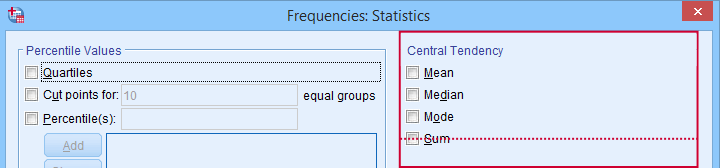 Percentiles, quartiles and measures of central tendency can be obtained from SPSS’ Frequencies dialog.
Quartile 3
Quartile 3 is the 75th percentile: the score that separates the lowest 75% from the highest 25% of scores. In Googlesheets, =PERCENTILE.EXC(A2:A234,0.75) returns quartile 3 for the scores in cells A2 through A234. For our 233 reaction times, that'll be 1,164 milliseconds.
The screenshot below shows that SPSS comes up with the exact same quartiles as Excel and Googlesheets. We'll now use quartiles 1 and 3 (811.5 and 1,164 milliseconds) for computing the interquartile range or IQR.
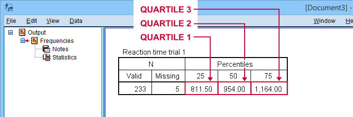 SPSS comes up with identical quartiles for our N = 233 reaction times
Interquartile Range - IQR
The interquartile range or IQR is computed as
$$IQR = quartile\;3 - quartile\;1$$
so for our data, that'll be
$$IQR = 1,164 - 811.5 = 352.5$$
The IQR is a measure of dispersion: it tells how far data points typically lie apart. Common measures of dispersion are
- the standard deviation
- the variance;
- the IQR;
- the range.
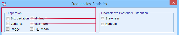 Measures of dispersion in SPSS’ Frequencies dialog.
Potential Outliers
In boxplots, potential outliers are defined as follows:
- low potential outlier: score is more than 1.5 IQR but at most 3 IQR below quartile 1;
- high potential outlier: score is more than 1.5 IQR but at most 3 IQR above quartile 3.
For our data at hand, quartile 1 = 811.5 and the IQR = 352.5. Therefore, the thresholds for low potential outliers are
- upper bound: 811.5 - 1.5 * 352.5 = 282.8;
- lower bound: 811.5 - 3 * 352.5 = -246.0.
Scores that are smaller than this lower bound are considered low extreme values: these are scores even more than 3 IQR below quartile 1.
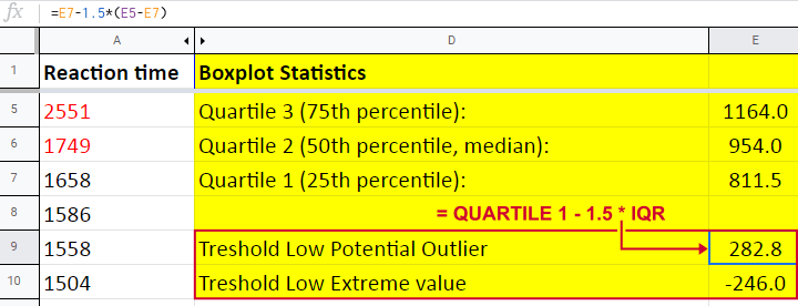
Thresholds for high potential outliers are computed in a similar fashion, using quartile 3 and the IQR. To sum things up: for our data at hand, thresholds for potential outliers are
- low potential outlier: -246 ≤ reaction time < 282.8 (milliseconds);
- high potential outlier: 1,692.8 < reaction time ≤ 2,221.5 (milliseconds).
As shown in our boxplot example, potential outliers are typically shown as circles. These either lie below the minimum or above the maximum (both excluding outliers).
A final note here is that these definitions apply only to boxplots. In other contexts, z-scores are often used to define outliers.
Extreme Values
For boxplots, extreme values are defined as follows:
- low extreme value: score is more than 3 IQR below quartile 1;
- high extreme value: score is more than 3 IQR above quartile 3.
For our 233 reaction times, this implies
- low extreme value: reaction time < -246 (milliseconds);
- high extreme value: reaction time > 2,221.5 (milliseconds).
In boxplots, extreme values are usually indicated by asterisks (*). Note that our example boxplot shows 4 high extreme values but no low extreme values.
Boxplots - Purposes
Basic purposes of boxplots are
- quick and simple data screening, especially for outliers and extreme values;
- comparing 2+ variables for 1 sample (within-subjects test);
- comparing 2+ samples on 1 variable (between-subjects test).
The figure below shows a quick boxplot comparison among 3 samples (age groups) on 1 variable (reaction time trial 3).
The youngest age group has 2 potential outliers. However, they don't look too bad as they'd fall in the normal range for the other age groups.
The young age group has the lowest “box”. This indicates that these respondents have the smallest IQR. Since the IQR ignores the bottom and top 25% of scores, this group does not necessarily have the smallest standard deviation too.
The median lies roughly midway between quartiles 1 and 3. This suggests a roughly symmetrical frequency distribution.
The oldest age group has the highest median reaction time and reversely. Respondents thus seem to get slower with increasing age.
Reaction time for the oldest respondents have the largest range: the scores seem to lie further apart insofar as respondents are older.
Boxplots or Histograms?
Histograms.
The figure below illustrates why I always prefer histograms over boxplots. It's based on the exact same data as our last boxplot example.
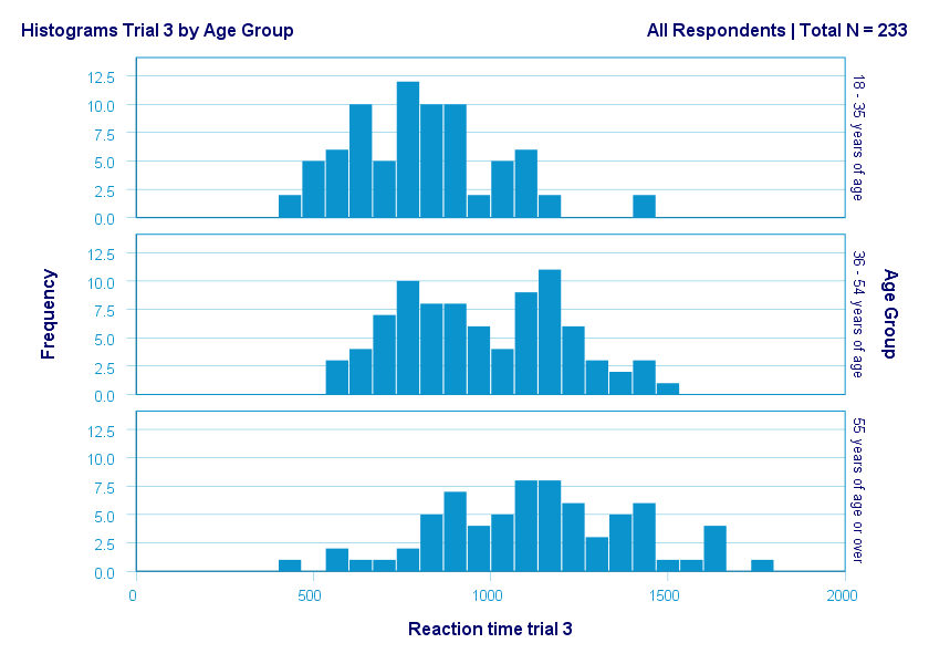
So what did the boxplot tell us that this histogram doesn't? Well, nothing really. Does it? Reversely, however, the histogram tells us that
- reaction times seem to follow a bimodal distribution for the intermediate age group;
- this distribution is therefore flattened (platykurtic) relative to a normal distribution. To some extent, this also holds for the other 2 age groups;
- means as well as standard deviations seem to increase with increasing age.
Our histograms make these points much clearer than our boxplot: in boxplots, we can't see how scores are distributed within the “box” or between the “whiskers”.
A histogram, however, allows us to roughly reconstruct our original data values. A chart simply doesn't get any more informative than that.
Agree? Disagree? Throw me a comment below and let me know what you think.
Thanks for reading!
Creating APA Style Correlation Tables in SPSS
Introduction & Practice Data File
When running correlations in SPSS, we get the p-values as well. In some cases, we don't want that: if our data hold an entire population, such p-values are actually nonsensical. For some stupid reason, we can't get correlations without significance levels from the correlations dialog. However, this tutorial shows 2 ways for getting them anyway. We'll use adolescents-clean.sav throughout.
 Correlation Table as Recommended by the APA
Option 1: FACTOR
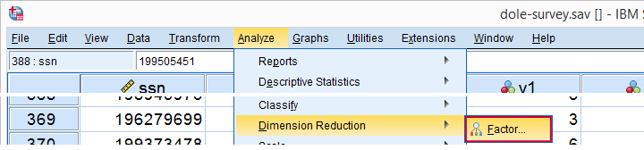
A reasonable option is navigating to
![]()
![]() as shown below.
as shown below.
Next, we'll move iq through wellb into the variables box and follow the steps outlines in the next screenshot.
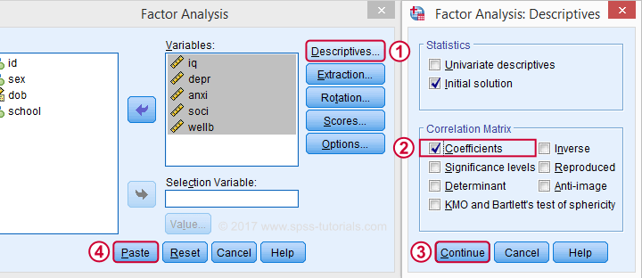
Clicking results in the syntax below. It'll create a correlation matrix without significance levels or sample sizes. Note that FACTOR uses listwise deletion of missing values by default but we can easily change this to pairwise deletion. Also, we can shorten the syntax quite a bit in case we need more than one correlation matrix.
Correlation Matrix from FACTOR Syntax
FACTOR
/VARIABLES iq depr anxi soci wellb
/MISSING pairwise /* WATCH OUT HERE: DEFAULT IS LISTWISE! */
/ANALYSIS iq depr anxi soci wellb
/PRINT CORRELATION EXTRACTION
/CRITERIA MINEIGEN(1) ITERATE(25)
/EXTRACTION PC
/ROTATION NOROTATE
/METHOD=CORRELATION.
*Can be shortened to...
factor
/variables iq to wellb
/missing pairwise
/print correlation.
*...or even...
factor
/variables iq to wellb
/print correlation.
*but this last version uses listwise deletion of missing values.
Result
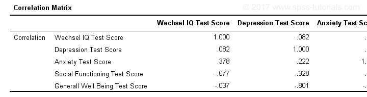
When using pairwise deletion, we no longer see the sample sizes used for each correlation. We may not want those in our table but perhaps we'd like to say something about them in our table title.
More importantly, we've no idea which correlations are statistically significant and which aren't. Our second approach deals nicely with both issues.
Option 2: Adjust Default Correlation Table
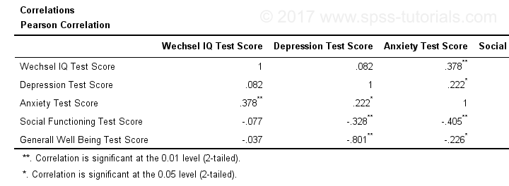
The fastest way to create correlations is simply running correlations iq to wellb. However, we sometimes want to have statistically significant correlations flagged. We'll do so by adding just one line.
correlations iq to wellb
/print nosig.
This results in a standard correlation matrix with all sample sizes and p-values. However, we'll now make everything except the actual correlations invisible.
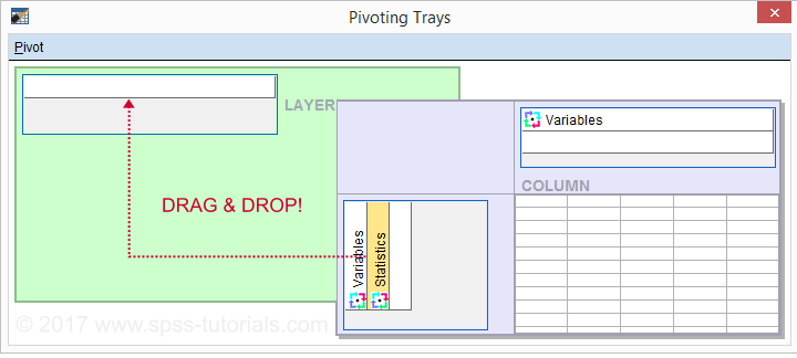
Adjusting Our Pivot Table Structure
We first right-click our correlation table and navigate to
![]() as shown below.
as shown below.
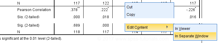
Select from the menu.
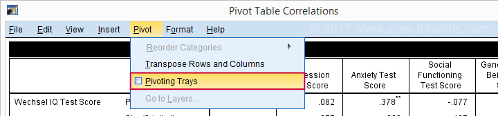
Drag and drop the Statistics (row) dimension into the LAYER area and close the pivot editor.
Result
Same Results Faster?
If you like the final result, you may wonder if there's a faster way to accomplish it. Well, there is: the Python syntax below makes the adjustment on all pivot tables in your output. So make sure there's only correlation tables in your output before running it. It may crash otherwise.
begin program.
import SpssClient
SpssClient.StartClient()
oDoc = SpssClient.GetDesignatedOutputDoc()
oItems = oDoc.GetOutputItems()
for index in range(oItems.Size()):
oItem = oItems.GetItemAt(oItems.Size() - index - 1)
if oItem.GetType() == SpssClient.OutputItemType.PIVOT:
pTable = oItem.GetSpecificType()
pManager = pTable.PivotManager()
nRows = pManager.GetNumRowDimensions()
rDim = pManager.GetRowDimension(0)
rDim.MoveToLayer(0)
SpssClient.StopClient()
end program.
Well, that's it. Hope you liked this tutorial and my script -I actually run it from my toolbar pretty often.
Thanks for reading!
Creating Histograms in SPSS
Introduction & Practice Data File
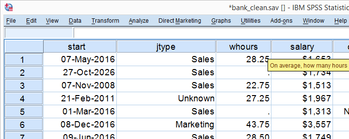
Among the very best SPSS practices is running histograms over your quantitative variables. Doing so is a super fast way to detect problems such as extreme values and gain a lot of insight into your data. This tutorial quickly walks you through using bank-clean.sav, part of which is shown below.
Option 1: FREQUENCIES without Frequency Tables
If you're running a data inspection without any need for pretty charts, then the easiest option is running the FREQUENCIES command shown below.
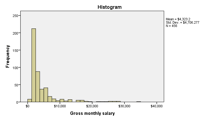
frequencies salary
/format notable
/histogram.
*/format notable suppresses (huge) frequency tables.
Result
Multiple Histograms in One Go
Running histograms like this does not allow you to use custom titles for your charts. However, it does allow running many histograms in one go as shown below. Oddly, doing so results in variable labels being used as chart titles instead of “Histogram” in our first example.
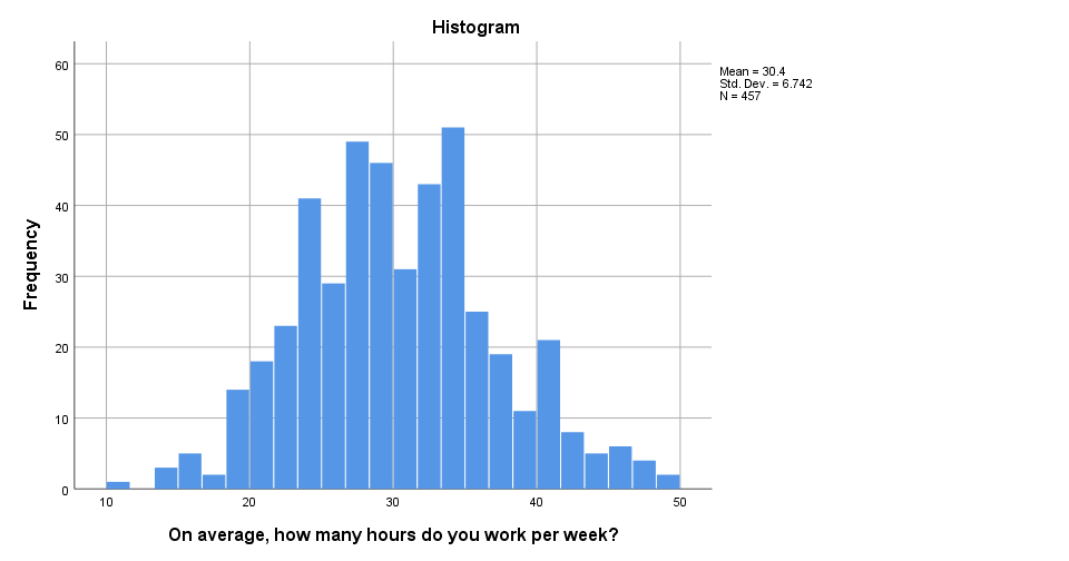
frequencies whours to overall
/format notable
/histogram.
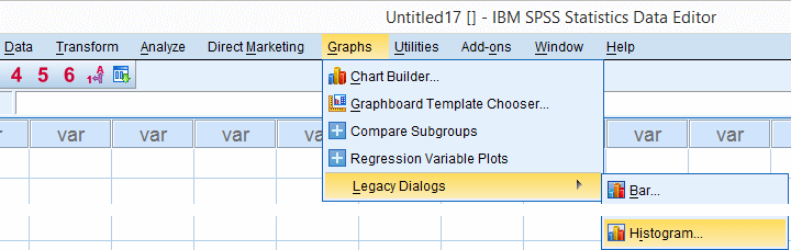
Option 2: GRAPH
If you'd like to include one or more histograms in your report, you probably need somewhat prettier charts. Creating a GRAPH command from the menu -as shown below- allows us to set nice custom titles and makes it easier to style our charts with an SPSS chart template.
SPSS dialogs for charts contain way more charts than most users are aware of and generate much nicer, cleaner syntax than the .
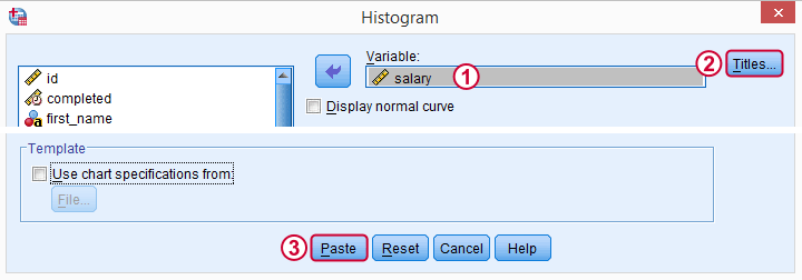
 We'll choose “All Respondents | n = 464” as our main title here because this is relevant but far from obvious.
Resulting Syntax
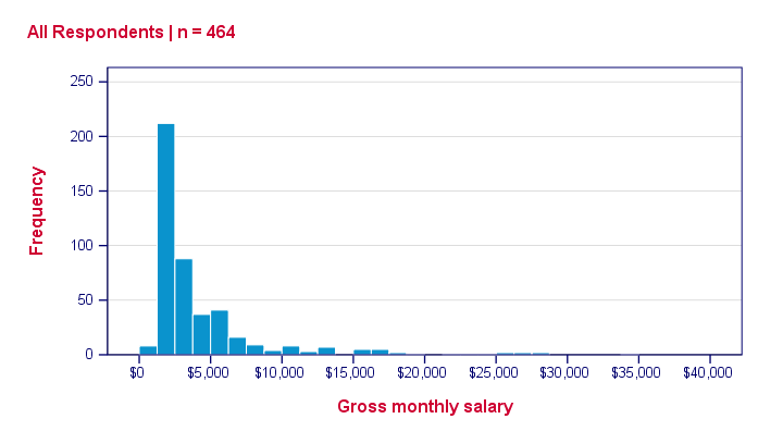
GRAPH
/HISTOGRAM=salary
/TITLE='All Respondents | n = 464'.
The result still looks pretty much the same. We'll fix that next.
Styling our Histogram
Last but not least, we'll style our histogram. If we save our styling as a chart template, we can easily apply it to all subsequent histograms, which may save us a lot of time. Like so, our final syntax example uses “histogram-nosum-title-720-1.sgt”. (“.sgt” is short for “SPSS Graph Template” but the file is referred to as a chart template.)
If this file is absent, SPSS will throw a warning and still run our histogram with whatever default template -if any- has been set.
SPSS Histogram Syntax with Template
GRAPH
/HISTOGRAM=salary
/TITLE='All Respondents | n = 464'
/template 'histogram-nosum-title-720-1.sgt'.
Final Result
So that's basically it. We could discuss some more options but we don't find them useful in practice, so we'd rather keep it short this time.
We hope you found this tutorial helpful. Thanks for reading!
APA Reporting SPSS Factor Analysis
- Introduction
- Creating APA Tables - the Easy Way
- Table I - Factor Loadings & Communalities
- Table II - Total Variance Explained
- Table III - Factor Correlations
Introduction
Creating APA style tables from SPSS factor analysis output can be cumbersome. This tutorial therefore points out some tips, tricks & pitfalls. We'll use the results of SPSS Factor Analysis - Intermediate Tutorial.
All analyses are based on 20-career-ambitions-pca.sav (partly shown below).
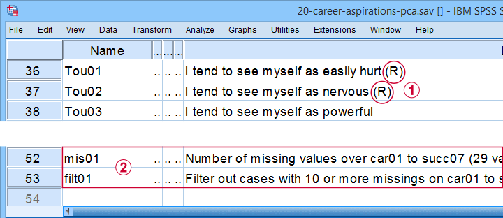
 Note that some items were reversed and therefore had “(R)” appended to their variable labels;
 We'll FILTER out cases with 10 or more missing values.
After opening these data, you can replicate the final analyses by running the SPSS syntax below.
filter by filt01.
*PCA VI - AS PREVIOUS BUT REMOVE TOU04.
FACTOR
/VARIABLES Car01 Car02 Car03 Car04 Car05 Car06 Car07 Car08 Conf01 Conf02 Conf03 Conf05 Conf06
Comp01 Comp02 Comp03 Tou01 Tou02 Tou05 Succ01 Succ02 Succ03 Succ04 Succ05 Succ06
Succ07
/MISSING PAIRWISE
/PRINT INITIAL EXTRACTION ROTATION
/FORMAT SORT BLANK(.3)
/CRITERIA FACTORS(5) ITERATE(25)
/EXTRACTION PC
/ROTATION PROMAX
/METHOD=CORRELATION.
Creating APA Tables - the Easy Way
For a wide variety of analyses, the easiest way to create APA style tables from SPSS output is usually to
- adjust your analyses in SPSS so the output is as close as possible to the desired end results. Changing table layouts (which variables/statistics go into which rows/columns?) is also best done here.
- copy-paste one or more tables into Excel or Googlesheets. This is the easiest way to set decimal places, fonts, alignment, borders and more;
- copy-paste your table(s) from Excel into WORD. Perhaps adjust the table widths with “autofit”, and you'll often have a perfect end result.
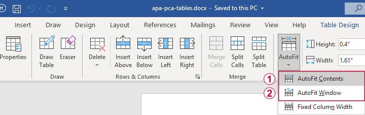 Autofit to Contents, then Window results in optimal column widths
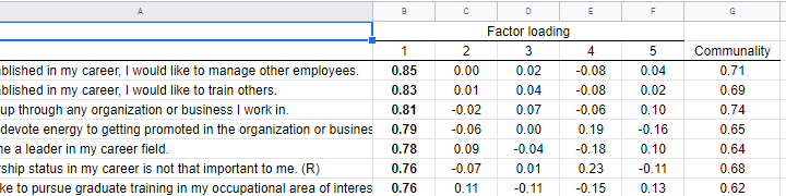
Table I - Factor Loadings & Communalities
The figure below shows an APA style table combining factor loadings and communalities for our example analysis.
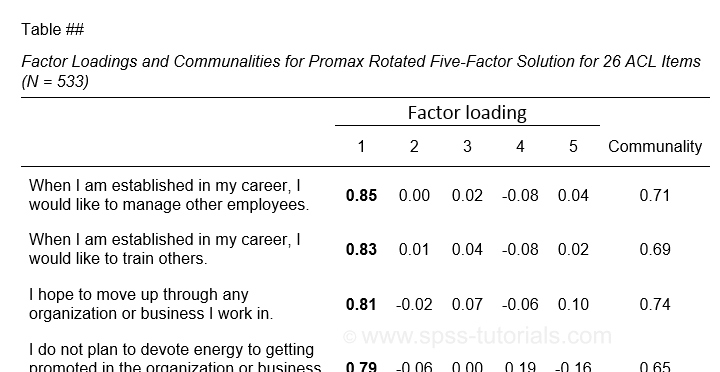 Example APA style factor loadings table
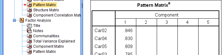
If you take a good look at the SPSS output, you'll see that you cannot simply copy-paste these tables for combining them in Excel. This is because the factor loadings (pattern matrix) table follows a different variable order than the communalities table. Since the latter follows the variable order as specified in your syntax, the easiest fix for this is to
- make sure that only variable names (not labels) are shown in the output;
- copy-paste the correctly sorted pattern matrix into Excel;
- copy-paste the variable names into the FACTOR syntax and rerun it.
Tip: try and replace the line breaks between variable names by spaces as shown below.
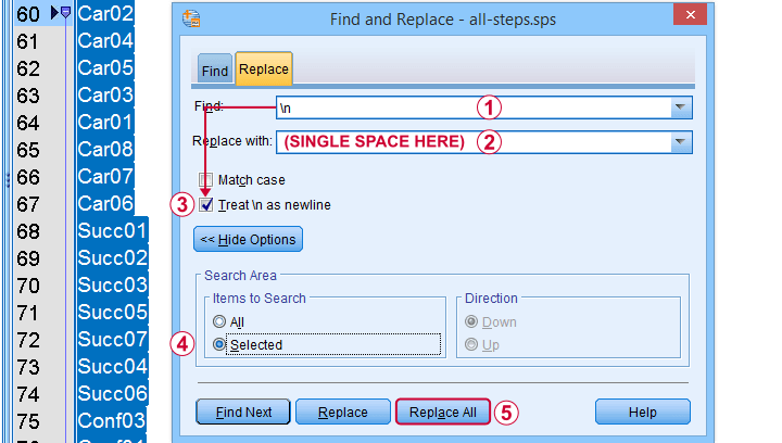 Replace line breaks by spaces in an SPSS syntax window
Also, you probably want to see only variable labels (not names) from now on. And -finally- we no longer want to hide any small absolute factor loadings shown below.
 This table is fine for an exploratory analysis but not for reporting
The syntax below does all that and thus creates output that is ideal for creating APA style tables.
set tvars labels.
*RERUN PREVIOUS ANALYSIS WITH VARIABLE ORDER AS IN PATTERN MATRIX TABLE.
FACTOR
/VARIABLES Car02 Car04 Car05 Car03 Car01 Car08 Car07 Car06 Succ01 Succ02 Succ03 Succ05 Succ07 Succ04 Succ06
Conf03 Conf01 Conf05 Conf02 Conf06 Tou02 Tou05 Tou01 Comp02 Comp03 Comp01
/MISSING PAIRWISE
/PRINT INITIAL EXTRACTION ROTATION
/FORMAT SORT
/CRITERIA FACTORS(5) ITERATE(25)
/EXTRACTION PC
/ROTATION PROMAX
/METHOD=CORRELATION.
You can now safely combine the communalities and pattern matrix tables and make some final adjustments. The end result is shown in this Googlesheet, partly shown below.
 An APA table for WORD is best created in a Googlesheet or Excel
Since decimal places, fonts, alignment and borders have all been set, this table is now perfect for its final copy-paste into WORD.
Table II - Total Variance Explained
The screenshot below shows how to report the Eigenvalues table in APA style.
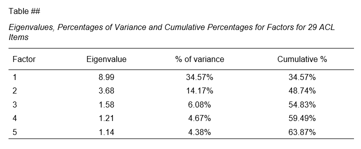 APA style Eigenvalues example table
The corresponding SPSS output table comes fairly close to this. However, an annoying problem are the missing percent signs.
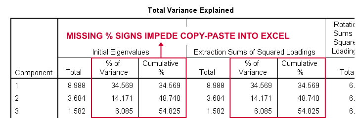
If we copy-paste into Excel and set a percentage format, 34.57 is converted into 3,457%. This is because Excel interprets these numbers as proportions rather than percentage points as SPSS does. The easiest fix is setting a percent format for these columns in SPSS before copy-pasting into Excel.
The OUTPUT MODIFY example below does just that for all Eigenvalues tables in the output window.
output modify
/select tables
/tablecells select = ["% of Variance"] format = 'pct6.2'
/tablecells select = ["Cumulative %"] format = 'pct6.2'.
After this tiny fix, you can copy-paste this table from SPSS into Excel. We can now easily make some final adjustments (including the removal of some rows and columns) and copy-paste this table into WORD.
Table III - Factor Correlations
If you used an oblique factor rotation, you'll probably want to report the correlations among your factors. The figure below shows an APA style factor correlations table.
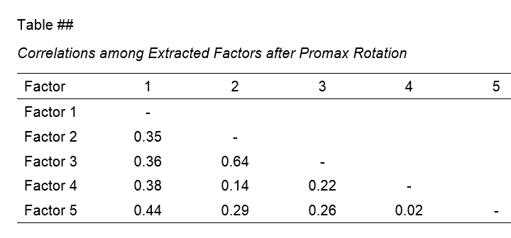
The corresponding SPSS output table (shown below) is pretty different from what we need.
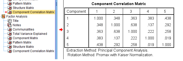 APA style factor correlation table
Adjusting this table manually is pretty doable. However, I personally prefer to use an SPSS Python script for doing so.
You can download my script from LAST-FACTOR-CORRELATION-TABLE-TO-APA.sps. This script is best run from an INSERT command as shown below.
insert file = 'D:\DOWNLOADS\LAST-FACTOR-CORRELATION-TABLE-TO-APA.sps'.
I highly recommend trying this script but it does make some assumptions:
- the above syntax assumes the script is located in D:\DOWNLOADS so you probably need to change that;
- the script assumes that you've the SPSS Python3.x essentials properly installed (usually the case for recent SPSS versions);
- the script assumes that no SPLIT FILE is in effect.
If you've any trouble or requests regarding my script, feel free to contact me and I'll see what I can do.
Final Notes
Right, so these are the basic routines I follow for creating APA style factor analysis tables. I hope you'll find them helpful.
If you've any feedback, please throw me a comment below.
Thanks for reading!
Creating Bar Charts with Means by Category
One of the most common research questions is do different groups have different mean scores on some variable? This question is best answered in 3 steps:
- create a table showing mean scores per group -you'll probably want to include the frequencies and standard deviations as well;
- create a chart showing mean scores per group;
- run some statistical test -ANOVA in this case. However, this is only meaningful if your data are (roughly) a simple random sample from your target population.
We'll show the first 2 steps using an employee survey whose data are in bank-clean.sav. The screenshot below shows what these data basically look like.
Creating a Means Table
For creating a table showing means per category, we could mess around with
![]()
![]() but its not worth the effort as the syntax is as simple as it gets. So let's just run it and inspect the result.
but its not worth the effort as the syntax is as simple as it gets. So let's just run it and inspect the result.
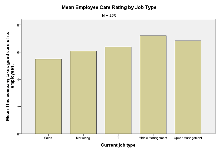
means q1 by jtype
/cells count mean stddev.
Note that you could easily add more statistics to the CELLS subcommand such as
Result
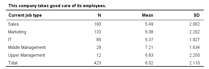
Basically, our table tells us that the mean employee care ratings increase with higher job levels except for “upper management”. A proper descriptives table -always recommended- gives nicely detailed information. However, it's not very visual. So let's now run our chart.
SPSS Bar Chart Menu & Dialogs
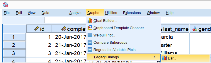
As a rule of thumb, I create all charts from
![]() and avoid the Chart Builder whenever I can -which is pretty much always unless I need a stacked bar chart with percentages.
and avoid the Chart Builder whenever I can -which is pretty much always unless I need a stacked bar chart with percentages.
In the dialog shown below, selecting enables you to  enter a dependent variable;
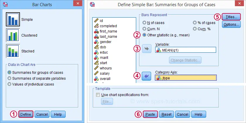
Basic Bar Chart Means by Category Syntax
GRAPH
/BAR(SIMPLE)=MEAN(q1) BY jtype
/TITLE='Mean Employee Care Rating by Job Type'
/SUBTITLE='N = 423'.
Result
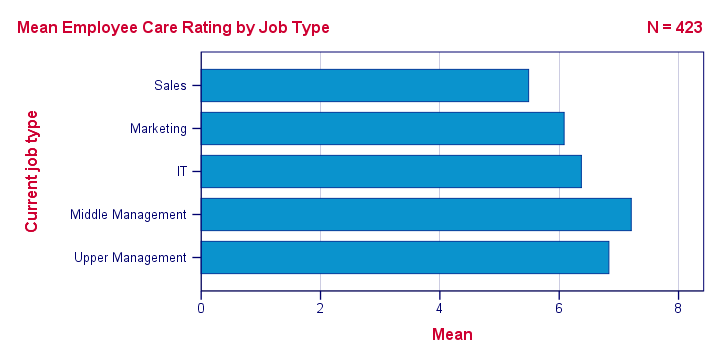
We now have our basic chart but it doesn't look too good.From SPSS version 25 onwards, it will look somewhat better. However, see New Charts in SPSS 25 - How Good Are They Really? Yet. We'll fix this by setting a chart template.
Note that a chart template can also sort this bar chart -for instance by descending means- but we'll skip that for now.
Bar Chart Means by Category Syntax II
set ctemplate "bar-chart-means-trans-720-1.sgt".
*Rerun chart with template set.
GRAPH
/BAR(SIMPLE)=MEAN(q1) BY jtype
/TITLE='Mean Employee Care Rating by Job Type'
/SUBTITLE='N = 423'.
Result
Right, so that's about it. If you need a couple of similar charts, you could copy-paste-edit the last GRAPH command (no need to repeat the other commands). If you need many similar charts, you could loop over the GRAPH command with Python for SPSS.
If you're going to run other types of charts, don't forget to set a different chart template. Or switch if off altogether by running set ctemplate none.
Thanks for reading!
Which Statistical Test Should I Use?
- Univariate Tests
- Within-Subjects Tests
- Between-Subjects Tests
- Association Measures
- Prediction Analyses
- Classification Analyses
Summary
Finding the appropriate statistical test is easy if you're aware of
- the basic type of test you're looking for and
- the measurement levels of the variables involved.
For each type and measurement level, this tutorial immediately points out the right statistical test. We'll also briefly define the 6 basic types of tests and illustrate them with simple examples.
1. Overview Univariate Tests
| MEASUREMENT LEVEL | NULL HYPOTHESIS | TEST |
|---|---|---|
| Dichotomous | Population proportion = x? | Binomial test Z-test for 1 proportion |
| Categorical | Population distribution = f(x)? | Chi-square goodness-of-fit test |
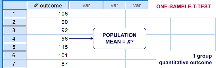
| Quantitative | Population mean = x? | One-sample t-test |
| Population median = x? | Sign test for 1 median | |
| Population distribution = f(x)? | Kolmogorov-Smirnov test Shapiro-Wilk test |
Univariate Tests - Quick Definition
Univariate tests are tests that involve only 1 variable. Univariate tests either test if
- some population parameter -usually a mean or median- is equal to some hypothesized value or
- some population distribution is equal to some function, often the normal distribution.
A textbook example is a one sample t-test: it tests if a population mean -a parameter- is equal to some value x. This test involves only 1 variable (even if there's many more in your data file).
2. Overview Within-Subjects Tests
| MEASUREMENT LEVEL | 2 VARIABLES | 3+ VARIABLES |
|---|---|---|
| DICHOTOMOUS | McNemar test Z-test for dependent proportions | Cochran Q test |
| NOMINAL | Marginal homogeneity test | (Not available) |
| ORDINAL | Wilcoxon signed-ranks test Sign test for 2 related medians | Friedman test |
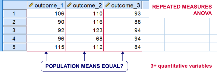
| QUANTITATIVE | Paired samples t-test | Repeated measures ANOVA |
Within-Subjects Tests - Quick Definition
Within-subjects tests compare 2+ variables
measured on the same subjects (often people).
An example is repeated measures ANOVA: it tests if 3+ variables measured on the same subjects have equal population means.
Within-subjects tests are also known as
- paired samples tests (as in a paired samples t-test) or
- related samples tests.
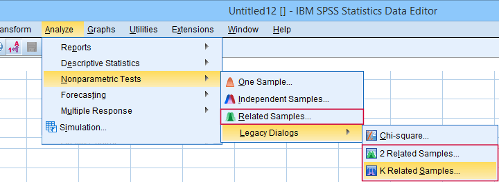 “Related samples” refers to within-subjects and “K” means 3+.
3. Overview Between-Subjects Tests
| OUTCOME VARIABLE | 2 SUBPOPULATIONS | 3+ SUBPOPULATIONS |
|---|---|---|
| Dichotomous | Z-test for 2 independent proportions | Chi-square independence test |
| Nominal | Chi-square independence test | Chi-square independence test |
| Ordinal | Mann-Whitney test (mean ranks) Median test for 2+ independent medians | Kruskal-Wallis test (mean ranks) Median test for 2+ independent medians |
| Quantitative | Independent samples t-test (means) Levene's test (variances) | One-way ANOVA (means) Levene's test (variances) |
Between-Subjects Tests - Quick Definition
Between-subjects tests examine if 2+ subpopulations
are identical with regard to
- a parameter (population mean, standard deviation or proportion) or
- a distribution.
The best known example is a one-way ANOVA as illustrated below. Note that the subpopulations are represented by subsamples -groups of observations indicated by some categorical variable.
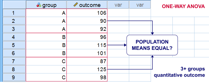
“Between-subjects” tests are also known as “independent samples” tests, such as the independent samples t-test. “Independent samples” means that subsamples don't overlap: each observation belongs to only 1 subsample.
4. Overview Association Measures
| (VARIABLES ARE) | QUANTITATIVE | ORDINAL | NOMINAL | DICHOTOMOUS |
|---|---|---|---|---|
| QUANTITATIVE | Pearson correlation | |||
| ORDINAL | Spearman correlation Kendall’s tau Polychoric correlation | Spearman correlation Kendall’s tau Polychoric correlation | ||
| NOMINAL | Eta squared | Cramér’s V | Cramér’s V | |
| DICHOTOMOUS | Point-biserial correlation Biserial correlation | Spearman correlation Kendall’s tau Polychoric correlation | Cramér’s V | Phi-coefficient Tetrachoric correlation |
Association Measures - Quick Definition
Association measures are numbers that indicate
to what extent 2 variables are associated.
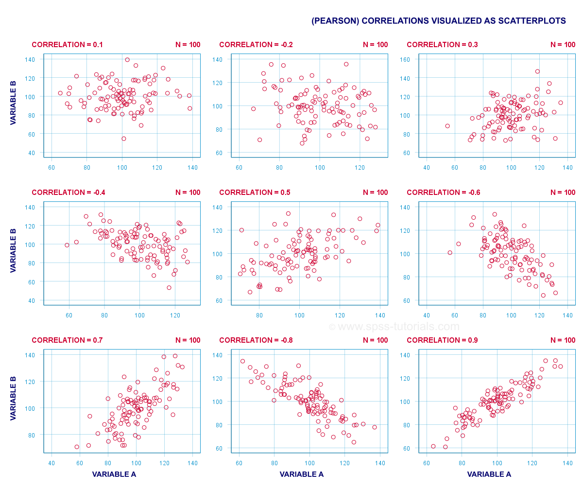
The best known association measure is the Pearson correlation: a number that tells us to what extent 2 quantitative variables are linearly related. The illustration below visualizes correlations as scatterplots.
5. Overview Prediction Analyses
| OUTCOME VARIABLE | ANALYSIS |
|---|---|
| Quantitative | (Multiple) linear regression analysis |
| Ordinal | Discriminant analysis or ordinal regression analysis |
| Nominal | Discriminant analysis or nominal regression analysis |
| Dichotomous | Logistic regression |
Prediction Analyses - Quick Definition
Prediction tests examine how and to what extent
a variable can be predicted from 1+ other variables.
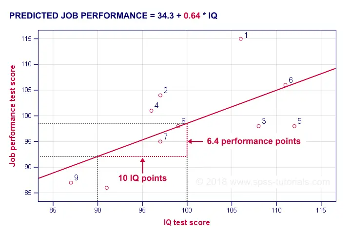
The simplest example is simple linear regression as illustrated below.
Prediction analyses sometimes quietly assume causality: whatever predicts some variable is often thought to affect this variable. Depending on the contents of an analysis, causality may or may not be plausible. Keep in mind, however, that the analyses listed below don't prove causality.
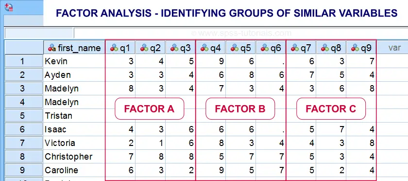
6. Classification Analyses
Classification analyses attempt to identify and
describe groups of observations or variables.
The 2 main types of classification analysis are
- factor analysis for finding groups of variables (“factors”) and
- cluster analysis for finding groups of observations (“clusters”).
Factor analysis is based on correlations or covariances. Groups of variables that correlate strongly are assumed to measure similar underlying factors -sometimes called “constructs”. The basic idea is illustrated below.
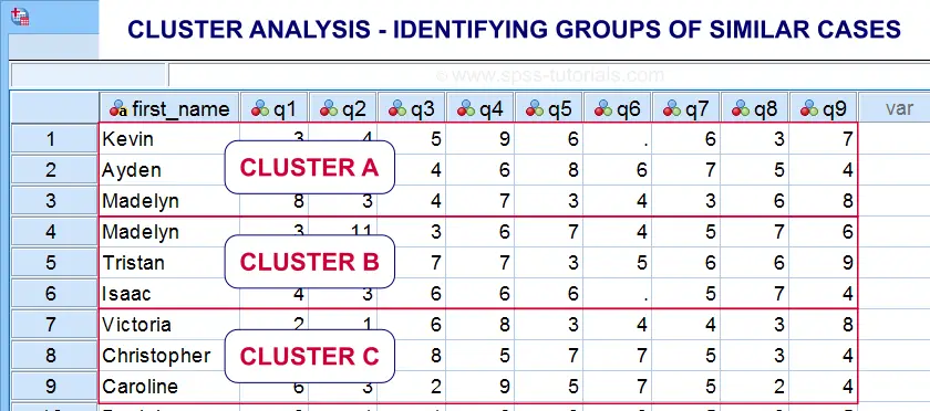
Cluster analysis is based on distances among observations -often people. Groups of observations with small distances among them are assumed to represent clusters such as market segments.
Right. So that'll do for a basic overview. Hope you found this guide helpful! And last but not least,
thanks for reading!
New Charts in SPSS 25: How Good Are They Really?
SPSS hasn't exactly been known for generating nice charts, although you really can do so by using your own chart templates. SPSS 25, however, allows you to “create great looking charts by default!”
This made me wonder: are the new charts really that great? The remainder of this article walks through the old and new looks for the big 5 charts in data analysis. All charts are based on bank_clean.sav and I'll include all syntax as well.
Overview “Big 5” Charts
| Chart | Purpose |
|---|---|
| Histogram | Summarize Single Metric Variable |
| Bar Chart Percentages | Summarize Single Categorical Variable |
| Scatterplot | Show Association Between 2 Metric Variables |
| Bar Chart Means by Category | Show Association Between Metric and Categorical Variable |
| Stacked Bar Chart Percentages | Show Association Between 2 Categorical Variables |
1. Histogram
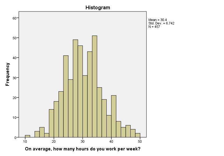 Histogram in SPSS 24
I'm not a big fan of the old histogram: the colors depress me and there is insufficient room between the title (“Histogram”) and the top of the figure.
The font sizes of the tick labels and statistics summary are too small. Unfortunately, you can't omit the statistics summary by syntax but you can style it or hide it altogether with a chart template.
 Histogram in SPSS 25
The new histogram has handy grid lines by default and much nicer colors. I still think some font sizes are too small but altogether, it's a huge step forward.
Histogram Syntax Example
frequencies whours
/format notable
/histogram.
2. Bar Chart Percentages
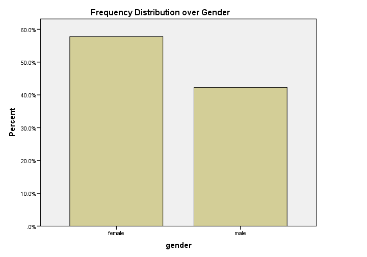 Bar Chart Percentages in SPSS 24
What really puzzles me with SPSS bar charts is that they are not transposed by default. With few categories, the bars become awkwardly wide. With many categories, there's insufficient room for the tick labels.
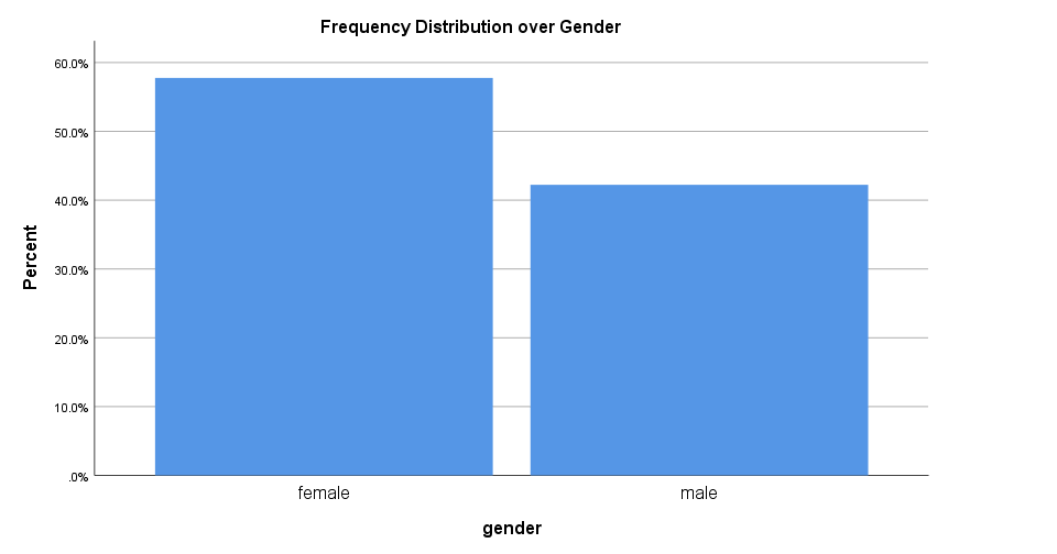 Bar Chart Percentages in SPSS 25
The new bar chart has much nicer styling. However, the bars are now even wider. I feel the transposed bar chart below works much better. Technically, it's the exact same chart as the previous examples, the only difference is that I applied a chart template. With this chart, I'll just increase or decrease its height, depending on the number of categories included.
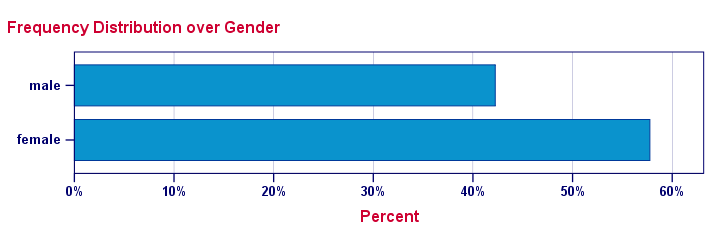 Transposed Bar Chart with Chart Template
Bar Chart Percentages Syntax Example
GRAPH
/BAR(SIMPLE)=PCT BY gender
/TITLE "Frequency Distribution over Gender".
3. Scatterplot
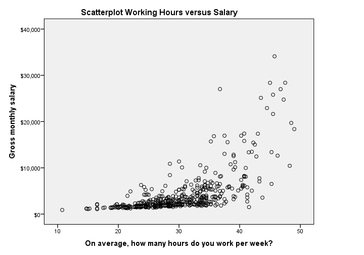 Scatterplot in SPSS 24
The old scatterplot has a rather depressing grey background and no gridlines. However, I do think circles tend to clutter less than dots and thus were a good choice.
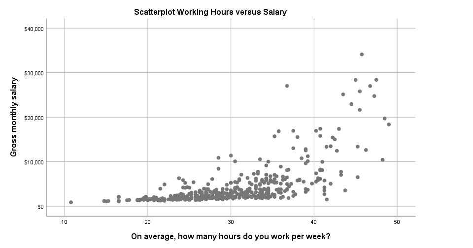 Scatterplot in SPSS 25
The new scatterplot has gridlines by default and a much nicer white background. However, I also feel the dots tend to clutter more than the old circles and it lacks color. If I need 50 shades of grey, I'll go and find myself a book shop.
Scatterplot Syntax Example
GRAPH
/SCATTERPLOT(BIVAR)=whours WITH salary
/MISSING=LISTWISE
/TITLE='Scatterplot Working Hours versus Salary'.
4. Bar Chart Means by Category
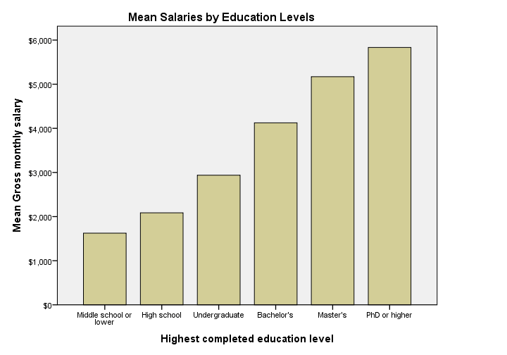 Bar Chart Means by Category in SPSS 24
Apart from its dull styling: not transposing bar charts may leave little room for tick labels -in this case education levels. SPSS seems to “solve” the problem by using a very tiny font size that doesn't look nice and is hard to read.
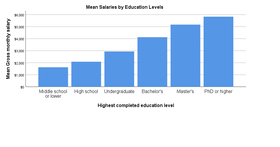 Bar Chart Means by Category in SPSS 25
The new bar chart has a much nicer styling: it uses a reasonable font size for the x-axis categories. However, a much smaller font size is used for the y-axis. I think this looks rather awkward.
Perhaps even more awkward is the large white space beneath the chart. It doesn't attract a lot of attention in the output viewer window. However, after copy-pasting the chart into a report, it becomes clear that this can't be intentional -or at least I hope it isn't.
Bar Chart Means by Category Syntax Example
GRAPH
/BAR(SIMPLE)=MEAN(salary) BY educ
/TITLE='Mean Salaries by Education Levels'.
5. Stacked Bar Chart Percentages
 Stacked Bar Chart Percentages in SPSS 24
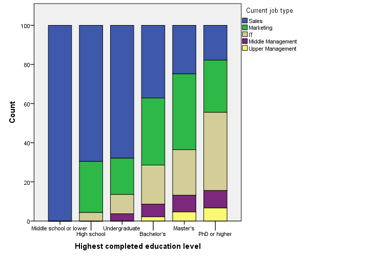
Regarding the old stacked bar chart, I can't help but wonder: You gotta be kidding me, right? Wrong. No kidding. This chart survived through SPSS 24. I'm not even going to discuss the looks. What I do want to point out, is that the y-axis label says “Count” instead of “Percent”. For adding injury to insult, the percent suffix is also missing from the tick labels.
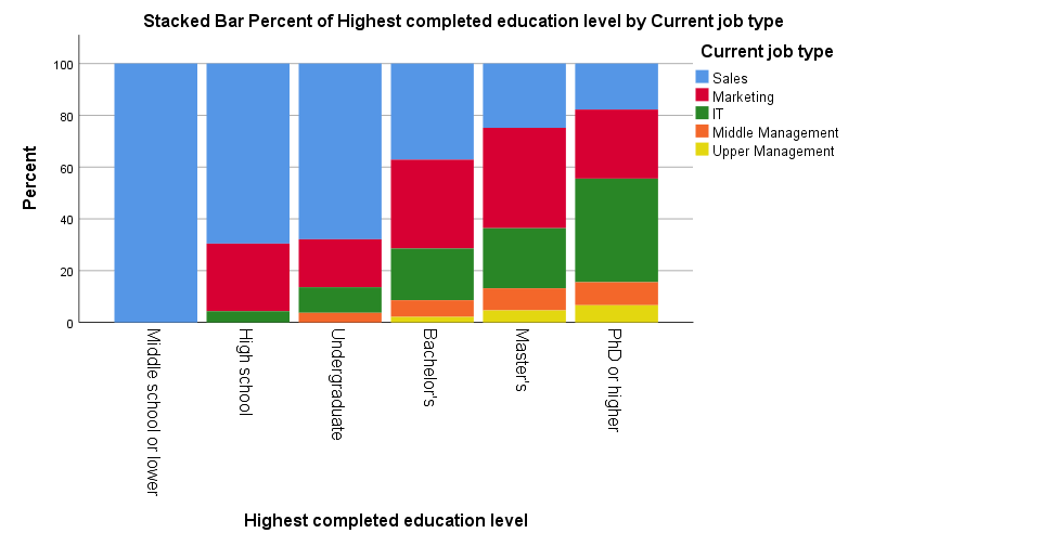 Stacked Bar Chart Percentages in SPSS 25
The new version looks way better -especially the colors! A minor change to the chart builder dialog is that it adds a title by default to the syntax. Unfortunately, the title is wrong: the chart shows “job type by education”, not “education by job type”.
Note that the y-axis is appropriately labeled “Percent” in the new version but the percent suffix is still missing from the tick labels.
And once again, not transposing the chart leaves insufficient space for the tick labels which now had to be rotated and push down the x-axis label. Surely it's a matter of personal preference but I'd rather go for the layout shown below.
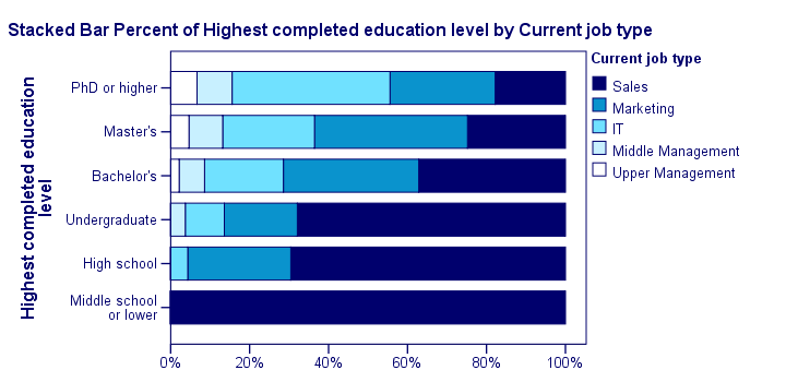 Transposed Stacked Bar Chart Percentages with Chart Template
Stacked Bar Chart Percentages Syntax Example
GGRAPH
/GRAPHDATASET NAME="graphdataset" VARIABLES=educ COUNT()[name="COUNT"] jtype MISSING=LISTWISE
REPORTMISSING=NO
/GRAPHSPEC SOURCE=INLINE.
BEGIN GPL
SOURCE: s=userSource(id("graphdataset"))
DATA: educ=col(source(s), name("educ"), unit.category())
DATA: COUNT=col(source(s), name("COUNT"))
DATA: jtype=col(source(s), name("jtype"), unit.category())
GUIDE: axis(dim(1), label("Highest completed education level"))
GUIDE: axis(dim(2), label("Count"))
GUIDE: legend(aesthetic(aesthetic.color.interior), label("Current job type"))
SCALE: cat(dim(1), include("1", "2", "3", "4", "5", "6"))
SCALE: linear(dim(2), include(0))
SCALE: cat(aesthetic(aesthetic.color.interior), include("1", "2", "3", "4", "5"))
ELEMENT: interval.stack(position(summary.percent(educ*COUNT, base.coordinate(dim(1)))),
color.interior(jtype), shape.interior(shape.square))
END GPL.
*Stacked Bar Chart Percentages - Pasted from Chart Builder SPSS 25.
GGRAPH
/GRAPHDATASET NAME="graphdataset" VARIABLES=educ COUNT()[name="COUNT"] jtype MISSING=LISTWISE
REPORTMISSING=NO
/GRAPHSPEC SOURCE=INLINE.
BEGIN GPL
SOURCE: s=userSource(id("graphdataset"))
DATA: educ=col(source(s), name("educ"), unit.category())
DATA: COUNT=col(source(s), name("COUNT"))
DATA: jtype=col(source(s), name("jtype"), unit.category())
GUIDE: axis(dim(1), label("Highest completed education level"))
GUIDE: axis(dim(2), label("Percent"))
GUIDE: legend(aesthetic(aesthetic.color.interior), label("Current job type"))
GUIDE: text.title(label("Stacked Bar Percent of Highest completed education level by Current ",
"job type"))
SCALE: cat(dim(1), include("1", "2", "3", "4", "5", "6"))
SCALE: linear(dim(2), include(0))
SCALE: cat(aesthetic(aesthetic.color.interior), include("1", "2", "3", "4", "5"))
ELEMENT: interval.stack(position(summary.percent(educ*COUNT, base.coordinate(dim(1)))),
color.interior(jtype), shape.interior(shape.square))
END GPL.
Subtitles and SPLIT FILE
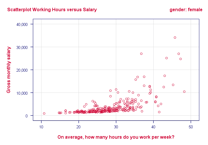
Creating charts with SPLIT FILE on adds a subtitle to them. Since titles are centered by default, the logical place for the subtitle is right below the main title as shown below (“gender: female”).
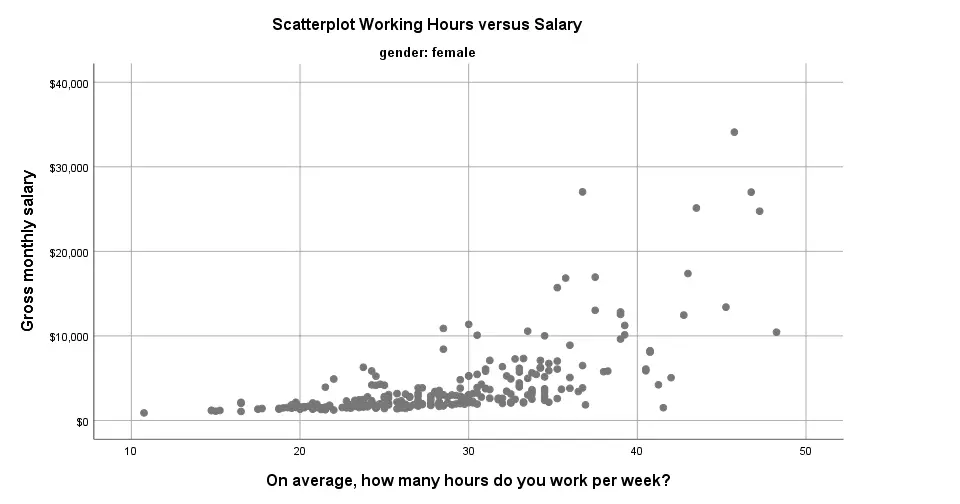 Scatterplot with Subtitle in SPSS 25
Alternatively, one could left align the main title and right align the subtitle as shown below. It looks nicer and makes better use of the available space.
 Scatterplot with Subtitle with Chart Template
Conclusion
Most charts have seriously improved in SPSS 25. I like the gridlines and the new color cycles -except for the new scatterplots which are entirely grey. Nevertheless, I can't help but feel it was a bit of a hasty job with sometimes insufficient eye for detail.
Next, there's the question: what if I liked the old looks better? Or what if my client does not want these changes? I had a quick look around but I couldn't find any way for returning to the old looks. If they're really really gone, then this violates SPSS’ backwards compatibility.
The same goes for the new charts being wider (854 by 504 pixels) than the old charts (629 by 504 pixels). I sure hope the larger width still fits into the layout of any reports that need to be delivered.
So what do you think about the old and new charts? Please let me know by dropping a comment below.
Thanks!
What Is a Histogram?
A histogram is a chart that shows frequencies for
intervals of values of a metric variable.
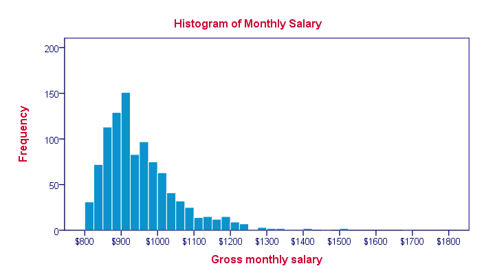
Such intervals as known as “bins” and they all have the same widths. The example above uses $25 as its bin width. So it shows how many people make between $800 and $825, $825 and $850 and so on.
Note that the mode of this frequency distribution is between $900 and $925, which occurs some 150 times.
Histogram - Example
A company wants to know how monthly salaries are distributed over 1,110 employees having operational, middle or higher management level jobs. The screenshot below shows what their raw data look like.
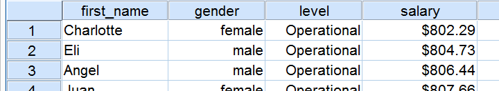
Since these salaries are partly based on commissions, basically every employee has a slightly different salary. Now how can we gain some insight into the salary distribution?
Histogram Versus Bar Chart
We first try and run a bar chart of monthly salaries. The result is shown below.
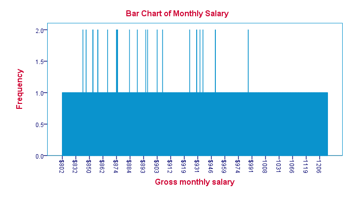
Our bar chart is pretty worthless. The only thing we learn from it is that most salaries occur just once and some twice. The main problem here is that a bar chart shows the frequency with which each distinct value occurs in the data.
Importantly, note that the first interval is ($832 - $802 =) $30 wide. The last interval represents ($1206 - $1119 =) $87. But both are equally wide in millimeters on your screen. This tells us that
the x-axis doesn't have a linear scale
which renders this chart unsuitable for a metric variable such as monthly salary.
Histogram - Basic Example
Since our bar chart wasn't any good, we now try and run a histogram on our data. The result is shown below.
This chart looks much more useful but how was it generated? Well, we assigned each employee’s salary to a $25 interval ($800 - $825, $825 - $850 and so on). Next, we looked up the number of employees that fall within each such interval. We visualize these frequencies by bars in a chart.
Importantly, the x-axis of our chart has a linear scale: each $25 interval corresponds to the same width in millimeters even if it contains zero employees. The chart we end up with is known as a histogram and -as we'll see in a minute- it's a very useful one.
Histogram - Bin Width
The bin width is the width of the intervals
whose frequencies we visualize in a histogram.
Our first example used a bin width of $25; the first bar represents the number of salaries between $800 and $825 and so on. This bin width of $25 is a rather arbitrary choice. The figure below shows histograms over the exact same data, using different bin widths.
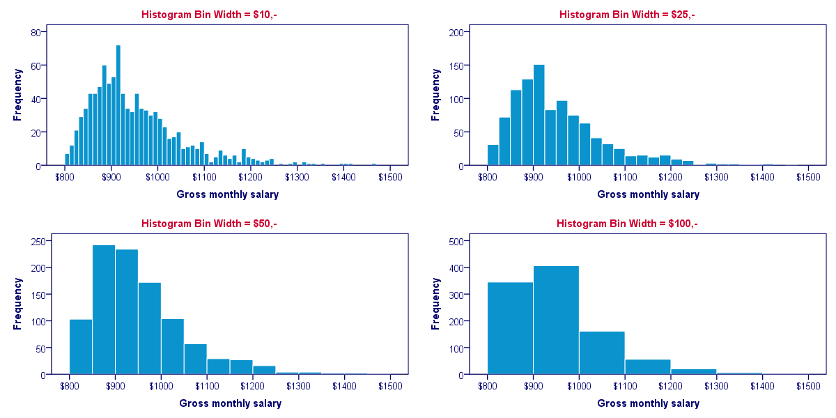
Although different bin widths seem reasonable, we feel $10 is rather narrow and $100 is rather wide for the data at hand. Either $25 or $50 seems more suitable.
Histograms - Why Are They So Useful?
Why are histograms so useful? Well, first of all, charts are much more visual than tables; after looking at a chart for 10 seconds, you can tell much more about your data than after inspecting the corresponding table for 10 seconds. Generally, charts convey information about our data faster than tables -albeit less accurately.
On top of that, histograms also give us a much more complete information about our data. Keep in mind that you can reasonably estimate a variable’s mean, standard deviation, skewness and kurtosis from a histogram. However, you can't estimate a variable’s histogram from the aforementioned statistics. We'll illustrate this with an example.
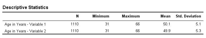
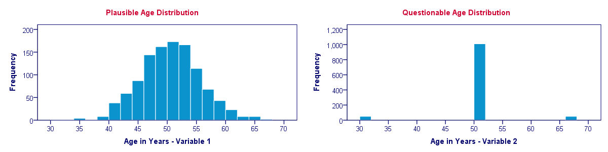
Histogram Versus Descriptive Statistics
Let's say we find two age variables in our data and we're not sure which one we should use. We compare some basic descriptive statistics for both variables and they look almost identical.
So can we conclude that both age variables have roughly similar distributions? If you think so, take a look at their histograms shown below.
Split Histogram - Frequencies
Each of the 1,110 employees in our data has a job level: operational, middle management or higher management. If we want to compare the salary distributions between these three groups, we may inspect a split histogram: we create a separate histogram for each job level and these three histograms have identical axes. The result is shown below.
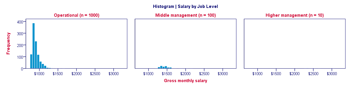
Our split histogram totally sucks. The problem is that the group sizes are very unequal and these relate linearly to the surface areas of our histograms. The result is that the surface area for higher management (n = 10) is only 1% of the surface area for “operational” (n = 1,000). The histogram for higher management is so small that it's no longer visible.
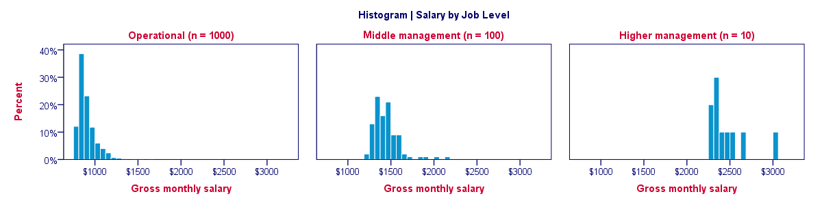
Split Histogram - Percentages
We just saw how a split histogram with frequencies is useless for the data at hand. Does this mean that we can't compare salary distributions over job levels? Nope. If we choose percentages within job level groups, then each histogram will have the same surface area of 100%. The result is shown below.
Histogram - Final Notes
This tutorial aimed at explaining what histograms are and how they differ from bar charts. In our opinion, histograms are among the most useful charts for metric variables. With the right software (such as SPSS), you can create and inspect histograms very fast and doing so is an excellent way for getting to know your data.