Which Statistical Test Should I Use?
- Univariate Tests
- Within-Subjects Tests
- Between-Subjects Tests
- Association Measures
- Prediction Analyses
- Classification Analyses
Summary
Finding the appropriate statistical test is easy if you're aware of
- the basic type of test you're looking for and
- the measurement levels of the variables involved.
For each type and measurement level, this tutorial immediately points out the right statistical test. We'll also briefly define the 6 basic types of tests and illustrate them with simple examples.
1. Overview Univariate Tests
| MEASUREMENT LEVEL | NULL HYPOTHESIS | TEST |
|---|---|---|
| Dichotomous | Population proportion = x? | Binomial test Z-test for 1 proportion |
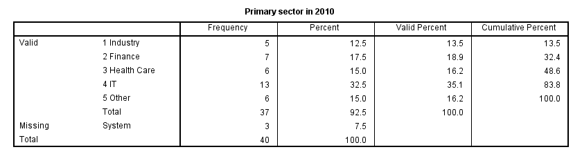
| Categorical | Population distribution = f(x)? | Chi-square goodness-of-fit test |
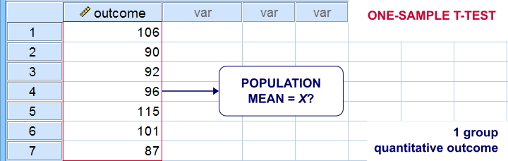
| Quantitative | Population mean = x? | One-sample t-test |
| Population median = x? | Sign test for 1 median | |
| Population distribution = f(x)? | Kolmogorov-Smirnov test Shapiro-Wilk test |
Univariate Tests - Quick Definition
Univariate tests are tests that involve only 1 variable. Univariate tests either test if
- some population parameter -usually a mean or median- is equal to some hypothesized value or
- some population distribution is equal to some function, often the normal distribution.
A textbook example is a one sample t-test: it tests if a population mean -a parameter- is equal to some value x. This test involves only 1 variable (even if there's many more in your data file).
2. Overview Within-Subjects Tests
| MEASUREMENT LEVEL | 2 VARIABLES | 3+ VARIABLES |
|---|---|---|
| DICHOTOMOUS | McNemar test Z-test for dependent proportions | Cochran Q test |
| NOMINAL | Marginal homogeneity test | (Not available) |
| ORDINAL | Wilcoxon signed-ranks test Sign test for 2 related medians | Friedman test |
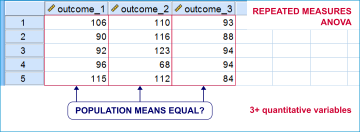
| QUANTITATIVE | Paired samples t-test | Repeated measures ANOVA |
Within-Subjects Tests - Quick Definition
Within-subjects tests compare 2+ variables
measured on the same subjects (often people).
An example is repeated measures ANOVA: it tests if 3+ variables measured on the same subjects have equal population means.
Within-subjects tests are also known as
- paired samples tests (as in a paired samples t-test) or
- related samples tests.
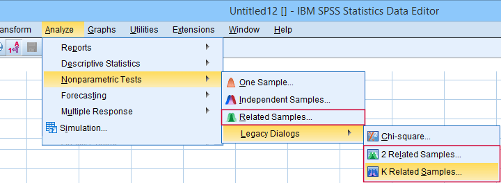 “Related samples” refers to within-subjects and “K” means 3+.
3. Overview Between-Subjects Tests
| OUTCOME VARIABLE | 2 SUBPOPULATIONS | 3+ SUBPOPULATIONS |
|---|---|---|
| Dichotomous | Z-test for 2 independent proportions | Chi-square independence test |
| Nominal | Chi-square independence test | Chi-square independence test |
| Ordinal | Mann-Whitney test (mean ranks) Median test for 2+ independent medians | Kruskal-Wallis test (mean ranks) Median test for 2+ independent medians |
| Quantitative | Independent samples t-test (means) Levene's test (variances) | One-way ANOVA (means) Levene's test (variances) |
Between-Subjects Tests - Quick Definition
Between-subjects tests examine if 2+ subpopulations
are identical with regard to
- a parameter (population mean, standard deviation or proportion) or
- a distribution.
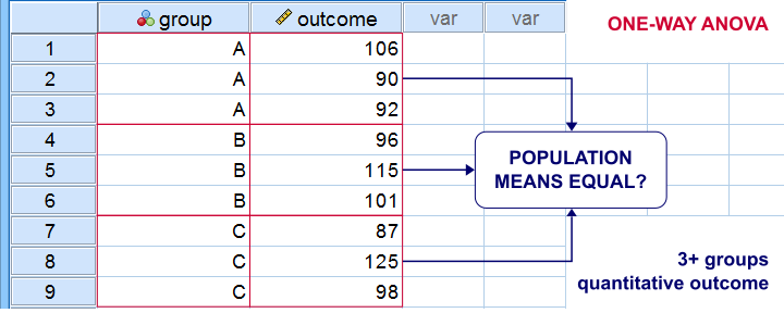
The best known example is a one-way ANOVA as illustrated below. Note that the subpopulations are represented by subsamples -groups of observations indicated by some categorical variable.
“Between-subjects” tests are also known as “independent samples” tests, such as the independent samples t-test. “Independent samples” means that subsamples don't overlap: each observation belongs to only 1 subsample.
4. Overview Association Measures
| (VARIABLES ARE) | QUANTITATIVE | ORDINAL | NOMINAL | DICHOTOMOUS |
|---|---|---|---|---|
| QUANTITATIVE | Pearson correlation | |||
| ORDINAL | Spearman correlation Kendall’s tau Polychoric correlation | Spearman correlation Kendall’s tau Polychoric correlation | ||
| NOMINAL | Eta squared | Cramér’s V | Cramér’s V | |
| DICHOTOMOUS | Point-biserial correlation Biserial correlation | Spearman correlation Kendall’s tau Polychoric correlation | Cramér’s V | Phi-coefficient Tetrachoric correlation |
Association Measures - Quick Definition
Association measures are numbers that indicate
to what extent 2 variables are associated.
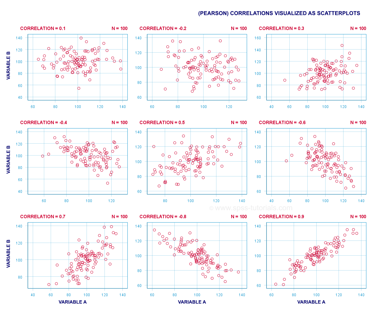
The best known association measure is the Pearson correlation: a number that tells us to what extent 2 quantitative variables are linearly related. The illustration below visualizes correlations as scatterplots.
5. Overview Prediction Analyses
| OUTCOME VARIABLE | ANALYSIS |
|---|---|
| Quantitative | (Multiple) linear regression analysis |
| Ordinal | Discriminant analysis or ordinal regression analysis |
| Nominal | Discriminant analysis or nominal regression analysis |
| Dichotomous | Logistic regression |
Prediction Analyses - Quick Definition
Prediction tests examine how and to what extent
a variable can be predicted from 1+ other variables.
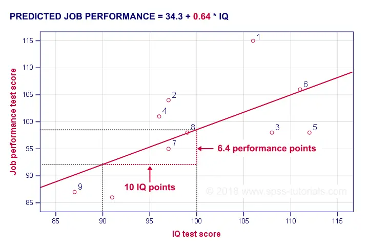
The simplest example is simple linear regression as illustrated below.
Prediction analyses sometimes quietly assume causality: whatever predicts some variable is often thought to affect this variable. Depending on the contents of an analysis, causality may or may not be plausible. Keep in mind, however, that the analyses listed below don't prove causality.
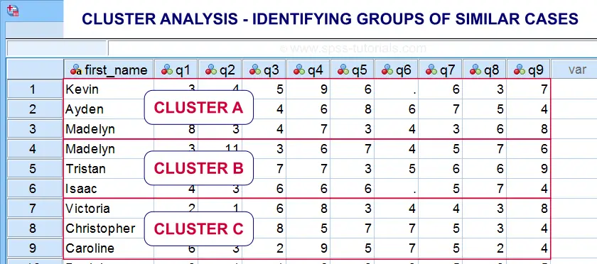
6. Classification Analyses
Classification analyses attempt to identify and
describe groups of observations or variables.
The 2 main types of classification analysis are
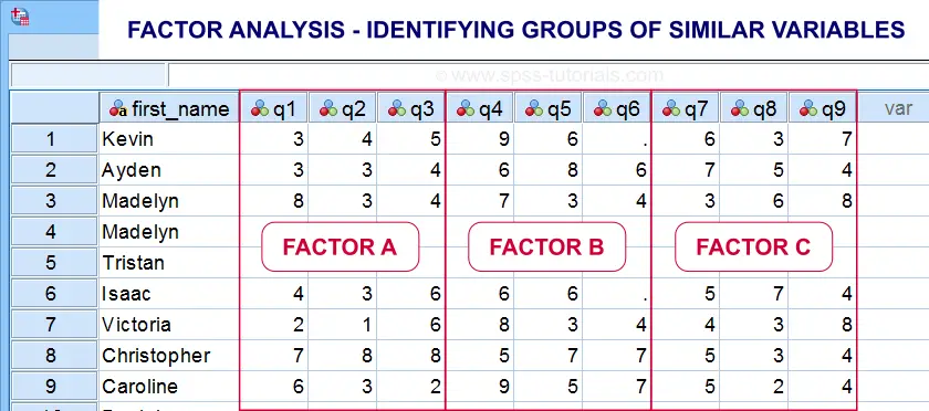
- factor analysis for finding groups of variables (“factors”) and
- cluster analysis for finding groups of observations (“clusters”).
Factor analysis is based on correlations or covariances. Groups of variables that correlate strongly are assumed to measure similar underlying factors -sometimes called “constructs”. The basic idea is illustrated below.
Cluster analysis is based on distances among observations -often people. Groups of observations with small distances among them are assumed to represent clusters such as market segments.
Right. So that'll do for a basic overview. Hope you found this guide helpful! And last but not least,
thanks for reading!
SPSS Data Analysis – Simple Roadmap
- Set Up Project Folder and Open Data;
- SPSS Data File Inspection;
- SPSS Categorical Variable Inspection;
- SPSS Metric Variable Inspection;
- Optionally: Edit Data;
- Choose and Run Tables/Charts/Tests.
1. Set Up Project Folder and Open Data
The biggest waste of time and effort in SPSS is probably not keeping projects organized. A related pitfall is not regularly making backup copies of the entire project. Avoiding this starts with setting up a project folder that'll contain all of your data -original and edited-, syntax and output files.
We recommend you never edit your original data and keep it in a safe place. For me, that's usually a subfolder called “ori”, short for “original data”. Make sure that the project contains all files you'd like to backup -and nothing else.
Done setting up a decent project folder? Then let's go and open the data.
 Keeping this project nicely organized saved me way more time than it cost me.
2. SPSS Data File Inspection
At this point we know which variables in our data -possibly all- we're actually going to use. A sound way to proceed from here is inspecting our data visually. Some things we need to know are
- is there a unique case identifier?
- are there excessively long variable names?
- are there any undesired string variables?
- are all variables and values clearly labeled? Is it absolutely clear what everything really means? If not, don't guess. Instead, obtain this information -preferably via email- from whomever is responsible for delivering accurate and complete data to you.
If you encounter any such issues, fix them right away. The sooner you troubleshoot such issues, the less time and effort they'll cost you.
 Shortening these variable names and applying variable labels saves more effort than it costs
At this point our data should be technically in order. So what about the contents of our variables? I suggest you carefully check these for categorical variables and metric variables separately.
3. SPSS Categorical Variable Inspection
We inspect categorical variables by
- running frequency tables showing both values and value labels and
- inspecting the corresponding bar charts.
A single line FREQUENCIES command suffices for many variables in one go. Issues we typically look for are:
- are any ordinal variables reversely coded (lower values indicating higher ratings)? If so, see SPSS - What’s the Best Way to Reverse Code Variables?
- should any user missing values be specified?
- are all frequency distributions plausible? That is, do all variables make sense?
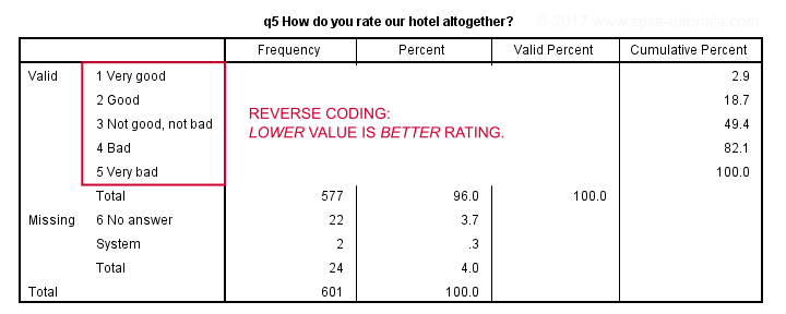 Reverse coded variable - not really wrong but inconvenient nevertheless.
If any such issues are present, try and fix them. If they can't be fixed, perhaps take some notes so you won't have any nasty surprises later on.
4. SPSS Metric Variable Inspection
We inspect metric variables by
- running basic histograms over them and
- inspecting simple DESCRIPTIVES tables.
Note that you can run many histograms with a single line FREQUENCIES command as shown in Creating Histograms in SPSS. Histograms basically tell you all you need to know. Issues to look out for are
- are all distributions plausible? What about the means and standard deviations?
- are there any extreme values -either very large or very small- that must be specified as user missing?
- do any variables have many system missing values?
Next, a basic DESCRIPTIVES table comes in handy for checking the completeness of a set of variables. It'll also allow for a quick comparison of means and standard deviations.
After completing these steps, we can be confident that our data are sound. Nothing incorrect or unusual can mess up any newly created variables or test results anymore. Now -and only now- should we proceed with editing or analyzing our data. As a bonus, we also know what our data basically look like.
5. Optionally: Edit Data
Perhaps your research questions relate to variables that still need to be created or adjusted. Well, this is the moment to do so. Our most read tutorials on common data adjustments are
- SPSS Date Variables Tutorial
- How to Compute Age in SPSS?
- SPSS IF Command
- SPSS RECODE Command
- How to Compute Means in SPSS?
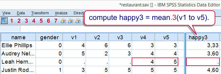 A nice -syntax only- trick for excluding cases with many missings when computing means
Hope those will get you started. Really, do adjust your data if needed. This often results in much nicer output with much less effort.
6. Choose and Run Tables, Charts & Tests
First off, which tables, charts and tests are appropriate is a complicated question that doesn't have a simple answer. Oftentimes, different approaches are equally defensible.
In any case,
the simplest analysis techniques examine each variable separately.
These are called univariate analyses (“univariate” means “for one variable”). As shown below, we should at least distinguish categorical from metric variables.
Minimal Overview Univariate Analyses
| Level | Table | Chart | Test |
|---|---|---|---|
| Categorical | FREQUENCIES | Bar chart frequencies | Binomial test (2 categories) Chi-square goodness-of-fit test (3+ categories) |
| Metric | DESCRIPTIVES | Histogram | One-sample t-test (mean) Kolmogorov-Smirnov test (distribution) |
A next step could be to examine if 2 variables are associated in any way. This involves bivariate analyses (“bivariate” means “for 2 variables”). Distinguishing categorical from metric variables once again, we arrive at the simple overview below.
Minimal Overview Bivariate Association Analyses
| Variable A | Variable B | Table | Chart | Test |
|---|---|---|---|---|
| Categorical | Categorical | CROSSTABS | Stacked bar chart percentages | Chi-square independence test |
| Metric | Categorical | MEANS | Bar chart means by category | Independent samples t-test (2 categories) One-way ANOVA (3+ categories) |
| Metric | Metric | CORRELATIONS | Scatterplot | Correlation test (non directional) Simple linear regression (directional) |
If you properly understand these tests, you'll start to see that most statistical tests are variations on these big 5 tests. For example,
- multiple regression is simple regression with more than 1 predictor;
- logistic regression is just regression with a dichotomous outcome variable;
- the Kruskal-Wallis test is basically a one-way ANOVA on ranked scores. And so on...
Is that all? No, not quite. First off, we only mentioned categorical and metric variables. Ideally, we'd distinguish
- dichotomous variables;
- nominal variables;
- ordinal variables and;
- metric variables.
We don't always need to treat these all separately but doing so results in a much more complete overview. We're working on it but it'll take another while.
For now, perhaps consult Which Statistical Test Should I Use?, part of which is shown below. Unfortunately, this overview is limited to statistical significance tests and does not suggest which tables and charts to use.
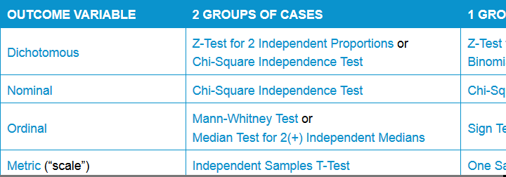 Simple overview statistical comparison tests
Thanks for reading!
Descriptive Statistics – One Metric Variable
Introduction
A previous tutorial introduced some summary statistics appropriate for both categorical as well as metric variables. Now it's time to turn to some measures that apply to metric variables exclusively. The most important ones are the mean (or average), variance and standard deviation.
Mean
Most of us are probably familiar with the mean (or average) but we'll briefly review it for the sake of completeness. The mean is the sum of all values divided by the number of values that were added. We can represent this definition by the formula $$\overline{X} = \frac{\sum\limits_{i=1}^n X_i}{n}$$ in which
- \(\overline{X}\) is the mean for variable \(X\);
- \(\sum\limits_{i=1}^n\) means that we sum over all values;
- \(X_i\) is a value from \(X\) and;
- \(n\) is the number of values that we're adding.
Example Calculation Mean
Now let's say we have some variable X1 containing the values 8, 9, 10, 11 and 12. If we fill these out in our formula, we'll see that the mean of these values is 10:
$$\overline{X} = \frac{8 + 9 + 10 + 11 +12}{5} = 10$$
Variance
The variance is the average squared deviation from the mean. We can represent this definition by the formula
$$S^2 = \frac{\sum\limits_{i=1}^n(X_i - \overline{X})^2}{n}$$
The variance is a measure of dispersion; it indicates how far the data values lie apart.
Example Calculation Variance
Let's reconsider variable X1 holding values 8, 9, 10, 11 and 12. If we apply the formula, we'll find that the variance is 2.Statistical software may come up with the value 2.5 here. This is because it divides the sum by (n - 1) instead of n. The difference between the two approaches is beyond the scope of this tutorial but we'll explain it in due time.
$$S^2 = \frac{(8-10)^2 + (9-10)^2 + (...) + (12-10)^2}{5} = 2$$
Now we have a second variable, X2, holding values 6, 8, 10, 12 and 14. How would you describe in words the difference between variables X1 and X2? They both have a mean value of 10. Well, the difference is that the values of X2 lie further apart; that is, X2 has a larger variance than X1.
Variance and Histogram
A variable's variance is reflected by the shape of its histogram. Everything else equal, as the variance increases, the histogram becomes wider and lower. The figure below illustrates this for real data. Each variable has 1,000 observations and a mean of precisely 100. Note that the three histograms use the same scales for their horizontal and vertical axes.
 Note how the histograms become lower and wider as variance increases.
Standard Deviation
The standard deviation is the square root of the variance. Its formula is therefore almost identical to that of the variance:
$$S = \sqrt{\frac{\sum_{i=1}^n(X_i - \overline{X})^2}{n}}$$
Just like the variance, the standard deviation is a measure of dispersion; it indicates how far a number of values lie apart.
The standard deviation and the variance thus basically express the same thing, albeit on different scales. So why don't we just use one measure for expression the dispersion of a number of values? The reason is that for some scenarios the standard deviation is mathematically more convenient and reversely for the variance.
Association between Metric and Dichotomous Variable
Summary
This tutorial shows how to create nice tables and charts for studying the association between a dichotomous and a metric variable. If statistical assumptions are met, these may be followed up by an independent samples t-test.
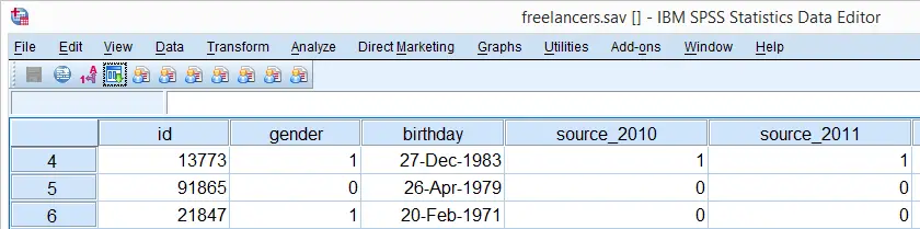
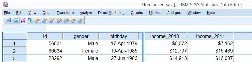
As an example, we'll investigate whether there's an association between income_2010 and gender in freelancers.sav: is the average income over 2010 equal for female and male respondents?
Quick Data Check
Before we do anything else with our two variables, let's first make sure they don't contain any unexpected values. We'll do so by running a histogram for our metric variables and a frequencies table for our dichotomous variable. The easy way to do so is by FREQUENCIES as shown in the syntax below.
We'll also run FORMATS for hiding the decimals of income_2010. This will suppress excessive decimal places in our output tables later on. Note that a simple tool for doing so is available from Set Decimals for Output Tables Tool.
SPSS Data Check Syntax
frequencies income_2010/format notable/histogram.
*2. Inspect frequencies for gender.
frequencies gender.
*3. Hide decimals in income_2010.
formats income_2010(dollar7).
Conclusion: nothing unusual is seen upon inspecting the results in the output viewer window. Note that neither variable has any missing values either. We may proceed our investigation confidently.
SPSS MEANS Table
We'd now like to take a look at the mean incomes for females and males separately. The way to go here is MEANS. We prettified the output table somewhat by using an SPSS table template (.stt file) that hides “Report” and shows the variable label as if it's a title.
means income_2010 by gender/cells count mean stddev.
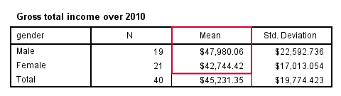
Conclusion: on average, male respondents made some $5,000 more than female respondents over 2010.
SPSS Bar Chart for Independent Means
We'll now visualize the mean incomes from our previous table. The way to go here is a bar chart for independent means. The screenshots below walk you through.
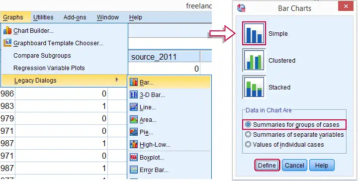
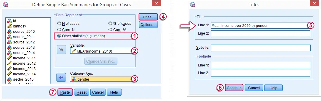
SPSS Bar Chart Independent Means Syntax
Completing the steps shown in the previous screenshots results in the syntax below. The result is shown in the next screenshot.
GRAPH
/BAR(SIMPLE)=MEAN(income_2010) BY gender
/title "Mean income over 2010 by gender".
SPSS Bar Chart Styling
Although our chart is technically correct, it's ugly and not very outspoken. For one thing, we'll add the frequencies for gender to their value labels. We can have this modification reversed by preceding it with TEMPORARY as shown in the next syntax example, step 1.
Next, we'll style the chart by applying an SPSS chart template (.sgt file). In our case, we'll transpose it (“put it on its side”) and have the dollar axis run from $40,000 through $50,000. The final result (after minor additional tweaks) is shown in the following screenshot.
SPSS Bar Chart Independent Means Syntax
temporary.
*2. Add N's to value labels. "\n" breaks labels over two lines (N beneath gender in chart).
value labels gender 0 'Female\nN = 21' 1 'Male\nN = 19'.
*3. Rerun chart. Indicates end of temporary command and reverses previous value labels command.
GRAPH
/BAR(SIMPLE)=MEAN(income_2010) BY gender
/title "Mean income over 2010 by gender".

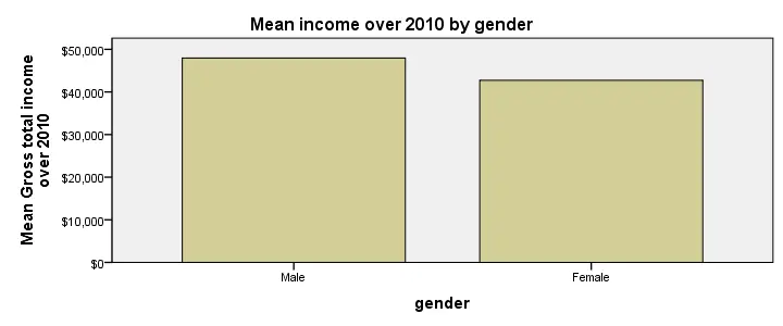
SPSS Population Pyramid
Another nice chart option for these data is a population pyramid. It visualizes the association between a metric and a categorical variable but it works best if the latter is dichotomous - exactly the case we've got here. The screenshot below walks you through.
SPSS Population Pyramid Syntax
XGRAPH CHART=[HISTOBAR] BY income_2010[s] BY gender[c]
/COORDINATE SPLIT=YES.
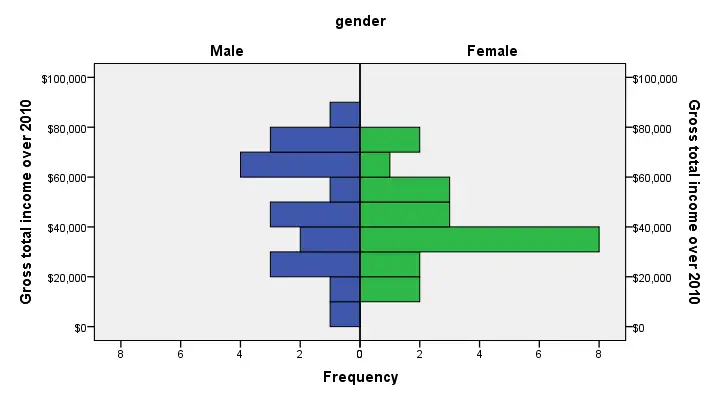
Conclusion: female respondents more often had incomes between $30,000 and $40,000 than males. Reversely, male respondents had incomes between $60,000 and $80,000 more often than female respondents. These are the most striking differences that account for the mean difference observed.
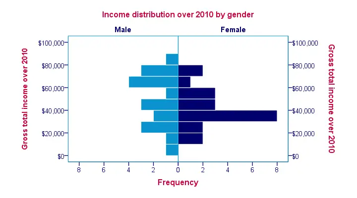
SPSS Population Pyramid Styling
Just as with our bar chart, we'll abuse the variable label of gender as a title and we'll again precede it with TEMPORARY. We'll add some more styling with an SPSS chart template.Styling our fake title and value labels (“Male” and “Female”) is notoriously hard as it can't be done with a chart template. If you don't want to do it manually, you'll need to dive into the chart's source code, possibly by using a Python script. The screenshot below shows our final result.
temporary.
*2. Temporarily set chart title as variable label.
variable labels gender 'Income distribution over 2010 by gender'.
*3. Run chart, then end temporary and reverse previous command.
XGRAPH CHART=[HISTOBAR] BY income_2010[s] BY gender[c]
/COORDINATE SPLIT=YES.
Association between Categorical Variables
This tutorial walks through running nice tables and charts for investigating the association between categorical or dichotomous variables. If statistical assumptions are met, these may be followed up by a chi-square test.
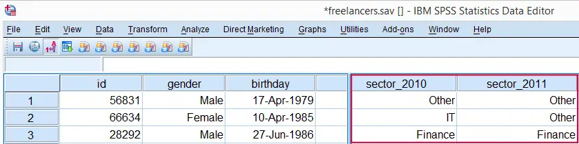
As an example, we'll see whether sector_2010 and sector_2011 in freelancers.sav are associated in any way.
SPSS Quick Data Check
Before doing anything else, let's first just take a quick look at both variables separately. In the syntax below, we first ensure we'll see both values and value labels in our output tables (step 1). Next, we run a basic FREQUENCIES command.
set tnumbers both.
*2. Run frequencies.
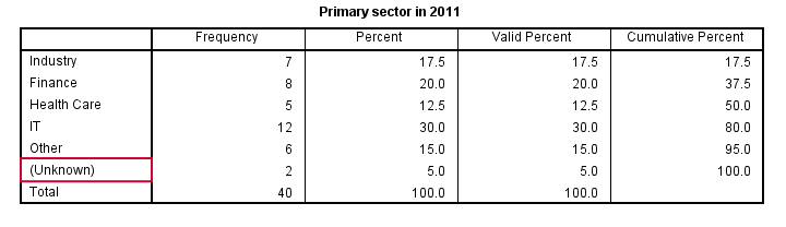
frequencies sector_2010 sector_2011.
RECODE System Missing Values
Both variables contain values from 1 through 5 plus system missing values. Since both variables are nominal, we may include these system missings as just another category. This keeps the N nice and constant over analyses and results in cleaner tables.For nicer tables, you may remove “Valid” with a Python script and apply styling with an SPSS table template (.stt file). The syntax below shows how to do so with RECODE.
recode sector_2010 sector_2011 (sysmis = 6).
*2. Explain what formerly missing value means.
add value labels sector_2010 sector_2011 6 '(Unknown)'.
*3. Show only value labels in output.
set tnumbers labels.
*4. Run clean frequency tables.
frequencies sector_2010 sector_2011.
SPSS CROSSTABS for Both Variables
Thus far, we only had a look at both variables separately. In order to see how they're associated, we'll inspect their contingency table obtained from CROSSTABS. Displaying column percentages without frequencies is our preferred option here.
crosstabs sector_2011 by sector_2010
/cells column.
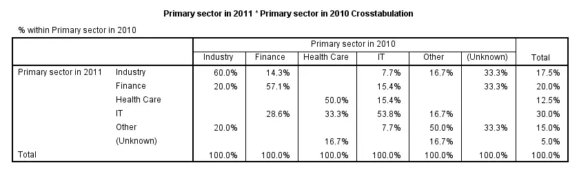
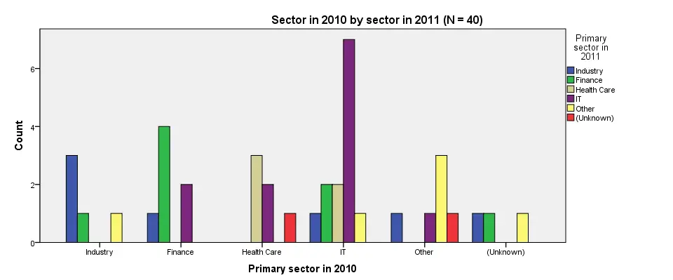
Conclusion: the variables are strongly related.Again, note that we're only describing the data at hand. We're not making any attempt to generalize these results to any larger population. Roughly, most people who worked in a sector in 2010 stayed in the same sector in 2011. For example, 60% of respondents who worked in industry in 2010 stayed in industry. Another 20% moved to finance and the final 20% moved to “other”.
SPSS Clustered Bar Chart Creation
We'll now visualize the contents of the previous table. An option here is a split bar chart but we'll go for a clustered bar chart instead. The screenshots below walk you through the process.
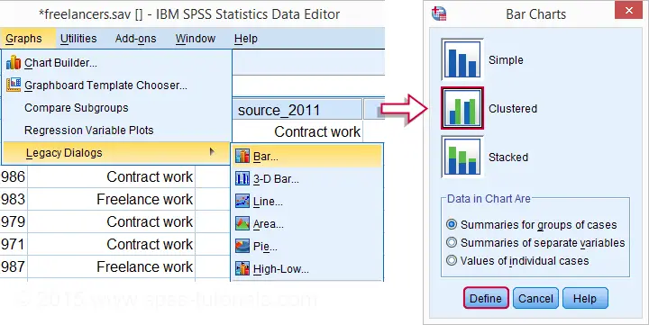
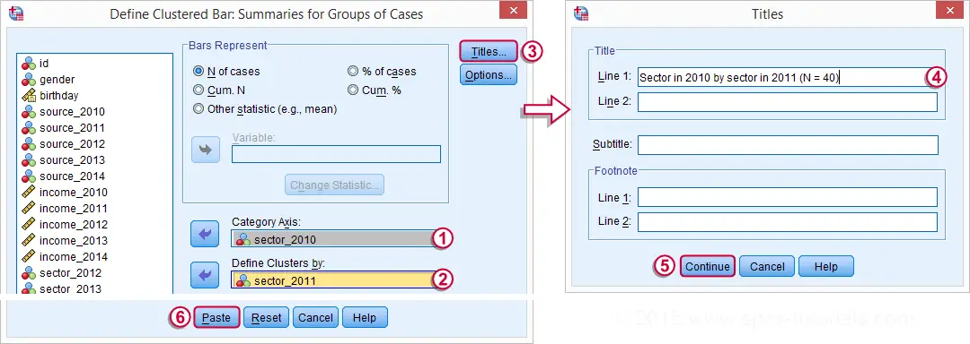
SPSS Clustered Bar Chart Syntax
GRAPH
/BAR(GROUPED)=COUNT BY sector_2011 BY sector_2010
/TITLE='Sector in 2010 by sector in 2011 (N = 40)'.
SPSS Clustered Bar Chart Styling
Although our chart is technically correct, it looks appalling. Its default color scheme basically just looks like a bad joke from the software developers. A fast way to prettify this and similar charts is building and applying an SPSS chart template (.sgt file). Our final result after doing so is shown in the last screenshot.
SPSS Clustered Bar Chart Example
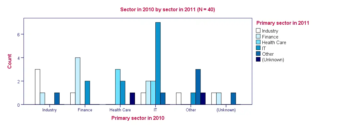
Conclusion: as with the contingency table, we don't see much of a clear pattern here except for people tending to stay in the same sector as the previous year.
Comparing Dichotomous Variables
This tutorial shows how to create nice tables and charts for comparing multiple dichotomous variables. If statistical assumptions are satisfied, these may be followed up by a McNemar test (2 variables) or a Cochran Q test (3+ variables). We'll use the freelancers.sav data throughout.
SPSS DESCRIPTIVES Table
The simplest way to compare multiple dichotomous variables is simply running DESCRIPTIVES: as long as 0 and 1 are the only valid values, means will correspond to proportions.If this doesn't hold, RECODE will usually be the easiest fix here.
The syntax below generates a basic descriptives table for source_2010 through source_2014. Note in the result (screenshot below) that the maximum and minimum values are indeed 0 and 1.
descriptives source_2010 to source_2014.
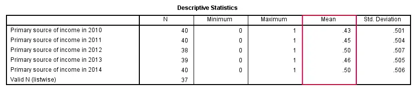
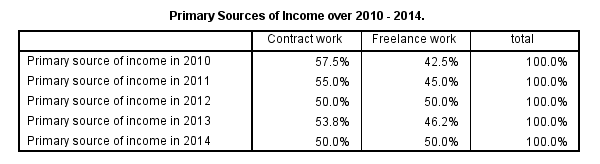
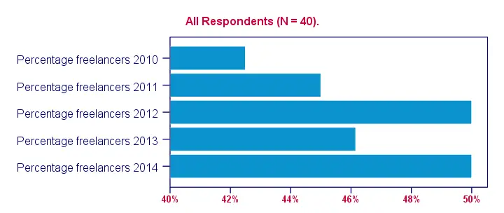
Conclusion: the lowest percentage of freelancers (43%) was observed in 2010, the highest percentages (50%) in 2012 and 2014.
SPSS TABLES Command
Although the previous table is technically correct, it doesn't quite get the message across because value labels are not shown. We may obtain a nicer table by using SPSS TABLES command.TABLES is the predecessor of CTABLES but doesn't require you purchase an extra license. It supposedly doesn't exist in SPSS anymore; it's absent from the menu as well as the command syntax reference. However, it works up to (at least) SPSS version 22. Using it is rather challenging since instructions are not easily obtained. The syntax below shows how to do so. Note that the percentages are (obviously) consistent with the proportions in the previous table.
tables
/format = zero
/ftotal = total
/table = source_2010 + source_2011 + source_2012 + source_2013 + source_2014 by (labels) + total
/statistics = cpct((pct4.1)'')
/title = 'Primary Sources of Income over 2010 - 2014.'.
 Output from SPSS TABLES Syntax
SPSS Bar Chart for Multiple Variables
A nice way for visualizing the previous tables is a bar chart for multiple variables. The screenshots below walk you through.
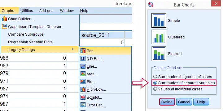
(Note that for older SPSS versions, the graphs under are located directly under .)
These steps generate the syntax below. The result is shown in the next screenshot.
SPSS Bar Chart for Multiple Variables Syntax
GRAPH
/BAR(SIMPLE)=MEAN(source_2010) MEAN(source_2011) MEAN(source_2012) MEAN(source_2013) MEAN(source_2014)
/MISSING=VARIABLEWISE
/title "All Respondents (N = 40).".
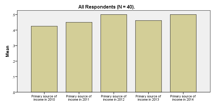
SPSS Bar Chart - Improvements
Our first bar chart -although technically correct- doesn't look nice at all. It doesn't quite convey its message either; all bars look roughly the same and the current variable labels are not very suitable for this chart.
Part of the problem can be solved by modifying our data: the result will be better with different variable labels and percentages instead of proportions. We could change things back after running the chart but a better option is simply closing and reopening the data without saving it. However, The most elegant solution is using TEMPORARY before modifying our data. The syntax below demonstrates how to do so.
temporary.
*2. Adapt variable labels.
variable labels source_2010 "Percentage freelancers 2010".
variable labels source_2011 "Percentage freelancers 2011".
variable labels source_2012 "Percentage freelancers 2012".
variable labels source_2013 "Percentage freelancers 2013".
variable labels source_2014 "Percentage freelancers 2014".
*3. Change 0 and 1 to 0% and 100% for percentages instead of proportions as means.
recode source_2010 to source_2014 (1 = 100).
formats source_2010 to source_2014 (pct4).
*4. Rerun exact same bar chart syntax as previously. This also reverses steps 2 and 3 and indicates end of temporary modifications.
GRAPH
/BAR(SIMPLE)=MEAN(source_2014) MEAN(source_2013) MEAN(source_2012) MEAN(source_2011) MEAN(source_2010)
/MISSING=VARIABLEWISE
/title "All Respondents (N = 40).".
SPSS Bar Chart - Styling
Last but not least, our chart will be much better if we build and apply an SPSS chart template (.sgt file). Like so, we'll transpose (“put on its side”) the chart because it creates space for our variable labels.
Also, we'll have the x-axis run from 40% through 50% in order to “magnify” the differences between years. The result after these (and additional) tweaks is shown in the final screenshot. Note that the didn't modify the syntax for the chart itself in any way.
Comparing Dichotomous or Categorical Variables
Summary
This tutorial shows how to create nice tables and charts for comparing multiple dichotomous or categorical variables. We recommend following along by downloading and opening freelancers.sav.
The question we'll answer is in which sectors our respondents have been working and to what extent this has been changing over the years 2010 through 2014. Variables sector_2010 through sector_2014 contain the necessary information.
SPSS Frequency Tables
A simple and straightforward way for answering our question is running basic FREQUENCIES tables over the relevant variables. The syntax below shows how to do so. The next screenshot shows the first of the five tables created like so.
set tnumbers both.
*2. Inspect frequency tables.
frequencies sector_2010 to sector_2014.
SPSS FREQUENCIES Output
Right, with some effort we can see from these tables in which sectors our respondents have been working over the years. However, these separate tables don't provide for a nice overview. Therefore, we'll next create a single overview table for our five variables.
The table we'll create requires that all variables have identical value labels. Inspecting the five frequencies tables shows that all variables have values from 1 through 5 and these are identically labeled. A final preparation before creating our overview table is handling the system missing values that we see in some frequency tables.
Including System Missing Values
Since we're dealing with nominal variables, we may include system missing values as if they were valid. This keeps the N nice and consistent over analyses. Since the valid values run through 5, we'll RECODE them into 6.
recode sector_2010 to sector_2014 (sysmis = 6).
*2. Apply description to former system missing values.
add value labels sector_2010 to sector_2014 6 '(Unknown)'.
SPSS TABLES Command
We'll now run a single table containing the percentages over categories for all 5 variables. One way to do so is by using TABLES as shown below. Using TABLES is rather challenging as it's not available from the menu and has been removed from the command syntax reference. We'll therefore propose an alternative way for creating this exact same table a bit later on.
set tnumbers labels.
*2. Frequency table for multiple variables.
tables
/ftotal = total
/table = sector_2010 + sector_2011 + sector_2012 + sector_2013 + sector_2014 by (labels) + total
/statistics = cpct((pct4)'')
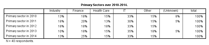
/title = "Primary Sectors over 2010-2014."
/caption "N = 40 respondents.".
SPSS TABLES Output Table
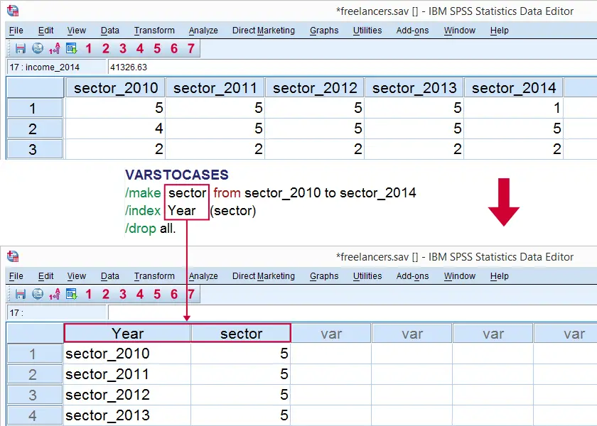
SPSS VARSTOCASES Command
At this point, we'd like to visualize the previous table as a chart. A single graph containing separate bar charts for different years would be nice here. However, SPSS can't generate this graph given our current data structure.
The solution is to restructure our data: we'll put our five variables (sectors for five years) on top of each other in a single variable. A second variable will indicate the year for each sector.
The syntax below shows how to do so with VARSTOCASES. Since we'll focus on sectors and years exclusively, we'll drop all other variables from the original data.
SPSS VARSTOCASES Syntax Example
VARSTOCASES
/make sector from sector_2010 to sector_2014
/index Year (sector)
/drop all.
Result
Additional Data Tweaks
Note that the variable label for sector is no longer correct after running VARSTOCASES; it's no longer limited to 2010. The first step in the syntax below will fixes this.
Also, note that year is a string variable representing years. We may chop off “sector_” from all values by using SUBSTR in order to clean it up a bit. This will make subsequent tables and charts look much nicer.
variable labels sector "Primary Sector".
*2. Chop off "sector_" from year.
compute year = char.substr(year,index(year,'_') + 1).
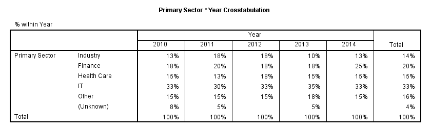
SPSS CROSSTABS Table
Since we restructured our data, the main question has now become whether there's an association between sector and year. Although year is metric, we'll treat both variables as categorical.
A contingency table generated with CROSSTABS now sheds some light onto this association. Note that the results are identical to the TABLES and FREQUENCIES results we ran previously.
crosstabs sector by year/cells column.
SPSS CROSSTABS Output
SPSS Split Bar Chart
Restructuring out data allows us to run a split bar chart; we'll make bar charts displaying frequencies for sector for our five years separately in a single chart. The screenshot below walks you through.
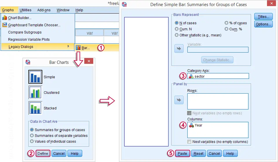
When running the syntax for this chart, the variable label of year will be shown above the chart. We don't want this but there's no easy way for circumventing it. The solution here is changing the variable label to a title for our chart and we do so by adding step 2 to our chart syntax below. Preceding it with TEMPORARY (step 1), circumvents the need to change back the variable label later on.
SPSS Split Bar Chart Syntax
temporary.
*2. Abuse variable label as title for chart.
variable labels Year "Primary Sectors by Year (N = 40)".
*3. Run chart and change back variable label.
GRAPH
/BAR(SIMPLE)=COUNT BY sector
/PANEL COLVAR=Year COLOP=CROSS.
SPSS Split Bar Chart
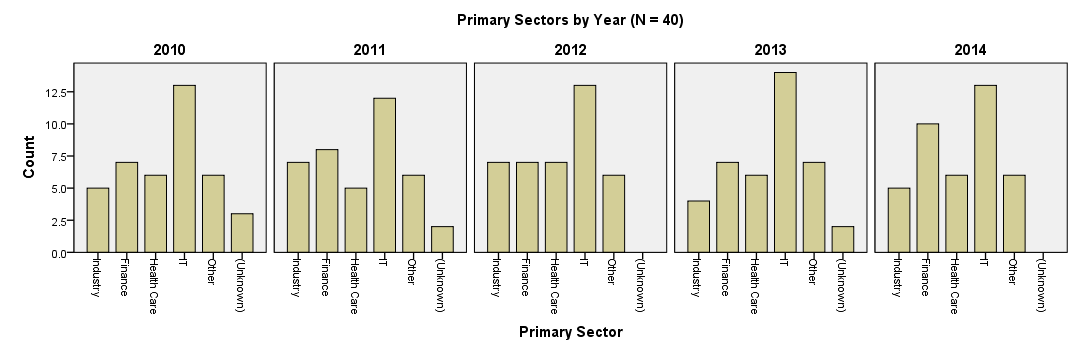
Conclusion
Our chart visualizes the sectors our respondents have been working in over the years. However, the chart doesn't look very pretty and its layout is far from optimal. Creating an SPSS chart template for it can do some real magic here but this is beyond our scope now.
For rounding up with a bit of an anti climax, we don't observe any outspoken association between primary sector and year.
Comparing Metric Variables
Summary
This tutorial shows how to create proper tables and means charts for multiple metric variables. If statistical assumptions are satisfied, these may be followed up by a repeated measures ANOVA. We'll use income 2010 through income_2014 from freelancers.sav throughout this tutorial.
SPSS FREQUENCIES for Inspecting Histograms
We'll first inspect the data in income_2010 through income_2014 by running basic histograms. This is done very easily with FREQUENCIES as shown in the syntax below.
Note in the output viewer window that some of the histograms look very weird due to extreme values.
SPSS FREQUENCIES Syntax for Histograms
frequencies income_2010 to income_2014
/format notable
/histogram.
Specifying User Missing Values
Note that some extreme values occur in the data. These presumably don't reflect actual yearly incomes but rather codes to indicate missing values. We'll specify them as user missing values with the syntax below. Reinspecting the histograms shows that the remaining values show plausible distributions.
missing values income_2010 to income_2014 (99999997 thru hi).
*2. Rerun histograms. Results now look ok.
frequencies income_2010 to income_2014
/format notable
/histogram.
SPSS DESCRIPTIVES Table
The basic answer to our question regarding the comparison of mean incomes over years is answered by a basic DESCRIPTIVES table. Because it tends to have excessive decimal places, we'll suppress those by hiding the decimals or our values with FORMATS.
A nicer alternative here is a very simple tool, discussed in Set Decimals for Output Tables Tool. However, we'll stick with our quick and dirty solution for now.
SPSS DESCRIPTIVES Syntax
formats income_2010 to income_2014 (dollar8).
*2. Run descriptives table.
descriptives income_2010 to income_2014.
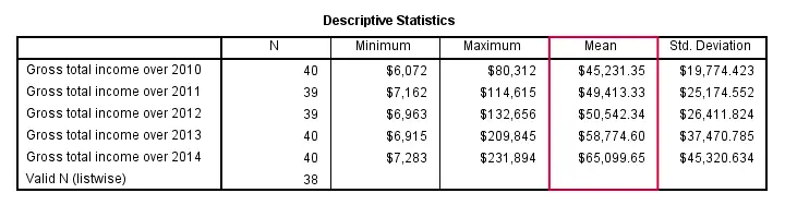
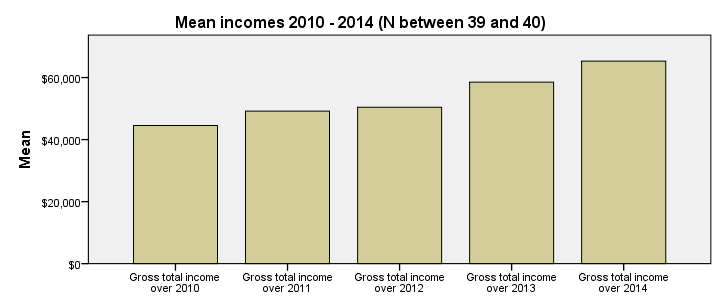
Conclusion: mean yearly incomes seem to gradually rise over the years. Starting from $45,000,- they increase with some $5,000,- per year on average.
SPSS Bar Chart for Multiple Variables
We'd now like to visualize these mean incomes with a chart. An appropriate choice here is a bar chart, as basic version of which is utterly easy to construct. The screenshots below walk you through.
In the left window of the screenshot below, select income_2010 through income_2014 by using Shift. Move the variables to . By default, SPSS will presume you want to plot the means (rather than some other statistic) of selected variables so this section doesn't need further editing.
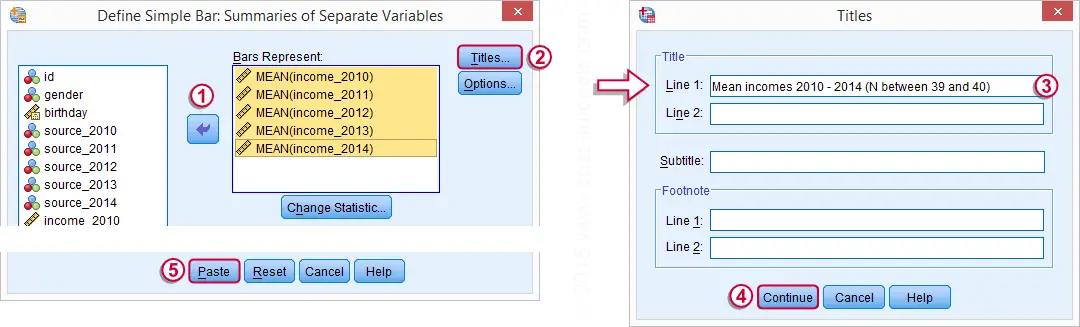
SPSS Bar Chart for Multiple Variables Syntax
Completing the steps shown in the previous screenshots results in the syntax below. Running it creates the desired bar chart.
GRAPH
/BAR(SIMPLE)=MEAN(income_2010) MEAN(income_2011) MEAN(income_2012) MEAN(income_2013) MEAN(income_2014)
/MISSING=LISTWISE
/TITLE='Mean incomes 2010 - 2014 (N between 39 and 40)'.
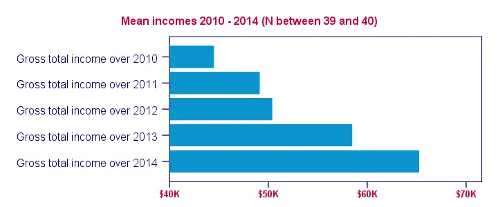
Styling the Bar Chart
The bar chart we've come up with so far provides insight into the mean incomes over 2010 through 2014. However, it could use some styling. The best way for doing so is building and applying an SPSS chart template (.sgt) file.
In order to create more space for the variable labels, our chart template transposes (“puts on its side”) the chart. Since this reverses the order of the variables in our chart, it's nice to circumvent this out by also reversing the variable order in the chart syntax as shown below.
Second, we'd like to display $40,000,- as $40 K. We can set “K” as a suffix for the x-axis with our chart template. DO REPEAT provides a fast way for dividing the data values of the income variables by 1000. We don't need to reverse this if we precede it with TEMPORARY.
Finally, we can highlight differences in mean income by having the x-axis run from 40 (now representing $40,000,-) through 70. We'll do so with our chart template as well. After adding minor additional tweaks, the screenshot below shows our final result.
SPSS Bar Chart Syntax Example
temporary.
*2. Divide income_2010 through income_2014 by 1000.
do repeat income = income_2010 to income_2014.
compute income = income / 1000.
end repeat.
*3. Reverse order of variables and rerun graph. This reverses previous data modification as well. Transpose chart with SPSS chart template.
GRAPH
/BAR(SIMPLE)=MEAN(income_2014) MEAN(income_2013) MEAN(income_2012) MEAN(income_2011) MEAN(income_2010)
/MISSING=LISTWISE
/TITLE='Mean incomes 2010 - 2014 (N between 39 and 40)'.
SPSS Bar Chart - Final Result
Analyzing Categorical Variables Separately
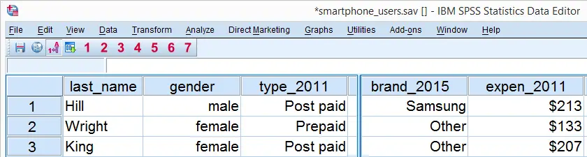
When analyzing your data, you sometimes just want to gain some insight into variables separately. The first step in doing so is creating appropriate tables and charts. This tutorial shows how to do so for dichotomous or categorical variables. We recommend you follow along by downloading and opening smartphone_users.sav.
SPSS Frequency Tables
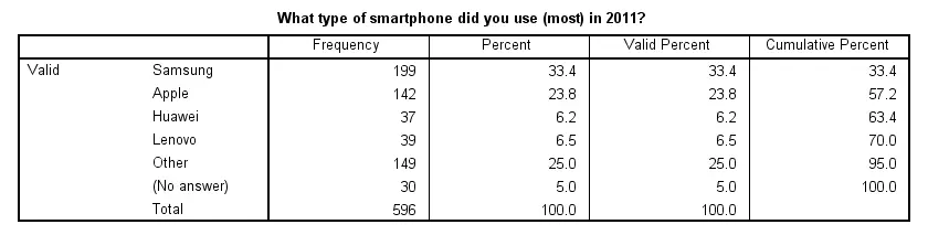
We'd like to know which smartphone brands were most popular in 2011. Our data contains a variable brand_2011 holding the relevant data. Since this is a categorical variable, a suitable table here is a simple frequency table as obtained with FREQUENCIES. The syntax below shows how to run it.
set tnumbers labels tvars labels.
*2. Create frequency table.
frequencies brand_2011.
Result
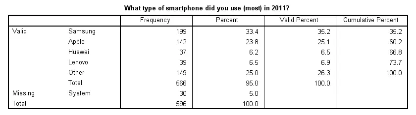
Note that there's some system missing values. Presuming these occurred due to respondents not using a smartphone in the first place, we'll report the figures under “Percent”. Conclusion: in 2011, 33% of our respondents used a Samsung smartphone, making it the most popular brand during that year.
SPSS Bar Charts for Categorical Variable
Our frequency table provides us with the necessary information but we need to look at it carefully for drawing conclusions. Doing so is greatly facilitated by creating a simple bar chart with bars representing frequencies. The fastest way to do so is including it in our FREQUENCIES command but this doesn't allow us to add a title. We'll therefore do it differently as shown by the screenshots below.
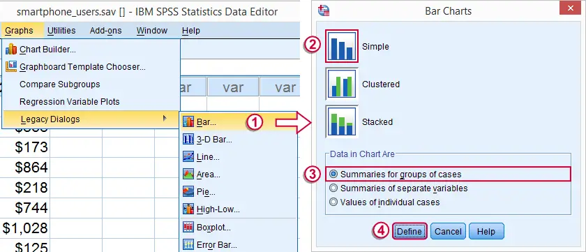
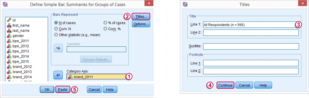
SPSS Bar Chart Syntax Example
GRAPH
/BAR(SIMPLE)=COUNT BY brand_2011
/title 'All Respondents (n = 566)'.
Result
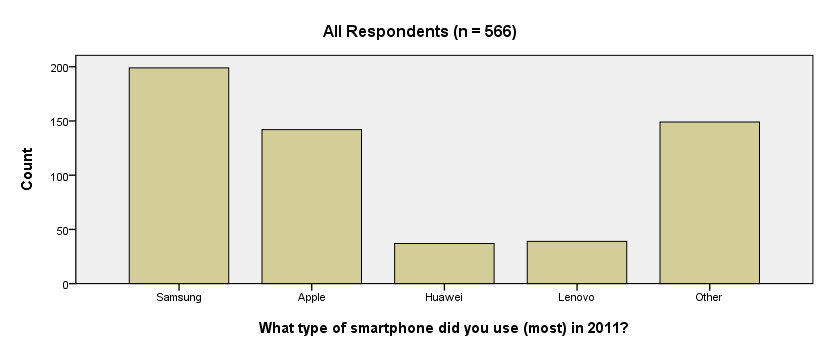
We now have our basic bar chart. For a serious report, however, you probably want a better looking chart. A great way for prettifying charts is discussed in SPSS Chart Templates - Quick Introduction.
System Missing Values
Thus far, we simply ignored the system missing values we saw in our frequency table. For nominal variables, an alternative approach is including them as just another answer category. The syntax below does just that for all brand variables. We'll first inspect which values are present. Next, we'll RECODE system missing values into a value that wasn't present yet. In our case that will be 6.
SPSS RECODE Syntax Example
set tnumbers both.
*2. Inspect which values are present in brand variables.
frequencies brand_2011 to brand_2015.
*3. Change system missing values to 6.
recode brand_2011 to brand_2015 (sysmis = 6).
*4. Apply value label to new value.
add value labels brand_2011 to brand_2015 6 '(No answer)'.
*5. Show only value labels in output tables.
set tnumbers labels.
*6. Rerun frequency tables.
frequencies brand_2011 to brand_2015.
Result
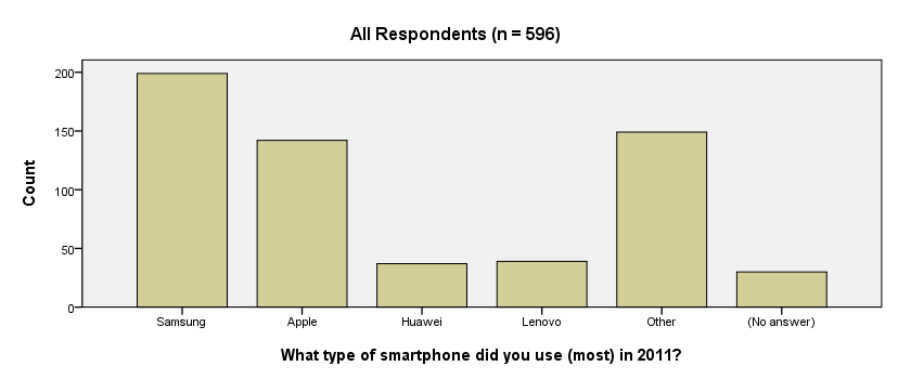
Note that our frequency table no longer includes any missing values. They've been converted to 6, which is labeled “(No answer)” and occurs 30 times for this variable.
We see that recoding system missing values make our frequency tables look better but there's another advantage: because the brand variables don't contain missing values anymore, their bar charts will all be based on the same number of respondents. This circumvents the need for specifying different numbers of respondents in their titles; we can create them very easily by copy-pasting-editing the syntax we used previously. The syntax below illustrates the idea.
SPSS Bar Charts Syntax Example
GRAPH /BAR(SIMPLE)=COUNT BY brand_2011 /TITLE='All Respondents (n = 596)'.
GRAPH /BAR(SIMPLE)=COUNT BY brand_2012 /TITLE='All Respondents (n = 596)'.
GRAPH /BAR(SIMPLE)=COUNT BY brand_2013 /TITLE='All Respondents (n = 596)'.
Result