Opening Excel Files in SPSS
- Open Excel File with Values in SPSS
- Apply Variable Labels from Excel
- Apply Value Labels from Excel
- Open Excel Files with Strings in SPSS
- Converting String Variables from Excel
Excel files containing social sciences data mostly come in 2 basic types:
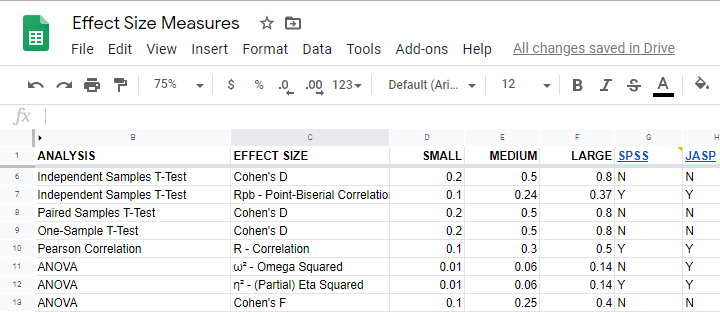
- files containing data values (1, 2, ...) and variable names (v01, v02, ...) and separate sheets on what the data represents as shown in course-evaluation-values.xlsx;
- files containing answer categories (“Good”, “Bad”, ...) and question descriptions (“How did you find...”) as in course-evaluation-labels.xlsx.
Just opening either file in SPSS is simple. However, preparing the data for analyses may be challenging. This tutorial quickly walks you through.
Open Excel File with Values in SPSS
Let's first fix course-evaluation-values.xlsx, partly shown below.
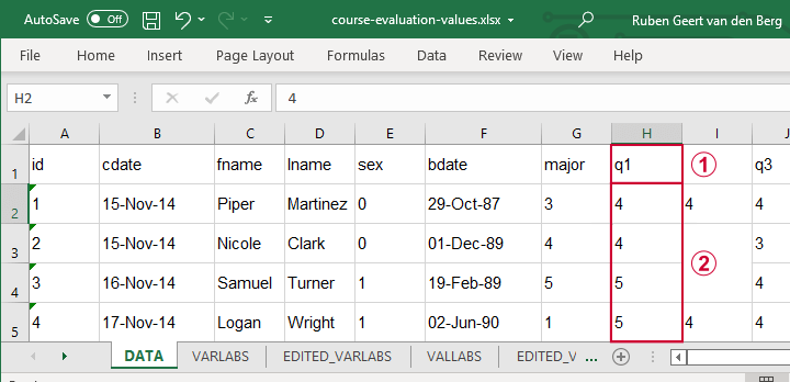
 The data sheet has short variable names whose descriptions are in another sheet, VARLABS (short for “variable labels”);
 Answer categories are represented by numbers whose descriptions are in VALLABS (short for “value labels”).
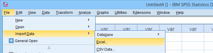
Let's first simply open our actual data sheet in SPSS by navigating to
![]()
![]() as shown below.
as shown below.
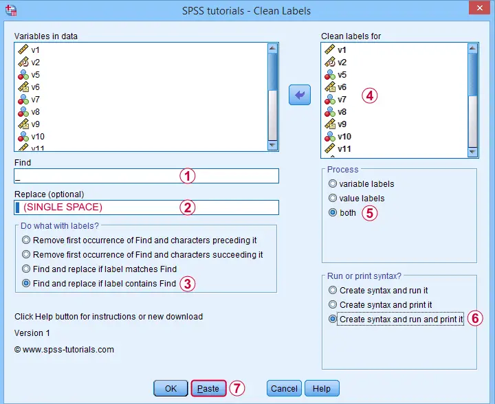
Next up, fill out the dialogs as shown below. Tip: you can also open these dialogs if you drag & drop an Excel file into an SPSS Data Editor window.
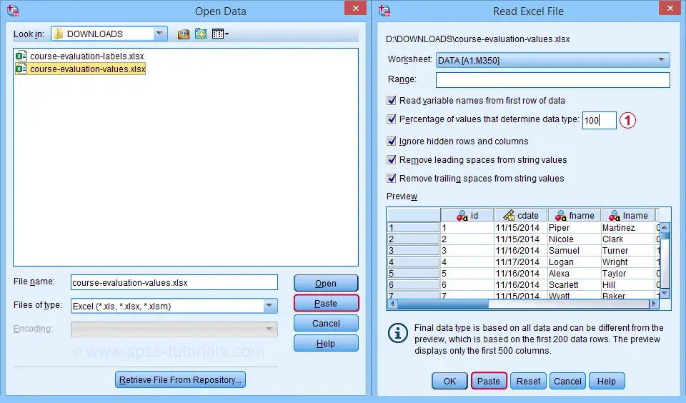
By default, SPSS converts Excel columns to numeric variables if at least 95% of their values are numbers. Other values are converted to system missing values without telling you which or how many values have disappeared. This is very risky but we can prevent this by setting it to 100.
Completing these steps results in the SPSS syntax shown below.
GET DATA
/TYPE=XLSX
/FILE='D:\data\course-evaluation-values.xlsx'
/SHEET=name 'DATA'
/CELLRANGE=FULL
/READNAMES=ON
/LEADINGSPACES IGNORE=YES
/TRAILINGSPACES IGNORE=YES
/DATATYPEMIN PERCENTAGE=100.0
/HIDDEN IGNORE=YES.
Result
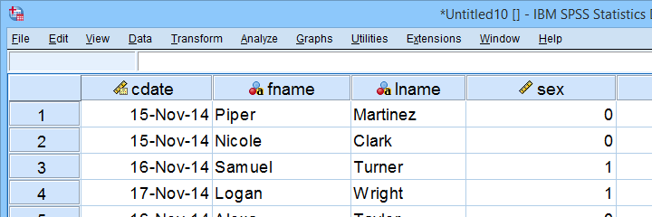
As shown, our actual data are now in SPSS. However, we still need to add their labels from the other Excel sheets. Let's start off with variable labels.
Apply Variable Labels from Excel
A quick and easy way for setting variable labels is creating SPSS syntax with Excel formulas: we basically add single quotes around each label and precede it with the variable name as shown below.
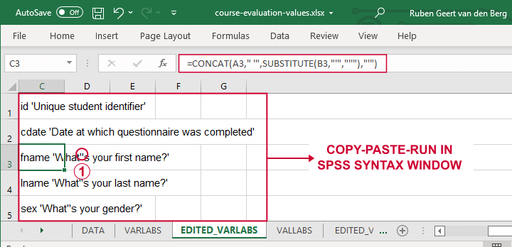
If we use single quotes around labels, we need to replace single quotes within labels by 2 single quotes.
Finally, we simply copy-paste these cells into a syntax window, precede it with VARIABLE LABELS and end the final line with a period. The syntax below shows the first couple of lines thus created.
variable labels
id 'Unique student identifier'
cdate 'Date at which questionnaire was completed'.
Apply Value Labels from Excel
We'll now set value labels with the same basic trick. The Excel formulas are a bit harder this time but still pretty doable.
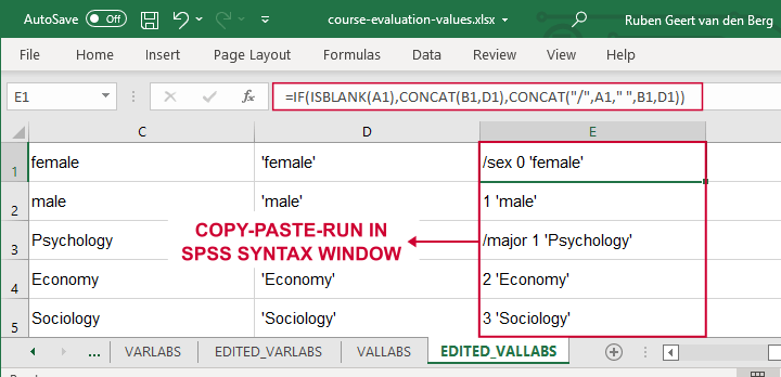
Let's copy-paste column E into an SPSS syntax window and add VALUE LABELS and a period to it. The syntax below shows the first couple of lines.
value labels
/sex 0 'female'
1 'male'
/major 1 'Psychology'
2 'Economy'
3 'Sociology'
4 'Anthropology'
5 'Other'.
After running these lines, we're pretty much done with this file. Quick note: if you need to convert many Excel files, you could automate this process with a simple Python script.
Open Excel Files with Strings in SPSS
Let's now convert course-evaluation-labels.xlsx, partly shown below.
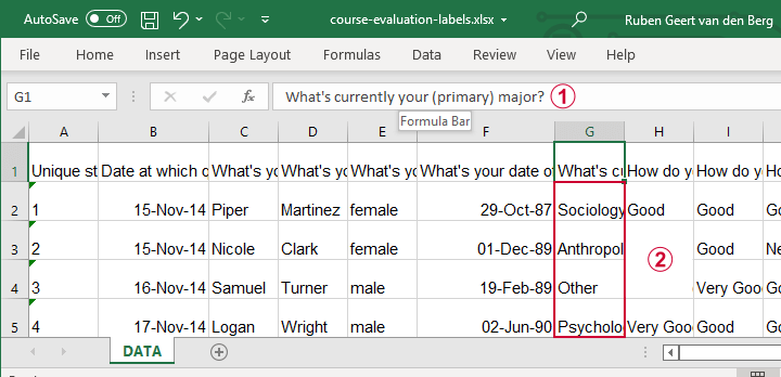
Note that the Excel column headers are full question descriptions;
the Excel cells contain the actual answer categories.
Let's first open this Excel sheet in SPSS. We'll do so with the exact same steps as in Open Excel File with Values in SPSS, resulting in the syntax below.
GET DATA
/TYPE=XLSX
/FILE='d:/data/course-evaluation-labels.xlsx'
/SHEET=name 'DATA'
/CELLRANGE=FULL
/READNAMES=ON
/LEADINGSPACES IGNORE=YES
/TRAILINGSPACES IGNORE=YES
/DATATYPEMIN PERCENTAGE=100.0
/HIDDEN IGNORE=YES.
Result
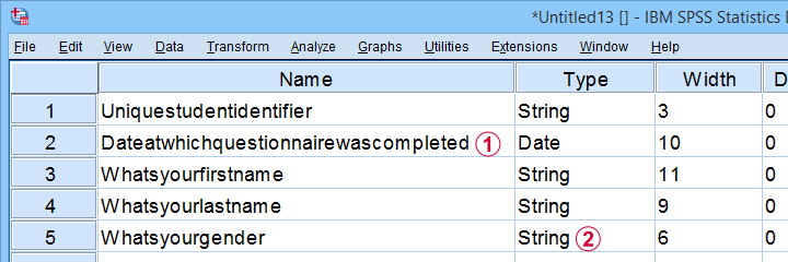
This Excel sheet results in huge variable names in SPSS;
most Excel columns have become string variables in SPSS.
Let's now fix both issues.
Shortening Variable Names
I strongly recommend using short variable names. You can set these with RENAME VARIABLES (ALL = V01 TO V13). Before doing so, make sure all variables have decent variable labels. If some are empty, I often set their variable names as labels. That's usually all information we have from the Excel column headers.
A simple little Python script for doing so is shown below.
begin program python3.
import spss
spssSyn = ''
for i in range(spss.GetVariableCount()):
varlab = spss.GetVariableLabel(i)
if not varlab:
varnam = spss.GetVariableName(i)
if not spssSyn:
spssSyn = 'VARIABLE LABELS'
spssSyn += "\n%(varnam)s '%(varnam)s'"%locals()
if spssSyn:
print(spssSyn)
spss.Submit(spssSyn + '.')
end program.
Converting String Variables from Excel
So how to convert our string variables to numeric ones? This depends on what's in these variables:
- for quantitative string variables containing numbers, try ALTER TYPE;
- for nominal answer categories, try AUTORECODE;
- for ordinal answer categories, use RECODE or try AUTORECODE and then adjust their order.
For example, the syntax below converts “id” to numeric.
alter type v01 (f8).
*CHECK FOR SYSTEM MISSING VALUES AFTER CONVERSION.
descriptives v01.
*SET COLUMN WIDTH SOMEWHAT WIDER FOR V01.
variable width v01 (6).
*AND SO ON...
Just as the Excel-SPSS conversion, ALTER TYPE may result in values disappearing without any warning or error as explained in SPSS ALTER TYPE Reporting Wrong Values?
If your converted variable doesn't have any system missing values, then this problem has not occurred. However, if you do see some system missing values, you'd better find out why these occur before proceeding.
Converting Ordinal String Variables
The easy way to convert ordinal string variables to numeric ones is to
- AUTORECODE them and
- adjust the order of the answer categories.
We thoroughly covered this method SPSS - Recode with Value Labels Tool (example II). Do look it up and try it. It may save you a lot of time and effort.
If you're somehow not able to use this method, a basic RECODE does the job too as shown below.
recode v08 to v13
('Very bad' = 1)
('Bad' = 2)
('Neutral' = 3)
('Good' = 4)
('Very Good' = 5)
into n08 to n13.
*SET VALUE LABELS.
value labels n08 to n13
1 'Very bad'
2 'Bad'
3 'Neutral'
4 'Good'
5 'Very Good'.
*SET VARIABLE LABELS.
variable labels
n08 'How do you rate this course?'
n09 'How do you rate the teacher of this course?'
n10 'How do you rate the lectures of this course?'
n11 'How do you rate the assignments of this course?'
n12 'How do you rate the learning resources (such as syllabi and handouts) that were issued by us?'
n13 'How do you rate the learning resources (such as books) that were not issued by us?'.
Keep in mind that writing such syntax sure sucks.
So that's about it for today. If you've any questions or remarks, throw me a comment below.
Thanks for reading!
SPSS SET – Quick Tutorial
Why should you learn anything about your SPSS settings? Well, doing so allows you to
- create better output with less effort;
- speed up a huge variety of tasks;
- accomplish tasks that are otherwise impossible.
So which settings are interesting to learn about? The table below presents our top 10.
Top 10 Most Useful SPSS Settings
| SETTING | OPTIONS | DESCRIPTION |
|---|---|---|
| TNUMBERS | BOTH / LABELS / VALUES | How to show values in pivot tables |
| TVARS | BOTH / LABELS / NAMES | How to show variables in pivot tables |
| OVARS | BOTH / LABELS / NAMES | How to show variables in output viewer outline |
| TLOOK | (path to .stt file) / NONE | Tablelook file: styling for pivot tables |
| SIGLESS | ON / OFF | Whether to display small significance levels as < 0.001 in tables |
| CTEMPLATE | (path to .sgt file) / NONE | Chart template file: styling for charts |
| LOCALE | (locale) / OSLOCALE | Country and character set |
| SEED | (chosen integer) / RANDOM | Random seed used if RNG = MC |
| PRINTBACK | NONE / LISTING | Whether to print syntax to output viewer |
| ODISPLAY | MODELVIEWER / TABLES | Whether to use model viewer for some output |
Background & Googlesheet for All Settings
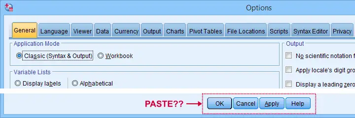
The vast majority of settings can be adjusted by navigating to
![]() as shown below.
as shown below.
Sadly, the options dialog is a bit of a labyrinth and finding your way here can be time consuming. Another major stupidity is that there's no Paste button here either.
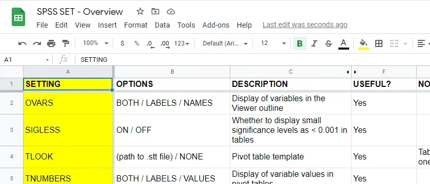
For these reasons, using SPSS syntax is a much better option for adjusting your settings. But where to start? Well, first off, we created an overview of all settings in this Googlesheet, partly shown below.
Note that Column F suggests if we think some setting is useful. The remainder of this tutorial demonstrates the 10 most useful settings, ordered from most to least important. All examples use bank-clean.sav, partly shown below.
SET TNUMBERS - Table Numbers
TNUMBERS controls how values are shown in output tables. The syntax below presents a quick demo.
set tnumbers both.
*Run minimal frequency table.
frequencies marit.
*Show only value labels in all succeeding tables.
set tnumbers labels.
*Run minimal frequency table.
frequencies marit.
Result
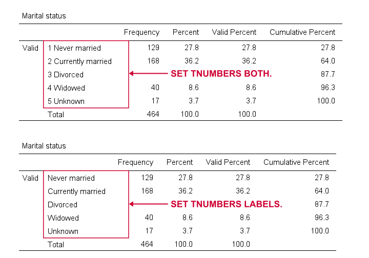
Reporting values and value labels is the recommended setting for screening data. However, for creating “clean” tables to include in your final report, you probably want to show only value labels.
SET TVARS - Table Variables
TVARS controls how variables are shown in output tables. For a quick demo, try the syntax below.
set tvars both.
*Run minimal descriptives table.
descriptives q1 to q3.
*Show only variable labels in succeeding output tables.
set tvars labels.
*Run minimal descriptives table.
descriptives q1 to q3.
Result
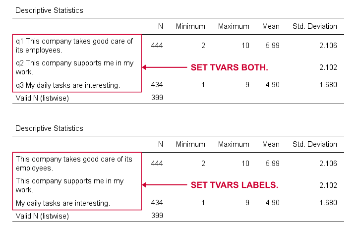
For screening data, showing both variable names and labels is often the way to go. For creating reporting tables, however, we recommend showing only variable labels.
SET OVARS - Outline Variables
OVARS controls how variables are shown in the output outline. The syntax below gives a quick demo.
set ovars both.
*Frequency tables & barcharts.
frequencies q1 to q3
/barchart.
*Show only variable names in viewer outline.
set ovars names.
*Frequency tables & barcharts.
frequencies q1 to q3
/barchart.
Result
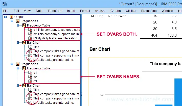
Note that the OVARS setting ignores the bar charts created with the frequency tables. The same goes for histograms. We believe this to be a tiny -but sometimes annoying- bug in SPSS.
SET TLOOK - Tablelook
Tablelooks or .stt files are plain text files containing styling for tables such as fonts, background colors and borders. The syntax demo below requires that clean-11pt.stt is located in a folder d:/templates on your computer.
set tlook none.
*Run minimal frequency table.
frequencies marit.
*Set nicer tablelook.
set tlook 'd:/templates/clean-11pt.stt'.
*Run minimal frequency table.
frequencies marit.
Result
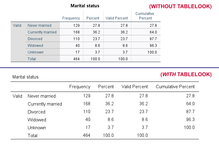
Notes
- You can also apply tablelooks to existing tables by using the menu or (faster) OUTPUT MODIFY.
- Sadly, the TLOOK setting ignores the CD command: you always need to specify both the folder and the file name...
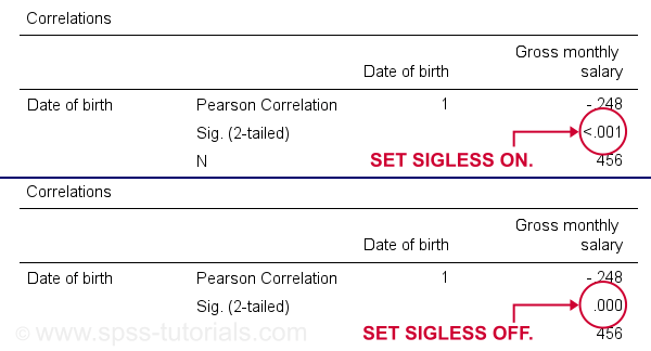
SET SIGLESS - Significance Less Than...
SIGLESS (introduced in SPSS 27) controls how small significance levels are shown in output tables. We believe there's a bug regarding this setting: the syntax below ignores it unless you run each line separately.
set sigless on.
*Run minimal correlation matrix.
correlations dob salary.
*Show small p-values as .000.
set sigless off.
*Run minimal correlation matrix.
correlations dob salary.
Result
SET CTEMPLATE - Chart Template
Chart templates or .sgt files are plain text files containing styling for charts such as colors, sizes and layout. The quick demo below requires that barchart-freq-dsort-en-h360.sgt is located in a folder d:/templates on your computer.
set ctemplate none.
*Minimal bar chart frequencies.
GRAPH
/BAR(SIMPLE)=COUNT BY marit
/TITLE='Frequency Distribution Marital Status'
/SUBTITLE='All Respondents | N = 464'.
*Set chart template for bar charts.
set ctemplate 'd:/templates/barchart-freq-dsort-en-h360.sgt'.
*Minimal bar chart frequencies.
GRAPH
/BAR(SIMPLE)=COUNT BY marit
/TITLE='Frequency Distribution Marital Status'
/SUBTITLE='All Respondents | N = 464'.
Result
Notes
- After creating the charts you need, you probably want to set your CTEMPLATE back to NONE.
- Some commands (GRAPH, GGRAPH) have a /TEMPLATE subcommand for applying chart templates but this doesn't work properly.
- You can also apply chart templates to existing charts from the menu or (faster) OUTPUT MODIFY.
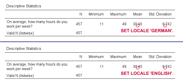
SET LOCALE
In recent SPSS versions, LOCALE is mainly used for specifying which decimal separator to use. It may also affect which character encoding SPSS uses but only if UNICODE = OFF (rarely used anymore).
set locale 'german'.
*Run minimal descriptives table.
descriptives whours.
*Set locale to German (dot as decimal separator).
set locale 'english'.
*Run minimal descriptives table.
descriptives whours.
Result
Quick note: I often prefer to use the DOT and COMMA formats for choosing which decimal separator is used. Doing so also makes converting string to numeric variables independent of your settings as discussed in SPSS Convert String to Numeric Variable. The syntax below, however, simply replicates the previous example using this alternative method.
formats whours(dot2).
*Run minimal descriptives table.
descriptives whours.
*Set format whours to comma (dot as decimal separator).
formats whours (comma2).
*Run minimal descriptives table.
descriptives whours.
SET SEED - Random Seed
Setting a random seed allows you to exactly replicate anything random in SPSS: computing random variables or drawing random samples. The example below computes two normally distributed random variables and then exactly replicates both.
set seed 1.
*Compute two "random" variables.
compute rnd01 = rv.normal(100,15).
compute rnd02 = rv.normal(100,15).
execute.
*Reset random seed to 1 (assuming RNG = MC).
set seed 1.
*Replicate previous "random" variables.
compute rnd03 = rv.normal(100,15).
compute rnd04 = rv.normal(100,15).
execute.
Result
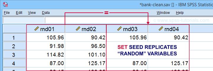
Minor note: SET SEED only takes effect if RNG = MC (default). You need to use SET MTINDEX if RNG = MT but I don't think anybody ever uses that.
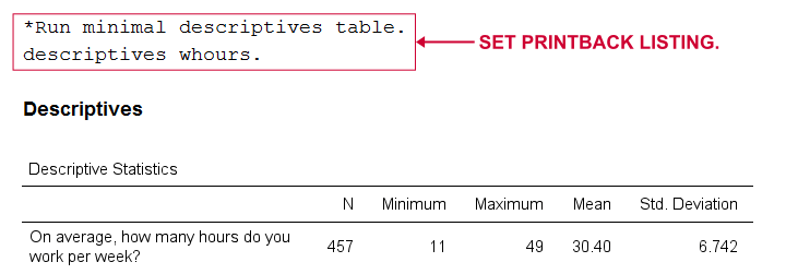
SET PRINTBACK
PRINTBACK tells SPSS whether to print the syntax you run (either from a syntax window or the menu) into your output window. Doing so may come in handy if you export all output to a single .pdf or WORD file.
set printback listing.
*Run minimal descriptives table.
descriptives whours.
*Don't print syntax into output viewer.
set printback none.
*Run minimal descriptives table.
descriptives whours.
Result
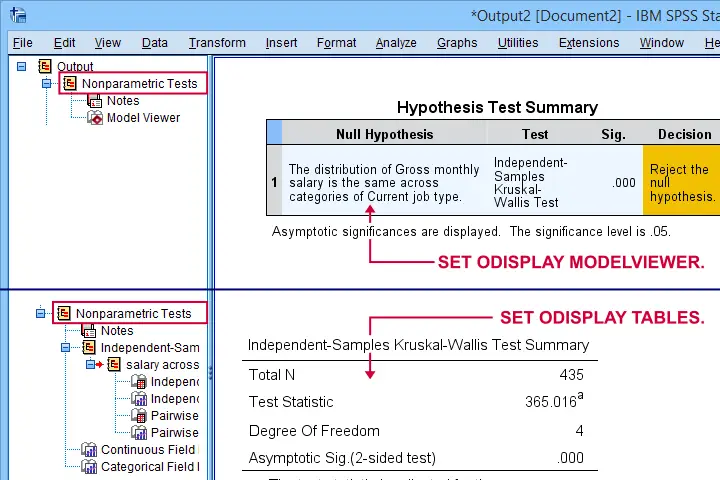
SET ODISPLAY - Output Display
For GENLINMIXED and NPTESTS, two output formats are available:
- the dreadful “model viewer” object or
- normal output (pivot) tables.
The syntax below creates both formats for a basic Kruskal-Wallis test.
set odisplay modelviewer.
*Kruskal-Wallis test.
NPTESTS
/INDEPENDENT TEST (salary) GROUP (jtype) KRUSKAL_WALLIS(COMPARE=PAIRWISE)
/MISSING SCOPE=ANALYSIS USERMISSING=EXCLUDE
/CRITERIA ALPHA=0.05 CILEVEL=95.
*Create pivot tables for NPTESTS (recommended).
set odisplay tables.
*Kruskal-Wallis test.
NPTESTS
/INDEPENDENT TEST (salary) GROUP (jtype) KRUSKAL_WALLIS(COMPARE=PAIRWISE)
/MISSING SCOPE=ANALYSIS USERMISSING=EXCLUDE
/CRITERIA ALPHA=0.05 CILEVEL=95.
Result
Note: I usually prefer a completely different command for the Kruskal-Wallis test as discussed in How to Run a Kruskal-Wallis Test in SPSS? This method does not include pairwise comparisons but I'm not a big fan of those anyway.
Related Commands - SHOW, PRESERVE & RESTORE
Before closing off, I should point out that you can use SHOW for looking up settings. Like so, SHOW ALL. shows all settings. These include some that you can't set with SET and some that you can't change at all.
Last but not least, you can undo changes in settings by preceding SET with PRESERVE and succeeding it with RESTORE. I find these commands mostly useful for building SPSS tools that change somebody else’s settings.
Right, I hope you found this tutorial helpful. Let me know if you (dis)agree and/or if I missed anything by throwing a quick comment below. Other than that:
Thanks for reading!
How to Find & Exclude Outliers in SPSS?
- Method I - Histograms
- Excluding Outliers from Data
- Method II - Boxplots
- Method III - Z-Scores (with Reporting)
- Method III - Z-Scores (without Reporting)
Summary
Outliers are basically values that fall outside of a normal range for some variable. But what's a “normal range”? This is subjective and may depend on substantive knowledge and prior research. Alternatively, there's some rules of thumb as well. These are less subjective but don't always result in better decisions as we're about to see.
In any case: we usually want to exclude outliers from data analysis. So how to do so in SPSS? We'll walk you through 3 methods, using life-choices.sav, partly shown below.
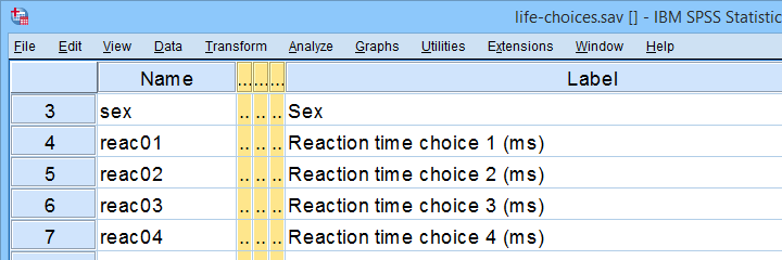 In this tutorial, we'll find outliers for these reaction time variables.
During this tutorial, we'll focus exclusively on reac01 to reac05, the reaction times in milliseconds for 5 choice trials offered to the respondents.
Method I - Histograms
Let's first try to identify outliers by running some quick histograms over our 5 reaction time variables. Doing so from SPSS’ menu is discussed in Creating Histograms in SPSS. A faster option, though, is running the syntax below.
frequencies reac01 to reac05
/histogram.
Result
Let's take a good look at the first of our 5 histograms shown below.
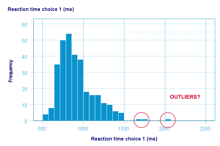
The “normal range” for this variable seems to run from 500 through 1500 ms. It seems that 3 scores lie outside this range. So are these outliers? Honestly, different analysts will make different decisions here. Personally, I'd settle for only excluding the score ≥ 2000 ms. So what's the right way to do so? And what about the other variables?
Excluding Outliers from Data
The right way to exclude outliers from data analysis is to specify them as user missing values. So for reaction time 1 (reac01), running missing values reac01 (2000 thru hi). excludes reaction times of 2000 ms and higher from all data analyses and editing. So what about the other 4 variables?
The histograms for reac02 and reac03 don't show any outliers.
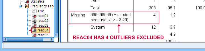
For reac04, we see some low outliers as well as a high outlier. We can find which values these are in the bottom and top of its frequency distribution as shown below.
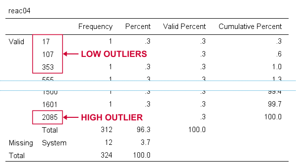 If we see any outliers in a histogram, we may look up the exact values in the corresponding frequency table.
We can exclude all of these outliers in one go by running missing values reac04 (lo thru 400,2085). By the way: “lo thru 400” means the lowest value in this variable (its minimum) through 400 ms.
For reac05, we see several low and high outliers. The obvious thing to do seems to run something like missing values reac05 (lo thru 400,2000 thru hi). But sadly, this only triggers the following error:
>There are too many values specified.
>The limit is three individual values or
>one value and one range of values.
>Execution of this command stops.
The problem here is that
you can't specify a low and a high
range of missing values in SPSS.
Since this is what you typically need to do, this is one of the biggest stupidities still found in SPSS today. A workaround for this problem is to
- RECODE the entire low range into some huge value such as 999999999;
- add the original values to a value label for this value;
- specify only a high range of missing values that includes 999999999.
The syntax below does just that and reruns our histograms to check if all outliers have indeed been correctly excluded.
recode reac05 (lo thru 400 = 999999999).
*Add value label to 999999999.
add value labels reac05 999999999 '(Recoded from 95 / 113 / 397 ms)'.
*Set range of high missing values.
missing values reac05 (2000 thru hi).
*Rerun frequency tables after excluding outliers.
frequencies reac01 to reac05
/histogram.
Result
First off, note that none of our 5 histograms show any outliers anymore; they're now excluded from all data analysis and editing. Also note the bottom of the frequency table for reac05 shown below.
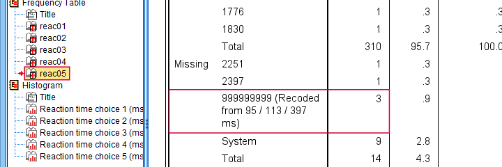 Low outliers after recoding and labelling are listed under Missing.
Even though we had to recode some values, we can still report precisely which outliers we excluded for this variable due to our value label.
Before proceeding to boxplots, I'd like to mention 2 worst practices for excluding outliers:
- removing outliers by changing them into system missing values. After doing so, we no longer know which outliers we excluded. Also, we're clueless why values are system missing as they don't have any value labels.
- removing entire cases -often respondents- because they have 1(+) outliers. Such cases typically have mostly “normal” data values that we can use just fine for analyzing other (sets of) variables.
Sadly, supervisors sometimes force their students to take this road anyway. If so, SELECT IF permanently removes entire cases from your data.
Method II - Boxplots
If you ran the previous examples, you need to close and reopen life-choices.sav before proceeding with our second method.
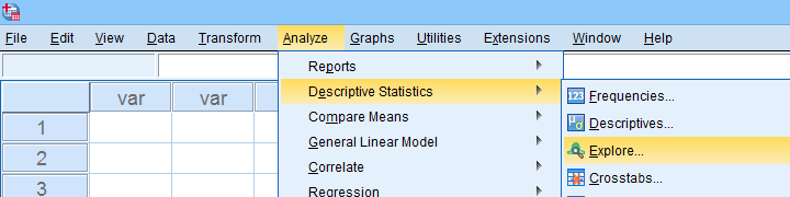
We'll create a boxplot as discussed in Creating Boxplots in SPSS - Quick Guide: we first navigate to
![]()
![]() as shown below.
as shown below.
Next, we'll fill in the dialogs as shown below.
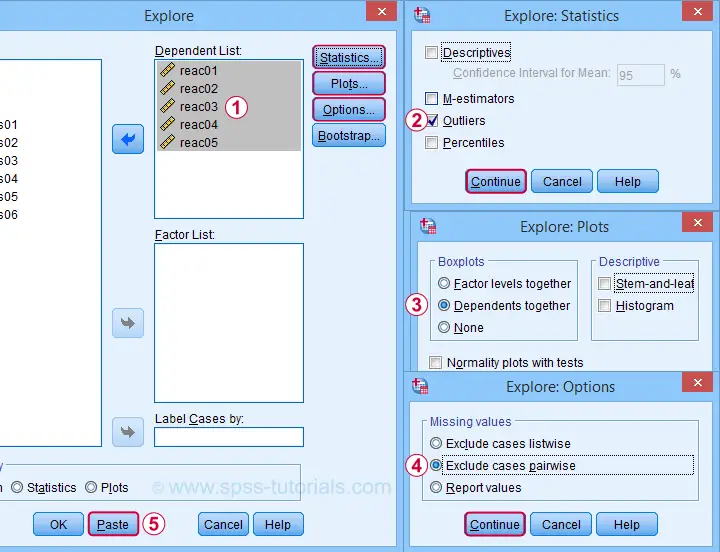
Completing these steps results in the syntax below. Let's run it.
EXAMINE VARIABLES=reac01 reac02 reac03 reac04 reac05
/PLOT BOXPLOT
/COMPARE VARIABLES
/STATISTICS EXTREME
/MISSING PAIRWISE
/NOTOTAL.
Result
Quick note: if you're not sure about interpreting boxplots, read up on Boxplots - Beginners Tutorial first.
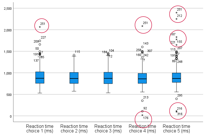
Our boxplot indicates some potential outliers for all 5 variables. But let's just ignore these and exclude only the extreme values that are observed for reac01, reac04 and reac05.
So, precisely which values should we exclude? We find them in the Extreme Values table. I like to copy-paste this into Excel. Now we can easily boldface all values that are extreme values according to our boxplot.
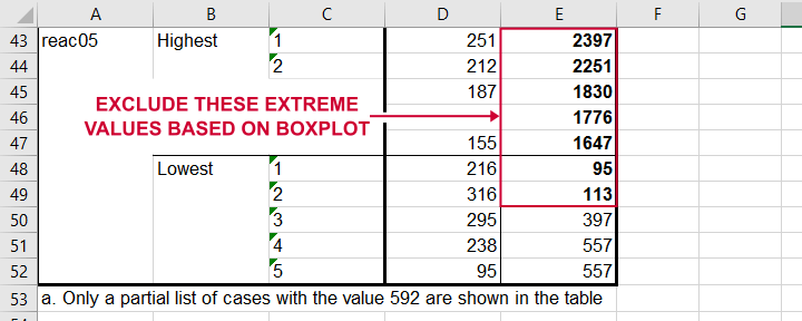 Copy-pasting the Extreme Values table into Excel allows you to easily boldface the exact outliers that we'll exclude.
Finally, we set these extreme values as user missing values with the syntax below. For a step-by-step explanation of this routine, look up Excluding Outliers from Data.
recode reac05 (lo thru 113 = 999999999).
*Label new value with original values.
add value labels reac05 999999999 '(Recoded from 95 / 113 ms)'.
*Set (ranges of) missing values for reac01, reac04 and reac05.
missing values
reac01 (2065)
reac04 (17,2085)
reac05 (1647 thru hi).
*Rerun boxplot and check if all extreme values are gone.
EXAMINE VARIABLES=reac01 reac02 reac03 reac04 reac05
/PLOT BOXPLOT
/COMPARE VARIABLES
/STATISTICS EXTREME
/MISSING PAIRWISE
/NOTOTAL.
Method III - Z-Scores (with Reporting)
A common approach to excluding outliers is to look up which values correspond to high z-scores. Again, there's different rules of thumb which z-scores should be considered outliers. Today, we settle for |z| ≥ 3.29 indicates an outlier. The basic idea here is that if a variable is perfectly normally distributed, then only 0.1% of its values will fall outside this range.
So what's the best way to do this in SPSS? Well, the first 2 steps are super simple:
- we add z-scores for all relevant variables to our data and
- see if their minima or maxima meet |z| ≥ 3.29.
Funnily, both steps are best done with a simple DESCRIPTIVES command as shown below.
descriptives reac01 to reac05
/save.
*Check min and max for z-scores.
descriptives zreac01 to zreac05.
Result
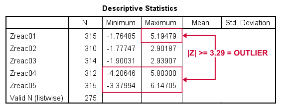 Minima and maxima for our newly computed z-scores.
Basic conclusions from this table are that
- reac01 has at least 1 high outlier;
- reac02 and reac03 don't have any outliers;
- reac04 and reac05 both have at least 1 low and 1 high outlier.
But which original values correspond to these high absolute z-scores? For each variable, we can run 2 simple steps:
- FILTER away cases having |z| < 3.29 (all non outliers);
- run a frequency table -now containing only outliers- on the original variable.
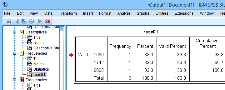
The syntax below does just that but uses TEMPORARY and SELECT IF for filtering out non outliers.
temporary.
select if(abs(zreac01) >= 3.29).
frequencies reac01.
temporary.
select if(abs(zreac04) >= 3.29).
frequencies reac04.
temporary.
select if(abs(zreac05) >= 3.29).
frequencies reac05.
*Save output because tables needed for reporting which outliers are excluded.
output save outfile = 'outlier-tables-01.spv'.
Result
 Finding outliers by filtering out all non outliers based on their z-scores.
Note that each frequency table only contains a handful of outliers for which |z| ≥ 3.29. We'll now exclude these values from all data analyses and editing with the syntax below. For a detailed explanation of these steps, see Excluding Outliers from Data.
recode reac04 (lo thru 107 = 999999999).
recode reac05 (lo thru 113 = 999999999).
*Label new values with original values.
add value labels reac04 999999999 '(Recoded from 17 / 107 ms)'.
add value labels reac05 999999999 '(Recoded from 95 / 113 ms)'.
*Set (ranges of) missing values for reac01, reac04 and reac05.
missing values
reac01 (1659 thru hi)
reac04 (1601 thru hi )
reac05 (1776 thru hi).
*Check if all outliers are indeed user missing values now.
temporary.
select if(abs(zreac01) >= 3.29).
frequencies reac01.
temporary.
select if(abs(zreac04) >= 3.29).
frequencies reac04.
temporary.
select if(abs(zreac05) >= 3.29).
frequencies reac05.
Method III - Z-Scores (without Reporting)
We can greatly speed up the z-score approach we just discussed but this comes at a price: we won't be able to report precisely which outliers we excluded. If that's ok with you, the syntax below almost fully automates the job.
descriptives reac01 to reac05
/save.
*Recode original values into 999999999 if z-score >= 3.29.
do repeat #ori = reac01 to reac05 / #z = zreac01 to zreac05.
if(abs(#z) >= 3.29) #ori = 999999999.
end repeat print.
*Add value labels.
add value labels reac01 to reac05 999999999 '(Excluded because |z| >= 3.29)'.
*Set missing values.
missing values reac01 to reac05 (999999999).
*Check how many outliers were excluded.
frequencies reac01 to reac05.
Result
The frequency table below tells us that 4 outliers having |z| ≥ 3.29 were excluded for reac04.
 Under Missing we see the number of excluded outliers but not the exact values.
Sadly, we're no longer able to tell precisely which original values these correspond to.
Final Notes
Thus far, I deliberately avoided the discussion precisely which values should be considered outliers for our data. I feel that simply making a decision and being fully explicit about it is more constructive than endless debate.
I therefore blindly followed some rules of thumb for the boxplot and z-score approaches. As I warned earlier, these don't always result in good decisions: for the data at hand, reaction times below some 500 ms can't be taken seriously. However, the rules of thumb don't always exclude these.
As for most of data analysis, using common sense is usually a better idea...
Thanks for reading!
Skewness – What & Why?
Skewness is a number that indicates to what extent
a variable is asymmetrically distributed.
- Positive (Right) Skewness Example
- Negative (Left) Skewness Example
- Population Skewness - Formula and Calculation
- Sample Skewness - Formula and Calculation
- Skewness in SPSS
- Skewness - Implications for Data Analysis
Positive (Right) Skewness Example
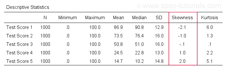
A scientist has 1,000 people complete some psychological tests. For test 5, the test scores have skewness = 2.0. A histogram of these scores is shown below.
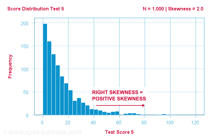
The histogram shows a very asymmetrical frequency distribution. Most people score 20 points or lower but the right tail stretches out to 90 or so. This distribution is right skewed.
If we move to the right along the x-axis, we go from 0 to 20 to 40 points and so on. So towards the right of the graph, the scores become more positive. Therefore,
right skewness is positive skewness
which means skewness > 0. This first example has skewness = 2.0 as indicated in the right top corner of the graph. The scores are strongly positively skewed.
Negative (Left) Skewness Example
Another variable -the scores on test 2- turn out to have skewness = -1.0. Their histogram is shown below.
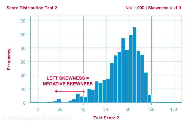
The bulk of scores are between 60 and 100 or so. However, the left tail is stretched out somewhat. So this distribution is left skewed.
Right: to the left, to the left. If we follow the x-axis to the left, we move towards more negative scores. This is why
left skewness is negative skewness.
And indeed, skewness = -1.0 for these scores. Their distribution is left skewed. However, it is less skewed -or more symmetrical- than our first example which had skewness = 2.0.
Symmetrical Distribution Implies Zero Skewness
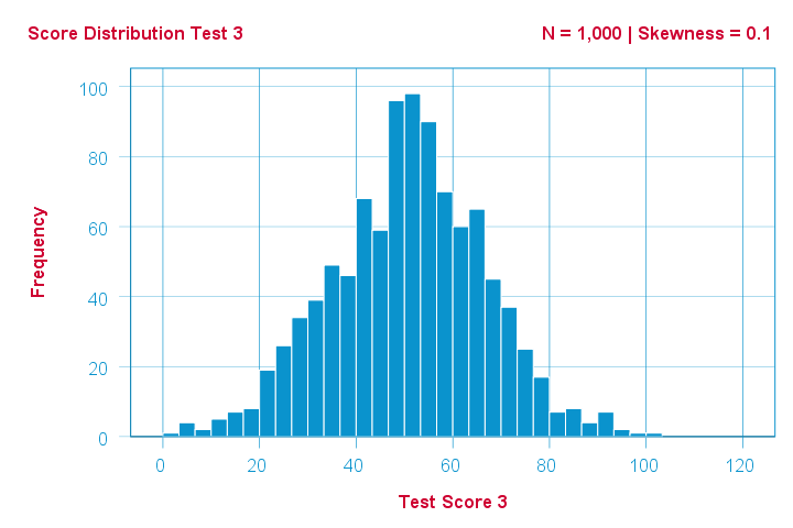
Finally, symmetrical distributions have skewness = 0. The scores on test 3 -having skewness = 0.1- come close.
Now, observed distributions are rarely precisely symmetrical. This is mostly seen for some theoretical sampling distributions. Some examples are
- the (standard) normal distribution;
- the t distribution and
- the binomial distribution if p = 0.5.
These distributions are all exactly symmetrical and thus have skewness = 0.000...
Population Skewness - Formula and Calculation
If you'd like to compute skewnesses for one or more variables, just leave the calculations to some software. But -just for the sake of completeness- I'll list the formulas anyway.
If your data contain your entire population, compute the population skewness as:
$$Population\;skewness = \Sigma\biggl(\frac{X_i - \mu}{\sigma}\biggr)^3\cdot\frac{1}{N}$$
where
- \(X_i\) is each individual score;
- \(\mu\) is the population mean;
- \(\sigma\) is the population standard deviation and
- \(N\) is the population size.
For an example calculation using this formula, see this Googlesheet (shown below).
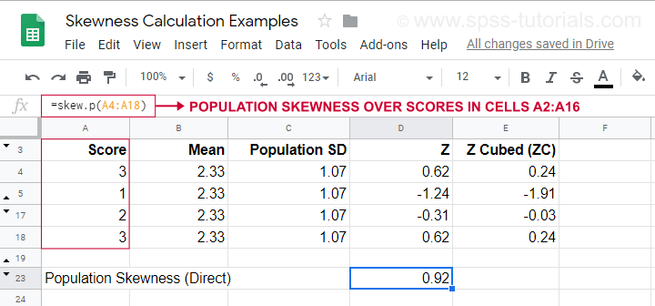
It also shows how to obtain population skewness directly by using =SKEW.P(...) where “.P” means “population”. This confirms the outcome of our manual calculation. Sadly, neither SPSS nor JASP compute population skewness: both are limited to sample skewness.
Sample Skewness - Formula and Calculation
If your data hold a simple random sample from some population, use
$$Sample\;skewness = \frac{N\cdot\Sigma(X_i - \overline{X})^3}{S^3(N - 1)(N - 2)}$$
where
- \(X_i\) is each individual score;
- \(\overline{X}\) is the sample mean;
- \(S\) is the sample-standard-deviation and
- \(N\) is the sample size.
An example calculation is shown in this Googlesheet (shown below).
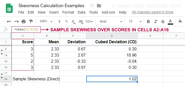
An easier option for obtaining sample skewness is using =SKEW(...). which confirms the outcome of our manual calculation.
Skewness in SPSS
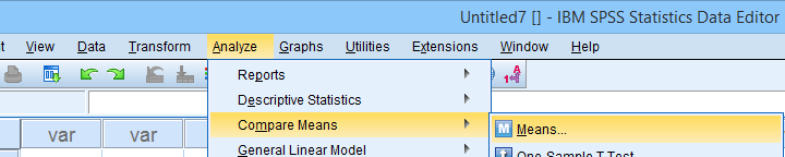
First off, “skewness” in SPSS always refers to sample skewness: it quietly assumes that your data hold a sample rather than an entire population. There's plenty of options for obtaining it. My favorite is via MEANS because the syntax and output are clean and simple. The screenshots below guide you through.
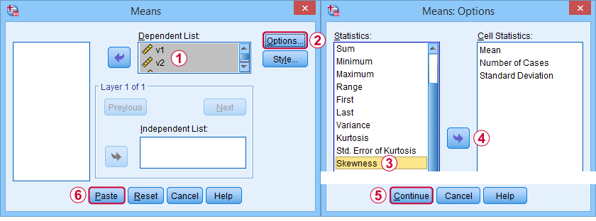
The syntax can be as simple as
means v1 to v5
/cells skew.
A very complete table -including means, standard deviations, medians and more- is run from
means v1 to v5
/cells count min max mean median stddev skew kurt.
The result is shown below.
Skewness - Implications for Data Analysis
Many analyses -ANOVA, t-tests, regression and others- require the normality assumption: variables should be normally distributed in the population. The normal distribution has skewness = 0. So observing substantial skewness in some sample data suggests that the normality assumption is violated.
Such violations of normality are no problem for large sample sizes -say N > 20 or 25 or so. In this case, most tests are robust against such violations. This is due to the central limit theorem. In short,
for large sample sizes, skewness is
no real problem for statistical tests.
However, skewness is often associated with large standard deviations. These may result in large standard errors and low statistical power. Like so, substantial skewness may decrease the chance of rejecting some null hypothesis in order to demonstrate some effect. In this case, a nonparametric test may be a wiser choice as it may have more power.
Violations of normality do pose a real threat
for small sample sizes
of -say- N < 20 or so. With small sample sizes, many tests are not robust against a violation of the normality assumption. The solution -once again- is using a nonparametric test because these don't require normality.
Last but not least, there isn't any statistical test for examining if population skewness = 0. An indirect way for testing this is a normality test such as
However, when normality is really needed -with small sample sizes- such tests have low power: they may not reach statistical significance even when departures from normality are severe. Like so, they mainly provide you with a false sense of security.
And that's about it, I guess. If you've any remarks -either positive or negative- please throw in a comment below. We do love a bit of discussion.
Thanks for reading!
Power (Statistics) – The Ultimate Beginners Guide
In statistics, power is the probability of rejecting
a false null hypothesis.
- Power Calculation Example
- Power & Alpha Level
- Power & Effect Size
- Power & Sample Size
- 3 Main Reasons for Power Calculations
- Software for Power Calculations - G*Power
Power - Minimal Example
- In some country, IQ and salary have a population correlation ρ = .10.
- A scientist examines a sample of N = 10 people and finds a sample correlation r = .15.
- He tests the (false) null hypothesis H0 that ρ = 0. The significance level for this test, p = .68.
- Since p > .05, his chosen alpha level, he does not reject his (false) null hypothesis that ρ = 0.
Now, given a sample size of N = 10 and a population correlation ρ = 0.10, what's the probability of correctly rejecting the null hypothesis? This probability is known as power and denoted as (1 - β) in statistics. For the aforementioned example, (1 - β) is only .058 (roughly 6%) as shown below.
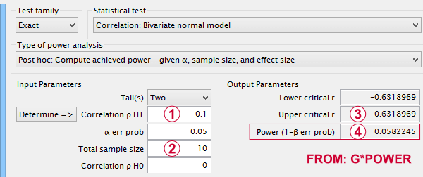
If a population correlation ρ = .10 and
we sample N = 10 respondents, then
 we need to find an absolute sample correlation of | r | > .63 for rejecting H0 at α = .05.
 The probability of finding this is only .058.
So even though H0 is false, we're unlikely to actually reject it. Not rejecting a false H0 is known as a committing a type II error.
Type I and Type II Errors
Any null hypothesis may be true or false and we may or may not reject it. This results in the 4 scenarios outlined below.
| Reality: H0 is true | Reality: H0 is false | |
|---|---|---|
| Decision: reject H0 | Type I error Probability = α | Correct decision Probability = (1 - β) = power |
| Decision: retain H0 | Correct decision Probability = (1 - α) | Type II error Probability = β |
As you probably guess, we usually want the power for our tests to be as high as possible. But before taking a look at factors affecting power, let's first try and understand how a power calculation actually works.
Power Calculation Example
A pharmaceutical company wants to demonstrate that their medicine against high blood pressure actually works. They expect the following:
- the average blood pressure in some untreated population is 160 mmHg;
- they expect their medicine to lower this to roughly 154 mmHg;
- the standard deviation should be around 8 mmHg (both populations);
- they plan to use an independent samples t-test at α = 0.05 with N = 20 for either subsample.
Given these considerations, what's the power for this study? Or -alternatively- what's the probability of rejecting H0 that the mean blood pressure is equal between treated and untreated populations?
Obviously, nobody knows the outcomes for this study until it's finished. However, we do know the most likely outcomes: they're our population estimates. So let's for a moment pretend that we'll find exactly these and enter them into a t-test calculator.
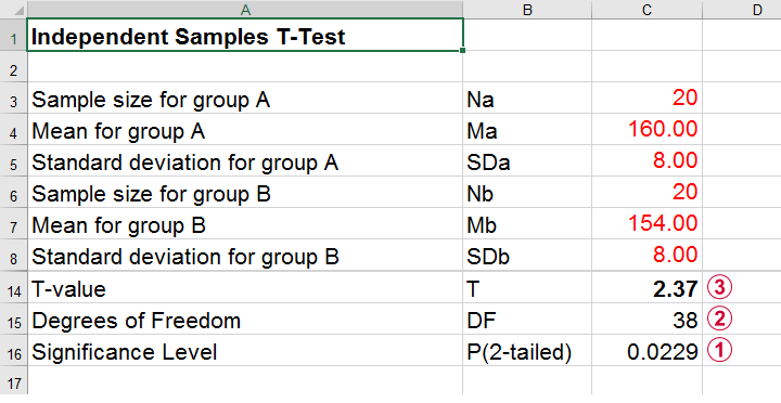 Compute t-test for expected sample sizes, means and SD's in Excel
We expect p = 0.023 so we expect to reject H0.
This is based on a t-distribution with df = 38 degrees of freedom (total sample size N = 40 - 2).
We expect to find t = 2.37 if the population mean difference is 6 mmHg (160 - 154).
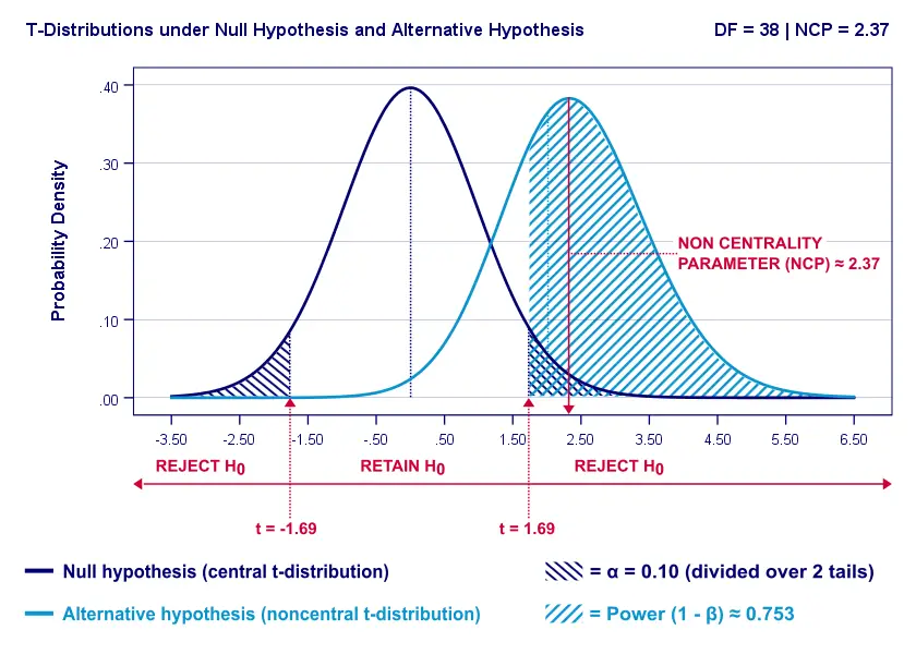
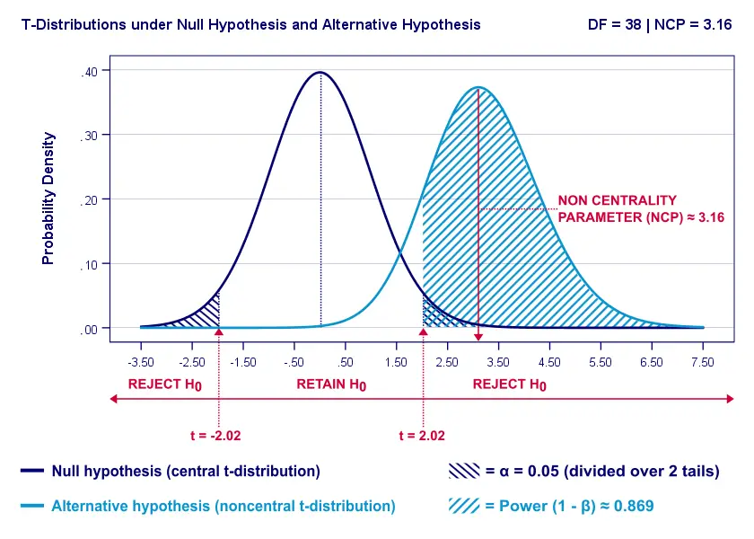
Now, this expected (or average) t = 2.37 under the alternative hypothesis Ha is known as a noncentrality parameter or NCP. The NCP tells us how t is distributed under some exact alternative hypothesis and thus allows us to estimate the power for some test. The figure below illustrates how this works.
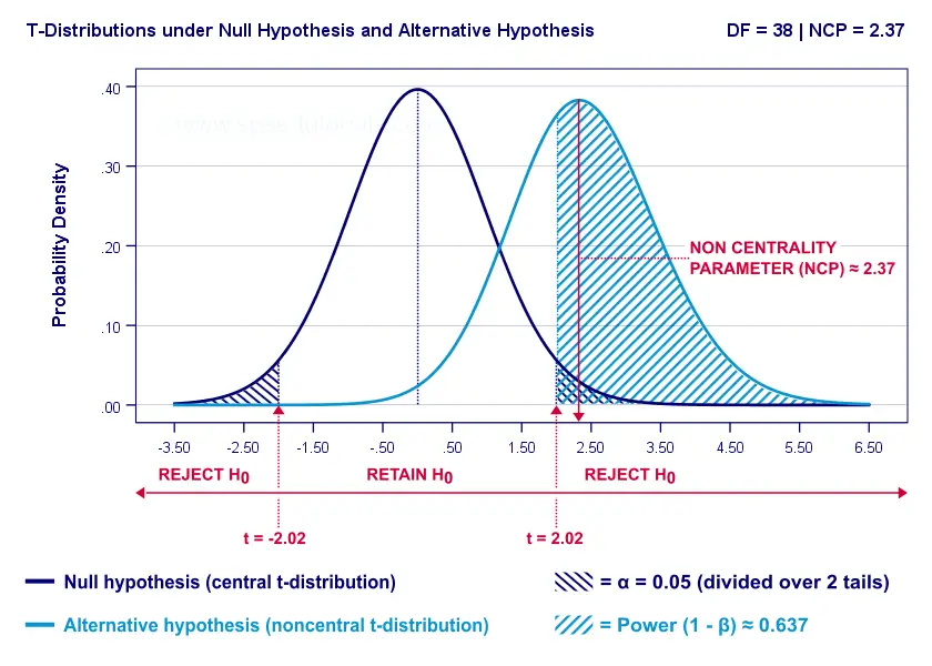
- First off, our H0 is tested using a central t-distribution with df = 38;
- If we test at α = 0.05 (2-tailed), we'll reject H0 if t < -2.02 (left critical value) or if t > 2.02 (right critical value);
- If our alternative hypothesis HA is exactly true, t follows a noncentral t-distribution with df = 38 and NCP = 2.37;
- Under this noncentral t-distribution, the probability of finding t > 2.02 ≈ 0.637. So this is roughly the probability of rejecting H0 -or the power (1 - β)- for our first scenario.
A minor note here is that we'd also reject H0 if t < -2.02 but this probability is almost zero for our first scenario. The exact calculation can be replicated from the SPSS syntax below.
data list free/alpha ncp.
begin data
0.05 2.37
end data.
*Compute left (lct) and right (rct) critical t-values and power.
compute lct = idf.t(0.5 * alpha,38).
compute rct = idf.t(1 - (0.5 * alpha),38).
compute lprob = ncdf.t(lct,38,ncp).
compute rprob = 1 - ncdf.t(rct,38,ncp).
compute power = lprob + rprob.
execute.
*Show 3 decimal places for all values.
formats all (f8.3).
Power and Effect Size
Like we just saw, estimating power requires specifying
- an exact null hypothesis and
- an exact alternative hypothesis.
In the previous example, our scientists had an exact alternative hypothesis because they had very specific ideas regarding population means and standard deviations. In most applied studies, however, we're pretty clueless about such population parameters. This raises the question how do we get an exact alternative hypothesis?
For most tests, the alternative hypothesis can be specified as an effect size measure: a single number combining several means, variances and/or frequencies. Like so, we proceed from requiring a bunch of unknown parameters to a single unknown parameter.
What's even better: widely agreed upon rules of thumb are available for effect size measures. An overview is presented in this Googlesheet, partly shown below.
In applied studies, we often use G*Power for estimating power. The screenshot below replicates our power calculation example for the blood pressure medicine study.
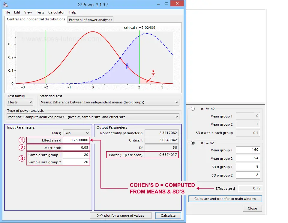 G*Power computes both effect size and power from two means and SD's
Note that estimating power in G*Power only requires
a single estimated effect size measure. Optionally, G*Power computes it for you, given your sample means and SD's.
the alpha level -often 0.05- used for testing the null hypothesis &
one or more sample sizes
Let's now take a look at how these 3 factors relate to power.
Factors Affecting Power
The figure below gives a quick overview how 3 factors relate to power.
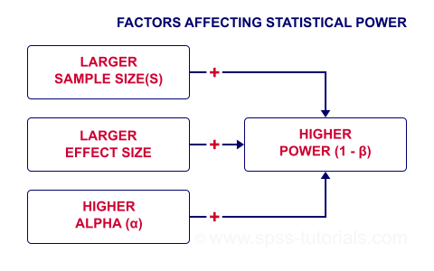
Let's now take a closer look at each of them.
Power & Alpha Level
Everything else equal, increasing alpha increases power. For our example calculation, power increases from 0.637 to 0.753 if we test at α = 0.10 instead of 0.05.
A higher alpha level results in smaller (absolute) critical values: we already reject H0 if t > 1.69 instead of t > 2.02. So the light blue area, indicating (1 - β), increases. We basically require a smaller deviation from H0 for statistical significance.
However, increasing alpha comes at a cost: it increases the probability of committing a type I error (rejecting H0 when it's actually true). Therefore, testing at α > 0.05 is generally frowned upon. In short, increasing alpha basically just decreases one problem by increasing another one.
Power & Effect Size
Everything else equal, a larger effect size results in higher power. For our example, power increases from 0.637 to 0.869 if we believe that Cohen’s D = 1.0 rather than 0.8.
A larger effect size results in a larger noncentrality parameter (NCP). Therefore, the distributions under H0 and HA lie further apart. This increases the light blue area, indicating the power for this test.
Keep in mind, though, that we can estimate but not choose some population effect size. If we overestimate this effect size, we'll overestimate the power for our test accordingly. Therefore, we can't usually increase power by increasing an effect size.
An arguable exception is increasing an effect size by modifying a research design or analysis. For example, (partial) eta squared for a treatment effect in ANOVA may increase by adding a covariate to the analysis.
Power & Sample Size
Everything else equal, larger sample size(s) result in higher power. For our example, increasing the total sample size from N = 40 to N = 80 increases power from 0.637 to 0.912.
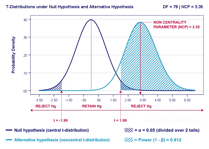
The increase in power stems from our distributions lying further apart. This reflects an increased noncentrality parameter (NCP). But why does the NCP increase with larger sample sizes?
Well, recall that for a t-distribution, the NCP is the expected t-value under HA. Now, t is computed as
$$t = \frac{\overline{X_1} - \overline{X_2}}{SE}$$
where \(SE\) denotes the standard error of the mean difference. In turn, \(SE\) is computed as
$$SE = Sw\sqrt{\frac{1}{n_1} + \frac{1}{n_2}}$$
where \(S_w\) denotes the estimated population SD of the outcome variable. This formula shows that as sample sizes increase, \(SE\) decreases and therefore t (and hence the NCP) increases.
On top of this, degrees of freedom increase (from df = 38 to df = 78 for our example). This results in slightly smaller (absolute) critical t-values but this effect is very modest.
In short, increasing sample size(s) is a sound way to increase the power for some test.
Power & Research Design
Apart from sample size, effect size & α, research design may also affect power. Although there's no exact formulas, some general guidelines are that
- everything else equal, within-subjects designs tend to have more power than between-subjects designs;
- for ANCOVA, including one or two covariates tends to increase power for demonstrating a treatment effect;
- for multiple regression, power for each separate predictor tends to decrease as more predictors are added to the model;
3 Main Reasons for Power Calculations
Power calculations in applied research serve 3 main purposes:
- compute the required sample size prior to data collection. This involves estimating an effect size and choosing α (usually 0.05) and the desired power (1 - B), often 0.80;
- estimate power before collecting data for some planned analyses. This requires specifying the intended sample size, choosing an α and estimating which effect sizes are expected. If the estimated power is low, the planned study may be cancelled or proceed with a larger sample size;
- estimate power after data have been collected and analyzed. This calculation is based on the actual sample size, α used for testing and observed effect size.
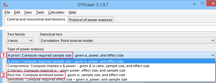 Different types of power analysis are made simple by G*Power
Software for Power Calculations - G*Power
G*Power is freely downloadable software for running the aforementioned and many other power calculations. Among its features are
- computing effect sizes from descriptive statistics (mostly sample means and standard deviations);
- computing power, required sample sizes, required effect sizes and more;
- creating plots that visualize how power, effect size and sample size relate for many different statistical procedures. The figure below shows an example for multiple linear regression.
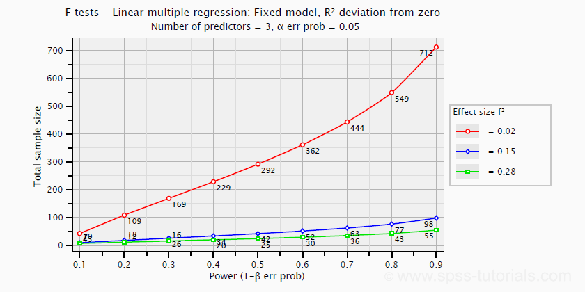 Required sample sizes for multiple linear regression, given desired power,
chosen α and 3 estimated effect sizes
Altogether, we think G*Power is amazing software and we highly recommend using it. The only disadvantage we can think of is that it requires rather unusual effect size measures. Some examples are
- Cohen’s f for ANOVA and
- Cohen’s W for a chi-square test.
This is awkward because the APA and (perhaps therefore) most journal articles typically recommend reporting
- (partial) eta-squared for ANOVA and
- the contingency coefficient or (better) Cramér’s V for a chi-square test.
These are also the measures we typically obtain from statistical packages such as SPSS or JASP. Fortunately, G*Power converts some measures and/or computes them from descriptive statistics like we saw in this screenshot.
Software for Power Calculations - SPSS
In SPSS, observed power can be obtained from the GLM, UNIANOVA and (deprecated) MANOVA procedures. Keep in mind that GLM - short for General Linear Model- is very general indeed: it can be used for a wide variety of analyses including
- (multiple) linear regression;
- t-tests;
- ANCOVA (analysis of covariance);
- repeated measures ANOVA.
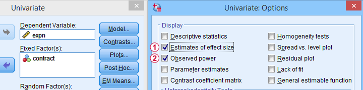 Select Observed power from Analyze - General Linear Model -
Univariate - Options
Other power calculations (required sample sizes or estimating power prior to data collection) were added to SPSS version 27, released in 2020.
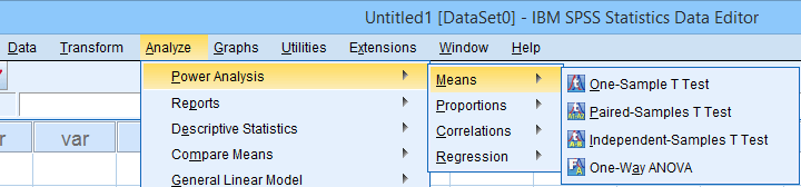 Power Analysis as found in SPSS version 27 onwards
In my opinion, SPSS power analysis is a pathetic attempt to compete with G*Power. If you don't believe me, just try running a couple of power analyses in both programs simultaneously. If you do believe me, ignore SPSS power analysis and just go for G*Power.
Thanks for reading.
SPSS Label Cleaning Tool
We sometimes receive data files with annoying prefixes or suffixes in variable and/or value labels. This tutorial presents a simple tool for removing these and some other “cleaning” operations.
- Prerequisites and Installation
- Example I - Text Replacement over Variable and Value Labels
- Example II - Remove Suffix from Variable Labels
- Example III - Remove Prefix from Value Labels
Example Data File
All examples in this tutorial use dirty-labels.sav. As shown below, its labels are far from ideal.
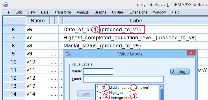
Some variable labels have suffixes that are irrelevant to the final data.
All value labels are prefixed by the values that represent them.
Variable and value labels have underscores instead of spaces.
Our tool deals with precisely such issues. Let's try it.
Prerequisites and Installation
First off, this tool requires SPSS version 24 or higher. Next, the SPSS Python 3 essentials must be installed, which is normally the case with recent SPSS versions.
Next, click SPSS_TUTORIALS_CLEAN_LABELS.spe for downloading our tool. You can install it by dragging & dropping it into a data editor window. Alternatively, navigate to
![]() as shown below.
as shown below.
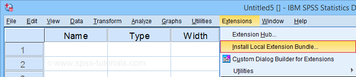
In the dialog that opens, navigate to the downloaded .spe file and select it. SPSS now throws a message that “The extension was successfully installed under Transform - SPSS tutorials - Clean Labels”.
Example I - Text Replacement over Variable and Value Labels
Let's first replace all underscores by spaces in both variable and value labels. We'll open
![]() and fill out the dialog as shown below.
and fill out the dialog as shown below.
Completing these steps results in the syntax below. Let's run it.
SPSS TUTORIALS CLEAN_LABELS VARIABLES=v1 v2 v5 v6 v7 v8 v9 v10 v11 v12 v13 v14 v15 v16 v17 v18 v19
v20 v21 v22 FIND='_' REPLACEBY=' '
/OPTIONS OPERATION=FIREPCONT PROCESS=BOTH ACTION=BOTH.
Results
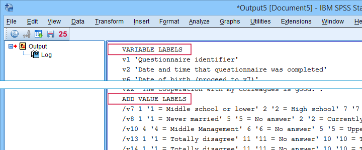
First note that all underscores were replaced by spaces in all variable and value labels. This was done by creating and running
- VARIABLE LABELS and
- ADD VALUE LABELS
commands. We chose to have these commands printed to our output window as shown below.
SPSS already ran this syntax but you can also copy-paste it into a syntax window. Like so, the adjustments can be replicated on any SPSS version with or without our tool installed. If there's a lot of syntax, consider moving it into a separate file and running it with INSERT.
Example II - Remove Suffix from Variable Labels
Some variable labels end with “ (proceed to question...” We'll remove these suffixes because they don't convey any interesting information and merely clutter up our output tables and charts.
Again, we start off at
![]() and fill out the dialog as shown below.
and fill out the dialog as shown below.
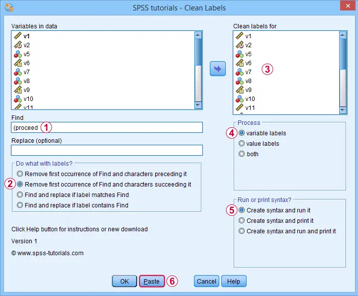
Quick tip: you can shorten the resulting syntax by using
- TO for specifying a range of variables such as V5 TO V1;
- ALL for specifying all variables in the active dataset.
We did just that in the syntax below.
SPSS TUTORIALS CLEAN_LABELS VARIABLES=all FIND=' (proceed' REPLACEBY=' '
/OPTIONS OPERATION=FIOCSUC PROCESS=VARLABS ACTION=RUN.
Note that running this syntax removes “ (proceed to” and all characters that follow this expression from all variable labels.
Example III - Remove Prefix from Value Labels
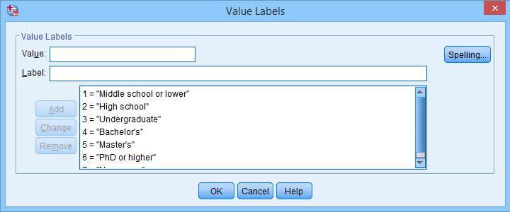
Another issue we sometimes encounter are value labels being prefixed with the values representing them as shown below.
Removing “= ” (mind the space) and all characters preceding it from all value labels fixes the problem. The syntax below -created from
![]() -
does just that.
-
does just that.
SPSS TUTORIALS CLEAN_LABELS VARIABLES=all FIND='= ' REPLACEBY=' '
/OPTIONS OPERATION=FIOCPRE PROCESS=VALLABS ACTION=RUN.
Result
After our third and final example, all value and variable labels are nice, short can clean.
So that'll wrap up the examples of our label cleaning tool.
Final Notes
I hope you'll find our tool as helpful as we do. This first version performs 4 cleaning operations that we recently needed for our daily work. We'll probably build in some more options when we (or you?) need them.
So if you've any suggestions or other remarks, please throw us a comment below. Other than that,
thanks for reading!
Kruskal-Wallis Test – Simple Tutorial
- Kruskal-Wallis Test Example
- Kruskal-Wallis Test Assumptions
- Kruskal-Wallis Test Formulas
- Kruskal-Wallis Post Hoc Tests
- APA Reporting a Kruskal-Wallis Test
A Kruskal-Wallis test tests if 3(+) populations have
equal mean ranks on some outcome variable.
The figure below illustrates the basic idea.
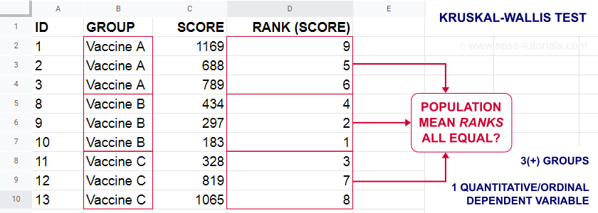
- First off, our scores are ranked ascendingly, regardless of group membership.
- Now, if scores are not related to group membership, then the average mean ranks should be roughly equal over groups.
- If these average mean ranks are very different in our sample, then some groups tend to have higher scores than other groups in our population as well: scores are related to group membership.
Kruskal-Wallis Test - Purposes
The Kruskal-Wallis test is a distribution free alternative for an ANOVA: we basically want to know if 3+ populations have equal means on some variable. However,
- ANOVA is not suitable if the dependent variable is ordinal;
- ANOVA requires the dependent variable to be normally distributed in each subpopulation, especially if sample sizes are small.
The Kruskal-Wallis test is a suitable alternative for ANOVA if sample sizes are small and/or the dependent variable is ordinal.
Kruskal-Wallis Test Example
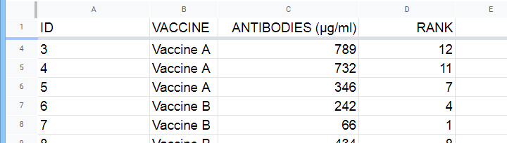
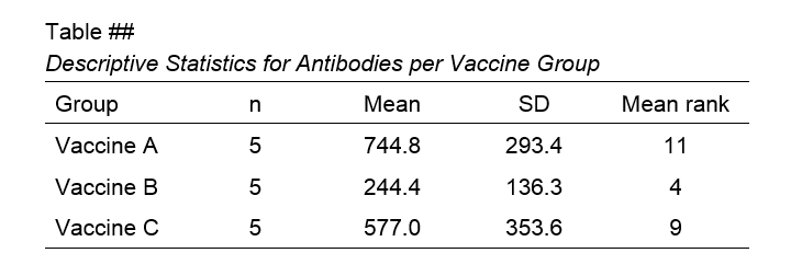
A hospital runs a quick pilot on 3 vaccines: they administer each to N = 5 participants. After a week, they measure the amount of antibodies in the participants’ blood. The data thus obtained are in this Googlesheet, partly shown below.
Now, we'd like to know if some vaccines trigger more antibodies than others in the underlying populations. Since antibodies is a quantitative variable, ANOVA seems the right choice here.
However, ANOVA requires antibodies to be normally distributed in each subpopulation. And due to our minimal sample sizes, we can't rely on the central limit theorem like we usually do (or should anyway). And on top of that,
our sample sizes are too small to examine normality.
Just the emphasize this point, the histograms for antibodies by group are shown below.
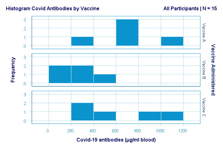
If anything, the bottom two histograms seem slightly positively skewed. This makes sense because the amount of antibodies has a lower bound of zero but no upper bound. However, speculations regarding the population distributions don't get any more serious than that.
A particularly bad idea here is trying to demonstrate normality by running
- a Shapiro-Wilk normality test and/or
- a Kolmogorov-Smirnov test.
Due to our tiny sample sizes, these tests are unlikely to reject the null hypothesis of normality. However, that's merely due to their lack of power and doesn't say anything about the population distributions. Put differently: a different null hypothesis (our variable following a uniform or Poisson distribution) would probably not be rejected either for the exact same data.
In short: ANOVA really requires normality for tiny sample sizes but we don't know if it holds. So we can't trust ANOVA results. And that's why we should use a Kruskal-Wallis test instead.
Kruskal-Wallis Test - Null Hypothesis
The null hypothesis for a Kruskal-Wallis test is that
the mean ranks on some outcome variable
are equal across 3+ populations.
Note that the outcome variable must be ordinal or quantitative in order for “mean ranks” to be meaningful.
Many textbooks propose an incorrect null hypothesis such as:
- some outcome variable has equal medians over 3+ populations or
- some outcome variable follows identical distributions over 3+ populations.
So why are these incorrect? Well, the Kruskal-Wallis formula uses only 2 statistics: ranks sums and the sample sizes on which they're based. It completely ignores everything else about the data -including medians and frequency distributions. Neither of these affect whether the null hypothesis is (not) rejected.
If that still doesn't convince you, we'll perhaps add some example data files to this tutorial. These illustrate that wildly different medians or frequency distributions don't always result in a “significant” Kruskal-Wallis test (or reversely).
Kruskal-Wallis Test Assumptions
A Kruskal-Wallis test requires 3 assumptions1,5,8:
- independent observations;
- the dependent variable must be quantitative or ordinal;
- sufficient sample sizes (say, each ni ≥ 5) unless the exact significance level is computed.
Regarding the last assumption, exact p-values for the Kruskal-Wallis test can be computed. However, this is rarely done because it often requires very heavy computations. Some exact p-values are also found in Use of Ranks in One-Criterion Variance Analysis.
Instead, most software computes approximate (or “asymptotic”) p-values based on the chi-square distribution. This approximation is sufficiently accurate if the sample sizes are large enough. There's no real consensus with regard to required sample sizes: some authors1 propose each ni ≥ 4 while others6 suggest each ni ≥ 6.
Kruskal-Wallis Test Formulas
First off, we rank the values on our dependent variable ascendingly, regardless of group membership. We did just that in this Googlesheet, partly shown below.
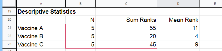
Next, we compute the sum over all ranks for each group separately.
We then enter a) our samples sizes and b) our ranks sums into the following formula:
$$Kruskal\;Wallis\;H = \frac{12}{N(N + 1)}\sum\limits_{i = 1}^k\frac{R_i^2}{n_i} - 3(N + 1)$$
where
- \(N\) denotes the total sample size;
- \(k\) denotes the number of groups we're comparing;
- \(R_i\) denotes the rank sum for group \(i\);
- \(n_i\) denotes the sample size for group \(i\).
For our example, that'll be
$$Kruskal\;Wallis\;H = \frac{12}{15(15 + 1)}(\frac{55^2}{5}+\frac{20^2}{5}+\frac{45^2}{5}) - 3(15 + 1) =$$
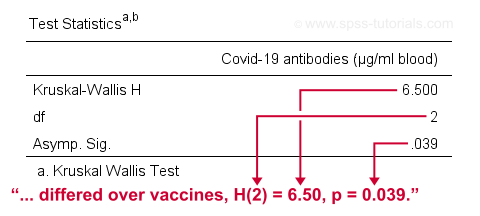
$$Kruskal\;Wallis\;H = 0.05\cdot(605 + 80 + 405) - 48 = 6.50$$
\(H\) approximately follows a chi-square (written as χ2) distribution with
$$df = k - 1$$
degrees of freedom (\(df\)) for \(k\) groups. For our example,
$$df = 3 - 1 = 2$$
so our significance level is
$$\chi^2(2) = 6.50, p \approx 0.039.$$
The SPSS output for our example, shown below, confirms our calculations.
So what do we conclude now? Well, assuming alpha = 0.05, we reject our null hypothesis: the population mean ranks of antibodies are not equal among vaccines. In normal language, our 3 vaccines do not perform equally well. Judging from the mean ranks, it seems vaccine B performs worse than its competitors: its mean rank is lower and this means that it triggered fewer antibodies than the other vaccines.
Kruskal-Wallis Post Hoc Tests
Thus far, we concluded that the amounts of antibodies differ among our 3 vaccines. So precisely which vaccine differs from which vaccine? We'll compare each vaccine to each other vaccine for finding out. This procedure is generally known as running post-hoc tests.
In contrast to popular belief, Kruskal-Wallis post-hoc tests are not equivalent to Bonferroni corrected Mann-Whitney tests. Instead, each possible pair of groups is compared using the following formula:
$$Z_{kw} = \frac{\overline{R}_i - \overline{R}_j}{\sqrt{\frac{N(N + 1)}{12}(\frac{1}{n_i}+\frac{1}{n_j})}}$$
where
- our test statistic, \(Z_{kw}\), approximately follows a standard normal distribution;
- \(\overline R_i\) denotes the mean rank for group \(i\);
- \(N\) denotes the total sample size (including groups not used in this pairwise comparison);
- \(n_i\) denotes the sample size for group \(i\).
For comparing vaccines A and B, that'll be
$$Z_{kw} = \frac{11 - 4}{\sqrt{\frac{15(15 + 1)}{12}(\frac{1}{5}+\frac{1}{5})}} \approx 2.475 $$
$$P(|Z_{kw}| > 2.475) \approx 0.013$$
A Bonferroni correction is usually applied to this p-value because we're running multiple comparisons on (partly) the same observations. The number of pairwise comparisons for \(k\) groups is
$$N_{comp} = \frac{k (k - 1)}{2}$$
Therefore, the Bonferroni corrected p-value for our example is
$$P_{Bonf} = 0.013 \cdot \frac{3 (2 - 1)}{2} \approx 0.040$$
The screenshot from SPSS (below) confirms these findings.
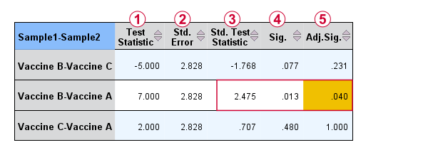
Oddly, the difference between mean ranks, \(\overline{R}_i - \overline{R}_j\), is denoted as “Test Statistic”.
The actual test statistic, \(Z_{kw}\) is denoted as “Std. Test Statistic”.
APA Reporting a Kruskal-Wallis Test
For APA reporting our example analysis, we could write something like
“a Kruskal-Wallis test indicated that the amount of antibodies
differed over vaccines, H(2) = 6.50, p = 0.039.
Although the APA doesn't mention it, we encourage reporting the mean ranks and perhaps some other descriptives statistics in a separate table as well.
Right, so that should do. If you've any questions or remarks, please throw me a comment below. Other than that:
Thanks for reading!
References
- Van den Brink, W.P. & Koele, P. (2002). Statistiek, deel 3 [Statistics, part 3]. Amsterdam: Boom.
- Warner, R.M. (2013). Applied Statistics (2nd. Edition). Thousand Oaks, CA: SAGE.
- Agresti, A. & Franklin, C. (2014). Statistics. The Art & Science of Learning from Data. Essex: Pearson Education Limited.
- Field, A. (2013). Discovering Statistics with IBM SPSS Statistics. Newbury Park, CA: Sage.
- Howell, D.C. (2002). Statistical Methods for Psychology (5th ed.). Pacific Grove CA: Duxbury.
- Siegel, S. & Castellan, N.J. (1989). Nonparametric Statistics for the Behavioral Sciences (2nd ed.). Singapore: McGraw-Hill.
- Slotboom, A. (1987). Statistiek in woorden [Statistics in words]. Groningen: Wolters-Noordhoff.
- Kruskal, W.H. & Wallis, W.A. (1952). Use of ranks in one-criterion variance analysis. Journal of the American Statistical Association, 47, 583-621.
SPSS – Kendall’s Concordance Coefficient W
Kendall’s Concordance Coefficient W is a number between 0 and 1
that indicates interrater agreement.
So let's say we had 5 people rank 6 different beers as shown below. We obviously want to know which beer is best, right? But could we also quantify how much these raters agree with each other? Kendall’s W does just that.
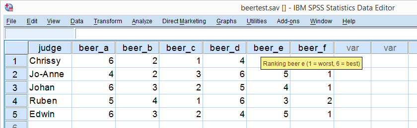
Kendall’s W - Example
So let's take a really good look at our beer test results. The data -shown above- are in beertest.sav. For answering which beer was rated best, a Friedman test would be appropriate because our rankings are ordinal variables. A second question, however, is to what extent do all 5 judges agree on their beer rankings? If our judges don't agree at all which beers were best, then we can't possibly take their conclusions very seriously. Now, we could say that “our judges agreed to a large extent” but we'd like to be more precise and express the level of agreement in a single number. This number is known as Kendall’s Coefficient of Concordance W.2,3
Kendall’s W - Basic Idea
Let's consider the 2 hypothetical situations depicted below: perfect agreement and perfect disagreement among our raters. I invite you to stare at it and think for a minute.
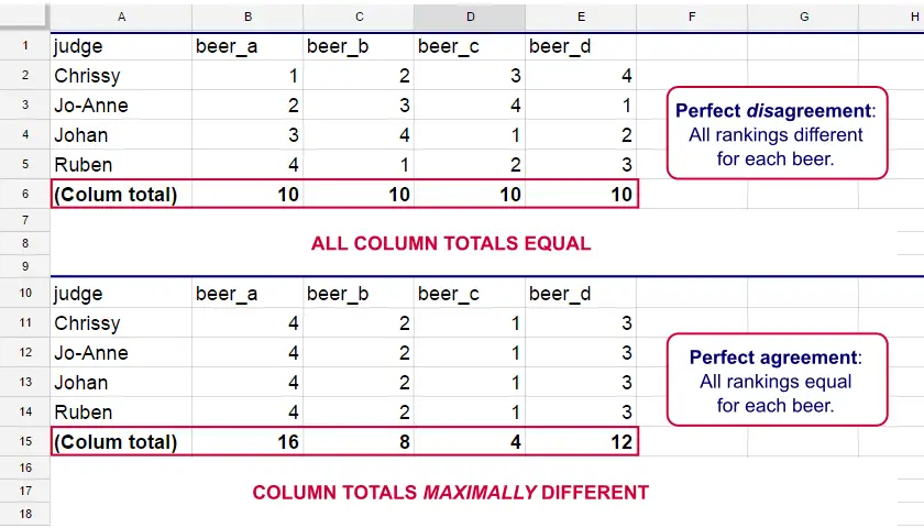
As we see, the extent to which raters agree is indicated by the extent to which the column totals differ. We can express the extent to which numbers differ as a number: the variance or standard deviation.
Kendall’s W is defined as
$$W = \frac{Variance\,over\,column\,totals}{Maximum\,possible\,variance\,over\,column\,totals}$$
As a result, Kendall’s W is always between 0 and 1. For instance, our perfect disagreement example has W = 0; because all column totals are equal, their variance is zero.
Our perfect agreement example has W = 1 because the variance among column totals is equal to the maximal possible variance. No matter how you rearrange the rankings, you can't possibly increase this variance any further. Don't believe me? Give it a go then.
So what about our actual beer data? We'll quickly find out with SPSS.
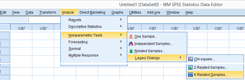
Kendall’s W in SPSS
We'll get Kendall’s W from SPSS’ menu. The screenshots below walk you through.
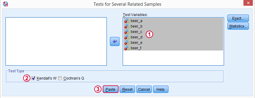
Note: SPSS thinks our rankings are nominal variables. This is because they contain few distinct values. Fortunately, this won't interfere with the current analysis. Completing these steps results in the syntax below.
Kendall’s W - Basic Syntax
NPAR TESTS
/KENDALL=beer_a beer_b beer_c beer_d beer_e beer_f
/MISSING LISTWISE.
Kendall’s W - Output
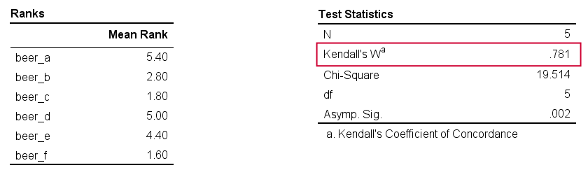
And there we have it: Kendall’s W = 0.78. Our beer judges agree with each other to a reasonable but not super high extent. Note that we also get a table with the (column) mean ranks that tells us which beer was rated most favorably.
Average Spearman Correlation over Judges
Another measure of concordance is the average over all possible Spearman correlations among all judges.1 It can be calculated from Kendall’s W with the following formula
$$\overline{R}_s = {kW - 1 \over k - 1}$$
where \(\overline{R}_s\) denotes the average Spearman correlation and \(k\) the number of judges.
For our example, this comes down to
$$\overline{R}_s = {5(0.781) - 1 \over 5 - 1} = 0.726$$
We'll verify this by running and averaging all possible Spearman correlations in SPSS. We'll leave that for a next tutorial, however, as doing so properly requires some highly unusual -but interesting- syntax.
Thank you for reading!
References
- Howell, D.C. (2002). Statistical Methods for Psychology (5th ed.). Pacific Grove CA: Duxbury.
- Slotboom, A. (1987). Statistiek in woorden [Statistics in words]. Groningen: Wolters-Noordhoff.
- Van den Brink, W.P. & Koele, P. (2002). Statistiek, deel 3 [Statistics, part 3]. Amsterdam: Boom.
Cohen’s Kappa – What & Why?
Cohen’s kappa is a measure that indicates to what extent
2 ratings agree better than chance level.
- Cohen’s Kappa - Formulas
- Cohen’s Kappa - Interpretation
- Cohen’s Kappa in SPSS
- When (Not) to Use Cohen’s Kappa?
- Related Measures
Cohen’s Kappa - Quick Example
Two pediatricians observe N = 50 children. They independently diagnose each child. The data thus obtained are in this Googlesheet, partly shown below.
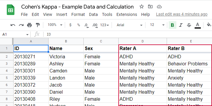
As we readily see, our raters agree on some children and disagree on others. So what we'd like to know is: to what extent do our raters agree on these diagnoses? An obvious approach is to compute the proportion of children on whom our raters agree. We can easily do so by creating a contingency table or “crosstab” for our raters as shown below.
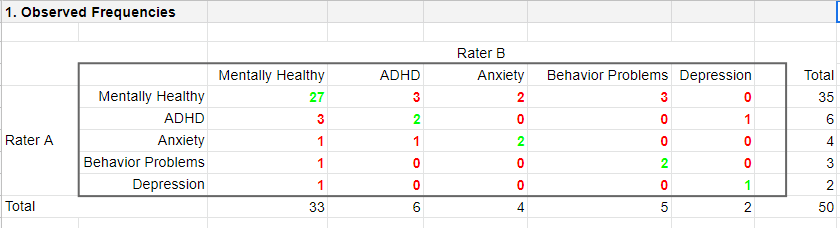
Note that the diagonal elements in green are the numbers of children on whom our raters agree. The observed agreement proportion \(P_a\) is easily calculated as
$$P_a = \frac{27 + 2 + 2 + 2 + 1}{50} = 0.68$$
This means that our raters diagnose 68% out of 50 children similarly. Now, this may seem pretty good but
what if our raters would diagnose children as (un)healthy
by simply flipping coins?
Such diagnoses would be pretty worthless, right? Nevertheless, we'd expect an agreement proportion of \(P_a\) = 0.50 in this case: our raters would agree on 50% of children just by chance.
A solution to this problem is to correct for such a chance-level agreement proportion. Cohen’s kappa does just that.
Cohen’s Kappa - Formulas
First off, how many children are diagnosed similarly? For this, we simply add up the diagonal elements (in green) in the table below.
This results in
$$\Sigma{o_{ij}} = 27 + 2 + 2 + 2 + 1 = 34$$
where \(o_{ij}\) denotes the observed frequencies on the diagonal.
Second, if our raters would not agree to any extent at all, how many similar diagnoses should we expect due to mere chance? Such expected frequencies are calculated as
$$e_{ij} = \frac{o_i\cdot o_j}{N}$$
where
- \(e_{ij}\) denotes an expected frequency;
- \(o_i\) is the corresponding marginal row frequency;
- \(o_j\) is the corresponding marginal column frequency;
- \(N\) is the total sample size.
Like so, the expected frequency for rater A = “mentally healthy” (n = 35) and rater B = “mentally healthy” (n = 33) is
$$e_{ij} = \frac{35\cdot 33}{50} = 23.1$$
The table below shows this and all other expected frequencies.
The diagonal elements in green show all expected frequencies for both raters giving similar diagnoses by mere chance. These add up to
$$\Sigma{e_{ij}} = 23.1 + 0.72 + 0.32 + 0.30 + 0.08 = 24.52$$
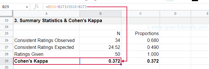
Finally, Cohen’s kappa (denoted as \(\boldsymbol \kappa\), the Greek letter kappa) is computed as3
$$\kappa = \frac{\Sigma{o_{ij}} - \Sigma{e_{ij}}}{N - \Sigma{e_{ij}}}$$
For our example, this results in
$$\kappa = \frac{34 - 24.52}{50 - 24.52} = 0.372$$
as confirmed by our Googlesheet shown below.
An alternative formula for Cohen’s kappa is
$$\kappa = \frac{P_a - P_c}{1 - P_c}$$
where
- \(P_a\) is the agreement proportion observed in our data and;
- \(P_c\) is the agreement proportion that may be expected by mere chance.
For our data, this results in
$$\kappa = \frac{0.68 - 0.49}{1 - 0.49} = 0.372$$
This formula also sheds some light on what Cohen’s kappa really means:
$$\kappa = \frac{\text{actual performance - chance performance}}{\text{perfect performance - chance performance}}$$
which comes down to
$$\kappa = \frac{\text{actual improvement over chance}}{\text{maximum possible improvement over chance}}$$
Cohen’s Kappa - Interpretation
Like we just saw, Cohen’s kappa basically indicates the extent to which observed agreement is better than chance agreement. Technically, agreement could be worse than chance too, resulting in Cohen’s kappa < 0. In short, Cohen’s kappa can run from -1.0 through 1.0 (both inclusive) where
- \(\kappa\) = -1.0 means that 2 raters perfectly disagree;
- \(\kappa\) = 0.0 means that 2 raters agree at chance level;
- \(\kappa\) = 1.0 means that 2 raters perfectly agree.
Another way to think of Cohen’s kappa is the proportion of disagreement reduction compared to chance. For our example, we expected N = 25.48 different diagnoses by chance. Since \(\kappa\) = .372, this is reduced to
$$25.48 - (25.48 \cdot 0.372) = 16$$
different (disagreeing) diagnoses by our raters.
With regard to effect size, there's no clear consensus on rules of thumb. However, Twisk (2016)4 more or less proposes that
- \(\kappa\) = 0.4 indicates a small effect;
- \(\kappa\) = 0.55 indicates a medium effect;
- \(\kappa\) = 0.7 indicates a large effect.
Cohen’s Kappa in SPSS
In SPSS, Cohen’s kappa is found under
![]()
![]() as shown below.
as shown below.
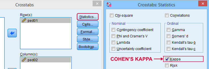
The output (below) confirms that \(\kappa\) = .372 for our example.
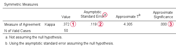
Keep in mind that the significance level is based on the null hypothesis that \(\kappa\) = 0.0. However,
concluding that kappa is probably not zero is pretty useless
because zero doesn't come anywhere close to an acceptable value for kappa. A confidence interval would have been much more useful here but -sadly- SPSS doesn't include it.
When (Not) to Use Cohen’s Kappa?
Cohen’s kappa is mostly suitable for comparing 2 ratings if both ratings
- are nominal variables (unordered answer categories) and
- have identical answer categories.
For ordinal or quantitative variables, Cohen’s kappa is not your best option. This is because it only distinguishes between the ratings agreeing or disagreeing. So let's say we have answer categories such as
- very bad;
- somewhat bad;
- neutral;
- somewhat good;
- very good.
If 2 raters rate some item as “very bad” and “somewhat bad”, they slightly disagree. If they rate it as “very bad” and “very good”, they disagree much more strongly but Cohen’s kappa ignores this important difference: in both scenarios they simply “disagree”. A measure that does take into account how much raters disagree is weighted kappa. This is therefore a more suitable measure for ordinal variables.
Related Measures
Cohen’s kappa is an association measure for 2 nominal variables. For testing if this association is zero (both variables independent), we often use a chi-square independence test. Effect size measures for this test are
- the contingency coefficient;
- Cramér’s V;
- Cohen’s W.
These measures can basically be seen as correlations for nominal variables. So how do they differ from Cohen’s kappa? Well,
- Cohen’s kappa corrects for chance-level agreement and
- Cohen’s kappa requires both variables to have identical answer categories
whereas the other measures don't.
Second, if both ratings are ordinal, then weighted kappa is a more suitable measure than Cohen’s kappa.1 This measure takes into account (or “weights”) how much raters disagree. Weighted kappa was introduced in SPSS version 27 under
![]()
![]() as shown below.
as shown below.
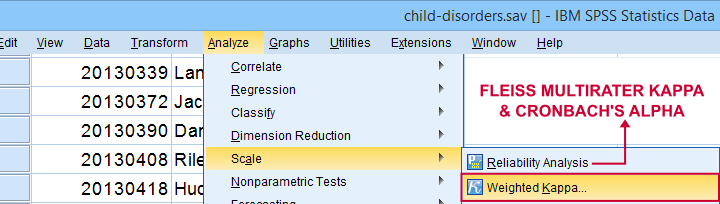
Lastly, if you have 3(+) raters instead of just two, use Fleiss-multirater-kappa. This measure is available in SPSS version 28(+) from
![]()
![]() Note that this is the same dialog as used for Cronbach’s alpha.
Note that this is the same dialog as used for Cronbach’s alpha.
References
- Van den Brink, W.P. & Koele, P. (2002). Statistiek, deel 3 [Statistics, part 3]. Amsterdam: Boom.
- Warner, R.M. (2013). Applied Statistics (2nd. Edition). Thousand Oaks, CA: SAGE.
- Howell, D.C. (2002). Statistical Methods for Psychology (5th ed.). Pacific Grove CA: Duxbury.
- Twisk, J.W.R. (2016). Inleiding in de Toegepaste Biostatistiek [Introduction to Applied Biostatistics]. Houten: Bohn Stafleu van Loghum.
- Van den Brink, W.P. & Mellenberg, G.J. (1998). Testleer en testconstructie [Test science and test construction]. Amsterdam: Boom.
- Fleiss, J.L., Levin, B. & Cho Paik, M. (2003). Statistical Methods for Rates and Proportions (3d. Edition). Hoboken, NJ: Wiley.
SPSS ANCOVA – Beginners Tutorial
- ANCOVA - Null Hypothesis
- ANCOVA Assumptions
- SPSS ANCOVA Dialogs
- SPSS ANCOVA Output - Between-Subjects Effects
- SPSS ANCOVA Output - Adjusted Means
- ANCOVA - APA Style Reporting
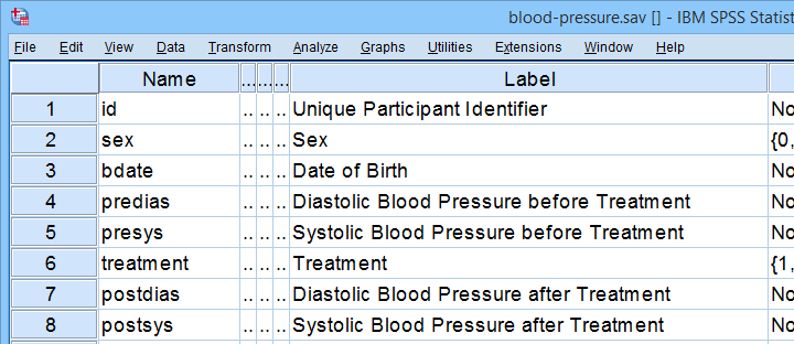
A pharmaceutical company develops a new medicine against high blood pressure. They tested their medicine against an old medicine, a placebo and a control group. The data -partly shown below- are in blood-pressure.sav.
Our company wants to know if their medicine outperforms the other treatments: do these participants have lower blood pressures than the others after taking the new medicine? Since treatment is a nominal variable, this could be answered with a simple ANOVA.
Now, posttreatment blood pressure is known to correlate strongly with pretreatment blood pressure. This variable should therefore be taken into account as well. The relation between pretreatment and posttreatment blood pressure could be examined with simple linear regression because both variables are quantitative.
We'd now like to examine the effect of medicine while controlling for pretreatment blood pressure. We can do so by adding our pretest as a covariate to our ANOVA. This now becomes ANCOVA -short for analysis of covariance. This analysis basically combines ANOVA with regression.
Surprisingly, analysis of covariance does not actually involve covariances as discussed in Covariance - Quick Introduction.
ANCOVA - Null Hypothesis
Generally, ANCOVA tries to demonstrate some effect by rejecting the null hypothesis that all population means are equal when controlling for 1+ covariates. For our example, this translates to “average posttreatment blood pressures are equal for all treatments when controlling for pretreatment blood pressure”. The basic analysis is pretty straightforward but it does require quite a few assumptions. Let's look into those first.
ANCOVA Assumptions
- independent observations;
- normality: the dependent variable must be normally distributed within each subpopulation. This is only needed for small samples of n < 20 or so;
- homogeneity: the variance of the dependent variable must be equal over all subpopulations. This is only needed for sharply unequal sample sizes;
- homogeneity of regression slopes: the b-coefficient(s) for the covariate(s) must be equal among all subpopulations.
- linearity: the relation between the covariate(s) and the dependent variable must be linear.
Taking these into account, a good strategy for our entire analysis is to
- first run some basic data checks: histograms and descriptive statistics give quick insights into frequency distributions and sample sizes. This tells us if we even need assumptions 2 and 3 in the first place.
- see if assumptions 4 and 5 hold by running regression analyses for our treatment groups separately;
- run the actual ANCOVA and see if assumption 3 -if necessary- holds.
Data Checks I - Histograms
Let's first see if our blood pressure variables are even plausible in the first place. We'll inspect their histograms by running the syntax below. If you prefer to use SPSS’ menu, consult Creating Histograms in SPSS.
frequencies predias postdias
/format notable
/histogram.
Result
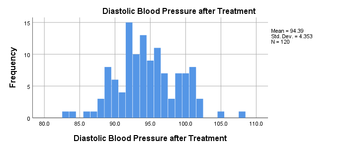
Conclusion: the frequency distributions for our blood pressure measurements look plausible: we don't see any very low or high values. Neither shows a lot of skewness or kurtosis and they both look reasonably normally distributed.
Data Checks II - Descriptive Statistics
Next, let's look into some descriptive statistics, especially sample sizes. We'll create and inspect a table with the
- sample sizes,
- means and
- standard deviations
of the outcome variable and the covariate for our treatment groups separately. We could do so from
![]()
![]() or -faster- straight from syntax.
or -faster- straight from syntax.
means predias postdias by treatment
/statistics anova.
Result
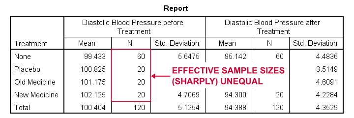
The main conclusions from our output are that
- all treatment groups have reasonable samples sizes of at least n = 20. This means we don't need to bother about the normality assumption. Otherwise, we could use a Shapiro-Wilk normality test or a Kolmogorov-Smirnov test but we rather avoid these.
- the treatment groups have sharply unequal sample sizes. This implies that our ANCOVA will need to satisfy the homogeneity of variance assumption.
- the ANOVA results (not shown here) tell us that the posttreatment means don't differ statistically significantly, F(3,116) = 1.619, p = 0.189. However, this test did not yet include our covariate -pretreatment blood pressure.
So much for our basic data checks. We'll now look into the regression results and then move on to the actual ANCOVA.
Separate Regression Lines for Treatment Groups
Let's now see if our regression slopes are equal among groups -one of the ANCOVA assumptions. We'll first just visualize them in a scatterplot as shown below.
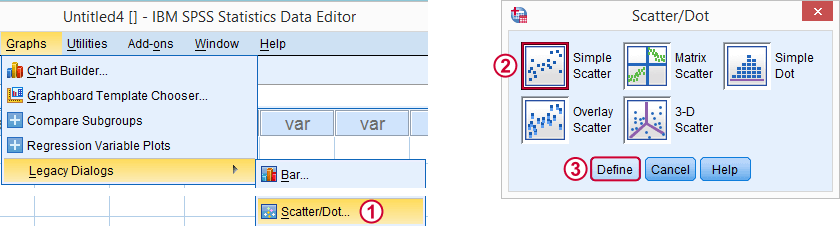
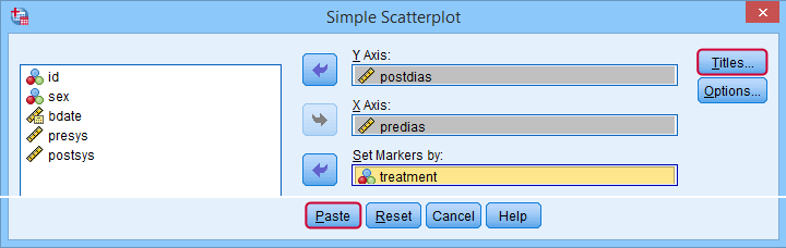
Clicking results in the syntax below.
GRAPH
/SCATTERPLOT(BIVAR)=predias WITH postdias BY treatment
/MISSING=LISTWISE.GRAPH
/TITLE='Diastolic Blood Pressure by Treatment'.
*Double-click resulting chart and click "Add fit line at subgroups" icon.
SPSS now creates a scatterplot with different colors for different treatment groups. Double-clicking it opens it in a Chart Editor window. Here we click the “Add Fit Lines at Subgroups” icon as shown below.
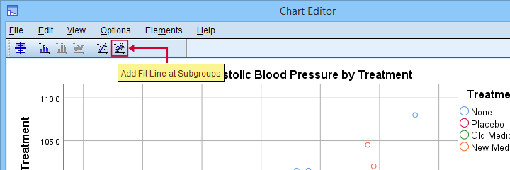
Result
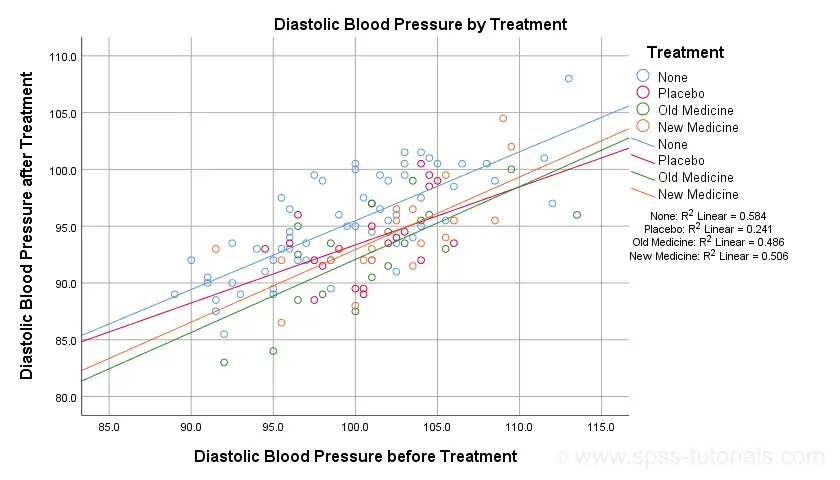
The main conclusion from this chart is that the regression lines are almost perfectly parallel: our data seem to meet the homogeneity of regression slopes assumption required by ANCOVA.
Furthermore, we don't see any deviations from linearity: this ANCOVA assumption also seems to be met. For a more thorough linearity check, we could run the actual regressions with residual plots. We did just that in SPSS Moderation Regression Tutorial.
Now that we checked some assumptions, we'll run the actual ANCOVA twice:
- the first run only examines the homogeneity of regression slopes assumption. If this holds, then there should not be any covariate by treatment interaction-effect.
- the second run tests our null hypothesis: are all population means equal when controlling for our covariate?
SPSS ANCOVA Dialogs
Let's first navigate to
![]()
![]() and fill out the dialog boxes as shown below.
and fill out the dialog boxes as shown below.
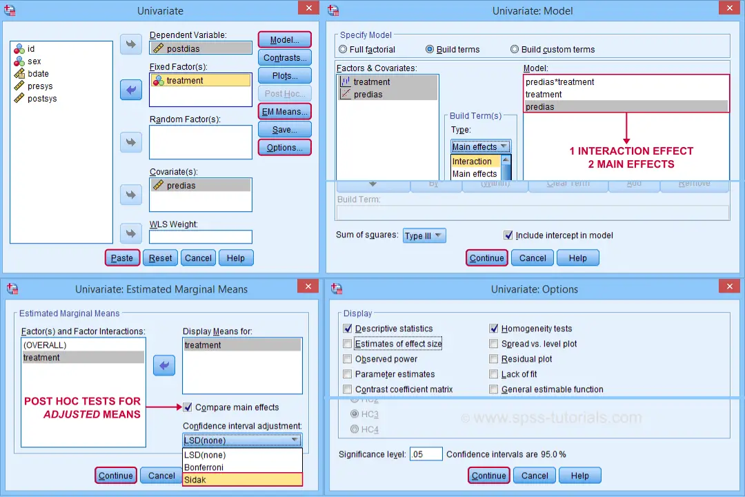
Clicking generates the syntax shown below.
UNIANOVA postdias BY treatment WITH predias
/METHOD=SSTYPE(3)
/INTERCEPT=INCLUDE
/EMMEANS=TABLES(treatment) WITH(predias=MEAN) COMPARE ADJ(SIDAK)
/PRINT ETASQ HOMOGENEITY
/CRITERIA=ALPHA(.05)
/DESIGN=predias treatment predias*treatment. /* predias*treatment adds interaction effect to model.
Result
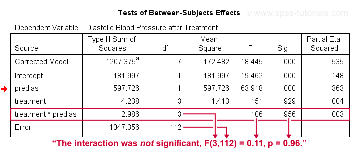
First note that our covariate by treatment interaction is not statistically significant at all: F(3,112) = 0.11, p = 0.96. This means that the regression slopes for the covariate don't differ between treatments: the homogeneity of regression slopes assumption seems to hold almost perfectly.
For these data, this doesn't come as a surprise: we already saw that the regression lines for different treatment groups were roughly parallel. Our first ANCOVA is basically a more formal way to make the same point.
SPSS ANCOVA II - Main Effects
We now run simply rerun our ANCOVA as previously. This time, however, we'll remove the covariate by treatment interaction effect. Doing so results in the syntax shown below.
UNIANOVA postdias BY treatment WITH predias
/METHOD=SSTYPE(3)
/INTERCEPT=INCLUDE
/EMMEANS=TABLES(treatment) WITH(predias=MEAN) COMPARE ADJ(SIDAK)
/PRINT ETASQ HOMOGENEITY
/CRITERIA=ALPHA(.05)
/DESIGN=predias treatment. /* only test for 2 main effects.
SPSS ANCOVA Output I - Levene's Test
Since our treatment groups have sharply unequal sample sizes, our data need to satisfy the homogeneity of variance assumption. This is why we included Levene's test in our analysis. Its results are shown below.
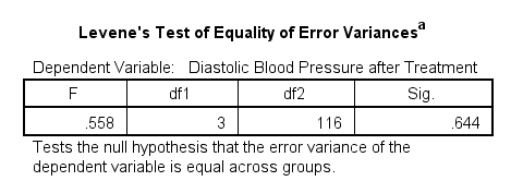
Conclusion: we don't reject the null hypothesis of equal error variances, F(3,116) = 0.56, p = 0.64. Our data meets the homogeneity of variances assumption. This means we can confidently report the other results.
SPSS ANCOVA Output - Between-Subjects Effects
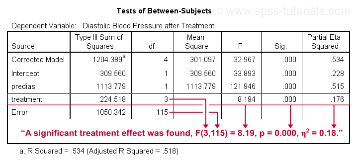
Conclusion: we reject the null hypothesis that our treatments result in equal mean blood pressures, F(3,115) = 8.19, p = 0.000.
Importantly, the effect size for treatment is between medium and large: partial eta squared (written as η2) = 0.176.
Apparently, some treatments perform better than others after all. Interestingly, this treatment effect was not statistically significant before including our pretest as a covariate.
So which treatments perform better or worse? For answering this, we first inspect our estimated marginal means table.
SPSS ANCOVA Output - Adjusted Means
One role of covariates is to adjust posttest means for any differences among the corresponding pretest means. These adjusted means and their standard errors are found in the Estimated Marginal Means table shown below.
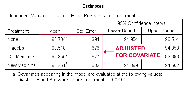
These adjusted means suggest that all treatments result in lower mean blood pressures than “None”. The lowest mean blood pressure is observed for the old medicine. So precisely which mean differences are statistically significant? This is answered by post hoc tests which are found in the Pairwise Comparisons table (not shown here). This table shows that all 3 treatments differ from the control group but none of the other differences are statistically significant. For a more detailed discussion of post hoc tests, see SPSS - One Way ANOVA with Post Hoc Tests Example.
ANCOVA - APA Style Reporting
For reporting our ANCOVA, we'll first present descriptive statistics for
- our covariate;
- our dependent variable (unadjusted);
- our dependent variable (adjusted for the covariate).
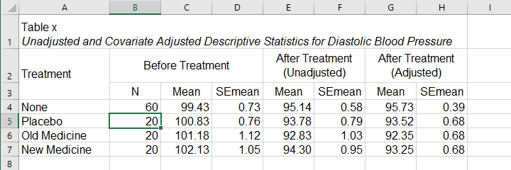
What's interesting about this table is that the posttest means are hardly adjusted by including our covariate. However, the covariate greatly reduces the standard errors for these means. This is why the mean differences are statistically significant only when the covariate is included. The adjusted descriptives are obtained from the final ANCOVA results. The unadjusted descriptives can be created from the syntax below.
means predias postdias by treatment
/cells count mean semean.
The exact APA table is best created by copy-pasting these statistics into Excel or Googlesheets.
Second, we'll present a standard ANOVA table for the effects included in our final model and error.
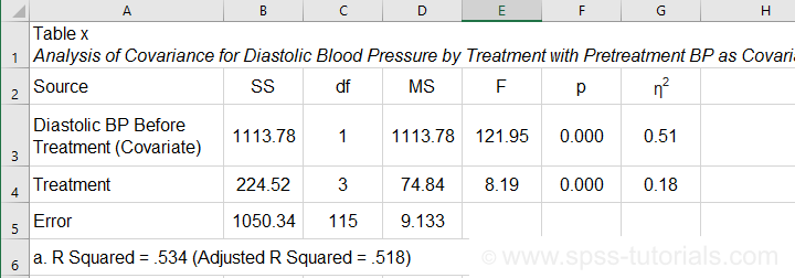
This table is constructed by copy-pasting the SPSS output table into Excel and removing the redundant rows.
Final Notes
So that'll do for a very solid but simple ANCOVA in SPSS. We could have written way more about this example analysis as there's much -much- more to say about the output. We'd also like to cover the basic ideas behind ANCOVA into more detail but that really requires a separate tutorial which we hope to write in some weeks from now.
Hope my tutorial has been helpful anyway. So last off:
thanks for reading!